.svg)
.svg)

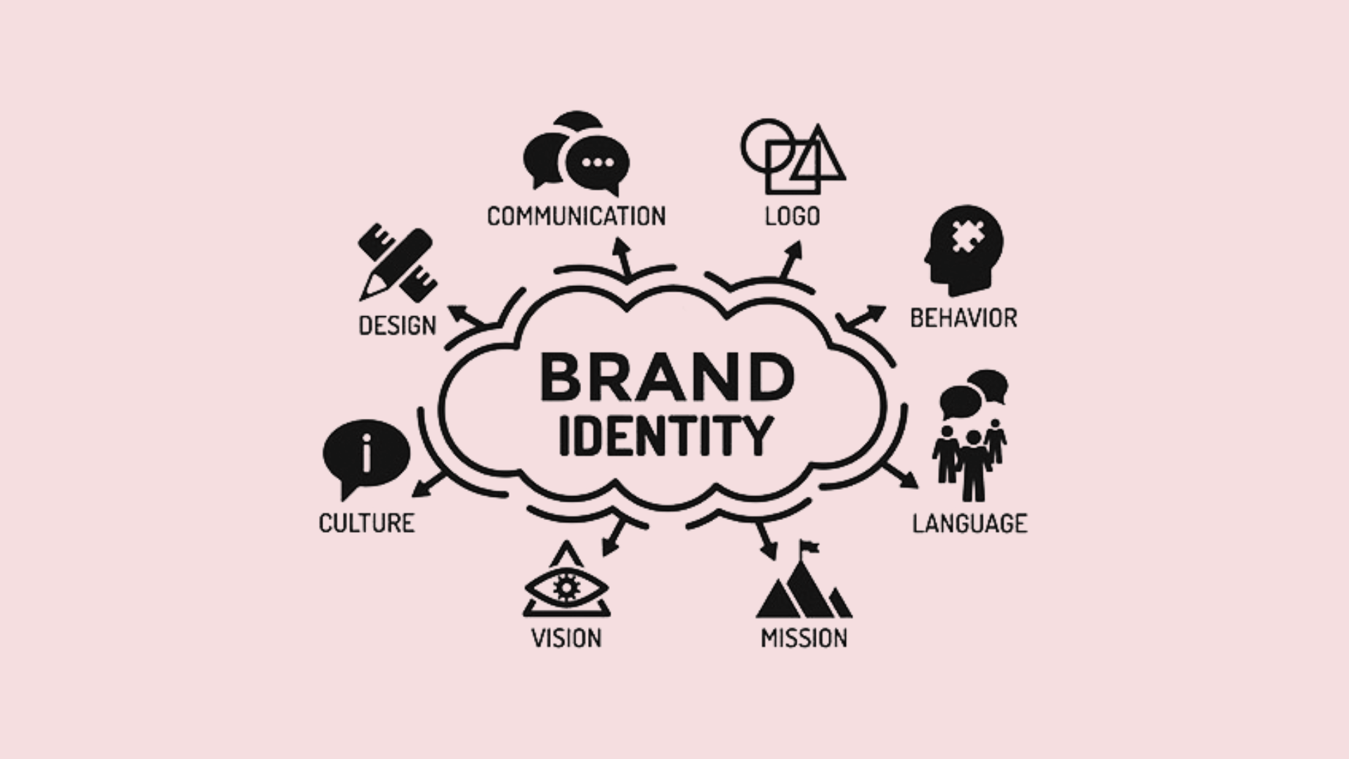

A brand identity system is a connected set of decisions and assets that ensures consistent recognition across every customer touchpoint. It is not a logo file sitting in a folder, it is the logic that tells every designer, developer, and vendor how to represent the brand correctly, every time. Get it right and you unlock faster production, fewer approval loops, and a brand that feels like one voice everywhere it shows up. This guide walks through building, documenting, and applying that system.
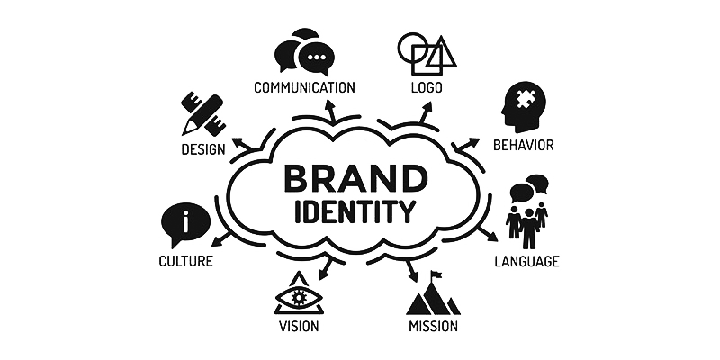
Core Components of a Brand Identity System
A brand identity system is built from several interdependent parts, and the moment you treat them as separate assets instead of linked decisions, cracks start to show. Shopify's breakdown of core brand elements frames logo, color palette, typography, and imagery as the tangible outputs of a broader branding strategy, and that framing matters: each piece only makes sense in relation to the others.
Here is what belongs in the system and how each piece earns its place:
- Logo system: a primary mark plus secondary, icon-only, and monochrome variants for different contexts.
- Color palette: primary, secondary, and neutral tones assigned specific roles rather than used interchangeably.
- Typography: a heading typeface for personality and a body typeface for readability, paired deliberately.
- Imagery: photography or illustration style that signals who the brand is for, not just what it sells.
- Iconography: a consistent grid and stroke weight so icons read as one family across products.
- Graphic language: recurring shapes, patterns, or layout devices that reinforce recognition beyond the logo.
- Voice and tone: how the brand sounds in writing, adjusted by context but never off-brand.
- Motion: transition styles and animation principles for digital touchpoints, where relevant.
The connection between these pieces is the actual system. A color palette chosen without testing against typography produces headlines that disappear on brand backgrounds. An icon set built on a different grid than the logo mark looks like it belongs to another company. A recent TU Delft thesis on node-based identity design argues that treating identity as a network of linked nodes, rather than a pile of files, helps designers preserve strategic intent as a brand scales across tools and teams. That is the shift worth making early: fewer standalone assets, more documented relationships between them.
A Practical Step-by-Step Process to Build a Brand Identity System
Building a brand identity system follows a sequence that resists shortcuts. Skip discovery and your color choices will be guesses. Skip documentation and your design work expires the day the founder leaves the room.
- Discovery: map the target audience, audit competitors, and write a positioning brief that states what the brand stands for and who it serves.
- Strategy: translate discovery into personality traits and three to five messaging pillars that will guide every design decision downstream.
- Design concepting: explore multiple visual directions before committing, testing logo marks, color stories, and type pairings against the strategy brief.
- Iteration: narrow to one direction and refine it against real use cases, not just a presentation deck.
- Logo system production: finalize primary and secondary marks, spacing rules, and minimum size requirements.
- Documentation: compile a style guide and token library so the decisions are usable without the original designer in the room.
- Asset handoff: package files in the formats each team actually needs, web, print, and social.
- Rollout: apply the system to flagship touchpoints first, website and core marketing materials, then expand.
- Governance: assign who approves new applications, how often the guide gets reviewed, and how exceptions are logged.
Each step produces something the next step depends on. A positioning brief without a clear audience statement will not give the design team enough to work with, and a style guide without governance will drift within a year regardless of how polished it looked on delivery day.

Designing the Visual System: Logos, Color, Type, and Icons
The visual system is where strategy becomes something people can actually see, and the details matter more than they get credit for.
- Logo system: define a primary mark, a secondary lockup, an icon-only version, clear spacing rules, and a minimum size so the mark never gets printed smaller than it can be read.
- Color palette: assign roles, primary for brand recognition, secondary for accents, neutrals for backgrounds and text, and check combinations for accessible contrast before locking them in.
- Typography: pair a distinctive heading face with a highly legible body face, confirm web licensing covers your use case, and consider variable fonts for flexibility across weights and screen sizes.
- Imagery and illustration: decide on subject matter, color treatment, and composition rules so photography and illustration feel like they came from the same brand.
- Iconography: build icons on a single grid with consistent stroke weight so they scale uniformly across app, web, and print.
Pro Tip:Test your primary color pairing against both light and dark backgrounds before finalizing it. A palette that only works on white rarely survives contact with real product screens.
Documenting and Governing the System
A brand identity system that lives only in one designer's head is not a system, it is a bottleneck. Documentation is what turns decisions into something a new hire, a freelancer, or an outside vendor can pick up and use correctly on the first try.
A usable style guide should include:
- Usage rules for the logo, including clear space, minimum size, and incorrect uses to avoid.
- Color codes in HEX, RGB, and CMYK so the palette prints and displays correctly everywhere.
- Typography specs with font names, weights, and fallback stacks for web use.
- Voice and tone samples showing how the brand sounds in a tagline versus a support email.
- File formats and export sizes for logos, icons, and templates, ready for designers and developers alike.
Beyond the guide itself, set up an asset library, often a Figma or Sketch component library, so teams pull from the same source rather than recreating assets from memory. Assign who approves changes, keep a version history, and build templates for recurring needs like email headers and social posts so adoption does not depend on someone rebuilding the wheel each time.
Accessibility and Technical Considerations That Shape Identity Decisions
Accessibility is not a layer added after design, it changes which colors, icons, and logo treatments are usable in the first place. The W3C's guidance on contrast notes that logotypes are generally exempt from text contrast thresholds, but recommends providing high-contrast logo variants whenever the logo functions as a clickable UI control rather than pure branding.
Icons carry their own rule. W3C technique G207 recommends a minimum 3:1 contrast ratio for icons that convey necessary information, tested against the least-contrasting part of the background behind them, which matters a great deal for icons placed over photography or gradients.
Build these checks into the workflow:
- Test logo variants against both light and dark UI backgrounds before shipping.
- Run icon sets through a contrast checker against gradient and photo backgrounds, not just flat color.
- Export logos as SVG for responsive scaling across devices.
- Use color tokens in code so a palette update cascades instead of requiring manual edits.
Applying the Brand Identity System Across Touchpoints
A system only proves itself once it leaves the style guide and shows up in the wild. Shopify notes that centralized brand settings in a platform's admin cascade changes across themes and connected apps, which is the same principle worth applying anywhere a brand appears.
- Website and product UI: store colors, type, and spacing as design tokens so updates propagate through components automatically.
- Marketing and social: build templates with fixed logo placement and motion rules so posts stay recognizable even when content changes daily.
- Packaging and print: confirm color modes (CMYK versus Pantone) and material constraints before a design that looked perfect on screen meets a printer.
- Audits: schedule a periodic review against the style guide to catch drift before it becomes the new normal.
How Raw Studio Applies a Brand Identity System in Practice
Our approach to building a brand identity system leans on research-driven design sprints and our Rapid MVP framework to validate identity decisions before full production, rather than guessing and fixing later.
- We hand clients a documented system: style guide, token library, and a usable asset package, not a single export folder.
- We build in governance guidance so the system survives beyond the handoff meeting.
- We have reported conversion improvements as high as 100% for some clients through combined branding and UX work, documented in our case studies.
Examples and Common Patterns Worth Prioritizing
Most strong brand identity systems share a few habits rather than a single look. They lead with one dominant color and use secondary tones sparingly, which keeps recognition high even in cluttered feeds. They favor a restrained type pairing, one display face and one workhorse body face, instead of chasing variety. They apply the same icon grid everywhere, so a navigation icon on the website matches the one in the mobile app pixel for pixel in spirit, if not in size.
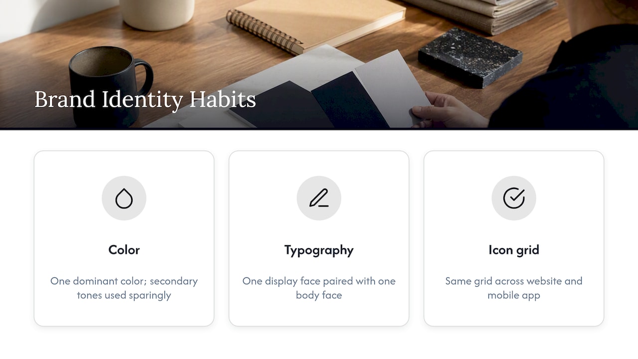
The pattern worth prioritizing above the rest is restraint at the decision level, not the asset level. A brand with three approved colors and one typeface pairing will look more consistent across ten touchpoints than a brand with twelve colors and three typefaces ever will, regardless of how talented the design team is. Prioritize the rules that prevent drift before prioritizing the polish of any single asset. A logo redesign gets noticed once. A governance gap gets noticed every week it goes unaddressed.
The Role of Brand Personality and Values in Shaping the Identity System
Visual choices are downstream of character, not the other way around. A brand that values approachability tends toward rounded shapes, warmer colors, and conversational copy, while a brand built on precision and trust leans toward structured grids, cooler tones, and more measured language. Skipping the personality definition and jumping straight to color swatches is how identity systems end up generic, technically consistent but indistinguishable from competitors.
Values should also show up in smaller, less obvious decisions: whether photography features real customers or staged models, whether the voice ever uses humor, whether the icon style feels playful or clinical. These choices compound. A system grounded in a clearly written personality brief gives every future designer a test they can apply to new situations, asking whether a new application still sounds and looks like the brand, instead of asking whether it simply looks acceptable on its own.
Bringing User Research and Data Into Identity Design
Identity decisions hold up better when they are informed by how real audiences respond, not just internal taste. User research, surveys, interviews, and usability testing on early concepts, can reveal whether a color palette reads as trustworthy or cheap to the actual target audience, long before a full rollout locks the choice in.
Data-driven insight also applies after launch. Tracking engagement on pages before and after a visual refresh, or testing two logo treatments through a controlled experiment, turns identity work from a one-time creative decision into something that keeps improving. This is part of why a research-first process, concepting, testing, refining, tends to outperform a process that goes straight from brief to final design. The goal is not to let data override every creative instinct, but to use it as a check against decisions that feel right internally but do not land with the people the brand is actually trying to reach.
Keeping the System Consistent and Flexible as the Brand Evolves
A brand identity system that cannot flex eventually gets ignored, and one that flexes too easily stops meaning anything. The balance comes from designing rules with built-in range from the start: a color palette with defined tints and shades for new contexts, a logo system with variants already approved for dark backgrounds or small spaces, so teams do not have to improvise when a new touchpoint comes up.
Version control matters here. Treat the style guide like a living document with dated updates and a changelog, so teams can see what changed and why, rather than discovering a quiet deviation six months later. Revisit the system on a set cadence, annually for most brands, more often for fast-growing ones, and distinguish genuine strategic evolution from a one-off exception someone wants approved. The brands that stay recognizable for years are rarely the ones that never changed anything. They are the ones that changed deliberately, inside rules built to absorb that change.
Measuring the Impact of a Brand Identity System
A brand identity system earns its keep when it shows up in numbers, not just compliments from the design team. Site engagement metrics, time on page, bounce rate, and return visits, often shift after a cohesive identity rollout, since visual consistency reduces the friction of a visitor trying to figure out if they are in the right place. Conversion rate is the sharper signal: a clearer visual hierarchy and consistent calls to action tend to move people through a funnel with fewer drop-off points.
Brand recall is harder to quantify but worth tracking through simple surveys asking whether customers can identify the brand from a color or icon alone, stripped of the logo. Internally, measure production speed: a well-documented system should shorten the time it takes a new designer or vendor to produce an on-brand asset, since they are no longer guessing. If governance is working, the number of off-brand executions caught in review should trend down over time, which is a quieter but equally real measure of whether the system is doing its job.

What Founders and Creatives Often Get Wrong
The mistake I see most often is treating branding as a logo project instead of a decision framework. A logo is the easiest part to approve and the easiest part to get wrong without noticing, because the real failures show up later, in a social template nobody can replicate or a color that was never tested for contrast.
Get specific about your audience before anything else, and put governance in place early. The handoff artifacts, the style guide, the token library, the templates, matter more than any single polished asset, because they are what let people who are not designers use the system correctly without asking you first.
Build Your Brand Identity System With Raw Studio
If you want a documented, research-backed brand identity system instead of a logo file and a guess, our branding and UX design work builds the full system: strategy, visual rules, asset library, and rollout support. Start with our free branding checklist or view pricing and packages to scope a project.