.svg)
.svg)
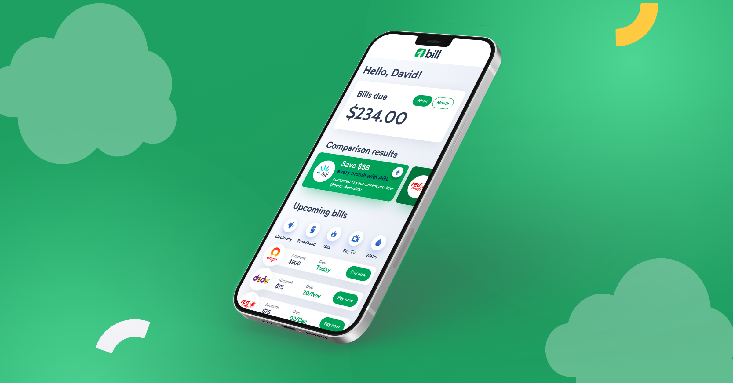
The ultimate app to manage bills and save money
An easier way to manage your bills.
Let’s face it, managing bills isn’t fun. But it’s also a really important part of everyday life. 1bill aims to alleviate some of those pains, and provide convenience to the users when it comes to dealing with bills.
So our challenge for 1Bill is to put together all the great features it require to help the user – while reaching their business goals.
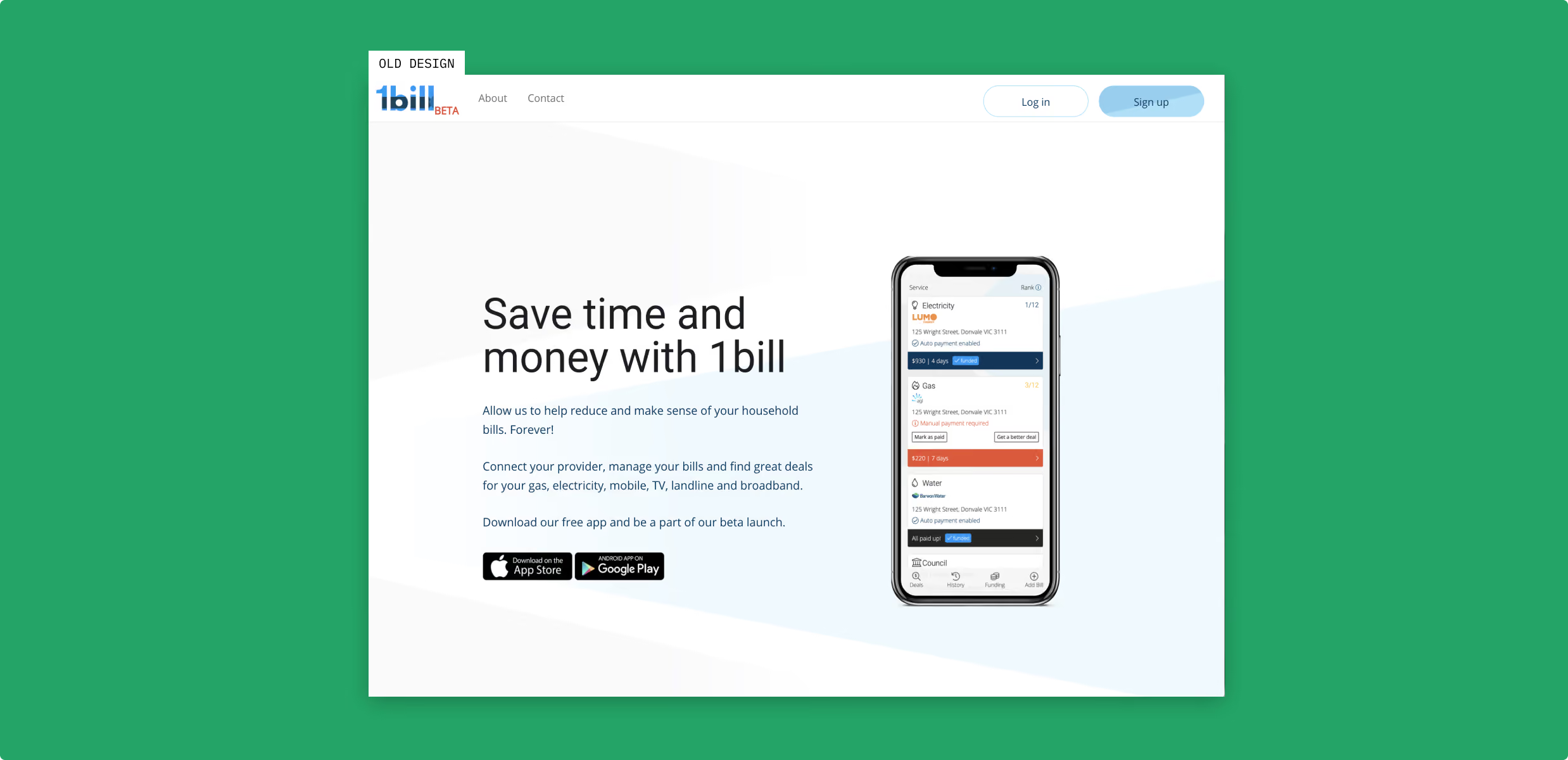
Rehauling 1bill’s branding and app design.
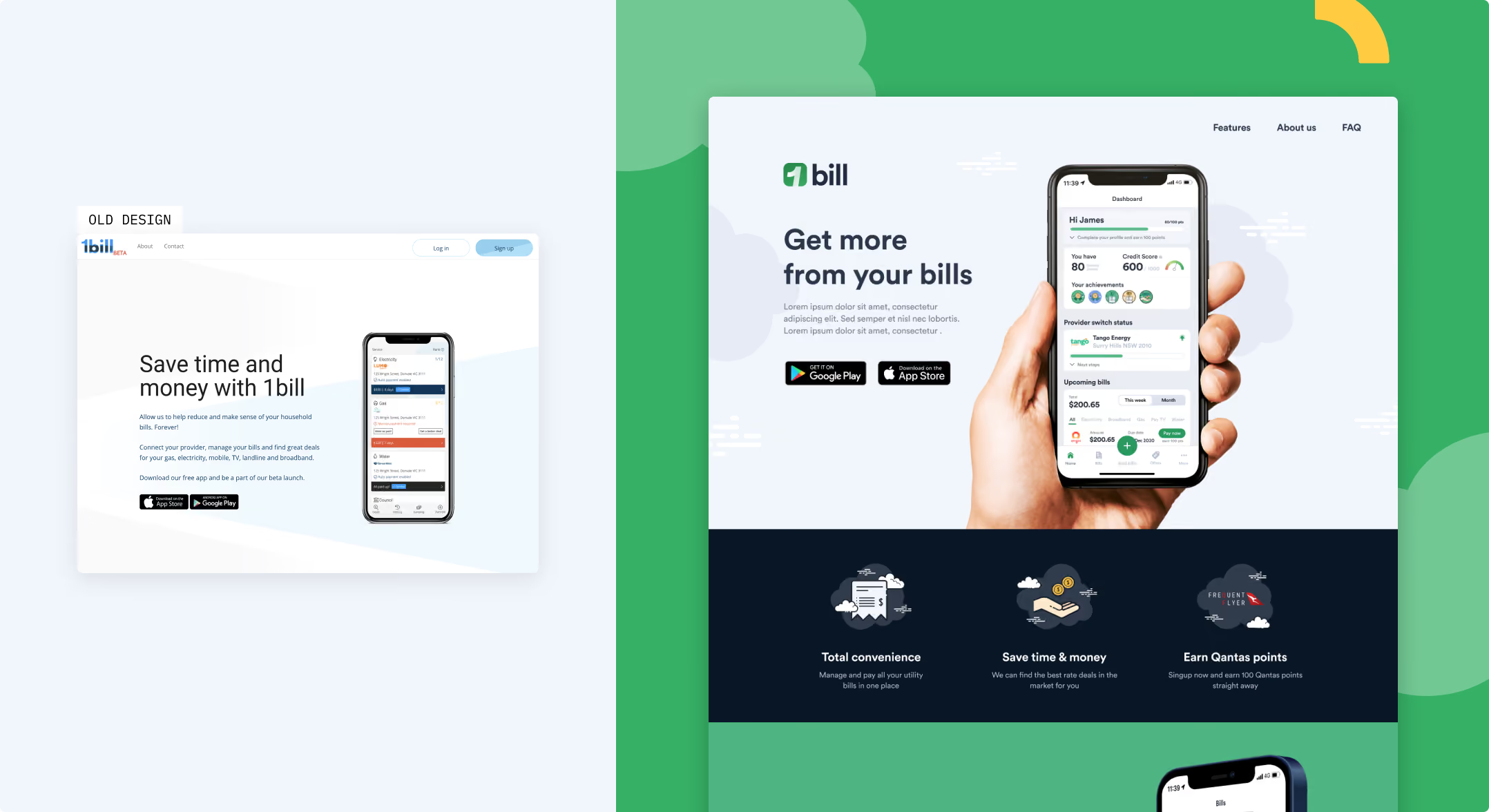
We’ve done a complete redesign of the 1bill app including its branding and strategy – in order to bring to life a product that offers multiple features and delivers convenience and benefits to the user.


UX Strategy
To establish a strategy, we started with a UX audit to figure out the limitations of the current app in order to propose new solutions. To do this, we interviewed our 1bill stakeholders to do a deep dive into the product and its features, such as bill payment and bill pricing comparisons.
Design goals
- Quickly and simply display 1bill services, so users can understand at a glance.
- Encourage users to input their information into the account.
- Using gamification to introduce fun to bill management.
A brand renovation
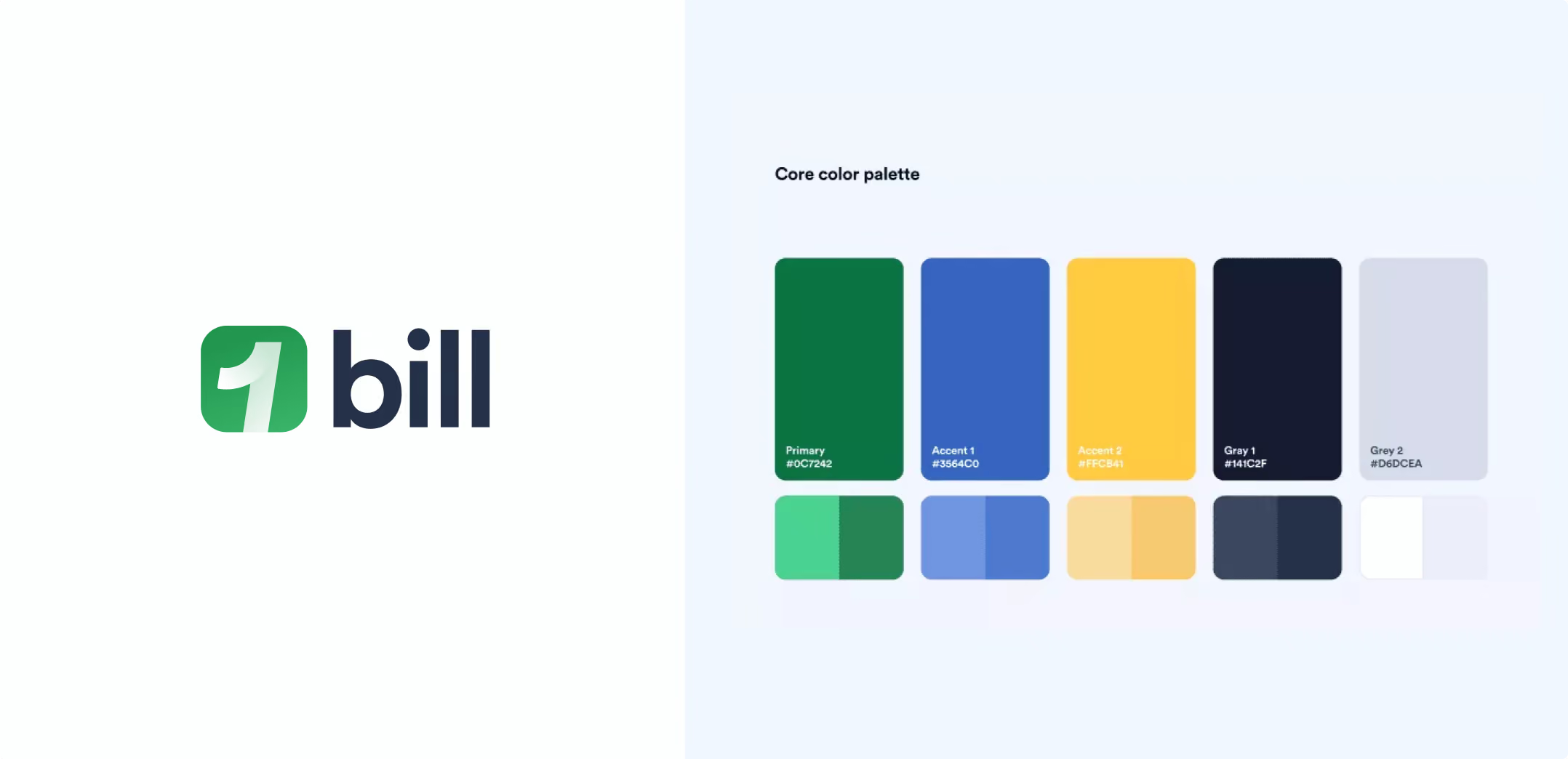
In order to achieve its goal, 1bill needed a complete brand revamp. They also wanted to align with their sister company – Compare and Connect – to match its minimal and modern style.
Design goals
- Quickly and simply display 1bill services, so users can understand at a glance.
- Prompt the users to input their information into the account, so 1bill can gain understanding and provide better services.
- Introducing fun to bill management, using gamification to engage users.
UX & UI Design
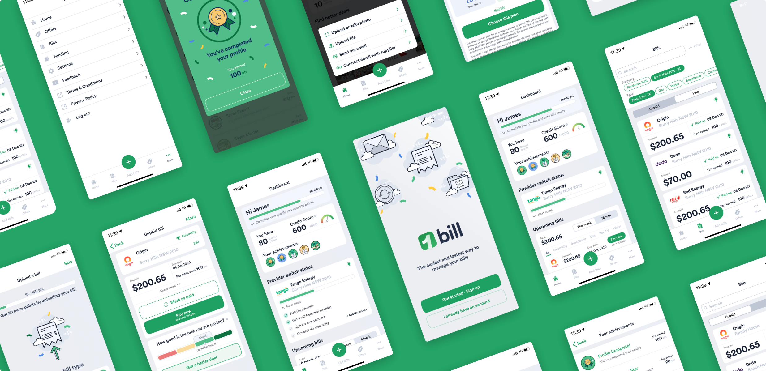
In redesigning the screens, we set to create the screens for 1Bill with the main goals of creating an experience that is engaging and simple to use.
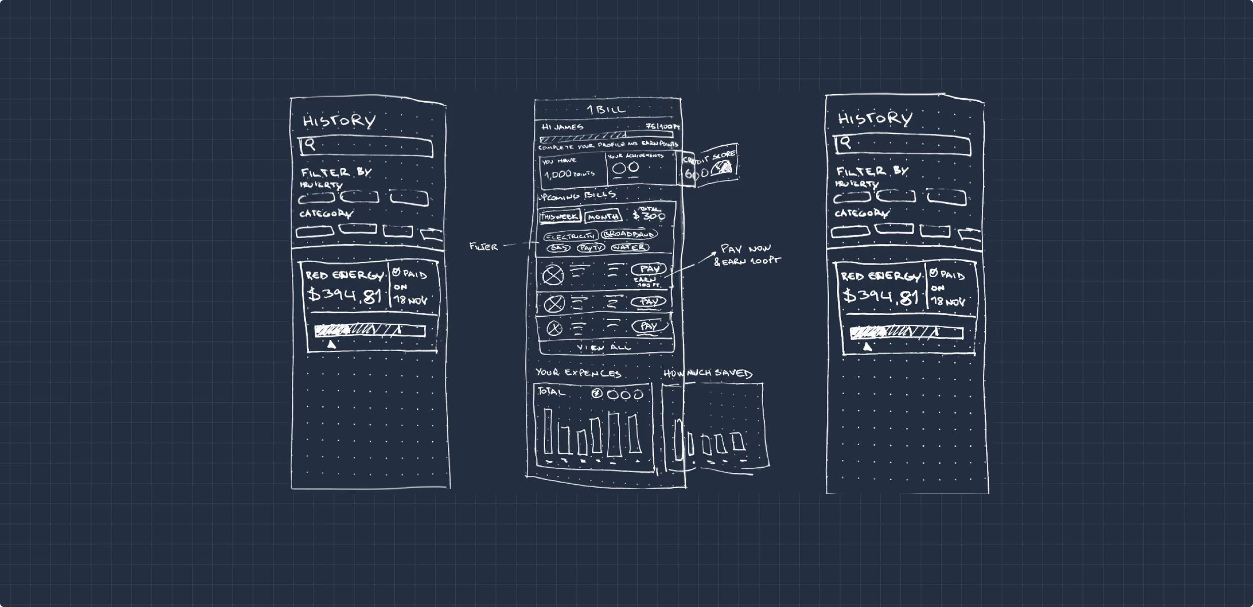
Making bill management simple and fun
We identified a few different strategies to help users have an engaging and easy experience.
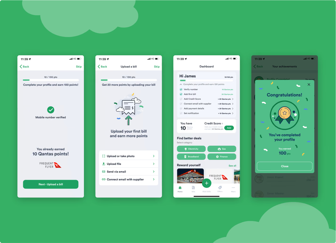
Gamifying the sign-up process
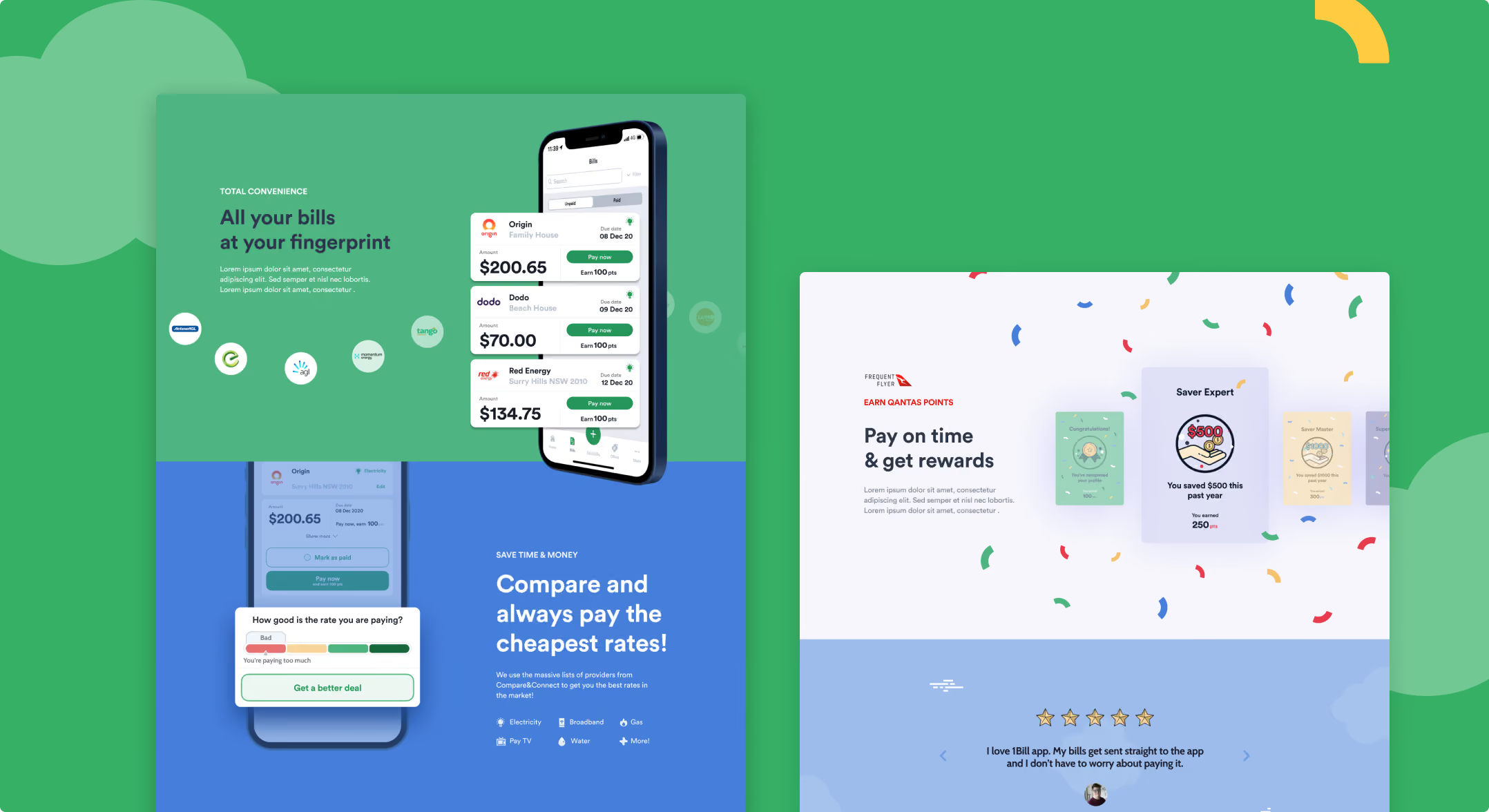
Each time a user completed their profile, they are rewarded by Qantas points – which encourages them to complete their input of information each time.
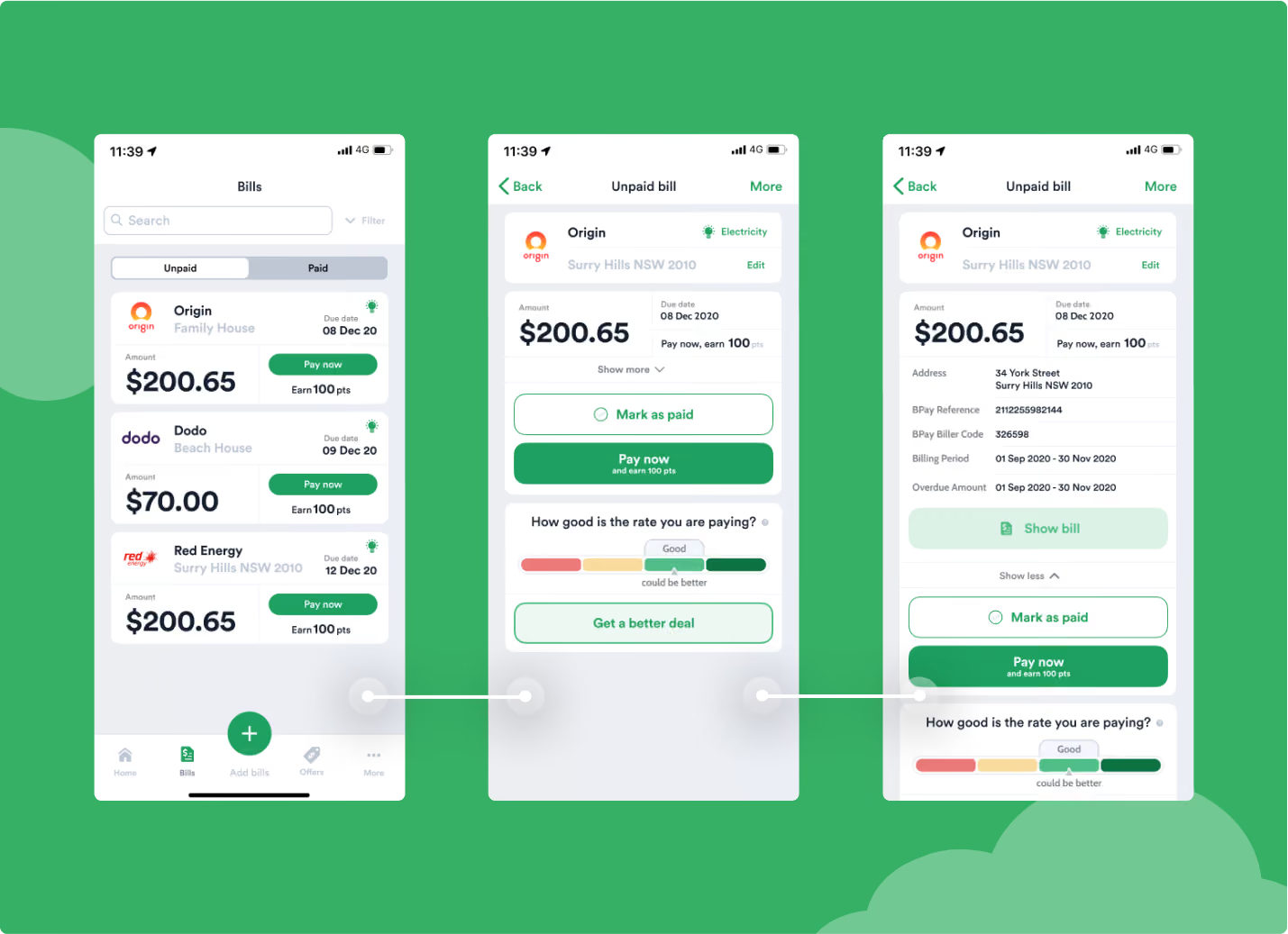
Simple cards
To make things easier and faster to use, we analysed the type of information that are normally included in bills and summarised them into a simple card. When a bill is selected, users can view more detailed information.
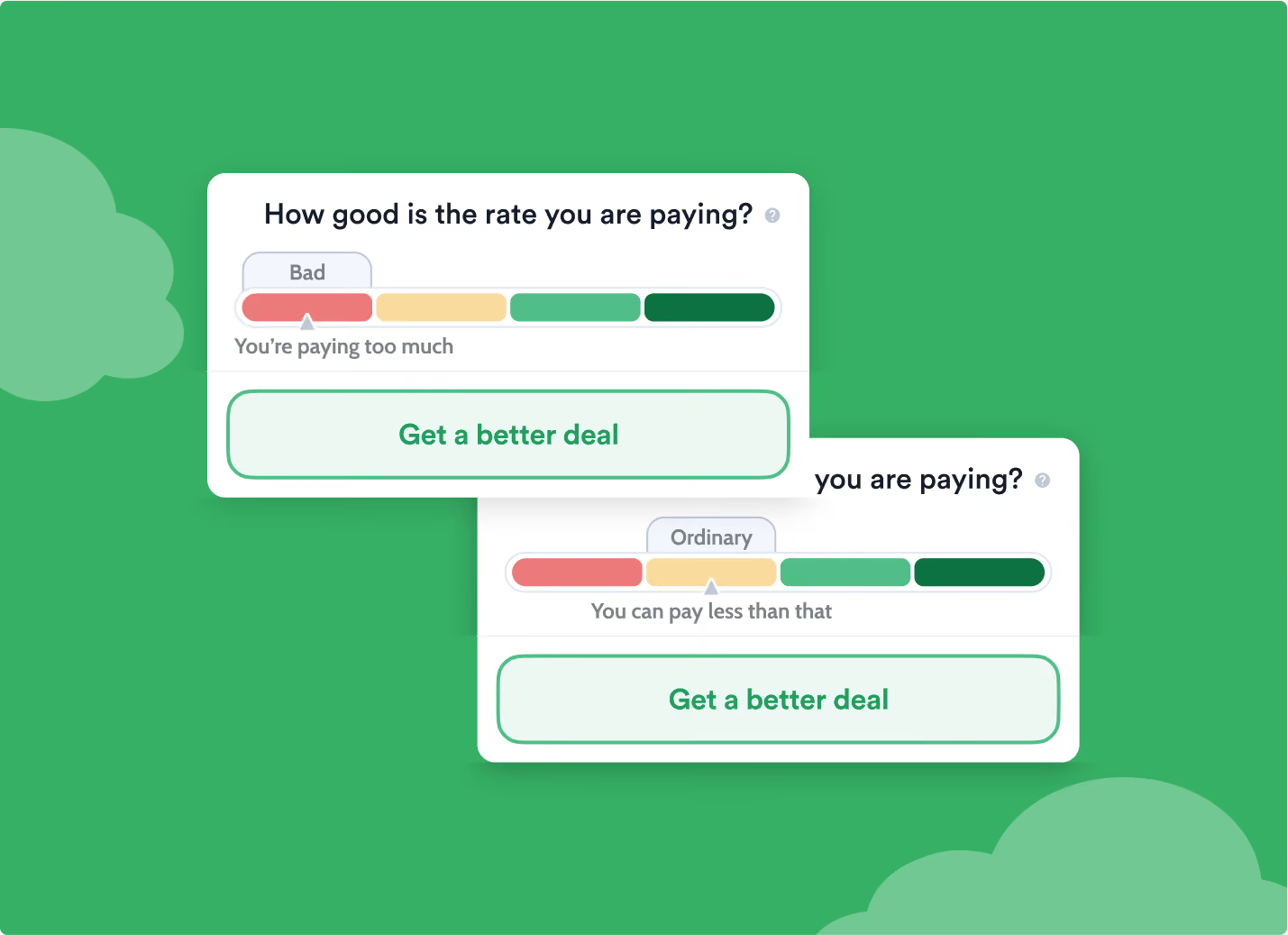
Find better deals
Rate comparison is one of the main features of 1Bill – and we wanted to display it in a clear and visual way, using a colour code system.
Generating engagement through rewards
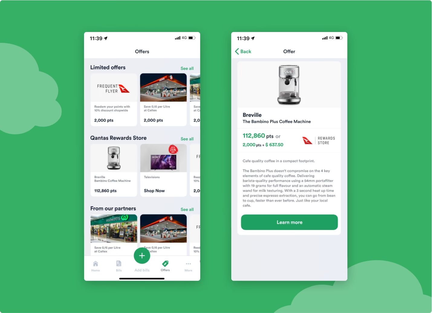
We implemented a point system which means that every action the users take will be rewarded by 1bill Points.From completing their profile or paying a bill, users can collect 1bill points and redeem exclusive benefits and offers
Next Case Studies