.svg)
.svg)

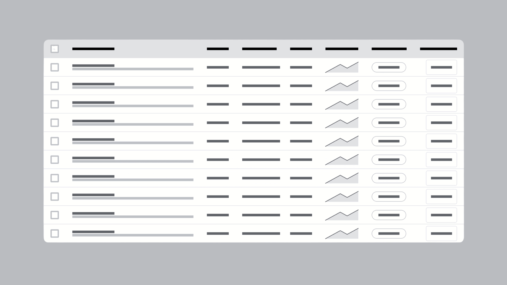

Good data table UX means designing around the one job the table actually does for a person, whether that's finding a record, comparing rows, editing an entry, or taking bulk action. Get that primary task right and the rest of the decisions, from column order to pagination, follow naturally. Before any wireframe, confirm five things: the record identifier sits in column one, filters are visible rather than buried, numbers align right, the header stays put on scroll, and the markup underneath is semantic, not just styled to look like a table.
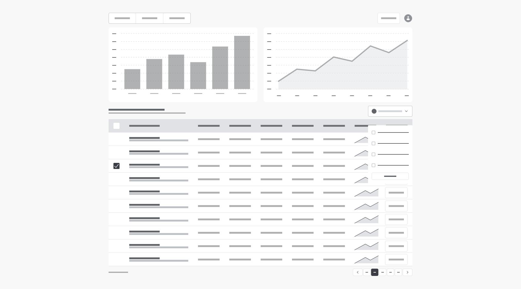
What Is Data Table UX, and When Should You Even Use a Table?
Tables exist to serve four jobs, and Nielsen Norman Group's research on enterprise interfaces names them clearly: finding records that match a criterion, comparing values across rows, viewing or editing a single record, and taking action on one or more records. If your interface doesn't need at least one of these, you probably don't need a table.
That distinction is worth sitting with because so many product teams default to a table just because the data happens to be tabular. A list of five customer testimonials doesn't need a table. A directory of 400 accounts with status, owner, and last-activity date almost certainly does. The tell is whether someone will scan across rows to compare, or whether they'll read one item at a time.
Here's a simple decision flow to run before you commit:
- If the primary job is comparing values side by side across many records, a table wins almost every time.
- If the primary job is reading one rich item at a time, whether that's a product listing or a user profile, cards or a detail view usually communicate faster.
- If both apply (some users compare, others deep dive), consider a table as the default view with a card or detail layout reachable on click.
- If the dataset is under roughly 10 to 15 rows and rarely grows, a table's overhead (sorting, filtering, headers) may not pay for itself. A simple list will do.
Before you commit engineering time to a table, get stakeholders to answer a short checklist out loud: What's the one thing a user needs to accomplish in under 10 seconds? Will this dataset realistically grow past a screen's worth of rows? Does anyone need to select multiple records at once? If nobody can answer the first question specifically, the design will drift, and you'll end up bolting on features nobody asked for. Tables are utilitarian tools. Their entire value comes from supporting a specific workplace task, not from looking comprehensive.
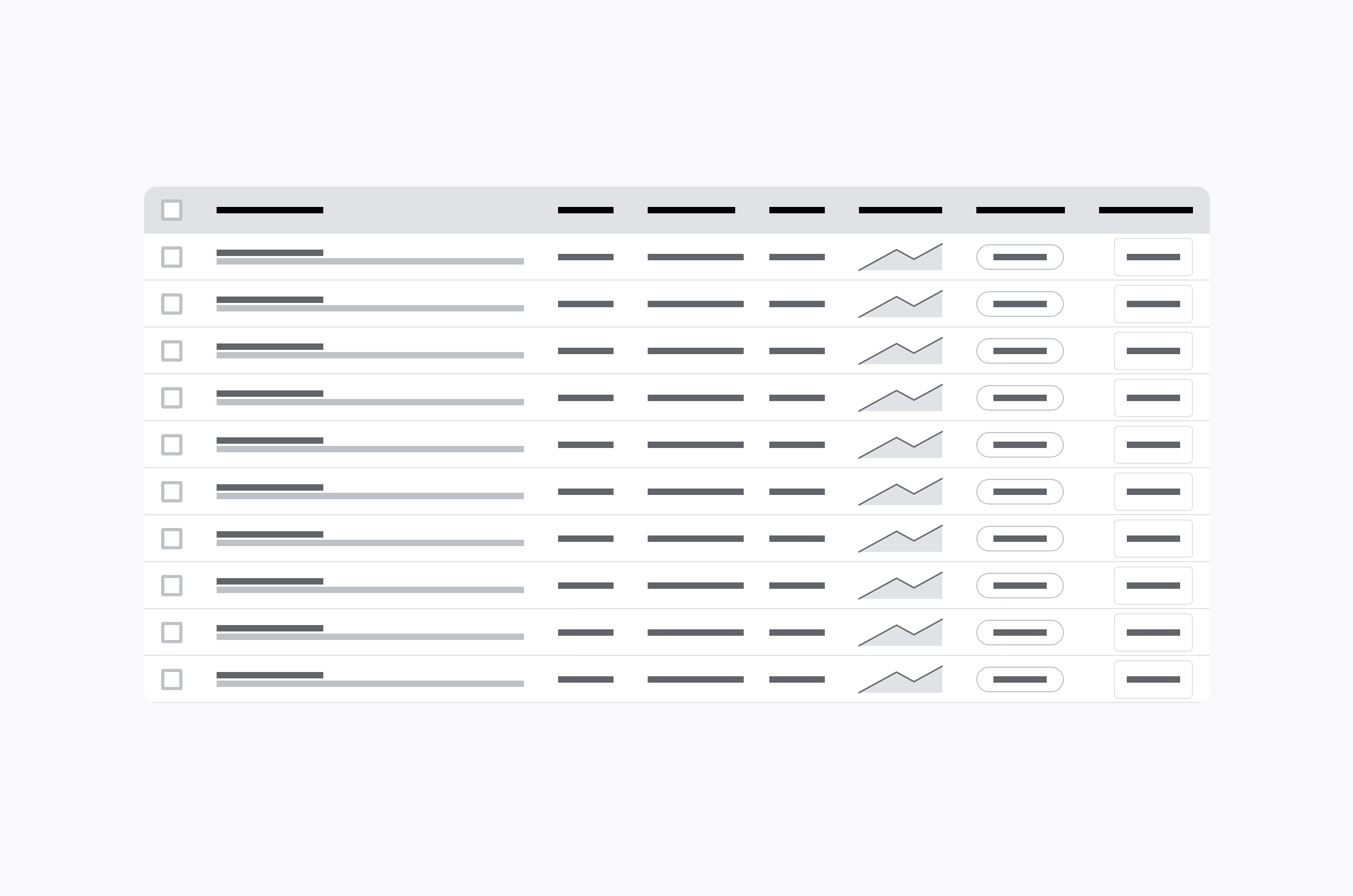
Table Anatomy: Column Order, Identifiers, and Alignment That Actually Help
Every table needs an anchor. That's the field a person uses to recognize a record among dozens of similar-looking rows, and it belongs in column one, ideally frozen there as the table scrolls horizontally. The mistake many teams make is anchoring on a database ID instead of a human-meaningful field. Nobody scans for "REC_00482." They scan for a customer name, an order number they recognize, or a project title.
Beyond the anchor, column order should follow the sequence someone uses to make a decision, not the order fields happen to sit in your schema. If a support agent scans status before owner before last update, put status second. Group related fields together (all date fields adjacent, all financial figures adjacent) rather than scattering them by column-creation date in your database.
A few concrete rules make the rest of the anatomy work:
- Left-align text columns; right-align numeric columns so decimal points and magnitudes line up for fast visual comparison.
- Push low-value audit fields (created-by, internal notes, record hash) into an expandable detail view or an optional column, not the default grid.
- Give users a discoverable column chooser rather than hard-coding every field into view. Something as simple as a gear icon above the table header works.
- Truncate long text with an ellipsis and reveal the full value on hover or click. Never let one long string blow out row height for every other row.
- GOV.UK's design guidance backs this directly: use captions and header scope, right-align numbers for comparison, and reduce or split large tables rather than shrinking type to cram everything in.
Pro Tip: Test your identifier column with a genuinely ugly dataset before launch. Long company names, duplicate-looking IDs, and null values expose column-width problems that clean sample data never will.
How Should Sorting and Filtering Work in a Data Table?
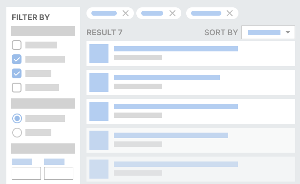
Filters need to be visible, not hidden behind a menu the user has to guess exists. A filter panel that's collapsed by default, with no indication that filtering is even possible, is one of the most common reasons enterprise users complain that a tool "doesn't have the data I need," when the data was there all along.
Once a filter is active, show it. Active filter chips above the table, each with its own dismiss control and a running result count ("Showing 42 of 1,204 records"), tell the user exactly what's happening to their view. Treating filtering as a visible state machine rather than an invisible backend query is what separates tables people trust from tables people abandon after a confusing search.
Sorting follows a similar logic. Single-column sort covers the vast majority of real tasks, and it should always show an obvious active indicator: an arrow, a highlighted header, something unambiguous. Multi-column sort is genuinely useful for power users in finance or operations roles, but it needs a visible priority number on each sorted column ("1" and "2" badges) rather than a hidden internal order nobody can reconstruct.
A few more things worth locking down early:
- Preserve filter and sort state across navigation. A user who filters, opens a record, and hits back should not land on an unfiltered table.
- When a filtered view returns zero results, say so plainly and suggest relaxing specific filters rather than showing a blank grid.
- Sorting and filtering guidance from NN/g's research on enterprise data tables is consistent on this point: discoverability and state transparency matter more than clever interaction design.
Selection, Bulk Actions, and In-Table Editing
A leading checkbox column is still the clearest way to let users select rows, and it should trigger a contextual action bar the moment the first row is checked, not a separate menu the user has to hunt for. Place that action bar close to the selection, either sticky at the top of the table or docked at the bottom of the viewport, so the connection between "I selected these" and "here's what I can do" stays obvious.
Select All needs a scope indicator. If a user selects all 20 visible rows, tell them explicitly whether that means all 20 on screen or all 4,000 matching the current filter, and offer a one-click way to extend selection to the full set. This single detail causes more support tickets than almost anything else in enterprise table design, because users assume "select all" means the entire dataset until proven otherwise.
Keep destructive bulk actions (delete, archive, deactivate) visually distinct from safe ones, and always confirm before executing them on more than one record. A single accidental bulk delete on live customer data is the kind of incident that ends up in a postmortem.
For editing individual records, side-panel or non-modal editing tends to beat full inline cell editing for anything beyond a quick status toggle. It keeps the table's context visible while the user edits, and it gives you room for proper validation messaging.
- Make save states explicit: a brief inline confirmation, not a silent success.
- Surface failed saves clearly, with the specific field that failed and why.
Pro Tip: If you support inline editing on a handful of fields (status, priority, a numeric quantity), constrain those to dropdowns or steppers rather than free text. It cuts validation errors dramatically.
Pagination, Infinite Scroll, or Virtualization: Which One Fits Your Data?
The right loading strategy depends entirely on dataset size and what the user is trying to do with it, not on which pattern looks more modern.
- Traditional pagination gives users a stable, bookmarkable position and predictable load times, but it interrupts flow when someone needs to scan across hundreds of records looking for one thing.
- Infinite scroll feels smooth for casual browsing but makes it nearly impossible to reference "row 340" again, and it tends to degrade badly on tables with dozens of columns.
- Virtualization (rendering only the visible rows in the DOM while scrolling) handles very large datasets, tens of thousands of rows, without the browser choking, but it adds real engineering complexity and can complicate keyboard navigation if not built carefully.
The deeper decision underneath all three is whether filtering and sorting happen client-side or server-side. Client-side works fine for datasets in the low thousands, but past that, every sort or filter action should hit the server, which introduces latency you need to design around with loading states and skeleton rows. Angular Material's documentation frames this well: performance planning is a UX decision, not just an engineering one, because the wrong choice shows up directly as a laggy, frustrating table.
Whichever approach you pick, insist on stable row identifiers across paginated or virtualized requests. Rows that reorder themselves between page loads, because the backend re-sorted on a non-unique key, erode trust fast. Before launch, test loading states, empty states, error states, and what happens when a request returns midway through a bulk action.
How Do You Design a Responsive Table for a Complex Dataset?
There's no single responsive pattern that works for every table, and pretending otherwise leads to squeezed, unreadable mobile grids. The right choice depends on which of the four core tasks the table serves, echoing the same task-first framing that should drive the desktop design.
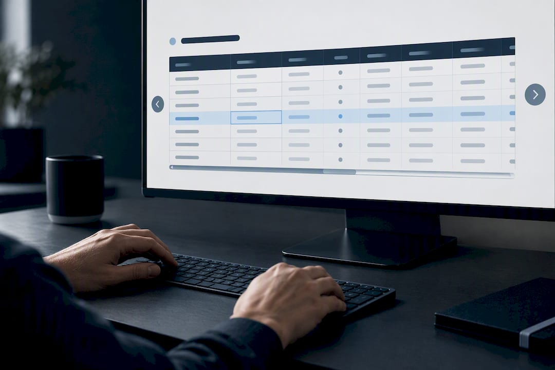
If comparison across records is the primary job, and someone genuinely needs to see how row A stacks against row B, keep the real table structure and let it scroll horizontally rather than collapsing it into something else. Just make that scroll region keyboard-accessible: add tabindex="0" and role="region" with an aria-labelledby pointing to a heading, so keyboard and screen reader users can discover and operate the scroll area instead of getting stuck.
If reading one row at a time is the primary job, a stacked card or accordion layout on small screens usually communicates better than a shrunken table, since each field gets to breathe with its own label.
A few smaller decisions round this out:
- Define priority columns (identifier, status, one key metric) that always show, and push secondary columns behind a toggle or an expand action.
- Offer a dedicated "full table" view or a link to the desktop layout for users who need every column on a small screen.
- If you stack fields into card form, repeat the column label next to each value so screen reader users get the same context sighted users get from headers. Smashing Magazine's research on this exact problem confirms there's no universal solution here, only task-appropriate trade-offs to test.
What Accessibility and Markup Does a Data Table Need?
Visual polish doesn't make a table accessible. Header-to-data relationships have to be encoded in the markup itself, because a screen reader can't infer from color and spacing what a sighted user infers instantly.
The baseline, non-negotiable requirements: a <caption> describing the table's purpose, proper <thead> and <tbody> structure, and <th> elements carrying scope="col" or scope="row". For tables with genuinely complex, multi-level headers, you'll need explicit id and headers attribute pairs connecting each data cell back to its controlling headers. The W3C's WAI tables tutorial lays out exactly which technique applies to which header complexity, and it's worth having your engineering team review it directly rather than working from secondhand notes.
Resist the temptation to reach for role="grid" unless you're prepared to build and test a full keyboard interaction model, arrow-key navigation between cells, focus management, the works. Native table semantics with a well-labeled scroll wrapper usually get you further with far less risk of half-finished ARIA.
- Announce dynamic changes (a filter applying, a bulk delete completing) through a live region so screen reader users aren't left guessing that anything happened.
- Any horizontally scrolling wrapper needs
tabindex="0",role="region", and anaria-labelledbyreference, not just visual affordance like a scrollbar. - Accessible table design done well also tends to pay off in organic visibility, since well-structured semantic markup is easier for search engines to parse as well as assistive technology.
Testing across at least one screen reader (NVDA or VoiceOver) before launch catches problems no amount of visual QA will surface.
Visual Hierarchy, Density, and Microcopy That Reduce Effort
Density is a decision, not an accident. Default to a comfortable "default" density with generous row padding, and offer a compact toggle for power users, like ops teams or analysts, who process hundreds of rows a day and want more on screen at once. Don't force compact density on casual users just because it looks efficient in a design review.
Sticky headers and frozen identifier columns genuinely help orientation in long tables, but they carry real implementation risk. Test z-index conflicts with dropdowns and tooltips, confirm keyboard focus doesn't get trapped behind a frozen column, and check behavior at browser zoom levels above 150%, a scenario teams routinely skip and users routinely hit.
For text that won't fit, decide on one truncation rule and apply it consistently: ellipsis with a hover tooltip for read-only values, or click-to-expand for values users need to copy. Mixing both behaviors across different columns confuses people fast.
Microcopy earns its keep in empty and error states especially. "No records match your filters. Try removing the date range." beats a blank table every time, and "Failed to save: email format is invalid" beats a generic red banner with no field reference.
- Document density modes explicitly in your design system, including exact row heights, so engineering doesn't guess.
- Test sticky elements at multiple zoom levels and with screen readers before calling them done.
Pro Tip: Write your empty-state and error microcopy before you build the happy path. Teams that leave it for last almost always ship a generic "No data" message that tells the user nothing useful.
How Do You Design, Test, and Iterate on a Data Table?
A workable process looks roughly like this, and it holds up whether you're building your first enterprise table or rebuilding your fifth:
- Observe real user tasks. Watch how people currently find, compare, or act on this data, even if it's in a spreadsheet today.
- Define the table's primary job and its record identity. Decide the one anchor field before touching layout.
- Inventory every field that could appear, then rank it as primary, secondary, or optional.
- Prototype column hierarchy based on decision sequence, not schema order.
- Specify interactions: sorting, filtering, selection, bulk actions, editing.
- Design responsive and accessibility states alongside the desktop layout, not after it.
- Test with realistic data extremes: absurdly long names, missing values, duplicate-looking IDs, slow network responses, and partial saves that fail midway through a bulk action.
- Instrument the shipped feature.
That last step matters more than most teams give it credit for. Track time-to-locate a record, filter usage rate, bulk-action completion rate, and error rate on inline edits. Without that instrumentation, you're redesigning based on opinion in eighteen months instead of evidence.
How Raw Studio Approaches Data-Table UX for Enterprise Products
A Design Sprint maps onto a table redesign almost cleanly: day one surfaces the real user tasks and the anchor field, days two and three prototype column hierarchy and interaction states, and day four or five tests the prototype against realistic, messy data rather than a clean demo dataset. For teams that need a working build faster than a full engagement allows, Rapid MVP applies the same task-first discipline to a functioning prototype instead of a static mockup.
Typical deliverables out of an engagement like this include an annotated interaction spec, a documented test plan covering the data extremes outlined above, and an instrumentation spec so the team can measure time-to-locate and error rates post-launch. If your table already works reasonably well and just needs sharper decisions on density or filtering, iterating in-house with this guide is usually enough. Bring in outside help when the table is core to the product's value and the cost of getting it wrong is measured in lost accounts, not just annoyed users.
The Trade-Offs Enterprise Teams Actually Face
Most articles on table design read like every rule is free. It isn't. Sticky headers cost you z-index headaches. Virtualization costs you keyboard-navigation complexity. A discoverable column chooser costs engineering time that could go toward the next feature on the roadmap. None of that is a reason to skip the pattern, but pretending the trade-off doesn't exist sets teams up to under-invest in testing.
My honest view: the biggest failure mode isn't picking the wrong pattern, it's skipping the step where you test with ugly, real data before launch. A table that looks flawless with twelve sample rows named "Acme Corp" and "Test User" will break in ways nobody predicted once real customer names, null fields, and slow API responses hit it. Prioritize incrementally. Fix the primary task first, then accessibility markup, then responsive behavior, then the polish. Teams that try to perfect all four simultaneously usually ship none of them well.
If you're wrestling with a specific edge case, a table with 40 optional columns, a dataset that needs both comparison and deep editing, it's worth talking through the specific constraints rather than applying generic advice.
Get Help Building a Table That Actually Works for Your Team
Raw is the alternative to guessing your way through a table rebuild. Where most teams either over-engineer a data grid with every feature a stakeholder requested, or under-invest and ship something that looks fine in a demo but breaks under real data, Raw's research-driven process gets to the actual user task first, then builds around it.
A Full UX/CRO Audit offers a diagnosis of where your current table may be causing user difficulties, such as buried filters, missing identifier columns, or accessibility issues. For teams that want to move straight to a validated design, a Design Sprint compresses weeks of back-and-forth into a focused, structured week that ends with a tested prototype instead of another round of opinions in a design review. And if your team wants ongoing support rather than a one-off project, the Design Team (Platinum) plan at $8,400 per month embeds that same process into your product roadmap on a continuing basis.
If you're not sure which of these fits your situation, start with a free UX audit and get a specific read on your table before committing to anything larger.