.svg)
.svg)

.png)

A build-ready Figma developer handoff gives engineers organized, Ready for dev files, documented components with every state, mapped variables instead of raw values, annotated edge cases, correct export settings, and a linked ticket or short walkthrough. Dev Mode and design tokens are the backbone of this process: they turn vague screenshots into something a developer can actually inspect, copy, and build from without pinging you five times a day.
Organize files and mark what's ready for development
Developers waste time hunting for the "real" version of a screen, and that single friction point causes more delays than any missing spec ever will. The fix is structural, not stylistic.
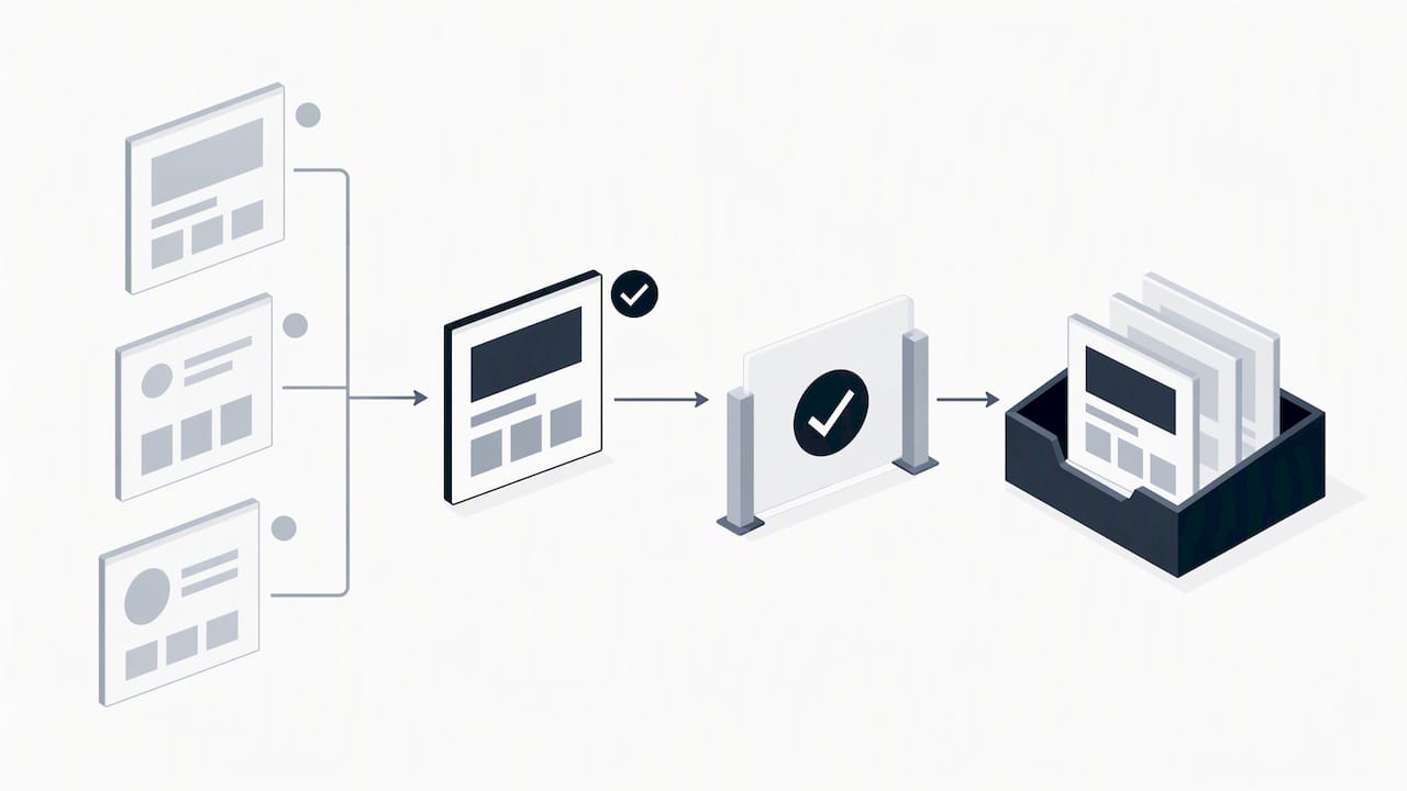
Create one page, often called "Ready for dev," that holds only finalized frames, or build an instances page that links directly to your components so developers always see the current, approved version rather than a work-in-progress copy. Figma's own guidance on optimizing files for handoff recommends exactly this: descriptive page names, a dedicated instances page, and clear export settings set before anything ships.
A few habits make this easier to maintain:
- Name pages and sections by function, not by date or initials, so "Checkout Flow" beats "V3 Final."
- Archive exploratory concepts, abandoned directions, and old iterations into a separate "Archive" page instead of deleting them.
- Use Focus view before sharing a link, since it shows developers exactly what they'll see, stripped of comments, stray frames, and leftover annotations that clutter the canvas.
Running Focus view as a final check takes under a minute and catches the kind of noise that turns a five-minute build task into a twenty-minute back-and-forth about which rectangle is the actual button. Treat the Ready for dev page as a contract: once something lives there, it should be finished, named sensibly, and free of placeholder text.
Use styles, variables and design tokens so specs map to code
Raw hex values and arbitrary pixel measurements are where most handoff drift starts. A developer sees #3B82F6 in one frame and #3B7FF5 in another and has no way of knowing if that's intentional or a mistake, so variables and styles exist to remove that ambiguity entirely.
Favor semantic naming over literal description: color-primary instead of blue-500, spacing-8 instead of 8px. Semantic names carry intent, which matters because a developer mapping tokens to code needs to know what a value means, not just what it looks like.
Dev Mode actively helps here: when it detects a raw value that resembles an existing variable, it suggests the matching variable so you can swap it in before the file ever reaches a developer. That single feature closes most of the gap between "designed with tokens" and "handed off with raw values."
Before marking anything Ready for dev, run through this quick check:
- Every color, spacing, and typography value traces back to a variable or style, not a one-off number.
- Variable names match (or clearly map to) the token names already used in the codebase.
- Each token carries a short description of its intended use, especially for anything semantic rather than literal.
One documented case:HP reported measurable efficiency gains and faster developer onboarding after adopting Dev Mode and Code Connect to link design tokens directly to production components. That's the kind of return that comes from treating tokens as infrastructure, not decoration.
Document components and variants: states, props and acceptance criteria
A component without documented states is an invitation for a developer to guess, and guesses are where regressions come from. Every interactive component needs its full range of states built and labeled before it reaches Dev Mode.
- Build and show the default, hover, active, focus, disabled, loading, and empty states for every interactive component, even when a state feels unlikely to appear often.
- Document each variant prop clearly, including what triggers it and what it should look like when combined with other props.
- Add at least one example instance that shows the component in realistic, populated use rather than lorem ipsum or placeholder icons.
- Write short acceptance criteria next to the component describing what "done" looks like for QA and for the developer closing the ticket.
Pro Tip:Write acceptance criteria as if you won't be in the room when QA tests it, because often you won't be.
Acceptance criteria don't need to be exhaustive documents. A line like "Button disables on submit and shows a spinner until the API responds" tells a developer and a QA tester exactly what correct behavior looks like, which removes the need for a clarifying message mid-sprint.
Naming conventions that scale: layers, components, and styles
Names are the first thing a developer reads in Dev Mode, and inconsistent ones cost more time than almost any other handoff gap. Separate your naming by purpose: containers describe layout (Card/Container, Section/Hero), components describe function (Button/Primary, Input/Text), and tokens describe intent (color-primary, spacing-16).
- Keep container names structural and layout-focused, never tied to content that will change.
- Name components by role and variant, matching the pattern your codebase already uses where possible.
- Store every naming rule in one design-system README or component documentation page so nobody has to guess or ask.
Align names with your engineering codebase loosely, not literally. You want a developer to recognize the mapping instantly without your Figma file leaking implementation details like specific class names or file paths that might change independently of the design.
Dev Mode and integrations: what to enable and how developers use it
Dev Mode exists to give designers and developers the same inspect view, and using it properly removes most of the "what does this mean" questions before they're ever asked. The Figma Dev Mode guide frames Ready for dev status and Focus view as communication tools, not just visual filters: when you mark a frame Ready for dev, you're telling a developer "this is final, build it now," and notifications let them know the moment something changes.
A few practical habits make the integration actually useful:
- Use the Inspect panel to surface variable values and code snippets instead of writing redundant spec text next to every frame.
- Add links to Storybook, Jira, or GitHub directly inside component descriptions so context travels with the design instead of living in a separate tool nobody checks.
- Set Ready for dev status deliberately and update it the moment a design changes, so developers aren't building against something you've already revised.
Dev Mode also raises a judgment call worth making early: when to hand over a code snippet versus when to point developers at living code.
Exported snippets are a starting point, never a replacement for a properly maintained component library. Treat Code Connect and Storybook links as the source of truth whenever a component already exists in code.
Annotations, acceptance criteria and a compact handoff checklist
Annotations are where edge cases and business logic live, and skipping them is the single fastest way to generate a flood of developer questions mid-sprint. Put logic directly on the frame it affects: a note like "if cart is empty, hide this module entirely" belongs next to the module, not buried in a separate document nobody opens.
Before marking a flow Ready for dev, work through this checklist and paste it into the ticket or a file comment:
- Every component state is built and labeled, including empty and error states.
- Responsive behavior is specified for at least mobile, tablet, and desktop breakpoints.
- Accessibility notes cover focus order, contrast, and any ARIA labeling the component needs. Our partners at Courimo built a sprint-friendly WCAG 2.2 checklist that pairs well with this step.
- Export settings are confirmed on every image or icon asset, with correct format and resolution.
- All linked assets, Storybook entries, or GitHub references are current and clickable.
- Acceptance criteria are written in plain language next to the relevant frame.
- The ticket links back to the specific Figma frame, not just the file.
A short checklist like this, pasted directly into a Jira ticket or a Figma comment, turns a vague "let me know if you have questions" into something a developer can actually check off.
Prototypes, interactions and handing off animations
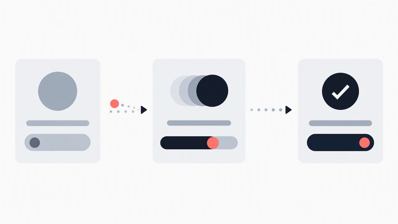
Static frames are enough for most screens, but anything with meaningful motion, a modal transition, a loading sequence, a gesture-driven interaction, needs a prototype flow and explicit notes on timing and easing. Guessing at animation intent from a static frame almost always produces something subtly wrong.
Dev Mode's Motion tab exposes keyframes, timing curves, and easing directly in the Inspect panel, and developers can copy that animation as CSS, React, or JSON code.
- Build a prototype flow for anything with a transition, gesture, or multi-step interaction; static frames alone leave too much to interpretation.
- Call out duration and easing explicitly, even when Dev Mode surfaces it, since a verbal note ("quick snap, not a slow ease") adds context code alone can't carry.
- Treat exported Motion code as a starting point. It gets you close, but production polish still usually needs a developer's hand.
Reduce back-and-forth: workflows, walkthroughs, and shared language
Most handoff friction isn't about missing specs, it's about mismatched expectations on format. A five-minute walkthrough, recorded or live, often prevents a dozen follow-up messages over the following week.
- Record a short async walkthrough for each shipped feature and link it directly in the ticket, so context survives even if the original conversation doesn't.
- Ask your developers directly whether they prefer Figma links, Storybook embeds, or Jira-attached specs, and match their preference instead of assuming.
- Keep every follow-up question in one thread tied to the file, and update Ready for dev status the moment something changes so nobody builds against a stale version.
Pro Tip:A two-minute Loom walkthrough often answers more questions than a page of written specs ever could.
Author perspective: balancing design intent with developer constraints
The best handoffs I've seen treat developer constraints as part of the design process, not an afterthought bolted on at the end. At Raw, we lean on design sprints and our Rapid MVP approach precisely because they force buildability questions early, before a file is polished enough to feel finished but too late to change cheaply.
No checklist survives contact with every team unchanged. Some developers want everything in Jira, others live entirely in Figma, and the right move is always to adapt the structure above to how your specific team already works, not to force a rigid process onto people who've found something that works for them.
, Philippe
How Raw can help your team ship handoffs faster
If your team keeps hitting the same handoff friction project after project, that's usually a process problem, not a people problem, and it's one we spend a lot of our time solving. Our Design Team (Platinum) engagement embeds ongoing UX/UI support into your existing workflow, while a focused Rapid MVP sprint can validate a build-ready structure before you commit engineering time to it.
- A short audit of your current handoff process often surfaces the one or two habits causing most of the friction.
- Our design sprint format bakes developer constraints into the design phase itself, rather than discovering them after handoff.
- Ongoing design support keeps component documentation and tokens current as your product grows.
Check our services page for the full range of options, or get in touch to talk through what your team's handoff process actually needs.
Discuss Your Design Handoff
Email Raw Studio to discuss UX/UI design, web development, or data-driven digital solutions for your team's next project. [email protected].