.svg)
.svg)

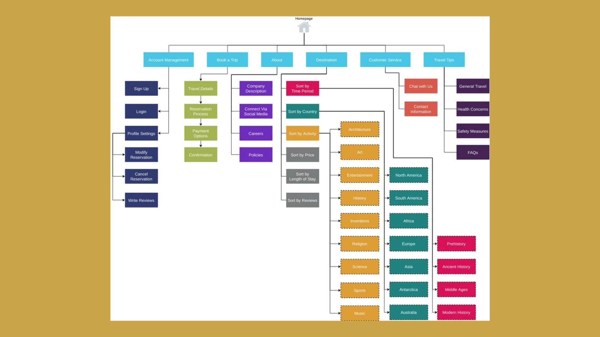

Website information architecture is the structured system of hierarchy, labels, and relationships that lets people find what they need without thinking twice about it. Get it right and you see faster task completion, fewer abandoned sessions, and measurably smoother conversion paths. Two moves get you started fast: run a lightweight content audit this week, and schedule a small card sort before you touch a single wireframe.
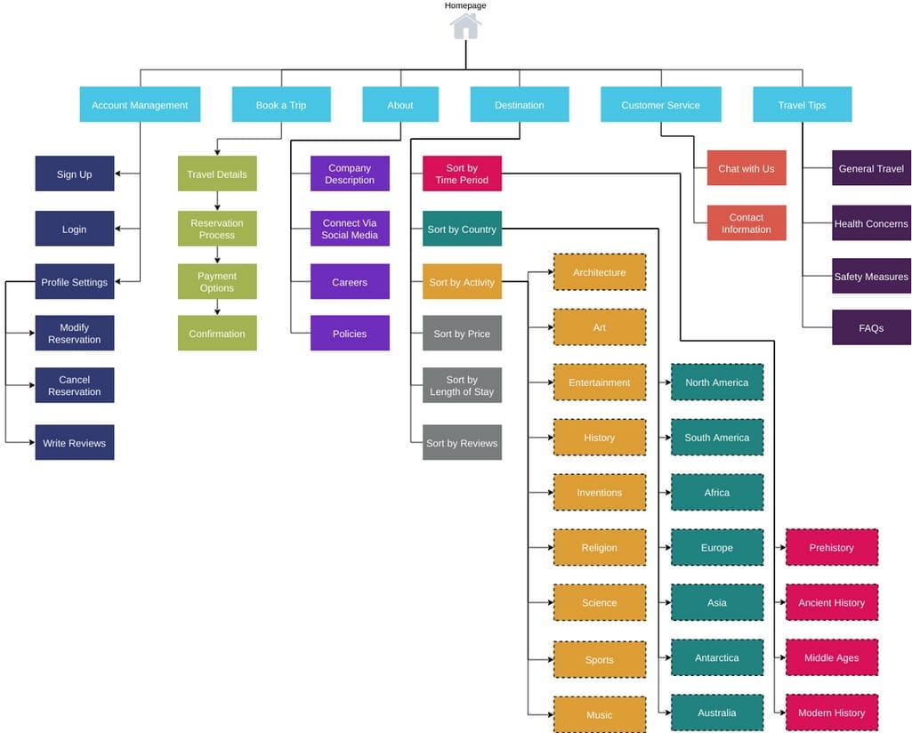
What Are the Core Components of Website Information Architecture?
Good site IA rests on five moving parts, and most redesigns fail because teams skip straight to visual layout without settling these first.
Hierarchy organizes content by importance and specificity, from broad category pages down to individual product or article pages. Taxonomy is the controlled vocabulary you use to classify that content consistently, think of it as the filing system behind the scenes. Labeling is what users actually see in menus and headings, and it needs to speak their language, not your org chart's. Metadata tags each page with attributes (type, date, category, audience) that power search, filtering, and related-content modules. Cross-linking connects related pages that live in different branches of the hierarchy, so users are not trapped in a single path.
On large, content-heavy sites, this structure stops being optional. The Web Style Guide notes that hierarchical organization paired with controlled vocabularies becomes the default approach once content volume grows past a certain point, because users start relying on predictable patterns to navigate.
A few principles turn these components into something usable:
- Clarity over cleverness. A label like "Solutions" tells a visitor nothing; "Pricing Plans" does.
- Consistency across the site. If one section uses "Guides" and another uses "Resources" for the same content type, you have created two mental models where one should exist.
- User-first language, not internal jargon. Your support team may call it a "knowledge base," but users search for "help."
- Prioritization. Not every page deserves a spot in the main menu. A homepage's job is triage; a category page's job is depth.
- Scalability. Structure it so adding a hundred new products or articles does not require rebuilding the whole system.
A homepage that tries to showcase everything ends up showcasing nothing. Its real job is routing visitors to the right section fast, while the section pages underneath do the heavy lifting of depth and detail.
Why Does Information Architecture Matter for UX and Revenue?
Findability is the mechanism, but conversion is the payoff. When someone lands on your site with a specific task in mind, whether that is comparing pricing tiers or finding a return policy, the number of clicks and decisions between them and that answer directly predicts whether they finish the task or leave.
Internal search behavior tells the story clearly. A spike in zero-result searches usually means your taxonomy does not match how people actually describe what they want. High bounce rates on pages reached through primary navigation often mean the label promised one thing and delivered another. Both are IA failures wearing a UX costume.
The business case shows up in three places: task completion rates climb when structure matches user expectations, conversion rates improve because fewer people give up mid-journey, and support ticket volume drops because people find answers themselves instead of emailing to ask. Poor IA also undermines SEO indirectly. Search engines reward sites where content is logically grouped and internally linked, because that structure signals topical authority the same way it signals it to human visitors, a connection well covered in site architecture guidance for SEO.
Statistic Callout: Card sorting and structural research exist precisely because the underlying logic of a site, not just its surface design, is what determines whether users complete tasks or bail. Get the categories wrong and no amount of visual polish fixes it.
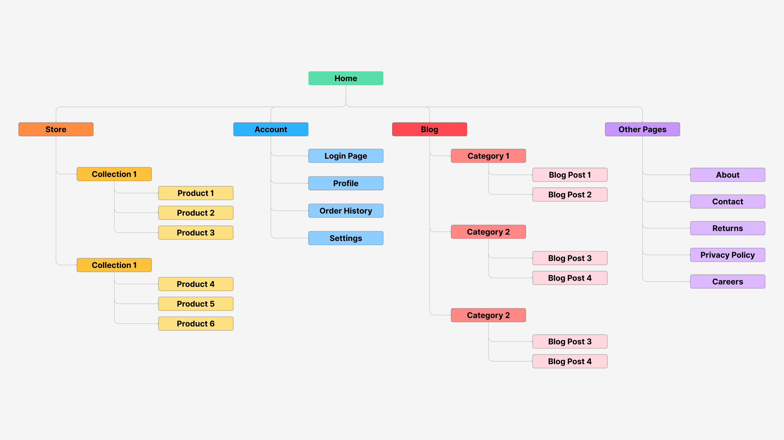
Is a Sitemap the Same Thing as Information Architecture?
No, and conflating the two is one of the most common planning mistakes teams make. IA is the underlying logic: the decisions about how content relates, what gets grouped together, and what a user should be able to infer from one label about what sits beneath it. A sitemap is just the visual record of that logic once it exists. NN/g's research puts it plainly: building a sitemap without first working out the IA behind it tends to produce a disjointed, confusing experience, because you are documenting a structure that was never actually reasoned through.
Navigation is different again. It is not the full IA, it is a curated slice of it. Good navigation shows users the handful of paths they need most often, while search, cross-links, and footer menus absorb everything else. Taxonomy is narrower still: it is the controlled vocabulary, the actual words and categories, that both IA and navigation depend on to stay consistent.
Here is how the four fit together in a typical project:
- IA comes first, built from research and content audits, and answers "how does everything relate?"
- Sitemap documents that IA as a visual tree, usually handed to developers for site structure and URL planning.
- Taxonomy defines the exact terms and categories used across labels, filters, and metadata.
- Navigation is designed last, exposing only the top-priority paths from the finished IA.
Hand developers the sitemap and taxonomy document together. Content teams need the taxonomy and labeling rules. Stakeholders mostly need the sitemap, since it is the easiest artifact to review at a glance.
How Do You Run Card Sorting and Tree Testing?
Card sorting and tree testing are the two research methods that turn guesswork about site structure into something you can actually validate, and they work best as a pair rather than either one alone.
Card sorting comes in three flavors. Open card sorts hand participants a stack of content labels and ask them to group and name categories themselves, which is ideal when you are building a new structure from scratch and need to learn how people naturally think about your content. Closed card sorts give participants your existing categories and ask them to sort cards into them, which is better for validating a hierarchy you already have. Hybrid sorts let people use your categories or invent new ones, splitting the difference. The Digital.NSW toolkit frames open sorting as most useful for new product structures, with closed sorting reserved for validating what already exists.
Tree testing flips the process. You present participants with a text-only version of your proposed hierarchy, no visual design, and give them tasks like "find the return policy." You measure whether they find it, how directly, and how long it takes. Think of it as a reverse card sort: instead of building categories, they are navigating ones you already built, which makes it the validation step that should happen after card sorting, not instead of it.
Here is a simple sequence for analyzing what comes back:
- Run cluster analysis on card sort data to find which items people consistently grouped together.
- Look at the labels participants invented themselves. Repeated words are your strongest signal for naming categories.
- Build a draft tree from those clusters and labels, then test it with a fresh group of participants.
- Track success rate, directness (did they backtrack?), and time to find for each task.
- Revise categories or labels that scored below your target success rate, and retest only those branches.
Aim for at least 15 participants per card sort to get patterns that hold up, a threshold echoed in the Boxes and Arrows guide to card sorting. Remote tools let you run both studies unmoderated with distributed participants, which is usually faster and cheaper than in-person sessions.
Pro Tip: Never let a card sort be the final word. Treat it as one input alongside task analysis and business constraints, because a category that looks statistically clean can still ignore a business priority that stakeholders never mentioned in the study.
The biggest pitfall is letting internal stakeholders override what the data shows because a category "makes sense from our side." It rarely makes sense from the user's side, and that gap is where most navigation confusion originates.
What Is the Step-by-Step Process for Building Website IA?
A reliable IA workflow runs through five stages, and skipping any of them tends to surface as confusing navigation months later.
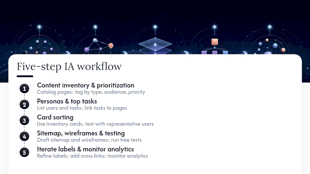
Step 1: Content inventory and prioritization. Catalog every existing page, document, or planned content type. For a large site, sample a representative slice rather than cataloging every single URL; for a smaller site, audit everything. Tag each item by type, audience, and business priority so you know what actually needs a home in the hierarchy.
Step 2: Define personas and top tasks. You do not need elaborate persona documents, you need a short list of who visits and what they are trying to accomplish. Link each top task directly to the content or pages that should satisfy it. If a task has no obvious page behind it, that is a gap your IA needs to fill.
Step 3: Run card sorts to generate top-level groups. Use the inventory from Step 1 as your card set and test with real or representative users. This is where open or hybrid sorts earn their keep, surfacing the categories and labels people actually use rather than the ones your team assumed.
Step 4: Build a sitemap and wireframes, then test them. Translate your card sort findings into a draft sitemap and rough wireframes for key templates: homepage, category page, detail page. Run tree tests against the draft hierarchy, and pair that with a few moderated sessions where you watch someone attempt real tasks. The CXL process follows exactly this arc: discovery, personas, mapping, card sorts, flows, then wireframes and testing.
Step 5: Iterate labels, add cross-links, and monitor analytics. Fix whatever categories or labels underperformed in testing. Add cross-links between related sections that live in different branches, since no hierarchy captures every useful relationship. Once live, watch internal search terms and navigation click paths for signs the structure needs another pass.
This is not a one-and-done exercise. Sites that grow, add product lines, or expand content types need to revisit this workflow periodically, not treat the original IA as permanent.
How Should You Label Content and Structure Taxonomy?
Labels are the single most underrated lever in information architecture. NN/g's research on IA mistakes points out that plain, descriptive labels help both human visitors and search engines understand a page, yet teams routinely default to internal shorthand instead.
A few rules keep labeling honest:
- Write for the task, not the department. "Track Your Order" beats "Logistics," because it describes what the user wants to do.
- Pick one grammatical form and stick with it. Decide whether categories are plural nouns ("Guides"), singular nouns ("Guide"), or verb phrases ("Get Help"), then apply that pattern everywhere.
- Avoid internal jargon entirely. Smashing Magazine's guidance warns specifically against letting internal org structures dictate labels users never asked for.
- Test labels the same way you test structure. A tree test will surface a confusing label just as reliably as it surfaces a confusing category.
Metadata does quieter but equally important work. Tag pages by type (article, product, service), by audience segment where relevant, and by any facet users might filter by, such as price range or category. Basic structured data (schema markup for products, articles, or FAQs) helps search engines parse that same structure, which reinforces the SEO benefit of a clean IA rather than fighting against it.
Add synonyms and redirects wherever your team's internal term and the user's search term diverge, so someone searching "cancel subscription" still lands on the page your team labeled "Manage Billing." Cross-links between related categories catch the traffic that a rigid hierarchy alone would lose.
What Tools and Deliverables Do You Need to Build IA?
You do not need an expensive toolkit to run a credible IA process, but you do need the right deliverable for each audience.
For card sorting and tree testing, dedicated remote research platforms let you recruit participants and run unmoderated studies at scale, useful when you need statistically stable patterns from a distributed audience. For diagramming, standard flowchart and sitemap tools handle the visual hierarchy that developers will reference for URL structure. Wireframe tools cover template layouts once your hierarchy is set, and a simple spreadsheet works fine as a taxonomy or labeling reference document.
Match deliverables to who receives them:
- Developers need the sitemap and taxonomy document, since it defines URL structure and page relationships.
- Content teams need the labeling and taxonomy rules, since they write and categorize new content against that vocabulary going forward.
- Stakeholders mostly need the sitemap alone, as the fastest artifact to review and approve.
If budget is tight, skip the elaborate deliverables entirely. A single spreadsheet listing every page, its category, and its label, paired with one round of card sorting, covers most of the ground a full engagement would, just with less polish and fewer validation rounds.
How Does Raw Approach Information Architecture Projects?
Raw works across tech, education, finance, and SaaS clients where content structure directly affects whether users complete a task or abandon it. IA work threads through several of Raw's core services, including UX Design, user research, and Conversion Rate Optimisation, rather than sitting as a standalone deliverable disconnected from the rest of a project.
In practice, this means card sorting and tree testing feed directly into the frameworks Raw runs for faster delivery, such as the Design Sprint process and RapidMVP prototyping, so structural decisions get validated with real users before a single screen gets designed in detail.
Whether you need that level of support depends on scope. A small brochure site with a dozen pages rarely justifies a full research engagement. A growing e-commerce catalog, a multi-audience SaaS product, or a site where support tickets keep referencing "I couldn't find" usually does, and that is where bringing in outside structure and research experience pays for itself quickly.
When Does IA Deserve a Full Engagement Versus a Light Touch?
Large content sites, e-commerce catalogs, and products with layered user journeys almost always justify full IA investment: card sorting, tree testing, the whole cycle. The cost of getting structure wrong compounds as content volume grows, and retrofitting a broken hierarchy later is far more expensive than getting it right upfront.
Smaller brochure sites or short-lived campaign pages rarely need that depth.
In practice, scoping the work to match the site's actual complexity, rather than applying one process to every project regardless of size, is what separates useful IA work from busywork. Timeboxed sprints suit constrained projects; deeper engagements suit anything with real structural risk.
How Raw Studio Can Help With Your Information Architecture
Raw is the practical alternative when structuring your site starts feeling bigger than an internal team can validate alone, particularly once card sorting, tree testing, and wireframe iteration need to happen in weeks rather than months. Where a DIY approach relies on borrowed tools and best guesses about sample size, Raw pairs UX Design and user research with frameworks like the Design Sprint and Rapid MVP to move from structural questions to a tested, validated hierarchy fast, backed by data rather than internal opinion.
If you already suspect your navigation is losing people but cannot pinpoint where, a Full UX/CRO Audit digs into exactly that, covering findability, labeling, and conversion friction in one pass. Teams that want structural work folded into a broader design and research partnership can look at the Design Team (Platinum) retainer at $8,400 per month, which covers ongoing UX, research, and optimization work rather than a single project. For a lower-commitment starting point, the free UX audit gives you a read on where your current structure is costing you conversions before you commit to anything larger. Full service details live on the services page.