.svg)
.svg)

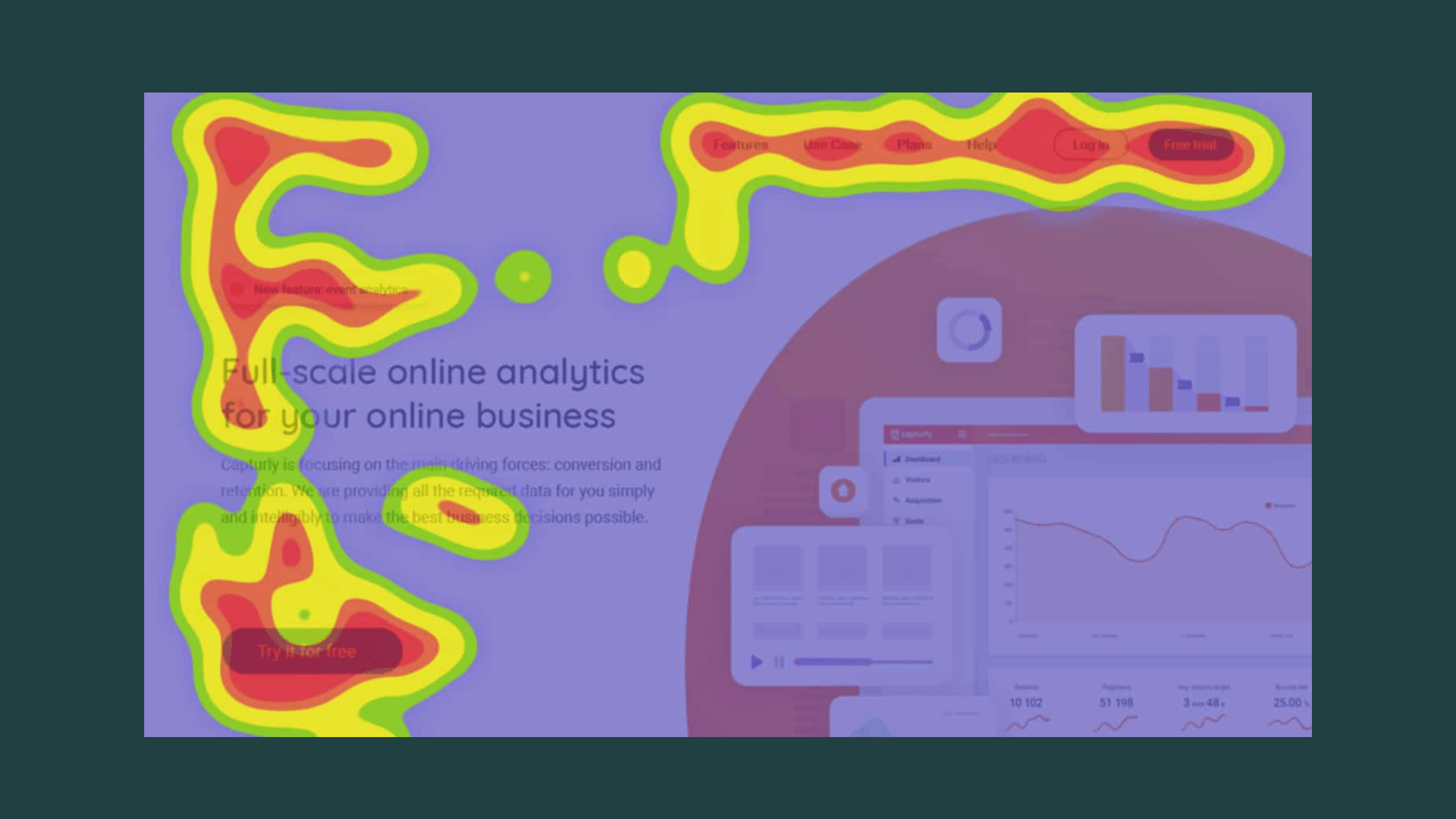

Heatmap analysis visualizes numeric matrices or interaction densities as a color-coded grid to reveal patterns at a glance. We reach for it during exploratory work, when we need to spot clusters, outliers, or behavioral hotspots fast, rather than when we need formal statistical proof. Think of it as a first conversation with your data, not the final word.
Core concepts: matrix encoding, scaling, and color encoding
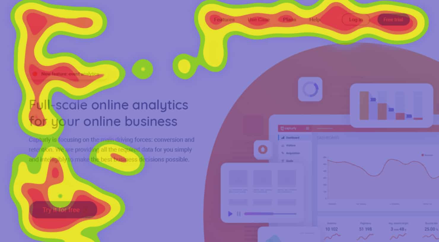
Matrix heatmaps encode numeric values across rows and columns. UX click and movement maps instead overlay interaction density on a page, while scroll maps encode how far visitors reached. These related visualisations need different denominators and interpretation rules; a hot area is not automatically evidence of attention or success.
State what each colour represents and how values were transformed. Scaling can reveal patterns, but it also changes the question the map answers. Choose the method deliberately and disclose its denominator or baseline:
- Z-score normalization centers values around a mean, useful when you're comparing rows measured on different scales.
- Percentizing converts raw counts into relative share, handy for click and scroll data where absolute numbers vary by traffic.
- Log or square root transforms compress skewed distributions so a handful of extreme values don't dominate the palette.
Palette choice matters just as much as the math. A sequential palette (light to dark, one hue) suits data that runs low to high, like engagement intensity. A diverging palette (two hues meeting at a neutral midpoint) suits data with a meaningful zero, like correlation coefficients running from negative to positive.
Heatmap types and use cases you'll actually run into
Not every heatmap answers the same question, and picking the wrong type is the fastest way to misread your data. Here's how the main varieties break down:
- Click maps show where visitors tap or click, exposing which calls to action pull attention and which ones get ignored entirely.
- Scroll maps show how far visitors reach down a page. A sharp drop near an element that resembles a page ending can suggest a false bottom, but confirm the explanation with recordings or user testing; the map alone does not establish the cause.
- Hover and mouse-movement maps show cursor activity on desktop. Cursor position is not a direct measure of gaze or attention, so use it as supporting evidence rather than a replacement for eye tracking.
- Clustered heatmaps reorganize rows and columns by similarity, which makes them the tool of choice for high-dimensional matrices like gene expression panels or correlation tables.
For that last category, interactive clustered heat map builders let researchers refine groupings step by step rather than committing to one static image, and tools built around the NG-CHM framework extend that same iterative exploration to genomics datasets where the matrix is too large to eyeball in one pass.
How to read heatmaps: signals, biases, and common traps
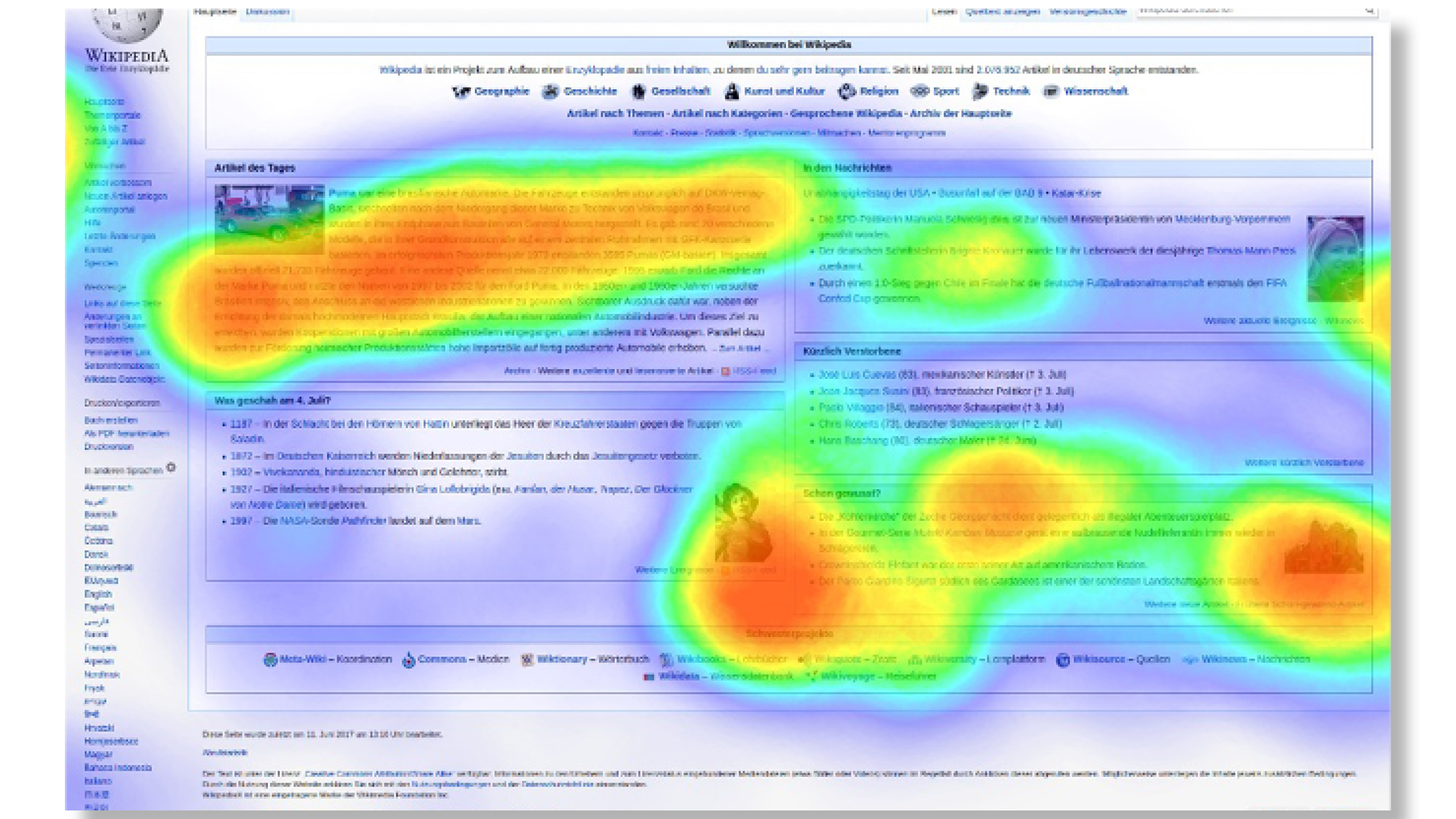
A hot cell means more density, not "good," and a cold cell means less density, not "bad." The only honest interpretation compares what you see against what you expected to see. A bright cluster around a button you designed to be clicked isn't insight, it's confirmation; a bright cluster somewhere you didn't expect is where the real question starts.
Four traps catch even experienced analysts:
- Low sample sizes turn a handful of clicks into a dramatic-looking hotspot that means nothing statistically.
- Segment averaging blends distinct user groups into one map, hiding the fact that two audiences behave completely differently.
- Dynamic content shifts page elements between sessions, scattering coordinate data into noise that looks like dispersion but is really just inconsistent layout.
- Breakpoint mixing combines desktop and mobile sessions into a single map, which routinely manufactures hotspots that don't exist on either device alone.
Layer on perceptual bias and the risk compounds. Behavioral research on colormap interpretation documents a dark-is-more and opaque-is-more bias: viewers instinctively read darker or more opaque colors as representing larger values, so a palette that runs against that instinct will mislead people before they've consciously analyzed anything.
Pro Tip:Treat every heatmap finding as a hypothesis. Confirm it with session recordings, a cohort split, or a proper A/B test before you redesign anything around it.
An actionable workflow: prepare, map, refine, validate
Building a heatmap that holds up under scrutiny follows a consistent sequence, whether you're analyzing a landing page or a genomics panel.
- Prepare your data. Clean missing values, decide how to handle outliers, and filter or reduce dimensions so the matrix isn't drowning in noise.
- Choose a transformation. Normalize, percentize, or apply a log or square root scale based on how skewed your distribution actually is.
- Select a palette and encoding direction. On light backgrounds, map higher values to darker or more opaque colors to align with how viewers naturally read intensity.
- Make clustering decisions deliberately. Choose the distance metric, linkage method, and row or column ordering to match the question. Computational costs and size limits depend on the algorithm and implementation; a limit reported for one interactive builder is not a universal heatmap limit.
- Build interactivity where exploration demands it, then export a clean static version for reporting once you've settled on the story.
- Validate before acting. Pair the heatmap with cohort comparisons, session recordings, or a controlled experiment.
Pro Tip:If your clustered heatmap changes shape every time you reorder the labels, your seriation method is doing more work than your data. Choose it on purpose.
Interactive packages like heatmaply make steps four and five easier to perform, since tooltips, zoom, and adjustable seriation let you test several orderings without regenerating the whole chart from scratch.
Choosing color scales and testing for accessibility
Rainbow colormaps have been a default for decades, and research into their use explains why that default deserves retirement: rainbow palettes produce non-uniform perceptual jumps, meaning equal changes in value don't look like equal changes in color, which quietly distorts how viewers judge magnitude.
Better alternatives exist and most heatmap tools now support them:
- Viridis and cubehelix maintain monotonic luminance, so brightness tracks value consistently from one end of the scale to the other.
- ColorBrewer sequential and diverging sets were purpose-built for data visualization and tested for perceptual clarity.
- Luminance-led palettes outperform hue-only ramps whenever fine distinctions between nearby values matter.
A meaningful share of viewers have a common red-green color-vision deficiency, according to research on colormap design, which means a palette that relies on hue alone excludes a meaningful share of your audience before they've read a single cell. Running a colorblind simulation on your chosen palette and confirming luminance contrast holds up in grayscale takes a few minutes and removes an entire category of misread results.
How we fold heatmap analysis into UX and CRO work
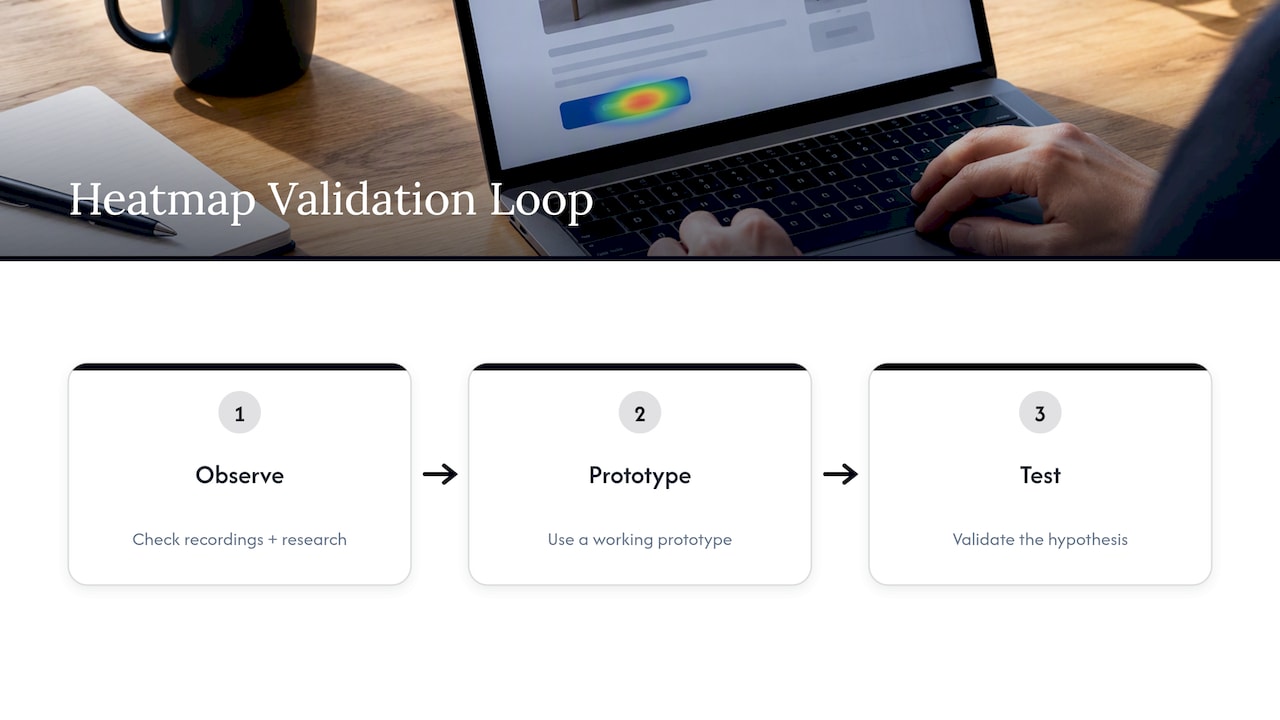
We never treat a heatmap as a verdict on its own. A hot zone becomes a real finding only after we cross-check it against session recordings and user research, then we validate the hypothesis with a working prototype rather than a guess. That loop, observe, prototype, test, is what turns a colorful grid into a decision worth shipping.
Where heatmap analysis is headed
AI is already pushing heatmap analysis from a quarterly diagnostic into continuous monitoring, with plain-language queries surfacing the sessions that matter instead of making analysts scroll through every recording. Gaze-prediction models are starting to generate heatmap-style output before a page even launches, letting teams catch obvious problems pre-release. The catch worth watching: agentic, non-human traffic is beginning to show up in click and scroll data, so checking session composition before you trust a pattern is becoming as important as the pattern itself.