.svg)
.svg)


A logo is the umbrella term for any visual identifier of a brand, while a wordmark is a text-only logo built around the brand name. If your brand is new or lesser known, a wordmark usually works hardest, because every glimpse repeats your name. Once awareness is strong, or you need a small square icon, a symbol or combination mark earns its place. The sections below unpack the trade-offs.
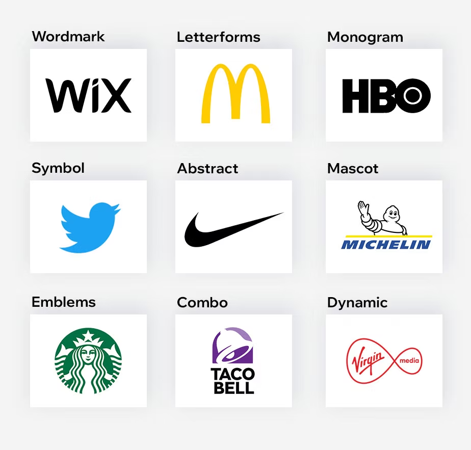
What is a logo, and which categories do designers use?
A logo is any visual mark that identifies a brand. That's the plain definition, and it matters, because people often use "logo" and "wordmark" as if they were rivals. They aren't. A wordmark is one kind of logo, sitting alongside several others that designers and industry guides describe in similar terms.
Here are the categories you will meet most often:
- Symbol or logomark: a standalone icon with no text, best for brands people already recognize or products that need a tiny square shape.
- Wordmark or logotype: the brand name set in custom or carefully chosen type, suited to brands that need their name remembered.
- Lettermark: initials or a short abbreviation, handy when the full name is long or hard to spell.
- Combination mark: a symbol and a wordmark together, flexible because the pieces can be used apart or as a pair.
- Emblem: text enclosed inside a badge, crest or seal, which gives a traditional, established feel but can be fiddly at small sizes.
If you also see "brand logo types" or "logo styles" in a brief, they mostly describe these same families with extra detail about mood and construction. Knowing the vocabulary helps you brief a designer clearly and avoids paying for a symbol you never needed.
What is a wordmark, and why does the typography matter so much?
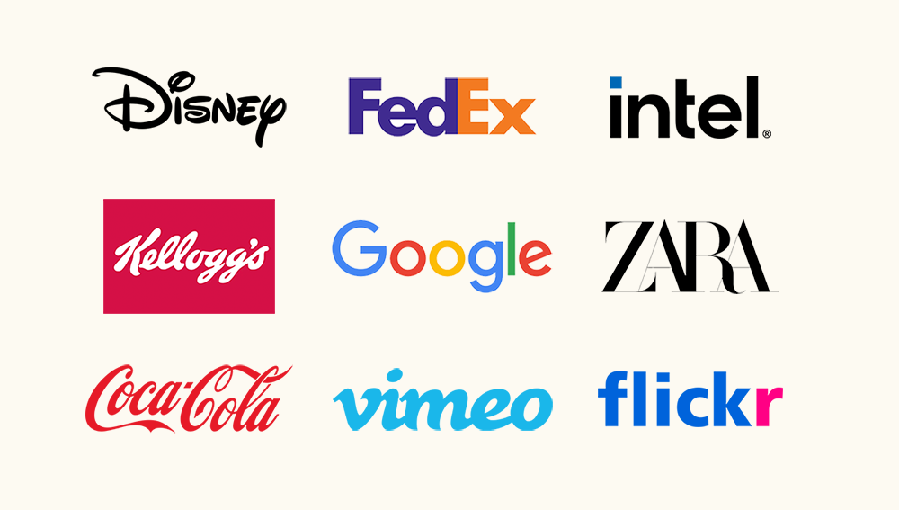
A wordmark, also called a logotype, is a text-based logo that puts the brand name front and center through typography. There is no icon to lean on. The letterforms do all the work, which is why every decision counts: typeface, weight, case, spacing and color each say something about who you are.
- Typeface: a geometric sans can read as modern and direct, a serif as established and trustworthy.
- Weight: heavy strokes feel confident, light strokes feel refined or quiet.
- Case: lowercase often feels friendly and approachable, all caps tends to feel authoritative.
- Spacing: tight or loose letter spacing changes the whole personality of the same word.
- Color: it sets mood and has to hold up on light, dark and busy backgrounds.
The evidence for protecting that typography is surprisingly strong. A study in Neurobiology of Language found that font changes slow recognition and raise brain activity in the visual word form area, and that brand-name recognition was more sensitive to font than to letter case.
How do wordmarks and symbols differ in practice?
The core difference is how recognition gets built. A wordmark reinforces your name every time someone sees it. A symbol has to be learned: people must connect the icon to the name before it does any naming work for you. Vistaprint's guide to logo types notes that symbols typically need significant marketing investment to build that association, which is why wordmarks suit new businesses so well.
Here is how the trade-offs play out:
- Name reinforcement: a wordmark teaches your name with zero learning curve. A logomark only does that after sustained exposure.
- Marketing investment: symbols pay off for brands that have already secured wide awareness. For everyone else, the budget to teach the icon often comes straight out of other growth work.
- Scalability: a symbol shrinks gracefully into a favicon or social avatar. A long wordmark can become illegible in a small square, so you need a stacked or condensed variant.
- Production: embroidery, engraving and signage each reward simple shapes. Thin, intricate letterforms struggle in thread, while bold symbols are forgiving.
- Vulnerability to errors: research on counterfeits found that logos with more graphical information were more prone to misspelling and counterfeiting errors than plain-text brand names. Heavy graphic treatments can make small mistakes harder to spot.
None of this makes a symbol a bad idea. It makes it a longer-term bet. A wordmark is also easier to evolve gently: a tweak to weight or spacing rarely wipes out equity, whereas redesigning an unestablished symbol effectively starts the learning process again. The question to ask is not which looks better, but which does more work for you right now.
When should you choose a wordmark, and when a symbol or combination mark?
Turn the trade-offs into decisions by running your brand through these criteria, in order:
- Brand age and recognition: new or little-known brands lean toward a wordmark. Established brands can start to trust a symbol.
- Name distinctiveness and length: a short, distinctive name is a gift to a wordmark. A very long or generic name may need a lettermark or a combination mark.
- Cross-language needs: if you serve audiences who read different scripts, a symbol travels more easily, though your name still needs a home alongside it.
- Usage map: list where the mark will live: app icon, signage, packaging, invoices, embroidery. Square and tiny spaces push you toward a symbol.
- Marketing budget: if you cannot fund the repeated exposure that teaches an icon, put your visual space behind the name.
A few quick scenarios show how this works. A consultancy with a distinctive surname and a mostly digital footprint points to a wordmark. A consumer app that lives on phone home screens points to a combination mark with a standalone icon. A heritage producer with a long name and strong local awareness might use an emblem on packaging and a wordmark everywhere else.
Pro Tip:Set your name in three or four candidate typefaces, then shrink each to favicon size and place it on a phone screen before you spend a cent on icon exploration. If the wordmark already works, you have your answer.
How do you design a wordmark or logo that actually works?
Good logo design is mostly production discipline. A mark that looks lovely on a presentation slide but falls apart on a hoodie has failed. Work through these areas:
- Legibility at small sizes: test the mark smaller than you think you need. If letters merge or counters fill in, increase weight or opening between characters.
- Kerning and optical spacing: spacing that looks even to the machine often looks uneven to the eye. Adjust pairs by hand, especially around letters like A, V, T and Y.
- Consistent type treatment: lock the typeface, weight and case, then use that treatment everywhere. The recognition research above is a reason to guard it.
- Color and contrast: build a primary color version plus single-color, reversed and grayscale versions, and check contrast on dark and photographic backgrounds.
- Responsive variants: plan a primary lockup, a stacked or condensed version, and an icon or monogram for tiny placements.
- Evolving gradually: refine rather than replace. Small shifts in weight or spacing keep recognition intact.
A typographic point worth remembering: congruence matters. An empirical study on name and typeface pairings found that aligning the image a name conveys with its typeface improved brand memory and consumer attitudes. A soft, playful name set in a stern industrial face sends mixed signals.
For deeper reading on type in digital settings, our piece on how typography hierarchy boosts UI usability covers the readability side.
Pro Tip:Make a one-page "stress test" sheet: login screen, favicon at its smallest, social avatar crop, embroidery mock-up and a black-and-white photocopy. Review it before approving any final mark.
Which sectors and situations favor each type of mark?
Patterns exist, though they are tendencies rather than laws:
- Service firms and consultancies: a wordmark keeps the focus on a name that clients need to recall and refer on.
- Early-stage startups: with no awareness to lean on, a wordmark uses every impression to cement the name.
- Consumer apps: they live in a square icon, so a symbol or a combination mark with a clean standalone icon is usually necessary.
- FMCG and packaged goods: shelf presence often rewards a bold symbol or emblem paired with the name.
- Long names: consider a lettermark or a stacked wordmark so the name stays readable at small sizes.
- Multilingual audiences: pair a wordmark with a simple symbol so recognition survives across scripts.
- Product sub-brands: a shared wordmark family with small symbol variations keeps a portfolio cohesive.
If you're building a digital product, our guide on successful branding for your digital product shows how these choices connect to the rest of the experience. For icon-heavy products, how tech giants approach app icons is a useful companion read.
How did logos and wordmarks evolve, and why do they carry cultural weight?
Brand marks are far older than modern branding. Craftspeople stamped marks on pottery, and guilds and merchants used seals to signal origin and quality. Heraldry and crests gave families and institutions a visual shorthand long before anyone talked about brand identity. Those early marks were symbols first, partly because many people could not read, and an image could carry meaning across language gaps.
Typography entered the story with printing and, later, industrial commerce. As companies grew and sold to strangers, names set in distinctive lettering became signatures of trust. Many of the best-known company names from the last century were essentially custom lettering, which is why the idea of a logotype feels so natural to us. Symbols then returned in force as brands went global and needed marks that crossed languages.
The digital era reshuffled the priorities again. Screens and app stores demanded tiny square icons, and brands that once relied on a full wordmark started to produce compact symbols too. At the same time, many companies simplified their marks into flat, clean wordmarks that scale cleanly.
Culturally, a mark carries more than information. A crest signals heritage, a plain sans-serif wordmark signals directness, and a playful symbol signals approachability. Choosing between logo types is partly choosing which of those stories you want people to hear first. Understanding that lineage helps you avoid copying a trend and pick something that fits your own history.

How do logos and wordmarks change what people feel about a brand?
Perception starts before anyone consciously reads anything. A symbol can deliver mood instantly: a rounded shape feels friendly, sharp angles feel energetic, a crest feels established. A wordmark delivers personality through letterforms: a wide, light typeface feels airy and modern, a tight, heavy one feels grounded and confident.
The difference shows up in what each mark helps people remember. A wordmark ties feeling directly to the name, so when someone recalls the vibe, the name comes with it. A symbol ties feeling to a shape, and the name must be attached through repeated exposure. That is why familiarity matters so much for icon-led identities.
Fit between name and typeface also shapes attitudes. As noted earlier, research on name and typeface congruence found that matching the image a name conveys with its typeface supports memory and favorable attitudes. A mismatch creates subtle friction that people feel without being able to explain.
There is a trust angle too. Plain, well-set type reads as transparent and confident, which suits professional services where credibility is the product. Elaborate graphics can read as creative and distinctive, which suits consumer brands competing on personality. Neither is better. The decision should follow the emotion you want attached to your name, your audience's expectations and where they will meet the mark first.
If you are still shaping your positioning before choosing a mark, our four-step approach to building a strong brand is a good place to anchor the conversation.
What mistakes should you avoid when choosing between a logo and a wordmark?
Most problems come from decisions made on looks alone. Watch for these:
- Assuming you need an icon: many founders ask for a symbol by default. For a new brand, the icon is optional and can distract from using visual space to cement the name.
- Prioritizing aesthetics over use: a mark that dazzles in a mock-up can fail on avatars, embroidery or at small sizes. Always map usage first.
- Choosing a trendy typeface: a fashionable face may date quickly, and changing fonts later can make recognition less immediate. Font consistency matters for recognition.
- Ignoring kerning and spacing: untouched default spacing is the clearest tell of an unfinished wordmark.
- Too much graphic detail: heavy treatments are harder to reproduce and, as the counterfeit research suggests, can make errors harder to spot.
- Skipping variants: one lockup is not an identity system. Without a stacked version and an icon, you will improvise badly later.
- Weak contrast testing: a mark that disappears on dark or busy backgrounds forces awkward workarounds.
- Leaving trademark protection to chance: consider which parts of your visual identity to protect, and consult a trademark professional about your options.
- Inconsistent use: every stray font swap or recolored version chips away at recognition. Write a short usage guide and stick to it.
The thread running through all of these is the same: decide with real usage in front of you, not an abstract idea of what a brand "should" look like.
How we decide between a wordmark and a logo
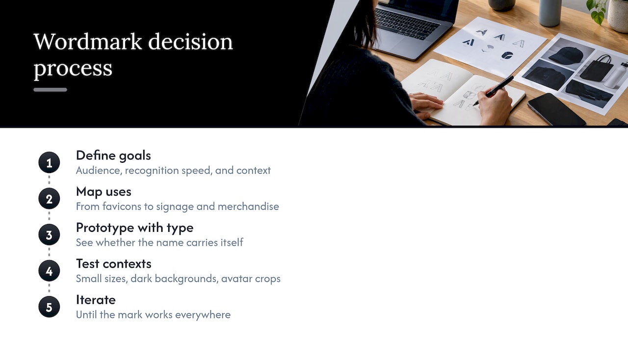
We approach this as a sequence, not a taste contest. First we define goals: who needs to recognize you, how fast, and where. Then we map the core uses, from favicons to signage to merchandise. Next we produce typographic-first prototypes, because type reveals quickly whether a name can carry itself. We then run quick usability checks on small sizes, dark backgrounds and avatar crops, and iterate until the mark holds up everywhere.
A Design Sprint or Rapid MVP fits naturally here. It helps you test a direction before committing budget.
Our briefing checklist is short: your name and any pronunciation quirks, your audience, your usage map, three brands you admire and why, and what you must avoid.
My own view: most new brands overspend on symbols and underspend on the name. Treat your wordmark as the main asset and let a symbol earn its way in later.
How we can help with your brand identity
If you want a wordmark, a symbol or a responsive identity system built properly, our team can take it from brief to usable files.
- Branding: logo and wordmark design, typography and usage rules.
- UX/UI Design Team: ongoing design support from $8,400 per month plus GST.
- Rapid MVP: a fast route to a tested first version.
- Design Sprint: a focused, research-informed way to validate a direction.
We usually begin with a briefing and a research-informed typographic prototype. Download our free branding checklist to start, or get in touch about branding to book a consultation.