.svg)
.svg)


Progressive disclosure means showing only what a person needs right now and deferring everything else to a secondary layer they can reach on demand. Its job is to cut cognitive load without cutting capability. The rule of thumb: use it for advanced or infrequent features on complex screens, and skip it whenever a task requires side-by-side comparison or safety-critical information has to stay visible.
Raw
raw.studio
Design Clearer User Experiences
Raw Studio uses research-driven UX/UI design to help businesses improve user engagement and validate digital product ideas.
Table of Contents
What Is Progressive Disclosure in UX?
Progressive disclosure is a design pattern that defers advanced, rarely used, or secondary features to a separate screen, panel, or control, so the primary interface stays focused on the task at hand. Nielsen Norman Group popularized the term in usability writing decades ago, and the Interaction Design Foundation frames it as a direct response to a simple problem: every extra control on screen taxes a user’s attention, whether they need it or not.
The mechanism is almost boring in its simplicity. You separate content into two tiers, primary and secondary, then use a trigger (a link, an icon, a toggle) to move between them. What is not boring is the effect on real products. Deferring complexity this way tends to improve three things at once:
That third point matters more than most teams realize. A settings panel with forty visible toggles does not just look intimidating, it invites people to change things they do not understand. It is about keeping people out of trouble.
Progressive disclosure is the wrong call in a few specific situations, though. If someone is comparing three pricing tiers or three product specs side by side, hiding any single attribute behind a “details” link breaks the comparison and forces extra clicks just to reconstruct a table they should have seen at once. The same logic applies to safety warnings, legal disclosures, and anything a regulator expects to be visible without interaction. When information genuinely needs to be seen and weighed together, disclosure is the wrong tool. So are its cousins, tabs, filters, and tooltips, each of which solves a related but distinct problem depending on whether the hidden content is independent of the main task or essential to completing it.
What Are the Main Types of Progressive Disclosure?
Not every disclosure pattern behaves the same way, and picking the wrong one is a common source of frustration for otherwise well-designed products. Recent implementation guides group the pattern into a few recognizable categories, and each maps to a different kind of task.
Choosing among these comes down to one question: is the secondary content a step in a sequence, an optional deep-dive, or a reaction to something the user just did? Answer that, and the category picks itself. When in doubt, prototype two versions and watch where people hesitate. That single observation usually settles the debate faster than a meeting ever will.
How Do You Design Clear Triggers and Signifiers?
The single biggest way progressive disclosure fails is not the hiding itself, it’s the labeling. If a trigger does not accurately promise what lies behind it, users hesitate, distrust the interface, or simply abandon the task rather than click and find out. This is the concept of information scent: a label like “Advanced” needs to actually lead to advanced settings, not to a random assortment of leftover features nobody knew where else to put.
A few rules keep scent strong:
Visual signifiers do the rest of the work. Microsoft’s own interface guidance recommends chevrons and arrows that visually indicate the control’s future state, a single chevron for an in-place expansion, a double chevron for a control that opens a separate menu or pop-up. That distinction sounds small until you consider how often users get surprised by a click that behaves differently than they expected. Set the expectation visually, and you remove the surprise before it happens.
Pro Tip: Test your trigger labels by covering the revealed content and asking five people what they think will happen when they click. If more than one guesses wrong, rewrite the label before you touch the layout.
Depth is the other place disclosure quietly breaks down. Nielsen Norman Group’s research on the pattern found that designs pushing past two levels of disclosure show measurably lower usability, and GitLab’s design system backs that with a concrete rule: cap disclosure at two levels and group secondary features instead of nesting them further. A settings panel that goes main menu, then submenu, then sub-submenu, is not organizing complexity. It is burying it.
Accessibility deserves equal weight here, not an afterthought at the end of a build. A checklist worth keeping on hand:
For microcopy, keep “Advanced” and “More” doing distinct jobs. “Advanced” signals depth and risk, options that could break something if misused. “More” signals volume, additional items of the same kind. Mixing the two erodes the very information scent you are trying to build.
What Are Common Progressive Disclosure UI Patterns?
Four or five patterns cover most real-world disclosure needs, and each has a distinct anatomy worth understanding before you drop one into a wireframe.
Accordions stack collapsible sections vertically, each with a header that expands to reveal its content and collapses again on a second click. They work best for FAQ pages, product specification lists, and settings grouped by category, situations where a user wants to scan headers first and dive into exactly one section. The accessibility rules above apply directly here: headers need aria-expanded, keyboard focus needs to land inside the panel once opened, and only one section needs to be open at a time unless your content genuinely benefits from multiple simultaneous views.
Modals and secondary screens pull a user entirely out of the current view to complete a focused sub-task, confirming a deletion, editing a single record, filling out a short form. Modals beat in-place disclosure whenever the secondary task needs undivided attention or when completing it would otherwise clutter the primary screen with form fields the user does not need again. The tradeoff is context loss: a modal that takes more than a few seconds to complete starts to feel like a detour rather than a shortcut.
Dropdowns and “more actions” menus handle overflow, a row of five icons where only three fit, a table row with more possible actions than can be shown as separate buttons. These work because they group low-frequency actions under a single, predictable trigger (often a “kebab” or three-dot icon) rather than forcing every possible action into permanent screen real estate.
Staged flows and wizards apply step-by-step disclosure to genuinely linear tasks, tax filing, account setup, checkout. They work best when steps have a natural order and when showing progress (a step counter, a progress bar) helps users tolerate the wait. Avoid wizards for tasks that are not actually sequential. Forcing a non-linear task into a staged flow just adds friction disguised as structure.
Lazy loading and content truncation defer rendering of long lists, comment threads, or article bodies until a user scrolls or clicks “read more.” This pattern solves a performance problem as much as a UX one, but the design choice still matters: truncation previews need to show enough real content that users can judge whether it is worth expanding, not just a teaser sentence engineered to bait a click.
A few product-agnostic examples worth studying directly:
None of these patterns are mutually exclusive. A settings page might use accordions for grouping and conditional disclosure inside each section for the truly rare options. The point is matching the pattern to the shape of the task, not picking whichever one looks trendiest in a component library.
How Do You Implement and Test Progressive Disclosure?
Treat this as a sequence, not a single design decision made once and forgotten.
On the metrics side, research on discoverability risk makes a specific point worth internalizing: progressive disclosure can quietly hide features users actually need, and the only reliable way to catch that is by watching expansion rates and task completion together, not either one in isolation. A low expansion rate paired with a healthy completion rate might mean the hidden feature genuinely was not needed. The same low expansion rate paired with a support-ticket spike about a “missing” feature means your trigger failed and nobody noticed until customers complained.
How Raw Studio Validates Progressive Disclosure in Practice
Inside a Design Sprint, disclosure decisions get tested the same week they get proposed, not months later in a post-launch review. Rapid MVP builds carry interactive prototypes into moderated sessions where we watch whether people find the “advanced” layer at all before we ever discuss visual polish.
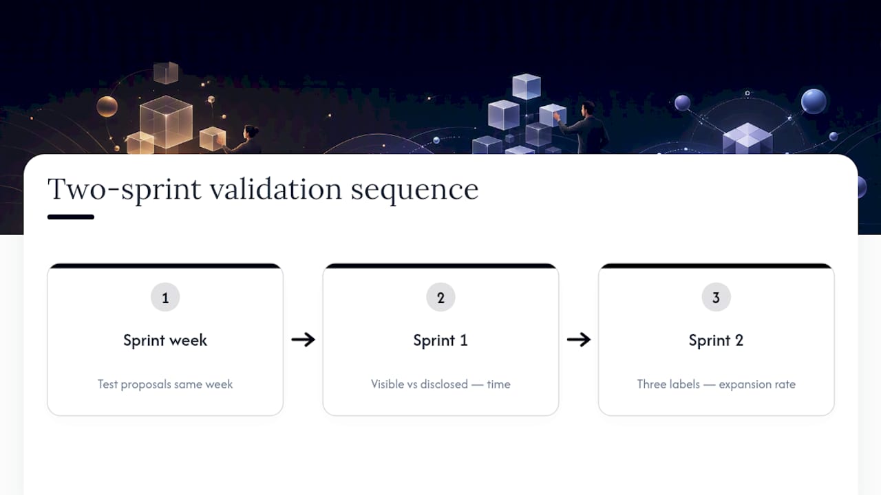
Two experiments worth running in your own first two sprints: in sprint one, prototype a single screen two ways, everything visible versus a disclosed version, and time task completion for both. In sprint two, test three label variants on the same trigger and track which one produces the highest expansion rate without hurting comprehension of the main screen.
This section reflects the editorial perspective of Philippe, drawing on Raw Studio’s applied design practice.
When Should You Reveal Information During a User Flow?
Timing decides whether a disclosure feels helpful or feels like a delay. The general principle: reveal information at the moment a user’s own action creates the need for it, not before and not long after.
A shipping-address field should appear the instant someone unchecks “same as billing,” not two screens later. A password-strength meter should update as someone types, not only after they submit the form and get rejected. This is the contextual disclosure category in action, and its pacing rule is simple: the reveal should feel like a direct consequence of what the user just did, arriving fast enough that the connection is obvious.
Staged disclosure follows a different pacing logic. Each step should ask for roughly one decision’s worth of input, no more, and should show visible progress so users can judge how much is left. A five-step wizard that front-loads three fields on step one and dumps twelve on step four will feel unbalanced even if the total field count is identical to a perfectly even flow.
Conditional disclosure has the loosest timing constraint, since the user is the one choosing when to open it. The design job here is making sure the trigger is visible at the moment it becomes relevant, not just present somewhere on the page. An “advanced options” link buried at the bottom of a long form will get missed by exactly the power users who most need it, simply because they stopped scrolling before they got there.
Should Mobile and Desktop Handle Disclosure Differently?
Yes, and the difference comes down to available space and interaction method, not just screen size. Mobile screens have room for far fewer simultaneous options, which makes progressive disclosure less of a nice-to-have and more of a structural requirement. A desktop settings panel with a sidebar and a content pane often becomes, on mobile, a single stacked list where every section needs to collapse by default just to fit.
Touch targets change the calculus for triggers, too. A chevron that is comfortably clickable with a mouse cursor needs a larger tap area on a touchscreen, generally at least 44 by 44 pixels, or users will mis-tap adjacent elements. Hover-triggered reveals, tooltips that appear on mouseover, common on desktop, have no direct equivalent on touch devices, since there is no hover state. Anything disclosed on hover for desktop needs a tap-based or persistent equivalent for mobile, not just a straight port of the same interaction.
Modals behave differently too. A desktop modal can afford to be a fixed-size overlay centered on the screen. On mobile, that same modal usually needs to become a full-screen sheet, both because screen space is limited and because a small floating modal on a phone is awkward to interact with and easy to dismiss by accident.
The practical rule: design the mobile disclosure pattern first when a product is mobile-heavy. It is far easier to expand a mobile-first pattern out to desktop’s extra space than to compress a desktop-first pattern down without losing clarity.
How Should Responsive Design Handle Disclosure Across Devices?
A disclosure pattern that works on a laptop does not automatically survive a resize to a tablet or a fold to a phone screen, and treating breakpoints as an afterthought is one of the more common ways teams undermine an otherwise solid pattern.
The safest approach is to define disclosure behavior per breakpoint deliberately, rather than letting a single component auto-adjust and hoping for the best. A three-column layout with visible secondary content on desktop might need to collapse that same content into an accordion at tablet width, then collapse further into a single-tap expandable card at phone width. Each of those is a legitimate version of the same underlying information hierarchy, not three separate designs.

State persistence across devices matters more than most teams plan for. If someone expands a section on desktop, then picks up the same account on a phone later, does that expansion state carry over? For most products it should not need to, since screen constraints differ enough that starting collapsed on mobile is usually the safer default, but the inconsistency should be a deliberate choice, not an accident of how the components happened to get built.
Test responsive disclosure behavior at actual breakpoints, not just by shrinking a browser window. Real devices introduce touch targets, safe-area insets, and on-screen keyboards that can cover a newly revealed field entirely, a failure mode that a resized browser window will never show you.
How Does Progressive Disclosure Fit With Minimalism and User Control?
Progressive disclosure is not minimalism, but the two principles reinforce each other constantly. Minimalism asks you to remove or defer anything that is not essential; disclosure gives you a mechanism for deferring rather than deleting. Without that distinction, teams sometimes conflate “hide it” with “cut it,” and end up removing features users genuinely needed, rather than simply relocating them.
User control is the principle that keeps disclosure from becoming manipulative. A well-designed reveal is something the user chooses to trigger, at a moment they choose, with a clear way to reverse it. The moment a “collapse” pattern starts hiding options that a user did not ask to hide, or removing an undo path, it stops serving the user and starts serving the designer’s preference for a tidy screen. That is a small but real ethical line worth respecting, since interfaces that quietly limit what users can find or undo erode trust fast, even when no single interaction feels dramatic.
The strongest interfaces treat disclosure as one tool among several, alongside plain minimalism (cutting features that add no value at all) and direct user control (letting people customize what stays visible by default). None of these substitutes for the others. A product that leans on disclosure alone, without ever asking whether a feature should exist at all, ends up with a beautifully organized version of a bloated product, not an actually simple one.
When Does Progressive Disclosure Backfire?
Disclosure creates more friction than clarity the moment a hidden feature is one that a majority of users actually need. That is a design failure disguised as tidiness, and it usually means your task analysis was wrong about what counts as “secondary.”
Presenting this trade-off to product leadership works best with a number, not a preference. Show the expansion rate on a proposed trigger next to the percentage of support tickets referencing that same feature. If those two figures do not agree, the disclosure decision needs revisiting before launch, not after.
The clearest organizational signal that a redesign, not another layer of hiding, is overdue: when every new feature request gets solved by adding one more toggle to an already crowded “Advanced” panel. At that point the problem is the underlying information architecture, and disclosure is just a bandage.
Get Expert Help Applying These Patterns
This approach offers an alternative to hiring a full internal UX team for teams that need quick insights into whether their disclosure decisions are working. A free UX audit can provide a specific read on where a product’s information hierarchy helps users and where it may cost completions, without requiring a lengthy engagement or guesswork about what to fix first.

These calls are validated using rapid interactive prototypes, moderated usability sessions focused on discoverability, and analytics instrumentation tracking expansion rates against task completion to provide a more integrated understanding. That combination, tested inside a Design Sprint timeline rather than a months-long process, is what turns a disclosure hypothesis into a validated design decision.
If your team suspects a settings panel, onboarding flow, or dashboard has drifted into “hide it and hope” territory, request a free UX audit and get a specific answer instead of another internal debate.
Sources
A few sources are worth bookmarking if you want to go deeper than any single article can cover:
FAQ
Can You Give an Example of Progressive Disclosure?
A checkout form that hides the billing-address fields until a user unchecks “same as shipping” is a common example, along with a settings menu that tucks rarely used options behind an “Advanced” link.
How Does Progressive Disclosure Work?
It separates content into primary and secondary tiers, then uses a labeled trigger, a link, icon, or toggle, to reveal the secondary tier only when a user asks for it, keeping the default view focused on the task at hand.
What Is Progressive Disclosure in an AI Assistant Interface?
In conversational AI products, progressive disclosure often means an assistant surfaces a simple answer first and offers a way to expand into sources, reasoning steps, or advanced settings only if the user asks, mirroring the same core pattern used across other software interfaces.
What Are the Core Principles Behind Good UX Design?
There is no single fixed list, but recurring principles across major UX frameworks include clarity, consistency, feedback, error prevention, accessibility, user control, and efficiency, and progressive disclosure supports several of these at once by reducing clutter without removing capability.
How Many Levels of Disclosure Should an Interface Have?
Usability research recommends capping disclosure at two levels, since designs that nest deeper tend to show lower usability, and grouping secondary features is generally a better fix than adding a third layer.