.svg)
.svg)

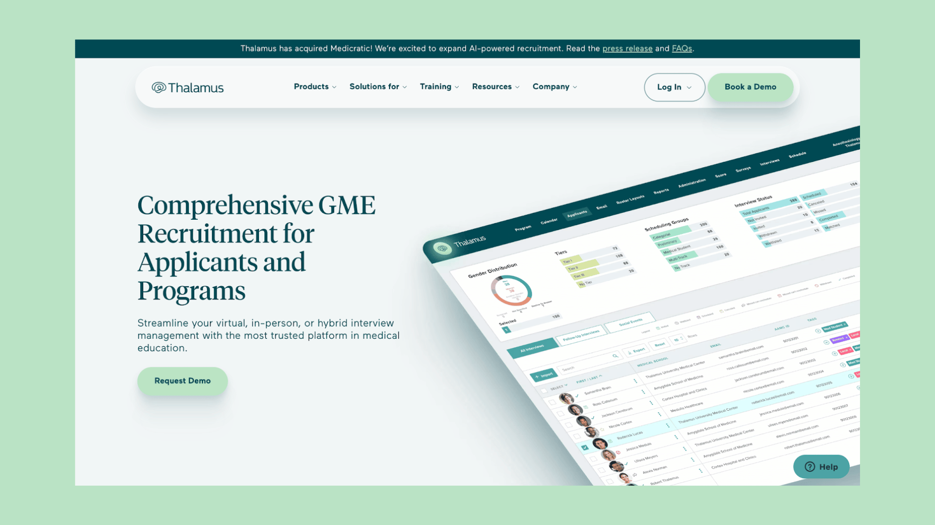

Five elements decide whether a B2B SaaS website converts: a single-focus hero, social proof positioned near decision points, feature copy translated into outcomes, one dominant CTA with a frictionless demo path, and a site fast enough that none of it matters if it loads slowly. If you fix one thing this week, fix the top of the homepage. Clarity above the fold and a CTA with zero ambiguity fix more conversion problems than any redesign that starts with the footer.
What Makes B2B SaaS Website Design Different From B2C
B2B SaaS website design has to do something a consumer product page never has to: convince three or four different people, on three or four different timelines, that the same fifteen-second visit was worth their time. A procurement lead, a department head, and an end user often land on the same page and need entirely different proof before they'll act. That's the real design brief.
Analyses of high-converting SaaS pages find the winners share a specific anatomy: a strong hero, social proof, benefit-framed features, a low-friction demo form, and a CTA that doesn't compete with itself for attention, according to KlientBoost's landing page research. The losers usually have all the same ingredients, just arranged so nothing stands out.
A few structural rules hold up across nearly every high-performing B2B SaaS site:
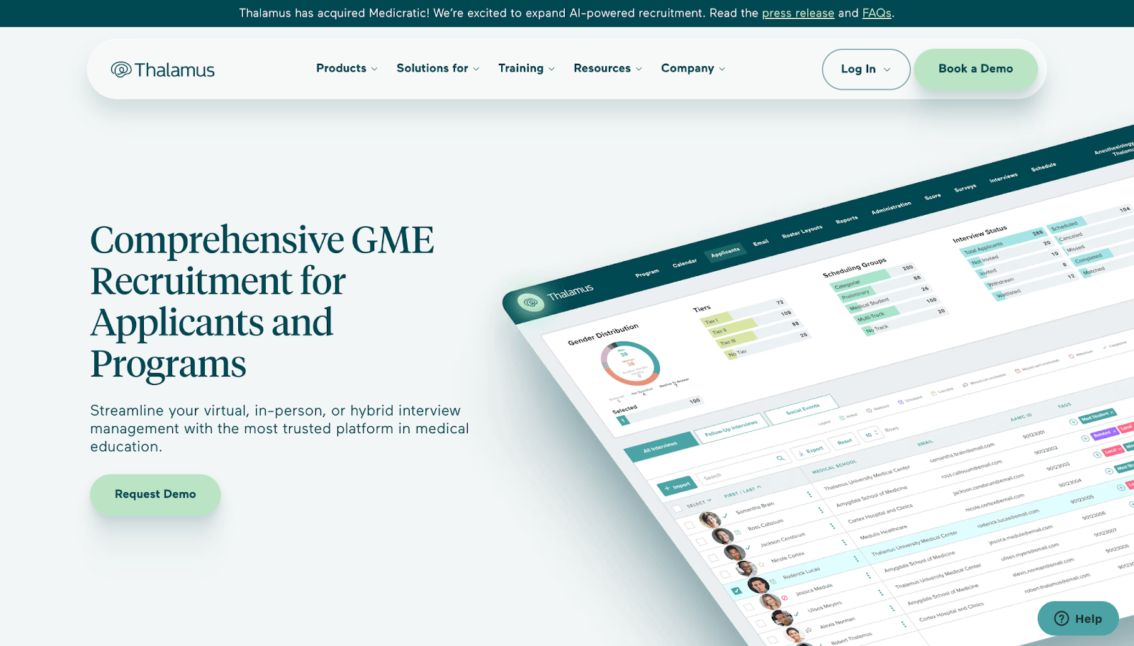
- Above-the-fold architecture: one headline that states the outcome, one subhead that adds specificity, one CTA, and a supporting visual or fifteen-second product clip. No secondary offer competing for the click.
- Segmented paths for different buyers: role-based or industry-based navigation lets a CFO and a VP of engineering each find proof relevant to their objection, without forcing either to wade through the other's content.
- Trust signals near the decision, not just the footer: logos and testimonials placed right before or beside the CTA measurably lift trust in B2B contexts, per the same KlientBoost analysis.
- Features rewritten as outcomes: "real-time sync" becomes "your team never works from a stale spreadsheet again." Quantify where you can.
- Speed and accessibility as defaults, not afterthoughs: page speed and mobile responsiveness aren't nice extras. UniformMarket's B2B design research ties slow load times directly to lower conversion in B2B contexts, and buyers now research extensively before ever talking to sales, so a sluggish page loses them before a rep gets the chance.
Design Patterns Worth Copying From SaaS Website Examples
Scrolling through curated galleries feels productive, but a bookmark folder full of pretty homepages doesn't ship a redesign. What ships a redesign is knowing which pattern solves which problem, and copying the structure rather than the surface.
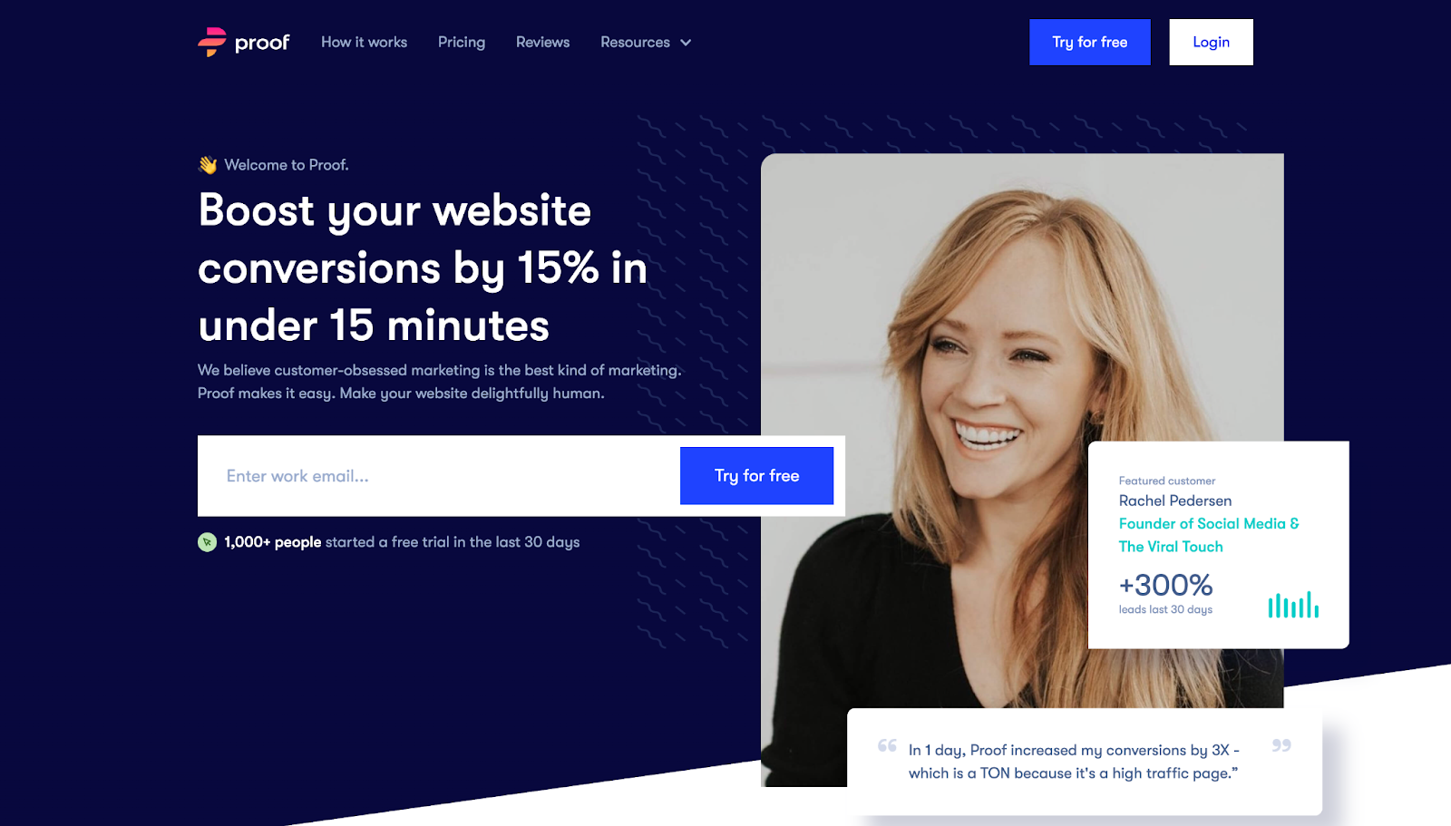
Webflow's 2026 roundup of SaaS website examples is a useful reference precisely because the strongest entries repeat the same moves: sharp messaging, visible integration logos, and product visuals that show the software actually working, not just illustrating it in the abstract. Four patterns cover most of what you'll need.
- The single-goal hero. One offer, one CTA, one supporting image or clip. Microcopy should name the outcome ("See your pipeline in one dashboard") rather than the feature ("Analytics platform"). This pattern wins when your product has one clear headline benefit and a short sales cycle.
- The scrollytelling case. A story-driven success narrative that walks a visitor from problem to result, often anchored by one flagship customer. It works best for complex products where the value isn't obvious from a screenshot alone, and it needs real customer data to avoid feeling like filler.
- The interactive ROI estimator. A calculator or configurator that lets a prospect plug in their own numbers. High impact, but expensive to build well. Scope a rough version first (three inputs, one output) before investing in a polished tool nobody has validated demand for.
- The resource hub for long sales cycles. A library segmented by role or industry, built for buyers who won't convert on visit one. This pattern matters most when your average deal takes months, not days.
Pro Tip: Curated galleries like Mobbin are great for spotting what's trending, but the moment you copy a whole page instead of the underlying pattern, you inherit someone else's assumptions about their buyer, not yours.
Implementation complexity climbs from pattern one to pattern three. Start with the hero and case pattern using existing assets. Save the estimator for after you've validated that visitors actually want to self-serve their own numbers.
Which A/B Tests Move the Needle Fastest?
CTA copy, hero layout, and form length are the three tests most likely to produce a measurable lift in B2B SaaS, and they're also the cheapest to run. Start there before touching anything structural.
A landing-page analysis found that pages built around a single, focused CTA consistently outperform pages juggling multiple competing calls to action, a pattern confirmed across KlientBoost's review of high-converting SaaS pages. If your hero currently offers "Book a Demo" next to "Start Free Trial" next to "Watch Video," you're asking visitors to make a decision before they've decided anything about your product.
Run these first:
- CTA wording: "Book a Demo" versus "See It in Action" versus "Get Pricing" often produce meaningfully different click rates depending on where the buyer sits in their evaluation.
- Hero layout: text-left versus text-right, and static image versus autoplay product clip.
- Form field count: every field removed from a demo request form typically reduces abandonment, though the tradeoff is lead quality your sales team needs to weigh in on.
- Case study placement: moving one proof point above the fold and tracking the change in demo click-through rate over the following weeks.
For measurement, track demo requests and trial signups as primary metrics, and scroll depth, time on hero, and form abandonment as supporting signals that explain why a primary metric moved. B2B traffic volumes are lower than e-commerce, so give a test at least three to four weeks and enough sessions to cover a full buying-committee cycle, not just enough for statistical significance on paper.
A useful two-week recipe: swap only your CTA copy, hold everything else constant, and measure demo request rate. It's the fastest, lowest-risk test on this list, and it tells you immediately whether your current wording is quietly costing you conversions. For a deeper breakdown of where B2B SaaS teams lose visitors before they ever reach a form, this rundown of common conversion mistakes is worth a read alongside your own test backlog.
How Should Microcopy and Product Demos Be Designed?
Good microcopy tells a visitor what happens next, not just what to click. "Start Your Free Trial, No Card Required" removes a specific objection; "Get Started" removes nothing. Every CTA on a B2B SaaS site should answer the unspoken question "what happens if I click this?"
Imagery works the same way. Screenshots should show a real, populated interface rather than an empty dashboard, because empty states tell a buyer nothing about the product's actual value. A fifteen to thirty second demo clip embedded in the hero usually outperforms a static screenshot, but only if it opens on the payoff, not a login screen.
Navigation deserves the same discipline as the hero. Different stakeholders evaluate on different criteria:
- Technical buyers want documentation, integrations, and security pages accessible within two clicks.
- Economic buyers want pricing, ROI proof, and case studies front and center.
- End users want to see the interface and understand day-to-day usability fast.
On gated demos, show enough before the gate that a visitor commits based on genuine interest, not blind faith. A short interactive preview before the "book a call" ask converts better than a wall that hides everything behind a form.
How Raw Studio Turns These Principles Into Measurable Results
The process includes stages to compress the usual redesign timeline: a Design Sprint that pressure-tests messaging and structure against real user feedback in days rather than months, a rapid MVP that ships a working version quickly to start learning from real traffic, and iterative CRO once the site is live and generating data worth acting on.
The Everdure case study shows what that process can produce at scale, a 100% increase in conversion rate driven by structural and UX fixes rather than a cosmetic redesign. Treat it as an illustration of what's achievable with disciplined process, not a guarantee every project replicates.
Before your next redesign, audit these first:
- Does your hero pass the five-second test: can a stranger state your product's core benefit without scrolling?
- Is there one dominant CTA, or three competing for attention?
- Where does your fastest-loading competitor beat you on page speed?
Pro Tip: Book design, development, and a CRO-minded stakeholder into the same room before wireframes start. Redesigns that separate those roles almost always rebuild the same friction they were meant to remove.
Connecting the Website to CRM and Marketing Automation
A conversion-optimized homepage is only half the job if the lead it generates disappears into an inbox for three days. Every demo request, trial signup, and gated content download should route directly into your CRM and marketing automation stack the moment it happens, not after manual entry.
That means your forms need to pass more than a name and email. UTM parameters, referring page, and any qualifying fields (company size, role, use case) should flow into the CRM automatically so sales can prioritize based on fit, not just chronology. A trial signup from a 500-person company and one from a two-person startup deserve different follow-up sequences, and that segmentation has to start at the point of capture, not after a rep manually sorts through a spreadsheet.
Marketing automation also closes the loop on your resource hub. If a visitor downloads a whitepaper aimed at technical buyers, that action should trigger a nurture sequence built for technical buyers, not a generic newsletter. This is where role-based content architecture pays off twice: once for the human reading it, and again for the automation rules built around it.
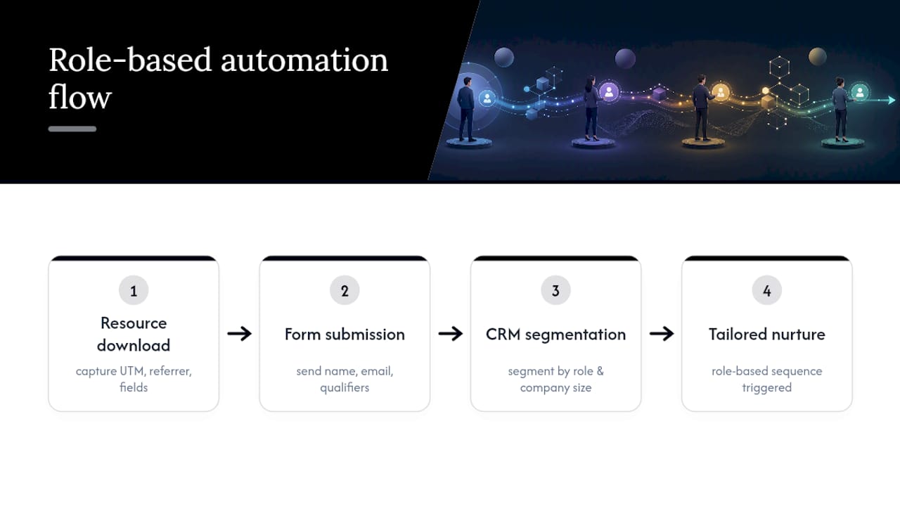
The practical failure point isn't usually the CRM itself. It's a website built without the CRM's data requirements in mind, so integration becomes a bolt-on months later. Map your form fields to your CRM's lead-scoring model before you finalize your form design, not after.
Where Personalization Actually Pays Off on a SaaS Site
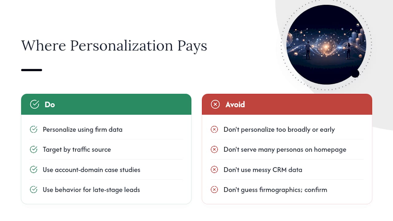
Personalization on a B2B SaaS site works best when it's based on firm data, not guesswork dressed up as intelligence. Showing a returning visitor from a known enterprise account a case study from their industry, or adjusting hero copy based on the campaign that brought them in, are both low-risk, high-return applications.
The mistake most teams make is personalizing too broadly and too early. A homepage that tries to serve five different personas with dynamic content blocks often ends up serving none of them well, because the logic gets complicated and the content underneath stays generic. Start narrow: personalize by traffic source (paid search visitors see different proof than organic blog visitors) or by known account data (enterprise domains see enterprise case studies) before attempting anything more granular.
Behavioral personalization, adjusting what a returning visitor sees based on pages they've already viewed, works well for resource hubs serving long sales cycles. If someone has already read your pricing page and a competitor comparison, showing them a demo booking CTA instead of another blog post recommendation respects where they actually are in the decision.
The data underpinning any personalization effort has to be clean before the personalization logic gets built. A site pulling from a messy CRM, or guessing at firmographic data instead of confirming it, personalizes based on bad assumptions, which erodes trust faster than generic content ever would.
How Do You Present Complex Pricing Without Losing the Buyer?
Complex B2B SaaS pricing, tiered plans, usage-based components, add-on modules, needs a page that clarifies rather than a spreadsheet dumped into a webpage. The goal is helping a buyer self-identify which tier fits them within seconds, not listing every feature difference in a wall of text.
Comparison tables work, but only when they lead with the differences that actually drive a purchase decision, not every minor feature discrepancy between tiers. Bury a critical distinction (seat limits, API call caps, support tier) under twenty rows of parity features, and buyers miss the thing that would have made their decision for them.
For genuinely complex or custom pricing, "Contact Sales" isn't a cop-out, it's often the honest answer. But even then, give visitors a directional sense of scale (starting price, typical range for their company size) so the CTA doesn't feel like a black box. Enterprise buyers in particular distrust pricing pages that hide everything behind a form with zero context.
Where features genuinely differ between plans, use plain-language labels over technical jargon. "Unlimited team members" communicates faster than "N+1 seat architecture," even to a technical buyer, because pricing pages get skimmed under time pressure, not read carefully.
What the Data Actually Tells Us About B2B SaaS Design
The conventional advice on B2B SaaS website design spends too much time on aesthetics and not enough on sequencing. Most teams redesign the homepage, then worry about CTAs, then think about page speed as a technical afterthought handled by engineering. That order is backwards. Page speed and CTA clarity are the two levers most directly tied to conversion, and they're also the two most commonly deprioritized in favor of visual polish.
The overrated fix is the total rebrand. A visually striking redesign with unresolved messaging and a slow backend will underperform a plainer site that loads fast and states its value clearly in five seconds. Gallery-driven inspiration is useful for spotting patterns, not for justifying a full visual overhaul when the actual problem is that your hero doesn't say what your product does.
What the evidence actually supports is sequencing fixes by leverage: clarify the offer first, fix the CTA second, address speed and mobile third, then layer in personalization and interactive elements once the fundamentals convert. Teams that reverse that order spend budget on features visitors never reach because they bounced before scrolling.
Get a Free UX Audit Before You Redesign Anything
Raw is the alternative to guessing your way through a redesign. Instead of rebuilding your entire site on instinct, Raw's free UX audit reviews your current homepage, hero, and conversion paths against the patterns covered above, then hands you a prioritized list of quick wins and a roadmap for what to fix first.
B2B sales cycles involve multiple stakeholders, procurement, technical evaluators, budget owners, and a site redesign that only reflects one internal opinion usually misses what the others need to see. An outside audit brings the cross-stakeholder perspective and measurement discipline that's hard to generate internally, especially when your team is too close to the product to spot where a first-time visitor gets confused.
If you'd rather start smaller, grab the free branding checklist and work through it before your next sprint planning session. Either way, the next step is the same: get a second set of eyes on your site before you spend another quarter guessing at what's broken.