.svg)
.svg)


Most navigation problems are easy to miss because users rarely say that your information architecture is confusing. They simply leave, search elsewhere, or contact support. By the time the problem appears in analytics, the cause may be a menu structure that made sense internally but not to customers.
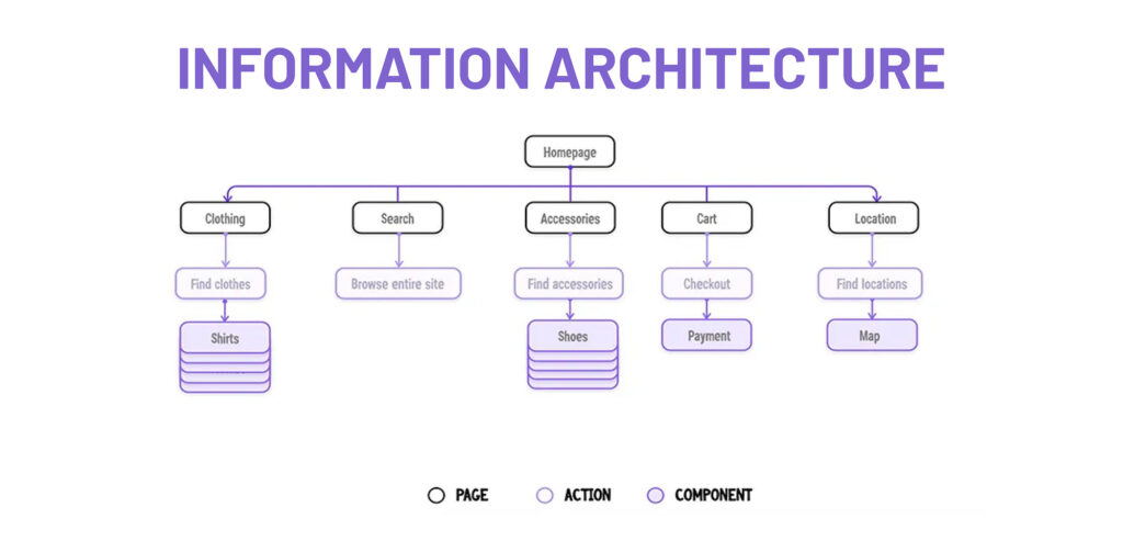
Information architecture, or IA, is how content, features, and labels are organised so people can move through a product without thinking too hard about where everything lives. When IA design works well, users barely notice it. When it does not, every other part of the experience has to work harder.
The good news is that information architecture does not have to rely on opinion. Card sorting and tree testing are two UX research methods that help teams build and validate site navigation using user behaviour.
Why Information Architecture Matters
Poor findability can affect conversion, adoption, and support costs.
If someone cannot find pricing, they may leave before becoming a customer. If an existing user cannot find account settings, they may contact support instead. If an important feature sits under navigation labelling that users do not understand, adoption can remain low even when the feature itself is useful.
Information architecture should be treated as product strategy, not final polish.
Raw Studio’s guide to service design explores a similar idea: customer experience depends on how people, processes, and touchpoints work together.

What Is Card Sorting?
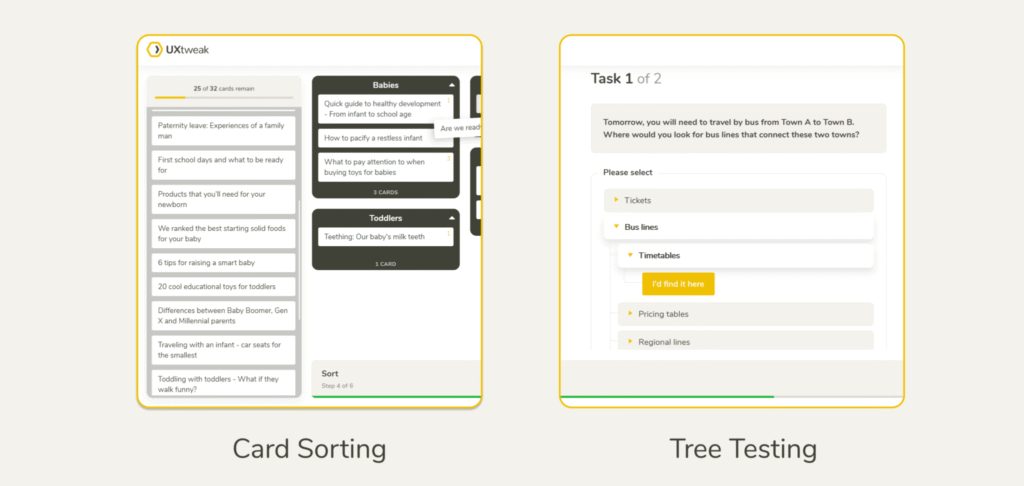
Card sorting asks participants to organise content into groups that make sense to them, revealing how they naturally understand the information.
It is especially useful when creating a new information architecture or when an existing structure no longer matches the way users think.
There are three common types. An open card sort lets participants create and name their own groups. A closed card sort gives participants predefined categories. A hybrid card sort combines both approaches by allowing participants to use existing categories or create new ones.
For early IA design, an open card sort is often the best starting point because it reveals natural groupings and language.
Raw Studio’s article on user interviews is useful here too. Both methods work best when teams listen to the language customers actually use instead of relying on internal terminology.
How to Run a Card Sort
Start with a focused set of content items. The original brief recommends around 30 to 60 cards, enough to reveal useful patterns without exhausting participants.
Each card should represent one clear concept. Avoid jargon or labels that only make sense internally.
If you are testing different user groups, run separate sessions because their mental models may not match.
Once the sessions are complete, look for repeated groupings and repeated labels. A similarity matrix can show how often participants placed two cards together, while a dendrogram can help reveal larger clusters.
Pay attention to the words participants choose. If users repeatedly select “Billing” while your team prefers “Account Management,” that is useful evidence for better navigation labelling.
What Is Tree Testing?
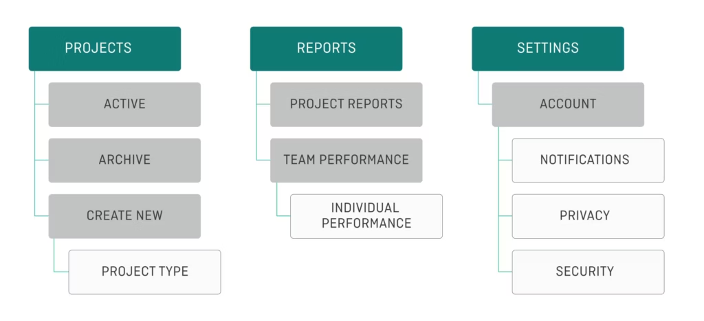
Card sorting helps you create a possible structure. Tree testing tells you whether people can actually use it.
In a tree test, participants see a stripped-back version of your site navigation. There are no colours, icons, or page layouts to guide them. They only see the hierarchy and labels.
Participants are then given realistic tasks, such as, “You want to update your billing details. Where would you go?”
Because the visual interface is removed, tree testing isolates the information architecture. If users struggle, the problem is likely structural or related to labelling.
What Should You Measure in Tree Testing?
Three metrics matter most: success rate, directness, and first click.
Success rate shows how many participants reached the correct destination. Directness shows whether they got there without backtracking. A high success rate with poor directness can suggest that people eventually find the answer, but the navigation labelling creates doubt.
First click shows where people go first. An incorrect first choice can reveal which category is pulling users away.
Raw Studio’s article on using data to inform UX design explains why observed behaviour should guide design decisions.
How Card Sorting and Tree Testing Work Together
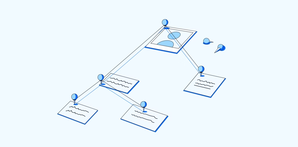
Card sorting and tree testing work best as a sequence.
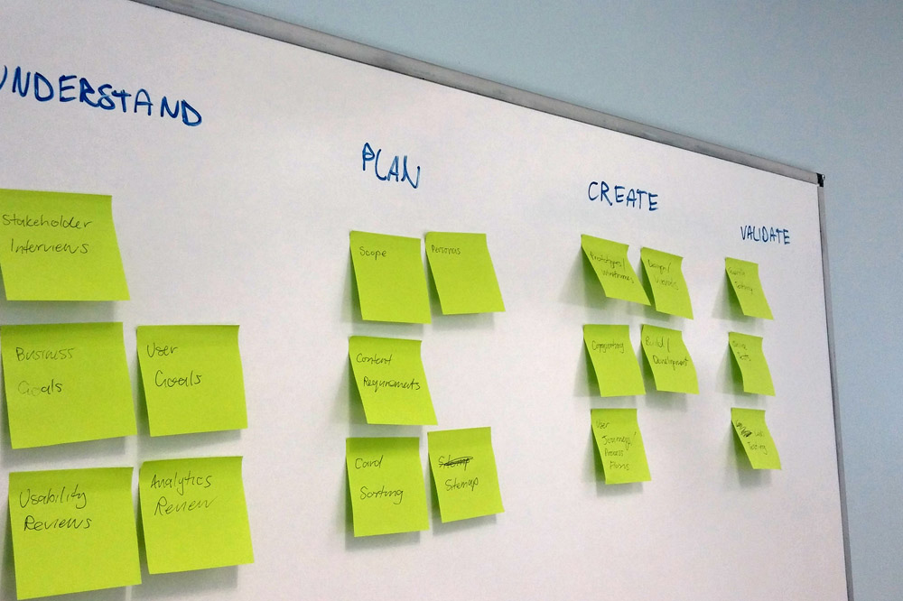
Start with card sorting to understand how users group information and what labels feel natural. Use those patterns to create a draft information architecture. Then run a tree test with a fresh group of participants to see whether they can find important content through that structure.
If people struggle with a branch, revise the labels or grouping.
This turns IA design into an evidence-based process. Instead of debating which menu label sounds better in a meeting, you can see how real users behave.
Common Information Architecture Mistakes
One of the biggest mistakes is building site navigation around the company’s internal structure. Customers should not need to understand your departments before they can use your website.
Jargon is another problem. Internal product names and acronyms may feel obvious to the team but mean little to a new customer.
Teams also test too late. Once navigation is built and filled with content, changing it becomes more expensive.
Raw Studio’s article on why menus are disappearing in modern UX is a useful reminder that navigation patterns continue to evolve. The best structure is one users understand quickly.
Test Your Information Architecture Before It Costs You
Good information architecture feels almost invisible. People find what they need, complete their task, and move on without thinking about the structure behind the experience.
Card sorting helps you understand how users naturally group and label information. Tree testing helps validate whether that structure works. Together, they can improve findability, reduce navigation friction, and make site navigation easier to use.
If your navigation has grown over time without being tested with real users, there may be more friction than your analytics can explain.
Get a free audit and proposal from Raw Studio and find out where your information architecture, navigation labelling, or wider UX may be making customers work harder than they should.