.svg)
.svg)

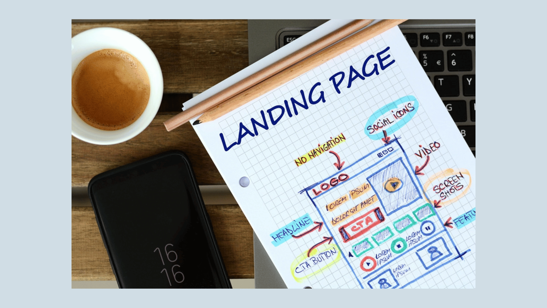

Landing page optimization is the practice of adjusting a page's copy, layout, and technical performance to convert more of its visitors into leads or customers. The single best first step is to pick one conversion goal and check that every element on the page speaks to the intent that brought the visitor there. Median landing pages convert around 6.6%, so there's real room to climb, and agencies like Raw Studio treat that climb as a research problem, not a guessing game.
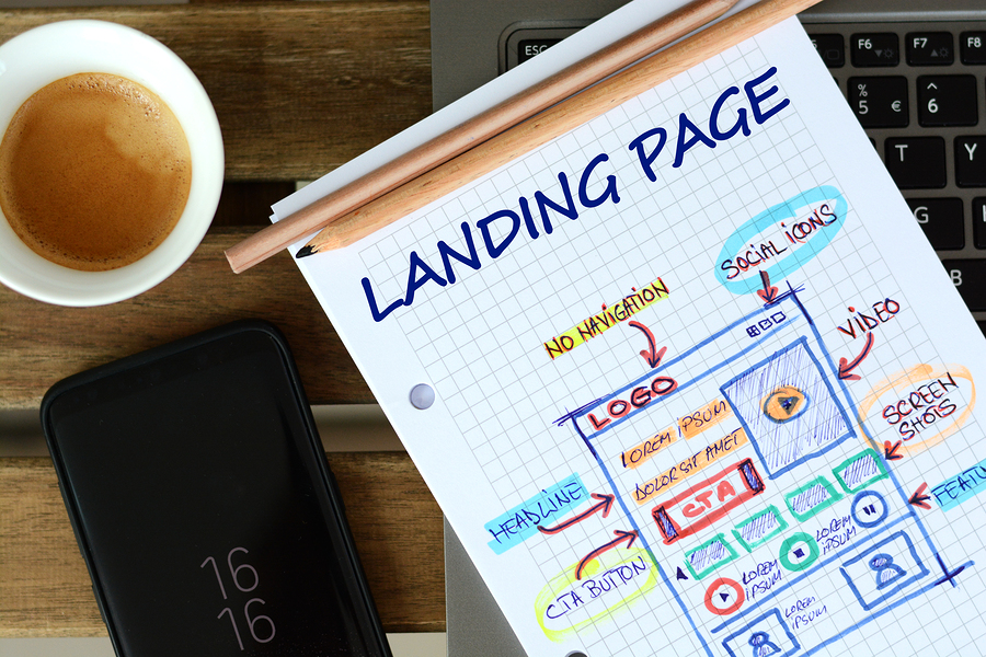
What landing page optimization actually covers
Landing page optimization (LPO) is narrower than full-site conversion rate optimization (CRO). CRO looks at the whole customer journey, from the first ad click to the final receipt. LPO zooms in on a single page: the one built to do one job, whether that's collecting an email, booking a demo, or closing a sale.
That narrowness is the point. A landing page with one goal converts better than one trying to be a homepage, a product catalog, and a lead form at once. If you're driving traffic to sign people up for a webinar, every headline, image, and button on that page should push toward registration. Nothing else.
Most landing pages that underperform share the same handful of problems, and none of them are exotic.
Intent mismatch tops the list. The disconnect kills trust in about three seconds. Google's own guidance on landing page experience says the same thing: pages that match the ad and keyword intent perform better and protect Quality Score.
Competing goals come next. A page that asks visitors to "Sign up," "Learn more," and "Follow us on social" all at once dilutes attention across three actions instead of driving one. Pick a single conversion goal and cut everything that doesn't support it.
Slow load times round out the usual suspects, and they're often the quiet killer because nobody notices a page that's merely a bit sluggish. Visitors do notice, and they leave before the value proposition even renders.
Fixing these three issues before touching headline copy or button color usually produces the biggest early wins, because they're structural. No amount of clever copywriting saves a page that loads the wrong promise at the wrong speed.
Top landing page optimization best practices worth testing first
Once the structural problems are handled, the tactical checklist below is where most measurable gains come from. These aren't listed in order of glamour, they're listed in rough order of typical impact, based on what shows up again and again in conversion testing across industries.
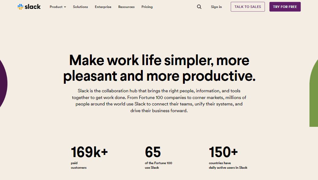
Headline and value proposition. Your headline has to tell visitors, in about five seconds, what they get and why it matters to them specifically. A benefit-led headline ("Get quotes from three insurers in two minutes") consistently outperforms a feature-led one ("Our comparison engine covers 40 providers").
Single conversion goal. Strip the main navigation, remove footer links to unrelated pages, and cut any element that gives a visitor an exit that isn't your CTA. Every extra link is a small invitation to leave.
CTA design and placement. The call-to-action button should be the most visually prominent element on the page, with copy that describes the next step rather than a generic "Submit." "Get my free quote" beats "Submit" because it restates the benefit at the moment of decision.
Hero imagery that reinforces the claim. A photo or video should show the product doing the thing you're promising, not a stock image of people laughing at a laptop. Mismatched imagery creates a small but real credibility gap.
Social proof near the CTA. A testimonial, client logo, or review count placed close to the button reduces last-second hesitation. Proximity matters more than volume: one relevant quote beside the button often outperforms a wall of five testimonials buried lower on the page.
Form minimization. Every additional field reduces completion. Ask for what you need to start the relationship, and collect the rest later through progressive profiling.
Inline validation. Tell visitors immediately when a field is wrong, not after they've filled out the whole form and hit submit. That single change removes one of the most common sources of abandoned forms.
Mobile-first layout. Design for the smallest screen first, then scale up. Buttons need to be large enough to tap accurately, and the value proposition needs to be visible without scrolling.
Pro Tip:Before writing a single new headline, watch five real session recordings of your current page. You'll often spot the actual problem in minutes, and it's rarely the one you assumed.
Raw Studio's conversion rate optimization work leans on this same sequencing: fix structure and intent first, then layer in message testing. It's a more disciplined path than randomly swapping button colors and hoping for a lift.
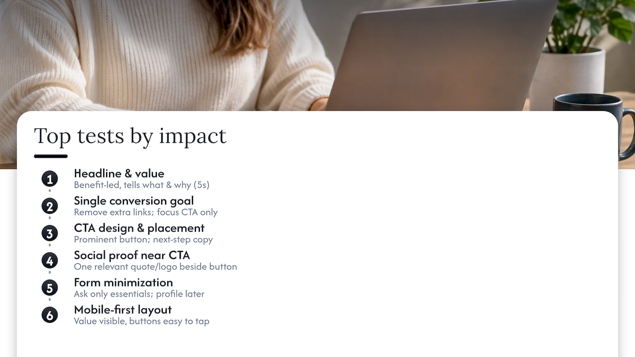
Writing copy and CTAs that actually convert
Copy is the highest-leverage lever on most landing pages because it's cheap to test and directly shapes how a visitor interprets everything else on the page. A weak headline undersells a strong offer just as easily as strong copy can rescue a mediocre one.
- Name the audience. Start by being specific about who the page is for: "For freelance accountants juggling more than 10 clients" tells the right person to keep reading and the wrong person to leave, which is exactly what you want.
- State the benefit, not the feature. Replace "Cloud-based invoicing software" with "Get paid three days faster without chasing a single client."
- Add one proof point. A number, a guarantee, or a named use case gives the benefit weight. "Trusted by independent bookkeepers across the country" works better than "Trusted by many."
- Write CTA copy as a next step, not a command. "Start my free trial" reads as something the visitor chooses to do; "Submit" reads as paperwork.
- Reduce risk in the microcopy under the button. A line like "No credit card required" or "Cancel anytime" removes the hesitation that stops a finger mid-click.
CTA testing usually pays off fastest on wording, then placement, then color, in that order. A button that says "Get started free" will often beat one that says "Sign up" by a meaningful margin, while changing the button from blue to green rarely moves the needle much on its own. Test one variable at a time so you know which change actually caused the shift, and give each test enough traffic to reach a real answer before calling a winner.
Forms and data collection: cutting friction without cutting corners
Every field you remove from a form tends to raise completion, but for readers building landing pages that collect personal information, there's a second layer to get right: privacy compliance. Getting this wrong doesn't just risk conversions, it risks regulatory exposure.
- Ask only for what you need right now. Name and email is usually enough to start; job title, company size, and phone number can wait for a later step.
- Use progressive profiling. Collect additional details after the first conversion, inside an account setup flow or a follow-up email, rather than front-loading a long form.
- Validate fields inline. Flag a malformed email address the moment it's typed, not after the visitor submits the whole form.
- Make consent explicit and separate. A single checkbox that bundles "I agree to the terms" with "I agree to receive marketing emails" is exactly the kind of choice architecture that data protection regulators scrutinize.
One of the clearest sourced guidelines here:APP 3 of the Australian Privacy Principles requires that organizations collect only personal information that is reasonably necessary, using fair means, and warns against choice architecture that nudges or bundles consent. In practice, that means the extra fields you're tempted to add at sign-up (birthday, company revenue, job function) increase both friction and regulatory risk at the same time, which makes progressive profiling the safer pattern on both counts.
If your landing page feeds an email nurture sequence, APP 7 restricts using that information for direct marketing and requires a simple, prominent opt-out in every marketing message you send. The Spam Act 2003 adds a related obligation: commercial electronic messages need accurate sender identification and a working unsubscribe link, every time. Raw Studio's form conversion work treats these two goals, plain-English consent and short forms, as compatible rather than competing. A clear opt-in checkbox with a one-line explanation of what the visitor is agreeing to tends to convert about as well as a vague one, and it keeps you on the right side of the rules.
Technical fixes that move conversion numbers
Speed and mobile usability aren't secondary polish, they're prerequisites. A beautifully written page that takes six seconds to load on a phone loses visitors before they read the headline.
- Compress and resize images before upload rather than relying on the browser to scale them down, which cuts page weight dramatically on image-heavy hero sections.
- Defer third-party scripts like chat widgets and marketing pixels so they load after the main content, not before it.
- Serve assets through a content delivery network to cut the physical distance data travels to a visitor's device.
- Apply server-side caching and optimized image formats so repeat visits and slow connections both load faster.
- Design tap targets for thumbs, not cursors: buttons need enough size and spacing to hit accurately on a small screen.
- Put the value proposition and CTA above the fold on mobile, since scrolling to find the offer is where a lot of mobile visitors quietly leave.
Mobile devices account for a substantial share of overall web traffic, which makes mobile-first design a baseline requirement rather than a nice-to-have for most landing pages today.
Accessibility fixes overlap heavily with conversion fixes: sufficient color contrast, readable font sizes, and keyboard-navigable forms help visitors with disabilities and just as often help visitors on a cracked screen in bright sunlight. Three metrics are worth tracking specifically: Largest Contentful Paint (LCP), which measures how fast the main content appears; First Input Delay (FID), which measures responsiveness to the first interaction; and Cumulative Layout Shift (CLS), which measures visual stability while the page loads. Google's free PageSpeed Insights and Lighthouse tools report all three in a few seconds.
Designing tests you can actually trust
A test only tells you something useful when it's built to answer a specific question, not just to see what happens.
- Separate your primary KPI from secondary ones. Conversion rate is almost always the primary metric; bounce rate and time on page are useful context but shouldn't decide a winner on their own.
- Write the hypothesis before building the variant. "Changing the CTA from 'Submit' to 'Get my free quote' will increase form completions because it restates the benefit" is testable. "Let's try a different button" is not.
- Estimate sample size and minimum detectable effect before launching, so you know roughly how much traffic and time the test needs before it can tell you anything reliable.
- Choose the right test type for the question. A/B tests answer "does this one change help," multivariate tests answer "which combination of changes helps most," and sequential rollouts let you expand a promising change gradually while watching for regressions.
- Set a decision rule in advance, including how long the test runs and what statistical significance threshold counts as a win, so nobody's tempted to call the test early because the numbers look good on day three.
Platforms like Optimizely are built around exactly this discipline: reusable page definitions, defined audiences, and clear success metrics, because ad-hoc testing without a stated hypothesis tends to produce results nobody can act on with confidence.
Building a 30/60/90 day optimization roadmap
Not every fix deserves the same priority, and a roadmap keeps a team from chasing whichever idea got mentioned most recently in a meeting.
A simple ICE score (Impact, Confidence, Ease, each rated on a scale and multiplied or averaged) or the more granular RICE model (Reach, Impact, Confidence, Effort) gives a team a repeatable way to rank test ideas instead of arguing about gut feelings.
A realistic first quarter might look like this: in the first 30 days, tackle quick technical wins (image compression, mobile CTA visibility, form field reduction) alongside a first headline test, since these need little build time and often show fast results. In days 31 to 60, run copy and CTA variant tests informed by the first round's data, and start a social proof placement test. In days 61 to 90, take on heavier technical work like CDN migration or a full mobile layout rebuild, since these need more engineering time and are worth doing once you know which page structure is winning.
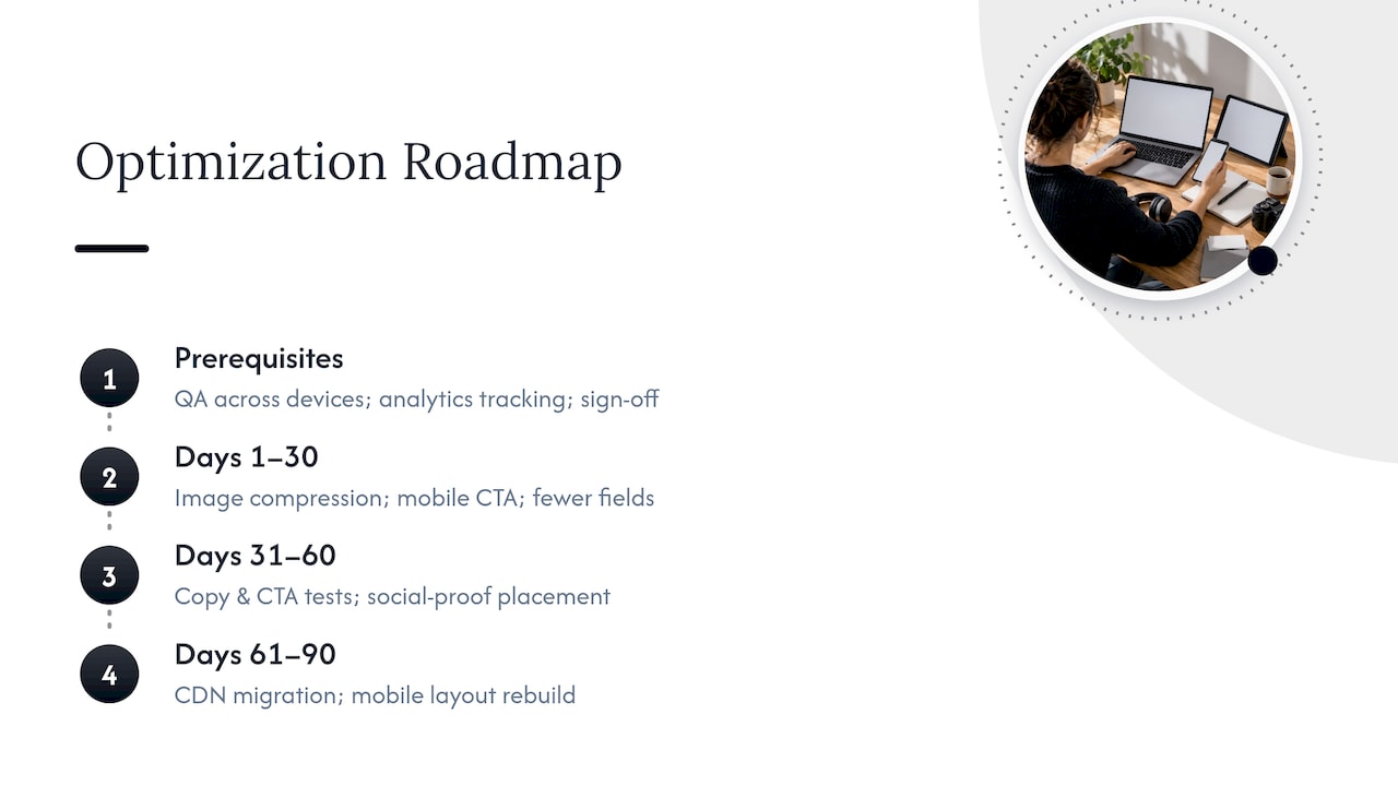
Before any test launches, a short coordination checklist saves rework: confirm analytics tracking fires correctly on the new variant, run QA across major browsers and devices, and get sign-off from whoever owns the page's business goal. Skipping the QA step is a common way teams end up with two weeks of broken data and no usable result.
Raw Studio's practitioner notes from real engagements
Raw Studio builds its landing page work around two repeatable frameworks rather than one-off redesigns. The Design Sprint compresses weeks of debate into a short, structured process where a team defines the problem, sketches solutions, and tests a prototype with real users before committing engineering time. RapidMVP takes the winning direction from a sprint and turns it into a testable, minimal version fast, so a hypothesis gets validated with real traffic instead of internal opinion.
That order matters. Testing a rough prototype with users before a full build catches the expensive mistakes early, when they cost an afternoon to fix rather than a sprint of development.
Raw Studio describes engagements that combine research, design, and testing as producing a 100% increase in conversion rate for some clients, a figure the agency attributes to the combination of structural fixes, message testing, and technical performance work rather than any single change.
- Fix the structural problems before the copy. Intent mismatch and competing goals usually cost more than a weak headline.
- Validate with a small, fast prototype before investing in a full build.
- Treat every launch as a hypothesis, not a finished decision, and keep testing after launch.
Pro Tip:If your team keeps redesigning the same page without a clear before-and-after metric, the problem usually isn't the design, it's the missing hypothesis.
Tailoring pages to different audience segments
A single landing page rarely serves every visitor equally well, because a first-time visitor from a search ad and a returning visitor from an email campaign are looking for different reassurance at different stages of deciding.
Segmentation by traffic source is the simplest starting point: a paid search visitor searching a specific product name needs a page that matches that exact query, while a visitor clicking from a retargeting ad already knows the brand and needs a nudge (a discount, a deadline, a specific objection answered) rather than a full introduction.
Segmentation by industry or role works well for B2B pages: the same product page can swap a headline, case study, or logo strip depending on whether the visitor works in finance or in education, using URL parameters or simple audience rules in the ad platform to route them to the right variant.
Behavioral personalization goes a step further, showing returning visitors a different message than first-time ones, or adjusting content based on what a visitor has already viewed elsewhere on the site. The tactic works, but it needs the same data-minimization discipline covered earlier: personalization built on inferred behavior still needs to respect what the visitor actually consented to share.
Reading behavior data beyond the basic conversion number
Conversion rate and bounce rate tell you whether something's wrong, but rarely tell you what. That's where behavioral analytics tools earn their place in the toolkit.
Heatmaps show where visitors click, move their cursor, and how far they scroll, which quickly reveals whether anyone's actually seeing the CTA or if it's buried below where attention drops off. A heatmap showing heavy clicking on a non-clickable image, for instance, is a clear sign that visitors expect it to do something.
Session recordings let you watch anonymized playback of real visits, which is often the fastest way to spot a confusing form field or a button that looks disabled when it isn't. Watching even a handful of recordings tends to surface the same friction point repeatedly.
Scroll-depth tracking tells you whether content further down the page is actually being read, which matters when deciding whether to move a social proof section higher or trust that it's already being seen.
None of these tools replace A/B testing, they inform what to test next. A heatmap that shows nobody scrolling past the hero section is a strong argument for moving your strongest proof point higher, which then becomes the hypothesis for your next experiment.
Connecting landing pages to your funnel and CRM
A landing page's job doesn't end at the form submission. What happens in the next five minutes often determines whether that lead ever becomes a customer.
Integrating the page directly with a CRM means a new lead's information, and ideally the specific campaign and landing page variant that generated it, lands in the sales pipeline automatically rather than through a manual export. That context helps sales teams follow up with the right message instead of a generic "thanks for your interest" email.
Marketing automation tools can trigger an immediate, relevant follow-up sequence based on which landing page or offer the visitor converted on, which keeps the momentum from the page itself rather than losing it in a delay. This is also where the direct marketing rules mentioned earlier apply in practice: every automated message in that sequence still needs a working unsubscribe link and clear sender information.
Attribution matters here too. When a landing page connects properly to analytics and CRM data, you can trace a conversion back to the specific ad, keyword, or campaign that drove it, which is the only way to know whether a landing page test that raised form completions also raised the quality of leads reaching sales. A page that gets more signups but sends worse leads downstream isn't actually a win.
What landing page optimization looks like across industries
The specific tactics that work best shift by industry, even though the underlying principles hold steady.
E-commerce landing pages tend to win most from urgency and proof close to the buy button: stock counts, delivery time estimates, and review scores placed right next to the add-to-cart action. Raw Studio's work with Everdure, a barbecue and outdoor cooking brand, involved rebuilding the e-commerce experience around clearer product storytelling and a smoother path to purchase.
SaaS landing pages usually convert better when the page addresses a specific objection (integration complexity, security, migration effort) rather than restating the feature list, since B2B buyers researching software are often comparing several tools at once and looking for the one answer that resolves their hesitation.
Lead generation pages for services like finance or education tend to hinge on trust signals: credentials, guarantees, and a form that asks for the minimum needed to start a conversation rather than a full intake questionnaire upfront.
Across all three, the common thread isn't a specific tactic, it's the same testing discipline: identify the biggest source of hesitation for that specific audience, build a hypothesis around removing it, and test the change rather than assuming it'll work.
What most teams get wrong about optimization
The biggest mistake I see isn't a bad headline or a clunky form. It's treating landing page optimization as a design task instead of a research process. Teams redesign a page, ship it, and move on, without ever defining what "better" meant in numbers before they started.
Mobile and privacy-conscious design aren't optional extras anymore, they're the baseline a page has to clear before any other tactic matters. A gorgeous desktop layout that loads slowly on a phone, or a form that quietly bundles marketing consent into a required checkbox, will cost you conversions and, in the second case, potentially compliance headaches, regardless of how clever the copy is.
Personalization is worth pursuing, but only as far as your data collection can honestly support it. The instinct to know more about a visitor before asking permission is understandable and also exactly the pattern that data minimization principles push against. The teams that win long-term are the ones running small, honest tests consistently, not the ones chasing the newest personalization trick.
How Raw Studio can help you optimize with less guesswork
If you've read this far and you're thinking about which fix to tackle first, that's usually the moment an outside set of eyes pays for itself. Raw Studio's Full UX/CRO Audit starts at $2,500 one-off and gives you a structured review of exactly where your landing page is losing visitors, backed by the same research-first process covered throughout this guide.
For teams that want a deeper rebuild rather than a single audit, Raw Studio's Design Sprint compresses weeks of internal debate into a short, structured process, and the Conversion Rate Optimisation service applies ongoing testing discipline after the initial fixes land. Teams that want continuous support without hiring in-house can look at the Design Team (Platinum) plan, priced at $8,400 per month, which covers ongoing design and optimization work rather than a single project.
Whichever path fits, the goal is the same one this whole guide has been pointing toward: fewer guesses, more evidence, and a page that earns its conversion rate rather than hoping for one. Check current pricing and service details on the Raw Studio pricing page or request the Free UX Audit for a lower-commitment first look.
Discuss Your Landing Page Goals
Email Raw Studio to discuss research-driven design, conversion rate optimization, or a digital solution tailored to your business. [email protected].