
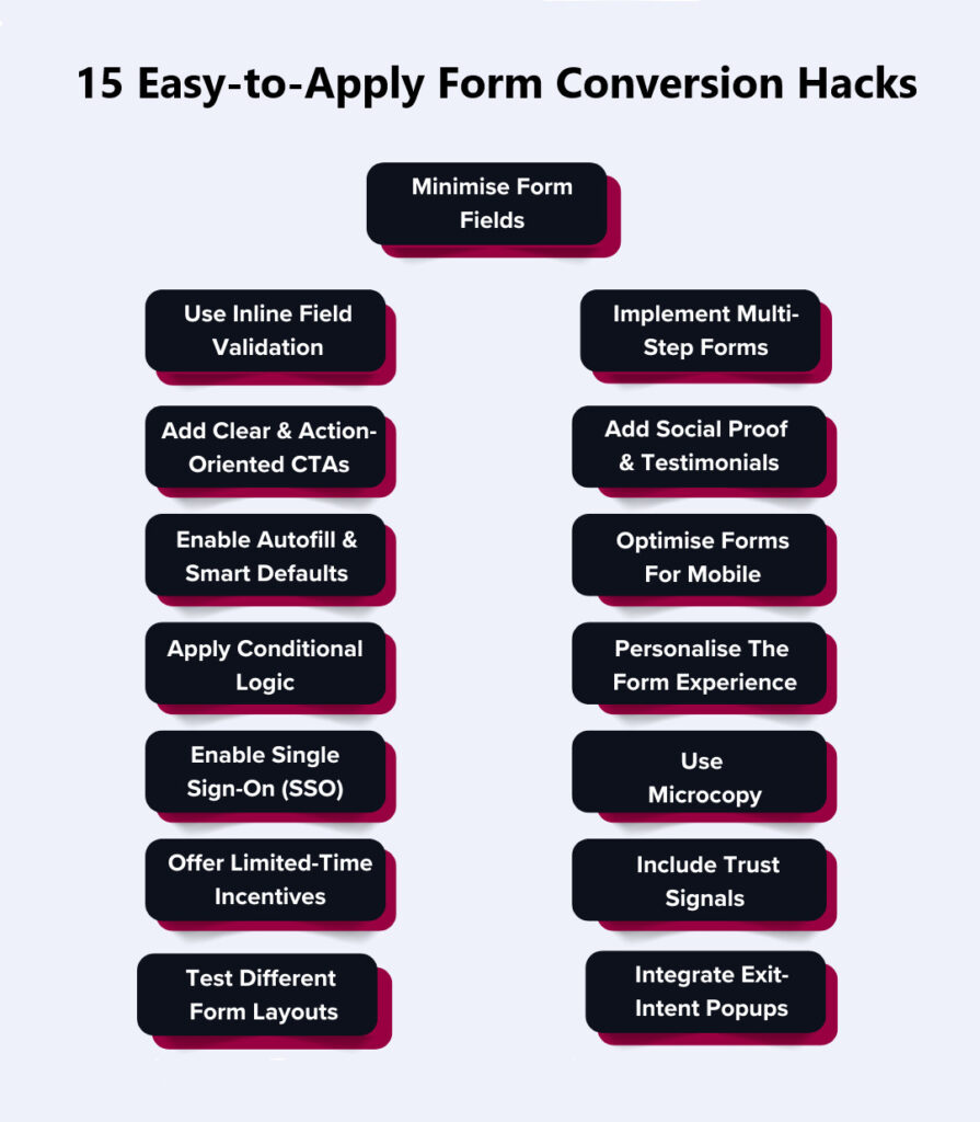
15 Form Conversion Hacks That Consistently Boost Signup Rates
Getting people to fill out your form is harder than getting them to stay on your page. That is why form conversion is the real battleground. And no, you don’t win it by adding one more field or trimming a sentence. The whole experience has to be so smooth that people don’t even pause to think about leaving.
That is what this is about. We will give you 15 form conversion hacks that consistently push conversions higher. But this isn’t just quick fixes – you will see how to reframe the form into something people would fill out because they want to.
Table of Contents
15 Easy-to-Apply Form Conversion Hacks That Reduce Drop-Offs
People don’t rage-quit your form. They leave because the form gave them an excuse to. Here are 15 form conversion hacks you can apply right away to make people finish what they start.
1. Minimise Form Fields To Essential Information Only
Every single field you add is a negotiation with the user. They are asking themselves: “Do I really want to give this much information now?” If the answer leans even slightly toward “nah,” they will bounce.
Reducing the number of fields in a form from 4 to 3 can increase conversion rates by 50%. Cut fields to stop bleeding these qualified leads. What is “essential” depends on your business, but here’s the hard rule – if you can collect it after signup, don’t put it in the form.
How to execute this properly to create high-converting forms:
- Remove anything that isn’t required for account creation or first contact. (Hint: most of you can remove phone number and company details.)
- If you need more info later, use progressive profiling – ask only once trust has been built.
- Run a field audit every 3 months. Teams tend to add extra fields back in over time.
- Use analytics to track lead quality and drop-offs by field to see exactly where people give up.
2. Use Inline Field Validation For Instant Feedback
People hate filling out a web form only to get a red error message at the end. That moment kills momentum. Inline validation fixes this. It tells users instantly if something looks wrong, so they fix it on the spot. This reduces frustration and prevents last-minute exits.
How to make validation work like a charm:
- Validate as they type for emails, passwords, phone numbers. Don’t wait for the submit click.
- Use visual reinforcement – green checkmarks for correct input, red text for errors.
- Keep error messages human – “Hmm, that email doesn’t look right” beats “Invalid input.”
- Never clear the field when wrong. That extra retyping friction pushes people out.
3. Implement Multi-Step Forms With Progress Indicators
Long WordPress contact forms scare people off at first glance. Breaking them down into steps feels lighter – even if the total input fields are the same. The secret is psychological momentum. Once potential customers complete step one, they are far more set on completing it.
How to structure multi-step forms:
- Break your form into logical steps: personal info → account setup → preferences.
- Keep the first step simple – just one or two easy fields to get them going.
- Add a clear progress bar or “Step 1 of 3” style indicator.
- Cap it at 3–4 steps max. Anything longer is bureaucracy.
4. Add Clear & Action-Oriented CTAs
“Submit” is lazy copy. Your call to action (CTA) should show what users gain by clicking. Rather than asking for action, promise a result. “Get My Free Demo” or “Join The Beta” feel like rewards, and the difference between them and the “Submit” button is night and day.
How to make CTAs work better:
- Rewrite with outcome-driven phrasing – “Get My Free Report,” “Join The Waitlist,” “Start My Trial.”
- Design with high-contrast colours. The CTA should stand out, not blend in.
- Size matters – make it thumb-friendly on mobile devices.
- A good form builder lets you run A/B tests. Run them regularly. Tiny word shifts (“Claim” vs. “Get”) can move form conversion rates by double digits.
5. Incorporate Social Proof & Testimonials Near The Form
Users hesitate before handing over their details. Social proof eases doubt by showing others have taken the same step and had a good outcome. The trick is placement – if it is tucked away somewhere else on the page, it won’t matter. Put it right next to the form so hesitation gets countered immediately.
How to perfect placement and impact:
- Place one short testimonial (with name and photo) right next to or under the form.
- Use client logos if you serve businesses – recognition gives you instant trust points.
- Highlight numbers: “Join 12,000+ marketers already using this.”
- Avoid long case studies here. People just need a quick push, not a novel.
SocialPlug does this beautifully. Before you even type anything, you see that others have already done this and loved the results. There is a “100,000+ Customers Trust Us” badge that immediately tells you you are in good company. Then you see “1,320 users gave a 5-star review,” which adds that extra punch of credibility.
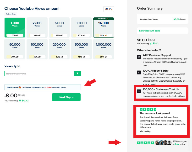
And just below that, actual reviews from verified customers make the experience more personal and authentic. You can literally read what real people said about the service right before deciding. And to top it all off, it also shows how many people have ordered the same service in the last 24 hours. Now that is worth copying.
The beauty of how SocialPlug does it is that none of it interrupts the flow. Every element reduces hesitation in real time. It is social validation happening at the exact moment users decide whether to buy.
6. Enable Autofill & Smart Defaults
Typing is the enemy of conversions, especially on mobile. If browsers already know the information, let them autofill it. Every second saved keeps people moving forward. It sounds small, but small frictions are exactly what cause drop-offs. In fact, a study found that autofill can increase form conversion rate by up to 10%.
How to apply autofill the right way:
- Enable browser autofill for fields like name, email, and address – test across Chrome, Safari, and mobile.
- Pre-select obvious options (e.g., auto-detect country via IP, default today’s date for bookings).
- Replace open text fields with dropdowns or toggles where possible.
- Test defaults carefully. Wrong guesses annoy users more than blank fields.
7. Optimise Forms For Mobile & Touch Devices
Most people aren’t filling out your form from a 27-inch monitor. They are on a phone, scrolling with one hand, and probably ready to leave if it feels awkward. This is where most online forms fail – they are “responsive” but not usable.
You have to balance the design from the word go and make every tap easy by removing the little annoyances that make someone think, “Forget it.”
How to get form optimisation right:
- Make fields and buttons big enough for thumbs (minimum 44px). No precision taps required.
- Trigger the right keyboard – number pad for phone, @ keyboard for email. Most teams forget this.
- Cut the form shorter on mobile than on desktop. Fewer fields = fewer chances to drop.
- Test on real devices. Don’t just shrink your desktop browser – it is not the same experience.
8. Apply Conditional Logic To Show Relevant Fields Only
Nobody wants to answer questions that don’t apply to them. Yet most forms force everyone through the same experience. That is lazy form design, and you can’t afford to make such UX mistakes because it kills conversions.
Conditional logic hides irrelevant stuff and shows only what matters. For instance, if someone chooses “Personal Account,” there is no reason to show “Company Size.”
Follow these tips:
- Build branching rules – show company fields only if “Business Account” is selected.
- Keep the reveal instant, no page reloads. Smoothness matters.
- Don’t overcomplicate. Too many conditions = confusion. Keep it tight.
- Monitor completion rates per segment. If a segment still drops off, simplify further.
The appointment form on CodaPet’s city selection page is such a clean example of how to use conditional logic without overcomplicating the user’s path. When you land on their page, it only asks what is necessary.
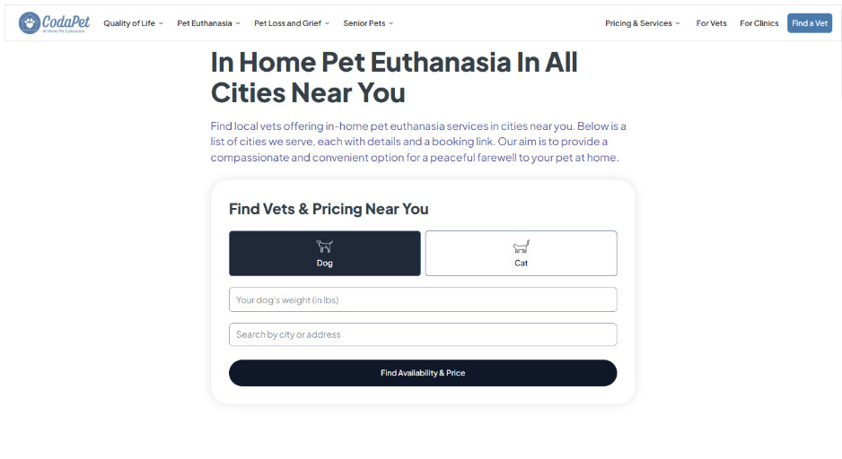
You start by choosing whether it is for a dog or a cat, and that one choice instantly changes what you see next. The questions that follow adapt based on what you picked, so everything feels relevant instead of random.
As you move further into booking an appointment, the logic keeps getting smarter – it asks about your city, then your preferred vet, and then shows the right time slots based on availability.
What is really nice is how natural the whole flow is. Every step just makes sense. That is what true form optimisation looks like – clean, responsive, and totally user-focused.
9. Personalise The Form Experience
Personalisation isn’t just for emails. A lead form can feel completely different if it matches who is filling it out. Someone coming from an ad about enterprise plans shouldn’t see the same generic copy as a freelancer. And you don’t need creepy data to do this – just connect the dots between user intent and where they came from to identify qualified leads.
Here’s how to personalise the entire form submission experience:
- Use URL parameters to pre-fill info (e.g., email from a campaign click).
- Mirror ad or landing page copy in the form header so it comes across smooth.
- Match the form’s headline and CTA to the traffic source (e.g., “Start Your Enterprise Trial” vs. “Get Started Free”).
- Segment by audience – don’t lump everyone into one generic signup flow.
10. Enable Single Sign-On (SSO) Options
Nobody wants another password. Forcing people to create and remember one is one of the biggest conversion killers. SSO removes that friction by letting people sign up with accounts they already trust. For B2B, LinkedIn is gold; for B2C, Google and Apple dominate.
Let’s look at the smart ways to roll this out:
- Put SSO buttons above the form fields, not crammed at the bottom.
- Offer 2–3 options max. Too many choices create decision fatigue.
- Make privacy clear: “We’ll never post without permission.”
- Track usage – if 70%+ of users pick SSO, make it the default flow.
Do This: Many form builders can’t handle SSO smoothly or connect with enterprise login systems. In that case, hire an experienced developer who has done this before rather than fight the limitations of your tool. They can set up secure authentication flows that actually work across devices and don’t break when your tech stack updates.
11. Use Microcopy To Guide Users Through Each Field
Most drop-offs happen because people hesitate – “What exactly do they want here?” Microcopy solves that. It is the tiny text under fields that tells users how to fill them out. This reassures them about sensitive data and keeps them from tripping up.
How to get microcopy down right:
- Explain the “why” – “We’ll use your phone only for delivery updates.”
- Give examples where errors are common: “Format: +61 400 000 000.”
- Add privacy reassurance – “We’ll never share your data.”
- Keep it tight – 5–10 words max. Anything longer is ignored.
You will see this done really well on Uproas’s Facebook Agency Ad Account page. The form teaches you what to do at every step. Each field has a clear, short line of microcopy that eliminates confusion.
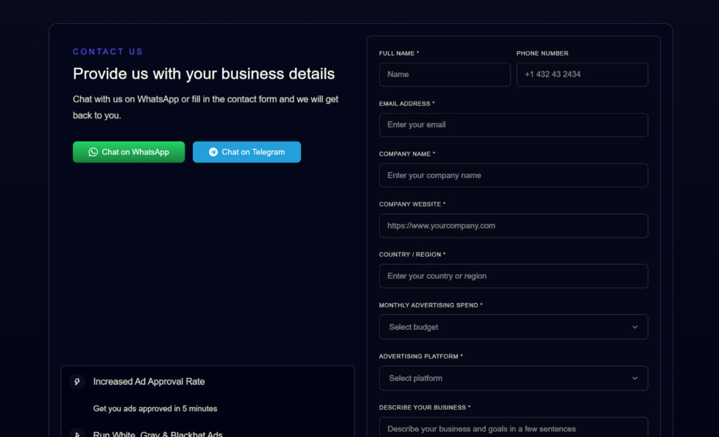
For instance, under the “Company Name” and “Website URL” fields, they add context so you know exactly what they are asking for – it is not just “fill this out,” it is “help us understand your business better.” That instantly makes the form purposeful.
Their tone feels like someone is right there, casually helping you fill it out. The small cues in fields like “Monthly Advertising Budget” and “Advertising Platform” make it obvious what kind of details they need and why – which means no guessing or re-entering.
Everything about that form quietly builds trust. You never wonder what they will do with your data or whether you are filling something wrong.
12. Create Urgency With Limited-Time Incentives
Sometimes the problem isn’t the form itself – it is that the user doesn’t feel a reason to act now. A real, time-sensitive incentive pushes people off the fence. But it has to be believable. Fake countdowns and recycled “limited-time” offers destroy trust. Done right, urgency gives people a reason to finish the form immediately instead of the “I’ll do this later” thoughts.
Here are ways to use urgency without looking cheap:
- Add a live countdown timer near the form (“Offer ends in 5h 23m”).
- Show scarcity with real numbers – “Only 18 seats left.”
- Tie urgency to value, not fear (“Register today for bonus access,” not “Don’t miss out forever”).
- Rotate incentives so repeat visitors don’t see the same “ending soon” trick.
13. Include Trust Signals Like SSL Badges & Privacy Notices
If people don’t trust your form, they won’t touch it. Users are already worried about scams and getting their inboxes flooded. If you don’t show that their data is safe, you are giving them a reason to bounce.
Do this right away:
- Add a visible SSL or padlock symbol near the email/phone field – where hesitation is highest.
- Place a short privacy notice like “We’ll never spam you. Ever.”
- Link to a privacy policy that is short and human-readable.
- For checkout forms, show logos people already know (Stripe, PayPal, Visa).
The checkout for IceCartel’s moissanite earrings is one of those pages that quietly teaches you how trust is built, one field at a time. The first thing you notice is the secure Shopify checkout URL – that “https://” and padlock symbol give off a ‘you’re good here’ feel.
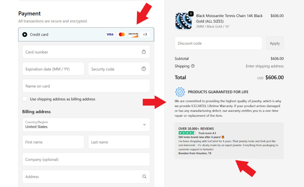
Each step feels legitimate because of where they have placed reassurance. Payment badges are clearly displayed at the bottom so you subconsciously register that your data is going through verified, global gateways.
Even better, they highlight real-time shipping details and taxes before payment. That transparency is a subtle but powerful trust cue. You know exactly what you are paying and how it is processed.
And then there is the “Products Guaranteed for Life” message – it straight-up tells you that if your jewelry arrives damaged or has a manufacturing defect, they will repair or replace it once. That single promise does what pages of copy can’t – it makes people feel sure.
Everything about IceCartel’s checkout quietly gives off credibility and security in the best way – a reminder that real trust is designed into every step.
14. Test Different Contact Form Layouts & Visual Hierarchies
The way your form looks is everything. A messy layout makes people think it will take forever. And that means dropping off. One with a clean, well-structured layout feels like a quick task. The only way to know what actually works is testing. Don’t assume – test.
Try these tweaks:
- Compare single-column forms vs. two-column forms vs. multi-column forms – see which one gets more completions.
- Test where your CTA button goes – bottom only vs. sticky CTA vs. repeated buttons.
- Increase spacing between fields so the form doesn’t look like a wall of text.
- Use heatmaps or session recordings to watch exactly where users stall.
- Connect your marketing tools to track conversions from each layout variation.
15. Integrate Exit-Intent Popups To Recover Abandoning Users
If someone moves their cursor to close the tab, you have lost them – unless you intercept. Exit-intent popups are your last chance to convert leads or at least capture a lighter commitment. But they only work if the offer is worth stopping for. Don’t just flash a “Wait!” pop-up – give them something that makes them reconsider walking away.
How to stop form abandonment:
- Test timing. Trigger too early and it feels spammy, too late and you miss the exit.
- Keep the copy short – “Almost done! Finish in 10 seconds.”
- Offer a small incentive – a discount, bonus content, or extended trial.
- Add a quick alternative – “Not ready to sign up? Get the free checklist.”
Get a UX & CRO Expert’s Eyes on Your Website. Book a free 30-minute UX Teardown and get actionable insights on what’s costing you conversions — no fluff, just fixes you can implement right away.
Book a Free UX Audit

Related posts

The State of UX 2026 – How Deep Thinking Is Becoming the New Standard
UX 2026 is defined less by shiny interfaces and more by how clearly products solve real problems. After years of […]

Top 10 Creative Design Agencies in Australia in 2026
By 2026, creative design agencies in Australia have moved far beyond just making things look good. The top agencies now […]

Empty States, Error States & Onboarding: The Hidden UX Moments Users Notice
When discussing user experience design, the spotlight often falls on primary workflows. Design teams tirelessly debate color schemes, button placements, […]
Creative product design that gets results
Take your company to the next level with world class user experience and interface design.
get a free strategy session
