Effective UI/UX Design: How Psychological Principles Enhance User Experience
Imagine landing on a website that feels effortless to use, where every click feels natural and every visual element seems to anticipate your needs. This is the magic of purposeful design—design crafted with a deep understanding of how people think, feel, and behave. In UI/UX design, creating an intuitive and engaging user experience means going beyond aesthetics; it means tapping into the psychology that drives human behavior.
Understanding psychological principles can transform a good design into a truly effective one. By incorporating insights from cognitive science, emotional triggers, and behavioral economics, designers can create interfaces that resonate with users on a deeper level. This article explores how leveraging psychology can lead to meaningful, user-centric design.
Table of Contents
The Role of Human Psychology in UI/UX Design
Psychology and user experience go hand in hand. A well-designed interface understands and anticipates user behavior, allowing users to navigate a product effortlessly. Here’s how human psychology plays a crucial role in shaping effective UI/UX design:
- Cognitive Biases
Humans are naturally biased in their thinking. Cognitive biases, such as the availability heuristic or confirmation bias, influence user behavior in subtle but powerful ways. For instance, users tend to favor familiar elements over unfamiliar ones. By understanding these biases, designers can create experiences that feel comfortable and predictable.
- Emotional Design
Emotion is at the core of decision-making. Interfaces that evoke the right emotions at the right stages of user interaction can significantly enhance engagement. Whether it’s delight, trust, or a sense of accomplishment, creating emotional touchpoints leads to a more memorable user experience.
- Behavioral Economics
Nudges, heuristics, and other principles of behavioral economics can be used to subtly influence user actions. A classic example is the use of “default options” to guide users toward a desired action, such as opting into newsletters or selecting eco-friendly choices.
Key Psychological Principles in UI/UX
Several psychological principles can be directly applied to UI/UX design to improve usability and user satisfaction:

Hick’s Law
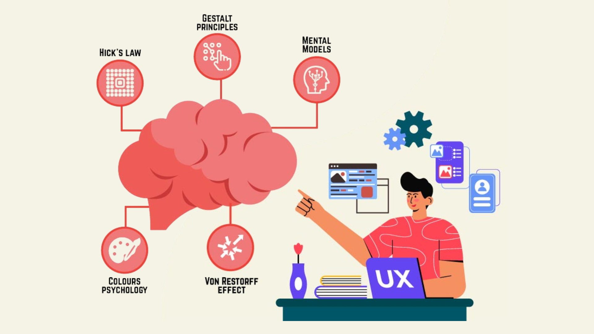
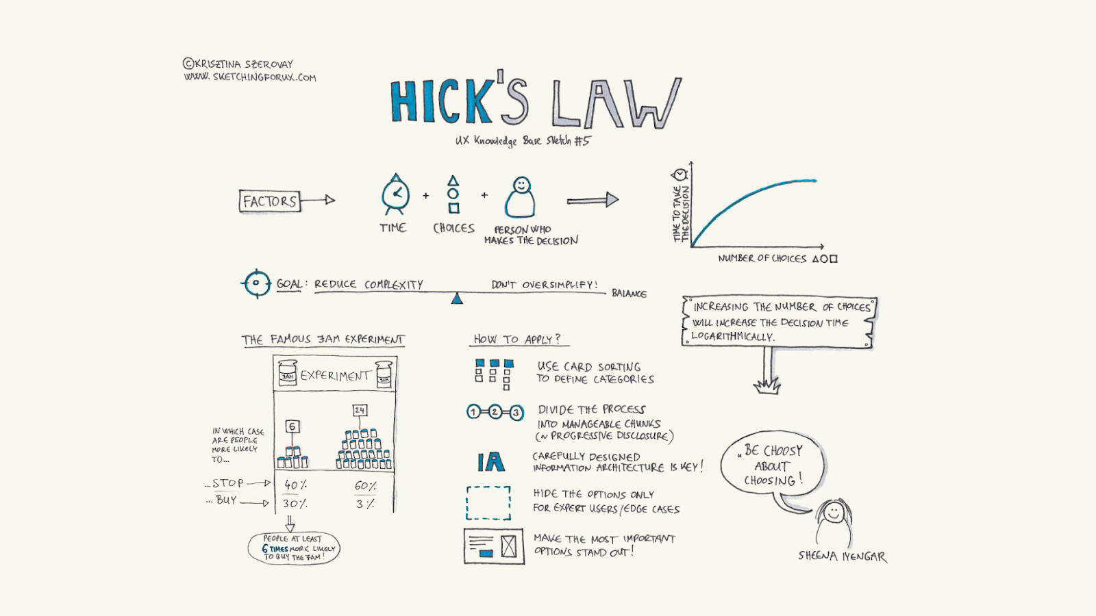
According to Hick’s Law, the time it takes for a person to make a decision increases with the number of choices they have. In UI/UX, simplifying decision-making by reducing choices is key. For example, Netflix uses Hick’s Law by providing users with a limited number of curated categories on their homepage, such as ‘Top Picks for You’ and ‘Trending Now.’ This helps users quickly make a decision instead of feeling overwhelmed by too many options. For instance, a well-designed e-commerce checkout process offers minimal, clear options to prevent decision fatigue, helping users complete their purchase without hesitation.
Fitts’s Law
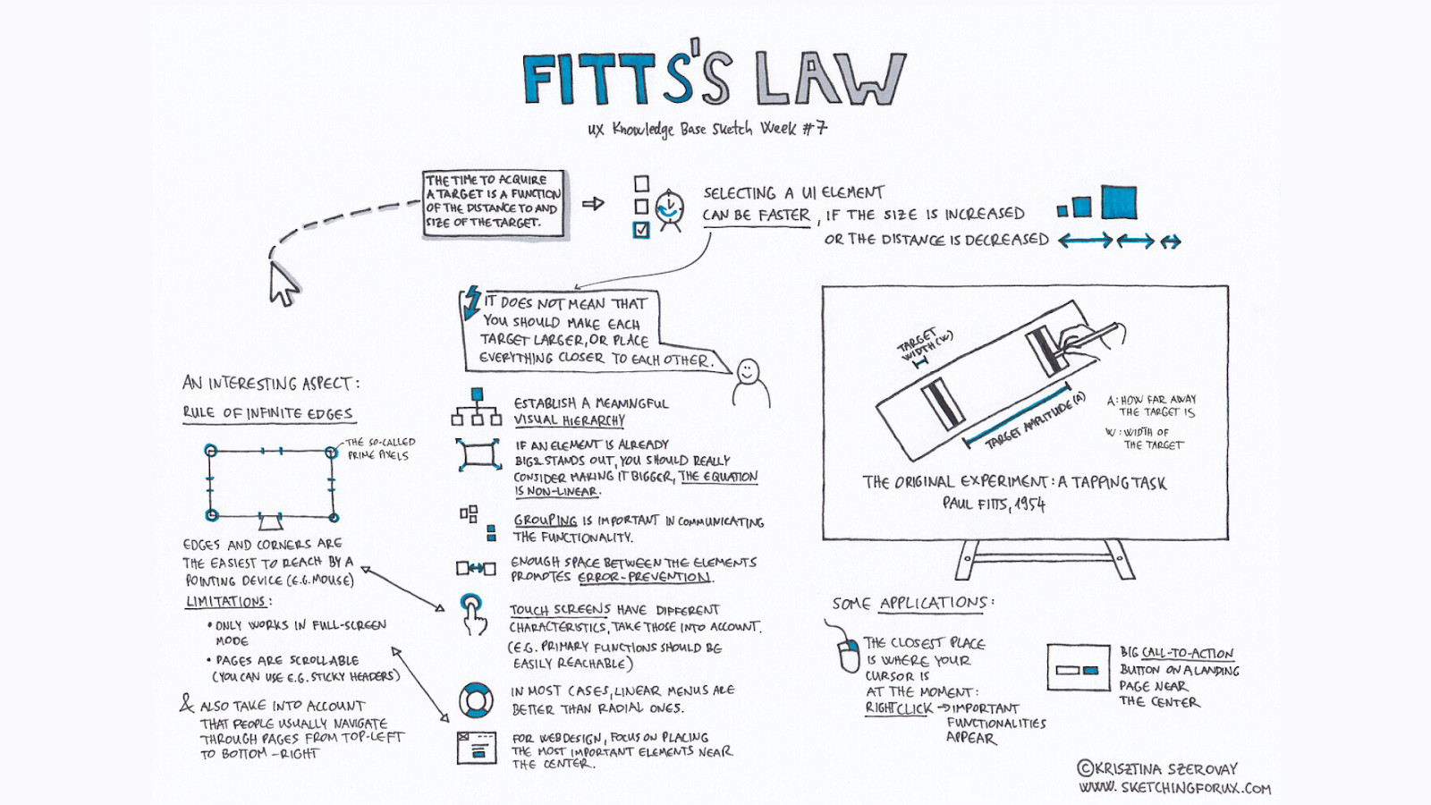
Fitts’s Law states that the time required to interact with a target is influenced by its size and distance. Larger and closer elements are easier to interact with. Applying this principle, designers should make critical buttons (such as “Buy Now” or “Sign Up”) large and easily accessible to ensure a smooth user experience. For example, Amazon’s product pages use large, prominently placed “Add to Cart” buttons, making it quick and easy for users to make a purchase without struggling to find the action they need to take.
Gestalt Principles
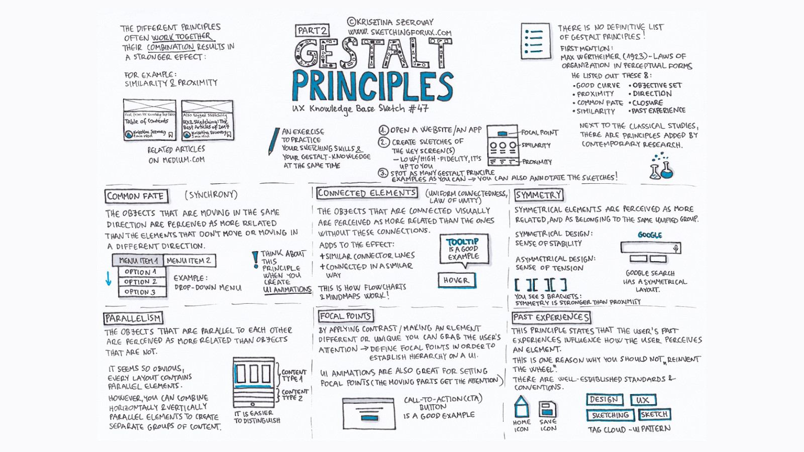
The Gestalt principles—such as grouping, similarity, and proximity—help users intuitively understand the structure of an interface. By leveraging these principles, designers can create layouts that feel cohesive, enabling users to quickly find what they’re looking for. For example, on e-commerce websites like IKEA, similar product types are grouped together visually, with images and descriptions aligned in a way that conveys their relationship. This allows users to easily browse and compare products within the same category without confusion.

Serial Position Effect
The serial position effect suggests that users are more likely to remember the first and last items in a sequence (primacy and recency). Designers can use this to their advantage by placing the most important content or actions at the beginning or end of a list to increase their visibility and recall. For example, on a mobile banking app, placing critical actions like “Transfer Money” and “Pay Bills” at the top or bottom of the main menu ensures that these frequently used functions are easily remembered and accessed by users.
Designing for Emotion and Trust
Building trust and evoking the right emotions are key aspects of a successful user experience. Here are some ways to achieve that:
a. Color Psychology
Colors evoke specific emotions and associations. Blue, for example, often conveys trust and reliability, making it a popular choice for financial websites. Understanding how colors influence user perception can help in creating an interface that feels welcoming and trustworthy.
b. Visual Hierarchy
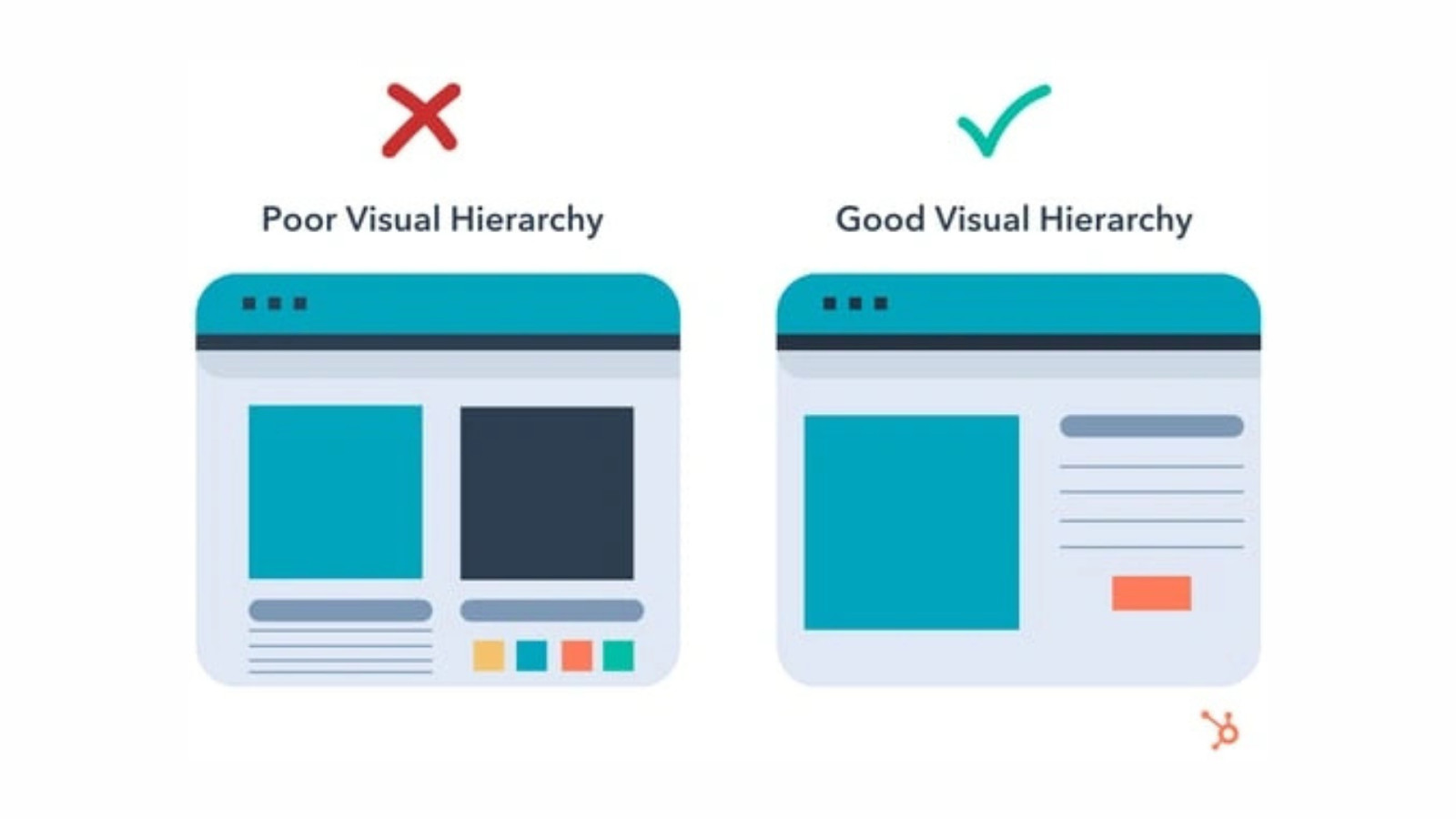
Visual hierarchy guides users’ attention based on the relative importance of elements. By structuring content from most to least important, designers can ensure users find what they need easily, building a sense of trust in the product.
c. Social Proof
Social proof—such as user reviews, testimonials, and trust badges—is an essential component in establishing credibility. By showing that others have benefited from a product or service, designers can reduce user hesitation and build confidence in the product.
User Motivation and Engagement Techniques
Motivating users and keeping them engaged is often a challenge, but with the right techniques, it becomes much easier:
Intrinsic vs Extrinsic Motivation
Intrinsic motivation comes from within—such as the satisfaction of completing a task—while extrinsic motivation is driven by external rewards like badges or discounts. By leveraging both, designers can create experiences that are both rewarding and fulfilling.
Gamification Elements
Adding gamification elements like rewards, progress bars, or challenges can keep users motivated. For instance, fitness apps often use streaks and badges to encourage regular exercise, making the experience feel like a rewarding game.
Feedback and Confirmation
Real-time feedback—such as a “Success!” message after submitting a form—reassures users that their actions were successful. This kind of positive reinforcement is crucial for maintaining engagement and preventing user frustration.
Reducing Cognitive Load
Reducing cognitive load helps users feel less overwhelmed and more comfortable using a product. This concept involves minimizing the mental effort users need to expend while navigating an interface, which ultimately makes the experience more enjoyable and efficient.

1. Minimizing Complexity
Interfaces should be as simple as possible, without unnecessary features that may confuse users. Simplified, minimalist designs reduce mental effort, allowing users to complete tasks effortlessly. For example, Google’s homepage is a great example of minimalism—featuring only a search bar and a couple of buttons, it makes the user’s task (searching for information) straightforward. Another example is Apple’s website, where product pages are clean and focused, allowing users to easily find the information they need without distractions.
2. Chunking Information
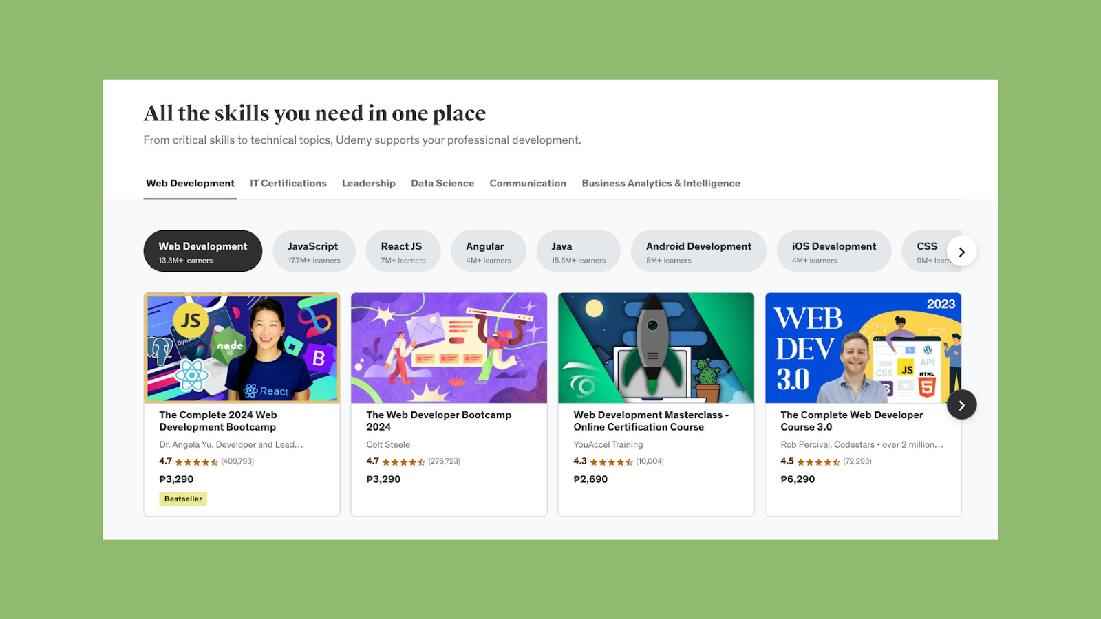
Chunking involves breaking down information into smaller, manageable sections. Instead of presenting an overwhelming block of text, breaking content into digestible chunks improves comprehension and retention. For instance, online courses on platforms like Coursera or Udemy are broken down into multiple short videos, which makes learning less daunting. Another example is e-commerce product descriptions—Amazon often uses bullet points to break down product features, making it easier for users to understand the key points quickly. Similarly, on Wikipedia, content is organized into different sections with headings and subheadings, allowing users to easily jump to the relevant information.
3. Clear Navigation Paths
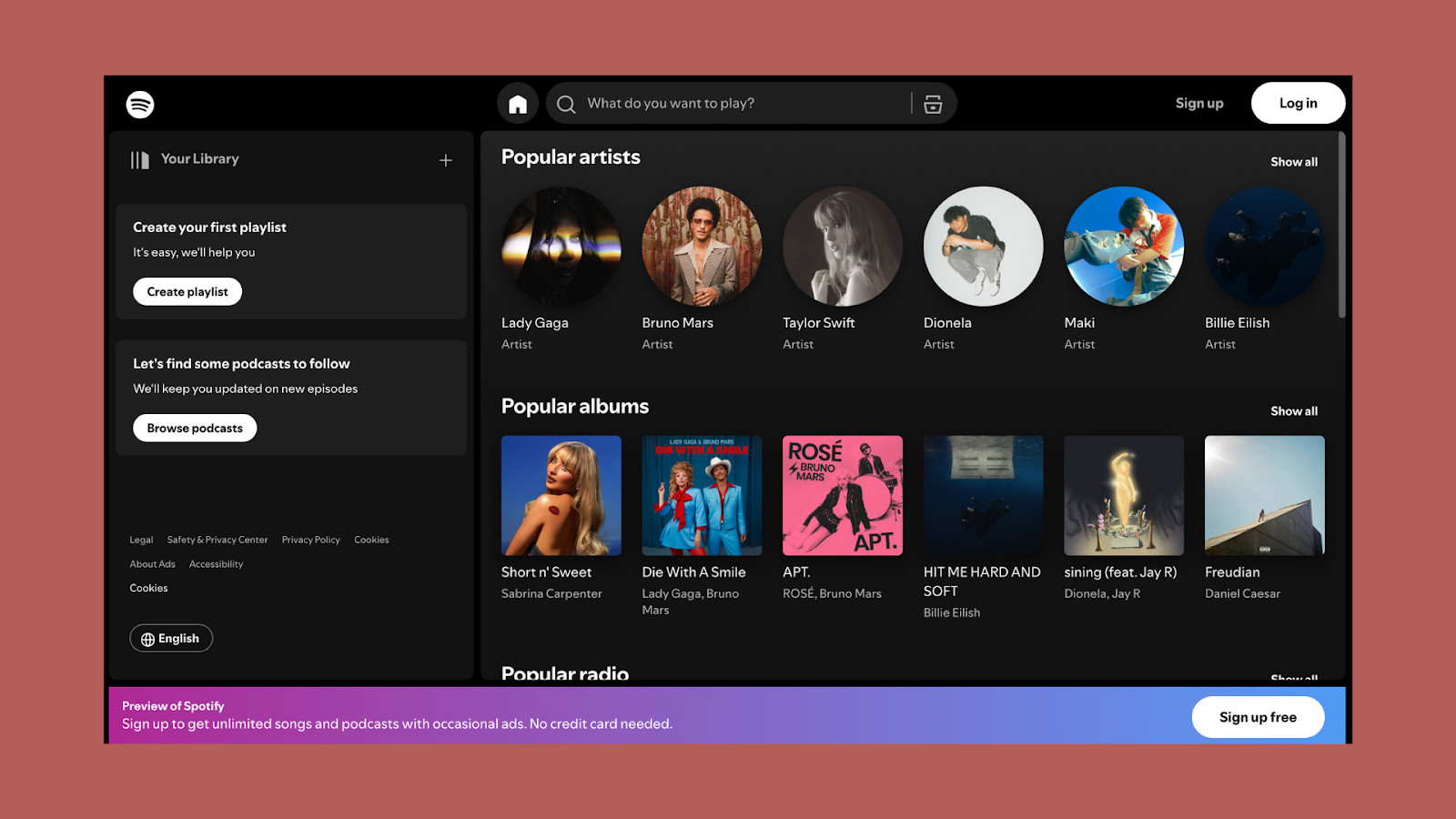
A straightforward user journey ensures users can easily find what they’re looking for. Clear navigation prevents confusion and provides users with a sense of control over their experience. For instance, Spotify’s navigation structure includes clearly labeled sections like “Home,” “Search,” and “Your Library,” allowing users to know exactly where to go for their desired actions. Another example is Airbnb, which uses a step-by-step booking process to guide users seamlessly from browsing to booking, reducing the likelihood of users feeling lost or overwhelmed during the process. Additionally, websites like LinkedIn provide a clear top navigation bar, categorizing different features (such as Jobs, Messaging, and Notifications) to help users quickly locate the desired function.
4. Progressive Disclosure
Progressive disclosure is a technique that helps to reduce cognitive load by initially presenting only the most essential information, while hiding more complex details until they are needed. This keeps the interface clean and prevents users from feeling overwhelmed by too much information at once. For example, in mobile banking apps like Revolut, users initially see an overview of their balance and recent transactions, with more detailed financial data available upon further interaction. Another example is Microsoft Word, where advanced formatting options are hidden under expandable menus, allowing users to focus on the most commonly used features without distraction.
5. Visual Hierarchy
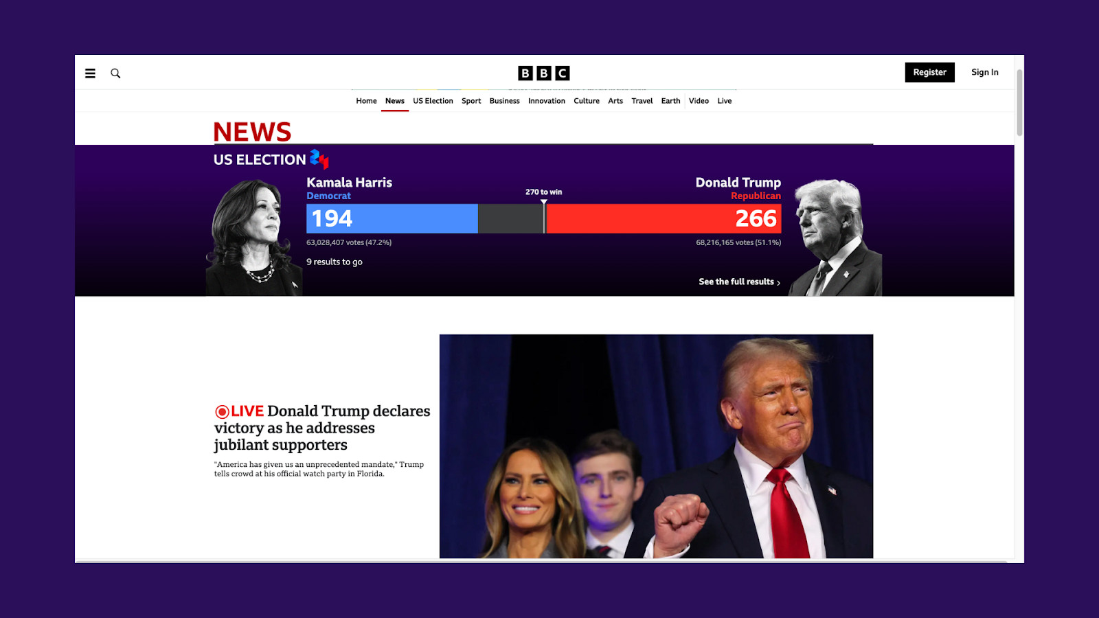
Visual hierarchy is the arrangement of elements in a way that implies importance. By emphasizing key features, users can easily determine where to focus their attention. For example, on Slack’s interface, important notifications or new messages are visually highlighted to draw the user’s attention. Another example is news websites like BBC, which use larger headlines and prominent images for the most important stories, while less critical articles are displayed in smaller fonts or lower on the page. This helps users quickly scan and identify the content they want to engage with.
Case Studies and Practical Examples
Let’s look at how popular products have applied these psychological principles effectively:
Airbnb
Airbnb’s interface is a prime example of leveraging social proof. By showcasing reviews from previous guests, Airbnb builds trust and reassures potential customers about the quality of the listings. This, combined with a clear visual hierarchy, allows users to easily compare options and make informed decisions.
Spotify
Spotify employs gamification to keep users engaged. Features like “Wrapped”—an annual summary of a user’s listening habits—creates a sense of accomplishment and personal connection, which encourages users to share their results on social media and continue using the platform.
Duolingo
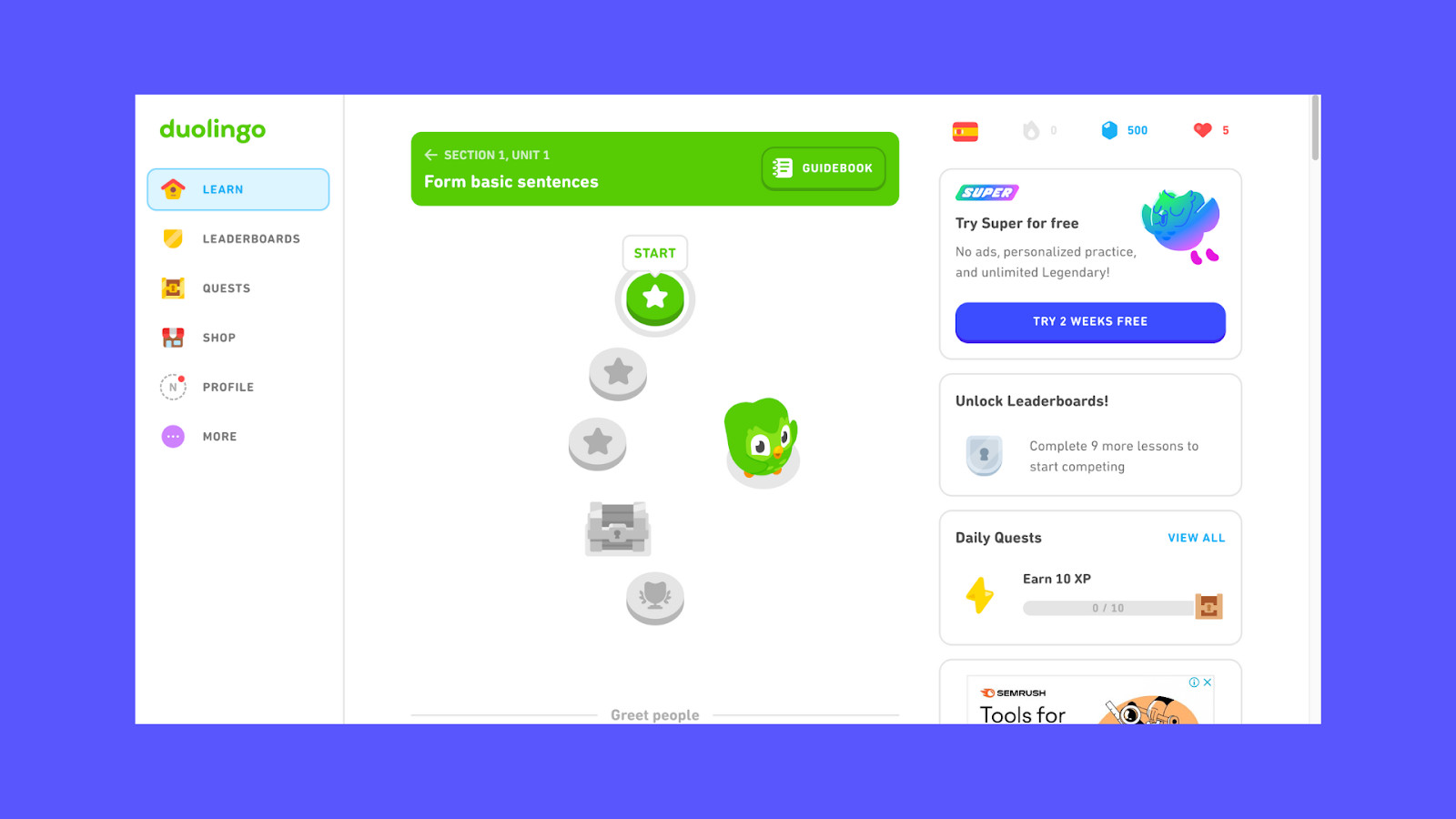
Duolingo is a great example of utilizing gamification and feedback. The language-learning app keeps users motivated through streaks, experience points (XP), and badges. Duolingo also provides real-time feedback on users’ answers, reinforcing learning and making the process feel like an engaging game. This combination of rewards and instant feedback helps keep users committed to their language-learning journey.
Netflix
Netflix leverages personalization and the serial position effect to enhance user experience. By recommending content based on users’ past viewing habits and placing top recommendations at the beginning of lists, Netflix makes it easier for users to decide what to watch next. This reduces decision fatigue and keeps users engaged with the platform. Additionally, Netflix uses visual hierarchy to highlight trending and new releases, making the interface both visually appealing and functional.
Common Mistakes to Avoid
Even with the best intentions, designers can sometimes make mistakes that negatively impact user experience:
Ignoring User Emotions
A purely functional design that lacks emotional appeal can feel cold and impersonal. Users crave connection, and designs that evoke positive emotions are more likely to be remembered and revisited. For example, an insurance website that only presents information without any empathetic messaging can feel intimidating. Adding friendly language and visuals that convey care can make the experience feel more human.
Overwhelming Users
Providing too many options or overly complex navigation can overwhelm users and lead to choice paralysis. Simplicity and clarity are crucial for guiding users toward their goals. For example, a food delivery app with numerous filters and sorting options can make it difficult for users to decide. Instead, offering a few curated categories, such as “Most Popular” or “Top Picks for You,” can make the decision-making process smoother.
Lack of User Feedback
When users perform an action, such as clicking a button, they need feedback to confirm that their action was successful. Ignoring this aspect can lead to frustration, as users are left wondering whether they did something wrong. For instance, when a user submits a form and nothing happens, they may feel confused. Adding a confirmation message like “Thank you! We’ve received your submission” provides clarity and reassurance.
Inconsistent Design Elements
Consistency is key in UI/UX design. When elements such as buttons, icons, or typography change throughout an interface, users may become confused or unsure about their actions. For example, if the “Submit” button is green on one page and blue on another, users may question whether both buttons perform the same function. Keeping design elements consistent helps users feel more confident navigating the product.
Ignoring Mobile Usability
Many users interact with products through their mobile devices. Ignoring mobile usability can lead to a frustrating experience. For example, a website that looks great on desktop but requires excessive zooming and scrolling on mobile can quickly drive users away. Ensuring that designs are responsive and that interactive elements are easily tappable on small screens is crucial for maintaining user engagement.
Conclusion
Incorporating psychological principles into UI/UX design is about more than just making things look good—it’s about creating meaningful, purpose-driven experiences. By understanding how users think, feel, and behave, designers can craft interfaces that resonate on an emotional level, guide decision-making effortlessly, and ultimately lead to satisfying user experiences.
Designing with purpose means considering every aspect of the user journey—from emotional touchpoints to reducing cognitive load. By leveraging the principles discussed in this article, designers can create products that are not only functional but also enjoyable, memorable, and trustworthy.
As the field of UI/UX continues to evolve, staying informed about psychological principles and their application will help designers craft better experiences. Remember: effective design doesn’t just meet user needs—it understands and anticipates them, leading to experiences that users love.
Take your company to the next level and get results with our world class user experience, interface design and implementation.
Get a FREE 30 min Strategy Session

Related posts
The Correct Way to Embed Accessibility in Your Design Process
No fancy introduction – 15% of the world’s population equivalent to more than 1 billion people live with some sort […]
A Quick Guide to Mobile-First Design
So, why mobile? 🤷♀️ Well, because mobile is now everything – with over 55% of web traffic coming from mobile […]
Top 10 Custom Dashboard Design Tips for 2024
In 2024, data-driven decision-making isn’t just a buzzword—it’s a necessity. As businesses continue to evolve, the ability to make informed […]
Creative product design that gets results
Take your company to the next level with world class user experience and interface design.
get a free strategy session


