.svg)
.svg)

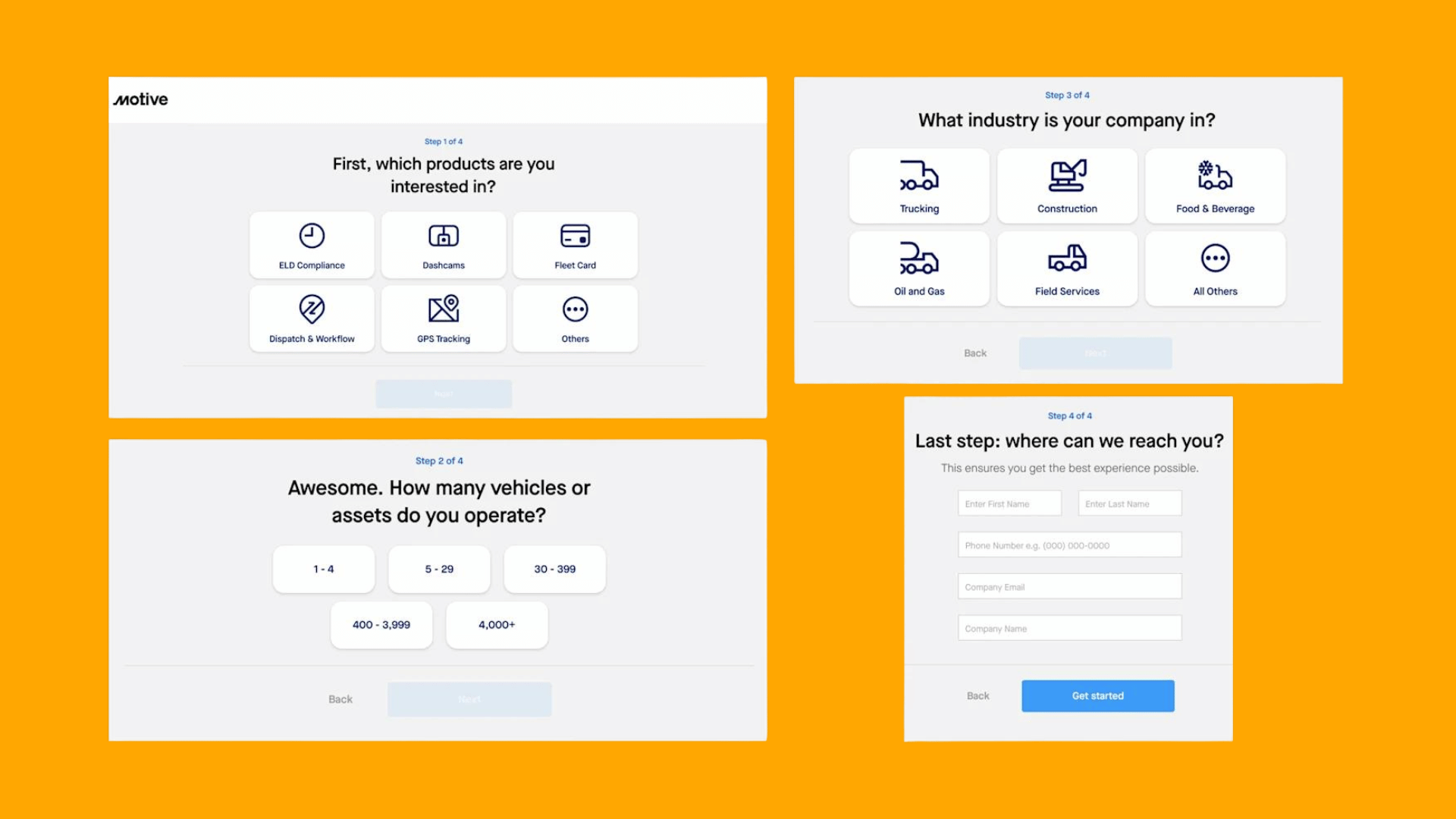

Use a multi-step form when you need to collect many fields, support conditional flows, or stage qualification: split the task into 3 to 5 focused steps, show the current step and total, validate as people move, and add a review screen plus save-and-resume for anything long. Skip the split and keep a single page when the form is short or speed is the whole point. Either way, the real test is step completion and drop-off, not instinct.
When should you choose a multi-step form over a single page?
The decision comes down to field count, branching logic, and how much time you’re asking someone to spend. A common guideline is that if a form has many fields or branching logic, breaking it into steps tends to reduce the feeling of a wall of inputs.
- Job applications, onboarding, and long surveys benefit from steps because the task is inherently sequential.
- Conditional eligibility forms (insurance quotes, loan pre-qualification) need steps so irrelevant fields never appear.
- Quick contact forms, newsletter sign-ups, or anything under six fields usually convert better as a single page, since adding steps just adds clicks.
Before building anything, audit the field list, map which fields depend on earlier answers, and estimate how long the whole task realistically takes. That audit decides the structure, not a template.
Grouping and sequencing fields without hiding what matters
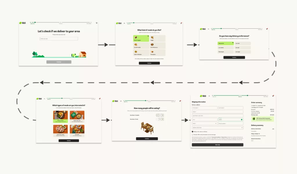
Once you know a form needs steps, the next job is deciding what goes where. Group fields by intent rather than by data type: contact details in one step, qualification questions in another, payment or confirmation at the end. Each step should feel single-purpose, typically containing a few related fields, rarely more.
Sequence matters as much as grouping. Start with the easiest, lowest-friction fields so people commit before hitting anything that requires thought. Put qualifying questions early, since they determine the rest of the path, and save a full review for last.
- Group by intent, not by field type, so each step answers one question in the user’s mind.
- Sequence from easy to effortful, ending every flow with a review step before submission.
- Use progressive disclosure for relevance, revealing follow-up fields only when an earlier answer makes them necessary, never to bury a mandatory or privacy-sensitive input out of sight.
Clear step labels, visual nesting for related fields, and descriptive headings all reinforce the grouping you’ve chosen, so the structure reads as logical rather than arbitrary.
Pro Tip:If you can’t explain why a field sits in a particular step in one sentence, it belongs somewhere else.
Progress indicators and navigation that don’t frustrate users
Every multi-step form needs to show both the current step and the total number of steps. This single fact, backed by W3C’s multi-page forms guidance, does more for perceived effort than almost any visual polish. A label like “Step 2 of 4” tells people exactly how much is left, which matters more than a decorative progress bar.
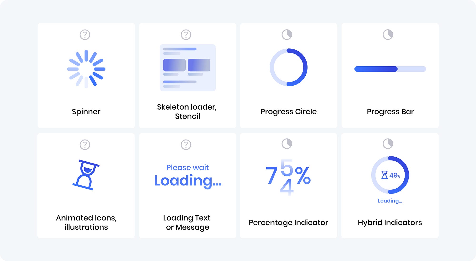
Choose the indicator type based on predictability. When the total number of steps is fixed and known upfront, a labelled stepper (showing each step’s name) outperforms a generic percentage bar, because it previews what’s coming. When the path branches based on earlier answers and the total can change, a simpler progress statement works better than a stepper that might mislead.
- Disable the “Next” button until required fields in the current step are valid, rather than letting people advance into an error.
- Allow jumping back to any completed step without losing entered data.
- Update the document title or an aria-live region on every step change so assistive technology announces the move.
- Avoid auto-animated progress that takes longer than a moment to settle, since it reads as a stall rather than feedback.
Validation and error handling across steps
The most reliable approach combines three layers of validation, each catching a different kind of mistake before it compounds into a frustrating review step.
- Inline, real-time checks catch obvious problems the instant they happen, like an email missing an “@” symbol.
- Per-step validation runs before the form allows someone to advance, confirming every required field in that step is filled and formatted correctly.
- Full validation on review checks cross-field rules that only make sense once all the data exists, such as a start date that can’t fall after an end date entered two steps earlier.
Every error message should name the specific field and explain what to fix, not just flag that something’s wrong. When a cross-field error surfaces at the review stage, link directly back to the step that needs correction instead of forcing a scroll through the whole flow again. The review screen itself should let someone edit any answer inline without restarting the sequence, which keeps a late-stage correction from feeling like a penalty.
Accessibility and privacy rules you can’t skip
WCAG success criterion 3.3.2 requires labels and instructions for every input, and accessibility guidance from the South Australian government makes clear that multi-step forms must also tell users their progress and the total number of steps, using semantic markup rather than visual cues alone. A progress element or an ordered list, paired with proper fieldset and legend grouping, gives both sighted and assistive-technology users a consistent read on where they stand.
- Manage focus on every step change, moving keyboard and screen-reader focus to the new step’s heading automatically.
- Use aria-live or status roles to announce step transitions without requiring a page reload.
- Keep every control keyboard-operable, including custom steppers and date pickers.
- Offer a way to extend or disable time limits rather than silently expiring a session mid-task.
Privacy deserves the same rigor.OAIC guidance on privacy impact assessments treats online choice architecture, including confirmshaming, biased framing, and bundled consent, as a fairness question under Australian Privacy Principle 3, even when every field collected is arguably relevant to the task. Before launch, run a privacy impact check on any form gathering personal information, apply data minimization so you only ask for what the task actually needs, and publish a privacy notice that explains what happens to the data.
What to measure: analytics and instrumentation for multi-step forms
Splitting a form into steps can inflate the appearance of progress while quietly adding more places for someone to leave. The metric that matters is qualified end-to-end completion rate: people who start the form and finish it with a usable submission, not just those who click past step one.
- Track step completion and drop-off for each individual step, not just the form as a whole.
- Log time per step to spot where people stall or second-guess an answer.
- Record validation errors by field to find which inputs cause the most friction.
- Capture resume events separately from fresh starts, since they behave differently in a funnel.
Event names worth standardizing across a codebase include stepEnter, stepExit, validationError, resume, reviewEdit, and finalSubmit. When testing whether splitting actually helped, isolate the variable: compare a shorter single-page version against a stepped version with the same total fields, rather than changing field count and structure at once.
Letting people save progress and come back later
For anything that takes more than a few minutes, build in a way to leave and return without losing work.
- Persist state in both
localStorageand server-side storage, so a closed tab doesn’t erase progress and a cleared browser cache doesn’t either. - Send a resume link by email for forms that people realistically complete across multiple sessions, like detailed applications.
- Design the review screen as an editable summary, with each answer shown next to a clear edit control and a short note on how long the data will be retained.
- Warn before a session times out, offering an extension rather than silently discarding entered data, and encrypt any draft data held in storage.
Mobile layout and performance: keeping steps fast and tappable
Multi-step forms live or die on mobile, where a slow transition between steps feels like a crash. Stick to a single-column layout throughout, since multi-column forms force horizontal scanning that doesn’t translate well to a narrow screen. Make every tappable control at least 44 by 44 pixels, use native input types (tel, email, date) so the right keyboard appears automatically, and set inputmode attributes to match.
- Place the primary action within thumb reach, typically bottom-anchored on small screens.
- Avoid wide, multi-label steppers that overflow a phone screen; a simple “Step 2 of 4” reads cleaner.
- Keep JavaScript per step minimal and lazy-load anything not needed for the current step.
- Test on throttled connections and older devices, since a transition that feels instant on a development machine can stall noticeably on a mid-range phone.
A practical checklist before you launch
Run through this before shipping, and again after the first real batch of submissions comes in.
- Field audit completed, with every field justified against the task.
- Steps grouped by intent, three to six fields each.
- Progress indicator shows step and total, built with semantic markup.
- Validation flow tested, inline, per-step, and final.
- Privacy review done against APP 3 principles.
- Analytics events firing for every step transition and error.
- A/B test plan written before launch, not after.
How we test and refine multi-step forms in practice
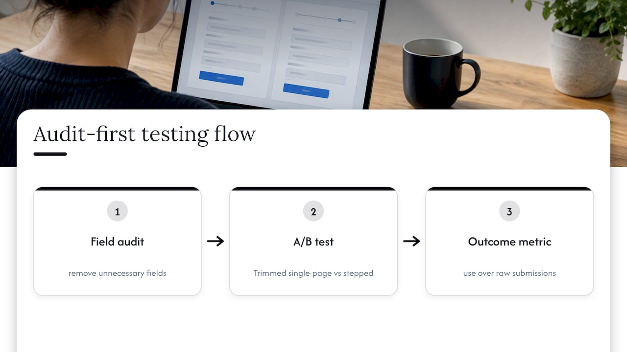
An effective approach starts with a field audit, then a two-variant A/B test run over several weeks, comparing a trimmed single-page version against a stepped redesign, with qualified completion as the deciding metric rather than raw submission count. We’ve seen conversion lift tied more often to removing unnecessary fields than to the number of steps itself, which is why the audit always comes before any structural rebuild. For teams weighing a redesign, a checkout friction review covers the same audit-first logic applied to purchase flows.
Where the trade-offs actually sit
The honest trade-off is between conversion and friction, and it’s easy to credit a structural change for a gain that actually came from cutting a redundant field. Treat step-splitting as one lever, run controlled experiments before declaring a win, and watch for compliance risk creeping in through confirmshaming or bundled consent dressed up as convenience. Small, honest tests beat a confident redesign every time.
How we can help you ship a compliant, measurable form
If a field audit, accessibility pass, and a proper A/B test sound like more than your team has time for, that’s the gap our UX Design work and Full UX/CRO Audit are built to close, starting with a field-by-field review and a measurement plan before any redesign begins.

- Full UX/CRO Audit reviews your current form against the patterns in this article; current prices are on the pricing page.
- Design and rapid prototyping methods can turn audit findings into a tested, shippable redesign efficiently.
- Ongoing optimization support keeps measuring completion rates after launch instead of guessing.
Check current packages on our pricing page or start with a free UX audit to see where your form is losing people.