Reducing Checkout Abandonment Through Micro UX
Checkout abandonment remains one of the most costly challenges facing online businesses today. After investing significant resources to attract users, encourage them to add products to their carts, and guide them through the purchasing process, many businesses still lose a large portion of potential customers just before conversion. Surprisingly, this issue often isn’t rooted in the product itself or its price but rather in the subtle user experience (UX) decisions that influence how smooth, predictable, and trustworthy the checkout journey feels.
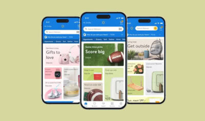
This is precisely where micro UX plays a pivotal role. Micro UX refers to the small design details and micro interactions that reduce friction, clarify user intent, and make each step in the checkout process feel effortless. These seemingly minor touches such as subtle animations, inline validation, and loading animations may appear insignificant individually, but collectively they have a huge impact on conversions. When checkout feels predictable and reliable, users move forward with confidence. Conversely, when the process is confusing or unreliable, abandonment rates soar.
Most checkout funnels experience significant user drop-off between steps, especially on form pages, payment screens, and shipping selections. By improving these critical moments through focused micro UX enhancements, businesses can boost revenue without increasing traffic or advertising spend, ultimately enhancing user experience and fostering greater user engagement.
Table of Contents
I. Understanding Why Users Abandon Checkout
To effectively reduce checkout abandonment, it’s crucial to understand the underlying reasons behind user drop-off. Typically, abandonment stems from a combination of psychological friction, technical friction, and cognitive overload.
Psychological Friction
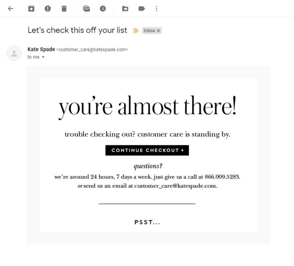
Users hesitate when they feel uncertain or suspicious about the checkout process. One of the biggest triggers is hidden fees. When shipping costs or taxes only appear at the last step, user expectations are shattered, and trust collapses. Confusion around return policies or unclear shipping timelines further increases anxiety especially for first time users who are still building confidence in your brand. These small details can create a disconnect between user expectations and reality, making it essential to design micro interactions that show users what to expect clearly and transparently.
Technical Friction
Performance issues can severely damage the checkout experience. Even a one-second delay in page loading can cause a measurable drop in completed purchases. Poor mobile form behavior is another major culprit. For example, form fields that zoom awkwardly, dropdown menus that misbehave, or inputs that require excessive manual correction frustrate users and push them away. Here, loading animations and visual feedback during the loading process can reassure users that the system is responsive, reducing frustration and confusion.
Cognitive Overload
If the checkout feels like tedious paperwork, users are more likely to abandon. Too many steps, repeated fields, irrelevant questions, and long scrolling sections add unnecessary mental burden. Users want to complete a purchase quickly, not fill out complex forms. By focusing on small details and removing unnecessary form fields, businesses can create a more streamlined and pleasant experience, reducing cognitive load and improving overall user experience.
II. Designing Checkout Forms That Reduce Effort
Well-designed checkout forms focus on enhancing user experience by removing effort rather than adding to it. This is where micro UX design elements shine, as they help users complete their tasks smoothly and intuitively.
Inline Validation
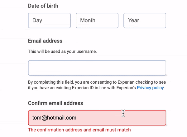
One of the key components of micro UX is inline validation. Providing users with real-time feedback as they complete form fields helps prevent late-stage errors that can ruin the experience. Instead of confronting multiple red error messages at the end, users receive immediate guidance, which creates clarity and maintains smooth momentum throughout the process. For example, indicating password requirements or confirming a correctly formatted email address instantly helps users avoid frustration.
Smart Input Behavior
Smart inputs reduce typing friction by automatically formatting phone numbers, credit card numbers, and postal codes. Predictive suggestions for cities, streets, and email domains further speed up data entry. These features are especially valuable on mobile devices, where typing is slower and more prone to errors. Such micro interactions, like a user clicks or user hovers triggering helpful suggestions can significantly improve the digital experience.
Reducing Required Fields
Every field removed from the checkout form increases the chance of conversion. Optional extras should be placed below the fold or within expandable sections to keep the form clean and focused. By asking only for essential information, you respect the user’s time and reduce cognitive load. This approach avoids unnecessary details that can confuse users or create friction during the checkout process.
III. Micro Interactions That Increase Confidence
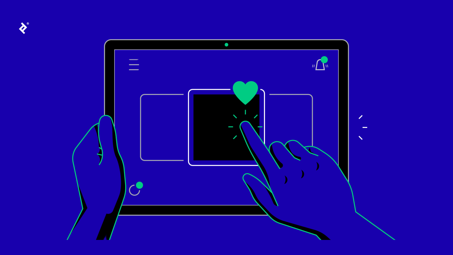
Micro interactions are small, purposeful moments in UX design that help users understand what is happening without requiring conscious thought. They provide visual feedback and reassurance, which are critical to maintaining trust during checkout.
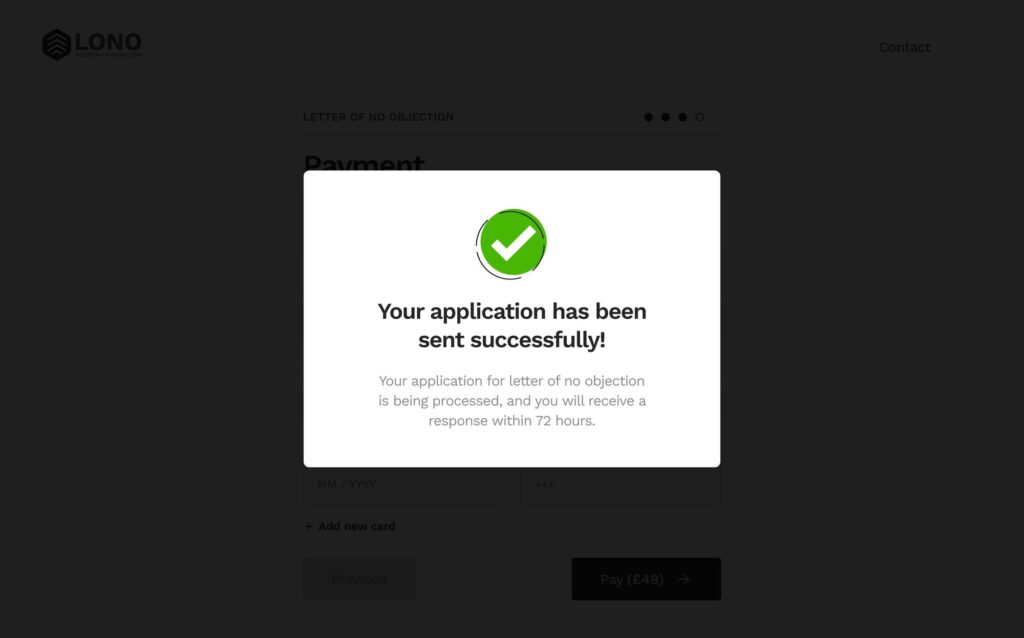
Success States
Simple cues like a small checkmark, a soft glow, or a subtle animation can confirm progress without interrupting the user’s flow. These lightweight signals help users feel confident that they are moving forward correctly. For instance, a progress bar that advances smoothly as users complete steps is a great example of an effective micro interaction that shows users their progress.
Error States Done Right
Error messages should be friendly, clear, and immediately helpful. Avoid blame or vague language. Instead, point directly to the problem and explain how to fix it in simple terms. Effective error micro UX prevents frustration and confusion, encouraging users to correct mistakes quickly. For example, highlighting missing password requirements inline helps users adjust their input without leaving the form.
Loading Feedback
People dislike waiting, but they hate uncertainty even more. Providing instant loading feedback through skeleton loaders, micro loading bars, or spinners makes the waiting time feel shorter and more predictable. When users are informed about the ongoing loading process, they remain calm and continue without abandoning the checkout. This kind of visual feedback is essential to maintaining a smooth interface design that respects users’ time and attention.
IV. Payment Experience UX
The payment step is often where the highest number of users drop off. However, it is also where micro UX can have the most significant impact on conversion rates.
One Tap Wallets
Integrating one tap wallets such as Apple Pay, Google Pay, and PayPal Express dramatically reduces checkout time. These options allow users to bypass manual form entry, speeding up the process and boosting user engagement. Mobile conversions often see immediate improvement when these wallets are available, as users can complete payment with a single tap or user action.
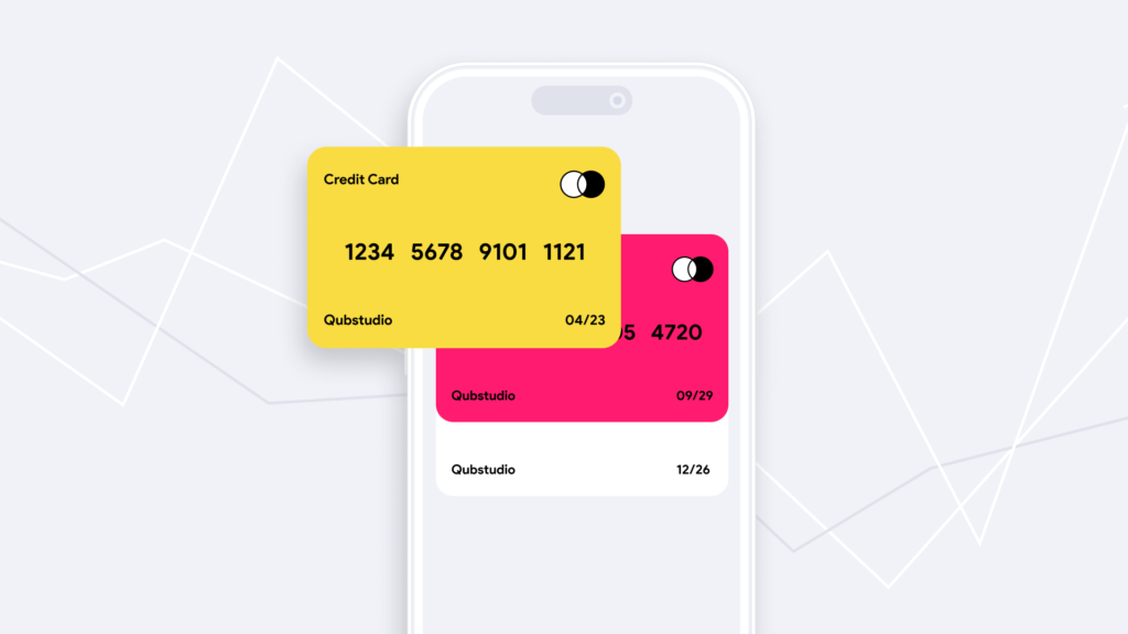
Trust Cues
Displaying trust badges, encryption labels, and security indicators reassures users that their payment information is safe. While these cues are expected, placing them thoughtfully ensures they subtly reinforce trust without overwhelming the interface. These design elements align with brand values and add a human element to the digital transaction.
Transparent Pricing
Nothing erodes trust faster than unexpected last-minute charges. Showing transparent pricing early in the process including total cost, shipping, and taxes helps users feel confident before entering payment details. This honest approach to pricing is a strong micro UX strategy that encourages users to complete their purchase, reducing anxiety and abandonment.
V. Visual Structures That Make Checkout Feel Shorter
Even if the number of steps remains unchanged, the perceived effort can be minimized through thoughtful visual design.
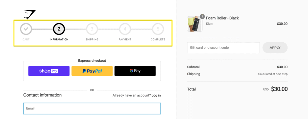
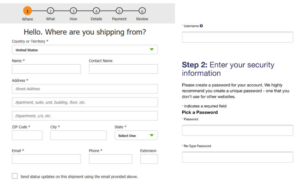
Progress Indicator
A progress bar or step-based indicator shows users where they are in the checkout process and what remains. This transparency reduces anxiety and gives users a clear sense of direction. It’s a good example of how micro animations and clear ui elements can guide users smoothly through multiple steps.
Smart Chunking
Breaking the checkout into smaller, manageable sections makes the process feel less daunting. Users can process compact groups of inputs faster than long, scrolling pages. Including a review step at the end reassures users and reduces mistakes. This method respects the finer details of human cognitive processing and improves overall user experience.
Collapsible Sections
Using collapsible blocks keeps the interface clean and focused. By displaying only relevant information at each stage, users can concentrate on the current task without distractions. This approach helps guide users gently through the process and avoids overwhelming them with too much information at once.
VI. Reducing Uncertainty Before Payment
Checkout anxiety is a natural response, so removing uncertainty is key to improving completion rates. Small micro UX elements act as anchors that create a feeling of security.
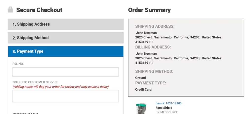
For example, a delivery estimate widget helps users understand when they will receive their product. A brief return policy snippet reassures users about their options. A support contact bubble offers help if needed, and a product summary confirmation reminds users exactly what they are paying for. These elements combine to guide users confidently toward finalizing their purchase, creating memorable moments that reinforce trust and reduce hesitation.
VII. Testing and Optimization Framework
Improving checkout is not a one-time project but an ongoing process that compounds over time. To maximize results, businesses should adopt a continuous optimization mindset.
Recording micro interactions helps you understand how users behave during checkout. Tools like heatmaps and scroll maps reveal where drop-offs occur, while session replays expose friction points invisible in aggregate analytics. Running A/B tests allows you to validate which micro UX improvements truly enhance conversions.
Organizations that embrace this iterative approach consistently outperform competitors by continuously refining their digital experience. This process of design micro interactions and analyzing user behavior ensures that improvements are aligned with the target audience and their evolving needs.
Conclusion
Micro UX represents a powerful, compounding advantage in checkout design. By improving trust, reducing friction, and making the process feel effortless, these small details collectively create a smooth and reliable path to purchase. The best part is that many micro UX enhancements are quick to implement and deliver a high return on investment.
Every small detail counts. Over time, your checkout transforms into a finely tuned engine that drives revenue and delights users. If you want expert help improving your checkout experience, consider exploring how we approach UX and conversion strategy at RAW Studio. Whether it’s creating a UX checklist, developing a testing plan, or rewriting your checkout copy, we can help you create an optimized experience that converts.
Get a UX & CRO Expert’s Eyes on Your Website. Book a free 30-minute UX Teardown and get actionable insights on what’s costing you conversions — no fluff, just fixes you can implement right away.
Book a Free UX Audit

Related posts

Common Design Red Flags From Your Website You Might Be Missing
A website can look modern, polished, and visually appealing, yet still fail at its most important job: supporting growth. In […]

The Hidden UX Genius of Netflix’s New Welcome Page
We often think of great UX as invisible: smooth, intuitive, just working. But every now and then, a redesign comes […]

UX for SaaS in 2025: What Top-Performing Dashboards Have in Common
You’ve probably felt it before: that moment when you open a dashboard expecting answers and instead, you’re met with a […]
Creative product design that gets results
Take your company to the next level with world class user experience and interface design.
get a free strategy session
