.svg)
.svg)


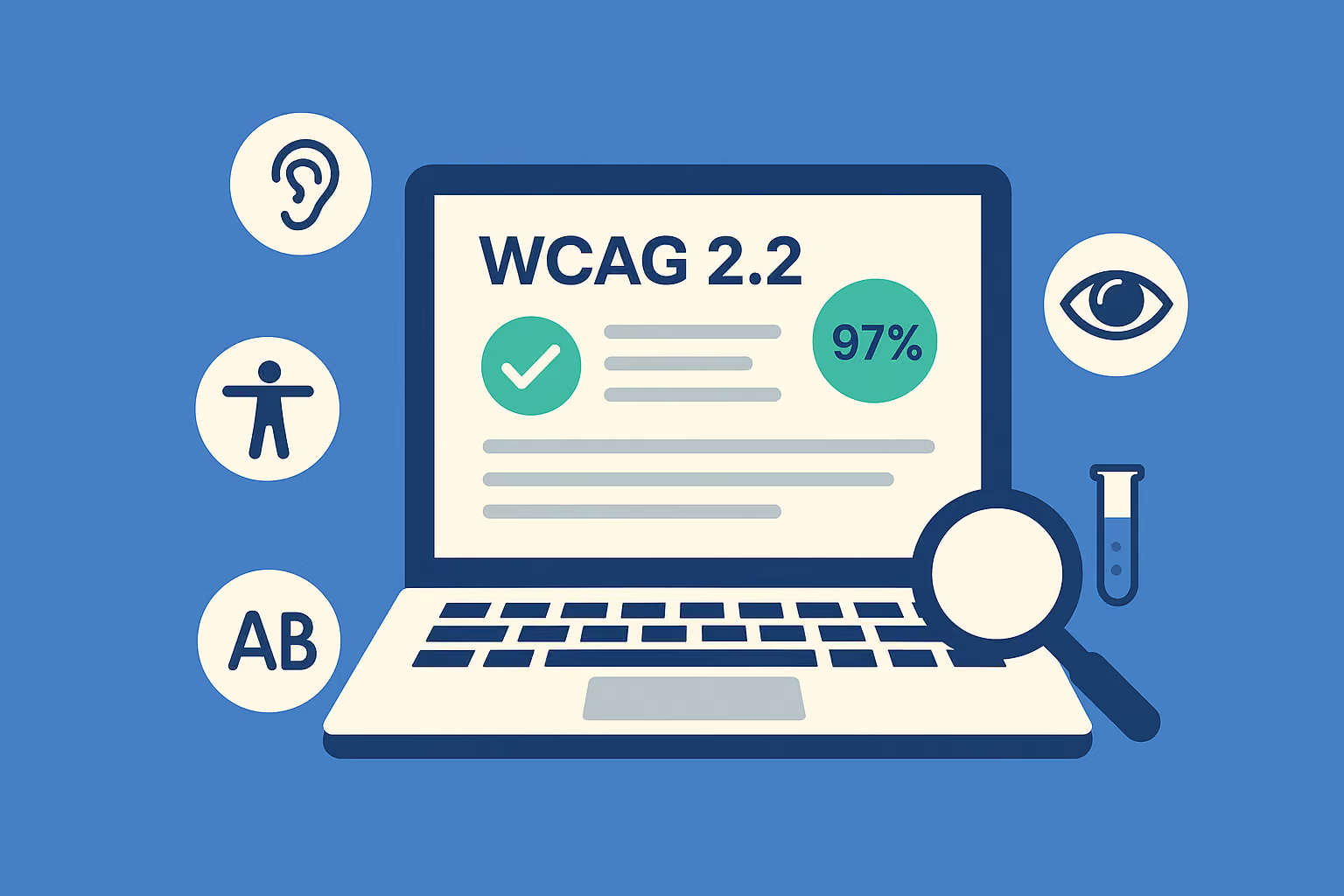
Here's the thing about most accessibility checklists floating around the internet: they read like a copy of the spec with the legal language stripped out. That's not useful when you're staring at a sprint board trying to figure out what to fix by Friday. What follows groups every relevant Level A and AA criterion under WCAG's four principles, Perceivable, Operable, Understandable, and Robust, with a plain test prompt for each one.
Perceivable
- Text Alternatives (1.1.1, A): Does every meaningful image, icon, and button have alt text that describes its function, not just its appearance? Failure example: a search icon with alt text reading "magnifying glass" instead of "Search."
- Captions and Audio Description (1.2.x, A/AA): Do all prerecorded videos have accurate captions and, where needed, audio description? Test by turning off sound entirely and watching whether meaning survives.
- Color Contrast (1.4.3, AA): Does body text meet a 4.5:1 contrast ratio and large text 3:1? Run this through a contrast checker on your actual rendered pages, not your design file.
- Non-Text Contrast (1.4.11, AA): Do buttons, form borders, and focus indicators meet 3:1 against adjacent colors? This one gets missed constantly on ghost buttons and outlined inputs.
- Reflow (1.4.10, AA): Does content reflow cleanly at 400% zoom without horizontal scrolling? Test on a 1280px viewport zoomed in, not just mobile breakpoints.
Operable
- Keyboard Access (2.1.1, A): Can you complete every task, forms, menus, modals, using only Tab, Shift+Tab, Enter, and arrow keys? Unplug your mouse and try to check out on your own site.
- Focus Not Obscured (2.4.11, AA, new in 2.2): When you Tab through the page, is the focused element ever hidden behind a sticky header, cookie banner, or chat widget? This is a common new failure seen in client audits by digital agencies.
- Target Size (2.5.8, AA, new in 2.2): Are clickable targets at least 24 by 24 CSS pixels, or do they have enough spacing to avoid accidental taps? Measure your mobile nav icons and social links first.
- Dragging Movements (2.5.7, AA, new in 2.2): Does every drag interaction, sliders, reordering lists, image carousels, have a non-drag alternative like buttons or keyboard controls? Test by trying to complete the action with only click or tap, no dragging.
- Consistent Help (3.2.6, A, new in 2.2): If a help link, chat icon, or contact option appears on multiple pages, does it sit in the same relative location every time? Check three random pages and compare.
Understandable
- Redundant Entry (3.3.7, A, new in 2.2): Does a multi-step form ever ask a user to re-enter information they already provided earlier in the same process? Walk through checkout or signup end to end.
- Accessible Authentication (3.3.8, AA, new in 2.2): Can users log in without solving a puzzle, transcribing a CAPTCHA, or memorizing something extra, unless an alternative exists? Test the login and password reset flows specifically.
- Error Identification (3.3.1, A): When a form field fails validation, does the error message name the specific field and explain the fix in text, not just color?
- Labels and Instructions (3.3.2, A): Does every input have a visible, programmatically associated label? Placeholder text alone does not count.
Robust
- Name, Role, Value (4.1.2, A): Do custom components, toggle switches, dropdown menus, accordions, expose their state to assistive technology? Test with a screen reader like NVDA or VoiceOver.
- Status Messages (4.1.3, AA): Do dynamic updates, "Item added to cart," form success messages, announce themselves to screen reader users without requiring focus to move?
If you're tracking this across a team, build it as a spreadsheet rather than a static document. A workable column structure looks like this:
ColumnPurposeCriterionThe success criterion number and name (e.g. "2.5.8 Target Size")LevelA or AAElement/PageThe specific component or URL under testTest MethodAutomated, manual, or user testingResultPass, fail, or not applicableNotesScreenshot link, remediation ticket number, or retest date
Export that structure to CSV or Excel and it becomes your living accessibility audit checklist, the kind you actually update every sprint instead of once a year before a client demo.
How to Build Checklist Runs Into Design, Build, and QA
A checklist that only gets used once, right before launch, catches problems too late to fix cheaply. The more effective pattern inserts shorter checklist passes at three points: design review, pre-release QA, and ongoing regression testing after every major release. Digital.NSW's guidance on WCAG 2.2 makes a similar point, recommending small, repeatable checks folded into normal delivery cycles rather than one large periodic audit.
Here's a practical sequence for embedding it:
- At design review, check color contrast, target size, and focus order in Figma or your design tool before a single line of code gets written.
- During build, run automated scanners in CI on every pull request so obvious failures, missing alt text, poor contrast, never reach staging.
- Before release, run the full manual checklist against the specific pages or flows changed in that release, not the entire site every time.
- After launch, schedule a regression pass quarterly, or whenever a major redesign touches shared components like navigation or forms.
Assign an owner for each stage. Designers own the design-review pass, developers own the CI gate, and QA owns the pre-release manual run. Without a named owner, accessibility checks quietly disappear the moment a deadline gets tight.
If your organization needs to make a formal conformance claim, the requirements are specific. W3C's conformance guidance states that all relevant success criteria at your chosen level must be satisfied using accessibility-supported techniques, and any unsupported technology must not block access to content. You can't claim AA conformance while quietly failing three criteria and hoping nobody checks.
Scope matters too. A full-site claim requires testing every page type and template, not just the homepage. A representative-sample approach works for large sites with repeated templates, but a one-page conformance claim only makes sense for a genuinely standalone page, like a single landing page with no shared navigation. Keep records: screenshots of failures, dated test notes, any user testing reports, and remediation tickets tied to specific criteria. That paper trail is what separates a defensible conformance claim from a marketing statement.
Pro Tip: Store your conformance evidence in the same repository as your design files and code, not a separate compliance folder nobody opens. When legal or procurement asks for proof six months later, you want it findable in under five minutes.
Automated Scanners vs. Manual Review vs. Real Users
No single testing method catches everything, and treating an automated scan as proof of accessibility is one of the more expensive mistakes teams make. Guidance from the Department of Justice on web accessibility explicitly warns that automated tools and checklists alone don't verify real-world usability. You need all three layers working together.
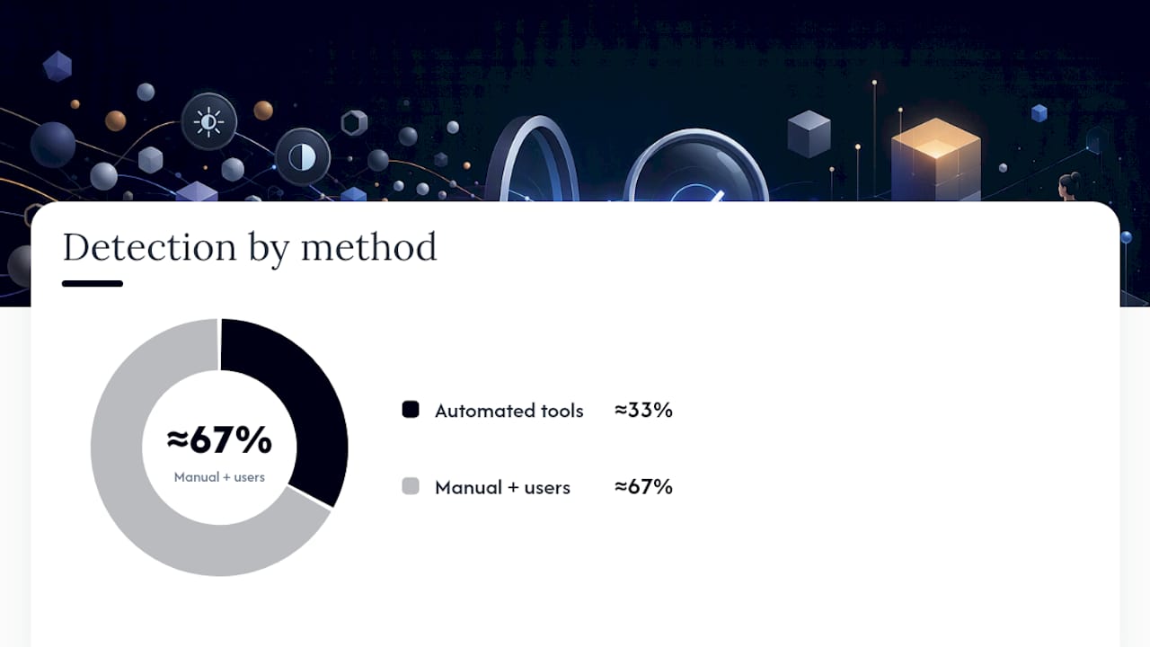
What automated tools catch well: missing alt text, contrast failures, missing form labels, and structural issues like heading order. CI-integrated scanners, browser extensions, and semantic HTML linters can flag these on every build, at scale, for free or cheap. What they consistently miss: whether a screen reader user can actually complete a task, whether focus order makes logical sense, and whether a drag interaction has a working alternative. Automated tools reliably catch roughly a third of WCAG failures. The rest require a human.
Manual checks worth scripting into a five-minute pass:
- Tab through the entire page and confirm focus never disappears or jumps illogically.
- Confirm the focus indicator is visible against every background it appears on.
- Measure suspect touch targets with browser dev tools against the 24 by 24 pixel minimum.
- Attempt every drag interaction using only keyboard or button alternatives.
- Zoom to 400% and check for horizontal scroll or overlapping content.
User testing with people with disabilities closes the gap automated and manual checks can't. Recruit through disability advocacy organizations or specialized panels rather than convenience samples, compensate participants properly, and test real tasks, not scripted walkthroughs of the happy path. Even two or three sessions with screen reader users or people with motor impairments surface issues that months of internal QA miss entirely.
Fixing the New WCAG 2.2 Criteria: Code-Level Notes
The six new success criteria trip up experienced teams because they're new territory, not because they're conceptually hard. Here's what actually fixes them.
- Focus Not Obscured: Audit every sticky header, cookie banner, and chat widget for z-index conflicts with focused elements. Add
scroll-margin-topto focusable elements so they scroll clear of fixed headers, and make surearia-hidden="true"is never applied to an element that can still receive keyboard focus. - Target Size: Set a minimum of 24 by 24 CSS pixels on interactive elements, or add invisible padding around smaller icons to expand the hit area without changing the visual design. Icon-only buttons in dense toolbars are the usual offenders.
- Dragging Movements: Never ship a drag-only interaction. Pair sliders with arrow-key support, give reorderable lists "move up/move down" buttons, and if you're building carousels, add visible prev/next controls alongside swipe gestures.
- Accessible Authentication: Drop CAPTCHA puzzles in favor of email magic links, passkeys, or simple checkbox verification. If a password is required, allow password managers and browser autofill rather than blocking paste into password fields.
- Redundant Entry: Use single-source data across multi-step forms. If a shipping address was entered in step one, prefill it as a billing address option in step three instead of asking again.
- Consistent Help: Pick one location, footer, header, or a persistent corner widget, for help links and contact information, and keep it identical across every template on the site.
For implementation code, the W3C's WCAG 2.2 techniques documentation includes working examples for most of these patterns. Navigation-heavy sites should also look closely at how menu patterns affect keyboard access, since collapsed and mega-menu navigation is where Focus Not Obscured failures cluster hardest.
Pro Tip: Test Target Size failures on a real phone, not a resized browser window. Chrome dev tools' mobile emulator doesn't reproduce actual thumb reach and mis-tap rates.
How Raw Studio Applies Checklist-Driven Accessibility
Accessibility work only holds up when it's built into delivery, not bolted on before launch. Some agencies fold WCAG checks into their design sprint and rapid prototyping processes at the wireframe stage, not after development, because catching a Target Size or contrast failure in design tools costs a fraction of what it costs to fix in production code.
A Free UX Audit is often where this starts for teams that suspect accessibility gaps but haven't mapped them against WCAG 2.2 specifically. It gives you a concrete list of what's failing before you commit to a larger engagement. For teams managing dense interactive interfaces, dashboards, data tables, filtering systems, the same checklist discipline applies to complex real-time UI patterns, where custom components are most likely to fail Name, Role, Value requirements.
Accessibility work also pays off beyond compliance. Building accessible design that supports search visibility is a real, measurable side benefit, since much of what WCAG requires, semantic structure, clear labeling, logical heading order, overlaps directly with what search engines reward.
Why Most Teams Treat WCAG 2.2 Backwards
Most teams treat accessibility as a final gate, a checklist run the week before launch, hoping the automated scanner comes back clean. That's backwards, and it's why Focus Not Obscured and Target Size failures show up in nearly every audit Raw runs on sites built in the last two years. Those two criteria are cheap to fix in Figma and expensive to fix in shipped code.
The conventional advice, "run axe or Lighthouse and you're covered," undersells how much of WCAG 2.2 depends on judgment calls automated tools can't make: whether a drag interaction genuinely needs a keyboard alternative, whether a help link's placement counts as consistent, whether authentication friction crosses into exclusion. Those require a human reading the criterion and testing the actual experience.
If you do one thing after reading this, make it the new criteria audit, Focus Not Obscured, Target Size, Dragging, Authentication, Redundant Entry, Consistent Help, before you re-audit everything else. They're the newest, least understood, and most commonly missed items on any current WCAG 2.2 checklist.