.svg)
.svg)


The techniques that consistently lift conversion rates are front-loaded headlines, a single clear value proposition, specific action-oriented CTAs, and tight microcopy that removes friction at the exact moment someone hesitates. Each one works because it matches how people actually read online: fast, skeptical, and looking for a reason to stop scrolling. Below, we break down why each technique works, how to test it, and what it looks like when it's done well.
What conversion copywriting actually means
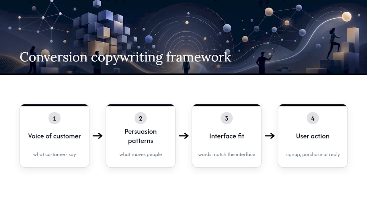
Conversion copywriting is the practice of writing words that turn attention into action, whether that action is a signup, a purchase, or a reply to an email. It sits at the intersection of three disciplines: understanding what your customer actually says about their problem (voice of customer), knowing which persuasion patterns move people to decide, and making sure the words fit the interface they're sitting inside. A brilliant headline on a confusing page still fails.
It matters most on landing pages, checkout flows, product pages, and transactional emails, anywhere a reader has to make a decision within seconds. On a pricing page, every word around the button carries weight. In a nurture email, the same principles apply but with more room to build a case.
Length is not a style choice, it's a decision about intent. A visitor comparing enterprise software wants depth, proof, and detail because the purchase is considered and risky. Someone buying a $30 candle wants three seconds of clarity and a reason to trust the checkout. Match the copy's length to how much the reader needs to know before they'll act, not to how much you have to say.

The techniques worth applying first
These are the levers with the clearest evidence behind them, ordered roughly by how much friction they remove and how fast you can test them.
- Front-load the headline with the benefit. Readers scan rather than read, and the first two words of a heading or link do most of the work in signaling what happens next, according to NN/g's research on scanning behavior. "Save 20 hours a week" beats "Our platform helps teams..." because the payoff arrives before the reader's attention does. Micro test: swap the first two words of your current headline for the strongest outcome word you have and watch scroll depth.
- Write one value proposition, not five. Pick the single sharpest difference between you and the alternative, state it in one sentence, and back it with a concrete detail rather than an adjective. "The only accounting software built for freelance photographers" tells a reader exactly who it's for; "powerful, flexible accounting" tells them nothing.
- Lead every benefit with the outcome, not the mechanism. Readers don't care that your app uses machine learning, they care that it cuts their invoicing time in half. Describe what changes for them first, then explain how if they keep reading.
- Write CTAs as a specific next action, not a generic verb. "Start my free trial" outperforms "Submit" because it describes what happens after the click and speaks in the reader's voice. Weak CTAs ("Learn more," "Submit," "Click here") ask for a click without telling the reader what they get for it, a pattern examined in guidance on crafting effective CTAs.
- Treat microcopy as clarity work, not brand voice work. Form hints, error messages, and button labels exist to remove a specific hesitation at a specific moment, and personality should never get in the way of that job, a distinction NN/g draws clearly in its microcopy research. "Password must include a number and a symbol" resolves confusion; a witty version of the same message often doesn't.
- Write for scanning, not reading. Short topic sentences, one idea per paragraph, and bullets over blocks of prose can improve measured usability by up to 124% compared with promotional "marketese," according to NN/g's foundational writing-for-the-web research. This single shift, cutting fluff and stating things plainly, is often the highest-leverage edit available on any page.
- Use social proof and risk reversal without overclaiming. A specific number of reviews, a named client, or a plainly worded guarantee builds trust faster than a superlative. "30-day money-back guarantee, no questions asked" reduces perceived risk in a way that "risk-free" never does, because it tells the reader exactly what happens if they're unhappy.
- Make the offer transparent before the point of payment. Surprise costs at checkout are one of the most common reasons a cart gets abandoned, and clearer delivery dates, upfront shipping costs, and simpler field labeling are consistently tied to lower abandonment, per Baymard Institute's checkout UX research. If a fee exists, name it early instead of letting the reader discover it at the last screen.
- Borrow persuasion patterns that work in a sentence, not a paragraph. Contrast ("Was $89, now $59"), anchoring (showing the higher-tier plan first), and reciprocity (a free resource before the ask) all work in short copy because they don't require the reader to hold much in their head at once.
- Adjust copy by segment and intent, not just by demographic. A returning visitor who abandoned a cart needs a different headline than a first-time visitor from a search ad. Small intent-based tweaks, swapping a headline for paid traffic versus organic, or referencing a plan a visitor already viewed, tend to outperform broad, one-size-fits-all copy.
Pro Tip:Before you write a single word of new copy, read your last twenty support tickets or reviews. The exact phrases your customers used to describe their problem are almost always better headline material than anything you'd come up with in a brainstorm.
Real copy, before and after
Seeing the fix matters more than reading about it. Here's how a few of these techniques change actual copy.
- Headline: "Innovative solutions for your business" becomes "Cut onboarding time from 3 weeks to 3 days." The second version leads with a number and an outcome instead of an empty adjective.
- CTA: "Submit" becomes "Get my free audit." The reader knows exactly what happens and what they receive.
- Microcopy (error message): "Invalid input" becomes "Enter a valid email, like [email protected]." The rewrite shows the fix instead of just naming the failure.
- Value proposition: "The smarter way to manage projects" becomes "Built for agencies juggling more than 10 client projects at once." Specificity replaces vague confidence.
Raw Studio has applied this same pattern, pairing copy rewrites with UX and testing changes, on client engagements and reports, delivering up to a 100% increase in conversion rates for some clients, through combined copy, design, and testing work. The approach is never copy in isolation: a headline rewrite paired with a clearer form layout tends to outperform either change on its own.
A simple template worth adapting: "[Outcome] in [timeframe], without [common objection]." It forces you to name a real result, a real timeframe, and the hesitation you're removing, all in one sentence.
How to test copy changes without fooling yourself
A copy idea is a guess until it's tested, and a badly designed test can make a losing headline look like a winner. Start by prioritizing what to test using impact, confidence, and effort: a headline change on your highest-traffic landing page beats a microcopy tweak on a rarely visited settings screen, even if the settings tweak is easier to ship.
Write the hypothesis before you touch the design: "Changing the CTA from 'Submit' to 'Get my free audit' will increase click-through because it names the outcome." That sentence becomes your test brief and your success criteria in one line.
- Primary metric: the action you actually care about, a signup, a purchase, a reply.
- Secondary metrics: time on page, scroll depth, and bounce rate, which explain why a test won or lost.
- Sample size and duration: run long enough to cover a full weekly cycle and to reach a minimum detectable effect that matches your traffic, not just until the numbers look good.
- Stopping rule: decide the test length and the winning threshold before launch, not after you've peeked at day two's results.
Pair the numbers with qualitative signals: session recordings and a one-question micro-survey ("What almost stopped you from completing this?") often explain a result that the A/B data alone can't. A test that shows a CTA underperforming means little until a recording shows readers hesitating over a hidden shipping fee two steps later, a pattern Baymard's checkout research turns up often.
A workflow for writing copy that converts
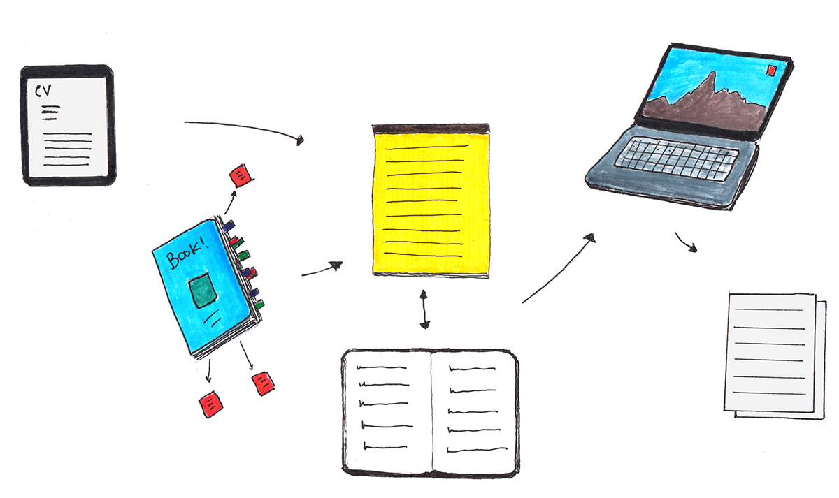
- Capture voice of customer fast. A 5-minute conversation with a recent customer, a scan of your top search queries, and a slice of support tickets will surface better language than an hour of internal brainstorming.
- Run a short writing sprint. Thirty to ninety minutes, one VOC note, one hypothesis, and two variants is usually more productive than a long round of committee edits.
- Peer review against a no-marketese checklist. Replace vague adjectives, quantify every claim you can, front-load the benefit, and confirm the CTA describes what happens after the click.
- Run a prelaunch checklist. Confirm tracking is firing, QA the variant on mobile, and name the test file clearly so nobody accidentally ships the losing version.
- Fold copy into the design process early. Writing headlines and CTAs during a Rapid MVP or design sprint, rather than after the layout is locked, keeps copy from being squeezed into a box it was never meant to fit.
Pro Tip:Draft your headline and CTA before your designer builds the wireframe. Copy written to fill an existing box is almost always weaker than copy the design was built around.
What most teams get wrong about conversion copy
The biggest mistake isn't a weak headline, it's marketese: the habit of reaching for words like "innovative" or "seamless" because they sound confident, when a specific number or outcome would do more work in the same space. The second is treating microcopy as an afterthought, when a single unclear error message can undo a great headline three screens later. The third is over-relying on design to fix a persuasion problem that only better words can solve.
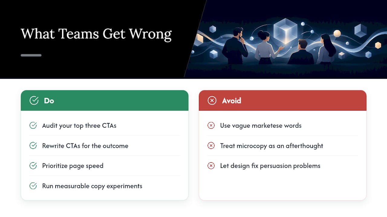
Heading into 2026, three priorities matter more than they used to. Speed: readers have less patience for slow-loading pages, no matter how good the copy is. Privacy-aware persuasion: personalization has to feel helpful, not surveilled. And measurable experimentation: teams that treat every copy change as a testable hypothesis, rather than a matter of taste, keep improving long after the obvious wins are gone.
If you make one change this week, audit your top three CTAs and rewrite each one to describe the outcome of the click instead of the action of clicking.
How Raw Studio can help with conversion copy and CRO
If you'd rather have a team that's already run this playbook dozens of times, Raw Studio's Conversion Rate Optimisation service pairs copy rewrites with the UX and testing work that makes them stick, since a great headline on a confusing layout still underperforms.
The starting point is usually a Full UX/CRO Audit, priced from $2,500 one-off, which identifies exactly where copy and design friction are costing you conversions before a single word gets rewritten. For teams that need to validate a new page or flow fast, a Design Sprint compresses research, copy, and testing into a short, focused engagement.
Start with a free UX audit to see where your own copy and design are leaving conversions on the table.
Where to go deeper
For more on scannable writing, NN/g's research on writing for the web is the clearest starting point. For checkout-specific friction, Baymard Institute's checkout UX findings cover form and microcopy issues in detail. Raw Studio's own breakdown of common SaaS UX mistakes is a useful companion for teams auditing their own product pages.
Discuss your conversion goals with Raw Studio. Email [email protected] to discuss branding, UX/UI design, conversion rate optimization, or a data-driven digital solution for your business.