.svg)
.svg)

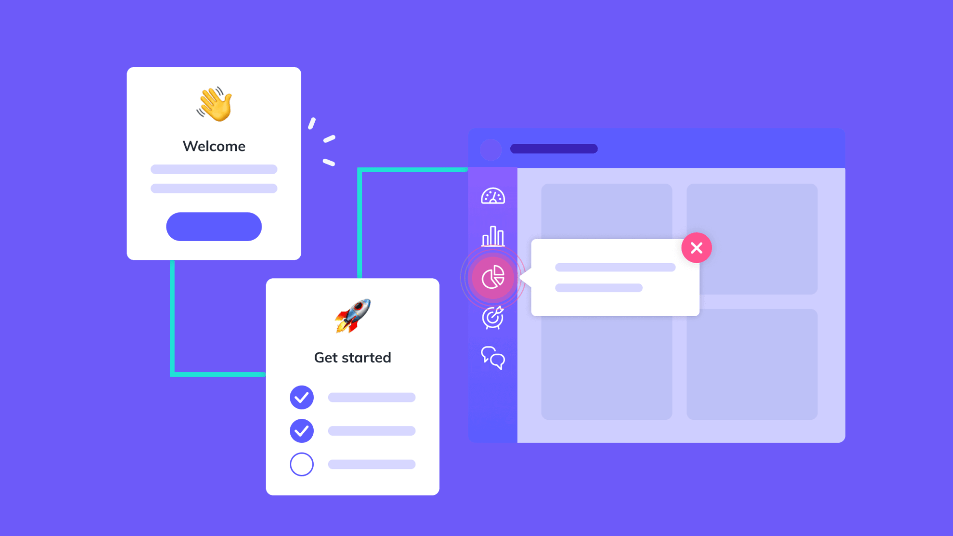

An effective onboarding flow does one job: get a new user to their first real moment of value as fast as honestly possible, with the least friction. If you're deciding where to start, two tactics carry the most weight: interactive walkthroughs for anything genuinely complex, and progressive disclosure for everything else. Some agencies build entire design sprints around exactly this problem.
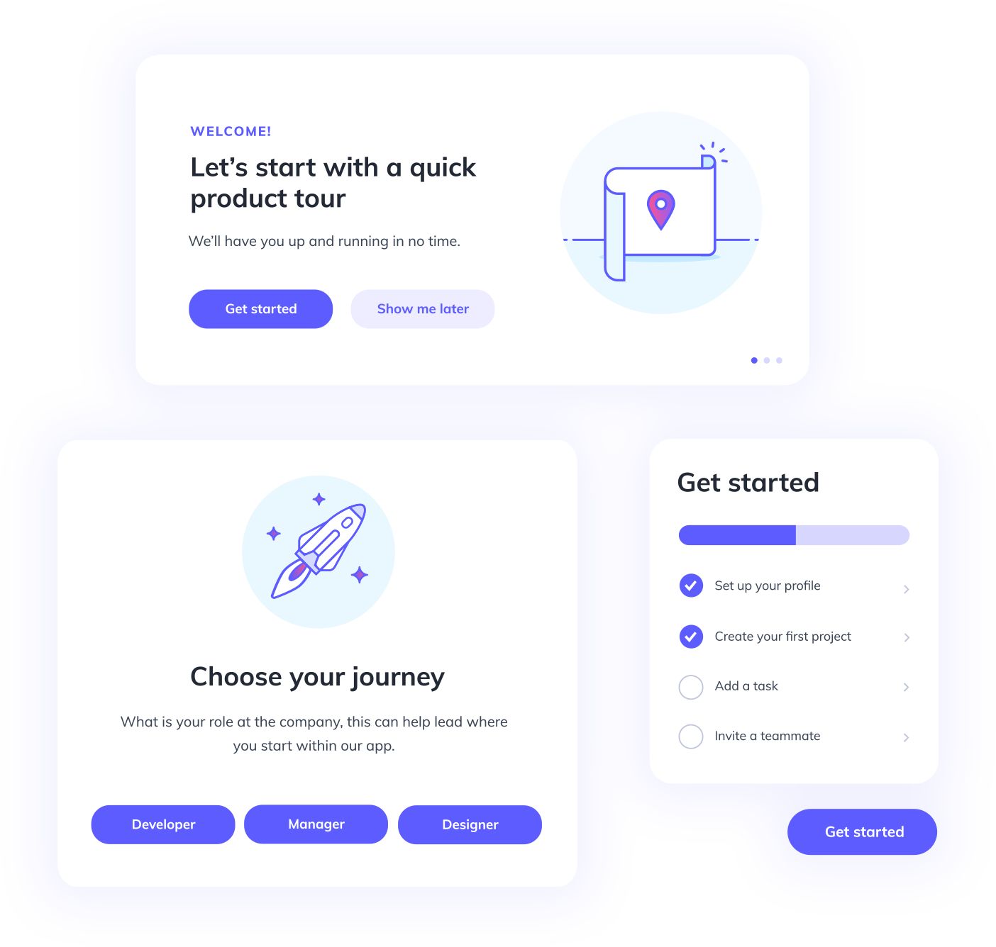
Why onboarding matters and where teams get it wrong
Onboarding is the bridge between "I just signed up" and "I understand why I signed up." It combines setup (the account details a product genuinely needs) with learning (the minimum a person must understand to get value). When it works, users reach that first payoff quickly and stay. When it doesn't, they churn before they ever see what the product can do.
Most onboarding failures come from a handful of repeatable mistakes:
- Front-loading feature tours before users have a reason to care about any of them.
- Turning the first session into a sales pitch instead of a path to value.
- Forcing a long, mandatory wizard when half the fields could wait until later.
- Interrupting the user's first real task with a tutorial they didn't ask for.
That last point is backed by research from Nielsen Norman Group on onboarding tutorials, which found that contextual "pull" help tends to work better than push tutorials that interrupt the user mid-task. People skip what they didn't ask for. Give them help they can call up when they need it instead.
Core design principles that should guide every onboarding decision
Every onboarding decision, from copy to layout to sequencing, should be checked against a small set of principles rather than personal taste.
Progressive disclosure is the anchor. NN/g's guidance on progressive disclosure recommends showing only the core options at first and revealing advanced ones on request, and it specifically warns against building more than two levels of disclosure unless you have strong evidence users need a third. Two levels cover most products.
Training wheels is the related idea of gating complexity rather than hiding it forever. NN/g's research on training-wheels interfaces found that initially limiting available features helps users build a working mental model faster, which pays off once you unlock the advanced functionality later.
Contextual help should win over push tutorials whenever you're choosing between the two, per the same NN/g onboarding research cited above. Keep help dismissible, but put it somewhere predictable, a help button or sidebar the user can find again without hunting.
Copy matters more than most teams expect:
- Step titles should describe the outcome, not the mechanism ("Connect your bank" beats "Step 2: Integration").
- Helper text should explain why a field is required, not just that it's required.
- Buttons should name the action explicitly ("Save and continue" rather than "Next").
Pro Tip:Write your onboarding copy as if the user is skimming, because they are. If a sentence doesn't survive a five-second read, cut it.
Common onboarding patterns and their trade-offs
Product teams generally reach for one of five patterns, and picking the wrong one for the job is where a lot of onboarding budget gets wasted.
Interactive walkthroughs guide the user through the actual interface, step by step, inside the real product rather than a slideshow. A controlled multi-arm comparative study of onboarding strategies on Lapsula, run across 620 users, found interactive walkthroughs produced the highest completion rate and satisfaction score. They work best for complex, high-value setups where the payoff justifies a few extra minutes of guided effort.
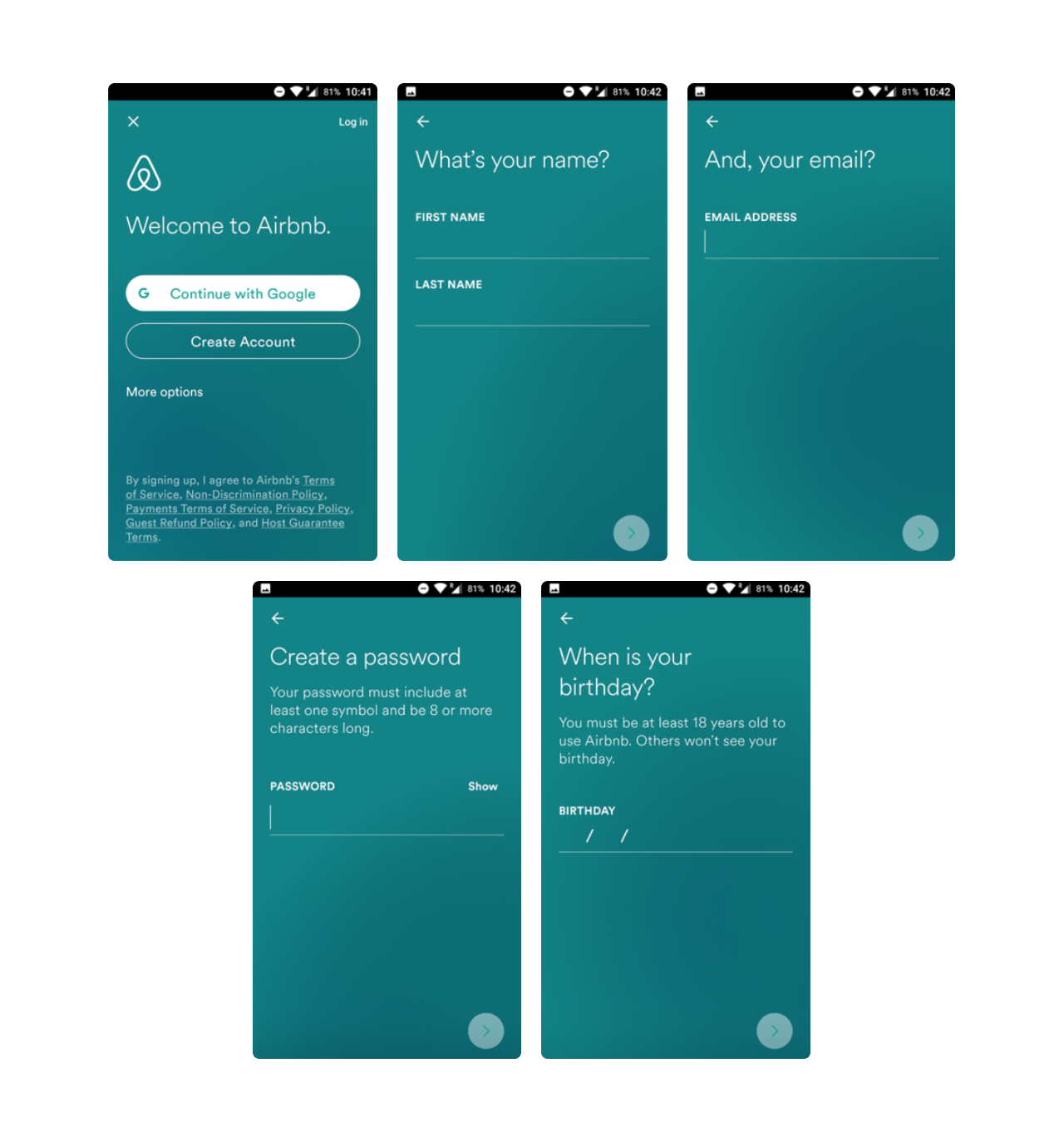
Wizards, which disclose fields in staged screens, came in second-best in that same study. They still make sense for account-critical data collection where every field is genuinely required, but watch your step count closely: each additional screen is a chance for someone to abandon.
Gamified checklists turn setup into a visible, non-linear list of tasks rather than a forced sequence. They give users a sense of agency and clarity about what's left to do, which suits products where setup steps don't have to happen in strict order.
Nudging (small contextual prompts that appear as the user works) is low-friction and good for reinforcing repeated habits, but the Lapsula study found it produced lower completion rates than walkthroughs or wizards when the task involved multiple steps rather than a single nudge-sized action.
LLM and chatbot-driven onboarding is the newest entrant. It can feel fast and conversational when it's well-built, but the same study reported mixed completion results compared to structured walkthroughs. If you build one, the same research recommends pairing it with prompt engineering, schema validation, and function-calling so conversational input gets translated into safe, structured data and validated before it ever hits your database. Raw Studio's own look at ChatGPT's UX covers some of the same tension between conversational ease and control.
- Interactive walkthroughs: best completion and satisfaction for complex setups.
- Wizards: reliable for mandatory data, but sensitive to step count.
- Gamified checklists: good for flexible, non-linear onboarding.
- Nudging: cheap and habit-forming, weaker for multi-step tasks.
- Chatbots: fast when done well, but empirically inconsistent.
A prioritized onboarding checklist you can implement this week
Start by deciding what's actually required. Everything else waits until it's needed.
- Separate required fields (the minimum to reach first value) from optional ones, and default to collecting only the required set.
- Target three steps or fewer for the primary flow, and show a visible step indicator so users know how much is left.
- On each screen, show one goal, one primary action, and helper text that explains why the field matters.
- Add a back button on every step, but only allow skip on steps marked optional.
- For longer flows, save progress automatically so users can resume without redoing work.
- End with a completion screen that confirms success, sets expectations for what happens next, and hands the user their first real in-product task.
Raw Studio's writing on SaaS UX patterns covers several of these structural choices in more depth, and the pitfalls piece on UX mistakes that kill SaaS conversion is worth a look if you're auditing an existing flow rather than building from scratch.
From an engineering standpoint, instrument each step as its own event (step viewed, step completed, step skipped, flow abandoned) so you can see exactly where people drop off rather than guessing from an aggregate completion number.
Pro Tip:Build your progressive reveal triggers around actual usage, not time on page. A user who has connected data should see advanced options; one who hasn't shouldn't, no matter how long they've been logged in.
Measuring and testing your onboarding flow
Track a handful of metrics consistently rather than a dashboard full of vanity numbers. Activation rate (the share of new users who complete the action that defines "activated" for your product) and time-to-first-value are the two that matter most early. Task completion rate per step and retention lift at 7 and 30 days tell you whether the flow is actually changing behavior, not just looking busy.
- Instrument each onboarding step as a distinct event, not just "onboarding started" and "onboarding finished."
- Track drop-off by step so you know exactly where to focus a fix.
- Compare interactive walkthroughs against contextual help on the same feature to see which drives faster time-to-value.
- Test wizard length directly, three steps against five, and watch completion rate move.
- Test checklist visibility (always visible versus dismissible) to see its effect on return visits.
If a test shows only a small lift, don't discard the idea outright. Small onboarding gains compound at scale, and a change that moves activation by even a modest amount can be worth stacking with the next experiment rather than abandoning. Raw Studio's retention webinar walks through some of the experiment sequencing that makes this compounding work in practice, and this step-by-step guide to SaaS conversion optimization is a solid companion resource if you're building your first testing roadmap.
What Raw Studio's client work shows about onboarding in practice
Raw Studio's Maqro case study is a useful illustration of what these principles look like when applied to a real fintech SaaS product. The work involved UX and conversion-rate-optimization led onboarding improvements, the kind of research-driven, sprint-based process Raw Studio uses across client engagements rather than a one-off redesign.
The tactics that move retention aren't exotic. They're the disciplined application of contextual help, staged complexity, and a completion moment that actually tells the user what to do next.
The agency's webinar on increasing retention through better onboarding covers practical tactics teams can lift directly: where to place contextual help, how to sequence a checklist, and which metrics actually predict retention rather than just looking good in a report. Raw Studio runs this kind of work through repeatable frameworks, notably its Design Sprint and Rapid MVP processes. These are built to take a team from an onboarding hypothesis to a testable prototype without months of back-and-forth. For teams handling complex financial data specifically, the agency's piece on banking app UX design is a relevant companion, since progressive disclosure carries extra weight when the product involves sensitive financial information.
When onboarding isn't your real problem
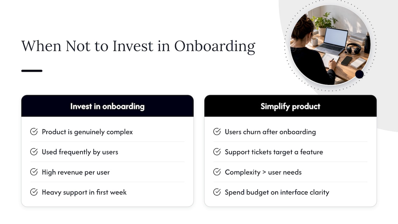
Sometimes the honest answer is that onboarding isn't broken, the product is hard to learn regardless of how it's introduced. If users churn well after onboarding, if support tickets cluster around a specific feature rather than the first session, or if the product's complexity is high relative to what a typical user needs, you're often better off simplifying the interface itself before you polish the walkthrough around it.
Onboarding investment makes the most sense when the product is genuinely complex, used frequently, tied to meaningful revenue per user, or generating heavy support load in the first week. When none of those apply, spend the budget on interface clarity first. A better flow can't fully compensate for a confusing product, and a simpler product needs less onboarding to begin with.
How Raw Studio helps teams turn this into a shipped flow
Designing an onboarding flow that actually holds up under real users takes more than picking the right pattern, it takes research, prototyping, and testing under a deadline. UX Design, Conversion Rate Optimisation, and Design Sprint services can help with understanding where users drop off, designing a flow around it, and validating the fix before it ships. A Rapid MVP process exists for teams that need a testable prototype fast, rather than a slow, meeting-heavy redesign.
If you're not sure whether your current flow needs a redesign or a smaller fix, a Free UX Audit is the lowest-friction way to find out. For teams ready to commit to a full engagement, the pricing page outlines packages including the Design Team (Platinum) retainer at $8,400 per month and the Full UX/CRO Audit starting from $2,500 one-off.
Discuss Your Onboarding Flow
Email Raw Studio to discuss UX, conversion, or digital product challenges with a team focused on data-driven design solutions. [email protected].