.svg)
.svg)



The single highest-leverage fix for privacy policy UX is layered disclosure: a plain-language summary at the top, persistent links wherever data gets collected, and withdrawal controls as easy to use as consent itself. Guidance from the OAIC and the EDPB both point the same direction: clarity and control, not just legal coverage.

Common usability mistakes on privacy and terms pages
Most privacy policies read like they were written to survive a lawsuit, not to inform a human being. That is often exactly what happened. Legal teams draft for precision and liability, and the resulting document lands on the page as a wall of clauses with no visual hierarchy, no summary, and no way to scan for the one thing a reader actually wants to know: what happens to their data.
The absence of a high-level summary is the biggest comprehension killer. When there's no plain-language entry point, readers either skip the policy entirely or bail after the first paragraph. The OAIC's guidance on app privacy policies recommends a layered approach precisely because a single dense document can't serve both the casual reader and the person who needs full detail.
Formatting compounds the problem. A policy with no headings, no table of contents, and no anchors forces readers to scroll and hunt, which most people won't do. And within that structure, certain patterns show up again and again as genuine dark patterns rather than honest design limitations:
- Opt-out links buried several clicks deep in account settings, far from where consent was originally given.
- Pre-checked boxes for data sharing or marketing that require active effort to decline.
- Vague category labels like "improve our services" that hide specific data uses such as ad targeting or third-party sales.
- Consent bundled with unrelated terms, so accepting the product also means accepting broad data use.
The EDPB's guidelines on deceptive design catalog these patterns in detail and recommend layered notices and clear headings as a direct countermeasure, not just a nicety.
Layered disclosure and effective summaries
A layered privacy policy puts a short, honest summary in front of the full legal text, and lets readers choose how deep to go. The OAIC's guidance treats this as a readability requirement, not a design flourish: the policy has to be "clearly expressed," and a wall of legal text rarely qualifies.
Your summary should answer four questions in one to three sentences:
- Who is collecting the data (the controller, named plainly).
- Why it's being collected (the actual purpose, not a euphemism).
- What main categories of data are involved (contact details, location, payment info).
- How someone can opt out or withdraw consent, with a direct link.
Design-wise, you have two solid options: an expandable summary that sits above the fold and unfolds into detail, or an inline TL;DR box styled distinctly from the legal body text so readers know at a glance which mode they're in. Either works. What doesn't work is a summary that's technically present but styled identically to the rest of the page, since readers will scroll straight past it.
Accessibility needs specific attention here. Expandable sections need visible keyboard focus states, ARIA labeling so screen readers announce them as expandable, and a printable or downloadable version of the full policy for anyone who can't rely on interactive elements.
Pro Tip:Write the summary last, after the full policy is done, then test whether someone who reads only the summary could explain your data practices back to you in one sentence.
Where and how to place privacy policy links and navigation
Discoverability is half the battle, and it's the half most teams skip. A policy that's well written but hidden three menus deep might as well not exist.
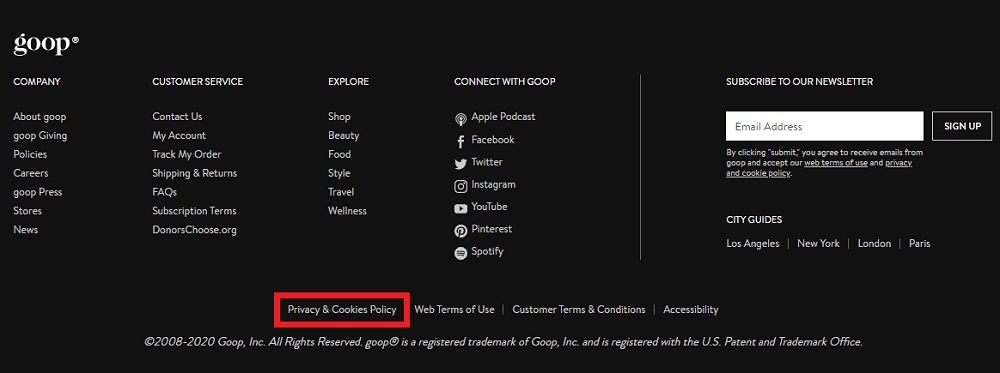
- Footer links matter for baseline compliance, but they're rarely where anyone reads the policy for the first time.
- Sign-up forms and account settings need their own contextual link, placed right next to the action that triggers data collection.
- Just-in-time links, shown at the exact moment a new data type is requested (like location or camera access), do more for comprehension than any footer link ever will.
Inside the policy itself, structure is what turns a document into something navigable. A linked table of contents at the top, anchor links for each section, and a visible version history with plain-language change highlights let returning readers see what's new without rereading the whole thing. The EDPB specifically calls out change tracking as part of avoiding deceptive design.
On mobile, the same principles apply under tighter constraints. Controls shouldn't sit behind more than one extra tap compared to desktop, and any link that requires horizontal scrolling or a tiny tap target is effectively hidden. If a setting takes four taps to reach on a phone, most people will never find it.
Consent UI, dashboards and withdrawal controls
Consent design has one non-negotiable rule: it has to be active. A pre-checked box isn't consent, it's a hurdle the user has to notice and clear. Every genuine consent choice should default to off and require a deliberate action, and it should be visually and functionally separate from unrelated terms of service so someone isn't agreeing to data sharing just to use the product.
A consent dashboard, whether it's for marketing preferences or something more regulated, needs a few core elements:
- A plain list of every active consent, in the language the user actually granted it in.
- A withdrawal action that takes effect immediately, not after a support ticket.
- A short note on what happens after withdrawal, such as losing personalized recommendations.
A quarter of the OAIC's Consumer Data Right guidance is built around one idea: withdrawal must be as prominent and simple as the original consent. That single requirement reshapes dashboard design, because it means the "withdraw" button can't be smaller, greyed out, or harder to find than the "consent" button was.
For anyone building under a Consumer Data Right style regime, the dashboard also has to show consequences of withdrawal clearly, not bury them in a tooltip. Our dashboard design write-up covers more of the interface mistakes that show up when teams treat dashboards as an afterthought.

Visual design, readability and avoiding deceptive patterns
Readable typography does more for comprehension than clever copywriting. Aim for a body font at 16 pixels or larger, strong contrast between text and background, and short paragraphs broken into digestible chunks rather than dense blocks. Sentences under 20 words consistently test better for comprehension than legal-length ones.
Icons and small tables can clarify data uses faster than paragraphs can, especially when you're listing categories like "data we collect," "why we collect it," and "who we share it with" side by side. A simple table beats three paragraphs saying the same thing.
Certain deceptive patterns need to be replaced outright, not softened:
- Replace pre-checked opt-in boxes with unchecked toggles that require a deliberate tap.
- Replace vague "accept all" buttons with equally prominent "manage preferences" options next to them.
- Replace buried unsubscribe links with one-click withdrawal in the same place consent was given.
- Replace legal jargon like "personal information may be processed" with specific verbs: "we store," "we share," "we sell."
Our piece on common design red flags walks through more of these patterns in a general UX context, and most of them apply directly to privacy flows.
Testing, metrics and evaluation for privacy policy UX
You can't improve what you don't measure, and privacy UX is measurable in the same way any other flow is. A few methods work well without much budget:
- Run a short comprehension quiz after someone reads your summary, asking them to name the data collector, one data type, and how to opt out.
- Track time-on-policy alongside clickflow: if most visitors leave within a few seconds, your summary isn't doing its job.
- A/B test the presence of a summary against none, expanded sections against collapsed ones, and toggle-based consent against checkbox-based consent.
A controlled experiment covered in SOUPS 2020 research on privacy notice design found that time spent on a notice correlated with better comprehension, and that giving readers a sense of control and curiosity increased both understanding and willingness to engage. Structure alone doesn't guarantee attention, the reader has to actually stop and read.
There's a real trade-off between gating comprehension and protecting conversion. Forcing someone through a quiz before they can proceed genuinely improves informed consent, but it adds friction that can tank sign-up rates. The honest approach is to gate hard only where the data use is unusual or sensitive, and rely on a strong summary plus easy withdrawal everywhere else.
Pro Tip:Run your comprehension test on the summary alone before testing the full policy. If people fail on the summary, no amount of full-policy rewriting will fix it.
Raw Studio practitioner examples and checklist
When privacy shows up in a Design Sprint or a Full UX/CRO Audit, it gets treated as a UX problem with the same rigor as checkout flow or onboarding, not as a legal add-on bolted on at the end. That means testing comprehension, mapping where consent happens in the journey, and mocking up dashboard states before a single line of legal copy gets finalized.
A compact checklist any design team can run in a single sprint:
- Rewrite the policy's opening into a plain-language summary suitable for easy comprehension.
- Add a linked table of contents with anchors to every major section to improve navigation.
- Mock up a consent dashboard showing active consents and an easy withdrawal option.
- Replace pre-checked boxes in the current flow with unchecked toggles requiring deliberate user action.
- Draft acceptance criteria with stakeholders detailing what "clearly expressed" means for this product, to ensure clarity and compliance.
Why product teams should treat privacy as a UX problem
I've come to see privacy less as a compliance checkbox and more as a trust mechanism that quietly shapes whether people stick around. A confusing consent flow doesn't just risk a fine, it tells someone the product doesn't respect their time or their data.
Designers are often the only people in the room who notice this. Interview-based research on UI/UX designers found they frequently act as informal privacy advocates, pushing for clarity that legal or growth teams didn't ask for. That instinct deserves a seat at the table, and it deserves to be tested, measured, and shipped in small increments rather than treated as a one-off redesign.
How Raw Studio can help implement privacy UX improvements
If your privacy policy reads like a liability document and your consent flow buries the opt-out, that's a fixable UX problem, not a permanent cost of doing business. A Full UX/CRO Audit gives you a clear view of where comprehension and discoverability are breaking down, and a Design Sprint turns that diagnosis into tested mockups in days rather than months.
For teams that need something built fast, RapidMVP gets a working consent dashboard or layered policy page in front of real users quickly, and our Design Team (Platinum) retainer keeps refining it as regulations and products evolve. Start with the audit and see what's actually costing you trust.
Discuss your privacy UX with Raw Studio. Email [email protected] to discuss UX/UI design, conversion optimisation, or a tailored digital solution for your product team.