7 Tips to Get Your UX Writing on Point
As mentioned in our previous article, UX Writing: What Is It and Why Does It Matter?, we covered the basics of UX copywriting and its importance in user experience and conversions.
If you truly value the role that good user interface design plays in customer experience, then UX writing should be a skill set you have up your sleeve. We’ve covered the what and why; now it’s time to cover the how. How suitable copy can get a customer over the line, how words have such a powerful force on user experience, and how you can utilise this to take your product that one step further.
Table of Contents
1. Reducing Cognitive Load
“Oh, don’t use big words. They mean so little.”
Oscar Wilde
Thanks, Oscar, that is so very true. Eloquently structured sentences with long words can be enjoyable in a novel or as a way to impress our teachers in our English essays. However, the last thing a user wants to do when going through an app is scan through paragraphs or look up that ten letter word in the dictionary.
“There’s a time and a place for ornate writing,” Sophie Tahran, senior UX writer for The New Yorker at Condé Nast, points out. “Marketing emails and blog posts offer enough real estate to rhapsodise about your latest product. UX writing, on the other hand, doesn’t pair so well with a thesaurus.”
That is why it is recommended to use short copy with relatively simple words, as it is much easier to digest. However, digestibility isn’t the only reason. When working with interfaces (particularly mobile), you need to work around space restrictions, so shorter text is necessary.

But what’s the optimal line length for your body text? The optimal length is considered to be 50-60 characters per line (75 max) including spaces (“Typographie”, E. Ruder).
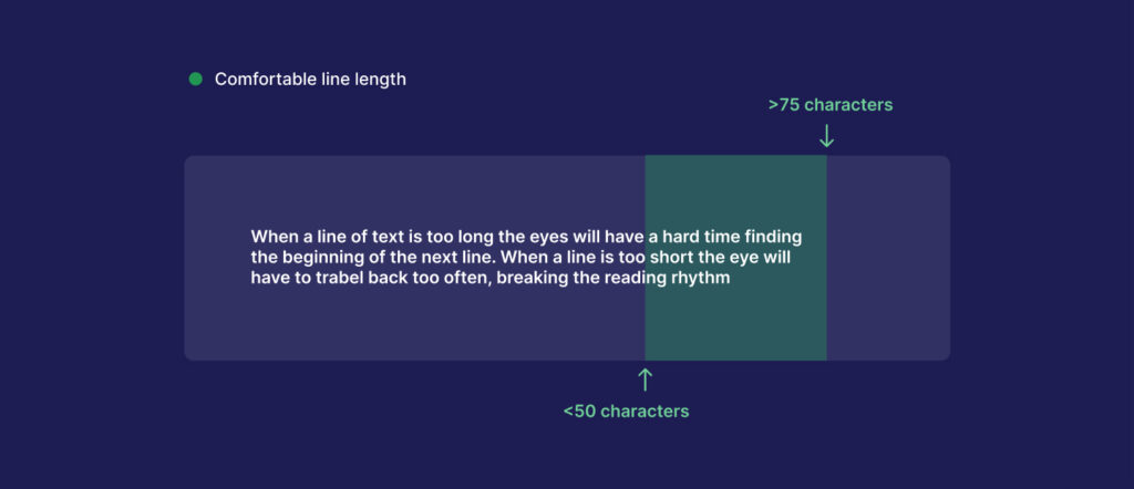
This point is displayed in the illustration above. Here are the cons of disregarding this ‘ideal’ range:
- Too wide – if a line of text is too long the reader’s eyes will have a hard time focusing on the text. This is because the line length makes it difficult to gauge where the line starts and ends. Furthermore it can be difficult to continue onto the correct line in large blocks of text.
- Too narrow – if a line is too short the eye will have to travel back too often, breaking the reader’s rhythm. Too short lines also tend to stress readers, making them begin on the next line before finishing the current one (hence skipping potentially important words).
According to E.Ruder’s Typographie, the subconscious mind is energised when jumping to the next line (as long as it doesn’t happen too frequently). At the beginning of every new line, the reader refocuses, but this focus gradually wears off over the duration of the line.
So as a means to avoid such user drawbacks, it’s recommended to keep your text within the range of 50-75 characters per line.
2. Always front-load important information
In other words, lead with the main point. This can differ significantly from regular copywriting, where sometimes we like to leave our readers on the edge of their seats until the very last sentence. In UX Writing, there is simply no time for that.
Despite a lot of thought going into copy, people generally scan websites for important information. Eyes flicker across the page, looking for something that meets their needs. People skim.
Some examples below show how leading with the main point can drastically differ from having it in the middle or at the end of the statement. This is because we want our users to directly see what the subject is and what value they will get out of it.
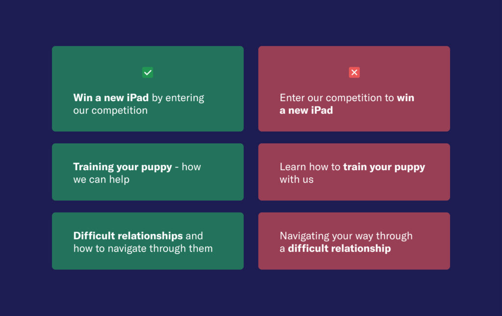
The same sort of practice applies with longer bodies of text, such as paragraphs. According to the Nielsen Norman Group, the best tips for constructing your site’s copy are:
- Include the most important points in the first two paragraphs on the page.
- Use headings and subheadings. Ensure they look more important and are more visible than normal text so users may distinguish them quickly.
- Start headings and subheadings with the words carrying most information: if users see only the first 2 words, they should still get the gist of the following section.
- Visually group small amounts of related content — for instance, by surrounding them with a border or using a different background.
- Bold important words and phrases.
- Take advantage of the different formatting of links, and ensure that links include information-bearing words (instead of generic “go”, “click here”, or “more”). This technique also improves accessibility for users who hear links read aloud instead of scanning the content visually.
- Use bullets and numbers to call out items in a list or process.
- Cut unnecessary content.
While these points are very helpful, it is still hard to control people’s motivation or their goals at the end of the day. However, you can do your best to optimise your content to do the heavy lifting for our users, allowing them to find what they need quickly. Use good web-formatting techniques, such as headers and sectioning, to draw attention to the most critical information instead of relying on the random words users may fixate on when no structure is present.
3. Utilise verbs in CTAs
With such a competitive landscape in most industries, it can be hard to win a potential customer’s heart and create a conversion. An excellent way to increase a user’s interest in a particular action is by starting your sentence or CTA with an imperative verb – a command word that tells the reader precisely what they need to do. Get to the point straight away and don’t use verbs that seemingly give the reader a choice of what action to take like ‘could’, ‘would’, ‘might’ or ‘should’. You want to sound confident and driven, instilling assurance in the user.


As you can see in the examples above, the verbs are put at the front of the CTA: ‘subscribe’ and ‘view’, whereas the others are a little bit vaguer and less urgent.
It might seem like a minor tweak or gesture, but it can be the little thing that helps you get that customer over the line.
4. Keep it consistent
I’m bringing back some wise words from Sophie Tahran (mentioned in the first tip point). Sophie recommends her readers remember that consistency is key when designing a site. If you use the words “buy” and “reserve” interchangeably, for example, it will be tough for your client’s customers to understand exactly what it is that they’re doing.
“Repetition is a tool that you can use to your advantage,” Tahran says, “Especially for the UX copy that holds the page together: links, field labels, product specifications, prices, shipping, and the like.”
The more consistent your terminology, the less confusion your client’s customers will face, and the faster they’ll zip through checkout.
This consistency also plays into brand tone and voice. “Voice makes your writing more consistent, and tone makes it more empathetic. Together, they make your products easier to use.” – Rhiannon Jones, Deliveroo. The tone of Voice encapsulates your brand’s personality.
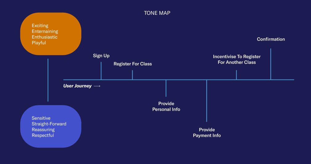
Above is a tone map taught in the GA UX Writing course, showing how your choice of tone is critical in particular areas. For example, signing up for a new product is an exciting experience, and we want our users to feel that way, so an excited and sometimes playful tone can be used when onboarding or signing them up. In areas where we ask our users for more personal information, whether health-related, security info or payment details, a more secure and to-the-point voice is best used to make the user feel assured that their details will be kept secure and confidential.
5. Check your readability
Key measures of your writing quality include reader understanding and recall of your message. One of the ways to facilitate maximizing comprehension and recall is to write in easily understandable language. You can conduct many tests to find out how clearly you are writing and how well your audience understands your messages.
Read out loud: It might seem like a simple yet strange tip, but going through your copy by reading it out loud can really help you to check whether it makes sense and if it is in the right tone.
Ask your colleague to check it: Sometimes, when you’re totally engrossed in something you can get tunnel vision. That’s where an extra set of eyes is incredibly helpful, allowing you to get feedback and potentially consider other alternatives to your copy.
Use an online readability checker:
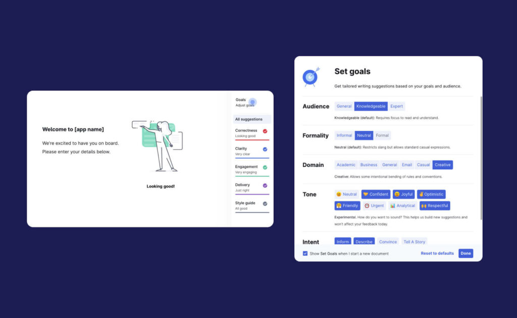
When a colleague or extra set of eyes isn’t accessible or nearby, there are a few excellent online readability assistants that can take your writing to the next level. I have found Grammarly to be a fantastic program to add to my UX writing toolkit (in my humble and somewhat biased opinion.) You can set goals, which impact how your writing presents itself, and it is your proofreading and sentence-structure-checking best friend. In addition, it helps you cut out any unnecessary words and suggests better ways to phrase sentences. There are, of course, other alternatives that will help you on your way to error-free writing, such as Hemingway. This article provides nine other alternatives to Grammarly if you want to weigh up your options!
6. Write for equity and inclusion
As you’re writing to meet the needs of your users, you can’t forget to make sure that your copy is accessible and inclusive to all users. The consideration and embracement of diversity are imperative to create an entirely usable product.
Differences in experiences can shape users’ different perspectives and thoughts. These experiences can be due to multiple factors, including but not limited to: race, ethnicity, location, gender, sexuality, ability/disability, and education level.
Depending on the product, audiences can vary, but it is important to still write for equity and inclusion. It is also important to note that all users may not have had access to quality education, and some may not have had access to education through their teens and beyond. The unfortunate reality of this world is that where you’re born (location-wise and economic status) can determine your education quality. Because of this, we need to make sure that we:
- Use simple language. Use language from a 12-year-old reading level or under. It’s safe, effective and covers all bases, allowing you to be accessible to a broader audience.
- Use a more conversational voice than a technical one. This can, of course, depend on your product type. But generally speaking, a conversational tone allows for better readability and creates a nice flow of words.
- Make sure that you’re using terms that are widely known. We don’t want our users looking up thesaurus.com or dictionary.com. An exception could be that you are using words that are specific to your platform or brand. In that case, it needs to be relatively well known amongst your user base, or you need to define this somewhere on your website.
Inclusion: Accessibility
This is an essential and often forgotten practice. When I scroll through my Instagram, I see a lot more celebrities and influencers using closed captions and image descriptions on their posts. As a person with no disabilities, I have never had to worry about whether something online has closed captions or image descriptions. But for so many others in this world, this lack of accessibility and inclusivity is a frustration they can experience daily.
We need to make sure that we’re creating products that are accessible to users who have impaired vision. As UX writers, we can make our products accessible by providing alt-text or accessibility texts.
There are three main ways that we can address accessibility as UX writers:
- On-screen text. This is the standard text that we usually associate with UX writing. It’s important to remember that the text you write on the screen is for sighted and non-sighted users.
- Screen-reader-only text. This is text specifically for non-sighted users that use assistive technology to help these users navigate a page.
- Alt-text. Alt-text is any kind of alternative text used to describe images or icons for non-sighted users. Alt-text is highly important because it helps provide context to non-sighted users with the meaning of images and where linked images go.
Below is an example of good alt-text practice and a not-so-good example. We want to create a descriptive experience for our users who utilise alt text and not be left in the unknown.

7. When in doubt, test it out
UX writing is a huge factor in your overall product design and user experience. Therefore it is as relevant to test as the visual design. Of course, this can be done during the overall product usability testing, but if you really want to dive deep, there are a few methods that you can try, including:
- Conversation mining: This skill is more research-based which will help in the user testing phase. At the same time, you’re almost testing your vocabulary and tailoring it to a particular user group for the product. In conversation mining, you dig into your users’ conversations, wherever they have them, and grab any keywords that are used frequently. This could be a Reddit thread (although they can often turn into rabbit holes), some customer reviews, or social media posts made by users tagging the brand or product. After all, if our aim is to create a conversational user interface, then what better way to do so than by using the words our users use in actual conversations?
- Highlighter test: Early on in the design process, a highlighter test can help determine the overall characteristics of the copy. The findings show how the design should speak to customers by understanding the language they use. Content testing can also indicate what information a user needs for that specific use case on a micro level. According to the UX Studio Team, the test involves providing participants with a printout of the text (if testing in a very early design phase), the coded highlighters, and clear instructions about marking the page. For example, “Using your green highlighter, highlight anything that makes you feel confident about the service”, or “Using red, underline anything that makes you feel less confident about the service”.
- 5 second test: Five second tests are a method of user research that help you measure what information users take away and what impression they get within the first five seconds of viewing a design. They’re commonly used to test whether web pages are effectively communicating their intended message. They’re great for finding out if users can figure out the purpose of the page and what the most memorable/impactful elements are.
- A/B Testing: According to VWO: “A/B testing, also known as split testing, refers to a randomised experimentation process wherein two or more versions of a variable (web page, page element, etc.) are shown to different segments of website visitors at the same time to determine which version leaves the maximum impact and drive business metrics.” Therefore, it can be a brilliant and data-backed way to test which CTA works best or which paragraph creates more conversions.
Wrap Up
I loved this quote given by John Moore Williams in a Webflow blog post: “To wildly oversimplify human behaviour for a minute: people are generally reluctant to exert effort unless they know they’ll get something in return for it.” We need to indicate and explain what users will get out of doing a particular action, and they’ll often be more inclined to do it.
We need to keep our primary goal at the forefront of our UX Writing practice: to create an empathetic experience for all users. UX Writing should not be an afterthought where you’re just fixing up words at the end; it should be well integrated within the development of a product. But in all honesty, it’s isn’t easy. I put this quote in my last blog post by Nathaniel Hawthorne, where he states that “easy reading is damn hard writing.” Incorporating effective, concise and inclusive writing takes time, dedication and effort. But if compelling copy allows a user to have an incredible experience, if it helps increase brand reputation, and if it gets those extra conversions… I’d say it’s worth the investment.
Take your company to the next level and get results with our world class user experience, interface design and implementation.
Get a FREE 30 min Strategy Session

Related posts
5 Reasons Why Good UX/UI Design is a Game-Changer for Startups
Startups are constantly seeking ways to stand out from the crowd and ensure long-term success. One of the most crucial […]
The Rise of No-Code in EdTech: How Educators Are Building Interactive Learning Experiences
The Rise of No-Code in EdTech: How Educators Are Building Interactive Learning Experiences Imagine you’re a teacher with a vision: […]
Threads Unraveled: How UX Flaws Weakened a Promising Social Platform
Threads emerged as a social media platform brimming with promise. Its unique focus on threaded messaging and ephemeral content aimed […]
Creative product design that gets results
Take your company to the next level with world class user experience and interface design.
get a free strategy session
