A Quick Guide to Mobile-First Design
Table of Contents
So, why mobile? 🤷♀️
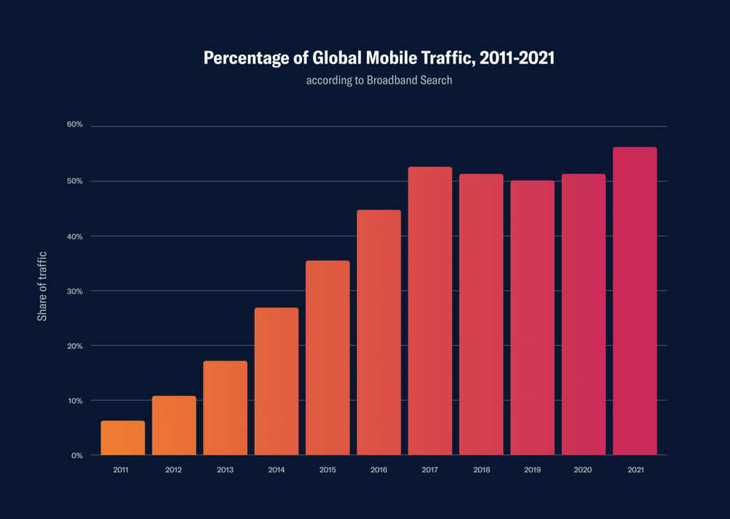
Well, because mobile is now everything – with over 55% of web traffic coming from mobile devices globally. We have come a long way since the early days of mobile device adoption, with terrible loading times and all of that pinching, dragging and pulling of touch screens in order to make sense of a website.
Creating a mobile site or app is almost expected now, as customers and society as a whole are relying on our smartphones more and more. And with the expectation that three quarters of the world will use just their smartphones to access the internet by 2025, it is important for businesses to realise the extreme importance of having a user-friendly access point to their services via mobile.
In this article, we’ll discuss what mobile-first design is, the benefits of implementing this approach, and some principles to get you started.
What is mobile-first design? 🤔
The term “mobile-first design” has been around for a little while now but is being used more and more as the world continues to shift to those smaller screens that can be held in the palm of our hand. But what exactly does this term mean?
Mobile-first design is a design philosophy that aims to create better experiences for users by designing for the smallest screen and working your way up. When you design from the smallest screen to the largest screen, this is known as progressive enhancement. It’s about designing with a strong foundation and adding enhancements as you go.
The practice empowers companies to draw their focus onto the key functions of a product, in turn helping to ensure that the user’s experience will be seamless on each device.
From a designer’s perspective, this approach means prototyping or sketching a mobile layout first, then moving to the larger screens. Due to the limited real estate on a mobile screen, the designer will have to decide on what is necessary for the user. As you progress through larger screens, you have a little bit more room to play around with, where you can add more copy, images or graphics, but those initial, user-friendly core actions from the mobile designs transfer through to the rest of the designs.

Mobile-first vs mobile-friendly 📱
While these two terms may sound quite similar, they mean very different things.
As discussed above, mobile-first is a practice and a means of prioritising the most important information on smaller devices and working your way up.
When something is “mobile-friendly,” it is built primarily for desktop users, but can then be sized down to mobile. It is built for big screens and then sized down – a stark contrast to the term “mobile-first.” The design elements and containers start big and then get smaller, and content that would typically be horizontal on a desktop is then positioned vertically according to CSS breakpoints. So basically, no pinching or zooming in and out as the screen width adjusts to a mobile. But I believe Gabriel Shaoolian puts the term’s relevancy well in their article by stating, “Think of mobile-friendly design as the bare minimum required in this day and age.”
Benefits 👏
Increases your customer reach 📈
It is evident from the previous statistics that we’re edging closer and closer to mobile devices dominating global internet traffic, so creating a mobile-centric platform will only increase interest and traffic. Creating a platform that is easier to use for mobiles also has the potential to increase customer loyalty, as they will feel more inclined to return to your product is they had a great experience.
Better UX ❤️
When designing mobile-first, you are creating a user experience that is tailored to a mobile device, rather than one that has been compressed from desktop. Better UX is known to increase traffic and conversions.
New revenue channels 💸
When providing a mobile service alongside the rest of your business, you can expand your revenue channels or increase existing ones. Apps can offer a multitude of monetisation opportunities including paid products, in-app purchases, gamification elements, upgrades, and premium capabilities.
Faster load times 🏎
More content means more loading time. Starting with mobile designs means reduced content on each page, which in turn speeds uploading time. Website conversion rates drop by an average of 4.42% with each additional second of load time (between the first 0-5 seconds) so faster loading times will in turn increase your chances of conversions. It will also help you rank higher on search engines as page load time is a significant ranking factor.
Principles 📚
Content first ☝️
Repeat after me… Mobile-first = content first.
Typically when designing for desktop, the layout is pivotal, and content comes later. We’ll pop in some lorem ipsum and worry about it later. However, with mobile we have very limited space, so what we place in those first few scrolls for a user is absolutely pivotal. When creating content for a mobile-first website, you should make that content concise and to the point as much as possible.
Take Airbnb as an example. Usually, large graphics are less prioritised on mobile devices, however carefully curated images are imperative in expressing an aesthetic experience, hence why they are prioritised here. The mobile screen keeps one image in an Instagram story-style layout that users can flick through, whilst the tablet and desktop allow for more room to display more images.
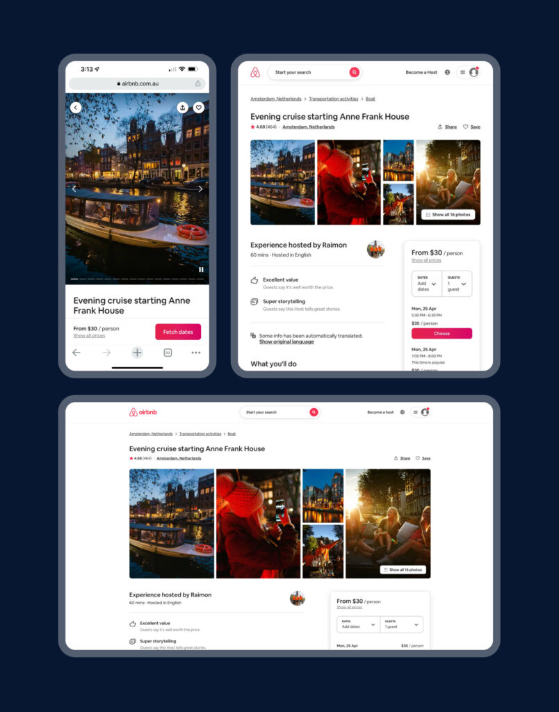
The title of the experience is always in view, as well as the cost (a.k.a the important stuff.) You will also notice that even though the image on the mobile takes up a lot of the screen, Airbnb has made sure that the primary button/CTA is still visible and accessible at the tap of a finger.
Hierarchy is everything 💯
On mobile, it is important to prioritise what elements you show and determine how to display the most important elements prominently. We only have a few seconds to capture a user’s attention, so it is important to display actionable and essential elements in that first initial screen.
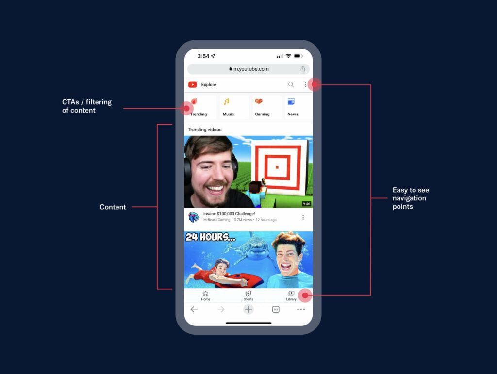
Take Youtube, which has visible navigation points – both a kebab menu in the top right-hand corner as well as a bottom bar. These provide access for those who need to log in, search for something or access their existing library. They have filtering at the top to find more specific videos, in turn tailoring the user’s experience further, and they also have a few videos on display ready to be viewed for those who are curious.
It is relevant to note that whilst there are some basic rules on how to structure your mobile site’s hierarchy, user research, feedback and analytics should also be taken into consideration before deciding what to place where. What will work for one company or one industry may not work for others, so it is recommended to reach out to your user base and ask them what they want or expect to see.
In the end, the most important thing to remember when approaching mobile-first design is that you’re doing it primarily for your user.
Easy navigation 🧭
Navigation that would typically be on the top bar of your desktop needs to be condensed on a mobile. One of the best ways to do this is by condensing your navigational elements or links into easy-to-access navigational buttons. An incredibly popular example of this is the hamburger menu.
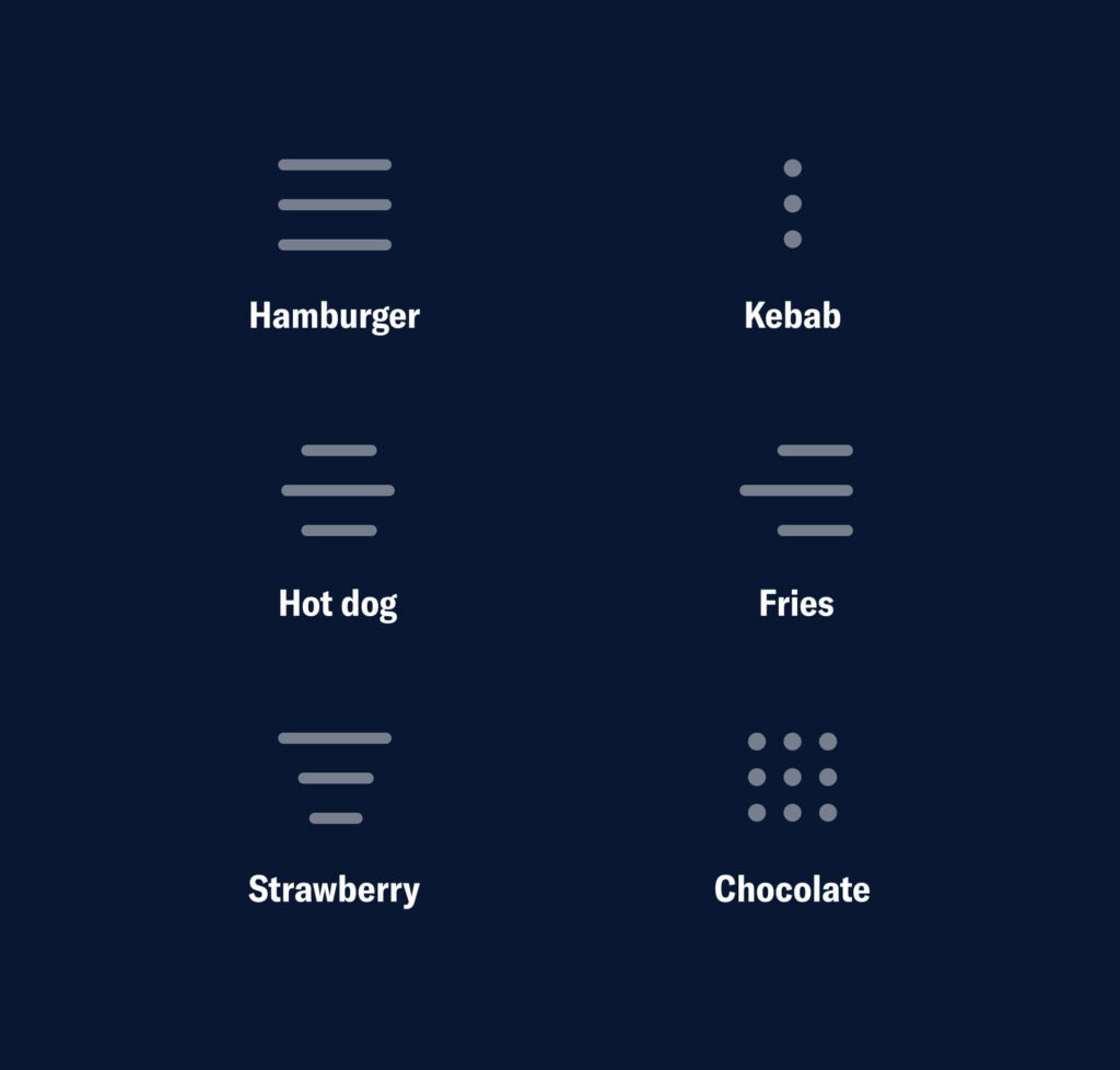
There are quite a few variations of this menu style. Treatments tend to vary for different device types (e.g. iOS vs. Android) or purpose of navigation.
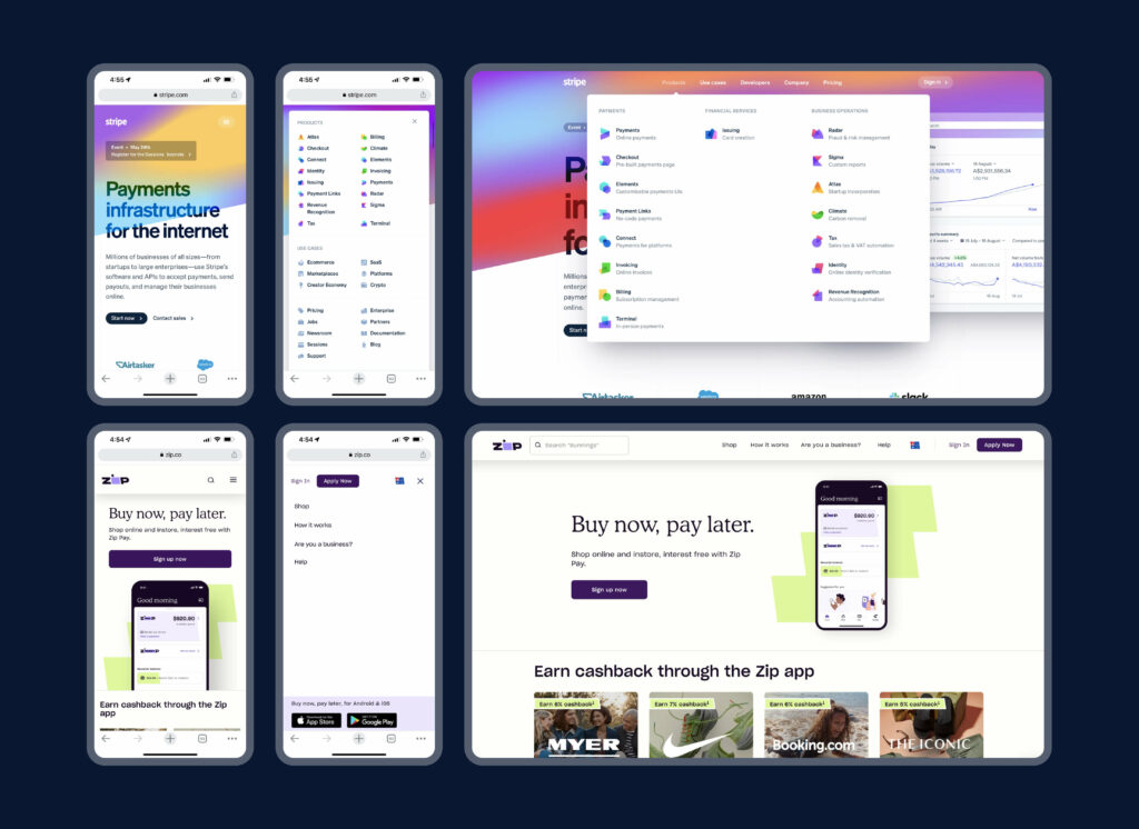
You can see in the two examples below, Stripe and Zip, that a hamburger icon has been utilised to “tuck away” their navigation. Zip’s hamburger content is relatively simple, with just four links and a button, whereas Stripe’s is much more complex. However, Stripe has still managed to condense their five navigation tabs into one menu.
Another approach is to have combination navigation, which is not only very fun to say out loud but can also allow you to prioritise certain tabs to keep your user engaged and not searching for too long.
Joe Toscano, an experience design consultant, talks about the beauty of combo navigation,
“Combo navigation allows the user to see the options they need the most and makes the rest accessible in a hamburger menu or something similar.
One great example comes from Apple’s mobile page where, instead of implementing a hamburger menu that hides options, Apple utilises combo navigation to present the most important links.”
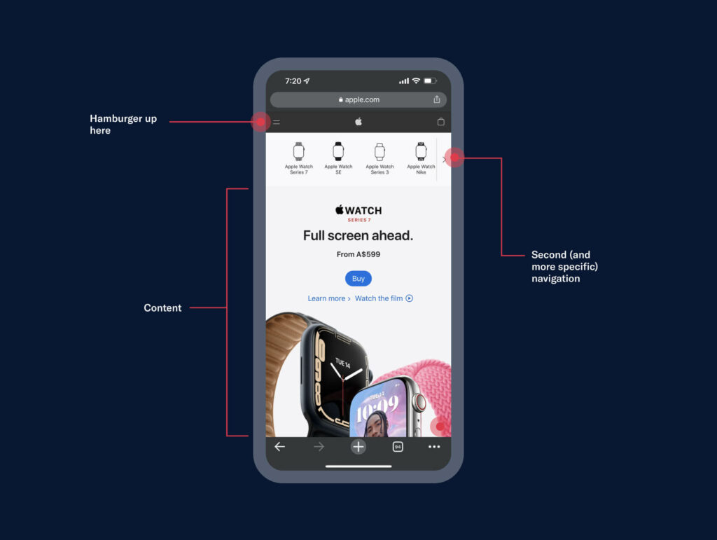
In the image above, you can see what Toscano is talking about. Apple does have their hamburger menu at the top, but also provides more specific and relevant navigation options within the specific page. This screen is the main page for Apple Watches, and at the top is a horizontal nav with all the different types, as well as some easy to see CTAs such as “Buy,” “Learn more” and “Watch the Film.”
Although there are a few different ways to approach navigation, the key objective is certainly getting your user from A to B in the most simple, seam-free way, which flows quite nicely into our final point…
Keep things simple ✨
Mobile-first means Marie Kondo-ing your content. The simplistic mobile design will provide users with clarity on what your website, company, product or service is all about in those first few pivotal seconds. Therefore, it’s so important to only keep elements and content that you really need in order to avoid any distractions.
Some tips for keeping it simple include:
- ⬜️ Don’t be scared of white space – embrace it. It will help you avoid that ‘cluttered’ feel
- ✌️ 1-2 columns max. horizontally, otherwise, it will be too confusing and unreadable
- 🚨 Easy to recognise CTAs – whether by placement and/or colour treatment
- ⬇️ Fewer graphics for better loading speed
- 🗺 Prioritising navigation links (as mentioned in our previous point)
- 📃 Limit your number of pages, and make sure the pages don’t scroll on for (what can sometimes feel like) eternity
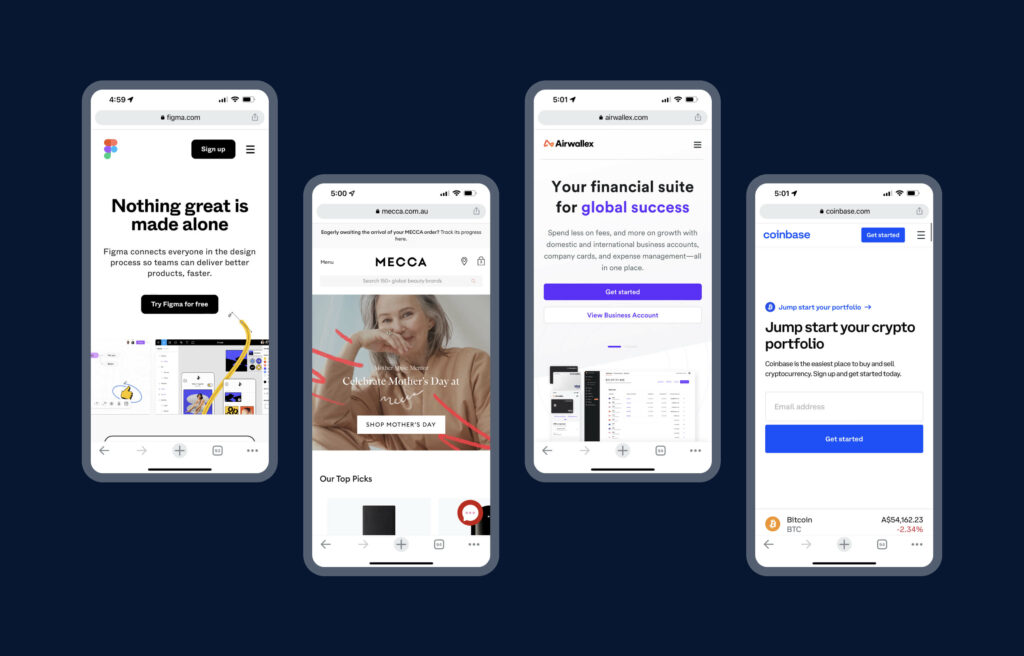
You’ll notice in the examples above of Figma, Mecca, Airwallex and Coinbase, how very simple the home pages are. There are hamburger menus to simplify navigation, 1-2 key CTAs for the user to click, simple and concise copy, and relatively limited graphics so as to not overwhelm or distract.
Wrap Up 🎁
Mobile-first doesn’t mean ignoring or dismissing your desktop users, it is just a way to open your audience up even further and make things more accessible and enjoyable to interact with, in turn benefiting your business.
Designing mobile-first is a great way to help in the exposure and success of your product and brand. Stripping away all the clutter and craziness and going back to basics will help you grasp what is essential to the fundamental user experience for your visitors.
Take your company to the next level and get results with our world class user experience, interface design and implementation.
Get a FREE 30 min Strategy Session

Related posts
Apple’s ‘Exhausted’ Emoji: The Symbol We Didn’t Know We Needed
Have you seen it yet? That yellow face with the heavy under-eye bags that just gets you? Apple recently dropped […]
5 tips on Creating an Award-Winning App Onboarding
Intro 👋 97% of companies say that good user onboarding is necessary for a product’s growth. This statistic from UserGuiding truly emphasises the […]
Top 5 No Code Tools for Building Your MVP
No-code tools have revolutionized the way startups and businesses build Minimum Viable Products (MVPs). These tools allow teams to create […]
Creative product design that gets results
Take your company to the next level with world class user experience and interface design.
get a free strategy session
