Design Psychology: 4 Principles that Empower Designers – Part 1
“Designers are psychology scientists with a pen.”
You might not know it yet, but you beautiful designer, have an almighty power in your hands: the power of understanding humans’ needs. By doing that, you’ve done 80% of your designer job. The other 20% is easy-peasy. By knowing and understanding your customers’ and users’ needs, you already have the keys to creating meaningful products that will help your users in every way possible. If you have not understood your users’ needs, you are creating something to fill the void as needs will not be met and users will not be engaged with your product.
Human psychology is not taught in design school, least of all Design Psychology, and it’s such a shame. Studying psychology in design is definitely important because it gives you keys and clues to understanding how humans work, both consciously and unconsciously.
Design Psychology is the use of psychological behaviour in humans to create and design more accurately. It’s about finding a balance between what is totally useful, to what is purely for artistic purposes. Design Psychology is here to help us do that.
You might want to get comfy and get yourself a cup of tea, or coffee, as this is part 1 of a 4-part series on basic design psychology. We’ll talk about cognitive biases, basic psychology laws that we can leverage when designing for both the human and the lazy, and last but not least, designing using our senses (sight, touch and hearing).
Table of Contents
Cognitive biases: What are they?
People are not rational, and it is neither a positive nor a negative statement. We are all prone to biases and that’s what makes us human. Knowing and being aware of it make it easier to tackle these biases daily. Because our brain is wired to irrational thinking, we try to live around it every day.
Have you ever wondered why we love buying things when it’s on sale? Or when the price has the 99 cents or 9 dollars ending? That’s mainly because our brain subconsciously thinks about what we can gain out of every situation based on habits. By experience, we know that we are saving money when buying things on sale and on those products that have the perfect 9 endings because they are very close to a round number so our brain focuses on the first number and doesn’t see the ending (there will be much more to gain from buying a $9.99 product than a $10, according to our dear brain).
But if biases rule our brain most of the time, we can use them in design and make the user experience even more pleasant: How can we use psychology to our advantage and design better?
Our brain might be a very powerful machine, but even it has limitations, which are called cognitive biases.
A cognitive bias is the unconscious mistakes that a brain makes while processing information, leading to the misinterpretation of the world.
These mistakes most often will come to light from problems related to memory, attention…. They are shortcuts your brain decides to make to make fast decisions and draw on past experiences. This makes us, human beings, act without reason sometimes. As you will see throughout this article, most of the concepts have strong links to each other and work together.
During the pandemic lockdowns we’ve been through these last few years, toilet paper became a holy and scarce product in some countries. People kept buying more and more toilet paper for fear that it would vanish from this world. In this case, people were not acting rationally. Acting rationally would be buying toilet paper whenever needed right? That, my friend, would be what is called the Scarcity Bias.
Even though we don’t need to buy 5 packs of toilet paper (that would be at least 60 rolls of TP…), we are scared that the product will not be available in the coming days or weeks. We assume that what is scarce is valuable and what is abundant is not. The same goes for concert tickets, hotel rooms, housing, water…
Here is a list of five of the most common and important cognitive biases in UX design, and how to work with them:
Anchoring bias
Anchoring bias is probably one of the most common and pervasive biases. It happens when you rely upon the first information you get when making a decision, whether it is relevant or not. Any future research about a product will be subconsciously compared to that first one.
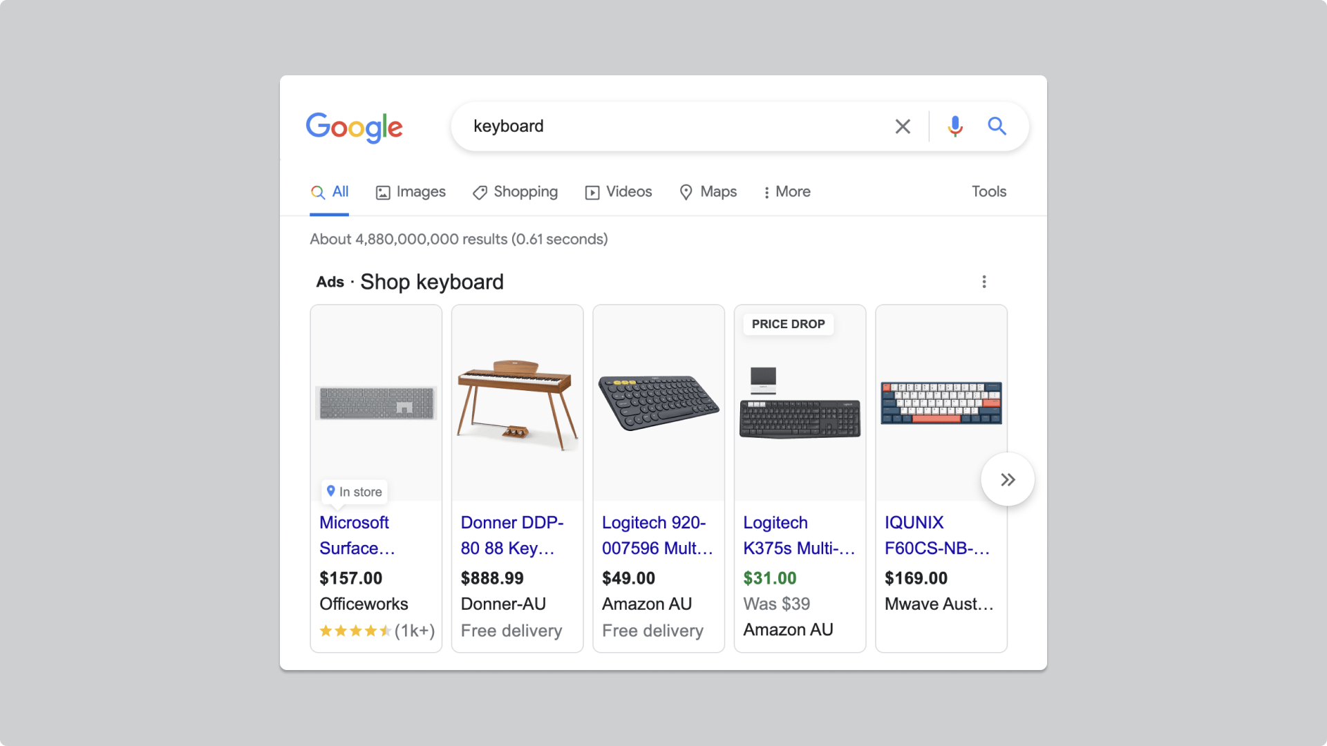
Think about when you want to buy something new, let’s say a new keyboard because your stupid cat spilled coffee on your old one. You would start the research process by asking Google “keyboard”. Your dear friend Google would give you a carousel of choices with keyboards sold online or near you. Well, my friend, you have found your anchor. For me, it would be the $49.00 keyboard offered by Amazon, maybe your anchor will be different. Subconsciously, all of your future research would be based on that first price you saw in your first research.
How does it affect UX Design and how to overcome it?
First impressions matter. It takes 0.05 seconds for your users to create an opinion about your website. The emotions, feelings, and overall appreciation of your product would be the anchor throughout the entire user journey. This can be very dangerous except if you know how to work around it.
You can easily navigate around this bias by prompting your user toward a direction (within reason). By doing so, you are influencing a user’s decision-making process.
- Offer a good default value/input
I recently bought a watch that would count the number of steps walked in a day. The app that was connected to the watch asked me what my daily step goal was. I honestly had no clue. I didn’t know how many steps I usually walk every day or how much I should walk.
Give your users reassurance by prompting them towards a direction, e.g. “The average number of daily steps leans towards 10,000” or “We recommend walking around 10,000 steps per day”.
mobbin.com does it well by giving an example of a search prompt to their users:

- 3-tier advertising
Give your users a variety of choices but prompt them towards a direction by telling them which one has the “best value” or is the “most popular”.
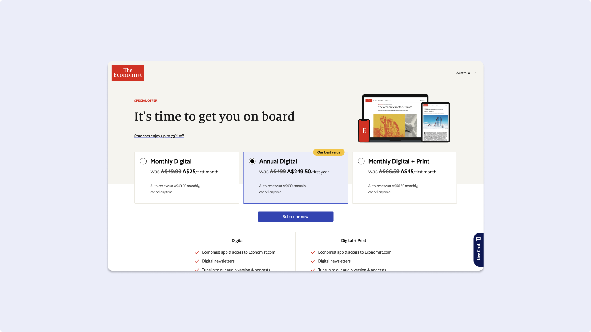

The 3-tier advertising is closely related to the Von-Restorff Effect (or the isolation effect), which states that when shown a bunch of choices, the one that they will decide to choose will be the one that differs the most from the others. It will be remembered as something that stands out and is unique.
The Endowment effect
The endowment effect refers to an emotional bias that causes an individual to place a higher value on something that they own or have created.
You would have more difficulties letting go of a project you have been working on for a long time even though you know that it is heading towards a dead-end. That is because you are emotionally attached to what you have done and well, you spent a lot of time on that baby. This is closely linked to two other phenomenons:
- Loss aversion: Potential loss is seen as more painful and emotionally more severe than the equivalent gain. e.g. Losing $100 is more painful than gaining $100.
- Sunk Cost Fallacy: People who have started something will more likely finish it even if the activity is not meeting their expectations. e.g. People would rather finish a book that is disappointing rather than give up mid-way through.
How does it affect UX design and how to overcome it?
- The Ikea Effect: Yep, the name comes from the Swedish furniture giant. This refers to the attachment people will have towards something that they have made or assembled.
Giving your users the ability to take part in the process will make them more attached to your product and give them less opportunity to give up.
Onboarding with the Ikea effect is a great strategy for your users to build a connection to your product.
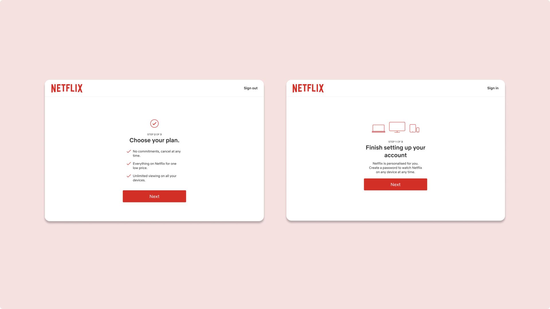
The progress bar is a great visual tool for your users to feel like they accomplishing things. It motivates users to complete the actions they have started and pushes them to finish. Netflix does it by announcing the number of steps there are in their onboarding process, letting the customer know how long they still have before the end.
Bandwagon effect
The bandwagon effect refers to the tendency of doing something because other people are doing it, regardless of one’s own beliefs. The bandwagon effect is very popular on social media, especially TikTok trends for example. People on TikTok would hop on a trend (a sound or dance, or a challenge) and do their own version of it. Because there are so many people using TikTok everywhere around the world (they boast around one billion active monthly users, making them the fifth most-used social media platform), many brands have started to use TikTok and hop on trends to communicate with their communities. Even the French minister of transport has understood the bandwagon effect and is very popular on French TikTok.
@jbdjebb Meilleur ministère. #fypシ #pourtoi
♬ swing lynn – lovdfilmz
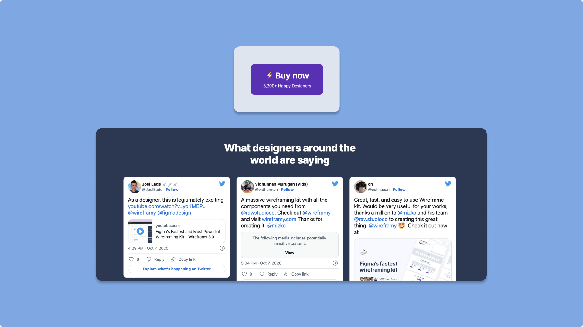
Other simpler ways to leverage the bandwagon effect would be to reassure the customers by giving them social proof. Like proof from other users, any proof that your product is actually working and liked, such as reviews, comments or posts from social media, here’s an example with wireframy.com:
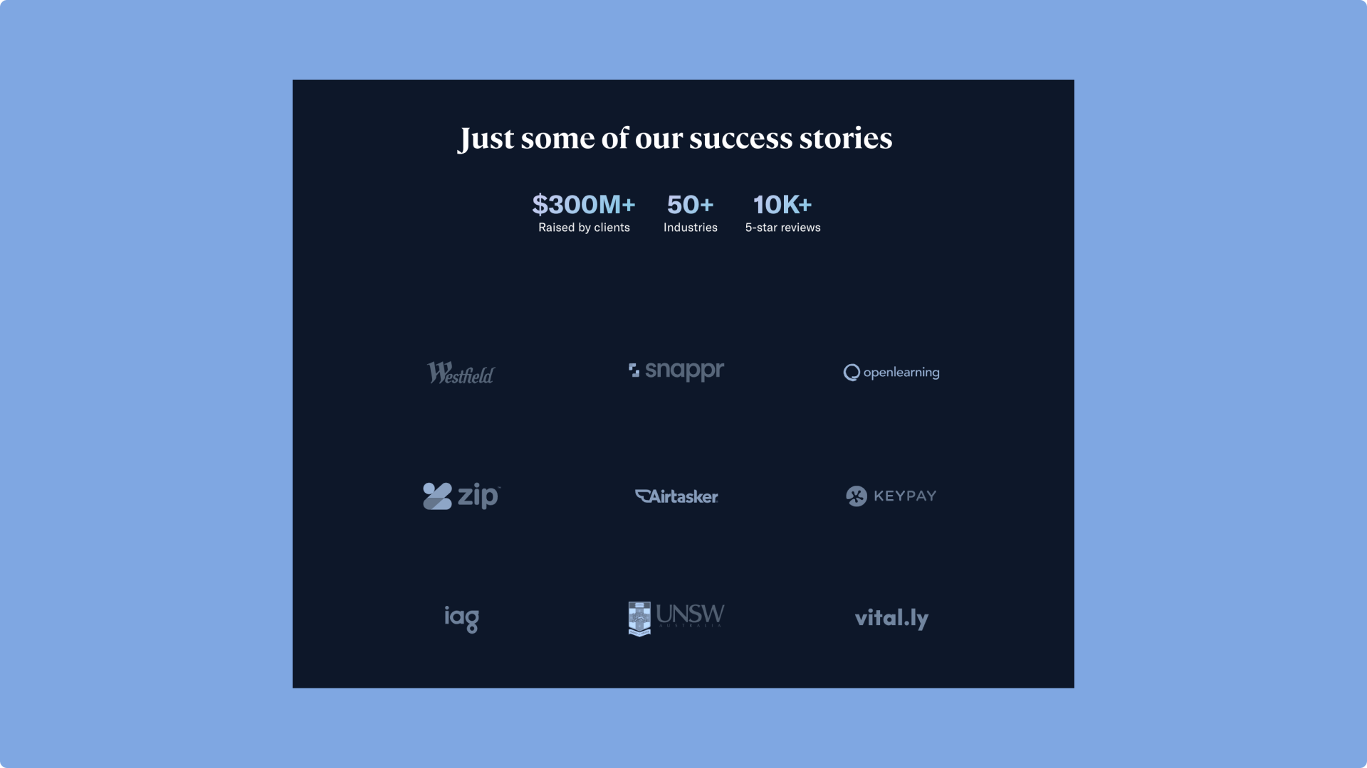
What matters is not only the number of people who have adopted your product but also what kind of people.
Raw.Studio features some of the companies and brands they have been working with, thus leveraging brand recognition. If these companies are using Raw.Studio’s services, you should as well.
Framing bias – Wording effect
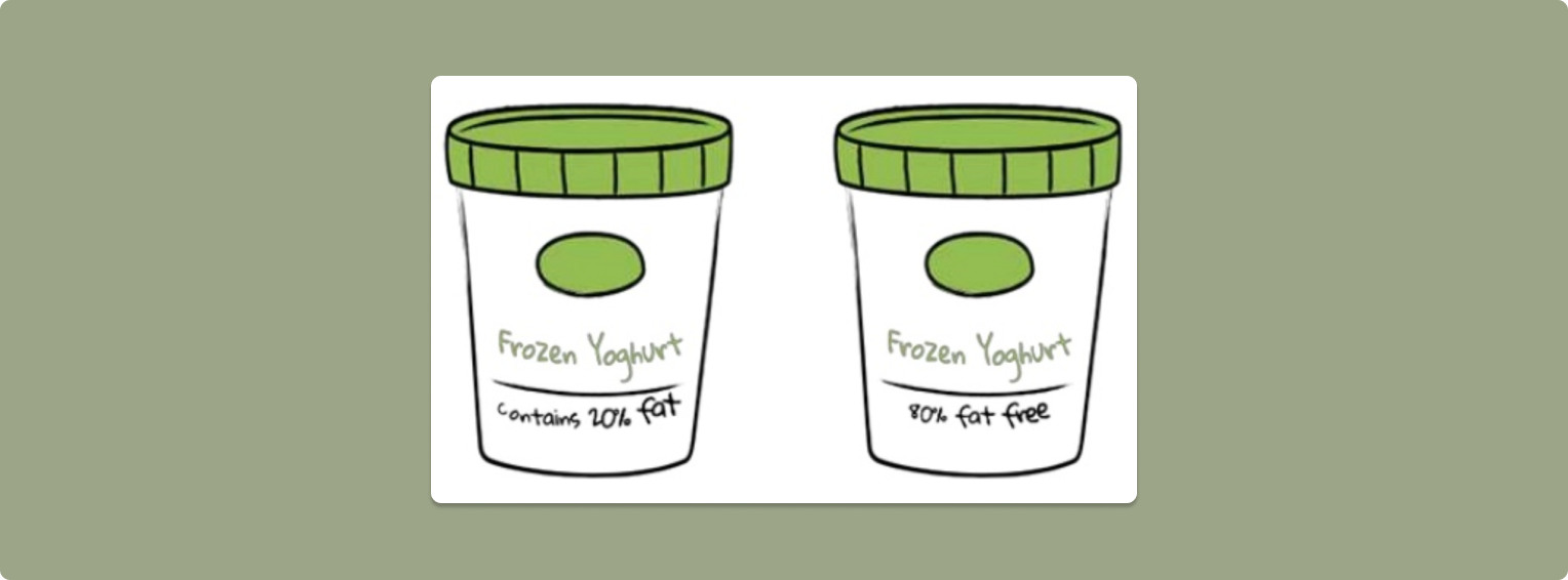
Which one of the above would you choose?
The framing effect occurs when decisions are influenced by the way it is delivered, with no regard to the facts themselves. In our example, we would mostly lean towards the more positive choice even though the two products are the same. This happens because our brains subconsciously choose an outcome in which we would avoid loss. As we have seen with loss aversion, loss has more weight than the equivalent gain.
How does it affect UX Design and how to overcome it?
- Visual Framing: The choice of colours affects decision-making since different colours will evoke different emotions. We’ll talk about that later on in this article.
- Positive & Negative framing: This one is self-explanatory. Marketers would usually lean toward negative framing as it creates a sense of urgency “Only … items available” as seen with the scarcity bias.
- Value Framing: The Rule of 100 is a very useful strategy when advertising for sales. Whenever your product costs less than $100, the use of percentage sales is more appealing because you can easily calculate it, as opposed to products that are over $100.

Confirmation bias
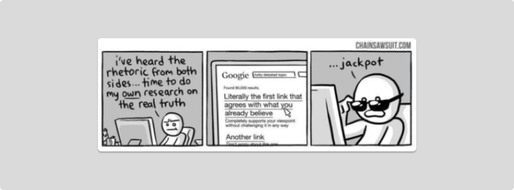
“People see what they want to see” is a somewhat definition of this. Confirmation bias is the tendency to choose and interpret information that confirms a preconceived belief. This bias is not only important in design but also in our everyday life. This, for example, would affect the way we see political information: we would spend more time looking for information that supports our beliefs and less time looking for information that contradicts it.
How does it affect UX Design and how to overcome it?
This confirmation bias, although very common, affects both designers and users. For designers, it can lead to designers having false assumptions and designing accordingly, impacting the end product.
The most straightforward way to overcome confirmation bias is to stay open-minded, do research and be open to feedback and disagreements. Before sharing your product with the world, test it among multiple user groups, it will give you more opportunities to be challenged.
Outro
These were the 5 most common cognitive biases that designers might come across and some ideas on how to tackle them.
Cognitive biases play a huge part in Design Psychology as our brains are ruled by our subconscious most of the time. However, Design Psychology is much more vast than that.
Part 2 is here, and we will see how designing for our users has an emphasis on designing for the human and for the lazy, with more laws and principles to tackle so brace yourself and we’ll see you there!
Take your company to the next level and get results with our world class user experience, interface design and implementation.
Get a FREE 30 min Strategy Session
Related posts
Neobank Design: 3 Great Examples in a New Era of Banking
A tech-oriented world has brought forth a banking space dominated by digital transactions, a decrease in physical cash and a […]
Error-Free UX: How to Anticipate and Prevent Errors in UX
Errors in UX design can lead to frustration, loss of trust, and even abandonment of a product. A well-designed UX […]
How Apple Revolutionised The Design Landscape in 6 Ways
“Design is how it works, not how it looks.” – Steve Jobs Apple has been at the forefront of design […]
Creative product design that gets results
Take your company to the next level with world class user experience and interface design.
get a free strategy session
