User Surveys: 6 Tips for Gaining Valuable Insights
Survey design is complicated, but when utilised correctly, surveys are an incredibly valuable and reliable tool in your research toolbox. Below we’ll delve into how to design that will help validate your qualitative insights.
Table of Contents
About UX surveys 💡
In comparison to other User Research methods, User (or UX) Surveys are a relatively easy way to get data about your users and potential users. I use the term ‘easy’ lightly though, as it can be equally as risky if you generate the wrong line of questioning, resulting in unusable data and wasted time.
Surveys allow you to gather data on a variety of things beneficial to a business, including:
🗣 Gathering feedback on an existing product
🛠 Refining a new feature
🤝 Collecting quantitative data to back-up your qualitative research findings
❤️ Learning about the behaviours, wants, needs and demographics of your user base
It is important to note that surveys are more on the quantitative side than qualitative. Even if you ask for a long response and get a detailed answer, you are still not able to ask follow up questions on the spot, or read the customer’s body language and see their expressions. So, whilst surveys can bring valuable insights to light, it does not disregard the importance of complementing this practice with in-depth user interviews or experience sampling.
Set your objectives 🎯
Yes, all surveys need a game plan.
So before you start crafting questions or picking what tool to use, sit down and think through what you want to learn from your survey. You want actionable feedback and you’ll be most likely to get that by thinking through the exact answers that you want.
You can think about answers to questions like:
- What are we trying to learn about our users from this survey?
- How is this survey going to help us here at x company?
- What are some assumptions we are making?
- What are we going to do with these results?
Planning will help the questions flow a little easier, create some guidelines, and give you some content to reflect back on after the survey has been conducted.
Participant sample size 👥
Surveys that produce statistically significant results are ones in which the researchers have confidence their findings are not due to chance. Acquiring such results depends on the researchers’ sample size, a.k.a how many people they gather data from versus the overall size of the population they wish to understand. Generally speaking, the larger the sample size, the more statistically significant it is, meaning there is less of a chance that the results happened by coincidence.
Determining how many people you need to sample in a survey study can be difficult, and the calculations look a little something like this:
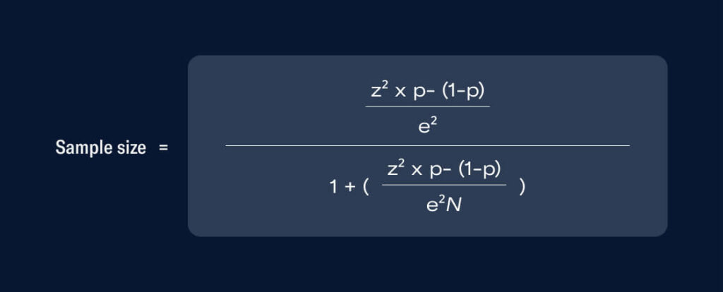
But you’re in luck. Thanks to the wonderful, all-powerful Google, you can have this calculation done for you on sites like SurveyMonkey and the ABS.
Stating that 85% of your users recommend a product doesn’t sound as legitimate if there were only 20 respondents. However, if this was backed by a larger number and a more chunky percentage of a user base, like 500 respondents, the confidence in this statement would grow.
And while it can be hard to promote surveys and get conversions, particularly if it isn’t incentivised, there isn’t much point in conducting a survey if you don’t get this valid participant sample size.
Pick the right question types ✅
There are five main question types in surveys:
- Open-ended questions
- Closed-ended questions
- Likert scale questions
- Rating scale (or ordinal) questions
- ‘Yes’ or ‘no’ questions
Below are some examples of the above question types.
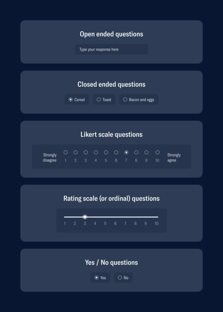
Picking the ‘right’ question type is completely dependent on what the question is and what response you would like to get out of it. If you want a straight answer, closed-ended questions are ideal as people can choose from predefined answers. These questions can generate nice statistics and are easy to answer and evaluate.
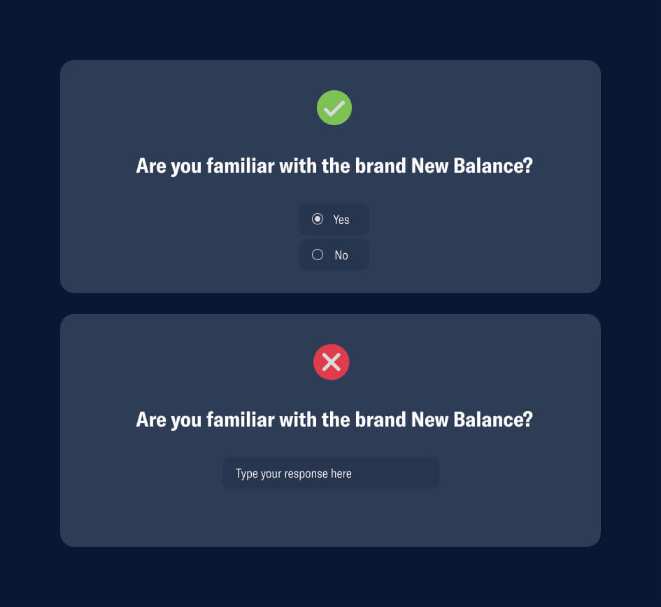
In the example above, the closed-ended question will likely obtain a ‘yes’ or a ‘no’ from the user, so to keep things simple and easy, using a yes/no question type is more suitable. An open-ended style that has a text box is unnecessary. While the second option technically isn’t wrong, it creates extra work for the user, and we are trying to make this an easy, relatively fast process to increase the chance of a conversion.
However, if you are eager to hear users elaborate, an open-ended or text field question is ideal. If you are looking for a numerical value or a rating, then rating scale/ordinal questions would be the way to go. You will see in the example below that a text field is more appropriate as a user base will have more than three limited opinions on a brand.
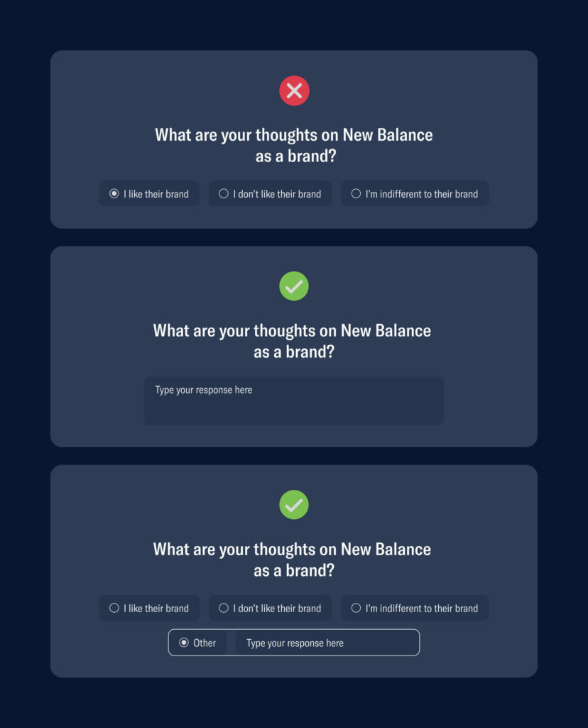
As a general rule of thumb, closed-ended questions can have limited answers / options, whilst open ended questions should allow the user to elaborate, whether with a text field or an ‘other’ option in multi-choice.
Pick a good balance of question types ⚖️
Structure the questionnaire in such a manner that it will provide the least amount of load on the mind, and we know cognitive overload has the ability to result in drop-off. A technique that is often adopted is the funnel, which Tom Hall explains in their article:
One technique that may help, called the funnel, is where you ask basic, general questions at the beginning, more complex questions in the middle, and return to general questions at the end.
The order of question complexity is important, but it is also important that the questions flow logically and ask connecting questions consecutively. It can be confusing for the user if you are jumping from Topic A a to Topic B then back to Topic A.
So, you can start off with some general questions that don’t require too much thinking or typing from the user, as displayed below.
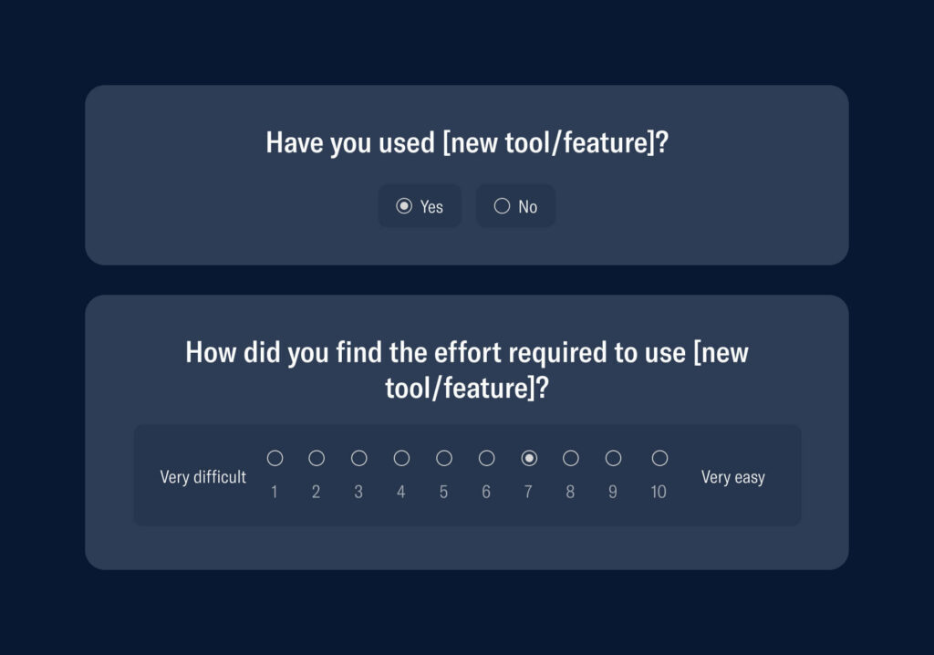
Then, once you have laid down the foundations, you can follow on with some denser questions that require a little more effort from the user, but still flow nicely after the previous questions.
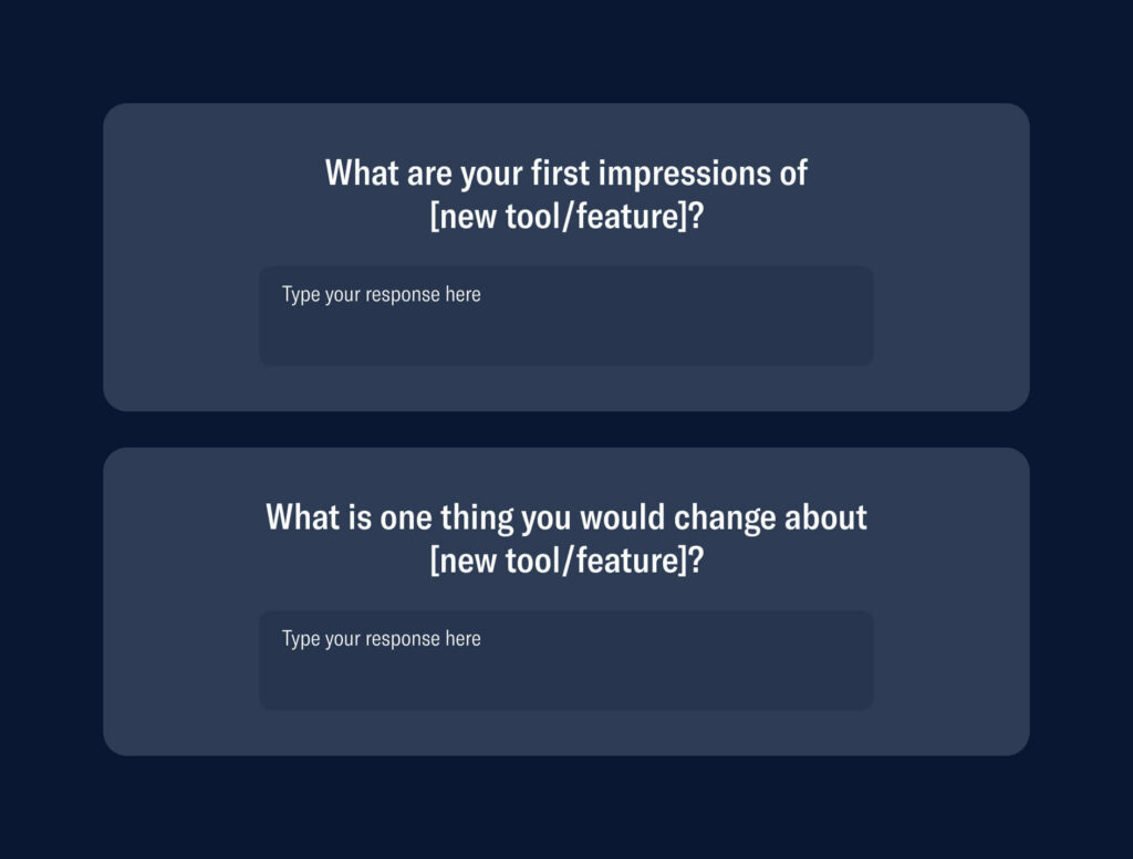
Now, after those four questions, we are able to understand more about:
- How many users are using the new tool/feature
- A general understanding of how easy/difficult they found the new tool/feature
- A deeper dive into first impressions and opinions
- Some areas where the new tool/feature can improve
These are really the key areas you want to learn about when releasing a new tool/feature, and the answers can be obtained from four questions in a well-balanced survey.
Balancing your question types will make things flow better, reduce cognitive strain, and make the experience all the more enjoyable for the user.
Make it quick and relevant ✨
SurveyMonkey that respondents tend to spend less time on each question the longer a survey is, and for surveys longer than 7–8 minutes, completion rates dropped by 5% to 20%.
The relationship between the number of questions in a survey and the time spent answering each question is not linear. The more questions you ask, the less time your respondents spend, on average, answering each question. When your respondents, in methodological terms, begin “satisficing”—or “speeding” through a survey—the quality and reliability of your data can suffer.
Brent Chudoba, SurveyMonkey
So, creating a long questionnaire not only reduces the completion rate, but it can reduce the quality of the answers, as users will just be clicking anything or not really thinking through their answers just so that they can get to the end. This will result in data that probably isn’t as genuine as it could have been if the survey creator had been conscious of time.
So respect your user’s time, regardless of whether it is a quick pop-up survey within your product or an external form, in order to get relevant, thought-out results.
Avoid biased or leading questions 🙅♂️
Without realising, we ask biased questions on a daily basis.
And survey construction is no different. Sometimes, when you have an idea in mind of how you would like the user to respond, you will subconsciously (or sometimes, strategically) tweak the language of your question to steer them toward a particular direction.
There are a few types of these approaches that should be avoided:
👍 Confirmation bias: when you are actively seeking the data that supports your assumptions or beliefs. For example, “Which button colour do you prefer?” The user may not even feel like a button is necessary, or they may want to edit the copy, but the question will not allow that, resulting in ingenuine data.
👀 Leading questions: when you ask a question and phrase it in a way that prompts the user to answer in a certain way. Say if you wrote, “What did you love the most about our [new feature/tool]?” They may not have loved the tool at all, they may have even disliked it, but the question doesn’t allow for a constructive or negative answer.
⚖️ Unbalanced scales: tweaking your likert scale to lean more toward one side (usually more on the positive.) For example, “How easy did you find this product to use on a scale of 1 (somewhat easy) to 5 (super easy)? This doesn’t allow the user to even provide an opinion of it being even the slightest bit difficult.
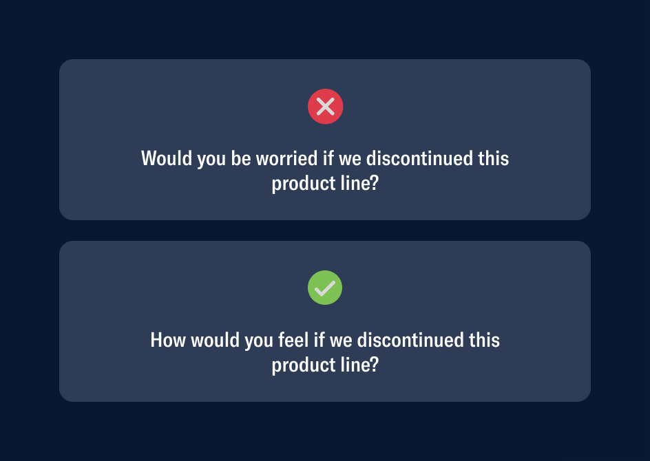
Above is a basic example of how a small change of wording can steer an answer into a completely different direction. In the incorrect example, there is ‘leading’ being used with the term ‘worried,’ which creates an uneasy feeling for the user. Even if they weren’t worried, they might be now! Where as the correct option uses the phrase ‘how would you feel?’ which opens the dialogue up and allows the user to truly think for themselves.
As mentioned before, sometimes these copy errors are not intentional and it can be easy to subconsciously, but it is a great practice to be mindful of this so that you can pull yourself up on any bias as you tweak and review your questions.
Wrap up 👀
Designing efficient and relevant surveys is truly an art; a practice that you are constantly iterating, tweaking and improving.
So, just to reiterate what we discussed:
🎯 Set your objectives before worrying about what questions to ask
👥 Make sure you have an adequate sample size before pulling insights from your survey
✅ Pick the right question type
⚖️ Balance these question types out in the survey for digestibility and retention
✨ Respect your user’s time and keep things quick and relevant
🙅♂️ Be wary of bias and leading questions
Keeping these tips in mind will have you well on your way to gathering clean and valuable data that makes an impact.
Take your company to the next level and get results with our world class user experience, interface design and implementation.
Get a FREE 30 min Strategy Session

Related posts
How Mascots Improve User Experience
Ever wondered why certain apps and websites feel more engaging and memorable? The secret might just be in their mascots. […]
Design Psychology: 4 Principles that Empower Designers – Part 2
This is part 2 of our 4-part series on basic design psychology, tackling design for humans and for the lazy. […]
Meta’s Messenger Logo U-Turn: A Branding Disaster
Meta’s decision to revert its Messenger logo back to its original blue has sparked confusion, frustration, and backlash from both […]
Creative product design that gets results
Take your company to the next level with world class user experience and interface design.
get a free strategy session


