Design Psychology: 4 Principles that Empower Designers – Part 3
This is part 3 of our 4-part series on basic design psychology, tackling design using senses (Sight and Touch). Check out part 1 on cognitive biases and part 2 on Designing for Human & for the Lazy if you’ve missed it.
Sensory Design, or Sensorial Design, is a branch of UX disciplines that considers multiple senses in UX design instead of one, making the user experience even richer and complete.
We’ll tackle the senses of sight and touch in this part and sound in the final part, so stay tuned for that one 😉
Table of Contents
Design using senses – Sensory Design
I came across the world’s most satisfying checkbox one day, which made me think… All my apps’ notifications are turned off except for the ones that don’t have Apple’s basic three rings notification sound. Mostly because I am so sick of hearing it and not knowing which app the notification sound belongs to. Of course, the design of a product is mostly focused on the visual parts but what makes an extraordinary product or brand is all of the ambient feelings we get from it. Namely:
- the sound part: DUDUM from Netflix, Snapchat’s notification sound…
- the haptic part: the vibration each time I like a post on Instagram, the home button on my iPhone (I genuinely can’t live without it, face ID is not my cup of tea), and swiping in general.
We are only going to tackle three of the five senses here, as we can’t really include taste and odour.
Sight
It’s not news to you, designer, that designing a product has, as an objective, to be seen. Just as there is a difference between hearing and listening, I reckon there is a difference between seeing and appreciating a product. But can you design a product with the purpose of being appreciated?
With all of the psychology stuff explained previously (which by the way, only represents like a tiny bit of the whole thing, which is massive, believe me), and now that we’ve understood more of how the brain subconsciously works, we can try to design even better products and with more depth.
First impressions matter, and I am a strong believer that colours play a major role in that. However, we should still bear in mind that our products should be accessible and inclusive to all, and not wager everything on colours. With that being said, let’s jump into colour psychology.
Colour is such an interesting and vast topic. It’s not only about the colour wheel and using complementary colours. We can dissect it indefinitely and use it as a powerful tool to make our designs stand out. Colours are visually pleasing to look at, especially when used accurately. But that’s only the tip of the iceberg. Colours can be much more than that. It can impact human emotions as well as the impression we have on something.
As we already probably know, colours convey emotions.
It can be hard to translate emotions universally. However, by knowing your target audiences and who your customers are, you can already focus on what colours and how to play with them based on the emotions you want to convey. Here is a (non-exhaustive) list of emotions evoked by colours in western culture.
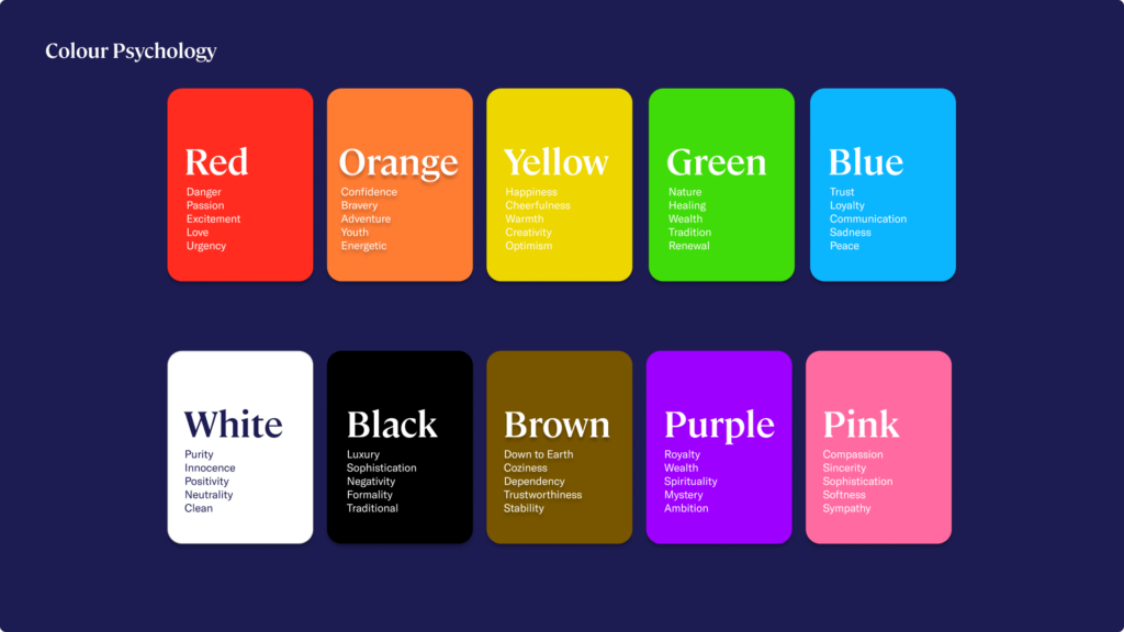
Let’s first define some concepts and terminology to understand the subject at hand:
- A colour hue is a shade of colour. Red, blue, and green are hues. We are talking about an object’s colour when speaking about hues.
- Saturation refers to how a colour shade, or a hue, would appear under certain lighting conditions.
- Chroma, or Luminance, describes the purity or the intensity of a colour.
- Value describes how light or dark a colour is.
- Tones, Shades and Tints are created respectively by adding grey, black and white to a colour, making it duller, darker or lighter.
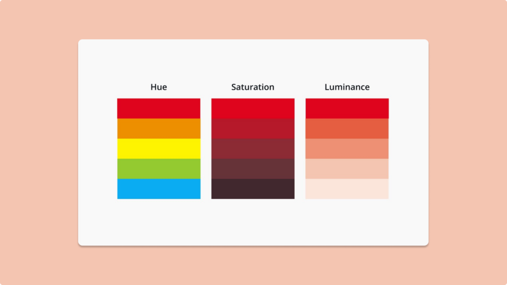
Already, with these basic concepts and terminologies, we can already have a lot of fun. Using pure colours or saturated colours for your website can convey different emotions.
Using pastel colours, with colours saturated titles, create harmony and convey calmness and relaxation. Combining these colours with moving objects in the background at a slow speed gives direction to the users.
A lot of brands whose market audiences are targeted towards babies and parents would adopt these pastel palettes as they give a feeling of comfort, softness, and reliability.
On the other hand, bright and vivid colour palettes that explode convey energetic and fun emotions. By using tints of the three main colours, the I WEIGH brand creates a sense of cohesion and logic without having the feeling of using too many colour hues.
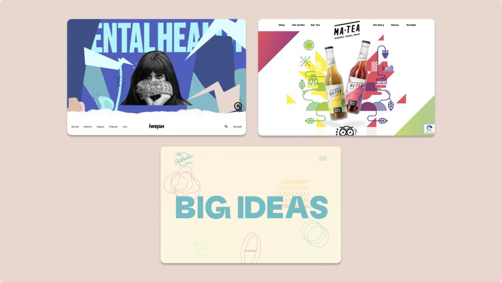
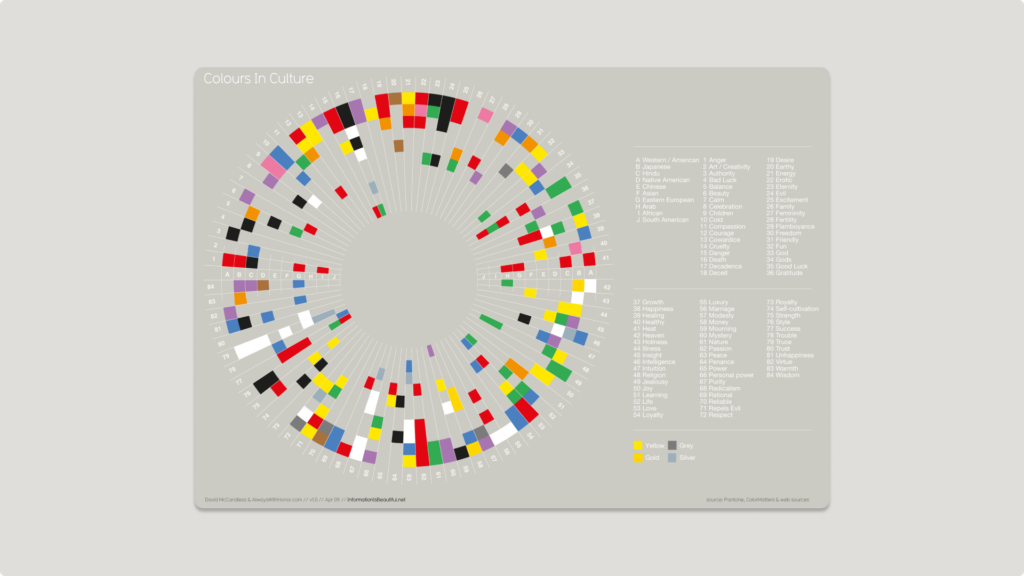
The perception of colours is very subjective and depends on many variables, such as age, genre, culture and even personal experiences. A simple white colour can be represent a wedding colour or peace and purity in most western countries. However, in other cultures, it could be equivalent to death.
One big challenge that every UX designer has or will encounter is to adapt to consumers with colour blindness, or colour vision deficiency. 1 in 12 men are colour blind and 1 in 200 women are colour blind. And that’s not counting the number of people who have any form of visual deficiency condition. That’s why it’s important to design with colours but not rely a whole product on it. You can of course design multiple versions of your product for the different types of visual conditions there are, but that would be really time-consuming. What we can do is create a product, still using colours, that would create a contrast to the majority of your customers.
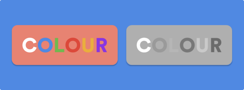
While you can’t cure colour blindness in the world, what you can do is engage in methods to still design the way you do, but by choosing palettes that are colourblind-friendly for example. Here are some tips:
- Avoid overlaying text on backgrounds with similar colour values. The different shades and intensities of colours will be visible to a colour-distinguishable person but to a colourblind person, the colours may look completely the same, thus making your product look like a plain block of colour with no elements.
- Rely on thickness of texts and convey messages with different fonts. Even if someone can’t figure out the colours difference in your product, they will still be able to distinguish which component is standing out from the size of it.
- Check your work. It can be difficult for people who don’t have colourblindness to bear in mind this challenge and design accordingly. But there are a lot of tools available online that will show how your website looks to a colourblind person: Colorblind Web Page Filter. Or you know, just grab one of your colourblind friend, that’ll do it.
For my iPhone-using people, do you remember when Apple introduced the celebration words animation? Whenever you would send a message with “Happy birthday”, “Congratulations” and many other words, iMessage would play some kind of animation related to it. (try to type “pew pew”😉).
These are great addition you can have to your product to have your users intrigued. Giving them new visual following a triggered action can add positive emotions to your product, making the users more engaged.
Twitter has tried this functionality some years ago. When you type in a certain hashtag and click on the like button, the heart will turn into a specific icon, such as the Tesla logo, or even the Apple one.
Twitter users clicking the Like icon for posts using #AppleEvent can briefly see a special animation using the Apple logo. https://t.co/rlyNHqfTni pic.twitter.com/neMGECKrAS
— AppleInsider (@appleinsider) September 14, 2021
In addition to that, you would have that cool animation of the logo on your screen and your phone would vibrate according to it, which introduces my next topic.
Touch
There are so many different gestures we can do with our mobile phones and on a computer, here is a list of few important ones:
- Tap: The most basic one that is most often associated with a strong CTA.
- Double-tap: Popularised by Instagram for liking posts, lots of other brands and apps use it for the same purpose. Apple released a “back tap” feature that resembles the double-tap and introduced a triple-tap. Each would have a specific action related to it, which can be personalised.
- Swipe: As we have seen earlier, this gesture calls for less commitment from the user but still remains enjoyable for the user. Swiping can be used to navigate between screens or scroll through a page.
- Scrolling: Very self-explanatory. It refers to the action of scrolling through a page or website, either on a mobile phone or a computer. Scrolling asks for a smaller amount of commitment from the users. Scrolling allows the user to be hooked to a platform, especially with infinity scrolling on most social media platforms.
- Long Press/Right-click: Long-press on a mobile phone would resemble the right-click function of the mouse when using a computer. It would unlock additional options and commands. Apple had a haptic 3D-touch before adopting the long-press functionality. The haptic 3D-touch would respond to the intensity to which a user would press on the screen to unlock the additional options.
- Clicking: It would be the computer version of tapping on mobile devices.
- Typing on the keyboard: The feeling of typing on a keyboard with your thumbs is clearly different from the feeling of typing on an actual physical keyboard. Have you noticed how keyboards have evolved and have now become a trend? People will replace their actual keyboard with a keyboard that feels “satisfying” to type with, both from the haptic/physical touch point of view, but also from the sound point of view. Apple has changed the sound of typing on iOS a few years ago. Typing letters, space bar or delete button would all have a different “click” sound.
To design accurately for users, we need to try and understand how we hold our phone. in 2013, researcher Steven Hoober conducted a 2-month study where he would observe how people used their mobile devices on the streets, in cafes, on trains and on buses (he described everything about the study on his website. It is very informative if you want to have a look). He observed three basic ways in which people would hold their phones: one-handed (49%), cradled (36%), and two-handed (15%). However, these ways are not fixed, people would use their second hand to get additional reach at some occasion for example, or switch to a two-handed use to type etc.
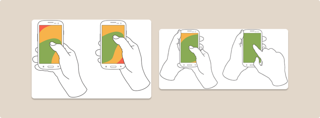
Depending on how users use their phones, you can see different zones being used; which we will call the thumb zones. Thumb zones will be different from person to person. My hand is freakishly small so my thumb zone is smaller than average (that’s one of the reasons why I stick with a small iPhone… Otherwise I can’t reach for the top left corner…).
Because mobile screens are becoming bigger and bigger now, the thumb zone, considered the “effortless territory”, is decreasing compared to the total screen size. This is important when designing because you want to put CTA buttons in the right place: in the effortless territory. Again, human beings are lazy, so you want to design so that the user has the least amount of effort to put in. A CTA button too high up on the screen will demand too much effort from the user and reduce positive emotions towards your products.
Combining animations with vibrations is such an underrated functionality. I love how my phone would have a small vibration each time I would like an Instagram post or a tweet, it’s somehow satisfying. This greatly enhances the user experience and will immerse them in your product.
Small outro
Part 4 is here, and we will see how adding sound as part of the senses into our products to make the UI and UX much more enjoyable for our users.
Take your company to the next level and get results with our world class user experience, interface design and implementation.
Get a FREE 30 min Strategy Session
Related posts
How to Conduct a UX Audit
A User Experience Design Audit is just one of the ways to identify the imperfect areas that may lack usability […]
Does ChatGPT have good UX?
ChatGPT, developed by OpenAI, can generate human-quality text, translate languages, write different creative content formats, and answer your questions in […]
Raw Studio acquires Jellypepper to expand its reach to the startup ecosystem
Some special news today! We’re announcing our acquisition of Jellypepper, a specialist creative agency based in Surry Hills. Jellypepper was […]
Creative product design that gets results
Take your company to the next level with world class user experience and interface design.
get a free strategy session
