Navigating the Pitfalls of Mobile-First Web Design: A Call for Balance
In recent years, the landscape of web design has undergone a significant shift with the rise of mobile-first design principles. As smartphones and tablets have become ubiquitous, prioritizing mobile user experiences has become paramount for businesses and developers. This article delves into the background of mobile-first web design, defines its key principles, and explores the potential benefits. However, it also sheds light on the often-overlooked challenges that this approach presents when translated to desktop screens.
Table of Contents
What is Mobile-First Web Design
Mobile-first web design involves creating a user experience tailored to mobile devices, considering factors such as smaller screen sizes, touch interactions, and varying network conditions. It encourages a focus on essential content and streamlined navigation to accommodate the limitations of mobile platforms.
The Rise of Mobile-First Web Design
Mobile-first web design is a strategy that prioritizes the design and development of a website for smaller screens, typically mobile devices, before scaling up to larger screens. The goal is to enhance the user experience for the growing number of mobile users. This approach gained traction as mobile internet usage surpassed desktop usage, prompting designers to rethink their strategies and prioritize the needs of mobile users.
Benefits of Mobile-First Web Design
Improved User Experience
Mobile-first web design ensures that a website or app is easy to use and navigate on mobile devices, which is where the majority of users will be accessing it. By starting with the mobile experience, designers can focus on creating a clear and concise layout that works well on smaller screens. This can lead to a more enjoyable and engaging user experience for everyone, regardless of the device they are using.
Reduced Development Costs
Designing for mobile first can actually save time and money in the long run. By starting with the most challenging design, designers can identify and resolve any usability issues early on, which can prevent more expensive problems down the road. Additionally, mobile-first web design can make it easier to create a responsive website that adapts to different screen sizes, which can eliminate the need to create separate designs for mobile and desktop.
Increased SEO Performance: Mobile-first web design can also help to improve a website’s search engine optimization (SEO) performance. Google has stated that it prefers websites that are mobile-friendly, and this is reflected in its search rankings. By designing a website with mobile users in mind, businesses can increase their chances of appearing at the top of search results.
Enhanced Brand Image
A mobile-first approach can also help to enhance a brand’s image. By showing that they are committed to providing a positive mobile experience, businesses can demonstrate that they are forward-thinking and customer-centric. This can lead to increased brand loyalty and trust.
Future-Proofed Design
Mobile-first web design is a future-proof approach that can help businesses stay ahead of the curve. As the number of mobile internet users continues to grow, it is more important than ever to design websites and apps that are optimized for mobile devices. By adopting a mobile-first approach, businesses can ensure that they are well-positioned to succeed in the years to come.
Issues with Mobile-First Web Design
Issue 1: Dispersed Content and Excessive Scrolling
Mobile-first web design is a popular approach that prioritizes the user experience on mobile devices. However, this approach can sometimes lead to issues when the same design is viewed on desktop screens. One of these issues is overly dispersed content and excessive scrolling.
This issue arises because mobile-first web designs often use a lot of white space and large elements to make the content more readable on smaller screens. When this design is adapted to a desktop screen, the content becomes spread out over a much larger area, and users have to scroll excessively to see all of the information.
Negative Impact of Dispersed Content and Excessive Scrolling
Increased Cognitive Load
Users are required to expend more mental effort to navigate through the website, leading to fatigue and frustration. The prolonged scrolling can hinder their ability to focus and process information effectively.
Difficulty Understanding Information
The dispersed nature of the content can make it challenging for users to grasp the overall message or narrative of the website. The fragmented presentation of information can impede comprehension and make it difficult to identify key points or follow the flow of ideas.
Decreased Satisfaction

Users are less likely to be satisfied with the website if they have to scroll excessively to find the information they need. The frustration and time-consuming nature of scrolling through lengthy pages can lead to a negative impression and a reduced likelihood of return visits.
An example of this is Pinterest. It is a popular social media platform that allows users to share and curate images. The website’s mobile-first design is evident in its use of large images and a lot of white space. This design works well on mobile devices, but it can lead to excessive scrolling on desktop screens. Users have to scroll down a long way to see all of the pins on a board, and the white space makes it difficult to focus on the content.
Issue 2: Impaired Navigation and Usability
Mobile-first web designs, with their focus on smaller screens and touch interactions, may inadvertently compromise navigation and usability when applied to desktop screens. While mobile users are accustomed to swiping and tapping, desktop users often rely on a mouse and keyboard for navigation. The design elements optimized for touch interactions on mobile may not translate seamlessly to the precision required by mouse-based navigation on larger screens. This discrepancy can lead to a compromised navigation experience and decreased overall usability.
Small Touch Targets
Mobile-first designs often feature elements optimized for touchscreens, where users interact with their fingers. When these designs are scaled up for desktops, clickable elements may become too small for precise mouse clicks. Users on desktops may struggle with accurately selecting buttons, links, or interactive elements, leading to frustration and a decline in usability.
Hidden navigation menus
This another common feature in mobile-first web design can present challenges on desktop screens. While mobile interfaces may use gestures or menu buttons to reveal navigation options, the transition to desktop screens may result in an inconsistent and less intuitive experience. Desktop users accustomed to visible navigation menus may find it challenging to discover and navigate through hidden menus, impacting the overall usability of the site.
Inconsistent design patterns across devices
A design that works seamlessly on mobile may exhibit inconsistencies when viewed on a desktop. This lack of uniformity in the user interface can confuse users and hinder the intuitive navigation they expect, leading to a compromised overall user experience.
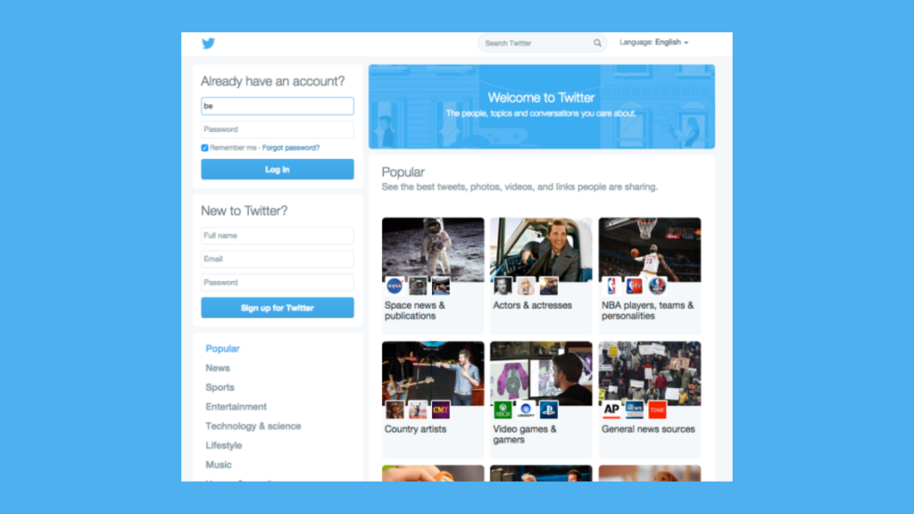
Twitter’s website, while visually appealing, also struggles with mobile-first design choices that can be cumbersome on desktop screens. The website’s reliance on small touch targets, the placement of essential options behind icons, and the inconsistent layout across devices can make navigation inefficient and frustrating.
Issue 3: Compromised Visual Appeal and Functionality
Mobile-first web design, while prioritizing the user experience on smaller mobile screens, can inadvertently lead to compromised visual appeal and functionality on larger desktop screens. This is primarily due to the inherent differences in screen sizes, aspect ratios, and user interactions between mobile and desktop devices.
Scaling Up Mobile-Optimized Graphics
Mobile-first web designs often employ graphics and images optimized for the smaller screen sizes of mobile devices. When these graphics are scaled up to fit larger desktop screens, they can appear pixelated, blurry, or distorted, compromising the overall visual appeal of the website. This loss of quality can negatively impact the user’s perception of the brand and the website’s professionalism.
Limited Layout Options
Mobile-first designs often adopt a minimalist approach with simplified layouts and reduced complexity to accommodate the limited screen space of mobile devices. While this approach can be effective on mobile screens, it can translate into a lackluster and uninspired experience on desktop screens. Desktop users expect a more elaborate and visually engaging experience, with greater flexibility in layout and design.
Lack of Responsiveness to Larger Screen Sizes
Mobile-first designs, while often responsive to different mobile screen sizes, may fail to adapt effectively to the larger screen sizes and higher resolutions of desktop displays. This can result in awkward spacing, disproportionate elements, and an overall lack of polish on the desktop interface. The lack of responsiveness can make the website appear outdated and unprofessional.
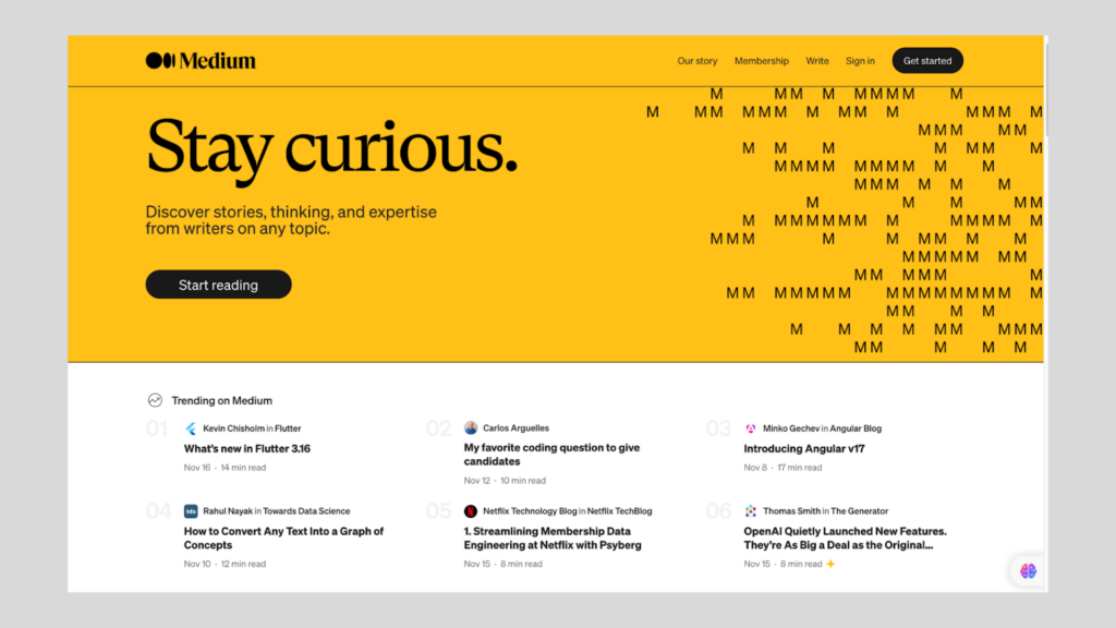
Medium’s website, designed for online publishing, exhibits a minimalist approach that translates into a bland and unengaging experience on desktop screens. The website’s lack of visual variety and limited layout options make it appear outdated and unprofessional.
Mitigating the Negative Impacts of Mobile-First Web Design on Desktop
The increasing prevalence of mobile devices has led to a shift in web design practices, with mobile-first approaches gaining popularity. While this approach prioritizes the user experience on mobile devices, it can lead to challenges in navigation, visual appeal, and overall usability on desktop screens. To mitigate these drawbacks and ensure a seamless user experience across all devices, designers and developers should consider the following strategies:
Emphasize Progressive Enhancement
Progressive enhancement is a web design philosophy that focuses on providing a basic level of functionality to all users, regardless of their device or browser capabilities. This approach involves enhancing the user experience incrementally, adding more advanced features and functionality for users with more capable devices. By adopting progressive enhancement, designers can ensure that all users have a positive experience, while also providing a richer experience for desktop users without compromising the core functionality for mobile users.
Design for Flexibility and Adaptability
Designing websites that can adapt to different screen sizes and input methods is crucial for providing a consistent user experience across devices. Responsive design techniques, such as flexible layouts, media queries, and fluid grids, allow websites to seamlessly adjust their presentation based on the user’s device and screen size. This ensures that the website remains usable and visually appealing on a wide range of devices, from smartphones to desktop computers.
Prioritize User Testing and Feedback
User testing is an essential tool for identifying and addressing usability issues that may arise from mobile-first designs on desktop screens. By conducting user testing sessions, designers can observe how real users interact with the website across different devices and gather valuable feedback on areas that need improvement. A/B testing can also be used to compare different design variations and determine which elements or layouts provide the best user experience for desktop users. Additionally, eye-tracking studies can provide insights into how users scan and navigate through the website, revealing potential areas of clutter or visual confusion.
Conclusion
The mobile-first web design approach has revolutionized web design, prioritizing the user experience on the ubiquitous mobile devices that shape our daily lives. However, it is crucial to acknowledge and address the potential drawbacks of this approach for desktop users. By emphasizing progressive enhancement, designing for flexibility and adaptability, and prioritizing user testing and feedback, designers can mitigate the negative impacts of mobile-first web design on desktop screens and create websites that provide a positive and seamless user experience across all devices.
Reassessment of the Mobile-First Approach
The growing popularity of mobile-first web design has led to a reassessment of its potential drawbacks for desktop users. While mobile-first has its advantages, it is essential to consider the impact of these design choices on a significant portion of the user base. The challenges of excessive scrolling, compromised visual appeal, and impaired navigation and usability on desktop screens should not be overlooked.
Advocacy for a Balanced Approach
A balanced approach to web design that considers the needs of users across various devices is essential. Designers should strive to create websites that provide a positive user experience on both mobile and desktop platforms, without compromising one at the expense of the other. By carefully evaluating the pros and cons of mobile-first design and implementing appropriate mitigation strategies, designers can ensure that their creations cater to the diverse needs of their audience.
Web designers and developers play a crucial role in shaping the user experience on the web. As mobile-first web design continues to evolve, it is imperative for these professionals to prioritize user experience and accessibility when implementing mobile-first designs. By adopting progressive enhancement principles, designing for flexibility and adaptability, and incorporating user testing and feedback into the design process, designers can create websites that are not only visually appealing and functionally sound but also accessible and enjoyable for all users, regardless of their device or screen size.
Take your company to the next level and get results with our world class user experience, interface design and implementation.
Get a FREE 30 min Strategy Session

Related posts
Meta’s Messenger Logo U-Turn: A Branding Disaster
Meta’s decision to revert its Messenger logo back to its original blue has sparked confusion, frustration, and backlash from both […]
Tech Giants’ Strategies for Captivating App Icons – Learn how
In the bustling digital marketplace, where attention spans are fleeting and competition fierce, a tiny square can hold immense power: […]
Apple’s ‘Exhausted’ Emoji: The Symbol We Didn’t Know We Needed
Have you seen it yet? That yellow face with the heavy under-eye bags that just gets you? Apple recently dropped […]
Creative product design that gets results
Take your company to the next level with world class user experience and interface design.
get a free strategy session


