Tech Giants’ Strategies for Captivating App Icons – Learn how
In the bustling digital marketplace, where attention spans are fleeting and competition fierce, a tiny square can hold immense power: the app icon. These miniature billboards on our home screens play a crucial role in shaping our perceptions and influencing our choices. They embody a brand’s essence, spark recognition, and ultimately, drive user engagement.
Table of Contents
Beyond Mere Decoration
App icons don’t just stand alone; they’re miniature flags planted firmly in the digital landscape, proudly proclaiming the values and personality of the brand they represent. Just like a company logo, a well-designed icon embodies the essence of the brand, distilling its core message into a visual shorthand. Take a look at the playful Spotify icon, with its vibrant green waves dancing across a black canvas. This simple design effortlessly conveys the brand’s focus on music and its energetic, youthful spirit.
Beyond mere aesthetics, app icons play a crucial role in user recognition. In a crowded app drawer, a consistent and memorable icon helps users instantly identify their favorite apps, creating a sense of familiarity and trust. Picture the instantly recognizable Twitter bird or the Instagram camera – these icons transcend mere logos, evolving into visual cues that trigger instant brand recall. They become unspoken companions, guiding us effortlessly towards the digital experiences we crave.
A Deep Dive into Apple’s Minimalistic App Icons
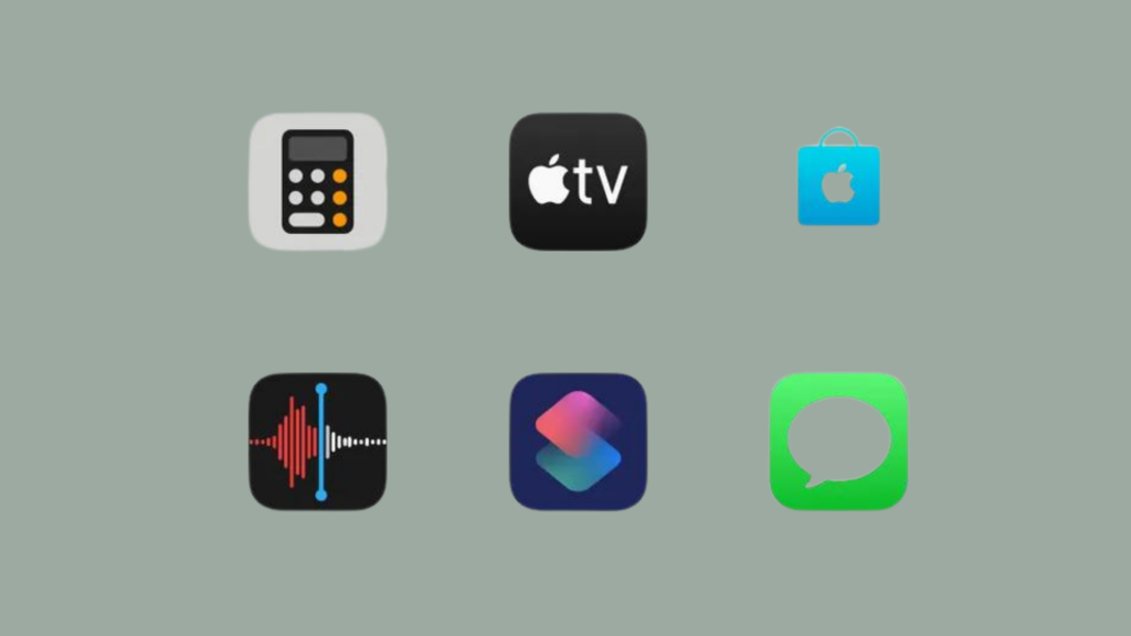
Apple’s design philosophy has always championed minimalism, prioritizing clean lines, intuitive interfaces, and an overall user-friendly experience. This dedication to simplicity extends far beyond hardware, permeating every aspect of the Apple ecosystem, including the iconic app icons that grace the iPhone and iPad screens. Today, we take a closer look at these tiny squares of brilliance, dissecting the key elements that make them not only aesthetically pleasing but also incredibly effective.
Focus on Simplicity and Clarity
Apple’s app icons are instantly recognizable for their uncluttered designs and bold, singular symbols. Gone are the days of intricate details and superfluous elements. Instead, each icon features a single, easily identifiable object or concept, eliminating any potential for confusion or ambiguity.
For instance, the Safari icon depicts a stylized compass, instantly conveying its function as a web browser. Similarly, the Mail icon features a stylized envelope, leaving no doubt about its purpose. This clarity not only enhances usability but also creates a sense of elegance and sophistication.
Consistent Design Language Across Apps
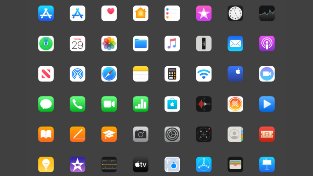
Apple carefully curates a unified design language that connects all its app icons. This consistency is achieved through several key elements:
Color palette: A limited set of vibrant, saturated colors is used, creating a cohesive and visually appealing aesthetic.
Shape and style: Most icons adhere to a rounded square format, with occasional exceptions for apps that naturally lend themselves to different shapes (e.g., the Music app’s eighth note).
Line weight and perspective: A consistent line weight and flat, isometric perspective are maintained across the board, ensuring visual harmony and unity.
This design language not only reinforces brand identity but also creates a sense of familiarity and intuitiveness for users navigating the iOS interface.
Effective Use of Negative Space
Apple masters the art of negative space, allowing empty space to play an active role in the overall design. This deliberate use of blank canvas creates a sense of breathability and prevents the icons from feeling cluttered or overwhelming.
Negative space also allows certain elements within the icon to stand out and take center stage. For example, the gap between the two overlapping circles in the Photos app icon draws immediate attention to the subject matter.
Apple’s minimalistic approach to app icons is not simply an aesthetic choice; it’s a strategic decision that prioritizes clarity, usability, and brand identity. By focusing on simplicity, consistency, and the effective use of negative space, Apple creates a set of icons that are not only beautiful to behold but also incredibly effective in serving their purpose. The next time you glance at your iPhone screen, take a moment to appreciate the subtle genius behind these tiny squares of design brilliance.
A Look at Google’s Material Design Principles in App Icons
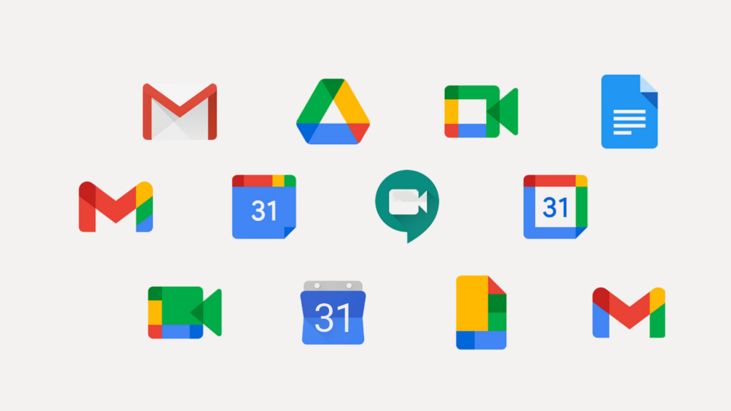
While Apple reigns supreme in the realm of minimalist app icons, Google takes a distinctly different approach with its Material Design philosophy. Material Design prioritizes tangibility, depth, and responsiveness, resulting in app icons that are vibrant, dynamic, and instantly recognizable. Let’s explore how these principles play out in the design of Google’s app icons, using three key elements:
Emphasis on Material Metaphor
Unlike Apple’s straightforward symbols, Google’s icons often employ material metaphors to visually represent their function. These metaphors are inspired by real-world objects and their interaction with light and shadow, creating a sense of depth and dimension.
For example, the Google Docs icon depicts a folded sheet of paper, instantly conveying its purpose as a document editor. Similarly, the Google Maps icon features a stylized pin, referencing its map navigation function. These material metaphors not only enhance visual interest but also make the icons instantly intuitive and easy to understand.
Bold Use of Colors and Shadows
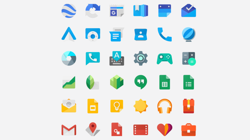
Material Design embraces a vibrant and playful color palette, eschewing Apple’s more limited approach. Google’s icons often utilize contrasting colors and gradients, creating a sense of visual hierarchy and drawing attention to key elements.
Similarly, shadows are strategically employed to add depth and dimension to the icons. This play of light and shadow further reinforces the materiality of the metaphors, making the icons feel tangible and interactive. Think of the Gmail icon’s envelope casting a subtle shadow, or the Play Store icon’s gradient creating a sense of depth within the play button.
Adaptive Icon System for Consistency Across Devices
One of the unique challenges of app design is ensuring consistency across a diverse range of devices, from phones to tablets to desktops. Google tackles this challenge with its adaptive icon system. This system allows developers to create a single icon file that dynamically adapts to different screen shapes and sizes, maintaining visual consistency while optimizing for various platforms.
This adaptive approach ensures that Google’s app icons remain instantly recognizable and user-friendly regardless of the device they’re displayed on. It’s a testament to Google’s commitment to accessibility and seamless user experience across all touchpoints.
Microsoft’s Fluent Design System in App Icons
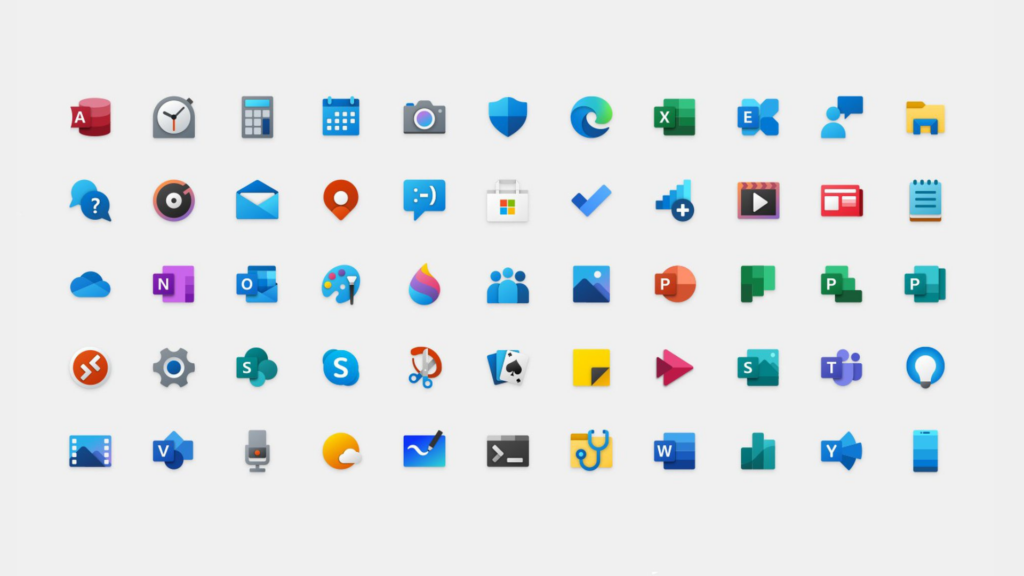
While minimalism and materiality dominate the app icon landscape, Microsoft carves its own path with its Fluent Design System. This system emphasizes connection, depth, and movement, resulting in app icons that bridge the gap between static images and interactive experiences. Let’s dive into how Microsoft leverages these principles to craft unique and engaging app icons:
Fluent Design Principles for a Cohesive Experience
Microsoft’s Fluent Design System isn’t just about individual icons; it’s about creating a seamless and cohesive experience across the entire Windows ecosystem. This is achieved through consistent visual elements and design principles applied across apps.
Depth and layering
Fluent icons often utilize layers and subtle shadows to create a sense of depth and dimension, similar to physical objects with light interaction. This adds visual interest and reinforces the idea of interconnectedness within the Windows environment.
Motion and animation
While most app icons remain static, some Microsoft icons incorporate subtle animations on hover or selection. This dynamic behavior reflects the interactive nature of Fluent Design and further enhances user engagement.
Accessibility and clarity
Despite the use of depth and motion, Microsoft prioritizes accessibility. Icons maintain distinct silhouettes and legible details, ensuring usability for users with visual impairments.
Use of Depth, Motion, and Light Effects:
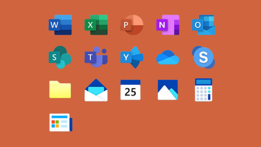
Beyond the core principles, Microsoft’s app icons showcase unique visual elements that set them apart:
Light and shadow play
Subtle gradients and highlights are used to create a sense of light and shadow interaction, adding realism and depth to the icons. For instance, the Office app icon features a document casting a soft shadow, making it feel tangible and dynamic.
Motion within static
Some icons incorporate minimal, intentional animation, suggesting movement without being overwhelming. The Photos app icon, for example, features a rotating circular element, hinting at the app’s image browsing capabilities.
Layered elements
Fluent icons often utilize layers to create visual complexity and interest. The Outlook icon, for example, combines an envelope with a stylized email symbol, providing depth and conveying the app’s functionality at a glance.
Incorporating Brand Identity in Iconography:
Microsoft carefully integrates its brand identity into its app icons.
- Color palette: A consistent set of vibrant colors is used, echoing the Windows UI and creating a sense of visual unity.
- Sehgoe Fluent Icons font: Microsoft utilizes its custom icon font, featuring geometric shapes and clean lines, aligning with the overall Fluent Design aesthetic.
- Brand recognition: While each icon maintains individuality, certain design elements like shape and color subtly nod towards the Microsoft brand, reinforcing recognition and familiarity.
Snapchat: Where Icons Come Alive with Playful Dynamics

In the realm of app icons, where minimalism and materiality often reign supreme, Snapchat stands out as a vibrant outlier. Its logo, the ever-evolving ghost, embodies the platform’s core values: playfulness, dynamism, and constant evolution. Let’s dive into the key elements that make Snapchat’s icon so unique and engaging:
Evolving and Dynamic Design Elements:
Unlike the static emblems of many other apps, Snapchat’s ghost is anything but stagnant. Here’s what sets it apart:
Expressions and poses
The ghost’s facial expressions and body language change regularly, reflecting the app’s ever-evolving features and updates. From a cheeky wink to a surprised open mouth, the ghost keeps users guessing what will come next.
Seasonal and event variations
Special occasions and holidays get their own unique ghost designs. Think Santa hats for Christmas or bunny ears for Easter. These festive variations add a touch of whimsy and keep users engaged throughout the year.
Hidden surprises
Sometimes, clicking on the Snapchat icon reveals hidden animations or Easter eggs. These playful discoveries contribute to the app’s sense of community and shared experience.
Playful Use of Illustrations and Characters:

The Snapchat ghost isn’t alone. The app frequently incorporates additional illustrations and characters into its icon design:
Themed companion
Depending on the season or event, the ghost might be joined by other playful figures like reindeer, pumpkins, or even the Easter Bunny. These additions further boost the icon’s fun and festive vibe.
Interactive elements
Occasionally, the ghost interacts with other elements within the icon, like holding a birthday cake or blowing out party horns. These animations add a touch of whimsy and encourage users to engage with the app.
In Focus: Instagram’s Captivating Icon Evolution
Like a vintage Polaroid gradually giving way to the sleek lines of a modern smartphone camera, Instagram’s app icon has undergone a fascinating transformation over the years. It’s a visual journey that mirrors the platform’s own evolution, from a humble photo-sharing app to a multifaceted giant of online expression. Buckle up, because we’re diving deep into the captivating lens of Instagram’s icon design!
From Polaroid Nostalgia to Flat Design Finesse:
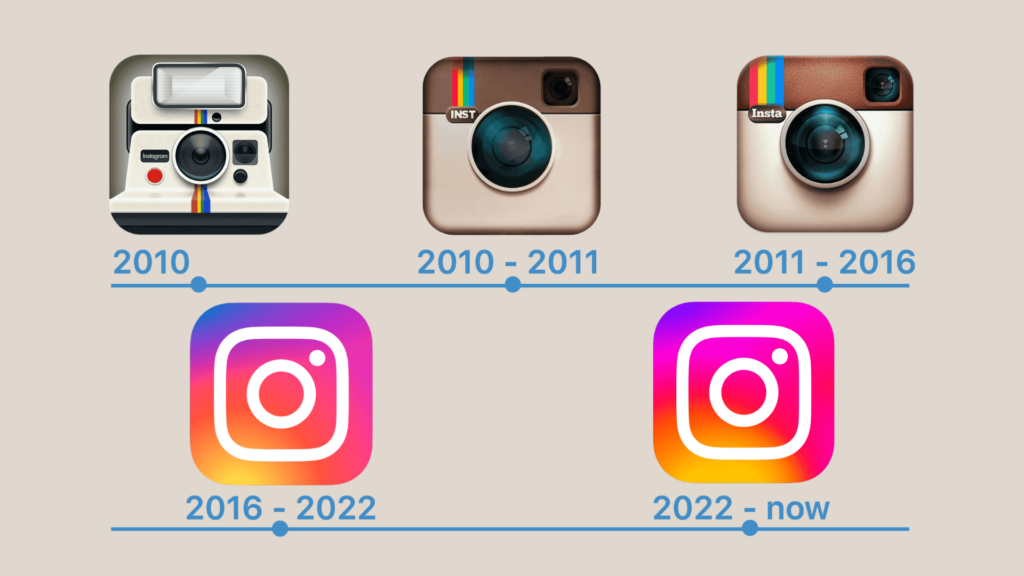
Instagram begins in 2010, where a charmingly beige Polaroid camera, complete with a rainbow stripe, graced the first Instagram icon. It was an era of skeuomorphic design, mimicking real-world objects to create a sense of familiarity and warmth. This camera perfectly captured the app’s initial focus on mobile photography, evoking a sense of instant gratification and analog charm.
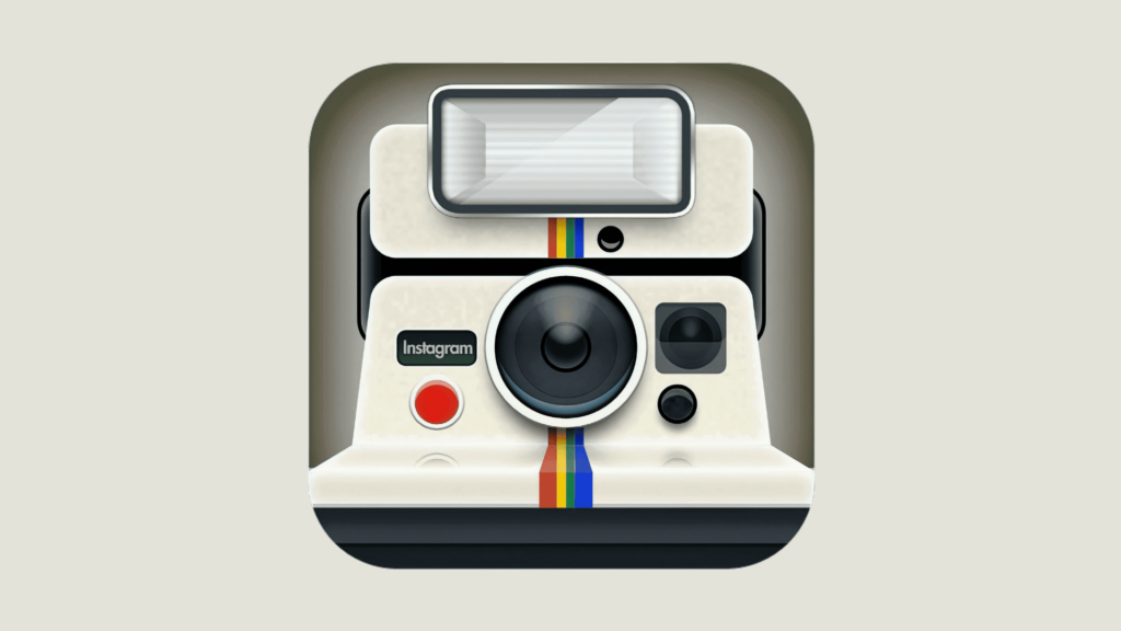
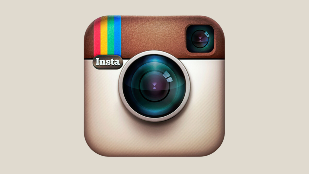
But trends evolve, and so did Instagram. Soon, the Polaroid gave way to a more detailed Bell & Howell-inspired camera, complete with a viewfinder and that now-iconic rainbow stripe. It was a subtle shift, reflecting a growing emphasis on filters and digital manipulation, while still holding onto the familiar essence of photography.

By 2011, skeuomorphism faded like a vintage filter. The camera flattened out, its lines sharpened, and a vibrant orange and purple gradient took center stage. This marked a significant leap towards minimalism, symbolizing Instagram’s expansion beyond pure photography and into a playground for visual storytelling.
And then, in 2016, came the boldest move yet. The camera vanished, replaced by a striking gradient-filled square. This wasn’t just a design change; it was a statement. Instagram was embracing minimalism head-on, shedding its skin to reveal a vibrant platform for all kinds of multimedia expression.

Iterating on Identity
It’s important to note that Instagram’s icon wasn’t a complete reinvention with each iteration. It was a series of carefully calibrated adjustments, ensuring a sense of continuity and brand recognition.
The core orange, purple, and pink gradient remained throughout, like a vibrant thread weaving through the years, solidifying visual unity and brand identity.
The essence of the camera never truly disappeared. Even after its physical form vanished, the square format and rounded corners subtly echoed its shape, a quiet nod to the app’s photographic roots.
And with each change, the colors grew bolder and brighter, mirroring the platform’s increasing emphasis on visual richness and creative expression.
Shifting Perceptions, Shaping Identity:
These design choices weren’t merely aesthetic; they subtly shaped how users perceived Instagram:
The early iterations evoked a sense of nostalgia and familiarity, connecting users to the app’s warm, photo-sharing origins.
The move to flat design and the disappearance of the camera signaled an evolving identity, showcasing Instagram’s ambitions as a multimedia platform, pushing its boundaries beyond pure photography.
And the iterative changes, always retaining a core essence, demonstrated the app’s dynamism and adaptability, capable of growth and change while staying true to its roots.
Beyond a Pretty Picture
Instagram’s icon evolution is more than just a collection of pretty pictures. It’s a visual narrative of a brand in constant dialogue with its users and the ever-changing digital landscape. Each iteration tells a story of growth, adaptation, and a passionate embrace of creativity. It reminds us that a brand’s visual identity is not static; it’s a living entity, constantly evolving to captivate, engage, and empower its users.
Conclusion
These diverse approaches all share a common theme: the importance of balancing innovation with brand consistency. While experimentation and exploring new design trends are crucial, maintaining a recognizable identity is equally important. The key lies in finding the sweet spot where fresh ideas enhance the user experience without diluting the brand’s core values.
Within this balance, encouraging experimentation is key. App icon design, like any art form, flourishes when boundaries are pushed and new ideas are explored. Hidden Easter eggs, subtle animations, and playful variations can add depth and engagement to the user experience. As long as these experiments stay true to the brand’s core identity, they can contribute to a vibrant and memorable app icon design.
Take your company to the next level and get results with our world class user experience, interface design and implementation.
Get a FREE 30 min Strategy Session

Related posts
The Future of UX Design in 2024
User experience (UX) design is the process of creating products and services that are easy to use and enjoyable for […]
8 Things to Consider When Designing for Children
Intro 👋 The age at which children are interacting and acquiring smartphones or smart devices is decreasing year by year. […]
Designing UX for Younger Generations: Strategies to Create Engaging User Experiences
Designing UX for Younger Generations is both a challenge and an opportunity for modern designers. These digital natives, encompassing Generation […]
Creative product design that gets results
Take your company to the next level with world class user experience and interface design.
get a free strategy session


