Microinteractions Unveiled: Transitioning from Usability to Emotion in Modern Design
Microinteractions refer to the small, nuanced animations or responses that occur when users engage with a digital product. They are the tiny details that, when thoughtfully designed, contribute to a more engaging and satisfying user experience. From the satisfying click sound when liking a post on social media to the subtle vibration confirming a successful payment transaction, microinteractions are the silent storytellers that communicate with users on a subconscious level.
Their importance in today’s digital landscape cannot be overstated. As users navigate an increasingly complex web of applications and websites, it’s the microinteractions that provide the moments of clarity and reassurance. They go beyond mere aesthetics, serving as communication tools that guide users, provide feedback, and establish a connection between the digital realm and human emotions.

Table of Contents
The Power of Tiny Tweaks
Microinteractions, the subtle animations and responses triggered by user actions, are often unnoticed heroes of good usability. These tiny tweaks can have a surprisingly big impact on how users experience an interface, making it smoother, clearer, and less prone to errors. Let’s delve into how microinteractions work their magic through four key aspects:
Guiding users through the interface:
Imagine a website where buttons just sit there, lifeless and uninviting. Now, picture those same buttons gently pulsating or changing color when you hover over them. Suddenly, they become beacons, guiding your attention and hinting at their function. This is the power of hover effects. They subtly nudge users towards the next step, reducing confusion and making navigation more intuitive.
Providing real-time feedback:
Ever clicked a button and been left in the dark, wondering if anything happened? Microinteractions like progress bars and spinners bridge that gap, offering immediate visual cues that your action is being processed. This instant feedback reassures users, builds trust, and prevents frustration.
Reducing cognitive load:
Our brains have limited processing power, and complex interfaces can overload them. Microinteractions can alleviate this cognitive burden by simplifying information and making it easier to digest. For example, animated error messages with friendly illustrations and clear instructions replace confusing text walls, helping users understand and fix mistakes quickly.
Preventing errors:
Microinteractions can act as gentle guardrails, steering users away from potential pitfalls. For example, a “shake” animation on an empty form field before submission reminds users to fill in missing information, reducing the chance of errors and frustration.
These are just a few examples of how microinteractions can transform an interface from bland to brilliant.
II. More Than Just Function: Emotional Connections
Microinteractions are more than just usability powerhouses; they’re also emotional architects, capable of building powerful connections with users and solidifying brand identity. Consider them tiny brushstrokes painting a bigger picture on the canvas of user experience. Let’s explore how these mini-interactions evoke emotions and build brand loyalty:
Adding personality and charm:
Imagine a lifeless calculator app. Now, replace the mundane button clicks with playful bounces and a confetti animation for successful calculations. Suddenly, the app morphs from a tool into a charming companion. This is the power of personality injected through microinteractions. They imbue brands with human-like qualities, making them relatable and endearing.
Creating a sense of delight and surprise:
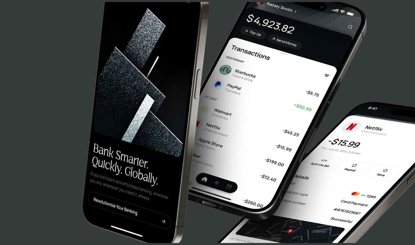
Who doesn’t love a delightful surprise? Microinteractions can sprinkle unexpected moments of joy into user journeys. Imagine opening a banking app to find a playful animation celebrating your saving milestone. This unexpected gesture fosters positive emotions and leaves a lasting impression, turning the app into a source of positive reinforcement.
Strengthening user engagement:
Engagement is the lifeblood of any digital product. Microinteractions can keep users hooked by creating a dynamic and responsive interface. Think of a news app using subtle screen vibrations when you swipe through articles, mimicking the feeling of turning a physical page. This tiny interaction adds a layer of tactility and makes the experience more immersive, encouraging further exploration.
Now, let’s put theory into practice with some captivating examples:
Custom Onboarding Animations
Duolingo uses playful animations during its onboarding process, turning language learning into a fun and engaging experience. Characters celebrate milestones, providing positive reinforcement.
Fun Loading Screens
Slack displays amusing messages and animations while loading, transforming a potential moment of frustration into an opportunity for entertainment. This keeps users entertained during brief waiting periods.
Subtle Sound Effects on Actions
The sound of a camera shutter when taking a photo in a mobile app can create a satisfying and immersive experience. It adds an extra layer to the interaction, making it more memorable.
III. Balancing the Magic: Less is More
Microinteractions wield a powerful spell, adding a touch of magic to user experiences. However, like any potent potion, the key lies in moderation. Beware the allure of overloading your interface with too many microinteractions, for in the delicate dance of user engagement, less can indeed be more.
Clarity and Focus:
The first commandment in the microinteraction manifesto is clarity. Every interaction should convey a clear and concise message. Users should effortlessly understand the purpose and outcome of each microinteraction. Strive for simplicity in design, ensuring that the magic you weave serves a distinct purpose without overwhelming the user.
Consistency with Overall Design Style:
The harmony of your design relies on consistency. Microinteractions should seamlessly blend into the broader design language, forming a cohesive narrative. Maintain a consistent style for your animations, sounds, and visual cues. This not only enhances the overall aesthetic but also fosters a sense of familiarity and comfort for users as they navigate through your enchanted interface.
Accessibility for All Users:
In the grand tapestry of user experience, accessibility is the golden thread that binds it all together. Ensure that your microinteractions cater to users of all abilities. Subtle animations, legible fonts, and mindful color choices contribute to an inclusive design. The magic should be accessible to everyone, regardless of their devices or impairments, ensuring a delightful experience for all.
Tips for Designing Effective Microinteractions
Purposeful Enchantment
Every microinteraction should serve a purpose. Whether it’s providing feedback, guiding users, or signaling transitions, ensure that the magic you infuse is intentional and meaningful.
Timing is Everything
The rhythm of your microinteractions matters. Consider the timing and duration of animations to ensure they complement the user’s natural flow. Too fast or too slow can disrupt the harmony of the experience.
Subtle Soundscapes
If sound is part of your enchantment, keep it subtle. Sounds should enhance, not distract. Users should have the option to control or mute sound elements to tailor the experience to their preferences.
Progressive Disclosure
Unveil the magic gradually. Instead of bombarding users with a myriad of microinteractions all at once, introduce them progressively. This helps users acclimate to the enchanted realm you’ve crafted.
User Feedback Elegance
Provide feedback in a way that feels natural. Microinteractions are an excellent tool for conveying acknowledgment or success subtly. Vibrations, gentle animations, or color changes can signify completed actions without disrupting the user’s journey.
V. The Future of Microinteractions
Microinteractions have undergone a significant evolution with the emergence of advanced technologies like Augmented Reality (AR) and Virtual Reality (VR). In traditional interfaces, microinteractions were limited to subtle animations or feedback cues. However, in AR/VR environments, microinteractions take on a more immersive role, enhancing user experiences in novel ways.
In AR, microinteractions can manifest as responsive overlays that seamlessly integrate with the user’s real-world environment. For instance, a gentle vibration or visual cue when a user’s gaze aligns with a specific object can provide valuable feedback. In VR, microinteractions can be more tactile, allowing users to manipulate virtual elements with hand gestures or controller movements. These technologies open up new possibilities for creating intuitive and engaging microinteractions that blur the lines between the digital and physical worlds.
Predicting the future impact of microinteractions on UX/UI design in AR/VR, we anticipate a heightened emphasis on natural and intuitive interactions. Designers will need to focus on creating microinteractions that leverage the unique capabilities of these technologies, such as spatial awareness, gesture recognition, and haptic feedback. As AR and VR become more mainstream, the integration of these microinteractions will play a crucial role in shaping seamless and enjoyable user experiences in immersive digital environments.
Conclusion
Microinteractions may be tiny, but their impact on UX/UI design is undeniable. They inject delight, build trust, and make technology feel natural. As we move into the future, embracing these “invisible details” will be key to crafting truly immersive and engaging experiences in both the physical and digital worlds. So, go forth, designers, and sprinkle your creations with the magic of microinteractions!
Take your company to the next level and get results with our world class user experience, interface design and implementation.
Get a FREE 30 min Strategy Session

Related posts
Neobank Design: 3 Great Examples in a New Era of Banking
A tech-oriented world has brought forth a banking space dominated by digital transactions, a decrease in physical cash and a […]
Apple’s ‘Exhausted’ Emoji: The Symbol We Didn’t Know We Needed
Have you seen it yet? That yellow face with the heavy under-eye bags that just gets you? Apple recently dropped […]
How Fintech is Using No-Code to Fuel Innovation
The rapid rise of no-code development has transformed the tech landscape, offering a powerful way for businesses to create software […]
Creative product design that gets results
Take your company to the next level with world class user experience and interface design.
get a free strategy session


