Microinteraction: The Small UX Details That Make a Big Business Impact
When we think about great digital products, our minds often go straight to the big features: the ones that solve our problems, entertain us, or make our lives easier. But the real magic? It often lies in the tiniest details we barely notice: microinteractions.
Think of the satisfying animation when you double-tap a photo on Instagram and that little heart pops up. Or the friendly loading spinner that assures you the app hasn’t crashed. These small, momentary interactions known as microinteractions are often what create a lasting emotional connection with a product.
Let’s dive into why these tiny touches can have a huge business impact and how to design them well.
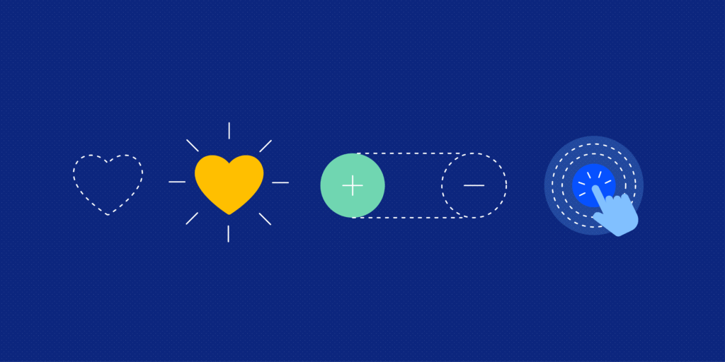
Table of Contents
I. What Are Microinteractions?
Microinteractions are the subtle design elements that guide users, provide feedback, and make an experience feel human. They’re like digital manners, little gestures that let users know their actions were noticed and appreciated.
Examples of Microinteractions in Apps
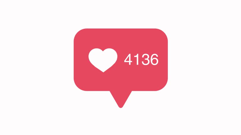
a. Instagram’s Heart Animation
When you double-tap a photo, a heart appears with a little pop. It lasts less than a second, but it’s a delightful confirmation that your action registered.
- Why it works: It gives instant feedback and adds emotional texture to the action.
- Business impact: Increases user engagement and encourages repeated interaction.
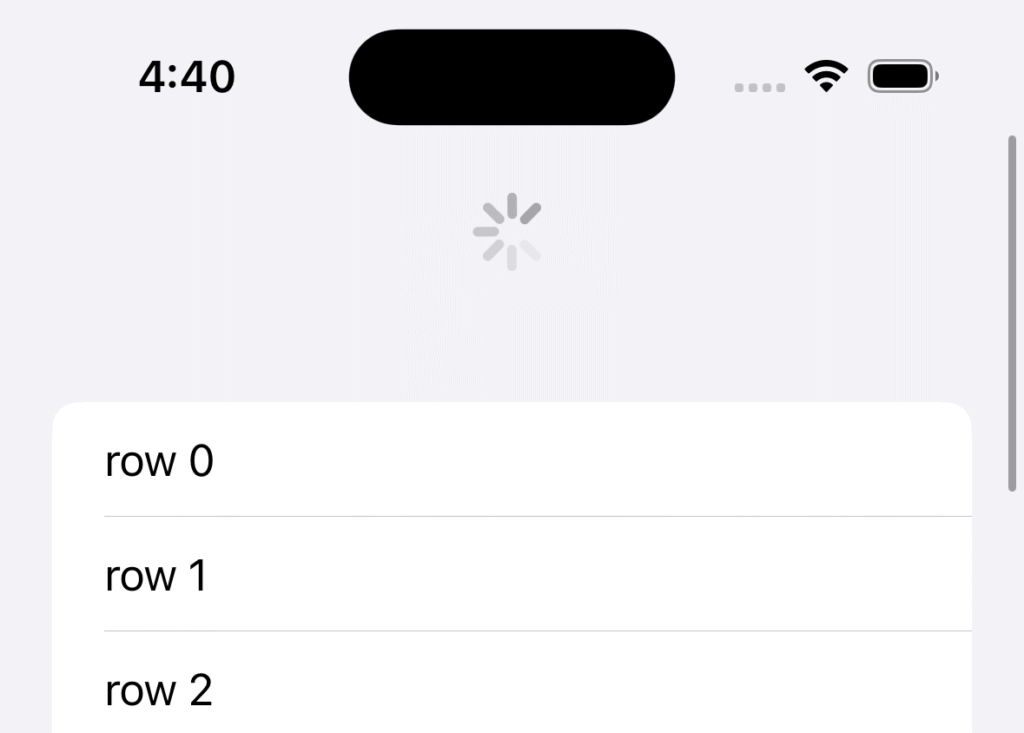
b. iOS Pull-to-Refresh
This feature isn’t just functional , the playful bouncing animation makes it feel good to refresh.
- Why it works: It shows system status (the app is loading new content), and gives users a sense of control.
- Business impact: Keeps users engaged longer by reducing uncertainty and adding a tactile feel.
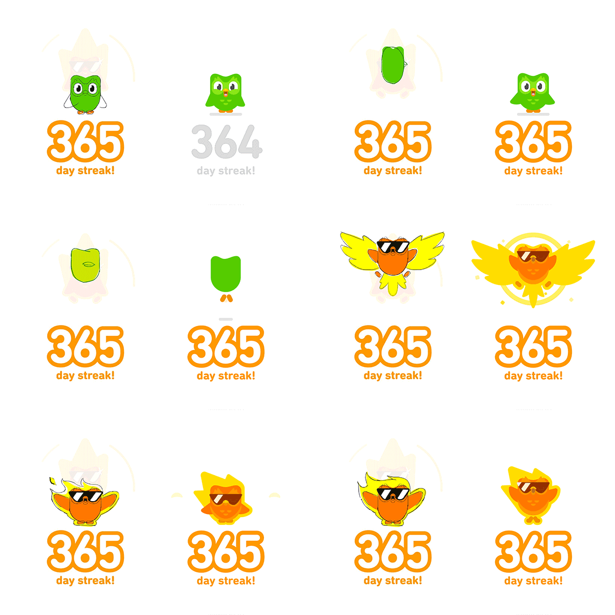
c. Duolingo’s Animated Feedback
When you get a question right, Duo (the owl mascot) celebrates with you. If you make a mistake, there’s gentle correction instead of harsh error messages.
- Why it works: Positive reinforcement keeps users motivated.
- Business impact: Higher retention rates and lower churn in gamified learning environments.
d. LinkedIn Connection Request Feedback
When you send a connection invite, a subtle pop-up confirms the action and gives suggestions on next steps.
- Why it works: Reinforces the action without taking you out of the flow.
- Business impact: Smooth onboarding improves network building and time on platform.
II. 5 Functional Purposes of Microinteractions (With Real-Life Examples)
Microinteractions do a lot of heavy lifting behind the scenes. They’re not just visual flourishes; they’re functional tools that help guide, reassure, and engage users. Here are five core ways microinteractions serve a meaningful purpose in digital products:
a. Provide Status Updates
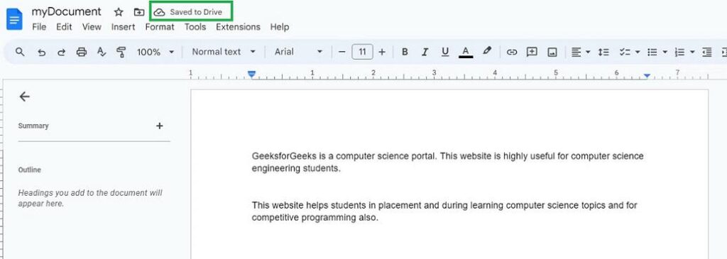
Microinteractions let users know what’s going on especially during moments of uncertainty, like loading or saving.
💡 Real Example: Google Docs Auto-Save
- When you type in Google Docs, a small message appears at the top: “Saving…” → “All changes saved in Drive.”
- Why it matters: It reassures users that their work is safe, without needing manual confirmation. This reduces anxiety, especially in high-stakes situations (like working on a report or proposal).
✅ Business Impact:
Builds trust in your platform. Trust reduces abandonment and increases repeat usage.
b. Prevent Errors
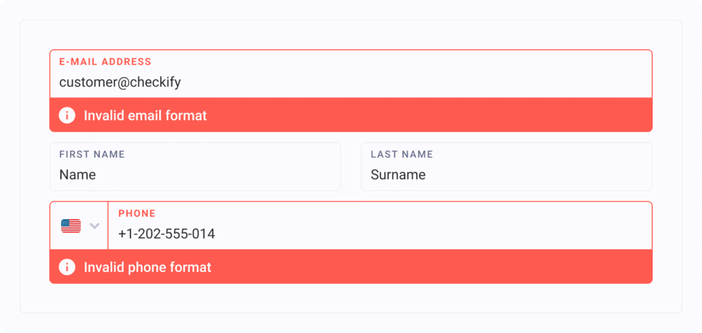
Microinteractions help users avoid mistakes before they happen by offering gentle, real-time corrections.
💡 Real Example: Shopify Checkout Form
- When users forget a required field or input an invalid email, the field is immediately highlighted with a soft animation and a helper message.
- Why it matters: It eliminates confusion and helps users complete tasks faster with fewer frustrations.
✅ Business Impact:
Reduces cart abandonment and customer service load both of which directly impact revenue.
c. Encourage Engagement

Tiny interactions can make users feel seen and appreciated leading them to engage more deeply.
💡 Real Example: Medium’s “Clap” Button
- Instead of just a “like,” Medium allows readers to “clap” up to 50 times per post, with a satisfying animation for each tap.
- Why it matters: It turns appreciation into a micro-game and gives the writer more nuanced feedback.
✅ Business Impact:
Drives user interaction and boosts visibility of high-performing content, keeping users engaged longer.
d. Provide Confirmation and Closure
Microinteractions help users feel confident that their actions succeeded. This is especially important after completing tasks or forms.
💡 Real Example: Instagram’s Heart Pop Animation
- When you like a photo, a quick heart animation confirms the action.
- Why it matters: It removes ambiguity and creates emotional reward, encouraging continued interaction.
✅ Business Impact:
Positive feedback loops like this keep users engaged and engaged users drive ad impressions, retention, and referrals.
e. Guide and Onboard Users
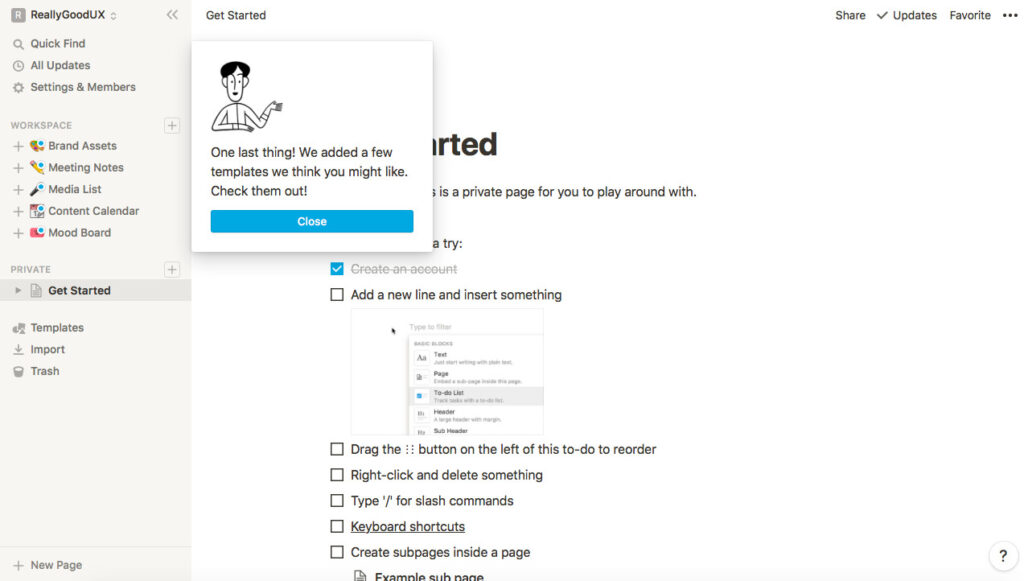
When new users open your product, microinteractions can gently teach them how to use it without long tutorials.
💡 Real Example: Notion’s Animated Tooltips
- Notion uses brief, animated pointers or nudges to explain buttons the first time you see them.
- Why it matters: It helps reduce cognitive load and improves feature discovery without overwhelming the user.
✅ Business Impact:
Better onboarding leads to faster activation, lower churn, and more successful user journeys.
III. Designing Good Microinteractions
Designing great microinteractions isn’t about flashy animations or gimmicky effects. It’s about enhancing the user’s experience in a way that feels natural, seamless, and satisfying. Dan Saffer, a leading voice in UX design, defines four key components of any microinteraction: triggers, rules, feedback, and loops/modes.
Let’s explore each of these in more depth with real-world app examples and practical advice you can apply today.
a. Triggers: The Spark That Starts It All
A trigger is what kicks off a microinteraction. It can be:
- User-initiated (e.g., tapping a button, swiping, typing)
- System-initiated (e.g., receiving a message, a timer running out)
Think of it like the switch that sets things into motion.
✅ Real-Life Examples:
- Tap-to-heart in Instagram: The act of double-tapping a photo triggers the like animation.
- Hover effect in Airbnb: When you hover over a listing card, the background subtly shifts and buttons appear, prompting further action.
💡 Design Tip:
Make triggers intuitive and consistent. If users have to guess what will happen when they tap or swipe, it creates friction. A good rule of thumb: if you need to explain it, it’s probably too complex.
b. Rules: The Invisible Logic Behind the Scenes
Rules define what happens after a trigger is activated. These rules are usually invisible to users, but they determine the interaction’s behavior and flow.
Rules answer questions like:
- What should animate?
- How long should it last?
- What comes next if the user taps again?
✅ Real-Life Examples:
- YouTube play/pause toggle: Clicking the play button changes the icon to a pause symbol and vice versa. This toggle behavior is part of the microinteraction’s rules.
- Duolingo streaks: Completing a lesson adds to your streak, and the animation + celebration is triggered only if it’s your first lesson of the day — a rule based on usage context.
💡 Design Tip:
Keep rules predictable and context-aware. Microinteractions should feel intelligent, adapting to the user’s behavior without creating surprise or confusion.
c. Feedback: The Conversation Between User and System
Feedback is what users see, hear, or feel as a result of their action. It’s the system’s way of saying: “I see what you did there, and here’s what happened.”
It can be visual (animations), auditory (sounds), or tactile (vibrations).
✅ Real-Life Examples:
- Apple’s iPhone keyboard haptics: You feel a subtle vibration with each keypress, reinforcing the typing action.
- Slack’s message sent sound: That little “whoosh” confirms that your message was sent.
- Google Pay animations: After completing a payment, a checkmark bounces into view with a soft chime, signaling success.
💡 Design Tip:
Feedback should be clear, immediate, and delightful. A good microinteraction removes uncertainty—users should never be left wondering, “Did that work?”
d. Loops and Modes: The Longer-Term Behavior
This is where the microinteraction grows a bit of a brain. Loops and modes define how it behaves over time or under different conditions.
- Loops control how long the interaction continues or if it repeats.
- Modes allow it to behave differently depending on context or user state.
✅ Real-Life Examples:
- Typing indicators in WhatsApp: They loop as long as someone is typing and disappear when they stop.
- Smart home apps like Nest: The temperature adjustment dial looks and behaves differently when you’re in “away” mode versus “home” mode.
💡 Design Tip:
Think about how the interaction scales. What happens when it repeats? Will the novelty wear off? Is there a way to make it adapt or personalize over time?
IV. When Animation Becomes a Distraction
The goal of microinteractions is to enhance the experience — not to compete with the experience itself.
But in an effort to be “cool,” it’s easy for designers or developers to fall into the trap of overdesigning interactions with:
- Unnecessary bounce effects
- Long fade-in/out transitions
- Too many elements animating at once
- Audio or vibration triggers that don’t serve a purpose
🎯 Real-World Case: Windows Vista’s UI Overload
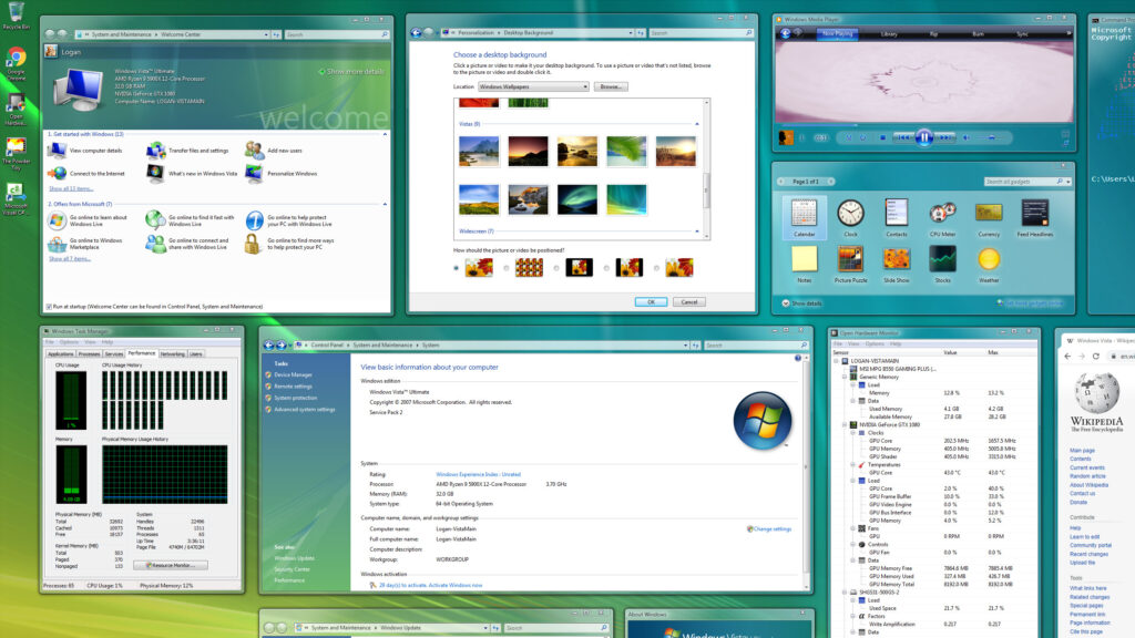
When Microsoft launched Windows Vista, they introduced a range of flashy new animations: windows zooming in and out, drop shadows, fade effects, etc. On paper, these were meant to create a smooth experience.
But in reality? Users quickly complained:
- The animations were too slow, creating unnecessary wait time.
- The system was resource-heavy, making devices lag.
- Users felt out of control, as things happened with delays or flourish instead of immediacy.
💡 Lesson: What feels elegant in a demo can feel sluggish in everyday use. Especially when users are trying to get things done quickly.
Conclusion: Microinteractions Are Your Silent Brand Ambassadors
The best brands: Apple, Airbnb, Instagram know that small touches can create big emotional payoffs. Microinteractions help build trust, make users smile, and reinforce your brand personality without saying a word.
They’re not just polish, they’re the glue that holds the user experience together. When designed thoughtfully, microinteractions can turn a good product into a beloved one.
So whether you’re building a new app or refining an old one, don’t underestimate the power of these small moments. Because when it comes to user experience, the little things are the big things.
Take your company to the next level and get results with our world class user experience, interface design and implementation.
Get a FREE 30 min Strategy Session
Related posts
Transforming Banking UX with AI
The banking industry is experiencing a dramatic transformation as artificial intelligence (AI) revolutionizes how financial institutions deliver services and interact […]
Stay ahead in SaaS: How to out UX your competitors
In today’s fiercely competitive SaaS market, understanding customer intent is more than just a strategy—it’s a necessity. With countless options […]
Designing Inclusive Dark Modes: Enhancing Accessibility and User Experience
Have you ever switched to dark mode on your phone late at night and felt instant relief as your eyes […]
Creative product design that gets results
Take your company to the next level with world class user experience and interface design.
get a free strategy session
