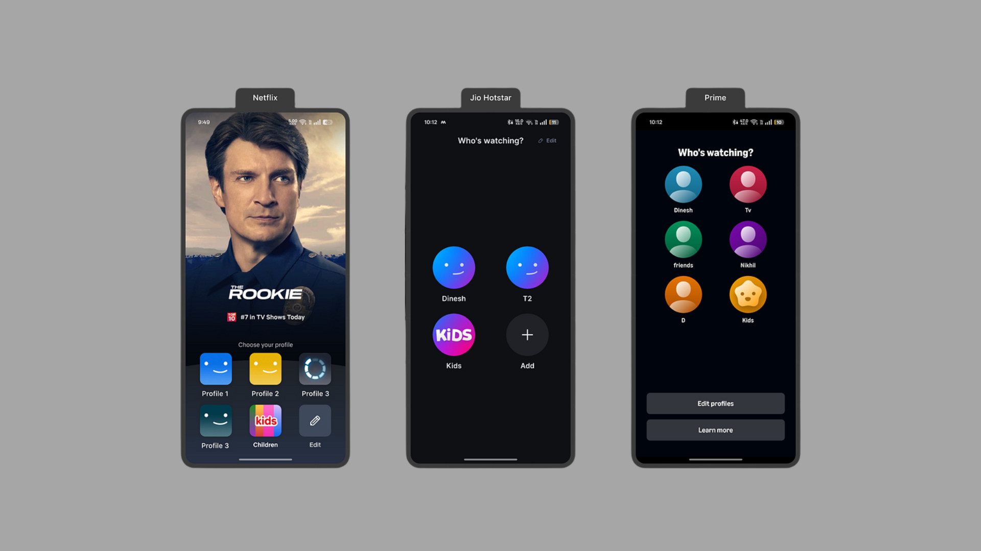
The Hidden UX Genius of Netflix’s New Welcome Page
We often think of great UX as invisible: smooth, intuitive, just working. But every now and then, a redesign comes along that deserves a closer look. Netflix’s new welcome screen is one of those quiet revolutions in UX that solves real user problems, supports business goals, and feels effortless in execution. If you’re a UX/UI designer, product strategist, or just someone who loves great design, this is a goldmine.
Let’s unpack why.
Table of Contents
A Welcome Page That Actually Welcomes
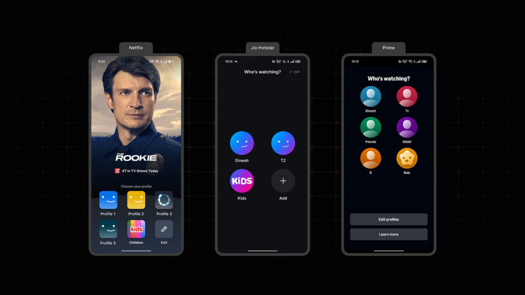
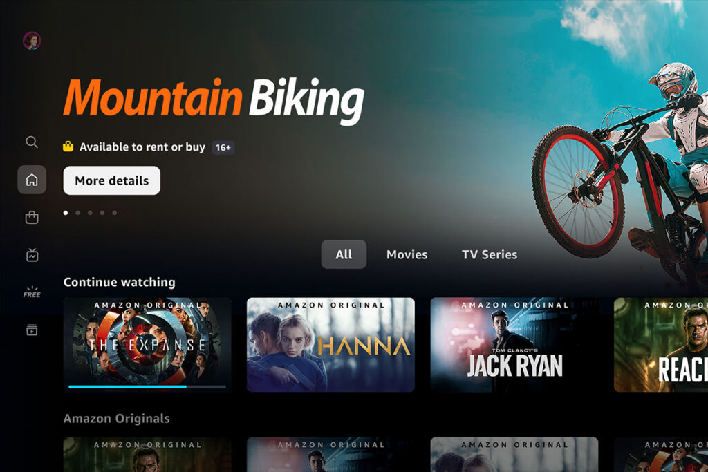
If you’ve opened Netflix recently, you’ve probably noticed something new: instead of jumping straight to profiles or an overwhelming wall of thumbnails, you’re now greeted with a bold, cinematic screen. Think: a full-bleed hero image from a trending show like The Rookie, paired with subtle but accessible profile icons anchored to the bottom of the screen.
At first glance, it feels like a visual facelift. But don’t let the simplicity fool you. This is a masterclass in reducing friction, guiding attention, and creating a brand experience the second someone logs in.
It’s not just pretty, it’s purposeful.
The Problem It Quietly Solves
Netflix didn’t make this change just for style points. This update addresses two big UX challenges that plague most streaming platforms:
Choice Overload
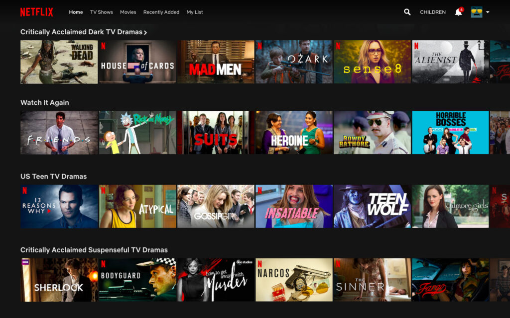
Ever opened Netflix, browsed for 10 minutes, and then just gave up or rewatched The Office? You’re not alone. On average, users spend 7 to 10 minutes just trying to decide what to watch. That number can spike even higher for families or indecisive viewers. It’s decision fatigue in action.
The Discovery Gap
While Netflix has endless content, it hasn’t always been great at surfacing what matters most right now. If nothing grabs you in the first few seconds, you’re left to scroll aimlessly or default to old habits.
The new welcome screen tackles both issues head-on. And the best part? It feels natural, not forced.
UX Moves That Make It Work
Let’s break down some of the design choices that make this welcome screen a UX win:
Hero Content, Front and Center
The star of the show is the hero banner. It’s not just visually striking, it’s strategically placed to focus user attention. Instead of overwhelming the user with too many choices, Netflix offers one clear, compelling starting point. It reduces effort and decision friction immediately.
Profiles Repositioned for Ergonomics
Moving profile selections to the bottom of the screen might seem minor, but it’s huge in terms of usability. Whether you’re on a smart TV remote or tapping on your phone, your natural interaction zone is toward the bottom. It’s thumb-friendly, reduces stretch or reach, and feels more aligned with how people actually use devices.
Cleaner Visual Hierarchy
The screen has a streamlined layout that guides the eye effortlessly. No more darting around trying to figure out what to do next. It’s structured, clean, and guides behavior in subtle ways that make the experience feel intuitive.
Smart UX, Smarter Business
Here’s where things get even more interesting: this isn’t just good UX. It’s smart business.
That hero image isn’t random. It’s always a trending or promoted show the kind of content Netflix wants you to see. So while it helps users make decisions faster, it also boosts visibility for specific titles.
That’s a win-win: the user gets less cognitive load and more instant engagement, and Netflix gets more eyes on the content it’s pushing that week.
It’s design thinking aligned with growth strategy – the sweet spot every product team should aim for.
Expect the Copycats
This kind of thoughtful redesign won’t go unnoticed. Competing platforms like Prime Video, Disney+, and even YouTube TV are likely already eyeing this structure. Why? Because it tackles problems that every streaming service faces:
- Users spend too much time deciding
- Home screens get cluttered fast
- Good content goes unnoticed
- UX rarely aligns directly with business KPIs
Don’t be surprised if hero-first, minimal-interaction welcome pages start popping up everywhere. Netflix just showed everyone what “smart simplicity” looks like.
What Designers Can Learn From This
If you’re working on any digital product – not just streaming apps – there are some serious takeaways here:
1. Prioritize Visual Hierarchy
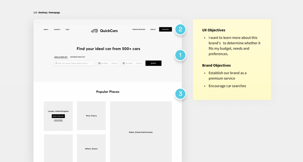
Always ask: what’s the one thing the user should do first? Then build your design around guiding them to it. In Netflix’s case, it’s “Watch this great show.”
2. Design for Natural Interaction Zones
Whether it’s a thumb on a phone or a remote on a smart TV, put important actions where users naturally reach. Don’t fight muscle memory. Use it.
3. Merge UX with Business Goals
Great UX doesn’t just feel good – it drives results. Whether it’s increasing views, reducing bounce, or promoting specific products, align your design with measurable goals.
4. Validate With Real Data
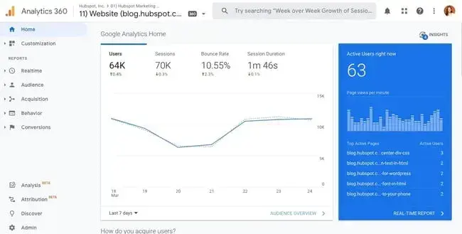
Netflix didn’t just guess this layout would work. They likely tested it across multiple user segments using engagement data, heatmaps, and retention curves. You should too.
Final Thought: First Screens Matter More Than You Think
The redesigned welcome page is more than a UI tweak, it’s a lens into how Netflix thinks about behavior, content strategy, and user psychology. It’s subtle, smart, and built with intention.
And that’s the real takeaway here: don’t treat landing pages or first screens as throwaways. They set the tone. They guide behavior. And in the best cases, they create that feeling of, “This just feels right.”
Design for that feeling.
Take your company to the next level and get results with our world class user experience, interface design and implementation.
Get a FREE 30 min Strategy Session

Related posts
AI Won’t Kill UX, Our Habits Will: Why Designers Must Stay Intentional
Let’s be honest: AI isn’t ruining UX. We are. Not on purpose but through habits we don’t always notice. We […]
Raw Studio acquires Jellypepper to expand its reach to the startup ecosystem
Some special news today! We’re announcing our acquisition of Jellypepper, a specialist creative agency based in Surry Hills. Jellypepper was […]
Subscription UX for Ecommerce Brands: Turning Occasional Buyers Into Lifelong Customers
Subscription UX have become a dominant growth strategy in Ecommerce, not because they are trendy, but because they solve real […]
Creative product design that gets results
Take your company to the next level with world class user experience and interface design.
get a free strategy session
