Double Click: Why This Classic Gesture Is Obsolete in Modern UX Design
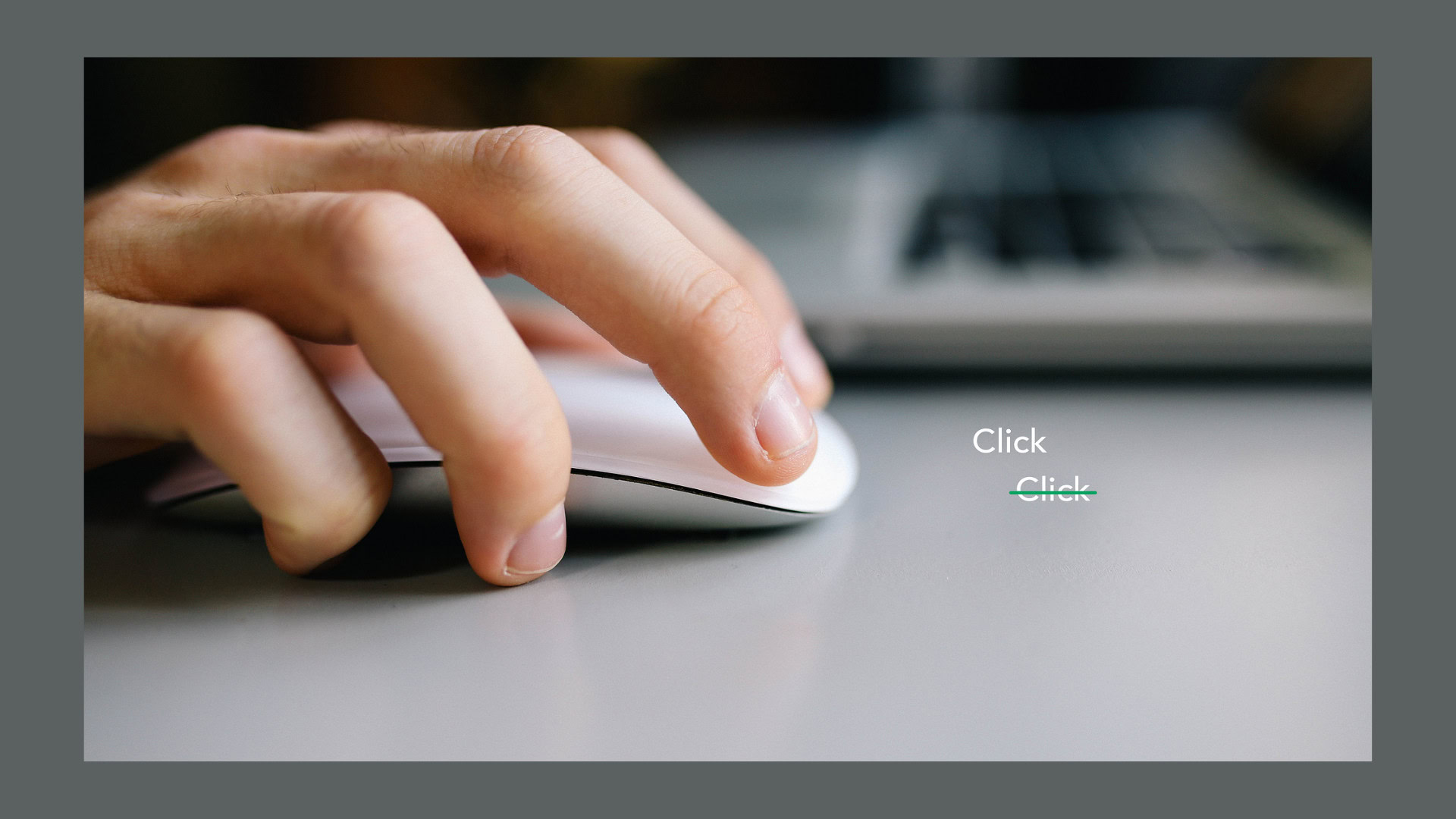
For decades, the double click has been one of the most familiar gestures in computing. Originating from the early days of graphical user interfaces (GUIs), double clicking was devised as a simple way to distinguish between selecting an item and opening it. However, as technology has evolved from mobile touchscreens to artificial intelligence (AI)-driven experiences, the double click has stubbornly survived despite becoming increasingly obsolete. In this article, we explore the origins of the double click, why it made sense at the time, and why UX designers today should move beyond it to create faster, more accessible, and intuitive user interfaces.

Table of Contents
The Origins of Double-Click: A UX Crutch
The double click emerged as a practical solution during the infancy of personal computing, when user interface design faced significant technological constraints. Early computer mice typically had only one or two buttons, and operating systems lacked sophisticated ways to differentiate between user intents with a single click. Designers needed a clear method to tell the system, “I want to open this item, not just select it.” The double click became that method, a gesture that users could learn and repeat to signal opening a file or application.
Operating systems like Windows and macOS standardized the double click, embedding it deeply into user behavior. While this interaction was clever and effective for its time, it quickly became a crutch for designers, an artifact of legacy systems rather than a deliberate usability choice. The double click was never truly intuitive; it simply fit the limitations of early human system interaction and interface design.
The Mobile UX Revolution That Killed Double-Click
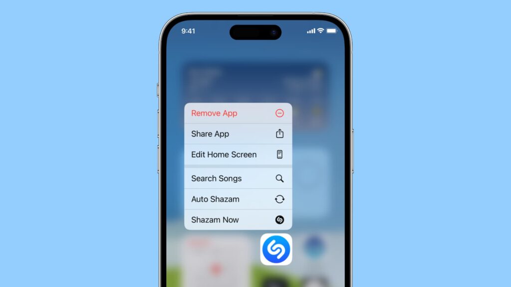
The rise of mobile phones and touchscreens revealed the double click’s shortcomings. Unlike a computer mouse, touchscreens do not support complex timing-based gestures easily. On small mobile screens, precision and speed are paramount. Users do not want to tap twice quickly just to open an app. Instead, mobile UX design embraced simplicity, favoring single taps for selection and action, swipes for navigation, and long-presses for contextual menus.
These gestures are natural, ergonomic, and accessible to a wide range of users, including those with varying motor skills. The mobile UX revolution reshaped user interface design by prioritizing clear, singular actions that enhance usability and user satisfaction. As a result, an entire generation of users grew up without ever needing to double click, making this interaction a relic of desktop computing rather than a universal standard.

The Myth That Double-Click Is Faster — and Why It Fails
Many argue that double clicking is faster because it combines selection and opening into one fluid motion. However, this supposed advantage does not hold up under scrutiny. The reality is that double clicks introduce timing variance and increase error rates, undermining overall usability.
Each user’s double-click speed differs, and operating systems allow customization of this speed, which can create accessibility challenges. If a user clicks too slowly, the system interprets two single clicks instead of a double click; click too fast, and unintended actions may occur. For users with motor impairments or older adults with slower reflexes, double clicking becomes a significant barrier rather than a convenience.
Therefore, the double click is fragile and unreliable, detracting from the overall user experience instead of improving it.
Why Double-Click Still Lingers
Despite its drawbacks, double clicking remains prevalent in many systems today. The short answer is inertia. Operating systems like Windows and macOS continue to ship with double-click defaults, and many legacy desktop applications depend on it. Developers and designers have internalized double clicking as “just how computers work,” and many users have never questioned or learned alternatives.
This resistance to change keeps interfaces stuck in the past, limiting progress toward more usable and accessible designs. For companies and design teams aiming to meet modern business goals and enhance brand loyalty, clinging to outdated interaction patterns like double clicking can hinder competitive edge and user satisfaction.
What Designers Already Do Instead
UX professionals and designers have largely moved on from double clicks, favoring single, clear actions that simplify the user’s experience. Modern user interface design incorporates several alternatives that improve usability and reduce errors:
- Single-click or tap for default actions, making interactions straightforward and predictable.
- Contextual UIs that reveal options on hover, right-click, or tap-and-hold, providing users with additional controls without complicating the main action.
- Long-press or hold-to-confirm patterns for safety-critical actions, reducing accidental triggers.
- Touch-first design that starts with mobile and scales gracefully to desktop environments, ensuring consistency across devices.
These design choices align with the broader concept of user experience (UX) design, which defines user experience as the person’s perceptions and responses resulting from the use or anticipated use of a product, system, or service. By focusing on clear, accessible interactions, designers create usable products that solve problems and meet user needs effectively.

The Final Nail: AI, Predictive Interfaces, and Smarter UX
Artificial intelligence is accelerating the obsolescence of the double click by enabling predictive interfaces that anticipate user intent. AI-driven systems can analyze context and user behavior to trigger the right action with minimal input, eliminating the need for redundant gestures.
For example, a photo app might automatically open the most recent image you viewed or predict which file you want next, streamlining interaction and reducing cognitive load. These smart interfaces enhance human system interaction by automating tasks and personalizing the user experience, aligning with the goals of interaction design foundation principles and UX aims to increase user satisfaction.
As AI continues to evolve, the double click will become an unnecessary friction point, replaced by interfaces that intuitively understand and respond to user needs.

User Feedback and Iteration: How Real Users Phased Out Double-Click
The transformation of user interface design is a testament to the power of user feedback and iterative improvement. The gradual disappearance of the double-click gesture from modern interactive systems didn’t happen overnight, it was the result of ongoing user research, usability tests, and a relentless focus on user satisfaction.
As digital products became more central to daily life, UX designers and UX professionals began to pay closer attention to the pain points users encountered. Usability testing revealed that double-clicking was a frequent source of confusion and errors, especially for new users, older adults, and those with motor impairments. User feedback consistently highlighted a preference for simpler, more direct interactions, prompting design teams to rethink established patterns.
Organizations like the Interaction Design Foundation have played a pivotal role in spreading best practices in UX design, emphasizing the importance of designing websites, mobile apps, and interactive systems that prioritize the end user’s interaction. By leveraging prototyping tools and conducting iterative usability tests, designers could quickly validate new ideas and refine their UI design based on real-world user needs.
This user-centered approach has become a key differentiator for most companies seeking to align their business objectives with positive UX outcomes. The term user experience now defines not just how a person feels about a particular product, but also how well the interface design supports their goals, reduces error rates, and fosters brand loyalty. Information architecture, interaction design, and visual design all contribute to the overall user experience, ensuring that digital products are both usable and delightful.
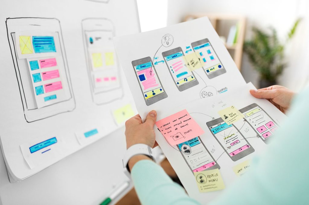
UX designers today are multidisciplinary, drawing on insights from human behavior, psychology, and business strategy to create products that meet evolving user needs. The use of prototyping tools and continuous user feedback allows for rapid iteration, ensuring that design choices are always informed by real user interactions. This process is especially critical in the fast-paced world of mobile apps and websites, where user expectations are constantly shifting.
As technologies like augmented reality and artificial intelligence become more prevalent, the importance of user-centered design will only grow. Companies that prioritize usability, accessibility, and user satisfaction will continue to gain a competitive edge, creating products that not only meet but exceed user expectations.
In essence, the decline of the double-click is a clear example of how user feedback and iterative design can drive meaningful change in UI design. By listening to users and embracing a broader concept of user experience, designers and companies can create products that are intuitive, accessible, and aligned with both user needs and business goals.
Recommendations for Designers Today
If your product teams or design teams still rely on double-click interactions, it’s time to reevaluate and modernize your user interface design. Here are key recommendations for moving forward:
- Identify and remove double-click dependencies. Replace them with single, clear actions that reduce error rates and improve usability.
- Use confirmation or undo mechanisms instead of complex gestures for safety-critical operations, enhancing user trust and satisfaction.
- Prioritize accessibility. Conduct usability testing with diverse users, including those with motor or visual impairments, to ensure your designs accommodate all user needs.
- Design for cross-device consistency. Adopt touch, voice, or gesture-first experiences that gracefully extend to desktop interfaces, reflecting current user behaviors and expectations.
- Educate users when shifting from legacy behaviors. Clear communication and user feedback help ease transitions and maintain positive UX.
By embracing these strategies, designers and companies can create digital products that align with modern human behavior, business objectives, and the broader concept of user experience.
Conclusion
The double click was a clever UX solution in 1984, born out of necessity to navigate early graphical user interfaces. However, in 2025 and beyond, it represents unnecessary friction that impedes usability and accessibility. Modern UX design is about removing barriers, not preserving outdated interaction patterns.
For UX designers, graphic designers, and product teams, the double click is no longer a key differentiator or a hallmark of mastery, it’s a sign of UX debt long overdue for elimination. Great interfaces anticipate the end user’s interaction, automate tasks where possible, and create positive UX by simplifying design choices. Moving beyond double clicks is essential for creating usable, accessible, and enjoyable digital experiences that deliver real value to users and businesses alike.
Take your company to the next level and get results with our world class user experience, interface design and implementation.
Get a FREE 30 min Strategy Session

Related posts
Why Menus Are Disappearing in Modern UX
Have you ever opened a new app or website and thought, “Wait… where’s the menu?” You’re not alone. Many users […]
7 UX Design Trends to Look Out For in 2023
2022 has ended and we are starting 2023 with brand new ideas and trends to look for. 2022 left us […]
Stop Scrolling: Kinetic Typography Is Redefining UX
Scroll through any modern website or mobile app and you’ll quickly notice something new: text that doesn’t just sit still […]
Creative product design that gets results
Take your company to the next level with world class user experience and interface design.
get a free strategy session
