
How Typography Hierarchy Boosts UI Usability
People do not read interfaces the way they read books. They scan, evaluate, and act. Nielsen Norman Group has consistently shown that most users scan pages instead of reading them fully, with studies indicating that roughly 79 percent of users scan while only a small minority read word by word. This behavior is not a flaw. It is an adaptation to information density and time pressure.

Because of this, typography hierarchy becomes a core usability mechanism. It allows users to understand what a screen is about in seconds, identify relevant sections without effort, and move confidently toward actions. When hierarchy is missing or weak, users feel lost even if the copy itself is good.
Research on first impressions also reinforces this point. Visual judgments about a page are formed extremely quickly, often within 50 milliseconds. Typography hierarchy strongly influences those early judgments because it defines clarity, order, and perceived quality before users read anything in depth.
Table of Contents
What Typography Hierarchy Is
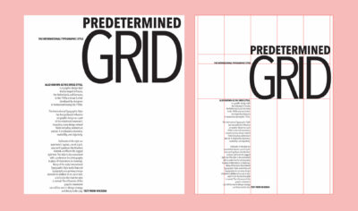
Typography hierarchy is the deliberate organization of text based on importance. It visually communicates meaning before content is read.

In UI design, hierarchy is built through multiple reinforcing signals. Size indicates priority. Weight adds emphasis. Color and contrast create separation. Spacing groups related information and reduces clutter. Position leverages natural scanning patterns such as top-first and left-biased viewing, which have been widely documented in eye tracking research.
When these signals work together, users do not need to think about where to look. The interface tells them.
How Typography Hierarchy Improves Usability
Typography hierarchy guides attention by clearly defining a starting point. A strong page title immediately answers where the user is and what the screen is for. Eye tracking studies show that users tend to fixate first on prominent text near the top of a page, making primary headings especially influential in orienting users.

Hierarchy also reduces cognitive load. When content is visually structured, users do not need to mentally organize it themselves. This aligns with cognitive load theory, which shows that reducing unnecessary mental effort improves comprehension and task success.
Scannability improves dramatically with good hierarchy. Nielsen Norman Group estimates that users read at most about 20 to 28 percent of the text on an average page. That means headings, labels, and emphasized phrases effectively become the real interface. Hierarchy ensures that these elements carry the most useful information.
Decision making becomes easier when hierarchy clearly separates primary actions from secondary details. Users can quickly distinguish what they should do from what they might want to know. This reduces hesitation and error rates.
Accessibility is also strengthened. Clear hierarchy, sufficient contrast, and consistent structure help users with low vision, cognitive differences, or reading difficulties. WCAG guidelines emphasize contrast and readable text structure because they directly affect usability for a wide range of users.
Levels of Typography Hierarchy
Most effective interfaces rely on a small, repeatable set of text levels.

Primary text is the page title or main header. It defines the purpose of the screen and sets expectations instantly. If this level is unclear or visually weak, the rest of the content becomes harder to interpret.
Secondary text includes section headings and subheaders. These enable scanning and act as signposts. Users often read these first to decide where to invest attention.
Body text delivers the main content. Its role is sustained readability. Size, line length, and line height matter more here than visual flair. If body text is too large or too heavy, it competes with headings and collapses the hierarchy.
Supporting and meta text includes captions, labels, helper text, and secondary details. This text should be visually quieter but still readable. It provides context without demanding attention.
When these levels are consistent across screens, users quickly learn how to move through the interface without friction.
Core Tools to Create Hierarchy

Font size is the strongest hierarchy signal. Clear steps between levels help users instantly recognize importance. Subtle differences often fail because they require interpretation instead of recognition.
Font weight reinforces emphasis, but only when used sparingly. Overusing bold dilutes its meaning and increases visual noise.
Color and contrast add another layer of differentiation. Color should support hierarchy, not replace it. Contrast is critical for readability and accessibility, especially in real-world conditions like glare or small screens.
Spacing and line height shape how content is grouped. Generous spacing around headings increases their perceived importance, while consistent line height improves reading flow and reduces fatigue.
Position and alignment guide scanning. Users tend to start at the top and follow predictable patterns, so placing key text in those paths improves discoverability.
A Simple Example Type Scale

A type scale is a predefined system of text styles that creates consistent hierarchy across an interface. Below is a simple, practical example suitable for many web and SaaS products.
Example UI Type Scale
- Page title (H1): 32px, semibold, line height 1.25 Used once per screen to define purpose and context.
- Section heading (H2): 24px, semibold, line height 1.3 Used to break content into scannable sections.
- Subheading (H3): 18px, medium, line height 1.4 Used for grouping within sections.
- Body text: 16px, regular, line height 1.6 Optimized for long-form reading and comprehension.
- Supporting text: 14px, regular, line height 1.5 Used for labels, helper text, captions, and metadata.
What makes this scale effective is not the exact numbers, but the clear relationships between levels. Each step is visually distinct, predictable, and reusable. Once users learn what a 24px heading means, they recognize it everywhere.
Common Mistakes That Weaken Hierarchy
A frequent problem is using too many font sizes. Each additional size increases ambiguity and forces users to interpret importance instead of recognizing it instantly.
Another mistake is overusing bold and accent colors. When emphasis is everywhere, hierarchy collapses and nothing stands out.
Inconsistent heading styles across screens break scanning patterns. Users cannot rely on learned behavior, which increases cognitive load and slows navigation.
Poor contrast harms both usability and accessibility. Text that looks subtle in design tools often becomes unreadable in real environments. WCAG highlights contrast because low contrast text is a major barrier for many users.
Ignoring spacing and line height creates dense layouts that feel heavy and exhausting, even if the typography itself is well chosen.
Best Practices for Effective Typography Hierarchy
Start with a clear type scale and treat it as part of your design system. Avoid exceptions unless there is a strong reason.
Limit font families to reduce noise and maintain clarity. Most interfaces work best with one primary family.
Use spacing intentionally to support hierarchy. Consistent vertical rhythm makes interfaces feel calmer and easier to scan.
Apply weight, color, and contrast with restraint and purpose. Emphasis should always signal importance.
Test hierarchy using real content and accessibility checks. Real text reveals problems that placeholders hide.
Conclusion
Typography hierarchy is a foundation of usable UI, not a cosmetic detail. Because users scan and read selectively, hierarchy determines whether they find what they need or leave frustrated.
When hierarchy is thoughtful and consistent, interfaces feel faster, clearer, and more trustworthy. If you want help designing and implementing typography systems that prioritize clarity and usability, explore Raw.Studio Their work focuses on building interfaces where structure and readability support real user behavior.
Take your company to the next level and get results with our world class user experience, interface design and implementation.
Get a FREE 30 min Strategy Session

Related posts
 for a Niche Market")
How to Design User Experience (UX) for a Niche Market
In today’s digital landscape, user experience (UX) is far more than just attractive visuals or smooth navigation. It fundamentally defines […]

Stop Scrolling: Kinetic Typography Is Redefining UX
Scroll through any modern website or mobile app and you’ll quickly notice something new: text that doesn’t just sit still […]

The Most Important UX Metrics to Track for High-Performing Products in 2026
For years, UX success was measured by surface-level numbers. Clicks, page views, and session counts filled dashboards and presentations. In […]
Creative product design that gets results
Take your company to the next level with world class user experience and interface design.
get a free strategy session
