Design Psychology: 4 Principles that Empower Designers – Part 2
This is part 2 of our 4-part series on basic design psychology, tackling design for humans and for the lazy. Check out part 1 on cognitive biases if you’ve missed it.
We’ve previously talked about cognitive biases that rule our subconscious brain. But we don’t always follow our subconscious, thank god. We are able to make conscious decisions. Sometimes. 🧐
Table of Contents
Design Psychology: Design for the human
Because our brain work in a certain way and has limits, we, humans, need to understand the the way it works so we can address the needs more accurately.
The paradox of choice – Hick’s Law
Do you know how much scrolling time it takes for a Netflix user to settle for a title? If you didn’t, take a look at our previous article on how Netflix leverages its customers’ indecisiveness by creating immersive UX.
The answer was 19 minutes. That’s actually very long (It’s almost the duration of one episode of the American sitcom Friends!).
This happens because Netflix’s users are paralysed by the number of choices they are offered and don’t know which one to settle for. This is called the Paradox of Choice, a concept popularised by American psychologist Barry Schwartz in 2004 which states that the range of choices that is available today is far greater than in the past, but still, people are not happier than expected. That’s because the more choice we have, the more indecisive and overwhelmed we get. This in turn creates irritation and dissatisfaction.
Sheena Iyengar, a Canadian author and professor, conducted a study in 2000, The Jam Experiment, to prove the Paradox of choice in a paper called When Choice is Demotivating: Can One Desire Too Much of a Good Thing?. In the jam experiment, a grocery store conducted A/B testing in 2 sessions:
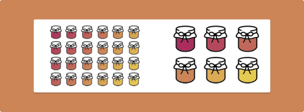
A: 24 choices of Jam
B: 6 choices of Jam.
The second session of testing attracted more purchases than the first one; 30% of shoppers bought jam during session 2 vs 3% of shoppers bought jam during session 1. Reducing options increases sales.
On the other hand, because we have so many options available to us, we become quickly paralysed, and because we get paralysed, we take more time to decide.

Here are some examples of brands that reduce cognitive and choice overload by constantly developing new innovative ways to help their users’ decision-making process:
- Netflix’s Top 10 was very successful when it first came out. As we’ve seen earlier, shows and movies that other people have watched and liked will have a much more important weight in our decision-making process, since we have the social proof that other people have appreciated them.
- Most of the time, brands will be able to apply Hick’s law concept through personalisation. The whole Spotify concept is actually ruled around Hick’s Law: they curate personalised playlists and songs based on what you’ve listened to, what you’ve skipped, and what you’ve liked, in order for you as a user to spend more time listening and less time deciding.
Miller’s Law (7±2 rule)
Let me introduce this magnificent law with a fun exercise. Can you try to remember the following set of numbers?
1 5 6 4 0 2 3 6 7 4
How many numbers did you remember?
In 1956, cognitive psychologist George A. Miller published a paper called The Magical Number Seven, Plus or Minus Two: Some Limits on Our Capacity for Processing Information. Phew that was a long title. In short, Miller pointed out that the human brain’s short-term memory has a limited capacity of 7 items and for a certain period of time only.
So no, don’t worry, you are not turning into Dory (although, she’s cute). Anyways. Giving your users too much information in a very small period of time will create a cognitive overload; the amount of mental resources required to operate the system will freeze because there is too much to process.
Think of the set of numbers as a piece of steak, a really good one, how would you eat that? You would cut it down into small pieces before chewing and eating right? What if we did the same thing with the set of numbers?
1564 023 674
Is it easier to memorise it now?
This technique is called chunking: Literally breaking down something into chunks to make it more digestible. This is already done with phone numbers and credit card numbers.
You can reduce your users’ cognitive overload by decluttering the interface and giving only bits of information. This will allow users to have time to process what is given to them without them going on freeze.
Spotify suggests genres by arranging the top genres in a carousel by chunks of two items and general genres in rows of four. By doing that, Spotify is giving the right amount of information to the user and they can easily navigate at their own pace. The choice of colours also makes it easier for the users’ brains to work.
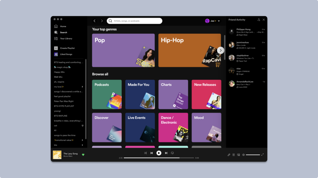
A great way to reduce cognitive overload would also be by hierarchising your content. This can be done by ranking the content you want to share with your users but also by taking advantage of font weight.
But don’t take this too literally. No magical number should restrain you in design. Think of it as a guideline.
Design Psychology: Design for the lazy
Human beings are lazy. That’s not news at all. We can do wonders by designing in a simple manner. “Less is More” right?.
Jakob’s law
Before coming to Australia, I was used to driving on the right side of the road. After only a few months of living in kangaroo land, I drove on the wrong lane for the first time. Imagine my mum’s surprise when she saw cars barging towards us. Hopefully, I got back to the right lane in time (no pun intended) and no one got hurt. This is to say that we are people of habit (and not that I am a bad driver. I am not).
When going on auto-pilot mode, as we can’t stay focused forever, our brains recall habits we are used to and apply them to current situations.
As human beings, we tend to look for patterns everywhere. Our brains are wired to find patterns, as they will function better, faster, and effortlessly. When you open a social network platform, you expect to land on the feed page because most of these apps work that way. You expect to have a discover feed, a message section, and your profile section page.
Users expect some features and functionalities to be located in certain places. your shopping cart is usually located on the top right corner, as well as the login button etc.
This is what Jakob’s Law is all about: the principle of usability that recommends the use of familiar patterns in design that will smooth user experience. This goes hand in hand with patternicity, which is defined as “finding meaningful patterns in meaningless noise” by Michael Shermer, American historian of science. Patterns we find might be real, or just manifestations of chance. (That is actually the explanation behind conspiracy theories😉).
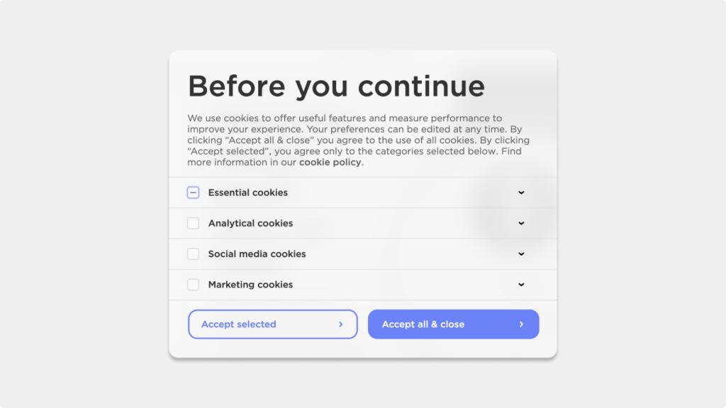
When I was browsing Withings’ website for my watch, I really wanted to buy it quickly, as I knew what I wanted and how to navigate through their website. I was quickly fooled by the website…
I usually spend some time declining the use of cookies on a website. As I was used to the “continue” button being on the bottom right corner and because this button screamed “Click on me! Click on me!”, I didn’t hesitate. Only right after clicking did the information got to my brain. I was pissed. I had taken time off my customer journey for actually nothing.
The Principle of Least Effort
I feel like this is self-explanatory. We are lazy people. And I mean we as the human being.
Relative to Jakob’s Law, we want to put in as little effort as possible to get something done, and in turn, we’ll choose the easiest and fastest path, even when we are capable of doing more.
From beginning to end, users will give in the least amount of effort possible to achieve a task. Some gestures ask for less effort from the user, swiping for example. It also asks for less commitment than actually tapping on the screen.
This swiping gesture has been popularised by the dating app Tinder ten years ago. Swiping is satisfying because it is easy, you can do it with your thumb, as it is the most common way to navigate on a mobile device, and it is an innate gesture; babies do it as well. This gesture is popular today, not only on dating apps, but also on social networks apps, such as swiping left to go to the next Instagram story, or swiping to access some other screens on Snapchat. Or even simpler than that actually, swiping down to get to your notification centre or swiping up to unlock your iPhone.
Another way to make your users more comfortable with your product is actually getting to know the user journey. The social Network TikTok added a new feature in their latest update, the ability to bookmark a TikTok video directly on the screen.
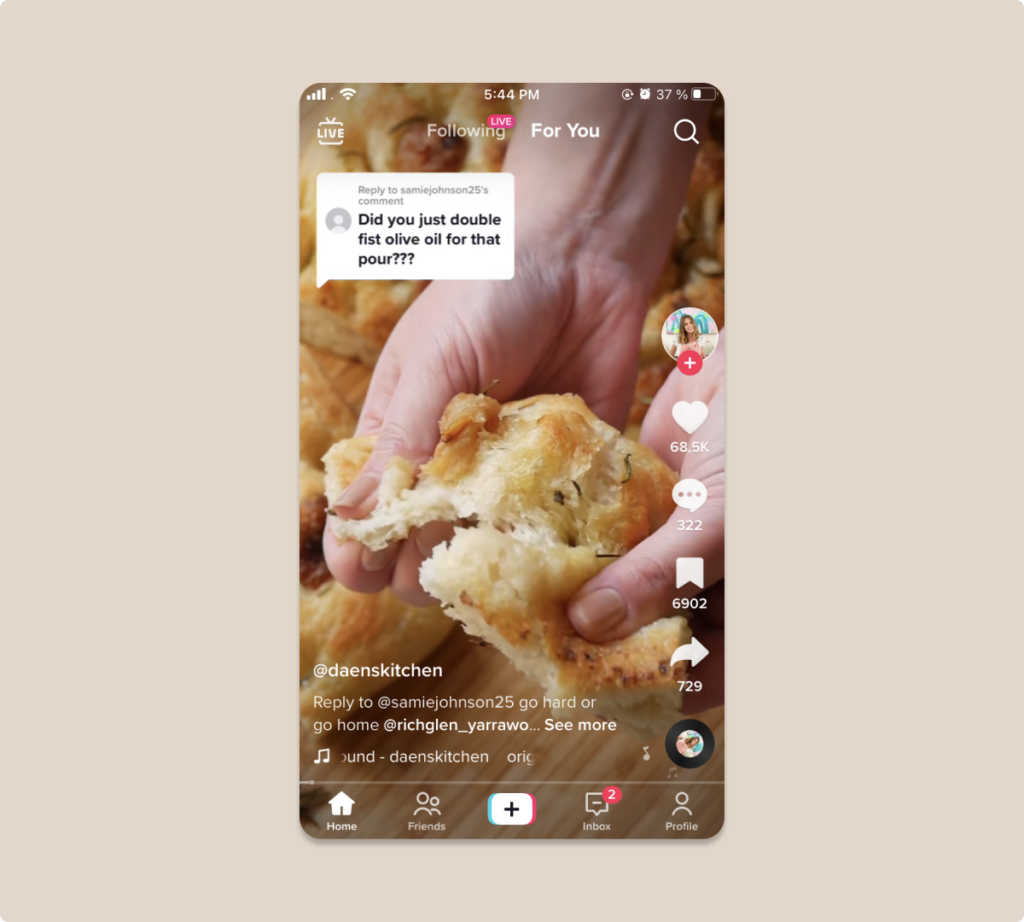
(Yes I like food). The old way to do that would be to tap on the share button and find the bookmark logo in the carousel. By knowing the behaviour of their users, TikTok was able to turn a pain point into a strength, reducing the amount of effort the user needs to bookmark a video, which was probably one of the most used functionality.
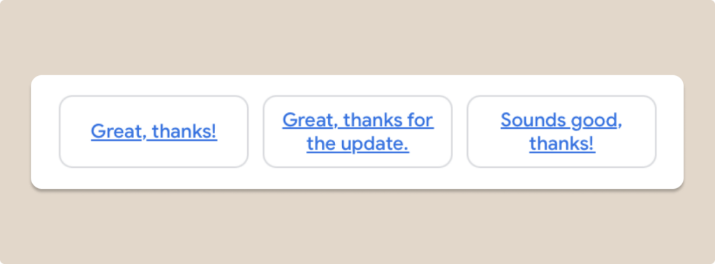
Apple and Gmail also have features that ask for less effort from the users, which make their experience with your product better. When receiving an email, Gmail will give three different suggestions of answers at the bottom of the email. You just need to click on it to edit, add things and send it. The same goes for when you are in the process of writing an email, Gmail will prompt some suggestions of sentences to help you redact your email.
Apple, on the other hand will predict the next words you are typing and suggest them to you with the predictive text feature that you can add from the accessibility settings.
Outro
Design psychology is about much more than a bunch of cognitive biases and principles.
Part 3 is here, and we will see how we can include and combine human senses into our products to make the UI and UX much more enjoyable for our users.
Get a UX & CRO Expert’s Eyes on Your Website. Book a free 30-minute UX Teardown and get actionable insights on what’s costing you conversions — no fluff, just fixes you can implement right away.
Book a Free UX Audit
Related posts
Becoming a Better Designer in 2022 with Jacalin Ding
With nearly 100k apps being released every month, product design has really taken off in the last ten years or […]
State Pattern: The Key to Seamless and Predictable User Experiences
Every digital experience we engage with daily, whether checking messages, streaming music, or shopping online, hinges on one crucial factor: […]
Design Guide for Startup Founders Building a Product
You have found your lightbulb moment and have an idea to revolutionise an industry. You’re ready to start your business; […]
Creative product design that gets results
Take your company to the next level with world class user experience and interface design.
get a free strategy session


