Case Study: How Headspace Designs for Mindfulness
In his twenties, Andy Puddicombe left his half-finished university degree behind and travelled to Asia.
At several different monasteries in different countries, Andy journeyed into his mind, first learning as a layperson and later was ordained as a monk. He continued his deep passion for meditation, setting up a practice in London. From a physical practice, Andy’s values were translated into an app. He wasn’t sure the techniques would be received well by Westerners en masse, and was skeptical of apps as a vessel… A skeptically contemplated app that has now made meditation a $320+ million dollar business.
This pandemic has encouraged me to take the plunge into Headspace. I forgot to unsubscribe after my free trial and unknowingly committed to a steep $91.99 per year subscription. It genuinely hurt seeing that money drain out of my account. Then I thought, “Well, I better start using it.” Now here I am months later, a converted user writing an article about the product!
Mindfulness has become quite the buzzword, so it’s no surprise that there have been a few apps that have emerged in the market that trying to tackle this concept. Below I will delve into some design concepts from Headspace that were discussed in their Design for Change talk, and how the design team uses the unique brand and science-based methods to connect to a modern audience.
Table of Contents
Some problems
From viewing Headspace designers Vicki Tan & Christine Cha’s talk, it was communicated that they faced two problems when looking into Headspace’s onboarding experience. They found that both issues they wanted to tackle were deeply rooted in human connection.
1. How to connect with new meditators through the Headspace
When looking for visual elements for the app, Christine said that the design team initially looked at what came up when searching for ‘meditation’ on Google.

Most images involved a human silhouette dramatically positioned in a magically lit landscape. The images seemed to be tailored to only certain people and was out of reach for the everyday human being – which contradicts Headspace’s belief that meditation is for absolutely everyone. Their mission is to “bring health and happiness to the world.” But, does everyone in the world have the time or geographical location to be able to head to a mountain top every morning to meditate? I mean, I certainly do not
So, Headspace proceeded to ask themselves “How do we make meditation more relatable?” They came up with three values:
A. Weird is relatable
Let’s face it, we’re all a little weird. Our uniqueness, our complications and our experiences are what define us as an individual, and Headspace wanted to go about embracing this.
They created visuals relating to the inside of the mind – the place where our innermost thoughts and feelings are produced. An example is their Mind Man illustration, pictured below.

The brain illustration is something we can all relate to. Although the characters aren’t necessarily human, we can almost see a bit of ourselves in them through colours and emotion.

B. Be purposeful with the details

Headspace made sure every colour, shape and line was intentional. The characters are ambiguous, designed in all different shapes and sizes with different colour combinations. They also made a point to avoid any sharp edges in their designs, as you’ll notice their characters are all quite curved and free-flowing.
The result is a warmer, friendlier design to create a more inclusive space.
C. Communicate abstract ideas through metaphors
Mental health can be a complex topic to some and Headspace recognises this. In order to tread lightly, the design team acknowledged that literal interpretations of emotions aren’t necessarily the best way to communicate to people. Harnessing metaphors allows you to connect to honest emotions.
Karen Hong, one of Headspace’s Brand Designers stated in an interview, “Although it may look like Iʼm just drawing cute smiley faces and characters all day, itʼs a cool challenge figuring out how to communicate abstract ideas and tougher topics…”
Take the example of anger, an emotion we have all felt before. Below, you will see two images – the first being a search result when typing in ‘anger’ on Google Images. It’s a very stereotypical portrait shot, and it definitely does not convey the same intensity of emotion of Headspace’s illustration. Whilst the illustration is not human, its visual elements almost seem more relatable than the image of the person. They use the symbolism of steam, stars and lightning bolts to emphasise the feeling of explosiveness and blinded confusion that can come in bouts of anger. The character’s fists and mouth are enlarged to further emphasise this rage.

Christine finished off her branding segment by mentioning that “meditation today is portrayed as a way to escape but our characters are here to communicate that meditation is quite the opposite. It’s about being present and mindful inside of your reality.”
2. How we helped new users build a meditation practise
When Headspace went from in-person events to a digitised platform, a lot of thought had to go into the transition from several-hour long seminars to just a few minutes of a user’s time. How were they going to get users to sign up, and ideally convert and stick around after their free trial period?
So, from more of a UX perspective, let’s dig into how Headspace increased conversions within their onboarding process.
A. Data-driven
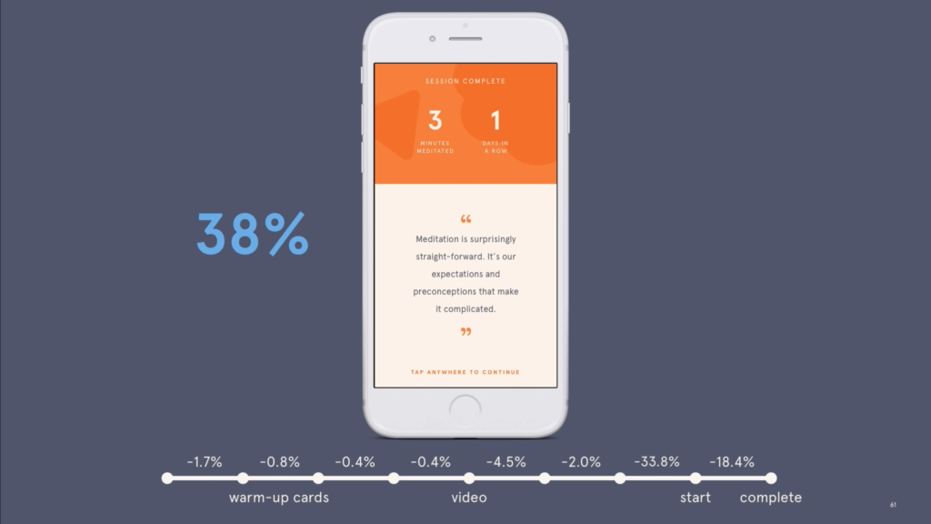
The initial onboarding process had quite a few steps, including an instructional video and an option to do your first meditation before even accessing the home screen. When analysing user data, they noticed that there was a 38% drop off rate between the start of the onboarding process and the end.
There was also a huge drop off in the second week and smaller drop offs throughout the following weeks.
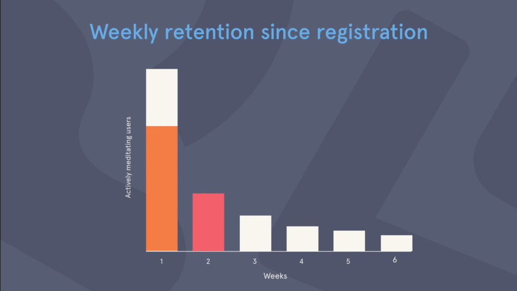
As users who moved past week two were five times more likely to convert to a paid subscription, week two became Headspace’s new focal measure of success.
B. Redesigning the onboarding
Headspace developed three data-driven hypotheses before they began designing:
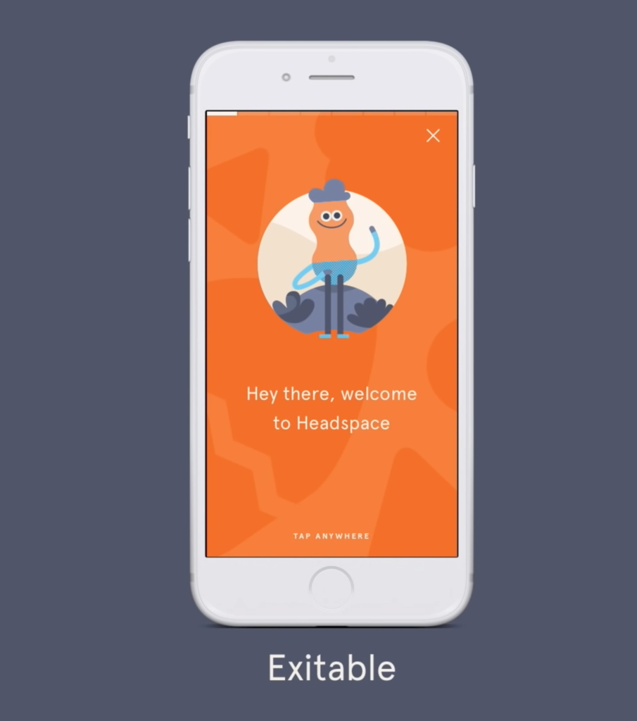
- Users are annoyed that they have to go through lots of steps – so they made the introduction screens easily exitable
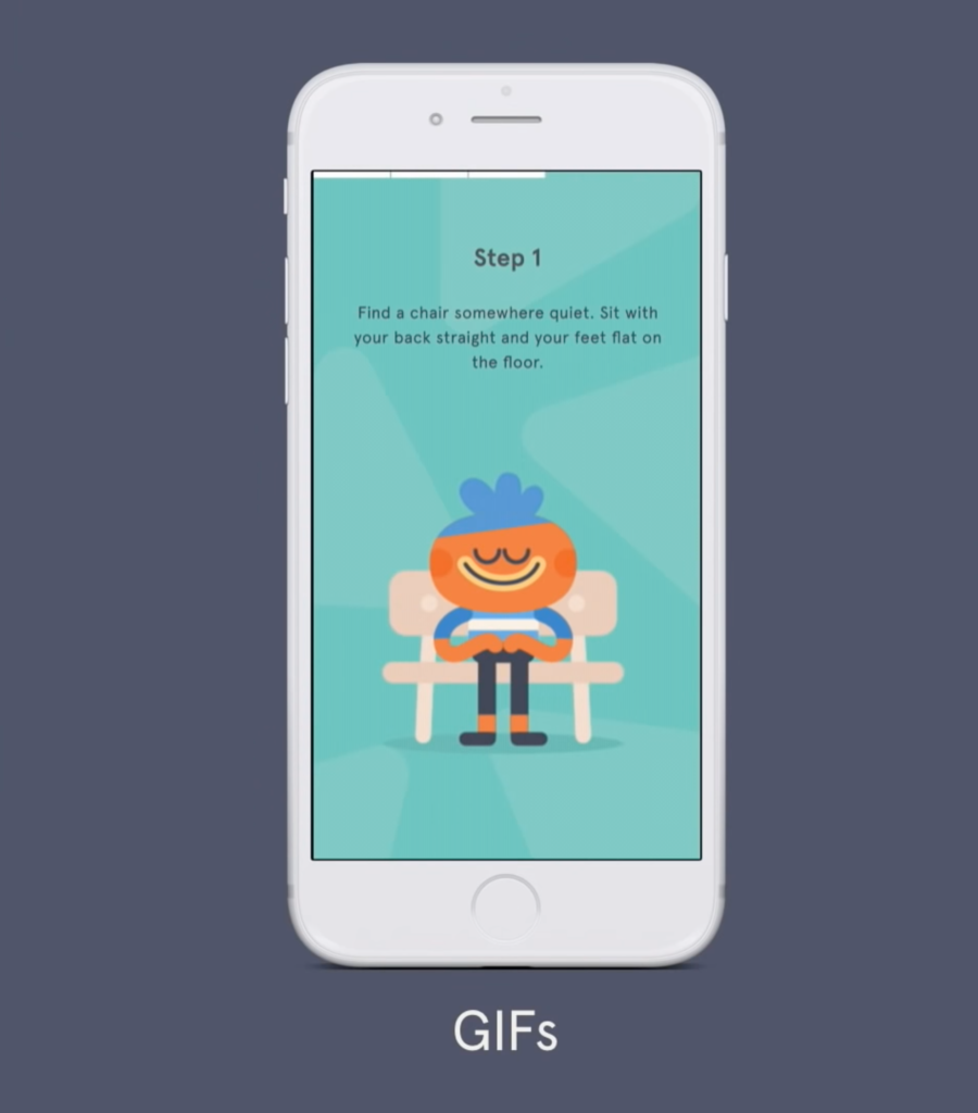
- They found the instructional video annoying – so they used GIFs instead that conveyed the same message
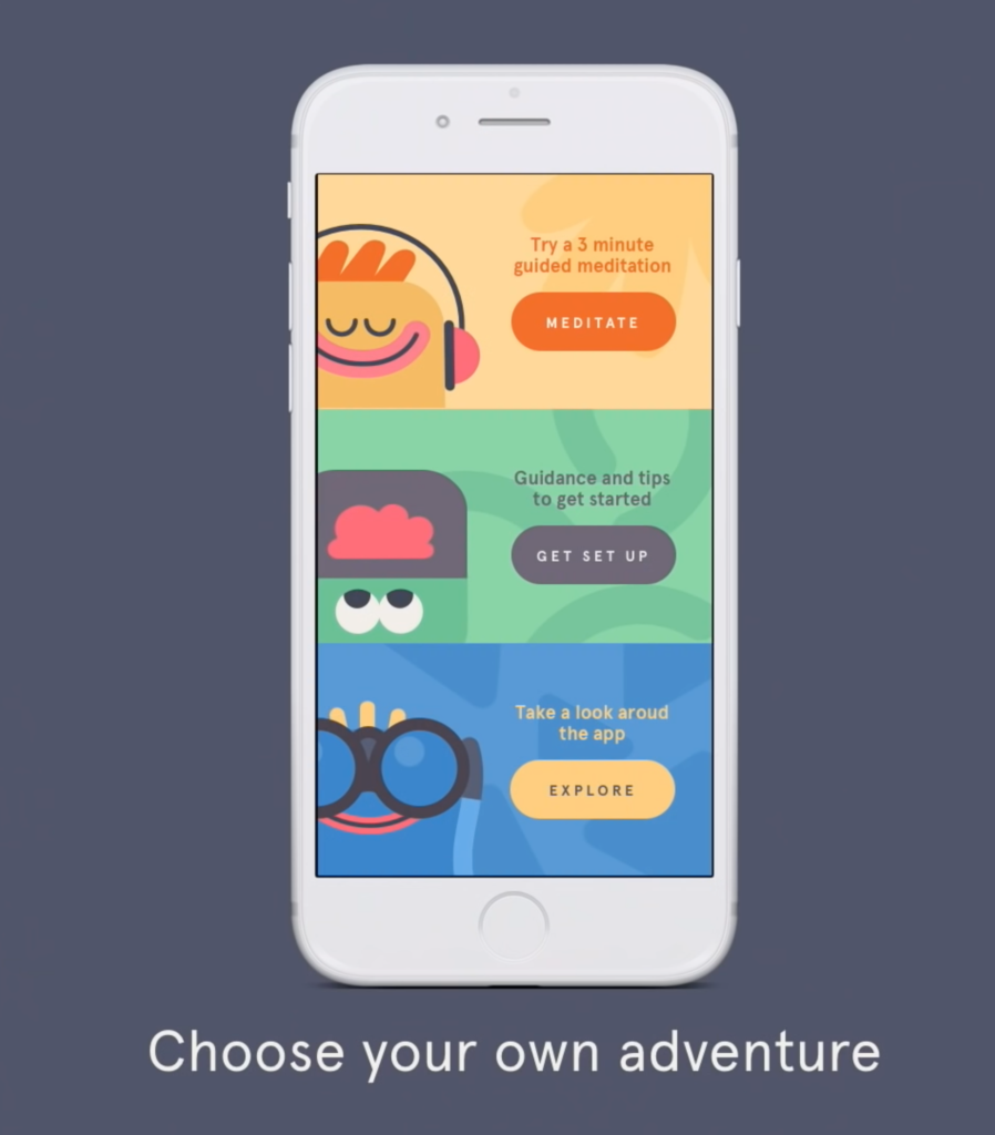
- Maybe all users didn’t want to be onboarded in the same way – so they created a choose your own adventure screen
- Low connectivity will result in disinterest – Downloading the meditation might take too long for users. To counteract this, the designers bundled session one with the app download – and make the CTA to view the first session optional.
These slight changes resulted in session one and home screen views going up… but nothing changed in regards to week two retention.
“That’s the limitation of data,” Vivian said “You can’t use it alone to prescribe solutions. You begin to design solutions based on assumptions rather than underlying user needs.”
C. User Research
Headspace acknowledges that meditation is rooted in Ancient practises, but they also think of it as a modern science. Their formula for research constructed of:
Data + research + science
They asked their users “What are you hoping to experience in the short-term and long-term through using headspace?” Seems simple right? Yet it was a question they were yet to ask their users. From these responses, they discovered that users were motivated by improving an area of their life and find value in being asked to articulate their goals.
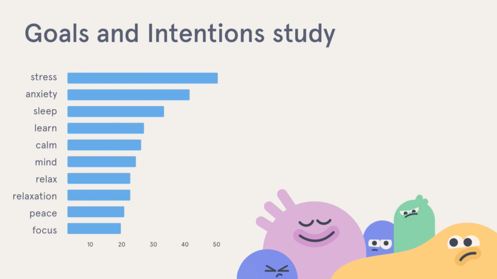
A diary study was then conducted, where users were asked to journal their first two weeks of using headspace. More uncoverings arrived:
- Most users were completely new to meditation
- New users needed more guidance
- Time wasn’t a problem – they just found it hard to prioritise healthy activity
In order to tackle these insights and get users into a healthy habit formation loop, Headspace set out to improve the user experience by:
- Creating intrinsic triggers will motivate users toward their goal. For example, if someone’s goal was to improve their sleep – the app would remind the user of their goal.
- Provide guidance on when / where to meditate and how to
- Provide realistic expectations on when you’ll notice a change or improvements in yourself
- Allow users to find the time to meditate
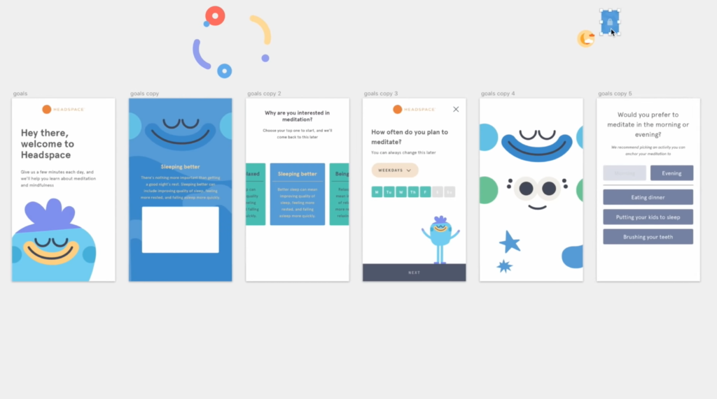
After prototyping these concepts, user interviews took place. What made this part challenging was that users were giving conflicting responses, e.g. some loved to be reminded of their meditation goals, others couldn’t think of anything worse.
“More often than not – even with all these tools at disposal, decisions have to be made.” – Vivian
The team had to make some tough decisions. With the trusty help of intuition, they decided to:
- Not ask users ‘how often they plan to meditate’ in the onboarding process
- Removed scientific facts to avoid any overwhelming moments, instead educating users later on in their journey with the app
- Removed the first session meditation – it was more important to get them through the onboarding door
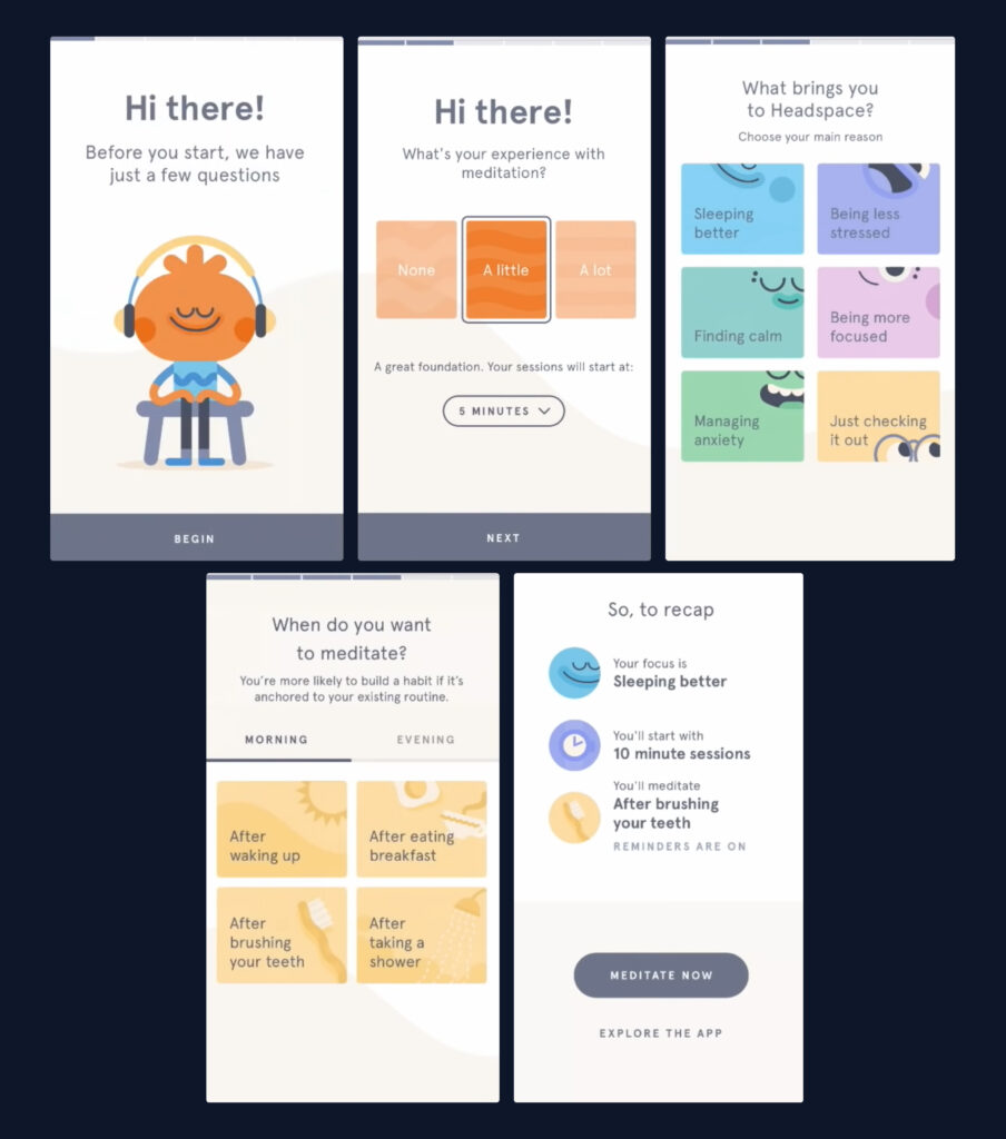
D. The Final Flow
- Starting with a warm welcome, Headspace sets context for what’s to come
- Users are then asked about their level of experience with meditation, and how long their sessions would go for
- What their overall goal is when using Headspace
- When they would like to meditate (and option to set reminders)
- A recap – with the option to start your first meditation or to explore the app
E. The Result
After the 6 week project of research and design, Headspace were able to see:
- a 10% relative increase in week 2 engagement
- an increase in conversion over 90 days
Headspace Today
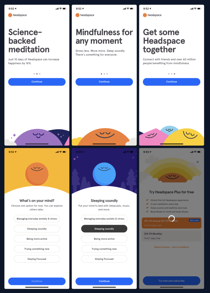
As you can see above, quite a bit has changed since Headspace’s leap into onboarding improvement several years ago. Their onboarding process has been simplified even further.
Headspace have definitely embraced the constant journey of searching and testing for a better experience for their user.
Wrap Up

Vivian concluded three important points that they learnt from this experience:
- Data can tell you what happened, but can’t make decisions for you
- Research and science can help you understand why, but aren’t always enough
- Intuition can sometimes help fill in the gaps
Headspace have clearly articulated their mission of “bringing health and happiness to the world” within their screens. Through evident research and testing, they have successfully created a calm, inclusive and vibrant space for different types of users to dip their toes in meditation and mindfulness.
It has become a healthy habit to check in and listen to the soothing voices of Andy and Eve on my morning commute. I think it’s safe to say that I am terribly grateful for my accidental subscription.
Take your company to the next level and get results with our world class user experience, interface design and implementation.
Get a FREE 30 min Strategy Session
Related posts
Dashboard Design Disasters: 6 UX Mistakes You Can’t Afford to Make
Have you ever stared blankly at a dashboard, overwhelmed by unclear data or buried in endless menus? You’re not alone! […]
Apple’s ‘Exhausted’ Emoji: The Symbol We Didn’t Know We Needed
Have you seen it yet? That yellow face with the heavy under-eye bags that just gets you? Apple recently dropped […]
Designing Inclusive Dark Modes: Enhancing Accessibility and User Experience
Have you ever switched to dark mode on your phone late at night and felt instant relief as your eyes […]
Creative product design that gets results
Take your company to the next level with world class user experience and interface design.
get a free strategy session
