How to Conduct a UX Audit
A User Experience Design Audit is just one of the ways to identify the imperfect areas that may lack usability in a product.
Audits have the ability to utilise both qualitative and quantitative data to provide insights in improving your product, resulting in increased conversions.
You can conduct different types of UX Audits and use multiple approaches depending on your time frame and budget – but the overall focus is to dig deep into your audience’s wants and needs. If you’re struggling with conversion or churn rate, or having general usage issues it might be time to have a look at things from a UX perspective.
We have put together a simple starting point for those who want to test the waters. The following points provide a high-level, constructive checklist for a usable product.
You can also assess yourself with our Free UX Audit.
Go to Self UX Audit QuestionnaireTable of Contents
📄 Landing page
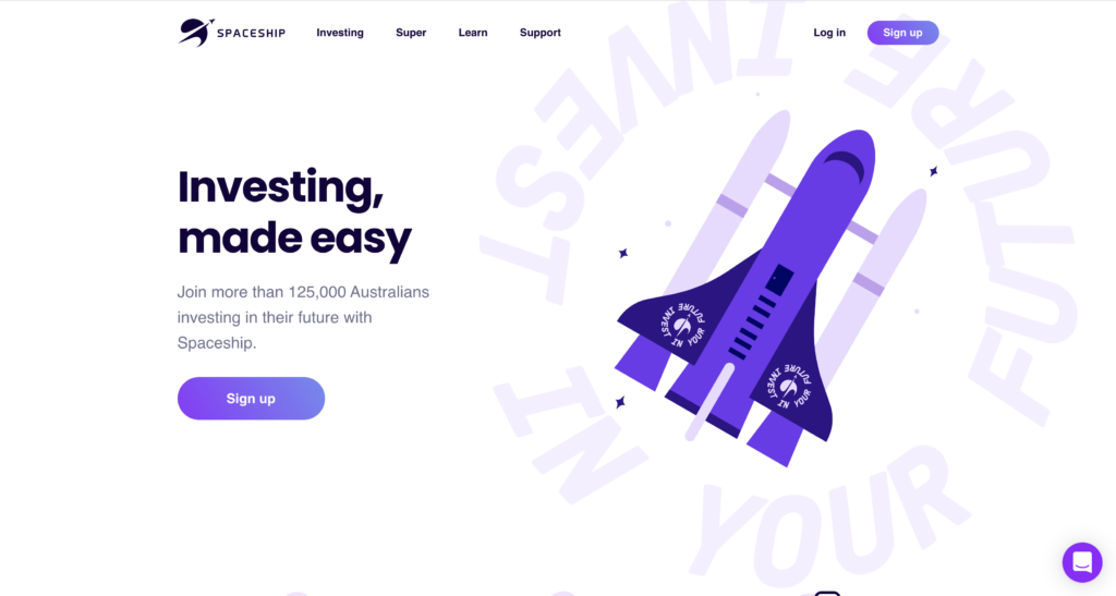
A landing page is a great way to drive traffic, improve your SEO and build your brand. It’s your opportunity to create conversions and build your customer base. It’s important to have the following:
☑️ It’s easy to comprehend what your company is about
A landing page is your first opportunity to capture your user’s attention and draw them in. Emphasising your values and USP on this screen will increase brand impact.
☑️ Your branding is clearly reflected in the design
Whether this be with colours, imagery or symbols – it’s important that your branding personality is nicely reflected in your website’s design. It will allow users to familiarise themselves with your product and to associate particular text or colours with your company.
☑️ Users are encouraged to adventure
It’s great having a beautifully crafted landing page, however, if the user has no prompt on where to go next… What’s the point? Displaying a clear Call To Action (CTA) will assist in the retention of a page visitor.
🧭 Navigation
Without well thought out navigation, your user will have trouble interacting with your product and will potentially abandon ship.
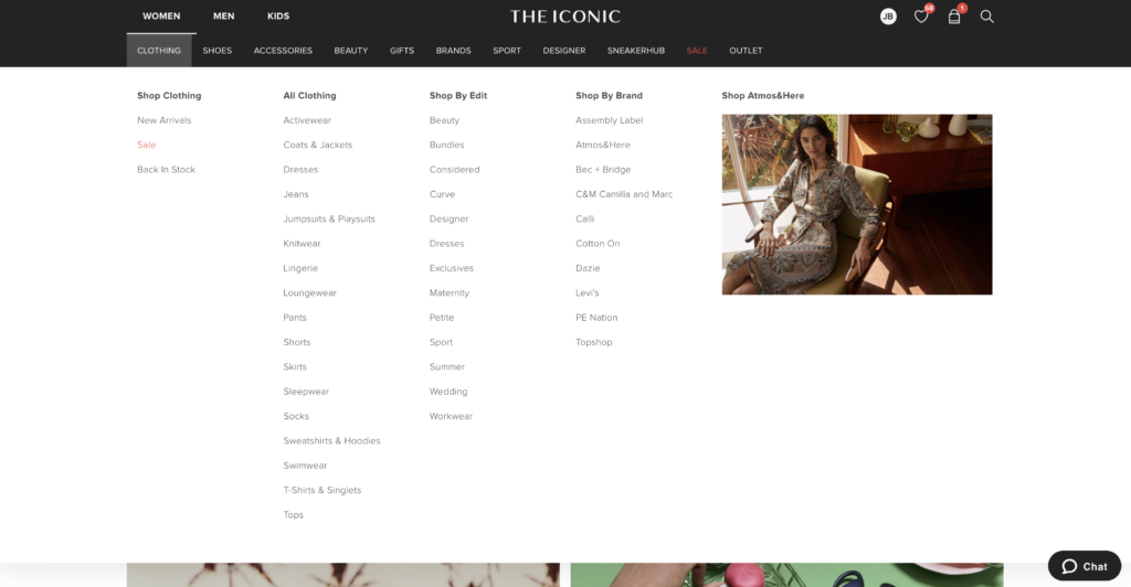
☑️ Providing different types of navigation for ease of use
Some users like to sift through particular categories to receive specific, accurate results. Others want to just type a word in and see what comes up. It’s important to provide multiple navigation options to allow different types of users to get to their desired goal.
☑️ Using easy-to-click, accurate links
Make sure your links look inviting and clickable – otherwise you’ll notice quite a lack of interaction
☑️ Providing a source of help if they get stuck
Sometimes you can’t provide exactly what someone is looking for. It’s important to provide features that allow your user to receive the support that they need, whether this be with a chat bot, FAQs or contact information.
⚠️ Errors, help and learnability
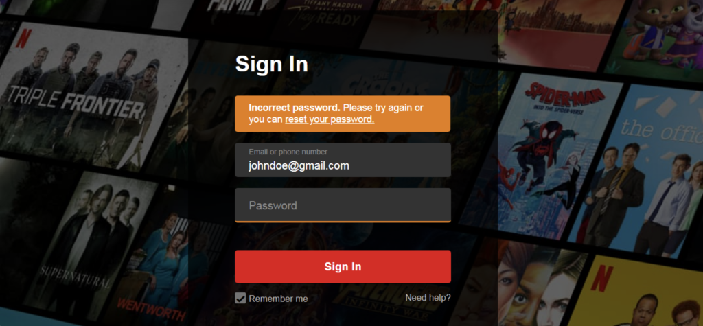
A site is error-tolerant if, despite evident errors in input, the intended result may be achieved with either no or minimal corrective action by the customer.
☑️ Notifying your customer if an error is made
Human error is unavoidable should be taken into consideration when designing a website. We all make mistakes or forget things. It’s imperative to notify your user of when such an error occurs – otherwise you’ll have some very confused (and annoyed) customers.
☑️ Notifying your customer if an error is made
There’s nothing more frustrating than being notified of an error but not being provided with recommended steps or a solution. There’s no winning in being ambiguous, be clear to your users in what steps to take to solve their issue so they can get back to using your product.
🎨 Content and design
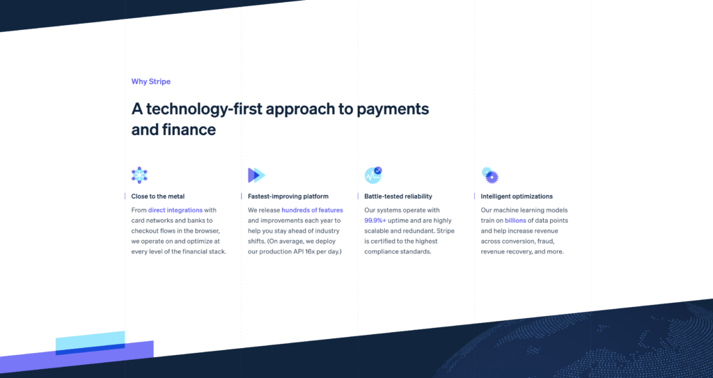
Appropriate visual design means that the fonts, icons, colours and layout help the customer complete common tasks. Your visual design should also reflect your branding well.
☑️ Relevant content in reference to specific page
For each page, the images and text need to reflect well with what that page has to offer. It needs to look intentional, otherwise it will appear rushed and unprofessional.
☑️ Effective hierarchy
When hierarchy is utilised effectively it creates a well structured and readable website. Titles and headings need to be larger than body text and text in general needs to be spaced out appropriately as to not be too cluttered
🔍 Search
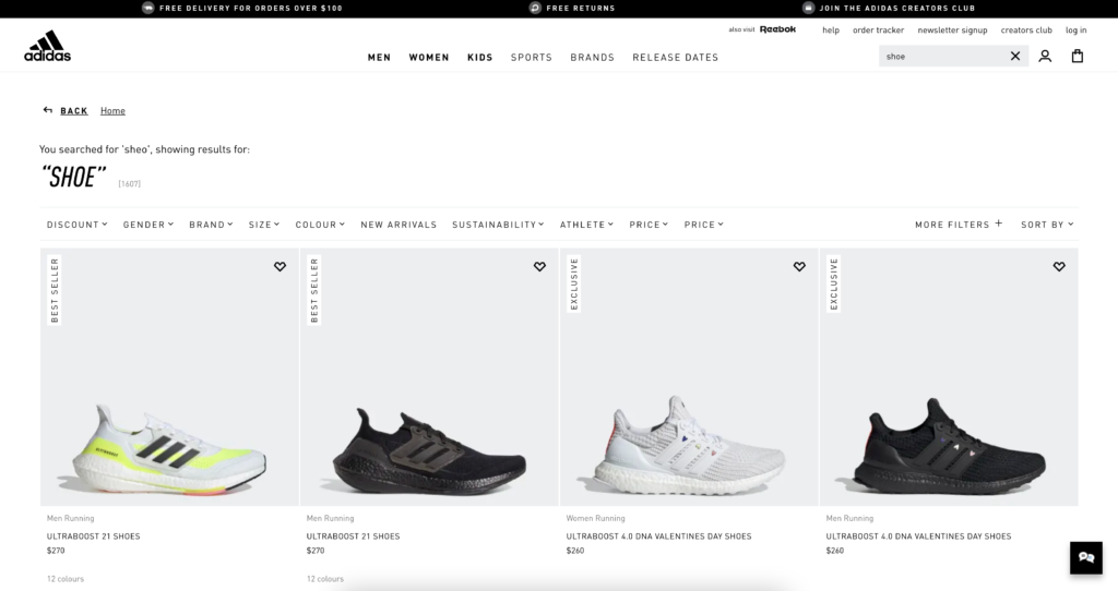
A good search engine needs to acknowledge the ‘human’ side of searching, which means dealing with spelling errors and synonyms.
☑️ Providing an accurate search function
Search functions that provide accurate results are key in providing a seamless customer experience.
☑️ A search function that deals with human errors
Spelling mistakes or grammatical errors can happen, and if a search engine does not pick up on this – it can be quite frustrating to the user.
📑 Tasks & Completing Forms
Tasks and forms are the components of a site that allow the customer to interact with the company. Well designed forms provide access to rich functionality while asking for minimum of input from the customer.
☑️ Making forms digestible
Extensive forms with no end in sight can be incredibly intimidating, and tend to have a much higher drop off rate than those that are divided into sections
☑️ Providing guidance
Sometimes the extensiveness of a form is unavoidable, but this is an opportunity to make it as easy as possible for your user. Providing guidance in tricky / potentially confusing spots can make the process a lot smoother.

🛠 Service pages
If you are providing a service you must provide detailed information about your services and your company on the website. For the users it should be easy to access, usually from the landing page
☑️ Having an ‘About us’ page
As a pivotal part of branding – you must have a story. And why not share this with your customers? It adds a personable approach to your content, and allows users to resonate with your brand.
☑️ Having a ‘Contact us’ section
A common mistake is not including an easy to find “Contact us” page. Having clearly displayed CTAs and sections for contact (whether it be a form, a chat bot, etc) shows you are very easily approachable.
☑️ Displaying your policies
Displaying your policies accentuates your approachability and legitimacy and is a great point of reference for customers.
🤝 Accessibility
The World Wide Web Consortium (W3C) provides a set of guidelines (Web Content Accessibility Guidelines WCAG 2.0) for making website content accessible for people with disabilities.
☑️ Contrast of colours
Contrast enables the designer to present the layout in a way that informs users which points of interaction are vital and which ones are secondary. Poor contrast leads to poor a readability level which results in users missing key data or feeling tense using the product. This tense feeling is due to the struggle with the copy which takes considerable effort to be read.
☑️ Alt. image attribute
Alt text is essential to accessible web design. It’s purpose is to describe images to visitors who are unable to see them. Including alt text ensures that all of your users, regardless of their level of visual ability, can appreciate the displayed content on your site.

Okay alt text: <img src="pancakes.png" alt="Blueberry pancakes">
Better alt text: <img src="tree.png" alt="Blueberry pancakes with maple syrup">
Best alt text: <img src="tree.png" alt="Stacked pancakes topped with blueberries and drizzled in maple syrup">
The following points are incredibly brief. To create a fully-accessible site you will need to delve much more into this. You can access the full list of W3C standards here

📈 Performance
There’s nothing more annoying than a clunky, “scrolly” website. We’ve all been there, and it makes the product simply unappealing and we tend to give up after a while. The same goes for loading time. We live in an impatient society where we expect things almost instantly. When a website takes 10+ seconds to load, it can feel like hours!
☑️ Loading time
According to a Financial Times Technology Department research piece, a test group were provided with a 5-second delay on a web page. They found the following:
- The first-second delay resulted in a 4.9% drop in the number of articles a visitor read
- The three-second delay resulted in a 7.9% drop
- Visitors read less when delays occurred
You can see how how much a few seconds can make to a user’s experience.
There are many things you can do to improve your loading time, including file compression, optimising your code, reducing redirects and optimising images.
☑️ Mobile responsiveness
Responsive design involves implementing design practices to ensure that your website automatically scales its content and elements to match the screen size that it is being viewed on. This reduces any unnecessary resizing, scrolling, zooming and panning for the user.

Wrap up
If you’re feeling uncertain about taking the plunge, we have a simple do-it-yourself UX/UI Audit that you can complete online here to get a bit of an idea of where your product stands and if it’s worth progressing further.
While a comprehensive UX Audit can be a pricey, time-consuming process, it can be the difference between a product with substandard performance and one that exceeds all user expectations.
Take your company to the next level and get results with our world class user experience, interface design and implementation.
Get a FREE 30 min Strategy Session

Related posts
Top 3 UX/UI Design Trends for November 2024
In the constantly changing world of UX/UI design, keeping up with the latest trends isn’t just about making things look […]
Performance vs. Design: How to Achieve the Perfect Balance
Balancing great design and fast performance in web development can feel like a never-ending battle. You want your website to […]
How ‘Ugly’ Websites Are Winning the Conversion Game
When we think about effective websites, sleek visuals, modern layouts, and professional aesthetics usually come to mind. Common wisdom tells […]
Creative product design that gets results
Take your company to the next level with world class user experience and interface design.
get a free strategy session
