The Correct Way to Embed Accessibility in Your Design Process
No fancy introduction – 15% of the world’s population equivalent to more than 1 billion people live with some sort of disability, and we need to consciously acknowledge that accessibility need not be limited to physical infrastructure. We need to effectively design digital products that are accessible to everyone.
When the Covid-19 pandemic began in 2020, most industries turned to technology and remote working to keep going. We saw multiple groups of people suffer the blow of this sudden transition. While boomers figured how to use Zoom and share their screen, the reality of tech products was brought forth – they are inaccessible, exclusive & discriminatory – designed for able-bodied, younger generations. That needs to change.
Designing for accessibility is not an overnight process, it takes time, resources and empathy, but I can promise you it’s not difficult. What’s difficult is a visually-impaired individual figuring out what an image is about because the alt text reads “sunsets, sun sets, city, sun, orange, beautiful, cityscape, sky, city vibes, Sydney, skyline” and not, “Sydney skyline during a sunrise”.
Note: Using the alt text space to insert keywords for SEO is NOT COOL.
Did you know you could be sued if your website does not meet accessibility standards? Netflix, Domino’s Pizza & Beyoncé (yes, THE Beyoncé) have been sued for inaccessible websites, leading to massive payouts.
This piece is meant to enable us to think about who is responsible for accessibility, and what to address in all stages of our design process, from project kick-off to build.
Table of Contents
Understanding Current Web Accessibility Standards
Let us introduce you to the holy grail for web accessibility, Web Content Accessibility Guidelines (WCAG) published by World Wide Web Consortium (W3C).
WCAG outlines requirements and considerations on how to make web content more accessible. There are different versions (1.0, 2.0, 2.1) & conformance levels (A, AA, AAA). Currently, websites must conform to a minimum of WCAG 2.1 AA. However, WCAG 2.2 is set to be published in June 2022.
Latest: A Working Draft of WCAG 3.0 has been recently published.
The goal of WCAG is to have one single shared standard that everyone can meet for web content accessibility. If we all strive to follow these guidelines, we are all making a contribution to making accessible design “the norm”, not a “nice-to-have”.
Applying Accessibility in the Design Process
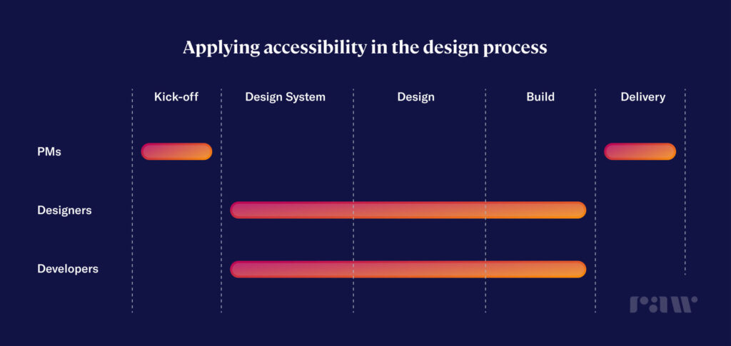
Having browsed on how to design for accessibility, it was found that there are 100s of pages full of tips and do’s & don’ts but no particular information on when it is the right time to incorporate them in the design process and the consequences for not considering or addressing it at the right time in the process.
Here are some tasks and considerations you can take on in the design process.
1. Project Kick-Off
At every project kick-off meeting, ensure that it’s a non-negotiable requirement in the brief. Do you know that saying “pick your battles”? Well, this is your battle to fight! Setting an expectation right from the start with your client and/or stakeholders will justify and explain why you’re spending time on making your designs accessible. Laying the groundwork for accessible design is far easier than struggling at the end… or even worse, getting sued for an inaccessible product.
2. Design System
A design system provides an opportunity for both designers and developers to incorporate accessibility and inclusivity principles in the designs from square one.
However, not everyone has the luxury to build out a design system that is completely accessible. It requires a lot of time and effort from both designers and developers to design and build a single component, let alone a whole design system (but we’ll leave this for another blog post).
If time is not your friend, a great place to start is addressing inclusivity and accessibility using WCAG guidelines in your design foundations.
With more than 2.2 billion living with some type of visual impairment, designers can ensure web content is readable by establishing accessible design foundations, such as typography and colour, from square one. This is quite pivotal as these design foundations will influence the design of your components and overall web experience moving forward, rather than trying to incorporate accessibility guidelines at the end of a project.
Here are a few design tips to use in your next project, or as an accessibility checklist for current or old projects. 👀 (We’re definitely going through some changes on the Raw.Studio website too!)
Typography
- A font size of at least 16px, ideally 20px for body text.
- Use bold and UPPERCASE when the text needs to be small.
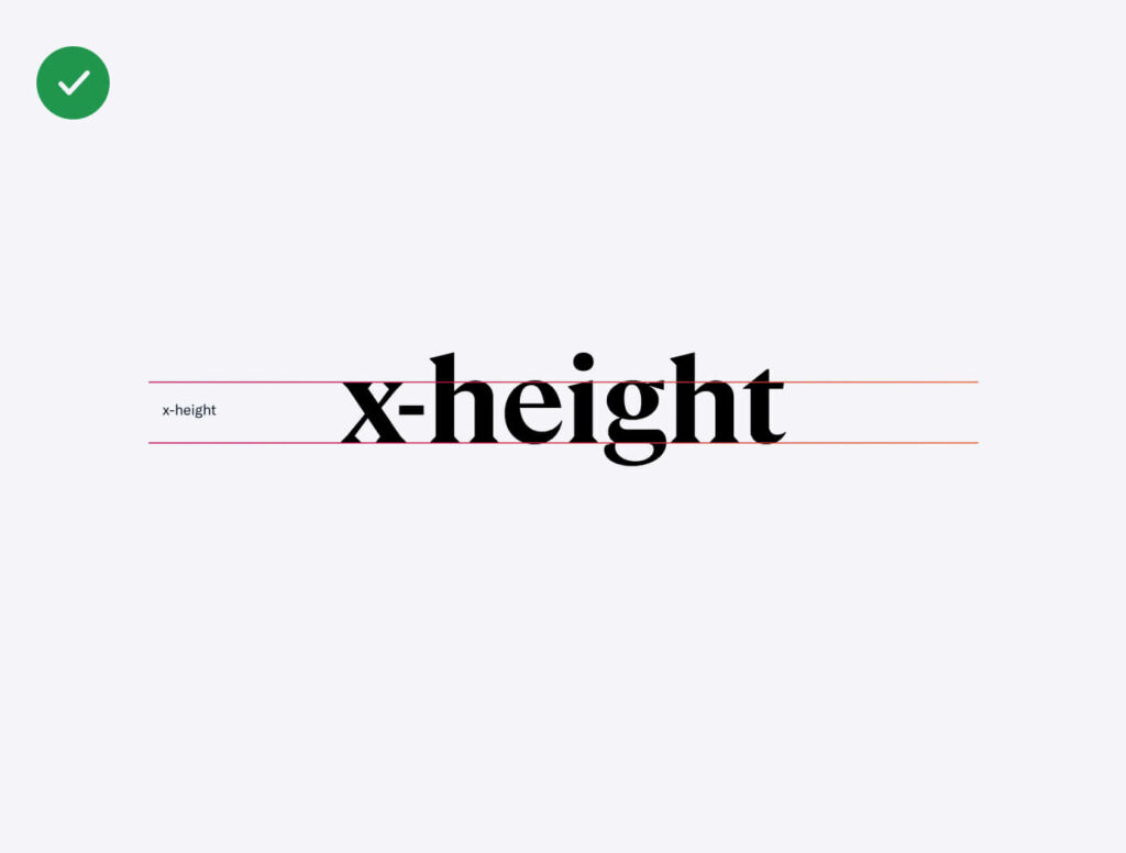
- Use fonts that have good x-height, especially body text.

Reading Experience
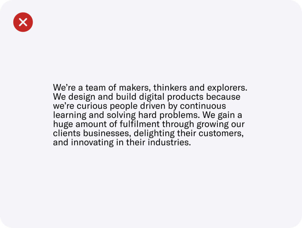
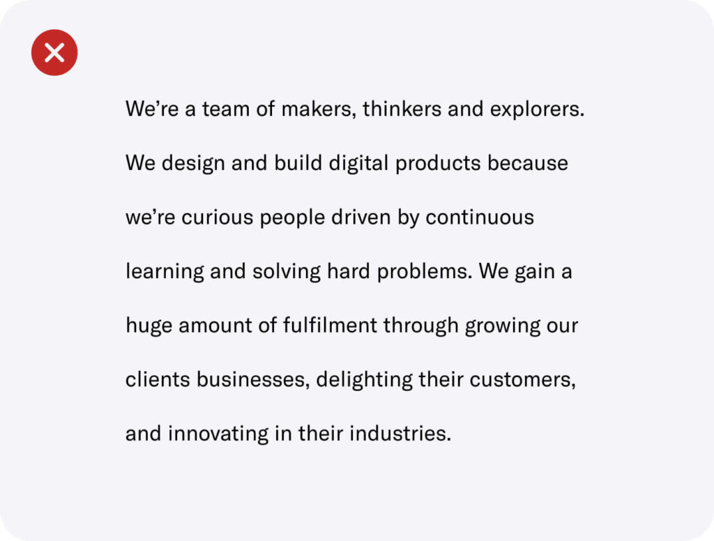
- WCAG recommends using a line-height of 1.5x of the font size. However, this varies from font to font, so use your best judgement. At Raw.Studio, we use 1.1x-1.3x for headings & 1.3x-1.5x for body.
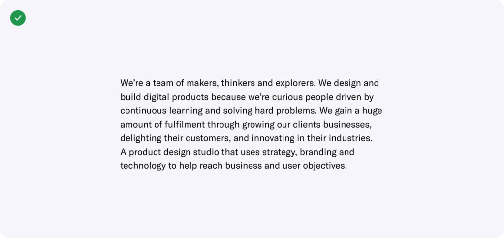
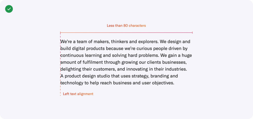
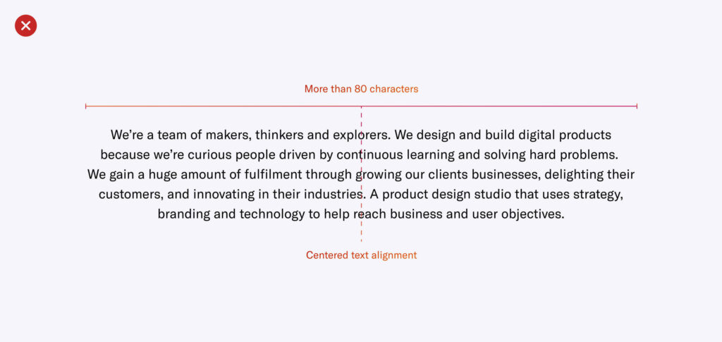
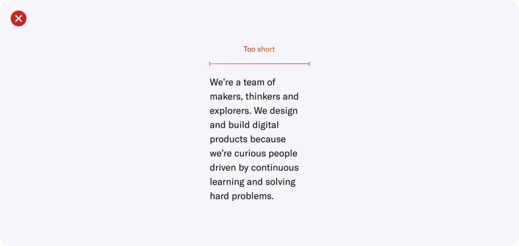
- Use no longer than 80 characters in a line of text. We recommend 50-60 characters.
- Avoid using centred text alignment for large content. Instead, use left text alignment.
Colour Contrast
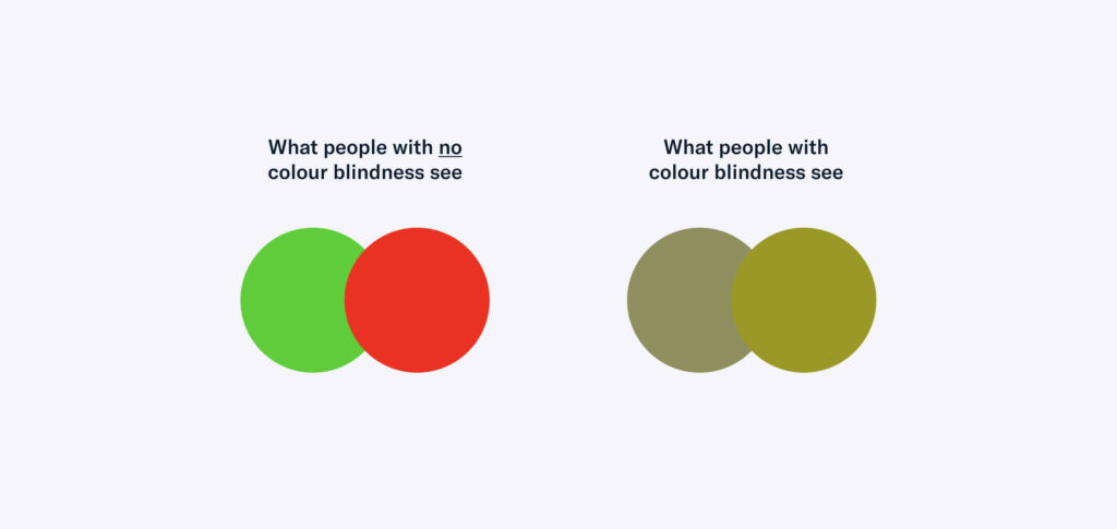
- Don’t use colour combos that affect those with colour blindness.
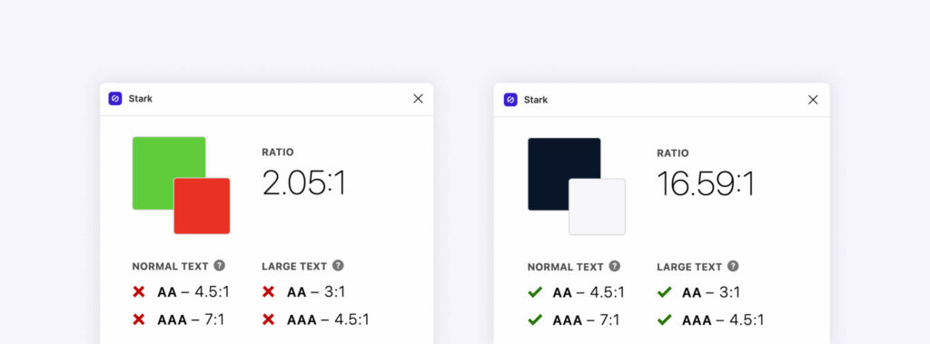
- Meet a minimum of Level AA with a contrast of 4.5:1 (foreground:background) for best visibility. Stark is a great Figma plugin to do quick colour contrast checks.
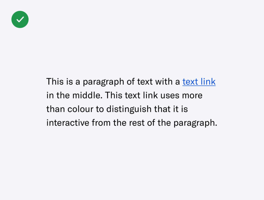
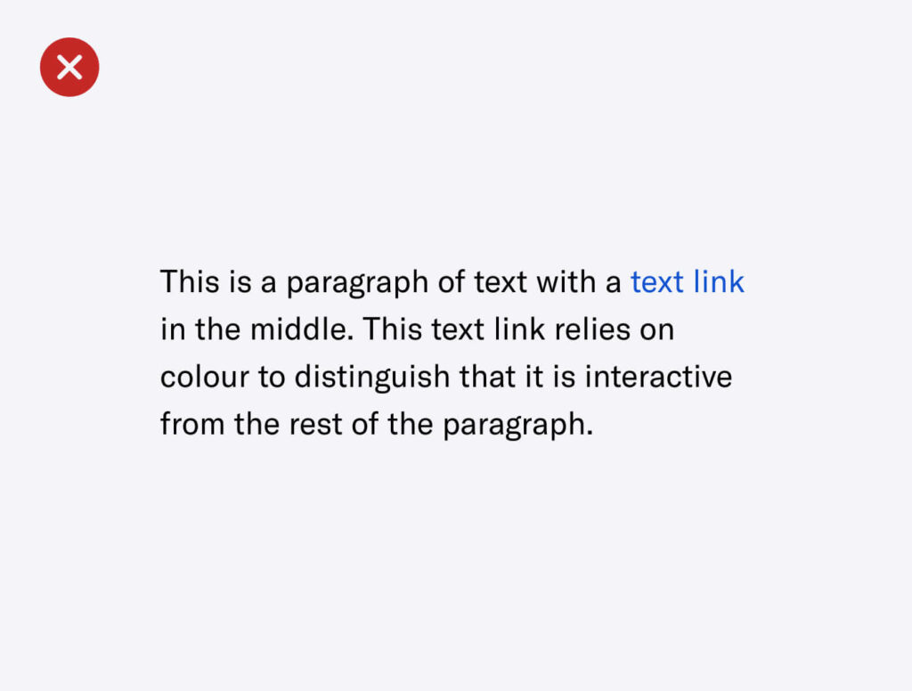
- Don’t rely on colour to distinguish interactivity, states or communicate messages. Instead, use multiple signals such as text treatment, border treatment or iconography.
Iconography
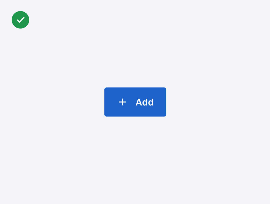
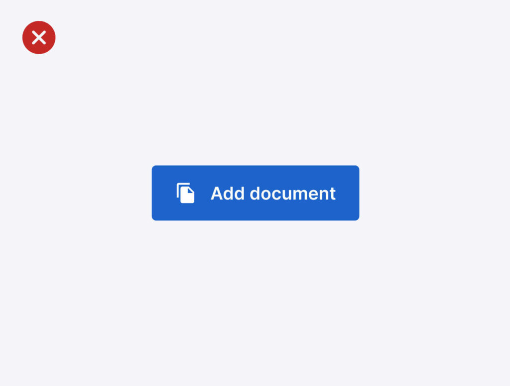
- Always use supporting text with decorative icons to communicate a clear message.
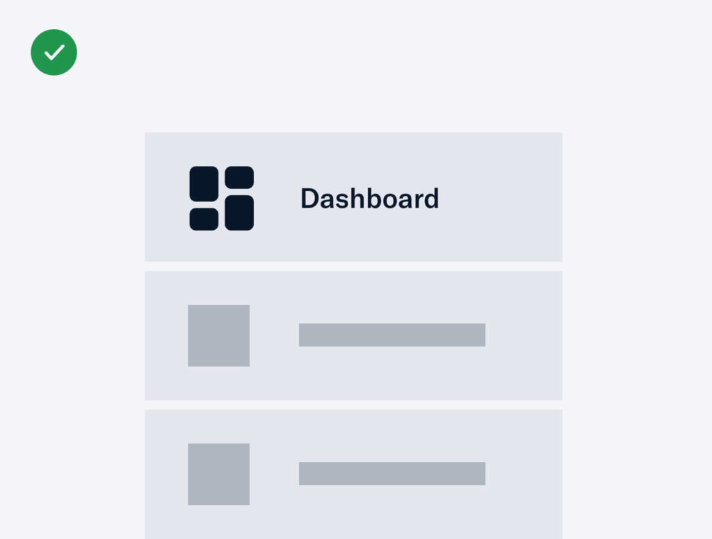
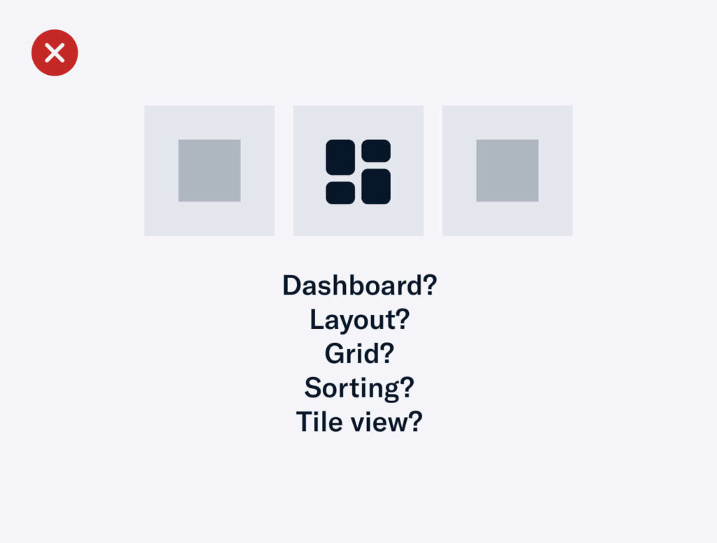
- We recommend using action-based icons for interactive elements, specifically buttons.
Decorative Elements or Images
Any element or image used for decorative purposes do not need to fulfil colour contrast requirements but make sure to use relevant alt text. If no alt text is required, make sure to keep the alt attribute but leave it empty. When a screen reader comes across an empty alt text, it will completely skip over the image without announcing its presence. If you don’t have an alt attribute, the screen reader will read the file name.



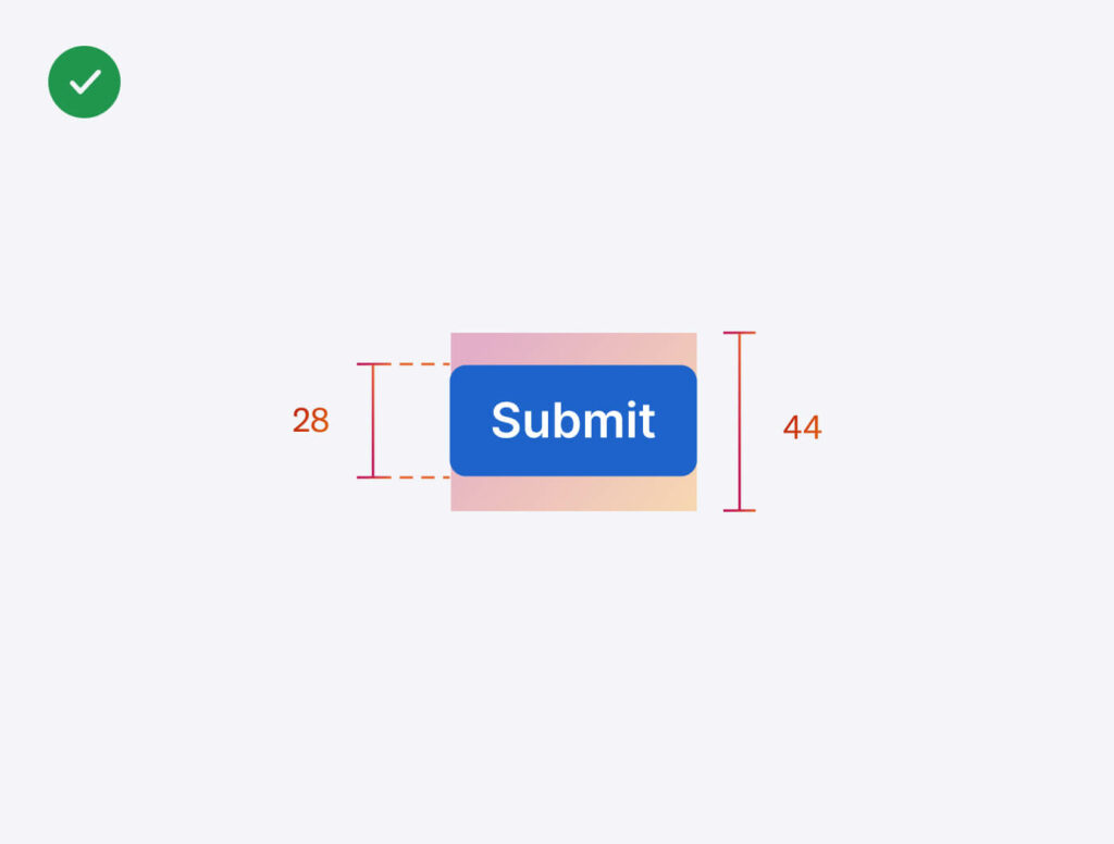
Interactive elements such as buttons
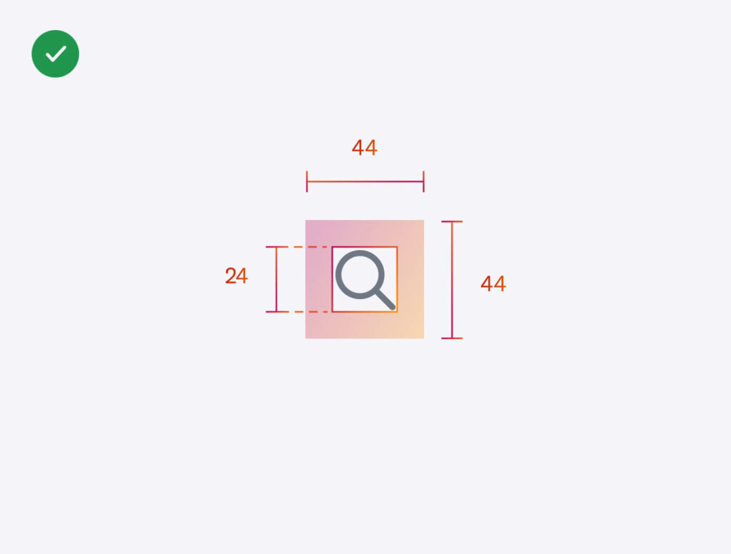
Allow for an adequate touch zone. WCAG states a minimum of 44px by 44px.
3. Design
Although the context for each digital experience may differ, if you’ve addressed accessibility in the previous stage, this design stage should be a breeze (hopefully)! It becomes easier and won’t seem like an ‘extra’ task you need to check off the list. All you’ll need to do is apply the accessible design foundations!
But of course, no surprise here, there is a new layer of accessibility that you would need to consider in this stage. Designers need to ensure that what they’re proposing, whether it’s design components or user flows, can be built for accessibility through regular collaborative sessions with developers. This will help developers understand what designers want to achieve so that they can provide accessible solutions or suggestions.
4. Build
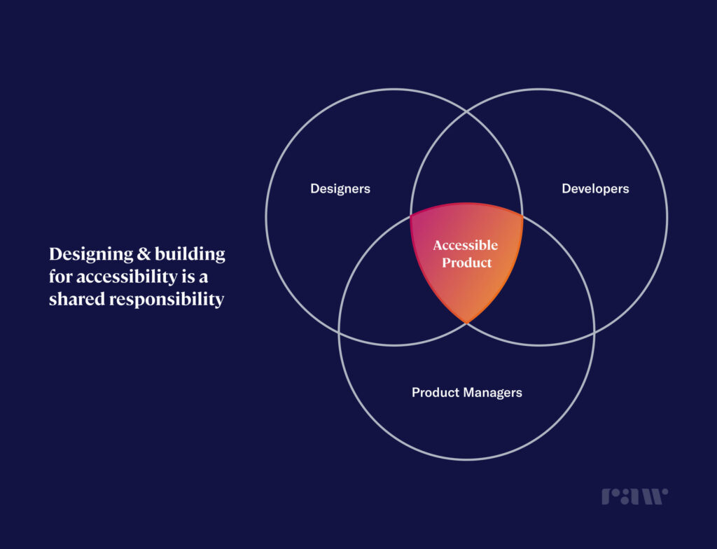
In an ideal world, all front-end developers follow good code & accessible practices when building designs. This is another great time for developers to reference the resources provided by the W3C. However, developers do not need to bear all of the responsibility in ensuring the experience is accessible in the build stage. In fact, it can be shared with the designers too.
A UI/UX designer could address all the design accessibility requirements in the design stage but if a developer does not integrate good code & accessibility practices, it becomes redundant.
How a designer can assist is through build review(s). A build review typically involves making sure the designs are pixel perfect in build, however, designers can take it up a notch and learn to inspect the code to ensure good code & accessibility practices have been implemented. This is why it’s a big bonus that a UI/UX designer understands the basics of HTML/CSS. Authoring & evaluation tools, such as HTML & CSS validators, can also be used to assist in accessibility checks.
Here are a few actionable tasks that both developers and designers can do to ensure you’re set up for accessible success:
- Use legitimate header tags. ScreenReaders use header tags (H1, H2, H3, H4…) to provide a sense of hierarchy to the user. Hence, make sure you correctly attach the tags and don’t skip any.
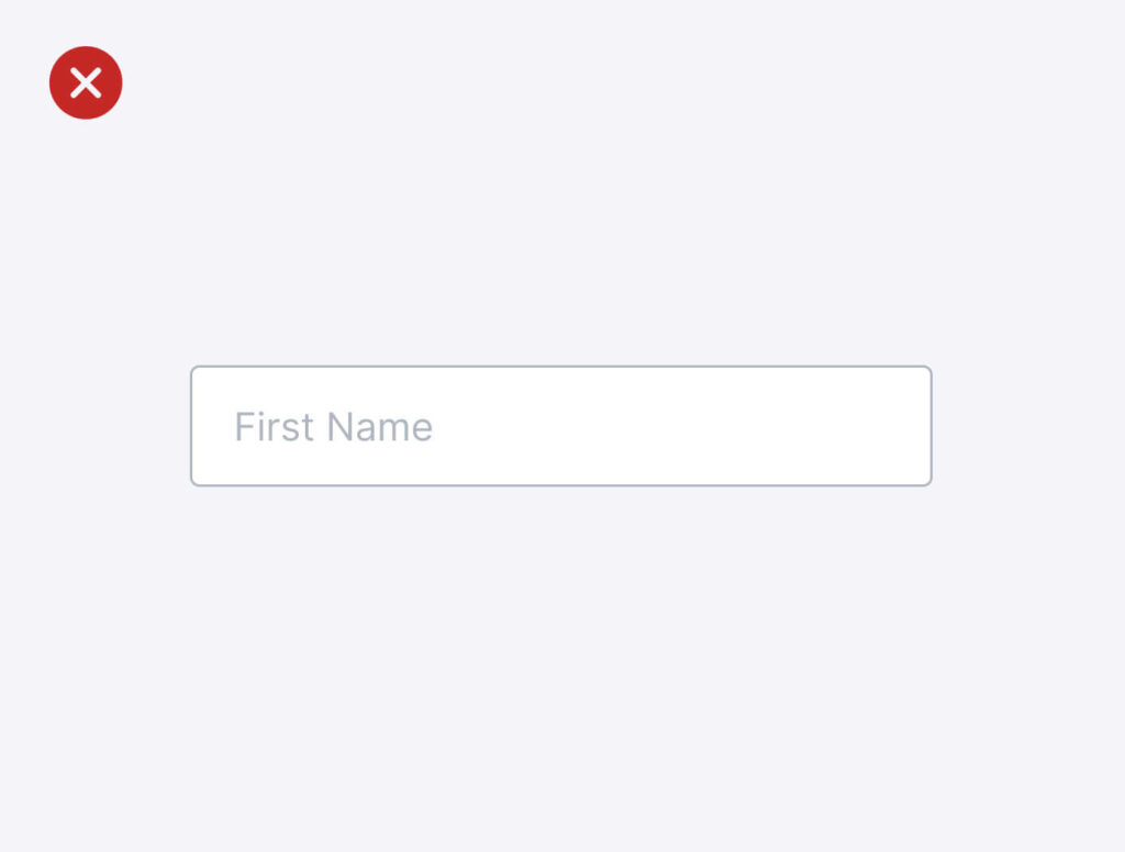
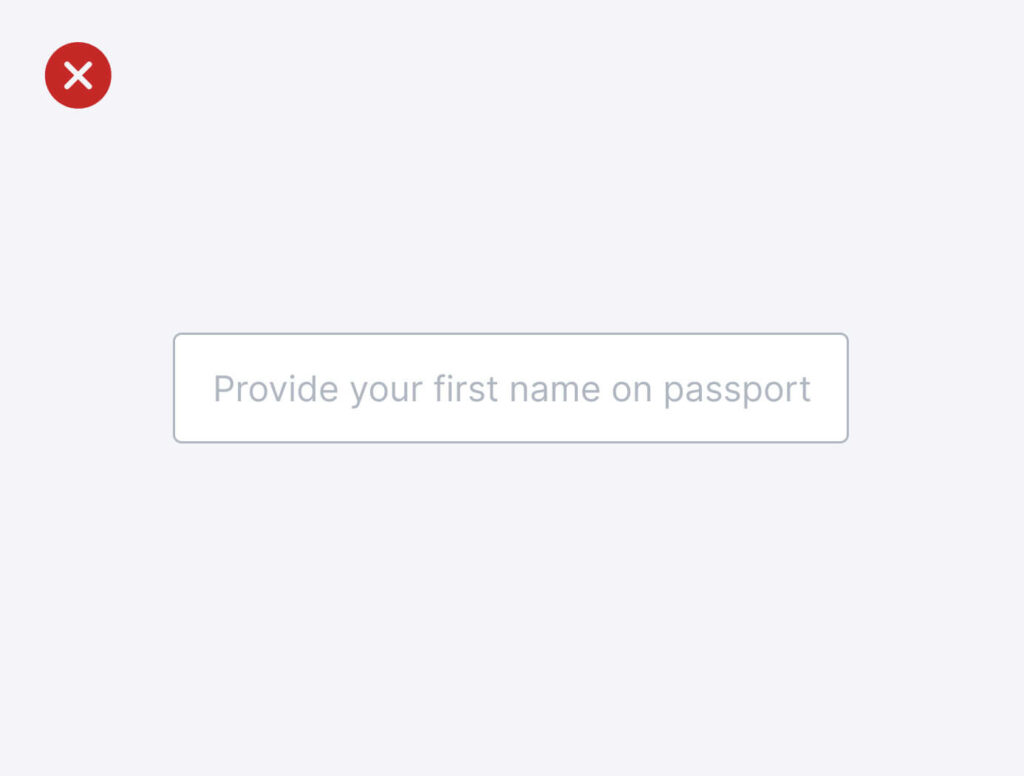
Remember: One page usually only has one H1 tag. 💡 (RE: designer<>developer communication) - Build accessible forms. This means labels and important information should always be visible in form fields. There have been trending aesthetics used for form fields where the label is placed within the field, however, this is essentially killing accessibility. Screen readers won’t be able to pick it up. You can definitely try to build it in an accessible way, but you’re spending time and effort on something unnecessarily complex for the sake of a ‘pretty’ design. You’ve got 99 problems but this ain’t the one!

- Use ARIA labels for every form field. We like to call them invisible labels. It is important to use the ARIA label especially when a form field label is not visible on the screen so that screen readers can pick it up and inform the users. For example, use “Edit”, not “Pencil” as the ARIA label for a pencil icon denoting the ability to edit.
Remember: When using ARIA labels, describe the function, not the vector. Example: Say “Edit”, not “Pencil” for a pencil icon denoting the ability to edit.


5. Delivery
After build reviews are successfully completed and verified by the designers & the developers, the finished product is reviewed by the product manager for final approval.
Although accessibility has been part of the conversation throughout, it is at this stage where a thorough, critical review needs to be conducted to ensure that the accessibility requirements are fulfilled. If the product meets all the criteria, you’re good to go!
💡 Pro tip: Test the full product with only the keyboard or a screen reader to empathetically secure accessibility features.
Conclusion
We must acknowledge that there’s not one single person that is responsible for delivering an accessible experience. It is a shared responsibility between product managers, designers and developers, some more than the other, depending on the stage of the design process.
However, designers have the power to create designs that can be experienced by everyone, regardless of ability, and ensure good practices are implemented throughout the design process. As we move towards Web 3.0, a decentralised internet by the people, for the people, it’s now important to design for accessibility, for everyone.
- Conduct an accessibility review for your existing products.
- Review W3C guidelines.
- Empathy is your best friend.
Let’s make 2022 the year we strive for inclusive, non-discriminatory design.
We’re going to leave you with one thought, “Designers don’t design for designers.”
Need some help? We’re here for you. Sign up for a FREE 30-min Strategy Session with Raw.Studio
Take your company to the next level and get results with our world class user experience, interface design and implementation.
Get a FREE 30 min Strategy Session

Related posts
Emojis in Product Design: How They Have Evolved and How to Use Them
A paragraph to a loved one, an Instagram post, a Twitter comment, a marketing email or a work message… these […]
How to Conduct a UX Audit
A User Experience Design Audit is just one of the ways to identify the imperfect areas that may lack usability […]
My Spotify: Everything You Need to Know About Spotify’s Latest Personalization Feature
Spotify, the leading music streaming service, has once again pushed the boundaries of personalized music experiences with the introduction of […]
Creative product design that gets results
Take your company to the next level with world class user experience and interface design.
get a free strategy session
