How Apple Revolutionised The Design Landscape in 6 Ways
“Design is how it works, not how it looks.” – Steve Jobs
Apple has been at the forefront of design since its birth. Taking strides in innovating for intuitive & straightforward design, so much so that their UI/UX design is called Human Interface design, exclaiming how they empathetically put humans at the core of their designs.
When the first iPhone was launched in 2007, Apple locked in its name in the hall of fame. While the competitors like Nokia & Blackberry were ruling the market, they missed Apple in their blindspot. It was not anticipated, really.
So what shot Apple to its glory? iOS, short for iPhone Operating System.
Let’s dive deeper!
Table of Contents
Software>Hardware
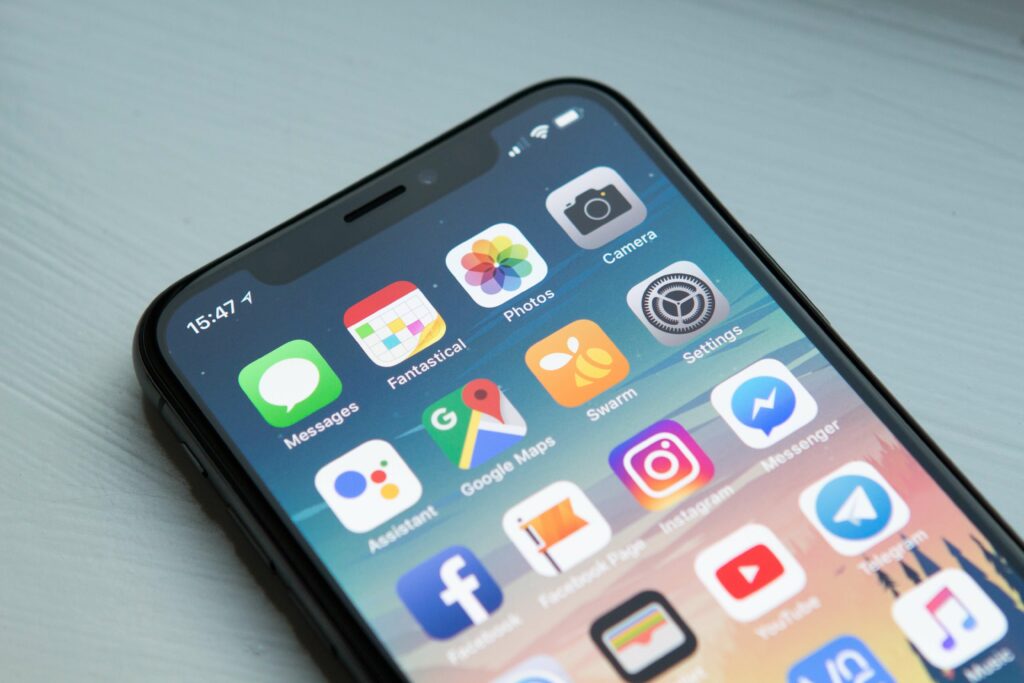
It’s the mid-2000s, and the consumerisation of technology is booming. Every month, a new phone comes into the market with better features: slider phones, flip-to-open, QWERTY keypads, better cameras, the works. Nokia, Samsung, Blackberry, Motorola and others are investing heaps in their R&D to innovate their phones, expressly, the hardware.
In Cupertino, California, Steve Jobs had something else in mind. Called a genius for a reason, Jobs wanted to ditch hardware and focus on the software. He wanted to build a multitouch screen device with the capabilities of a Mac that fits in your pocket. With talented designers like Bas Ording, Jobs was keen on ditching the glamorous UI with something simple.
Ording and his team of talented designers built the iOS Dock X or iOS 1 for the first iPhone. Once Steve Jobs unveiled it in 2007, that’s it. The face of UI/UX changed forever. Apple overtook the phone market by storm and still hold that ever-growing power. It’s criticised that Apple doesn’t innovate as much anymore, just copies what Android does, but that’s always met with the logic that Apple does it better. An iPhone may seem complicated to a first-time user, but it’s considered reasonably intuitive to use. Nokia is just legendary folklore at this point.
The Rubber Band Effect
Ording and his team set out to test and iterate with touch devices after recently acquiring FingerWorks. FingerWorks’ iGesture Pad was one of the first gesture-sensitive touchpads on the market. Instead of tracking just one finger, like most trackpads at the time, it followed multiple fingers, hence ‘multitouch’.
Once they realised what they had in their hands was a pure treasure, the possibilities were endless. Initially, this multitouch display was considered for computers, but it was decided to build a phone with it.
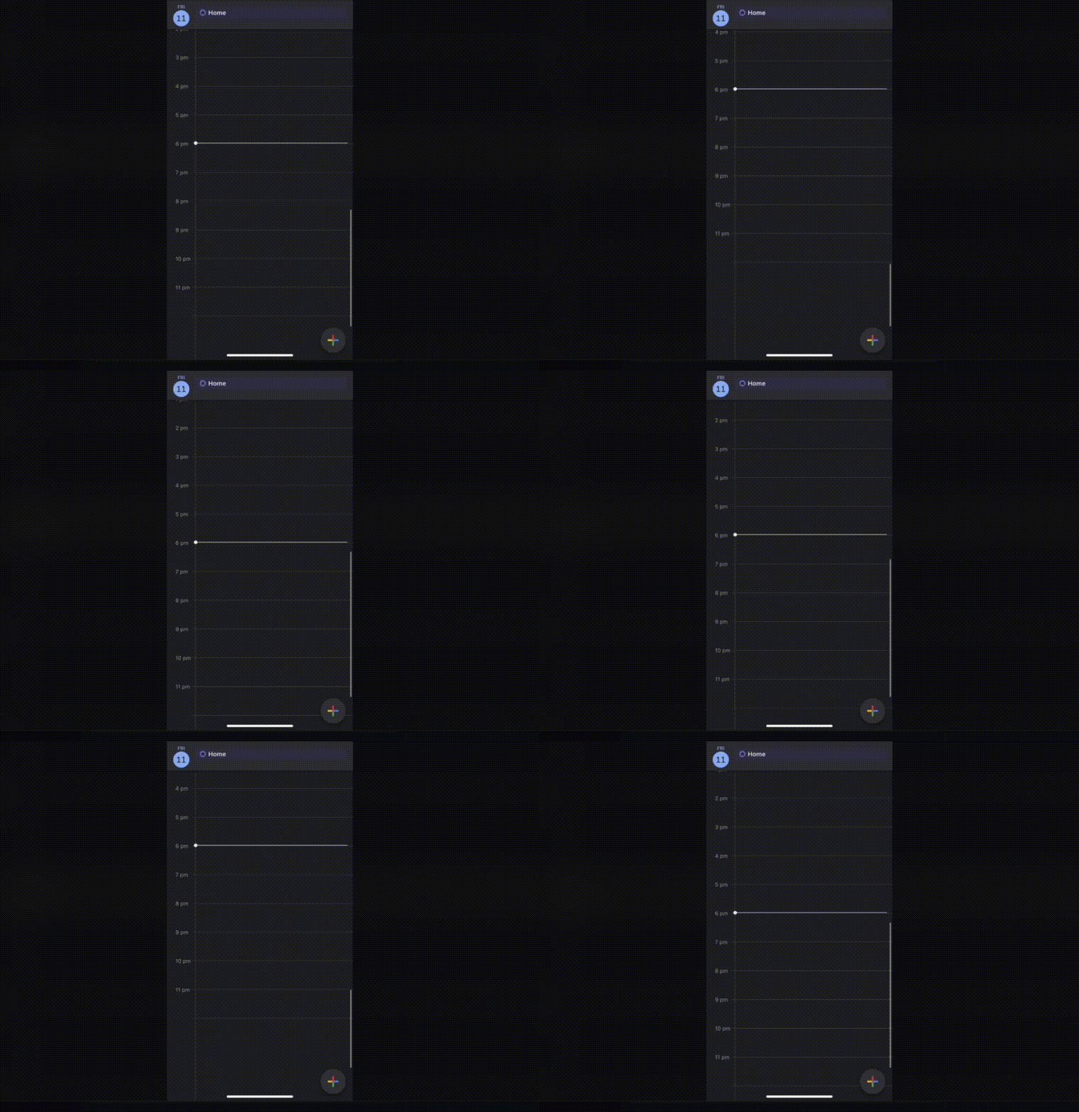
Ording initially started by compiling a list of contacts on Adobe Director and adding their contact information. Then, if you clicked on a contact, it would open up their details and display ‘calling’. Easy peasy. So after adding some 200 contacts, Ording was scrolling through the list when he realised something. When he reached the end of the list, it would be a hard stop- almost as if the gesture was unresponsive or had crashed.
Ording figured that the list needed to move with pulling up or down with the finger gesture. So he added a space at the end of the list, and upon scrolling, the list would move with the scroll gesture, but it wasn’t enough. Ording knew he was on the right track but not there yet. That’s when he added a snapback-like effect. So, when the list reached the end, it would still scroll to show space and then snap back, i.e., go back to its original position- like an elastic rubber band.
Et voila! Ording got it. Something as simple as this effect let the user know that they had reached the end of a list and that the device was not lagging or crashing.
Genius.
This effect is used to date in all iOS lists.
Slide to Unlock
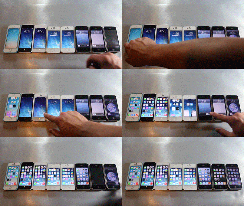
Now this one’s a crowd favourite—the ‘Slide to Unlock’ revolutionised how we use phones even today.
The irony of this gesture is quite strong- after so much research and testing into multitouch gestures, Jobs wanted a one-finger touch gesture to unlock the iPhone. The need for this feature arose when the designers realised that the proximity sensor might not be enough to avoid unwarranted dialling or deleting emails.
Initially, the proximity sensor switched off the screen when the phone was pocketed, but it might switch on in the process of removing the phone from a pocket. Hence, Jobs initiated the research for a single-touch gesture that ‘unlocked’ the phone. This gave birth to the iconic Slide to Unlock gesture.
Designing this feature was no easy feat either. There were initial tests with two-finger touch gestures like pinching out or in or sliding up. But they were still too much. Then came across the one, long swipe gesture. Easy, fast and intuitive.
The idea of a vertical swipe gesture was immediately ditched since it may contribute to the problem of unlocking the phone while removing it from a pocket. Hence came the horizontal slide to unlock. But the problem wasn’t fully solved. How do you tell the user to swipe in a particular direction? Adding arrows would make it too chunky as there were too many words already. This was solved with the flashlight-like effect in the left-right order, a subtle indicator to the user.
Multi-sensory Cues
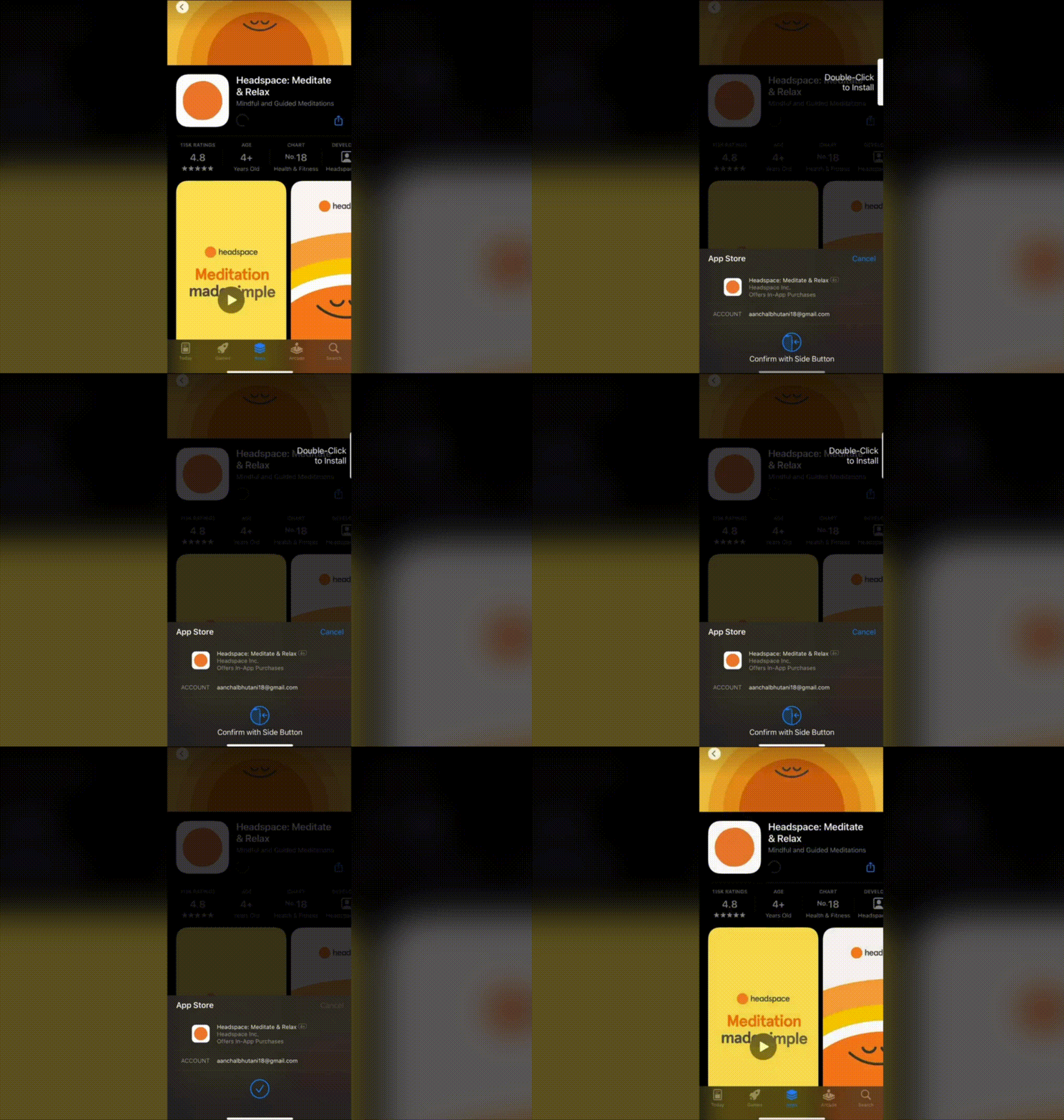
Apple understood the need for an experience than just functionality. With different sensory cues, iOS not only provides a wholesome experience for an abled user but fulfils the needs of its disabled users.
One of the best examples of this is completing payment via Apple Pay. Once you receive a screen to pay, you see a small animation adjacent to the lock screen button, showcasing that you need to double-click that specific button to pay- taking out the confusion of which button to press. Next, it verifies with your Face ID or passcode. This is when the best part comes in. Once the payment is completed successfully, the user is notified with three different sensory cues:
- A small animation with a check mark and ‘Done’ written on the screen
- A positive notification sound
- A short vibration feedback
These cues enhance the user’s experience, providing a sense of accomplishing a task. These cues can be translated into the user flow of any app where you want to indicate successful completion.
Haptic Touch

Over the years, iOS brought forth different types of touch use cases. They started with 3D Touch, moving on to Force Touch and Haptic Touch. With these touch-types, you could essentially ‘deep press’ into the screen to activate specific functions that weren’t available otherwise. This included Live Photos, editing home screens, revealing hidden options, and more.
Now, if you apply slightly more pressure than standard touch or just press and hold, you can see app shortcuts from your home screen, unhide extra buttons and settings or animate photos. When you deep press, you receive a short vibration, i.e., haptic feedback, to indicate that the touch worked and then complete the intended action.
This benefits the UI because it helps maintain the ‘clean’ and ‘simple’ aesthetic, tucking away extra functions and decluttering the screens, yet making the options a touch away. Some may call it a trade-off- aesthetics over functionality. Although being able for more than five years now, a lot of users are not aware of this functionality since there are no visual cues present to indicate the use of Haptic Touch, ending up in these users going through longer routes for the same functions that are just hidden away on their screen, a touch away. But once aware of it, a power user thrives.
If you’re building a product, it may be a good idea to use the Haptic Touch to your advantage, keeping your product intuitive and straightforward since the user may already be used to this functionality. The least you can do to use this feature is make the product compatible with Haptic Touch Home Screen Shortcuts.
Human Interface Guidelines
Apple is known for its notoriously stringent policies for publishing an app on the App Store. As a result, setting high standards and critical reviews usually takes a few tries for almost all apps to pass quality checks and assessments.
These guidelines have been developed over the years to ensure cohesiveness and uniformity to maintain the Apple experience for the user. In addition, iOS has 3 ‘themes’ or objectives that enable it to differentiate itself from its competitors, allowing product designers to create a high-quality app: clarity, deference, and depth.
To promote the same uniformity, Apple even provides their UI Kit to look after certain standard features such as Navigation, Views and Controls. Throughout these guidelines, it can be seen that the value of aesthetic integrity is emphasised, which ultimately leads to the clean UIs we see now.
If you’re not sure where to start or how to match the expectations of the said guidelines, a good idea may be to reach out to a UI/UX agency.
Take your company to the next level and get results with our world class user experience, interface design and implementation.
Get a FREE 30 min Strategy Session
Related posts
Figma AI: A New Era of Design
Figma has become synonymous with modern design collaboration. Its cloud-based platform has revolutionized the way UI/UX designers work together, fostering […]
State Pattern: The Key to Seamless and Predictable User Experiences
Every digital experience we engage with daily, whether checking messages, streaming music, or shopping online, hinges on one crucial factor: […]
Spotify Daylists: Unveiling the UI, UX, and ML Magic Behind Personalized Music
With over 515 million active users as of Q2 2023, Spotify has solidified its position as a global leader in […]
Creative product design that gets results
Take your company to the next level with world class user experience and interface design.
get a free strategy session
