BeReal: 5 Ways the Anti-Social Media App is Changing the Game
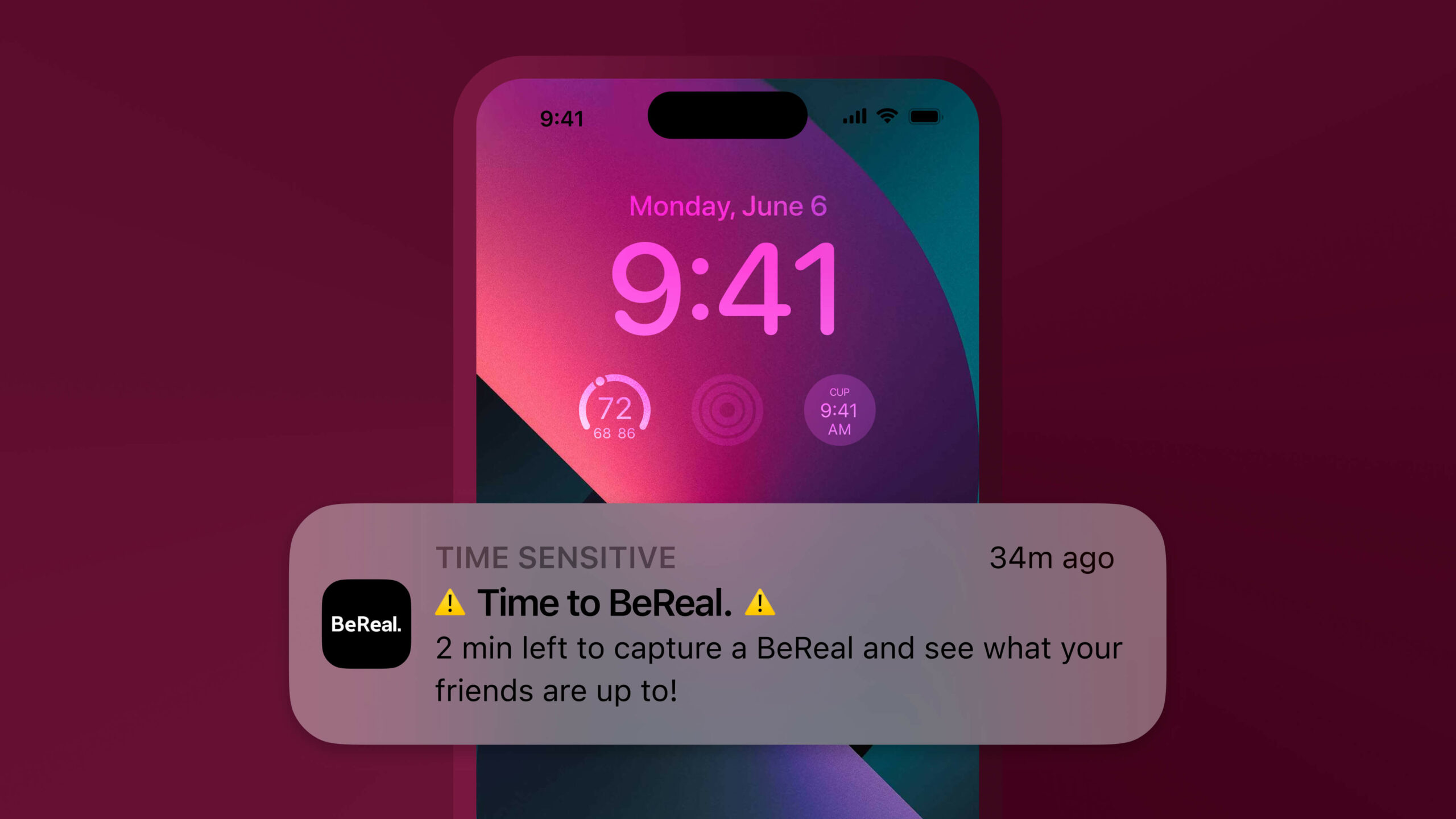
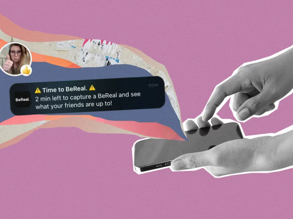
Ding. A notification
⚠️ Time to BeReal ⚠️
There are now two minutes to open the app and hit the capture button, taking an image from both the front and rear cameras. The images are then sent out to your friends who are also capturing their current imperfect moments.
Today we’ll be dissecting the anti-social media app that has increased its usage by 315 per cent in a year and its downloads increasing by over 1000 per cent in 2022, and how they’re targeting user motives and needs that its competitors aren’t.
Table of Contents
What is BeReal? 🤔
BeReal was founded in December 2019 by Alexis Barreyat. It’s an app centred around ‘being real,’ and capturing authentic, spontaneous images. As mentioned in the intro, the app has blown up significantly in the last few months with 10 million daily active users, rising from just 10,000 a little over a year ago.
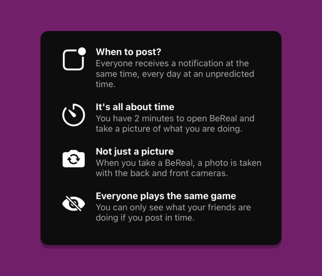
Every day at a different time, everyone is notified simultaneously to capture and share a Photo in 2 minutes. A new and unique way to discover who your friends really are in their daily life.
BeReal
You will see some of the basic rules and features of BeReal below:
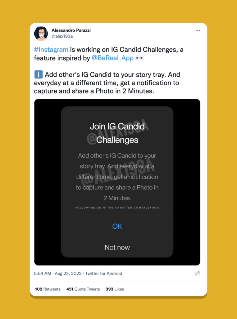
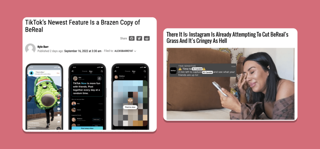
As of late, there has been a lot of discussion about other social media platforms copying BeReal’s concept. Mind you, this concept isn’t necessarily new, there are a few other apps out there that centre around taking an image a day. But, the recent popularity of BeReal has drawn attention to the fact that TikTok and Instagram are missing this particular feature. They have wasted no time in bringing it over onto their platforms, with TikTok introducing a daily sharing function called TikTok Now and Instagram internally prototyping IG Candid Challenges.
So what is it – other than a differentiating feature – that draws people into the platform and has these social media giants doing some homework?
1. Authenticity ✨
In a world where perfectly timed food prep reels, beautiful holidays overlayed with dreamy filters and curated snaps from celebratory moments clog our phones, it is easy to differentiate what is ‘real’ and what is tailored to social media.
As mentioned at the beginning, and in the app name itself, BeReal aims to encourage individuals to embrace their everyday lives, whether that particular moment is extraordinary or incredibly mundane. This approach gives users less control over what their pictures can be but makes up for the lack of control with a more authentic representation of each user. I am pretty sure I had three days in a row where my BeReal was just of me sitting on a beanbag with a coffee on my phone or watching Netflix.
However, feelings have been mixed about this approach. Some users feel pressured to take an amazing BeReal, while others embrace the imperfection and often mundane tasks of everyday life. In Joanna Panagopoulos’ article for The Australian, they wrote about these contradicting feelings amongst users:
Social media app BeReal pressures teenagers to live impressive, aesthetic lives, at all times of the day. Yet that’s not what people in their twenties are saying: they are comforted knowing everyone is as boring and unkempt as they are.
Joanna
You can also still post outside of the two minutes, allowing those who want to present the best version of themselves to upload at a time when they might be doing something more interesting.
It just goes to show that regardless of the intent of your product, it can be interpreted and used differently from user to user. However, BeReal has been able to produce a product that acknowledges this gap in a saturated market that is often perceived as ‘inauthentic,’ creating interest and intrigue.
2. Urgency and Scarcity ⚠️
Feelings of scarcity occur when we want something that is exclusive or in low supply. That wantful thinking causes more people to fight for that already-scarce resource, even though there may be more abundant alternatives out there.
Joris Beerda
Now, the above quote isn’t referencing social media specifically, but it’s easy to see how this translates into the world of temporary or time-sensitive digital assets, like stories that disappear after 24 hours.
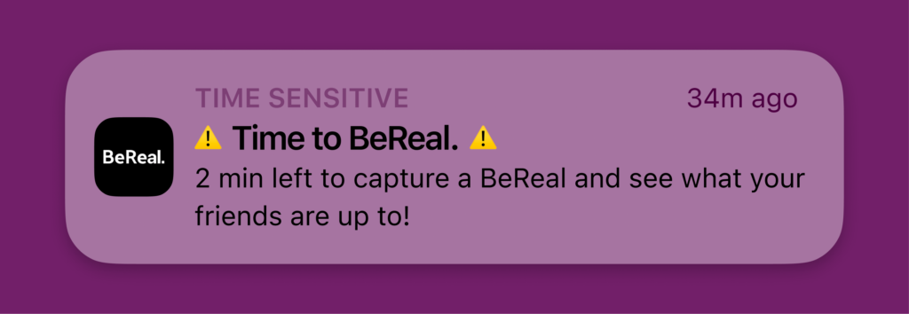
BeReal’s concept is based on time pressure. Users are encouraged to upload their BeReal in the two-minute time frame. If you miss it, you won’t be able to see others’ posts until you post, and you will also have an “x minutes/hours late” noted on your belated upload.
So despite it not being the end of the world if you miss the two-minute deadline, there is still this innate urge to make it in the time requested, as if it is some sort of challenge or game.
Karisa puts it well in her article about her early interactions with the product, and how BeReal’s gamified elements made it fun to interact with:
I soon came to understand the particular satisfaction of achieving the trifecta: capturing an interesting tableau, taking a flattering selfie and posting it all on time. There’s an element of luck, too, if you happen to be somewhere cool when it’s time to be real and not on your couch or, as one of my friends feared, on the toilet.
Karisa Langlo
The term scarcity comes into play here too as users are only allowed to post once a day. There is only one opportunity per day to share your experiences with your friends. The implementation of restricted access and time restraints can create excitement and eagerness to interact, overall creating an engaged user base.
3. Simplicity ⚪️
It has become more apparent than ever that social media platforms at this point are cherry-picking successful features from each other and bringing them to their platform. Youtube was once for long videos, TikTok for short videos, Instagram for photo sharing with friends and Snapchat for time-sensitive content. Today, the lines between the platforms are blurred to the point that a single social media site contains features that combine at least two or more of the others.
These inevitable iterations and additional features can be amazing, however they can also draw you further away from the core goal of the app. It can sometimes feel like you’re fishing for family and friends’ content in a sea of random reels and sponsored posts.
This constant cognitive overload is then quite contrasting to a platform like BeReal resorting back to basics.
The app doesn’t profess to do ‘everything’ or have a gazillion cool features. It does however target a particular goal that seems to be somewhat forgotten in the social media market – simply sharing a moment with your friends, family, or any loved ones without falling down an algorithmic rabbit hole.
4. Slight Visual Differentiation 👀
For quite some time now, there has been a shift toward a sort of uniformity regarding product design. Most logos are relatively minimal, websites and apps have big, bold headlines, there are rounded sans-serif fonts, and minimal black and white interfaces with lots of negative space and little to no colour. On a positive note, uniformity does reduce what some call “app fatigue” but it does also reduce a lot of individuality.
App Fatigue is a term used for the feeling of being too overwhelmed or uninterested in downloading a new app as it means learning a whole new interface and receiving more notifications than you already have.
BeReal incorporates elements and icons familiar to those using other social platforms, like camera capture, comment icons and a smiley face for reactions. It also sets itself apart a little bit with a stark black background, as opposed to many social platforms that are traditionally white background (keeping in mind their dark mode alternatives of course.)
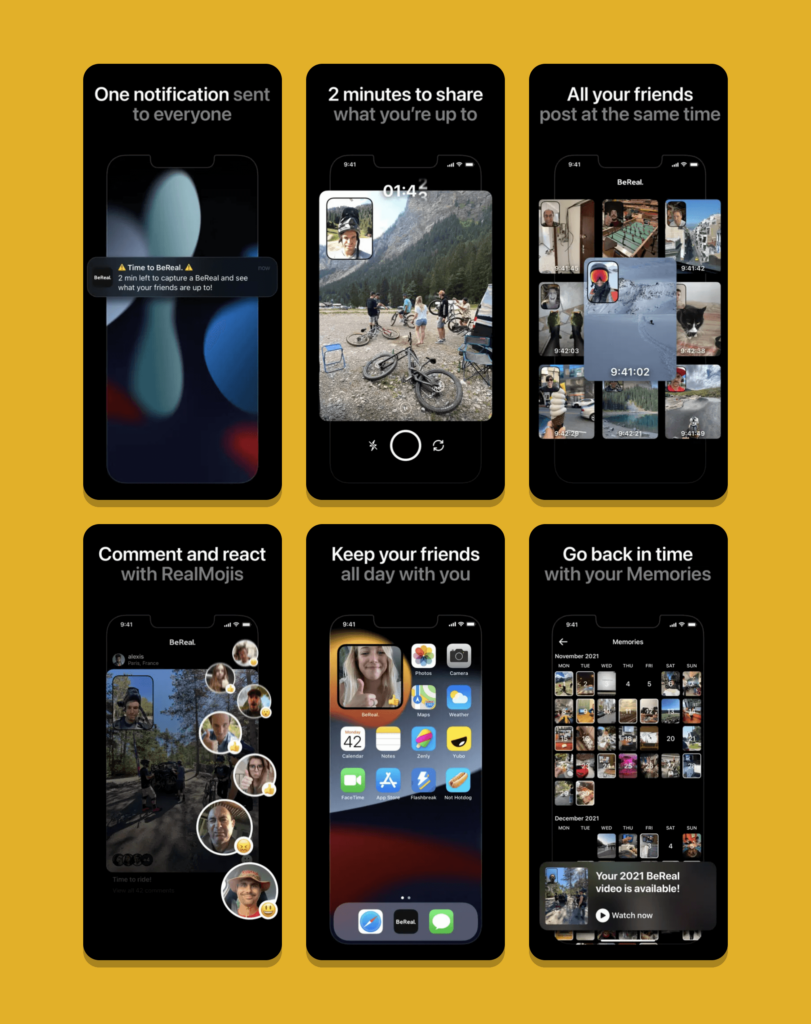
While there are areas BeReal could improve on in regards to their UI design such as spacing, readability of fonts over images and also their slightly confusing navigation, it is evident that they are making a considerable effort to differentiate themselves visually from the rest of the products out there, while also creating familiarity to entice rather than scare away new users.
5. Human Elements ❤️
A heart produced by a double tapping of the screen has become an anxiety-inducing measure of success. Instagram has allowed users to hide their like count as it was worrisome to some if others saw that their posts didn’t get much engagement. Likes and reactions can also oftentimes feel transactional rather than an individual appreciating your content.
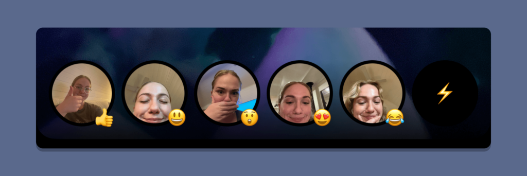
As you will see in the example above, BeReal’s array of reaction options includes emojis, like many other social platforms, however, they also include a space for you to capture an image reflecting this emoji.
Context of course matters, and while a selfie reaction might not be appropriate on a professional platform like LinkedIn, it’s a wonderful way to feel like you are sharing with another person and they are reciprocating with a human reaction.
Wrap Up
Just to reiterate, BeReal has been tapping into the following qualities that have garnered it a lot of attention:
✨ Authenticity · In a world where a lot of social media apps are starting to feel ‘inauthentic,’ to some a platform that preaches the exact opposite is like a breath of fresh air.
⚠️ Urgency and Scarcity · Scarcity creates the feeling of exclusivity which in turn ignites a sense of urgency, a tactic that has been proven to retain users and keep interest.
⚪️ Simplicity · With over 4.83 million apps available to download on the App Store and Google Play, keeping an app simple and easy to understand with familiar elements increases your chances of adoption.
👀 Slight Visual differentiation · While app fatigue is a thing and using similar concepts to other platforms helps users to understand the product, showing a little edge and visual differentiation is a subtle way to set yourself apart.
❤️ Human Elements · Incorporating human elements into the product to make interactions feel a little more wholesome and ‘real.’
BeReal is far from perfect and has more to do with general improvements, bug fixes and listening to the wants and needs of its users. Sceptics are saying the craze and obsession could soon die out (think of the drop in interest of Wordle.) But regardless, there is a lot to be learned from how well this anti-social underdog has been received and how its user base has grown exponentially in the past several months. They have truly challenged what we consider normal in today’s all-consuming space of social media.
Take your company to the next level and get results with our world class user experience, interface design and implementation.
Get a FREE 30 min Strategy Session
Related posts
Design Psychology: 4 Principles that Empower Designers – Part 4
Here it is! The final part of our 4-part series on basic design psychology! We’ll be tackling the last sense […]
User Surveys: 6 Tips for Gaining Valuable Insights
Survey design is complicated, but when utilised correctly, surveys are an incredibly valuable and reliable tool in your research toolbox. […]
Designing Inclusive Dark Modes: Enhancing Accessibility and User Experience
Have you ever switched to dark mode on your phone late at night and felt instant relief as your eyes […]
Creative product design that gets results
Take your company to the next level with world class user experience and interface design.
get a free strategy session
