Enhancing SaaS with UX/UI
In today’s highly competitive SaaS (Software as a Service) market, one of the most significant challenges companies face is demonstrating the value of their products to potential and existing users. With an ever-increasing number of SaaS solutions available, users can quickly become overwhelmed, making it crucial for businesses to ensure their offerings stand out. One of the most effective ways to achieve this is through exceptional UX/UI design.
Good UX/UI design helps users quickly grasp the benefits and features of a SaaS product, leading to higher adoption rates, increased user satisfaction, and improved retention. By focusing on the user experience, SaaS companies can create intuitive, engaging, and efficient interfaces that highlight the product’s value. In this article, we’ll explore key strategies to enhance SaaS products with UX/UI design, emphasizing the importance of onboarding, simplicity, personalization, and continuous feedback.
Table of Contents
I. Understanding User Needs and Pain Points

Identifying and Researching Your Target Audience
Understanding your target audience is the first step in enhancing your SaaS product with effective UX/UI design. Without a clear grasp of who your users are, their needs, and their behaviors, creating a product that truly resonates with them becomes challenging. To identify and research your target audience, start by conducting comprehensive user research. Surveys and questionnaires can help you gather demographic information, user preferences, and behavioral data. Interviews provide deeper insights into their needs and expectations, while focus groups facilitate discussions and collect qualitative data about user experiences and perceptions.
Mapping Out Common Pain Points and Challenges
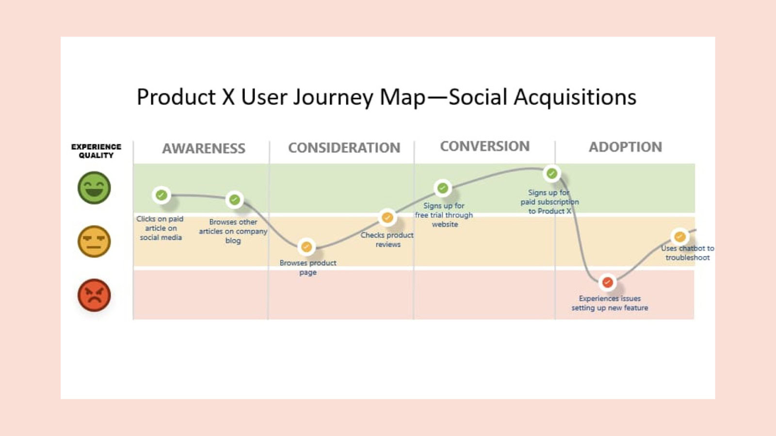
Once you have a clear understanding of your target audience, the next step is to identify and map out the common pain points and challenges they face. Recognizing the obstacles that prevent users from achieving their goals and the frustrations they experience while using your product is essential. To achieve this, conduct user journey mapping. Create detailed user personas representing different segments of your target audience, including information about their goals, needs, and pain points. Develop user journey maps that outline the steps users take when interacting with your product, identifying touchpoints where they encounter difficulties or friction.
Gathering user feedback is another critical aspect. Establish multiple channels for users to provide feedback, such as in-app feedback forms, customer support interactions, and social media. Conduct usability testing sessions to observe how users interact with your product in real-time, helping you identify areas for improvement.
Importance of Aligning Your Product’s Value Proposition with User Needs
Aligning your product’s value proposition with user needs is crucial for demonstrating its value effectively. When users perceive that a product meets their needs and solves their problems, they are more likely to adopt and continue using it. Define a clear value proposition that articulates how your product addresses specific user needs and pain points, highlighting the benefits and outcomes users can expect. Emphasize what sets your product apart from competitors by showcasing unique features and advantages that cater to user needs.
It is important to continuously validate and refine your value proposition. Regularly collect and analyze user feedback to ensure your value proposition remains relevant and compelling. Use insights from user feedback and data analysis to make continuous improvements to your product, updating features and functionality to better align with user needs.
II. Effective Onboarding and First Impressions in SaaS
Designing a User-Friendly Onboarding Process
Creating a seamless and user-friendly onboarding process is crucial for setting the stage for a positive user experience with your SaaS product. The onboarding process is the first interaction users have with your product, and a well-designed onboarding can significantly influence their perception and future engagement. To design an effective onboarding process, it’s important to focus on simplicity, clarity, and engagement.
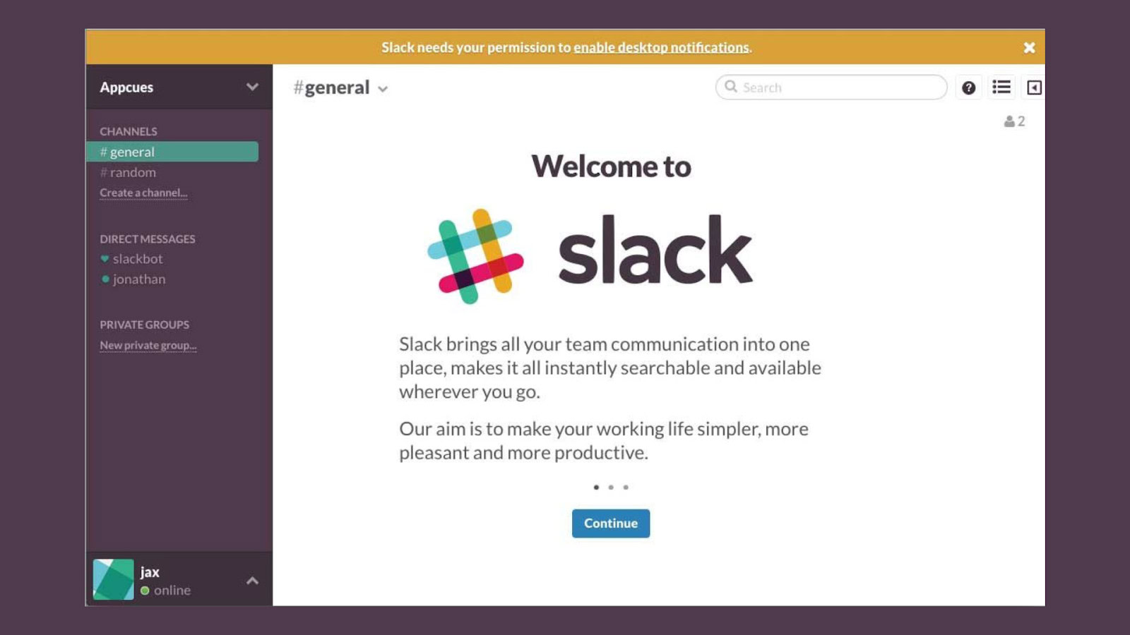
Begin by mapping out the onboarding journey, ensuring each step is straightforward and intuitive. Avoid overwhelming users with too much information at once. Instead, introduce features progressively, allowing users to become familiar with the basic functionalities before moving on to more advanced options. This gradual learning curve helps users feel more confident and less frustrated. For example, Slack’s onboarding process introduces users to its basic messaging features before diving into more advanced tools like integrations and customizations.
Key Elements of an Effective Onboarding Experience
Several key elements contribute to an effective onboarding experience. Clear instructions are fundamental; provide concise, easy-to-follow guidance that helps users understand what they need to do at each step.
Use simple language and avoid jargon to ensure instructions are accessible to all users, regardless of their technical proficiency.
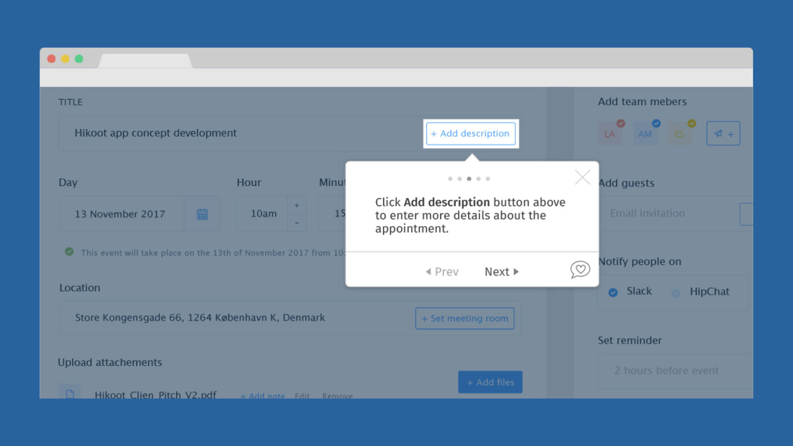
Interactive tutorials can significantly enhance the onboarding process. These tutorials guide users through the essential features of your product, allowing them to learn by doing.
Incorporate interactive elements such as tooltips, walkthroughs, and in-app prompts that encourage users to engage with the product actively.
This hands-on approach helps users retain information better and feel more comfortable using the product.
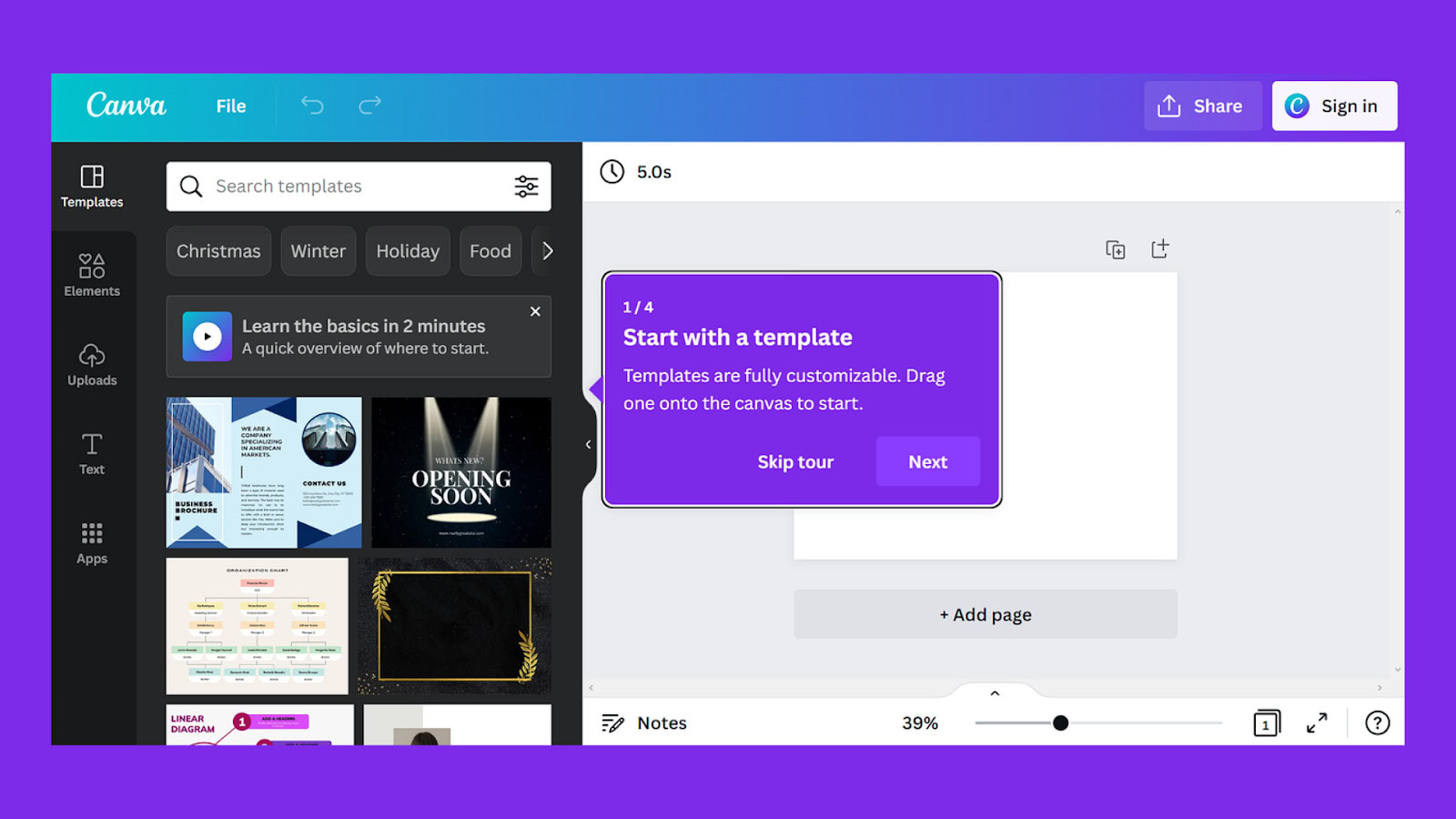
For instance, Canva’s onboarding tutorial guides new users through creating a simple design, showing them how to use various tools and features interactively.
Personalized welcomes can also make a significant impact. Tailor the onboarding experience to individual users by incorporating elements such as personalized greetings, customized dashboards, and user-specific recommendations. Personalization makes users feel valued and ensures that the onboarding process is relevant to their specific needs and preferences. Netflix, for example, personalizes its onboarding by asking users about their viewing preferences and recommending shows and movies based on their selections right from the start.
Role of UX/UI in Creating a Positive First Impression
The role of UX/UI in creating a positive first impression cannot be overstated. The initial interactions users have with your product often determine whether they will continue using it or abandon it in favor of a competitor. Good UX/UI design ensures that users have a smooth and enjoyable experience from the moment they start using your product.
A clean, visually appealing interface is essential for making a positive first impression. Use a consistent design language that aligns with your brand identity, and ensure that the layout is uncluttered and easy to navigate. Pay attention to details such as typography, color schemes, and iconography, as these elements contribute to the overall aesthetic and usability of the product. Airbnb excels in this area with its minimalist, user-friendly interface that makes searching for and booking accommodations straightforward and visually pleasing.
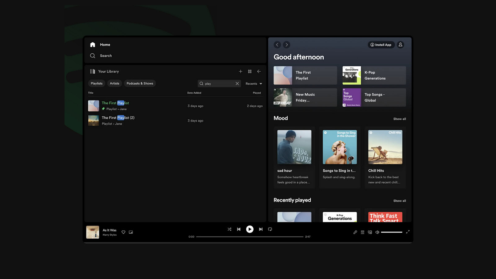
Intuitive navigation is another critical aspect. Users should be able to find what they need quickly and effortlessly. Design clear and straightforward navigation menus, and implement robust search functionality to assist users in locating specific features or information. An intuitive and user-friendly interface reduces friction and makes the onboarding process more enjoyable. Spotify’s app is a prime example of intuitive navigation, where users can easily discover new music, find playlists, and navigate their library without confusion.
III: Communicating SaaS Value Through Features and Benefits
Highlighting Core Features and How They Address User Needs
Communicating the value of your SaaS product effectively requires a clear presentation of its core features and how they address user needs. Users should quickly understand what your product offers and how it can solve their problems or improve their workflows. To achieve this, focus on showcasing features that directly correlate with the most common pain points and challenges your users face.
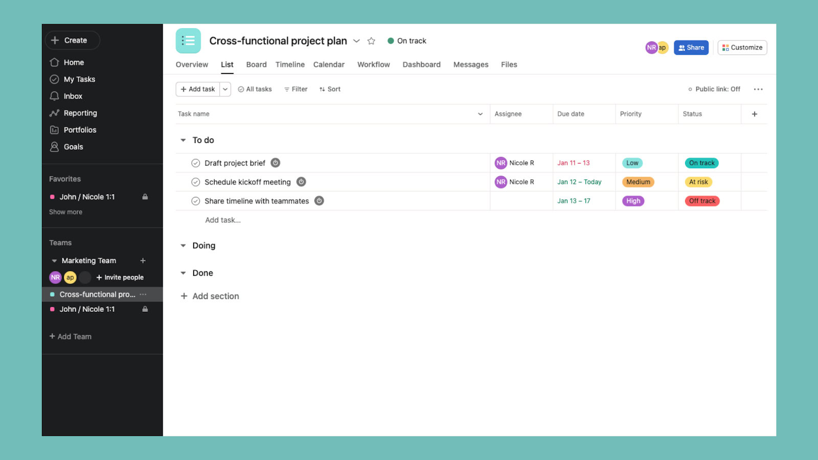
For example, if your SaaS product is a project management tool, highlight features like task automation, collaboration tools, and time-tracking functionalities. Explain how these features help users manage their projects more efficiently, reduce administrative burden, and improve team collaboration. Monday.com, a popular project management tool, excels at this by emphasizing its customizable workflows and integration capabilities, showing how they streamline project management for various industries.
Using Storytelling to Illustrate the Real-World Benefits of Your Product
Storytelling is a powerful tool for illustrating the real-world benefits of your product. By crafting narratives around how your product has positively impacted actual users, you make it easier for potential customers to envision similar benefits in their own context. Stories can create an emotional connection and make the product’s value more tangible.

Consider creating detailed case studies that follow the journey of a user or a business from problem identification to successful resolution with the help of your product.
For instance, HubSpot often shares stories about how its marketing and sales software has helped businesses grow their customer base and streamline their operations. These stories include specific metrics and outcomes, making the benefits clear and relatable.
Incorporating User Testimonials and Case Studies to Build Credibility
User testimonials and case studies are essential for building credibility and trust with potential customers. They provide third-party validation of your product’s value and demonstrate that real users have achieved positive results. Collect and showcase testimonials from satisfied users who can speak to the specific benefits they’ve experienced.
Incorporate these testimonials strategically across your marketing materials.
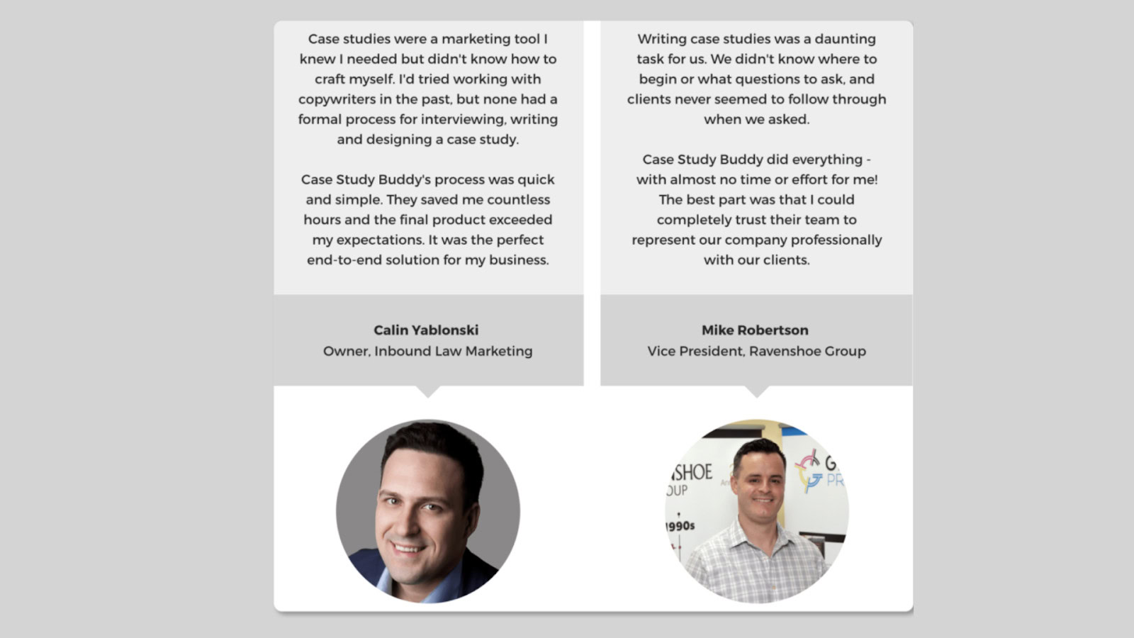
For example, featuring user testimonials on your website’s homepage or product landing pages can immediately capture the attention of visitors and reinforce the credibility of your claims. Salesforce effectively uses testimonials and detailed case studies to highlight how various companies have leveraged its CRM platform to drive growth and improve customer relationships.
Case studies should be comprehensive and cover various aspects of the user’s experience, from the initial challenges they faced to the solutions your product provided and the outcomes they achieved. Include quotes from users, relevant statistics, and before-and-after scenarios to paint a complete picture.
For example, Slack’s case studies often detail how companies improved internal communication and collaboration after adopting the platform, complete with specific performance metrics and user feedback.
IV. Leveraging UX/UI to Showcase SaaS Value
Importance of a Clean, Intuitive, and Visually Appealing Interface
A clean, intuitive, and visually appealing interface is essential for showcasing the value of your SaaS product. First impressions matter, and users often form opinions about a product within seconds of interacting with it. A well-designed interface not only attracts users but also facilitates ease of use, making it simpler for them to discover and understand the value of your product.
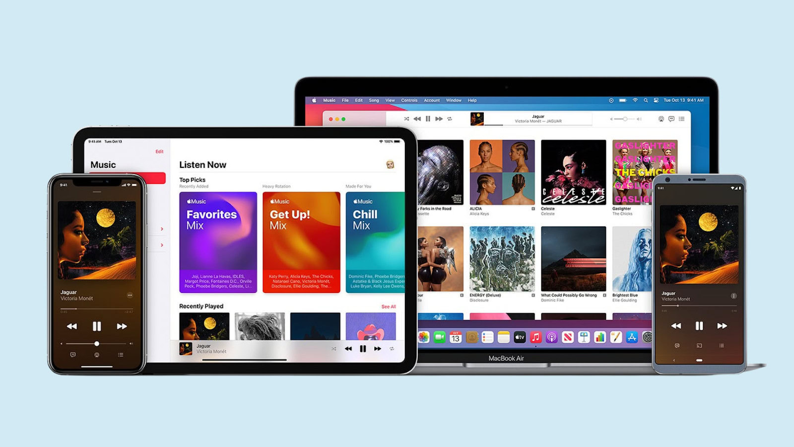
A visually appealing interface should use a consistent design language, incorporating elements such as color schemes, typography, and iconography that align with your brand identity. This consistency creates a cohesive user experience and reinforces brand recognition.
For instance, Apple’s design aesthetic is renowned for its simplicity and elegance, which contributes to its strong brand identity and user loyalty.
Techniques for Guiding Users Through Your SaaS Product
Effective UX/UI design includes techniques that guide users through your product, ensuring they can easily navigate and utilize its features. Tooltips, progress bars, and other interactive elements can significantly enhance user experience by providing contextual assistance and highlighting key functionalities.
Tooltips: Tooltips offer brief, informative messages that appear when users hover over or click on specific elements within the interface. They are particularly useful for explaining the function of buttons, icons, and other interactive components without cluttering the screen. For example, Trello uses tooltips to help new users understand how to create and manage boards, lists, and cards.

Progress Bars: Progress bars are visual indicators that show users how far they have progressed through a particular process, such as onboarding or completing a task. They provide a sense of accomplishment and motivate users to continue. LinkedIn uses progress bars effectively during profile setup, encouraging users to complete their profiles by showing their progress and suggesting additional steps.
Interactive Tutorials: Interactive tutorials engage users by guiding them through the product’s features step-by-step. These tutorials can be particularly beneficial for new users who need to familiarize themselves with the product quickly. Canva, for instance, uses interactive tutorials to teach users how to create designs, use templates, and explore various design tools.
Ensuring Consistency and Ease of Use Across Different Platforms and Devices
In today’s multi-device world, ensuring consistency and ease of use across different platforms and devices is crucial. Users expect a seamless experience whether they are accessing your SaaS product from a desktop, tablet, or smartphone. A responsive design that adapts to various screen sizes and resolutions is essential for maintaining usability and aesthetics across all devices.

Consistency in design and functionality helps users feel comfortable and confident when switching between platforms. For instance, Google’s suite of applications, including Gmail, Google Drive, and Google Calendar, maintains a consistent look and feel across web and mobile interfaces, ensuring users can navigate and use the tools efficiently regardless of the device.
To achieve this consistency, employ a design system that includes standardized UI components, design patterns, and guidelines. A design system ensures that all elements of your product are cohesive and provides a reference for designers and developers to create new features that align with the overall user experience.
V. Gathering and Acting on SaaS User Feedback
Methods for Collecting User Feedback
Collecting user feedback is a crucial step in understanding how users interact with your SaaS product and identifying areas for improvement. Several methods can be employed to gather valuable insights from users:
Surveys: Surveys are a versatile tool for collecting feedback from a broad user base. They can be distributed via email, social media, or directly within the app. Survey questions should be designed to elicit detailed responses about user satisfaction, feature usability, and overall experience. For example, SurveyMonkey allows you to create customized surveys that can target specific user segments.
Interviews: Conducting one-on-one interviews provides deep insights into user experiences and expectations. These sessions can uncover detailed feedback that might not be captured through surveys. Interviews can be conducted in person, over the phone, or via video calls, offering flexibility in how you engage with your users. Companies like Adobe often use user interviews to gather in-depth feedback on their creative software suite.
In-App Feedback: In-app feedback tools enable users to provide immediate feedback while using the product. This method captures the user’s thoughts and issues in real-time, providing context-specific insights. Tools like UserVoice and Intercom allow users to submit feedback directly within the app, making it easy for them to share their experiences without leaving the platform.
Analyzing SaaS Feedback to Identify Areas for Improvement
Once feedback is collected, it needs to be systematically analyzed to identify common themes and areas for improvement. Start by categorizing feedback into different types such as feature requests, usability issues, bugs, and general suggestions. This categorization helps in prioritizing which areas to address first.
Qualitative Analysis: Review open-ended responses from surveys and interviews to identify recurring themes and sentiments. Use coding techniques to tag feedback with specific keywords, making it easier to spot patterns and common issues. For example, if multiple users mention difficulty navigating a particular feature, this indicates a need for a design overhaul in that area.
Quantitative Analysis: Analyze numerical data from surveys and in-app feedback to identify trends. Look at metrics such as Net Promoter Score (NPS), Customer Satisfaction Score (CSAT), and task completion rates to gauge overall user satisfaction and pinpoint areas requiring attention. Tools like Tableau can help visualize this data, making it easier to identify trends and correlations.
Demonstrating Responsiveness by Implementing User Suggestions and Communicating Changes
Acting on user feedback not only improves your product but also builds trust and loyalty among users. Demonstrating responsiveness involves both implementing the suggestions and effectively communicating these changes back to your users.
Implementing User Suggestions: Prioritize feedback based on factors like the number of users affected, the severity of the issue, and the strategic goals of your product. Develop a roadmap that includes high-priority feedback items and sets realistic timelines for implementation. For instance, when Dropbox received feedback about the need for better offline access, they developed and rolled out enhancements to their mobile app to address this request.
Communicating Changes: Keep users informed about how their feedback is being addressed. Use multiple communication channels such as email newsletters, in-app notifications, and blog posts to announce new features, improvements, and bug fixes. Transparency about the feedback process and the changes made demonstrates that you value user input and are committed to improving their experience. Slack, for instance, frequently updates its users on new features and improvements through detailed release notes and blog updates.
VI. Building Long-Term User Relationships
Strategies for Maintaining User Engagement and Loyalty
Maintaining user engagement and loyalty is critical for the long-term success of any SaaS product. To achieve this, it’s essential to continuously engage users and make them feel valued. One effective strategy is to regularly update the product with new features and improvements based on user feedback. This not only keeps the product relevant but also shows users that their opinions matter.
Another key strategy is to foster a sense of community among your users. This can be achieved through user forums, social media groups, and regular webinars or events where users can share their experiences, ask questions, and provide feedback. Salesforce excels in this area by hosting its annual Dreamforce conference, which brings together its user community for learning, networking, and sharing best practices.
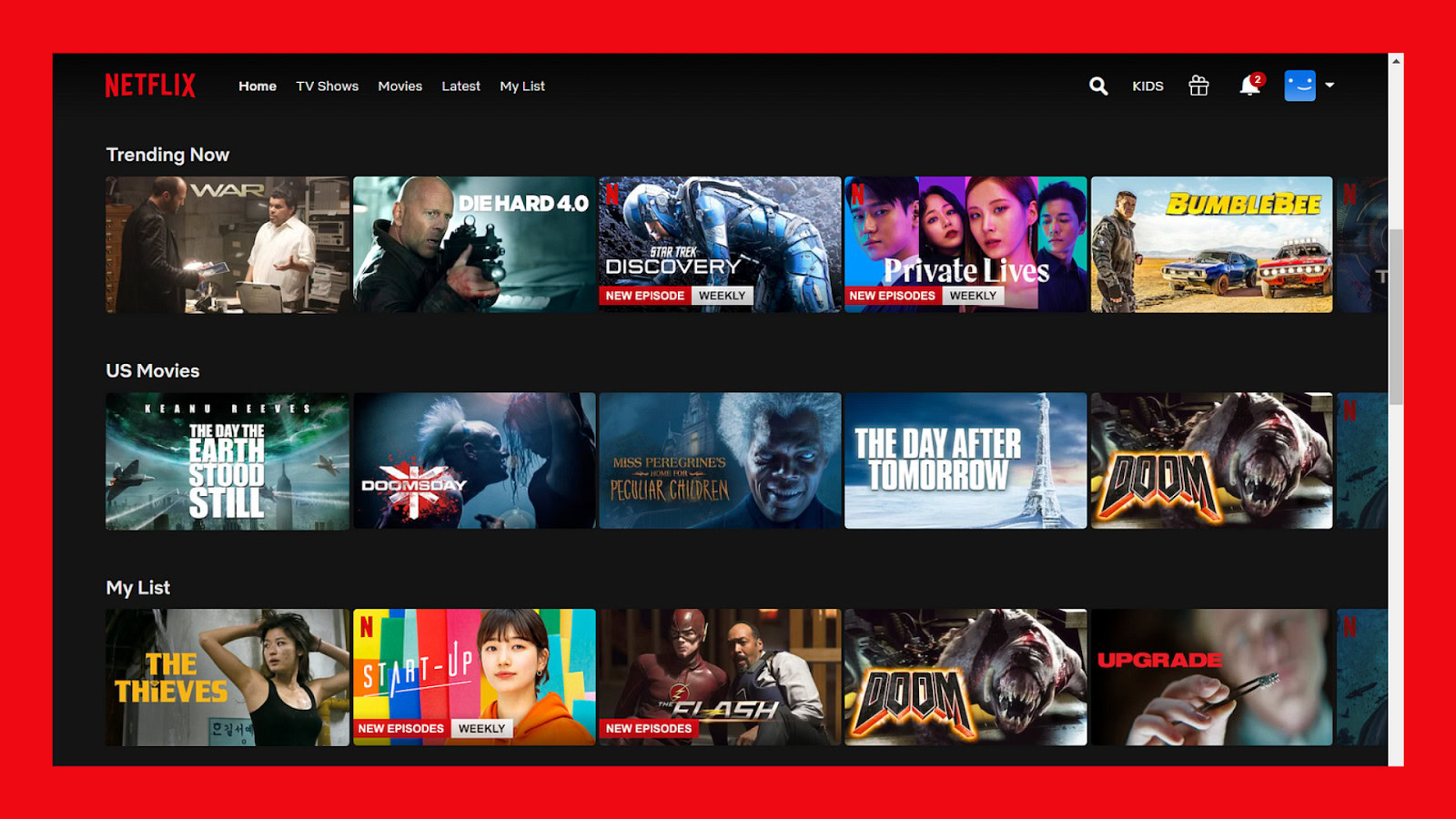
Personalization is also vital for maintaining engagement. Tailor the user experience to individual preferences and usage patterns. For example, Netflix’s recommendation engine suggests content based on viewing history, keeping users engaged and coming back for more.
Role of UX/UI in Creating a Seamless and Enjoyable SaaS User Experience Over Time
UX/UI design plays a pivotal role in creating a seamless and enjoyable user experience over time. A well-designed interface ensures that users can navigate the product effortlessly and find the features they need without frustration. Consistency in design across all touchpoints—whether it’s the website, mobile app, or desktop application—helps users feel comfortable and reduces the learning curve.
A great example of this is Spotify, which maintains a consistent user experience across all devices, making it easy for users to switch between their smartphone, tablet, and computer without any confusion. The intuitive design and easy navigation contribute to a smooth and enjoyable experience that keeps users coming back.
Additionally, the UX/UI design should evolve based on user behavior and feedback. Regularly conduct usability testing and gather user insights to refine the interface and add new functionalities that enhance the overall user experience. Google’s iterative approach to improving its suite of applications, such as Gmail and Google Docs, demonstrates how continuous UX/UI enhancements can keep users satisfied and loyal.
importance of Transparency and Trust in Building Lasting User Relationships
Transparency and trust are foundational to building lasting relationships with users. Being transparent about product updates, changes, and the reasons behind them helps build trust and ensures users feel informed and respected. Regular communication, such as release notes, blog posts, and emails, should clearly explain what’s new and how it benefits the users.
Trust also comes from delivering on promises and maintaining high standards of security and privacy. Users need to feel confident that their data is safe and that the product will reliably meet their needs. For instance, Slack emphasizes its commitment to security and privacy, providing detailed information about its practices and regularly updating users on improvements in this area.
Conclusion
In conclusion, making users realize the value of your SaaS product requires a multifaceted approach that combines effective communication, excellent UX/UI design, and a strong focus on user needs and feedback. By implementing strategies to maintain user engagement and loyalty, leveraging UX/UI to create a seamless and enjoyable experience, and fostering transparency and trust, you can build long-term relationships with your users.
The key strategies discussed—understanding user needs, effective onboarding, communicating value through features and benefits, leveraging UX/UI, gathering and acting on user feedback, and building lasting relationships—are essential for demonstrating the value of your SaaS product.
SaaS providers must continuously invest in user-centered design and support to stay competitive and ensure long-term success. By prioritizing these elements, you can create a product that not only meets but exceeds user expectations, fostering loyalty and driving growth.
Take your company to the next level and get results with our world class user experience, interface design and implementation.
Get a FREE 30 min Strategy Session

Related posts
User Surveys: 6 Tips for Gaining Valuable Insights
Survey design is complicated, but when utilised correctly, surveys are an incredibly valuable and reliable tool in your research toolbox. […]
Beyond Pointing and Clicking: Exploring the Future of User Interfaces
We’ve come a long way from the days of cryptic commands typed into blinking cursors. User interfaces (UIs), the bridges […]
8 Ways You Can Use Gamification In Your Design
You will inevitably experience gamification at some point in your life. Gamification incorporates the fun and engaging elements found in […]
Creative product design that gets results
Take your company to the next level with world class user experience and interface design.
get a free strategy session
