Designing Inclusive Dark Modes: Enhancing Accessibility and User Experience
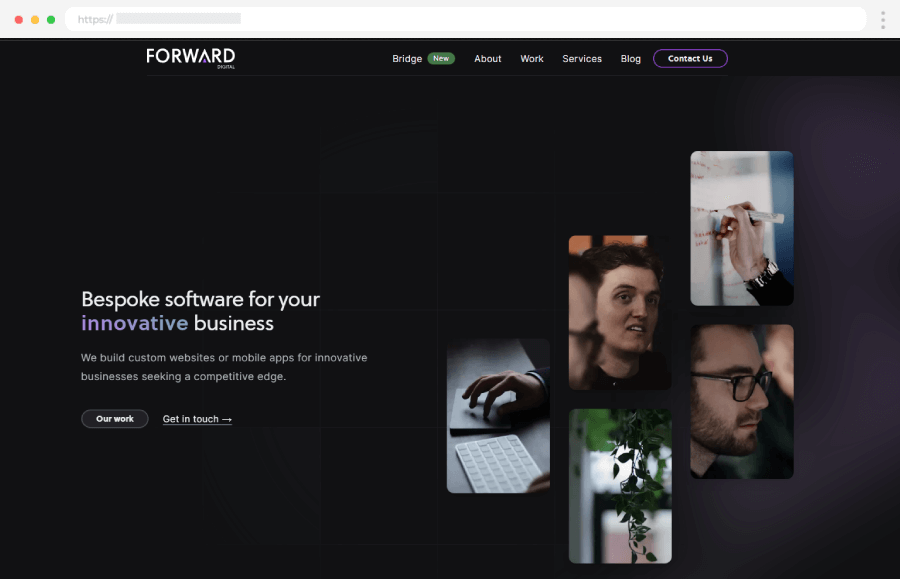
Have you ever switched to dark mode on your phone late at night and felt instant relief as your eyes relaxed? You’re definitely not alone! Dark mode featuring dark backgrounds paired with lighter text isn’t just trendy; it’s become a favorite setting for millions of users worldwide. But while it’s great for aesthetics and comfort, it’s equally crucial to design dark modes that are genuinely accessible to everyone.
In this article, we’ll explore why dark mode is popular, identify common accessibility challenges, offer practical tips for inclusive design, and provide real-world examples and best practices that help you build dark modes everyone can enjoy.

Table of Contents
1. Why Everyone Loves Dark Mode
Dark mode is more than just a cool look, it’s appealing for several practical reasons. For starters, it significantly reduces eye strain, especially in dim or nighttime environments. Bright screens can cause discomfort and eye fatigue, but dark themes create a softer, more relaxing viewing experience.
Another fantastic advantage of dark mode is its battery-saving potential. If your device has an OLED screen (common in smartphones), dark mode reduces power consumption because dark pixels use less battery power. This means you can spend more time on your device without worrying about charging.
Beyond these practical benefits, many users simply prefer the visual appeal of dark mode. It feels sleek, modern, and easier on the eyes, making your app or website feel contemporary and user-friendly.
2. Accessibility Challenges with Dark Mode
Despite its many perks, dark mode isn’t perfect. It presents some unique accessibility challenges that designers must be aware of.
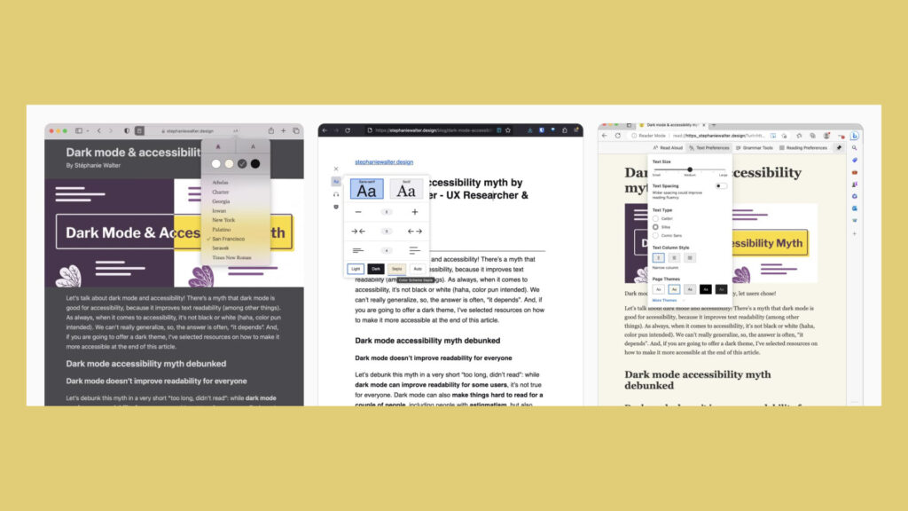
For example, some users, especially those with astigmatism or certain visual impairments, may find it harder to read white or brightly colored text against a dark background. This contrast can cause blurred vision or visual distortions, leading to discomfort.
Additionally, certain colors that look vibrant and readable in a standard theme might become less distinguishable when viewed against darker backgrounds. Users with color vision deficiencies may struggle with this lack of contrast, reducing readability and usability.
Another subtle issue is what’s known as the “halo effect,” where text edges appear fuzzy or glowing due to anti-aliasing techniques on darker backgrounds. This visual effect can make reading more tiring, especially over extended periods.
3. Essential Tips for Inclusive Dark Mode Design
To create dark modes that work effectively for everyone, there are some key design principles worth following.
1. Ensure Optimal Contrast:
Always maintain sufficient contrast between text and background by following standards such as the WCAG 2.1 guidelines. Clear contrast enhances readability for all users, especially those with visual impairments.
2. Avoid Pure Black Backgrounds:
Pure black can create stark contrasts causing eye strain. Instead, choose softer shades like dark grays or muted tones, making your dark mode easier on the eyes.
3. Test on Various Devices and Conditions:
Regularly test your dark mode designs on multiple devices, screen types, and under different lighting conditions. This ensures consistency and accessibility for all users, regardless of their viewing environment.
4. Provide User-Controlled Customization:
Allow users to easily adjust settings such as text size, contrast levels, and color schemes. Empowering users to customize enhances usability and makes your dark mode more accessible.
5. Clearly Highlight Interactive Elements:
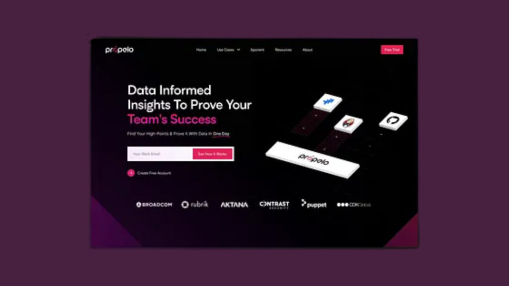
Ensure interactive elements, such as buttons, links, and focus indicators, are clearly visible and distinguishable. This clarity improves navigation and ensures users can effortlessly interact with your content.
4. Putting Users First: Features That Enhance Accessibility
Designing inclusively also means empowering users to control their own experience.
One of the best ways to achieve this is by providing easy-to-find toggles that allow users to switch effortlessly between dark and light modes. Not every user prefers dark mode all the time, and giving them this flexibility dramatically improves their overall comfort and satisfaction.
Furthermore, offering customization options can significantly enhance usability. Allow users to adjust text sizes, modify contrast levels, and select preferred color schemes according to their personal needs. Such user-focused features not only cater to accessibility but also create a sense of personal connection and control.
Finally, always ensure your design remembers user preferences. When a user chooses dark mode or adjusts certain settings, preserving these preferences across sessions makes their interaction smoother, more intuitive, and enjoyable
5. Real-World Inspirations and Best Practices
Some well-known companies have set fantastic examples in creating inclusive dark modes, providing inspiration for all designers.
a. Slack’s Multiple Dark Themes
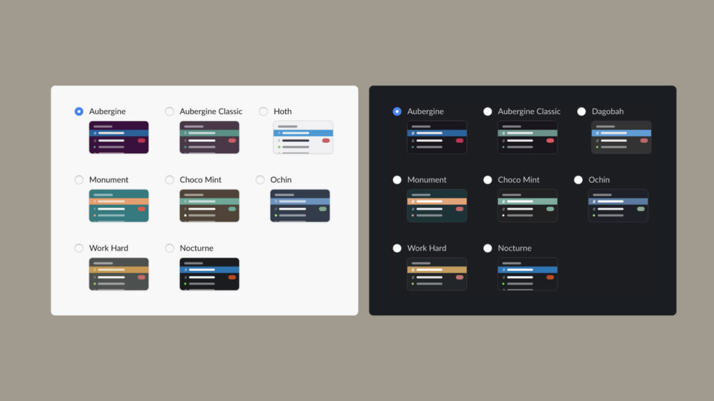
Slack provides not just one but several dark themes, allowing users to choose the theme that best suits their visual comfort and preference. This approach promotes personalization and user satisfaction.
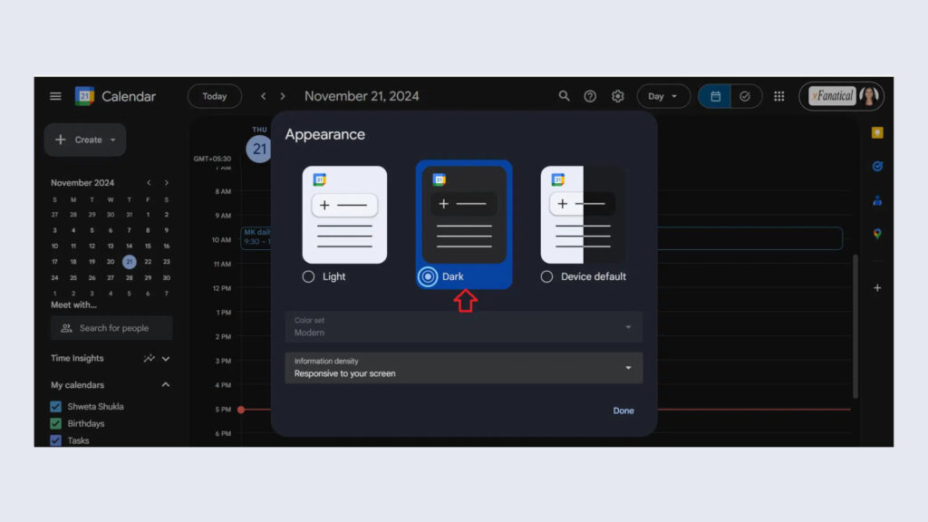
b. Google’s Seamless Dark Mode Integration
Google has integrated dark mode seamlessly across its ecosystem. It respects and synchronizes with users’ system-wide preferences, ensuring effortless toggling and consistent user experiences.

c. Semantic HTML and ARIA Roles
Using semantic HTML and appropriate ARIA roles ensures content is accessible to assistive technologies such as screen readers. Proper coding supports users with disabilities, enhancing usability for everyone.
d. Clear Focus Indicators
Interactive elements and navigation cues, like focus indicators, should be clear and distinct in both dark and light modes. Visibility ensures ease of navigation, particularly benefiting keyboard users or those relying on assistive technology.
e. Regular Testing with Assistive Technologies
Consistently testing designs with actual assistive tools such as screen readers, magnifiers, and accessibility checkers ensures your dark mode design remains inclusive, functional, and user-friendly for everyone.
Conclusion: Creating Inclusive Digital Experiences
Incorporating inclusive design practices into dark modes isn’t just about making a website or app look good. It’s about ensuring everyone feels comfortable, valued, and included.
Understanding the benefits and challenges of dark mode, following accessibility guidelines, and providing thoughtful customization options, designers can dramatically enhance user experiences. Let’s make accessibility a priority in our designs, ensuring digital products are enjoyable and accessible to everyone, regardless of visual abilities.
Together, we can create a digital world where everyone thrives, comfortably enjoying the sleek and effective experiences offered by inclusive dark modes.
Take your company to the next level and get results with our world class user experience, interface design and implementation.
Get a FREE 30 min Strategy Session

Related posts
Why Great UX Doesn’t Always Come from User Requests
In User Experience (UX) design, there’s a widely held belief: “design for the user,” which suggests that products should be […]
Designing with Empathy: How Inclusivity Enhances User Experience (4 steps)
What is Inclusivity in Design Inclusive design is the practice of “intentionally including the needs of users who likely experience […]
Designing UX for Younger Generations: Strategies to Create Engaging User Experiences
Designing UX for Younger Generations is both a challenge and an opportunity for modern designers. These digital natives, encompassing Generation […]
Creative product design that gets results
Take your company to the next level with world class user experience and interface design.
get a free strategy session


