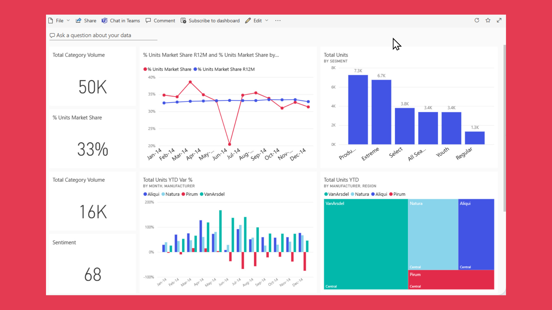
UX Rules for Real-Time Performance Dashboards
Real time dashboards have become the nerve centers of modern organizations, transforming how businesses monitor performance and make strategic decisions. Whether in sales and marketing, IT operations, healthcare, or finance, these dashboards provide instant access to real time data, allowing users to track key metrics and respond proactively. When designed effectively, a real time dashboard feels like a superpower: it delivers real time insights that enable teams to act before issues escalate or opportunities pass by.
However, not all dashboards live up to this promise. Some become cluttered with irrelevant charts, suffer from slow refresh rates, or present inconsistent user interfaces that confuse users rather than guide them. The difference between a dashboard that drives informed decisions and one that generates noise often hinges on thoughtful design and clarity of purpose.
In this article, we’ll explore how to build real time dashboards that truly empower users, enhance business performance, and enable quick interference with time sensitive data.
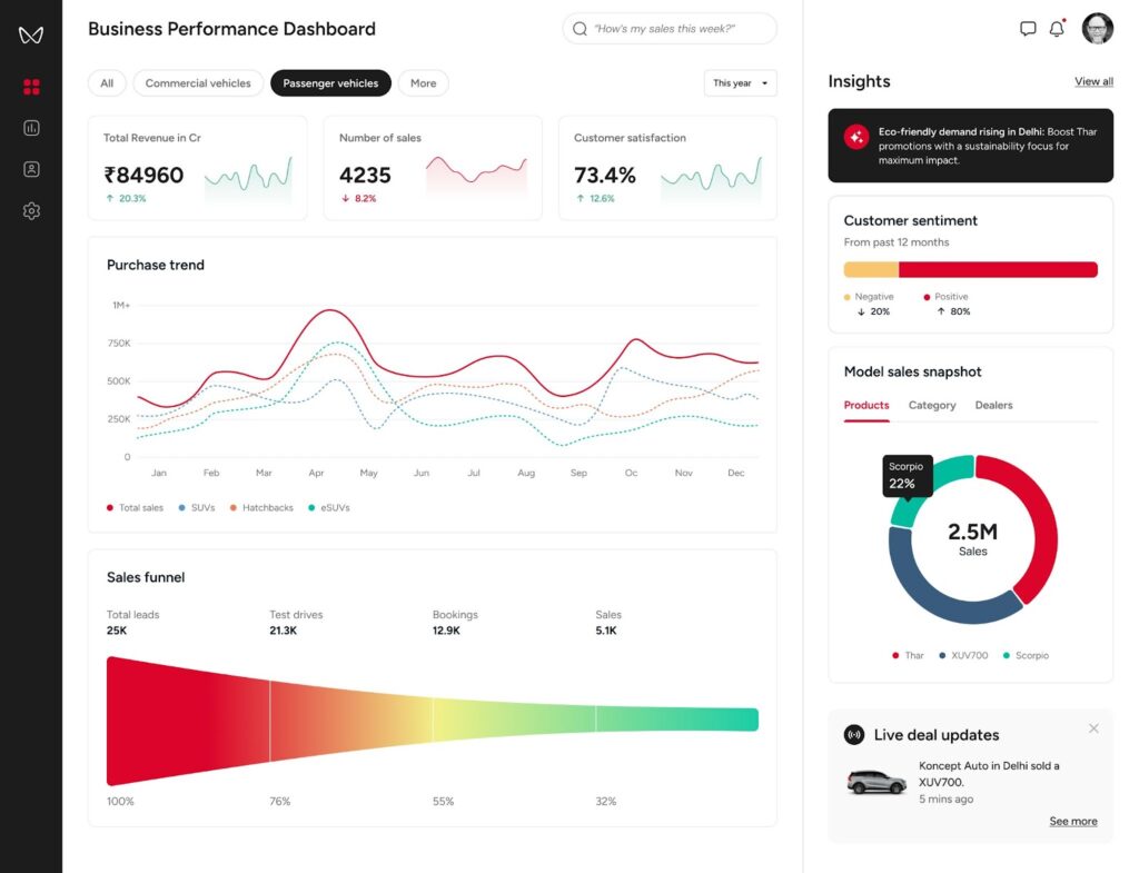
Table of Contents
Dashboards as Navigation Systems
Imagine embarking on a long road trip without navigation tools. You’d rely on road signs, ask for directions, or consult paper maps—an approach that’s stressful, slow, and prone to mistakes. Now compare that to using a live navigation app like Waze or Google Maps, which offers real time rerouting suggestions, alerts about accidents, and traffic updates. This dynamic guidance helps you reach your destination efficiently and avoid delays.
Real time dashboards should aspire to this standard. They are not static reports showing what happened yesterday; instead, they function as live navigation systems for your business. A well-crafted time dashboard:
- Shows where you are right now by displaying current key performance indicators (KPIs), system health, or sales numbers.
- Highlights risks or roadblocks ahead, such as outages, drops in conversions, or inventory shortages.
- Suggests or enables better paths, like shifting ad spend, rerouting deliveries, or assigning additional staff.
By thinking of dashboards as navigation tools, the goal becomes clear: help users move forward with confidence using real time data streams, rather than simply admiring static charts.
Purpose Comes First
Dashboards often fail because they try to be everything at once. The crucial first question is: what decision should this dashboard help make?
For example:
- An airline operations dashboard isn’t just a flight tracker; it helps staff decide whether to reroute planes during bad weather.
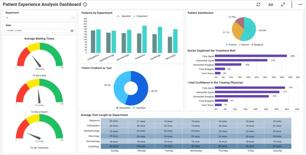
- A healthcare analytics dashboard isn’t about listing every patient; it assists administrators in determining if more beds need to be opened or patients diverted.
- A sales KPI dashboard shouldn’t list every deal but rather flag underperforming regions so coaching and resources can be directed quickly.
Without a clear purpose, dashboards become data wallpaper—noisy, unfocused, and ultimately ignored. Defining the dashboard’s role ensures every chart and metric serves a meaningful function, whether monitoring customer lifetime value or tracking procurement costs.
Designing with Intention
Once the purpose is clear, design choices should reinforce it. Here’s how to build dashboards that guide instead of overwhelm.
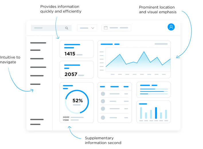
Once the dashboard’s purpose is clear, design choices should reinforce it. Building real time dashboards that guide action rather than overwhelm users requires attention to several key components.
Focus on the Right Metrics
It’s tempting to cram in every business KPI, but this creates noise and dilutes focus. Separate vanity metrics from actionable metrics:
- Vanity metrics (e.g., total website visitors) may be interesting but rarely drive immediate action.
- Actionable metrics (e.g., bounce rate on a newly launched landing page) indicate issues that need fixing.
For instance, a support team’s operational dashboard should spotlight average response time and ticket queue length, not social media likes.
Visual Hierarchy Matters

Users shouldn’t hunt for essential information. Organize data so the most important metrics are immediately visible:
- Large numbers at the top: key financial metrics like revenue this month, uptime percentage, or emergency room capacity.
- Supporting visuals below: breakdowns by region, team, or service.
- Details at the bottom: tables or lists for in-depth analysis.
This hierarchy ensures users quickly grasp overall business performance before exploring granular data.
Match Visuals to the Story
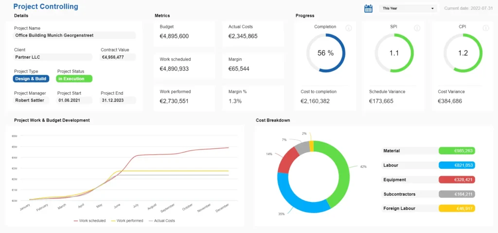
Choosing the right chart type is critical to avoid confusion:
- Use line charts to show trends over time.
- Use bar charts to compare categories.
- Use heatmaps to display performance across geography or highlight seasonal or outlier figures.
- Use sparklines to monitor tiny fluctuations.
For example, a supply chain dashboard tracking delivery delays benefits from a heatmap that instantly reveals bottlenecks, while a spreadsheet of numbers would be less intuitive.
Keep Users in Control
Dashboards should offer interactive features allowing users to explore data at their own pace:
- Filters to narrow down by region, team, or product.
- Date selectors to compare current performance with historical data.
- Drill-down options to zoom from company-wide KPIs to individual team metrics.
Power BI and other dashboard software excel at enabling this layered exploration, empowering users without overwhelming them.
Building Trust Through Consistency and Performance
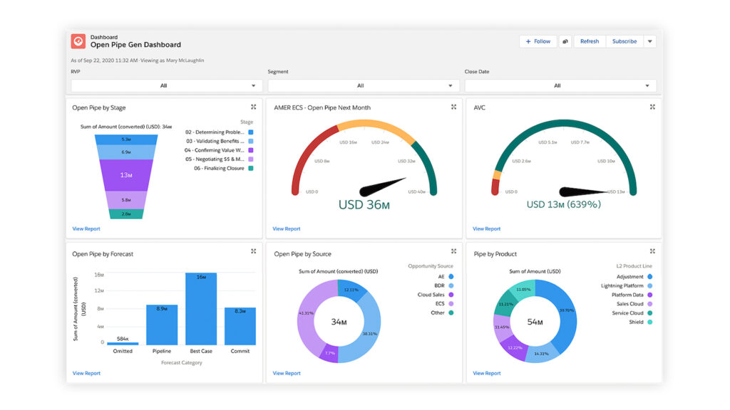
Trust is essential for dashboards to be relied upon. It stems from consistent design and responsive performance.
- Consistency means adhering to a design system where colors, icons, and layouts have predictable meanings. For example, if red indicates critical issues in one part of the dashboard, it should mean the same everywhere. Salesforce exemplifies this approach, reducing cognitive load for users.
- Performance refers to the dashboard’s responsiveness. Real time should mean low latency, with data refreshing instantly or near-instantly. Techniques like pre-aggregating data or lazy-loading less critical visuals help achieve this. Bloomberg terminals, used by financial traders, demand such performance because delays can cost millions.
A slow or inconsistent dashboard frustrates users and erodes confidence in the data itself, undermining its value as a tool for strategic decision making.
Accessibility and Feedback
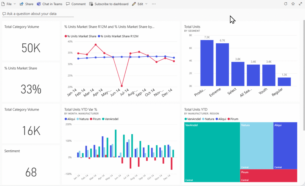
Inclusive design ensures dashboards serve all users effectively. Accessibility features include:
- High-contrast modes for users with low vision.
- Patterns and labels alongside color to accommodate colorblind users.
- Screen reader compatibility so dashboards are usable beyond visual interaction.
Microsoft Power BI has made significant strides in this area, enhancing usability across diverse workforces.
Equally important is providing clear feedback about the dashboard’s state:
- Indicate when data is loading or refreshing.
- Display timestamps showing the last update.
- Show error messages clearly when data sources fail.
These small touches reassure users that the system is live and reliable, fostering trust and adoption.
From Solo Screens to Shared Tools
A dashboard confined to one user’s screen is a missed opportunity. The best real time analytics dashboards promote sharing and collaboration.
For instance, if a marketing manager notices a sudden spike in campaign metrics or ad costs, instead of sending static screenshots, they should be able to annotate the chart, share it with finance or the CMO, and spark a quick discussion.
Tools like Looker Studio facilitate this by embedding sharing and commenting features directly into the dashboard interface. This transforms dashboards from passive displays into active hubs of team collaboration and strategic planning.
Wrapping Up
Real time dashboards are much more than collections of charts and numbers. They are dynamic maps that guide decisions, highlight risks, and spark timely action. To build dashboards that truly empower users and elevate business performance, follow these principles:
- Start with Purpose: Define the exact decision the dashboard should support.
- Build with Intention: Select the right key metrics, visuals, and establish a clear visual hierarchy.
- Ensure Trust: Deliver consistent design and lightning-fast performance with low latency.
- Make it Inclusive: Design for accessibility and provide clear feedback on data status.
- Encourage Collaboration: Turn dashboards into shared tools that enable dialogue and collective action.
Ask yourself: does your real time dashboard act as a live guide, providing real time information and allowing quick interference? Or is it just another noisy display? The answer determines whether users rely on it daily or avoid it altogether.
By applying these principles and leveraging the right tools—whether Power BI, dashboard software, or custom web applications—you can create real time analytics dashboards that unlock the full potential of your data, empower C-level executives and teams alike, and drive smarter, data driven decisions.
Take your company to the next level and get results with our world class user experience, interface design and implementation.
Get a FREE 30 min Strategy Session

Related posts
Prototyping: A Startup Founder’s Secret to Success
We’ve had so many grass-root startups come up to us with an extraordinary product idea but don’t know where to […]
Why Immersive and Voice Interfaces Are the Next UX Frontier
Talking on your phone in public seemed strange and futuristic ten years ago. Asking Alexa to turn off the lights […]
Top 30 AI Tools for Designers in 2025
Imagine this: You’re a designer with a looming deadline. The brief demands precision, speed, and creativity. The clock is ticking, […]
Creative product design that gets results
Take your company to the next level with world class user experience and interface design.
get a free strategy session


