
15 Data-Backed UX Changes That Lift Conversion

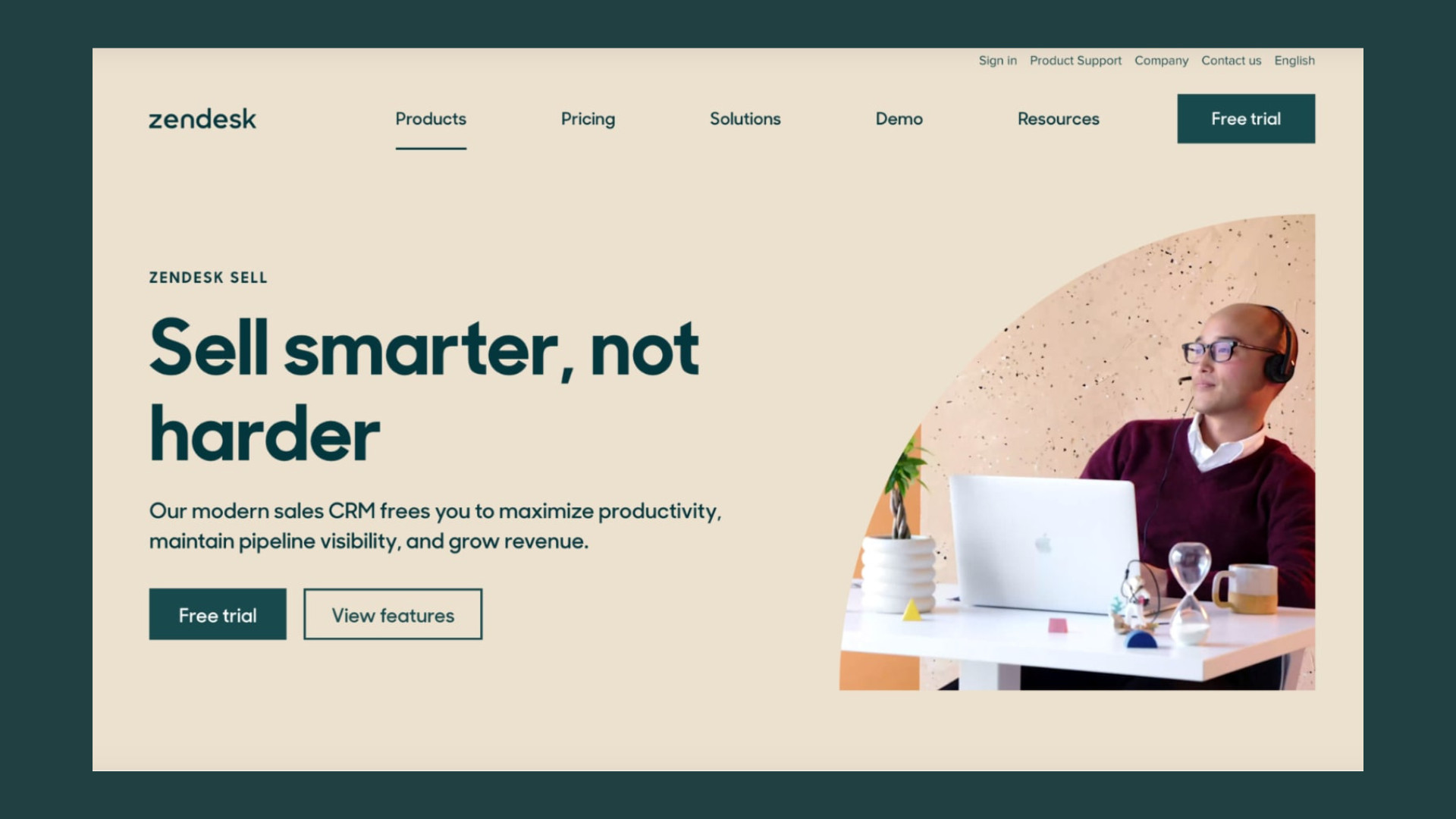
Most landing pages aren’t losing conversions because of one massive, glaring error. Instead, they’re bleeding leads in small, almost invisible increments. A confusing headline here, an extra form field there, or a button that boringly demands you to “Submit” rather than offering a real benefit.
On their own, these look like minor nitpicks. Together? They can easily be the difference between a page that converts at a sluggish 2% and one that crushes it at 5% or more.
If your traffic is solid but your conversion rate refuses to budge, the problem usually isn’t your media plan. It’s the page itself: what it says, how it’s laid out, and how much unnecessary friction it puts between your visitors and the outcome they want. That’s what landing page optimisation is all about, making deliberate, data-backed changes tied to how real people actually read, decide, and act online.
Below are 15 changes we consistently see move the needle for our SaaS, ecommerce, fintech, healthtech, and edtech clients. You don’t need to tackle all 15 this afternoon, but the earlier items on this list carry the most weight. Start there.
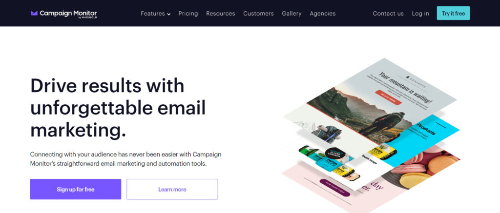
Table of Contents
1. Lead with one crystal-clear value proposition above the fold
Visitors decide whether to keep reading or bounce within seconds. If they can’t immediately answer, “What is this, who is it for, and why should I care?” from your headline and subheadline, they’re gone before they even scroll. Your value proposition needs to clearly state the outcome you deliver, not just a laundry list of features and it absolutely must be legible on mobile without scrolling.
The fix? Usually, it’s to cut, not add. Strip your headline down to your single strongest benefit and let the subheadline carry the supporting details. If your team can’t agree on one core value proposition, resolve that debate before you touch the design.
2. Give the page a single, primary call to action (CTA)
A landing page littered with competing CTAs such as “Book a demo”, “Download the guide”, “Start free trial”, “Contact sales” forces the visitor to do the heavy lifting of deciding. Every extra choice adds cognitive load and drastically lowers the odds that any action gets taken.
Pick the one action that matters most for your campaign and make everything else secondary, both visually and structurally. Secondary actions can still exist for folks who aren’t ready to buy yet, but they should look and feel subordinate. Size, colour contrast, and placement should make your primary CTA impossible to miss.
3. Match the page message to the ad or email that sent them there
Message matching is one of the highest-leverage, lowest-cost fixes in conversion rate optimisation. If someone clicks an ad promising “50% off your first order” and lands on a generic page that doesn’t mention the offer, you’ve broken the promise that earned you the click. That gap creates immediate doubt.
Your headline, imagery, and offer should echo the exact language used in the ad or email that brought them there. This is especially crucial for paid traffic, where every mismatched click is literally money down the drain.
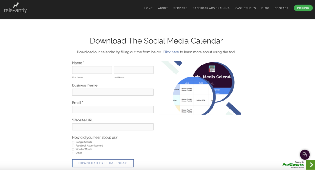
4. Cut the form down to what you actually need right now
Every additional form field gives your user another reason to abandon ship. First name, last name, email, phone number, and company size might feel like reasonable defaults, but every field you ask for adds friction especially on mobile where typing is clunky.
Ask yourself: What do we actually need to follow up with this lead today? Defer everything else. If your sales team wants more data for segmentation, capture it progressively after the initial conversion. We cover this in much more depth in our guide on the 5 common mistakes that kill form conversions and how to avoid them, but the short version is: fewer fields equal fewer excuses to bounce.
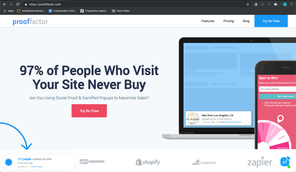
5. Put social proof right next to the decision point
Testimonials, client logos, review scores, and case study stats work best when they sit right next to the CTA, not buried at the bottom of the page. The exact moment someone is weighing up whether to hand over their email or credit card is the moment they need reassurance from people just like them.
Be as specific as possible. A logo wall says, “Credible companies use this.” A quote with a real name, role, company, and a hard metric says, “This actually worked.” The latter is infinitely more persuasive. Put it as close to your button as the layout allows.
6. Rewrite CTA copy to sell the outcome, not the effort
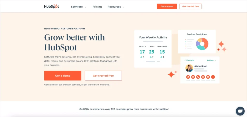
“Submit” tells the visitor absolutely nothing about what happens next. “Start my free trial”, “Get my quote”, or “See my results” tells them exactly what value is waiting for them on the other side of the click. Outcome-led copy reduces hesitation because it removes the ambiguity.
This is a cheap, five-second change and one of the easiest things to A/B test. (Pro tip: First-person phrasing like “Get my audit” almost always outperforms second-person phrasing like “Get your audit” in testing).
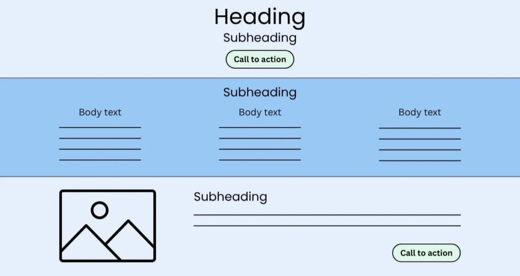
7. Build a clear visual hierarchy with directional cues
People don’t read landing pages top-to-bottom like a novel; they scan. Your job is to control that scan path so their eyes land on the headline, the value proposition, the proof, and the CTA—in exactly that order. Size, colour, whitespace, and contrast matter far more than clever copy if your hierarchy is a mess.
Use directional cues to guide attention where you want it: an arrow, a person in your hero image looking toward the form, or a visual break that draws the eye downward. If every element on the page is screaming for equal attention, nothing wins.
8. Treat page load speed like a conversion lever (because it is)
Every extra second of load time is measurable revenue lost. This is especially true on mobile and for paid traffic where you’ve already paid for the click. Core Web Vitals aren’t just technical jargon; they are proxies for how frustrating or seamless your page feels to a real human being trying to make a decision.
Common culprits include massive, unoptimised hero images, render-blocking scripts, and bloated tracking pixels. A quick technical audit targeting these specific issues often produces the fastest wins.
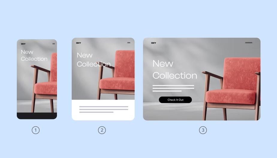
9. Design mobile-first, not mobile-adapted
If the majority of your traffic arrives on a phone and for most businesses today, it does, your mobile layout isn’t a secondary consideration. It is the main event. Pages designed for desktop and awkwardly squeezed to fit a smaller screen usually result in cramped forms, tiny tap targets, and CTAs pushed way below the fold.
Design the mobile experience first. Ask yourself: What’s visible without scrolling? Is this form thumb-friendly? Is the CTA reachable early? Once that’s perfect, adapt it upward for desktop. Not the other way around.
10. Strip out the main site navigation
A full navigation menu on a dedicated landing page is basically an invitation to get distracted and leave. Every link in your header is an exit ramp away from the one action you actually want the visitor to take.
Obviously, this doesn’t apply to your homepage. But for dedicated campaign pages built to drive conversions, strip the navigation back to just a clickable logo. It keeps their attention locked on the page’s job.
11. Ditch the vague claims for specific numbers
“Trusted by leading businesses” is instantly forgettable marketing speak. “Trusted by 427 Australian businesses” is credible, specific, and grounded in reality. Numbers signal that a claim has actually been measured, and modern consumers have naturally learned to tune out vague superlatives.
Wherever you can replace a fluffy adjective with a hard figure, a percentage, a dollar amount, or a timeframe, do it. Specificity builds trust faster than persuasive copywriting ever could.
12. Answer objections before they even have to ask
Every visitor arrives with unspoken baggage: Is my data secure? What if I hate it? Am I locked into a contract? If your page doesn’t answer these questions, they will leave to find the answers elsewhere.
An FAQ section near the bottom, a short risk-reversal line directly under the CTA button (“No credit card required” or “Cancel anytime”), or a rock-solid guarantee all drastically reduce the perceived risk of taking action. This is absolutely vital for high-consideration purchases like fintech or healthtech products.
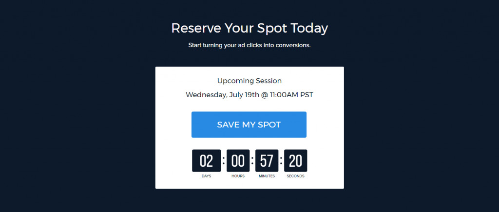
13. Use urgency and scarcity but only when they’re real
Countdown timers and “only 2 seats left!” messages can certainly lift short-term conversions. But manufactured, fake urgency that visitors can see right through (like a timer that miraculously resets when you refresh the page) will deeply damage your brand’s trust.
If you’re going to use urgency, make it genuine: a real deadline, genuinely limited capacity, or a strict seasonal offer. Ethical urgency works because it gives an undecided person a legitimate reason to act now rather than later (which almost always means never).
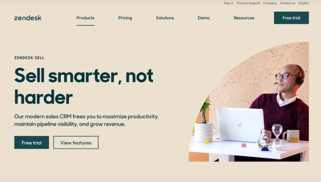
14. Write headlines about the benefit, not the product
“AI-Powered Analytics Platform” describes what your engineers built. “See Exactly Which Pages Are Costing You Customers” describes what the visitor actually gets. Benefit-led headlines instantly connect to the outcome the user cares about. Feature-led headlines, on the other hand, force the reader to do the mental translation themselves—and frankly, most won’t bother.
Run this filter through every headline on your page, not just the hero section.
15. Test everything. Don’t just assume it worked.
Every single item on this list is a highly educated hypothesis, not a bulletproof guarantee for your specific audience. The only way to know what truly moves your conversion rate is to test it. Use A/B testing if you have the traffic volume, or structured before-and-after analysis if you don’t.
Prioritise your changes by expected impact and ease of implementation. Ship one meaningful test at a time, and measure it against a clear baseline. Optimisation isn’t a one-and-done project; it’s an ongoing discipline.
Turning this into a real CRO machine
Reading a list like this is great, but the businesses that see serious, compounding revenue gains treat these 15 changes as inputs into a structured system, not a weekend to-do list. That means auditing the page against real user data, prioritising ruthlessly, testing methodically, and rolling those learnings into the next iteration.
When you do this right, the results compound. A page that converts meaningfully better this quarter will keep paying you dividends every single month after, without requiring an extra cent of ad spend.
This is exactly the heavy lifting we do through our conversion rate optimisation service. We combine deep UX expertise, hard data, and rigorous testing to lift conversions on pages that already have traffic but just aren’t converting it.
If you want a clear, no-obligation read on where your landing page is leaking money, start with our free UX audit. Or, just get in touch and we’ll tell you exactly what we think is holding your page back.
Get a UX & CRO Expert’s Eyes on Your Website. Book a free 30-minute UX Teardown and get actionable insights on what’s costing you conversions — no fluff, just fixes you can implement right away.
Book a Free UX Audit

Related posts
UI and UX Design Trends for 2026: What Founders and Designers Need to Know
The digital design landscape is evolving rapidly, and the shift from 2024 UX trends to the priorities of 2026 is […]
Personalized Shopping Experiences With Behavior UX
Personalization has moved from being a nice touch to becoming a core expectation in ecommerce. Shoppers want faster paths to […]
Ambient AI in UX: Interfaces That Work Without Buttons
Ambient AI is quietly reshaping how people interact with digital products. Instead of clicking buttons, filling forms, or issuing explicit […]
Creative product design that gets results
Take your company to the next level with world class user experience and interface design.
get a free strategy session
