
What Is a Design System? A Founder’s Guide to Scaling UI

Ask five people in the same company what a design system is and you may get five different answers.
A designer might point to a Figma library full of buttons, cards, and form fields. A developer might mean the coded components the engineering team reuses across the product. Someone in marketing might think of the brand guidelines that define colours, typography, and logo usage.
They are all describing parts of the same thing, but none of them describes the whole system.
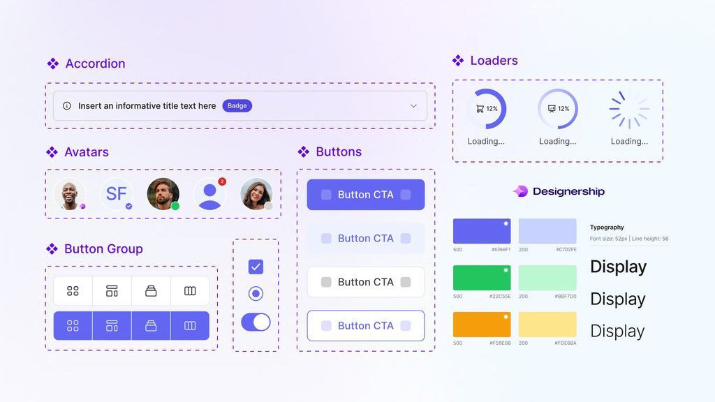
A design system is the shared framework that defines how a digital product looks, behaves, and gets built. It connects design principles, visual foundations, design tokens, reusable components, interaction patterns, documentation, and the processes that keep all of those pieces up to date.
For a growing company, this is not simply about making the interface look more polished. A good design system can reduce repetitive work, help designers and developers move faster, make products feel more consistent, and give new team members a much clearer starting point.
But not every company needs one yet.
This guide explains what a design system actually includes, the difference between a design system vs style guide, how it differs from a component library, when it makes sense to build one, and what founders should expect it to achieve.
Table of Contents
What is a design system?
In simple terms, a design system is a shared collection of standards, reusable assets, and rules that helps teams design and build consistent digital products.
A working system usually contains several layers.
Foundations define the visual language of the product, including colour, typography, spacing, grids, iconography, motion, and sometimes tone of voice.
Design tokens turn those design decisions into reusable values. Instead of repeatedly specifying the same colour, font size, border radius, or spacing value, teams define it once and reference it throughout the product.
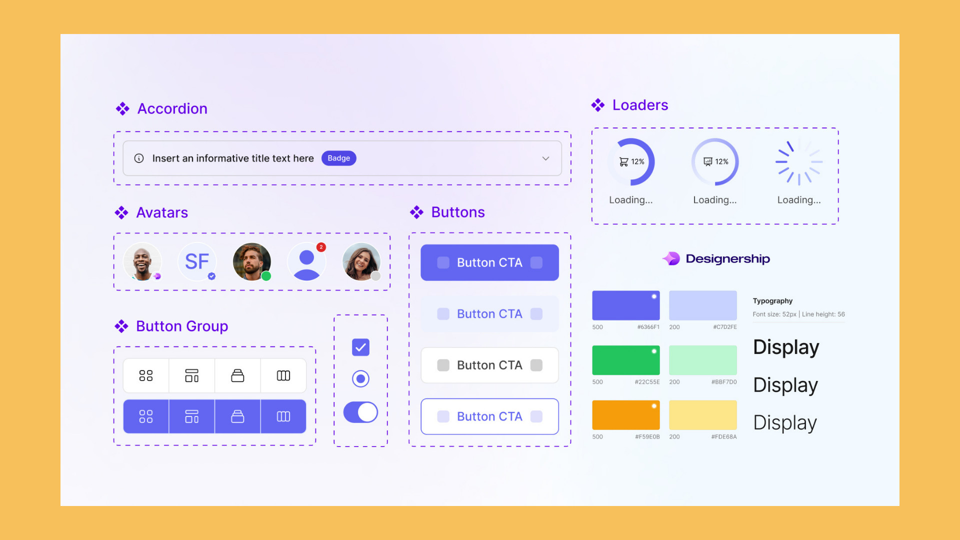
Components are reusable interface elements such as buttons, form fields, navigation bars, cards, tabs, alerts, and modals.
Patterns combine those components to solve recurring product problems. A login flow, checkout experience, search interface, or account settings page may all rely on established patterns.
Documentation explains how and when each part of the system should be used. Good documentation also explains when something should not be used.
Finally, there is governance: who owns the system, how changes are proposed, who approves new components, and how design and engineering keep everything aligned.
Leave one of those areas out and you may still have a useful toolkit. But it is not quite a complete system.
The difference becomes more important as the company grows. One designer can remember why a particular button behaves a certain way. Ten designers and several engineering teams cannot rely on everyone carrying that knowledge in their heads.
Design system vs style guide vs component library
The terms design system, style guide, and component library are often used interchangeably, but they solve different problems.
A style guide defines the visual rules
A style guide is usually a reference for how the brand should look.
It might contain your logo, brand colours, typefaces, typography hierarchy, illustration style, icon rules, and tone of voice.
That information is useful, but it does not necessarily explain how an interface should behave.
A style guide can tell you what your primary colour is. It will not necessarily tell a developer what happens to an input field when validation fails, how a button behaves while an action is loading, or how navigation changes on mobile.
Raw Studio’s guide to typography hierarchy and UI usability is a good example of why these foundational decisions matter. Typography may look like a visual concern at first, but hierarchy directly affects how easily people can scan and understand an interface.
A component library gives you reusable parts
A component library is the collection of interface elements the team can reuse.
Think buttons, dropdowns, cards, checkboxes, alerts, tabs, form fields, tables, navigation elements, and modals.
The library may live in Figma, in code, or ideally in both.
This saves teams from rebuilding the same interface elements every time they create a new screen. But a library alone does not necessarily explain which component should be used in a particular situation or how new variations should be introduced.
It gives you the parts, but not always the rules.
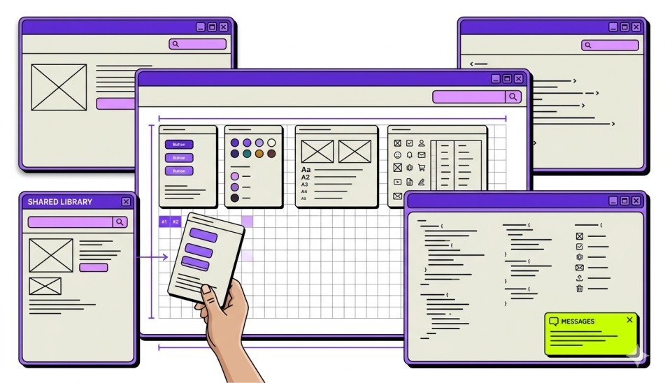
A design system connects everything
A design system includes the visual foundations and reusable components, but it also provides patterns, documentation, principles, ownership, and governance.
A simple analogy is Lego.
A component library gives you the bricks. A style guide tells you what colours and shapes the bricks should have. A design system adds the instructions, building principles, and a process for deciding when a new brick needs to be created.
That distinction matters when companies ask for a “style guide” even though the problem they are actually trying to solve is product inconsistency.
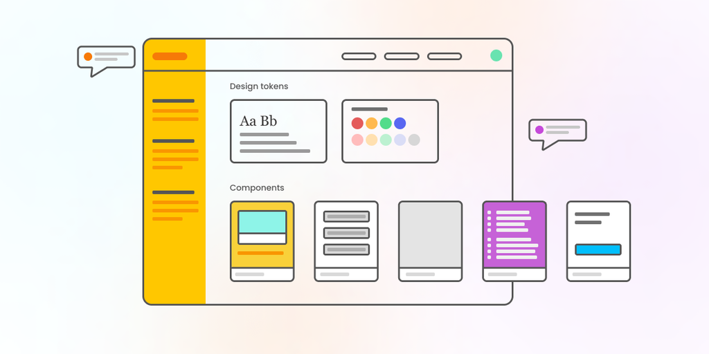
Why design systems matter commercially
Design systems are often discussed as if they only benefit designers.
They do not.
For growing companies, the biggest benefits usually appear in speed, consistency, maintenance, and collaboration.
Teams stop rebuilding the same things
Without a shared system, a designer working on one feature might create a new dropdown because they cannot find the existing one.
A developer on another squad may then build a slightly different version.
Repeat that across dozens of features and you eventually have several versions of what should have been the same component.
Every variation has to be designed, coded, tested, maintained, and fixed separately.
A good design system reduces that duplication.
Shipping gets faster
When common components and patterns already exist, teams spend less time solving familiar interface problems.
Designers can focus on the part of the feature that is actually new. Developers can start from tested components instead of rebuilding basic UI every sprint.
This is particularly important in SaaS products, where the interface often expands quickly as new features are added. Raw Studio’s article on enhancing SaaS products with UX/UI discusses how consistency across platforms and devices contributes to a smoother user experience.
The product feels more consistent
Users learn how an interface works through repetition.
If a primary button looks and behaves one way on the dashboard and completely differently in account settings, people have to stop and interpret the interface again.
Small inconsistencies may seem harmless individually. Across a large product, they create friction.
A design system gives teams a shared language for avoiding that drift.
Accessibility is easier to build in from the beginning
Accessibility becomes much harder when it is treated as something to check at the end of every project.
A design system gives teams an opportunity to solve common accessibility requirements once and carry those decisions across the product.
If your base form fields, buttons, colour combinations, typography, focus states, and other shared components are designed properly, every feature using those components starts from a stronger position.
Raw Studio goes into this in more detail in The Correct Way to Embed Accessibility in Your Design Process, including how accessibility can be addressed at the design-system level rather than repeatedly patched into individual screens.
New team members have something to work from
When there is no documented system, new designers and developers spend a lot of time reverse-engineering how the product works.
They search old files, inspect existing screens, ask colleagues why certain components behave differently, and learn the rules through trial and error.
Good documentation shortens that process.
The system becomes a shared source of knowledge instead of relying entirely on people who happen to have been around longer.
What does a working design system look like?
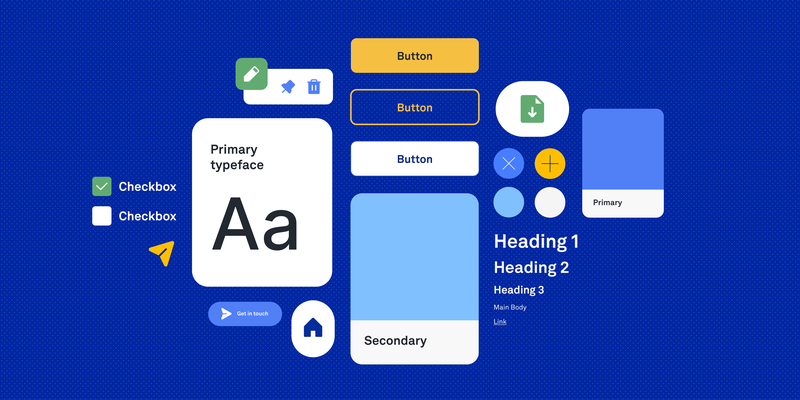
Looking at well-known design system examples can make the concept seem much bigger than it needs to be.
Google has Material Design. Microsoft has Fluent. Atlassian, Shopify, IBM, GitHub, and many other large product companies maintain extensive systems.
But those companies also have enormous products and teams.
Your system does not need hundreds of components to be useful.
A practical system might begin with:
- Colour and typography tokens
- Spacing and layout rules
- Buttons and links
- Form controls
- Alerts and notifications
- Cards and containers
- Navigation components
- Tables
- Modal behaviour
- Common interaction states
- Accessibility guidance
- Usage documentation
The important part is not how large the library is. It is whether the team actually trusts and uses it.
Design tokens are the foundation
Design tokens are one of the less visible parts of a design system, but they are also one of the most useful.
A token represents a reusable design decision.
Instead of hard-coding a particular blue every time the brand colour appears, you might use a token such as:
color-brand-primary
The same idea can be applied to spacing, typography, border radii, shadows, animation speeds, and other design values.
Why does that matter?
Imagine your company updates its primary brand colour.
If the old colour has been manually entered in hundreds of places, updating it becomes a large clean-up job.
If the interface references the same shared token, the change can be managed centrally.
Tokens also help designers and developers use the same language. Rather than one side talking about a colour in Figma while the other talks about a hex value in CSS, both sides can refer to the same semantic value.
That becomes especially valuable when a product spans web, mobile, and multiple teams.
Components need more than a default state
A screenshot of a button is not a complete button component.
What happens when it is disabled?
What happens while something is loading?
What does its hover state look like?
How does keyboard focus appear?
How does it behave when there is an error?
Strong components account for the states that occur in real products, not just the version that looks good in a design file.
This is also why accessibility belongs in the system itself. If each team invents its own focus states, contrast rules, and error behaviour, accessibility becomes inconsistent by default.
Patterns are where the system becomes genuinely useful
Components solve individual interface problems. Patterns solve recurring user problems.
That distinction is important.
A form field is a component.
The way your product validates an entire form, explains errors, preserves entered information, and confirms successful submission is a pattern.
A button is a component.
The structure of a multi-step onboarding flow is a pattern.
Teams often spend a lot of time building components and not enough time documenting these larger interaction patterns. Yet patterns are where much of the actual product thinking lives.
They help teams avoid repeatedly redesigning solutions to problems the company has already solved.
Documentation should explain why
Documentation that only shows what a component looks like is not enough.
People also need to understand why the component exists and when to use it.
If two button types look similar, explain what distinguishes them.
If a modal should only be used for particular interactions, say so.
If a new variation should be avoided because another component already solves the problem, document that too.
Good documentation reduces interpretation.
It should help someone who was not involved in creating the system make the same decision the original team would have made.
When should a startup build a design system?
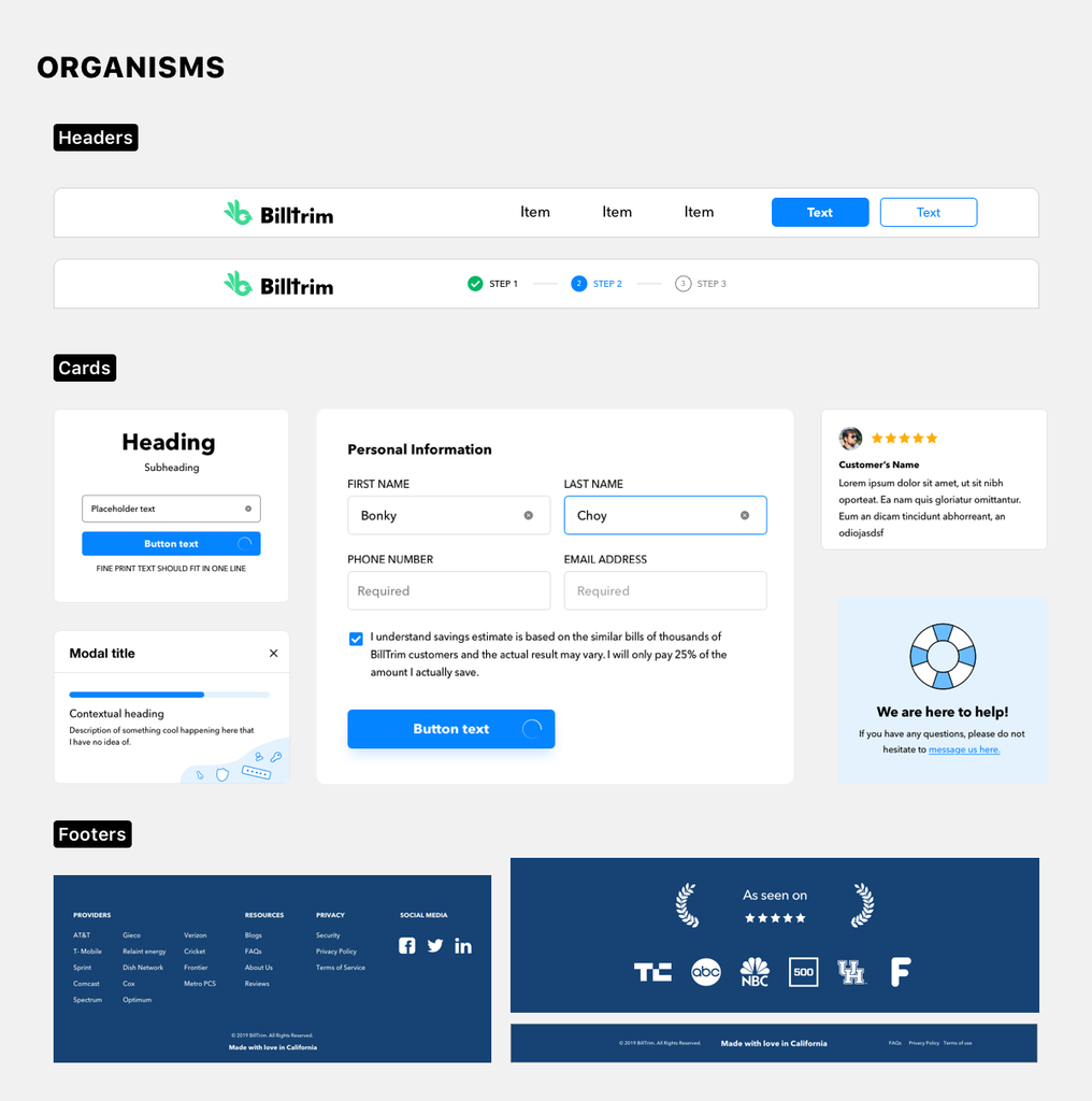
A design system for startups should usually start smaller than founders expect.
Building a complete design system before the product has stabilised can create more work than it saves.
If you are still testing product-market fit and the interface could change dramatically in three months, spending weeks designing a highly structured component architecture may be premature.
You may be better served by a lightweight foundation: basic colours, typography, spacing, and a small set of reusable components.
A more formal design system starts making sense when:
- Multiple designers are working on the product.
- Several engineering teams are shipping UI at the same time.
- The same components keep being recreated.
- Visible inconsistencies are appearing across the product.
- You are expanding from web to mobile or another platform.
- New designers and developers struggle to understand existing patterns.
- Design and development frequently disagree about what the “correct” component is.
- UI-related technical debt is becoming expensive to maintain.
At that point, the cost of not having a system often becomes greater than the cost of building one.
Raw Studio’s look at the state of UX in 2026 explores a related shift: interface production is getting easier, which means the real value increasingly lies in thoughtful systems, strategic decisions, and understanding why the product works the way it does.
When are you not ready for one?
There are also situations where building a large design system is unnecessary.
If you have one designer and a small development team working closely together, everyone may already understand the product’s visual and interaction rules.
If your product is still changing constantly, creating rigid standards around today’s UI could slow down tomorrow’s pivot.
This is one of the biggest mistakes with a design system for startups: building the system you imagine needing in three years rather than the one your team needs today.
Start with the areas where inconsistency is already costing you time.
Then grow the system alongside the product.
Should you build from scratch or adopt an existing system?
You do not necessarily need to design every primitive from zero.
Existing systems and component frameworks can give teams tested foundations for common interface elements. Material Design is one obvious example. Libraries built around accessible primitives can also remove a significant amount of groundwork.
For many growing products, the sensible approach is to adopt a solid foundation and customise it with your own design tokens, branding, components, and product-specific patterns.
A fully custom system makes more sense when the way your product behaves is genuinely unusual, when existing frameworks fight against your requirements, or when visual differentiation is strategically important.
Otherwise, building every checkbox and dropdown from scratch can consume budget without creating much competitive advantage.
Design and engineering need the same system
A design system that only exists in Figma is incomplete.
If designers update a component but the coded version never changes, the two systems immediately begin to drift.
The reverse is also true. Developers may improve a component in production without that change making its way back into the design library.
A mature setup treats the design and coded versions as two representations of the same system.
That might mean shared token names, linked documentation, versioned component releases, or simply a disciplined process where a designer and developer review changes together.
The exact process matters less than maintaining alignment.
Raw Studio’s article on the developer-first approach looks at this relationship in more detail, including component-based design systems and treating parts of the design system as code.
The goal is to move away from a handoff mentality where design “finishes” something and throws it over to development.
A design system works best when both disciplines own it.
How do you measure the ROI of a design system?
There is rarely one number that proves whether a design system is working.
Instead, look for changes in the way your team works.
Useful signals include:
- Time from design handoff to shipped feature
- Percentage of reused components versus newly created ones
- Number of duplicate components
- UI-related bugs
- Accessibility issues
- Time spent onboarding new designers and developers
- Time required to make system-wide UI changes
- Frequency of design-development inconsistencies
You should also pay attention to behaviour.
Are teams actually using the system?
Are designers finding what they need instead of creating new components?
Are developers reusing existing code?
Are people contributing improvements?
A beautifully documented design system that everyone works around has very little value.
Common reasons design systems fail
Most design systems do not fail because the buttons were badly designed.
They fail because the system itself was poorly managed.
Nobody owns it
When ownership is unclear, updates become somebody else’s problem.
Over time, the design files, documentation, and code drift apart.
The system needs an owner, even if maintaining it is only part of that person’s role.
It becomes too rigid
A design system should create consistency, not prevent new ideas.
If every new product problem turns into an argument about whether the system “allows” it, teams will eventually stop using the system.
The system should make common decisions easy while still leaving room for genuinely new problems.
The team builds too much too soon
You do not need to predict every possible component the company might ever need.
Build what already appears repeatedly. Add to it as the product creates new requirements.
It stops evolving
The product will change.
The users will change.
Technology will change.
Your design system has to change with them.
Treat it as a product that needs maintenance rather than a project that gets completed.
A design system should make the product easier to build
That is ultimately the test.
A successful design system should make everyday decisions easier for designers and developers. It should reduce unnecessary variation without forcing every interaction into the same template.
It should help new people understand the product faster and help existing teams spend less time recreating work that has already been solved.
It should also be appropriate for the stage of the company.
Sometimes that means a mature system with tokens, hundreds of coded components, extensive documentation, and formal governance.
Sometimes it means a shared Figma library, a dozen carefully built components, and a one-page set of rules everyone follows.
Both can be valid.
The goal is not to have the most impressive design system.
The goal is to have enough system to support the product you are actually building.
Where Raw Studio fits in
At Raw Studio, we build and extend design systems as part of our product, UI design, and development work because the value does not come from creating another polished Figma file.
It comes from giving the people building the product a shared foundation they can continue using after the engagement ends.
That might mean defining design tokens, cleaning up an inconsistent component library, documenting reusable patterns, aligning design with coded components, or deciding that your team does not need a full system yet.
The right answer depends on where your product and team are today.
If your interface is becoming inconsistent, different teams are rebuilding the same components, or you are preparing to scale the product and want stronger foundations in place first, get a free audit and proposal from Raw Studio.
We will help you work out what is worth systemising now, what can wait, and what will make the biggest difference to the way your team designs and ships.
Get a UX & CRO Expert’s Eyes on Your Website. Book a free 30-minute UX Teardown and get actionable insights on what’s costing you conversions — no fluff, just fixes you can implement right away.
Book a Free UX Audit

Related posts
How Revolut Uses 4 Onboarding UX Tactics to Activate New Users Faster
Fintech onboarding must feel secure without feeling slow. A banking app cannot remove identity checks, legal consent, or account protections […]
How IKEA Uses 4 UX Strategies to Simplify Complex Buying Decisions
IKEA UX is one of the strongest examples of how thoughtful design can make a complex buying journey feel simple, […]
10 Best Indexing Tools in 2026 for SEO, UX, and Better Website Visibility
Right indexing tool helps ensure your pages can be discovered in the first place. In 2026, that distinction matters. Businesses […]
Creative product design that gets results
Take your company to the next level with world class user experience and interface design.
get a free strategy session
