
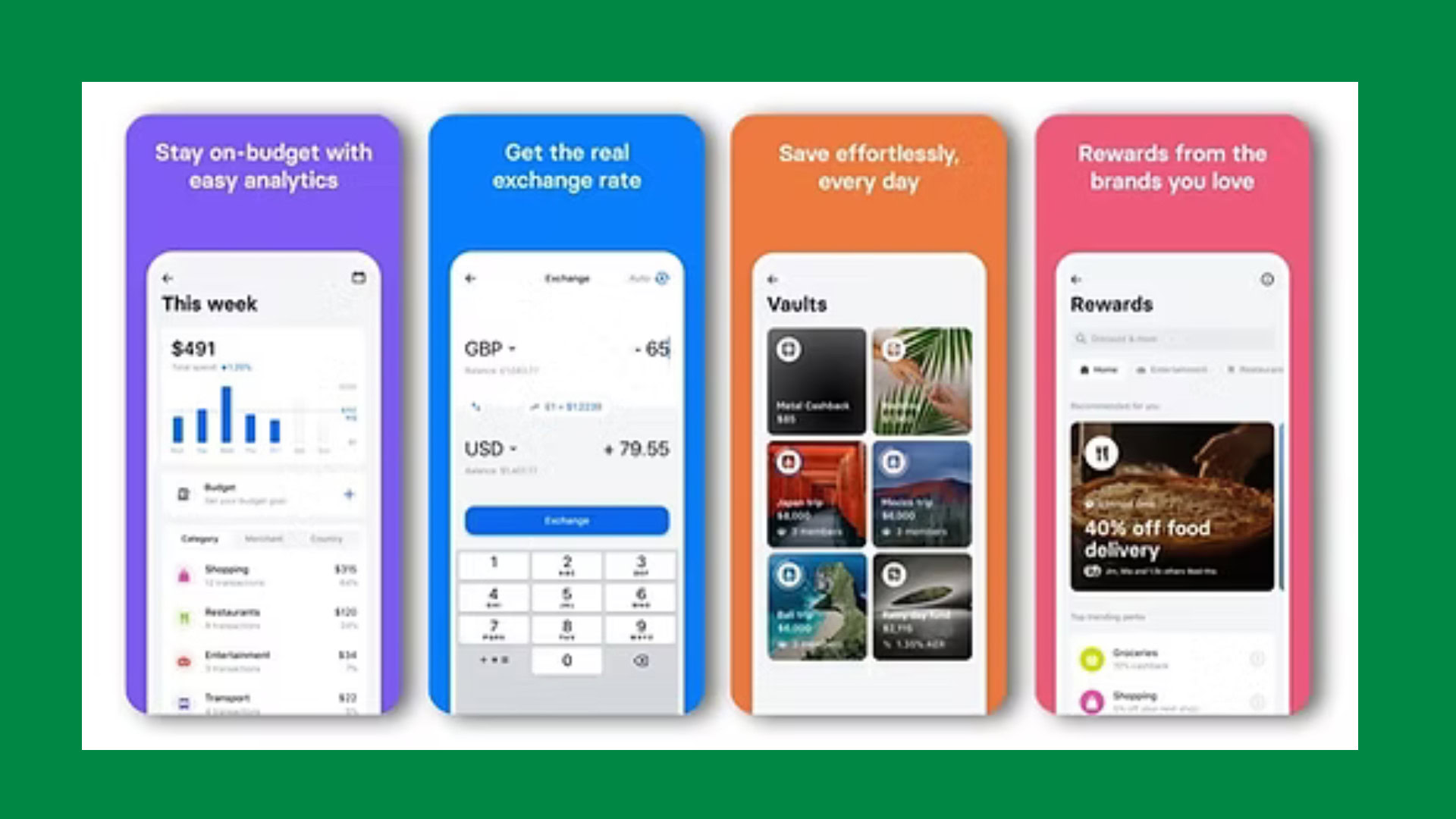
How Revolut Uses 4 Onboarding UX Tactics to Activate New Users Faster

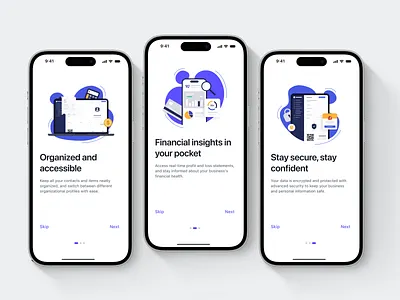
Fintech onboarding must feel secure without feeling slow. A banking app cannot remove identity checks, legal consent, or account protections simply to create a faster journey. Yet every extra field, document request, and permission gives a new user another reason to hesitate or leave.
This is where Revolut UX offers a useful lesson. Rather than presenting account creation as one long administrative form, Revolut turns onboarding into a guided sequence combining compliance, feedback, and early product value. The exact flow varies by country, but the broader design principles remain consistent.
This article examines four Revolut UX tactics that help activate new users faster: step-by-step onboarding, progress indicators, smart form inputs, and early feature previews. It also explains why they work and how other digital product teams can apply them.
Table of Contents
The Fintech Onboarding Problem: Necessary Friction
Opening a financial account requires more information than joining a typical consumer app. Users may need to confirm contact details, create a passcode, share personal information, scan an identity document, complete a facial check, answer tax questions, and approve legal declarations.
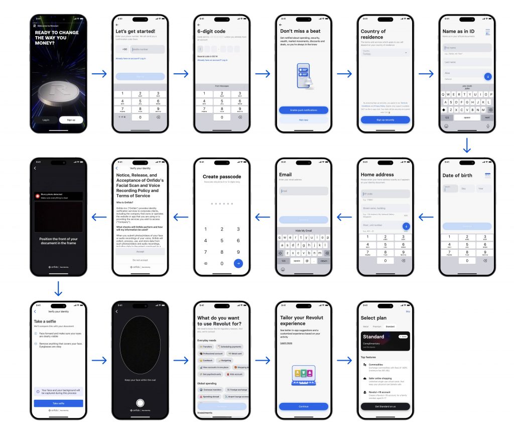
Revolut’s published onboarding process for Hungary describes a guided journey that can include contact verification, a six-digit passcode, document scanning, NFC reading, facial verification, legal declarations, internal review, and digital contract signing. These steps may be necessary, but presented badly, they can feel like an interrogation.
The UX challenge is not to eliminate every step. It is to help users understand what is required, why it matters, and how close they are to reaching value.
1. Step-by-Step Onboarding Reduces Cognitive Load
The first strength of Revolut UX is its use of focused, sequential screens. Instead of displaying a large form, the interface generally asks for one clear action at a time: enter a phone number, confirm a code, choose a country, provide a legal name, or scan a document.
This makes a complex process feel manageable. Each screen has a clear purpose and limited competition for attention. Users only need to understand and complete the next small task.
This principle also appears in RAW.Studio’s fintech work. In the Maqro fintech UX case study, onboarding was designed to identify customer goals and investment strategies so the following experience could be personalised. Onboarding should not be generic data collection. It should gather information that improves the product experience.
2. Progress Indicators Replace Uncertainty With Momentum
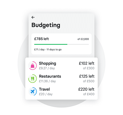
Users are more patient when they know the system is working. Revolut uses status messages, timers, confirmation screens, and processing feedback during actions such as code verification or identity checks.
These elements answer important questions: Was my action received? Is the app still processing? Did I complete this correctly? What happens next?
RAW.Studio’s article on microinteractions in modern design explains that progress bars and spinners provide immediate feedback, reassure users, and prevent frustration. In a fintech flow, that reassurance matters because the user is sharing sensitive information.
Specific feedback is stronger than generic animation. “Checking image quality” tells users exactly what the system is doing.
3. Smart Form Inputs Make Correct Completion Easier
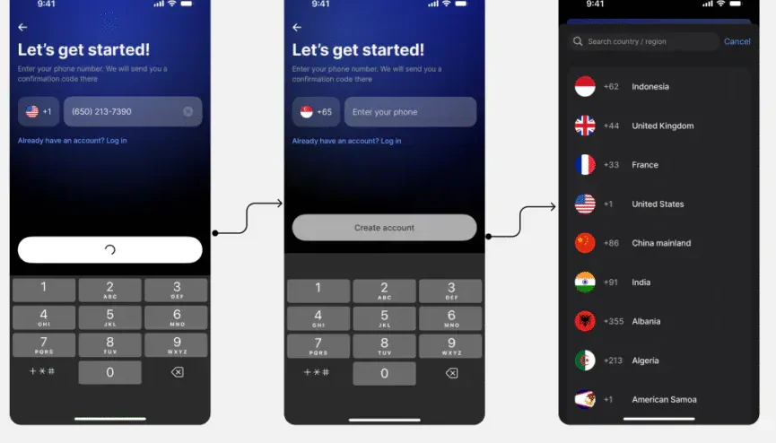
Revolut UX also reduces friction through inputs that match the task. A phone number field can include a searchable country code selector. Verification codes can use SMS autofill. Legal-name fields can include examples. Document capture can flag blurry images and allow an immediate retake.
A detailed review of Revolut’s onboarding identified inline number confirmation, automatic code support, direct error messages, contextual permission requests, and real-time document feedback. These decisions prevent avoidable errors from becoming abandonment points.
This aligns with RAW.Studio’s article on form conversion mistakes, which argues that users often abandon forms because the experience makes them work harder than necessary. Smart inputs reduce that work by clarifying requirements and helping users recover quickly.
4. Early Feature Previews Show Value Before the Work Is Finished
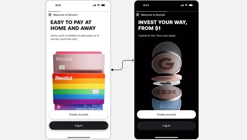
Many onboarding flows ask for information first and explain the product later. Revolut often introduces benefits, cards, payments, notifications, savings, or other capabilities around the signup journey.
This changes the emotional framing. The user is not merely completing KYC. They are moving toward a product they can imagine using. Feature previews create motivation and give meaning to the remaining steps.
Revolut now presents a broad experience spanning spending, transfers, savings, virtual cards, budgeting, and investing to more than 75 million customers worldwide. Early previews help users understand that wider value before the account is fully activated.
Why These Revolut UX Tactics Work
Together, these four tactics create clarity. Users know what is being requested, receive feedback after acting, understand how to correct mistakes, and see the benefit waiting beyond setup.
That clarity reduces perceived effort. The journey may still contain many regulatory steps, but it no longer feels like one enormous task. Each completed screen creates momentum, while contextual explanations build trust.
The tactics also reduce uncertainty at the moments when users are most likely to pause. Clear instructions reduce the fear of making a mistake. Immediate feedback confirms that the system is responding. Early product previews remind users why completing the process is worthwhile.
This creates a stronger path between signup and activation. A registered user is not necessarily an activated user. Activation happens when the person reaches an important first outcome, such as adding money, creating a virtual card, making a transfer, or setting up a savings feature. Effective onboarding should help users reach that moment as quickly and confidently as possible.
Three Ways to Apply These Lessons
Break Onboarding Into Small, Meaningful Steps
Group fields by purpose and present them in a logical sequence. Each screen should ask for one decision or one closely related set of details. Remove anything that is not required for activation and collect secondary information later.
However, avoid breaking the process into so many screens that the journey feels artificially long. The goal is not to create more steps. It is to reduce the amount of information users must process at one time.
Explain Sensitive Requests When They Appear
Do not assume users understand why you need identity documents, camera access, tax information, location data, or notifications. Add short, plain-language explanations beside the request.
For example, instead of simply asking for camera access, explain that the camera is required to scan an identity document securely. Instead of requesting notifications without context, explain that alerts can help users monitor payments and detect unexpected activity.
Context builds more trust than a long privacy statement hidden elsewhere.
Show Value Before Asking for Too Much
Preview the dashboard, demonstrate a core feature, personalise the journey, or explain the outcome users are working toward. A user is more likely to complete a demanding process when the benefit feels specific and immediate.
Product teams should then test the flow with funnel analytics, heatmaps, form data, and session recordings. RAW.Studio’s guide to CRO tools for UX and UI explains how these tools can reveal hesitation and support evidence-based improvements rather than subjective design decisions.
Measure where users leave, how long individual steps take, which errors occur most often, and how many completed signups reach the first meaningful product action. Improving onboarding completion is useful, but improving activation is the more important business outcome.
Conclusion
The key lesson from Revolut UX is that secure onboarding does not have to feel bureaucratic. Compliance creates necessary friction, but thoughtful design determines whether that friction feels confusing or manageable.
By dividing the journey into small steps, making progress visible, designing smarter inputs, and previewing value early, product teams can help more users reach activation with confidence.
The best onboarding experience does not hide what is required. It makes every requirement understandable, gives users useful feedback, and continually reinforces the value of continuing.
If your onboarding flow is losing users before they experience the product, request a free strategy session and proposal from RAW.Studio. The team can help identify friction, improve UX clarity, and turn account setup into a stronger conversion journey.
Get a UX & CRO Expert’s Eyes on Your Website. Book a free 30-minute UX Teardown and get actionable insights on what’s costing you conversions — no fluff, just fixes you can implement right away.
Book a Free UX Audit

Related posts
How Netflix Uses 4 Personalization Tactics to Increase Retention Revenue by $1B and Conversion Rate by 15%
Most companies focus on getting new users. They spend heavily on ads, partnerships, and promotions to boost sign-ups. Netflix, however, […]
How YouTube Uses 4 UX Loops to Maximize Watch Time and Conversions
YouTube UX has become one of the most influential examples of modern digital product design because it transforms ordinary user […]

How to Choose a UX Design Agency: A 2026 Buyer’s ChecklistHow to Choose a UX Design Agency: A 2026 Buyer’s Checklist
You have a product that needs to convert better, a redesign that is overdue, or a launch that cannot afford […]
Creative product design that gets results
Take your company to the next level with world class user experience and interface design.
get a free strategy session
