Case Study: The Evolution of Google Maps & Colour Picking Methodology
Since Google Maps launched 15 years ago, they have revolutionised the world of digital maps and now help over one billion users get from A to B – and so much more!
It’s almost impossible to think of a time before we could enter an address into our smartphones and just go. Since its release in 2005, Google Maps have evolved and adapted to the wants and needs of our fast-paced and ever changing society.

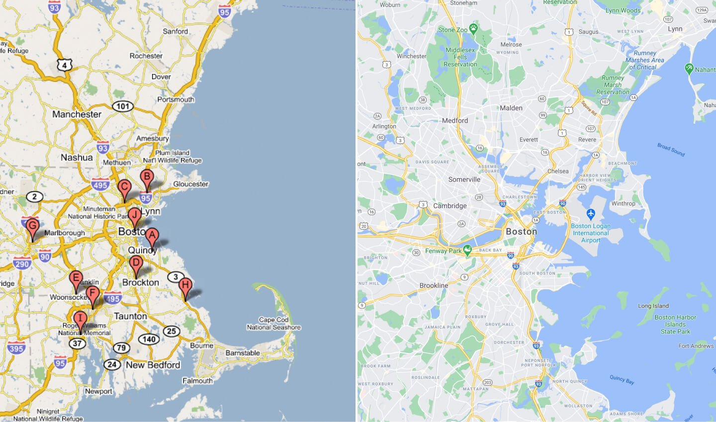
One of the continually iterated aspects of the product has been Google Maps’ colour system. When we look at the current interface, we can see that colours are kept to a minimum, with slight changes in gradients providing a minimal yet effective sense of depth. But it wasn’t always this way. Last year, Google undertook a 1 year expedition to complete the incredible feat of gradually refining their colour palette from 700+ colours down to 25 major and minor tones whilst increasing usability. In this article we’ll delve into the transition to this innovative palette.
Table of Contents
How it Started
In Google’s blog post, Alex Vallis mentions how the initial colour configuration assigned a specific colour to every detail (e.g. a particular colour for shrubs and another for a deep forest.) This in turn created such minute differences in colours that it was almost impossible to distinguish important elements like roads, text, and borders.
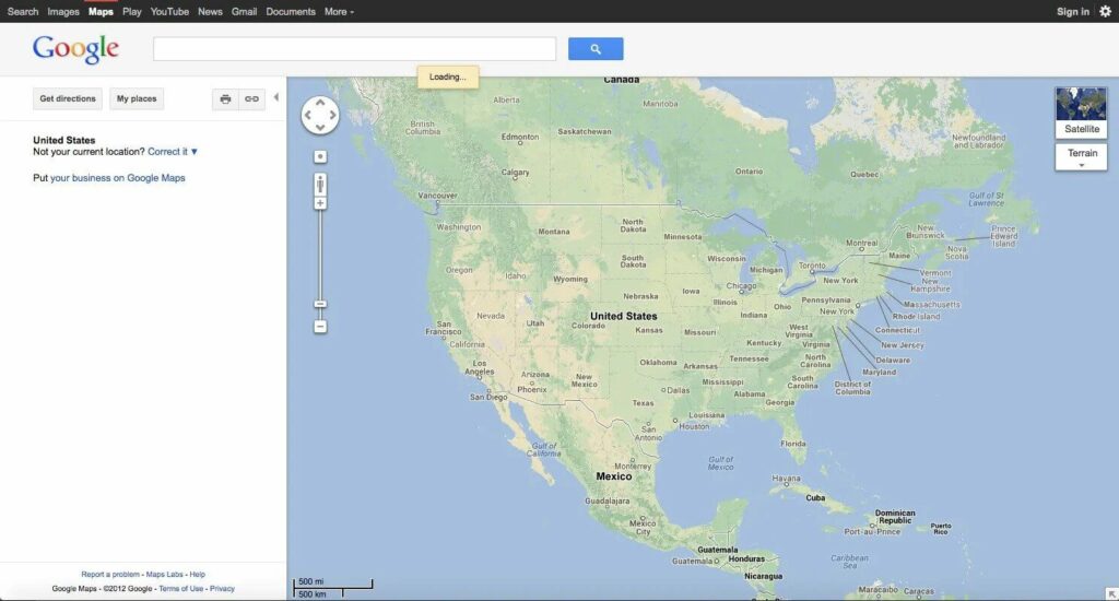
David Cronin (UX Director) said he remembered his “jaw dropping because there were so many colours.” According to Dana Steffe (Visual Designer), they began venturing into their hypothesis on whether the colour palette could be reduced into a smaller number of swatches that aligned more to Material Design, whist maintaining the smallest of details.
Reassessing the current design
The team at Google Maps began by experimenting with distinguishing map details, improving accessibility and reducing the range of colours. They questioned underlying assumptions and asked why these colours were the way they were.
Below is one of many examples. The Sahara Desert features a varied topography, shaped over time by the wind. Geographical features include sand dunes, sand seas (ergs), barren stone plateaus, gravel plains, dry valleys, and salt flats. However, this variation was not reflected in Google Maps’ previous design, with majority of the region represented by a common light beige tone.
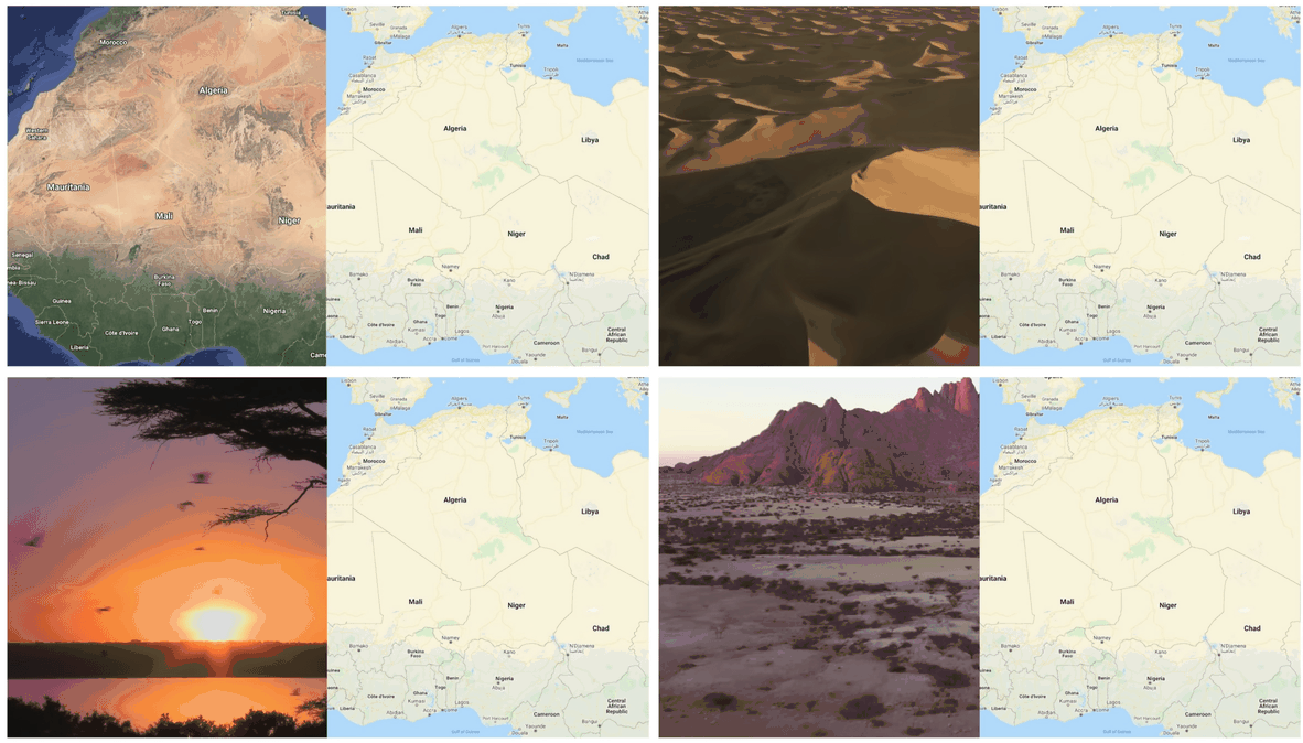
It was evident that the implementation of colours weren’t depicting the true nature of landscapes across the globe. It was decided that this project, if undertaken, would be able to uncover the inconsistencies and unnecessary aspects of the current legacy system in order to create a structure that was far more reflective of the Earth’s details.
Emotion behind colour
While different colours can evoke different emotions in each individual, depending on geographical and cultural context, they can also assist in drawing an emotional connection to a particular landmark or earthly feature.
A resident of the Amalfi Coast could immediately associate a body of water with a clear and blissful baby blue or turquoise, whilst an Amsterdam local would think fondly of their brown-toned canals that would mirror the vibrant surrounding architecture when still. To fully understand the importance of emotional connection to an earthly feature, the design team at Google shared personal memorabilia of bodies of water they had witnessed across the globe.
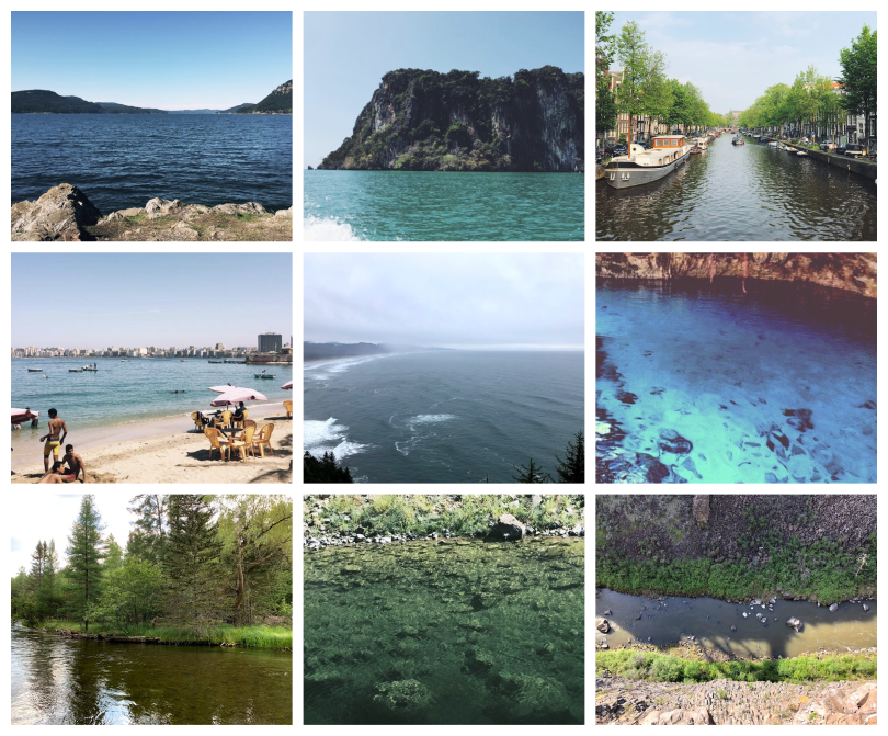
The most intimidating part of this is the weight to accurately represent people’s worlds. How do you do that well, and how do you do it globally? If you’re choosing colours for desert, or forests, we all know that these regions don’t look the same everywhere.
Dana Steffe, Staff Visual Designer
The product was being designed for users across the globe, so it was important to consider a multitude of perspectives when considering colour. They wanted to reflect back to users and the world that they live in by capturing that worldly vibrancy in a way that feels meaningful.
Experimenting and refining colour
The team started off with baby steps by making small iterations at a time which instilled them with the confidence to proceed into a larger scale piece.
What made this collaboration really magical was our conversations around what types of questions we were trying to answer and when: What are we trying to help users learn about the world? How do we entice them to explore the Map a little bit more? That’s how we started to refine the hierarchy to communicate that there’s more to find out.
Sarah Needham, Senior Interaction Designer
This refinement didn’t come straight away. There were hundreds of sketches and iterations over colours and hierarchy, as you will see below in the explorations for water.
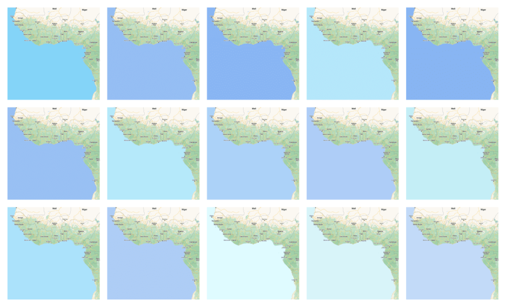
So how does it all work? Google Maps has high-definition satellite imagery for over 98 percent of the world’s population. Google’s new “colour-mapping algorithmic technique” is able to take this satellite imagery and translate it into comprehensive and easily distinguishable map elements – from busy roads to lush green forests to varying types of blue for lakes, oceans and ravines.
To accomplish this, Google analysed advanced satellite imagery and assigned more detailed colours from their HSV colour model to different types of areas. Matt Simpson (Staff UX Designer) stated that “We were able to do more with less.”
The Result
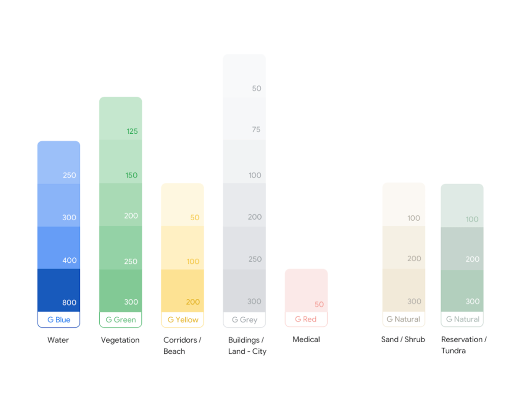
The team at Google managed to limit their colour palette down to 25 major and minor tones, drastically reducing complexity and aligning closer with Material Design.
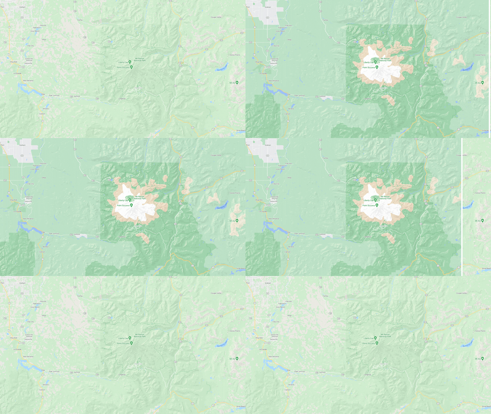
Once the changes were implemented in the next update, users were able to fully understand what they were seeing and comprehend the contrast between elements. You will be able to see below a before and after of Mt. Rainier National Park. Now the snowy peaks are evidently visible and effectively detailed, reflecting the true nature of that particular landscape.
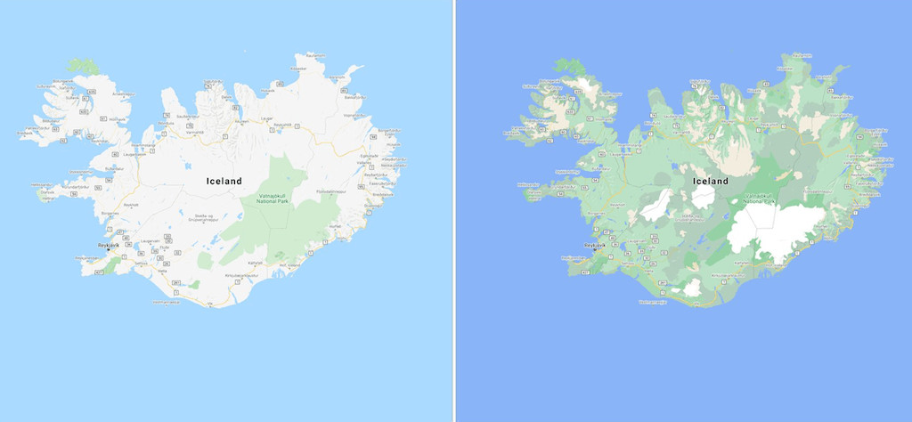
Below is another brilliant example- a before and after of Iceland. Sujoy Banerjee (Product Designer) added that “Iceland’s rich landscape is now much easier to visualise. You can see the varying densities of greenery throughout the country and more easily spot Vatnajökull – the largest ice cap in Iceland, which is now depicted in white.”
Google have managed to:
- Effectively experiment and test in a collaborative manner different colour concepts in order to find the best options for the redesign.
- Reduce a complex colour palette to something far more minimal yet simultaneously more detailed and accurate.
- Create a more accessible and usable product that kept billions of users in mind.
This calculated and validated minimalism has unlocked the potential to create a more accurate representation of the world. Stripping it down to basics has truly benefited the team by creating a clean, accessible and informative product that also acts as an opportunistic canvas to build upon for the future.
Take your company to the next level and get results with our world class user experience, interface design and implementation.
Get a FREE 30 min Strategy Session
Related posts
Why Pinterest’s Personalization Strategy Could Revolutionize Digital Discovery
Have you ever opened Pinterest and felt like the platform knows exactly what you want—before you even realize it yourself? […]
The Rise of No-Code in EdTech: How Educators Are Building Interactive Learning Experiences
The Rise of No-Code in EdTech: How Educators Are Building Interactive Learning Experiences Imagine you’re a teacher with a vision: […]
Conversational UX: From Chatbots to UX Design
Let’s be real, we’ve all chatted with a bot at some point. Whether it was ordering pizza, asking a quick […]
Creative product design that gets results
Take your company to the next level with world class user experience and interface design.
get a free strategy session


