Spotify’s Embodiment of Emotional Design
On average, each smartphone user has 80+ apps on their phone, but only really launch around 9 apps per day. Curiously, I checked my own phone – which somehow holds 148 apps, with only 10 being used only a daily basis.
One particular app that myself and many others use to cater to our music-streaming and podcast-binging needs is Spotify. In fact, Statistic states that as of the first quarter of 2022, Spotify had 182 million premium subscribers worldwide, up from 158 million in the corresponding quarter of 2021. Spotify’s subscriber base has increased dramatically in the last few years and has more than doubled since early 2017.
Something that stands out in particular about Spotify’s overall experience is its focus on personalisation, which can be drawn from a practice called Emotional Design. Spotify utilises positive emotional triggers throughout their product to delight users, like their custom mixes based on a user’s recently listened-to tracks.
Personalisation results in an emotional user experience, which is key to driving app engagement. One of the main reasons why most app users churn within just 90 days is due to disengagement. So it is clear to see how important it is to provide fresh, personalised, regular content to customers.
In this article, we will discuss how emotional design plays a key factor in Spotify’s iconic, personalised experience, and what we can learn from it.
Table of Contents
💭 So, what is emotional design?
Don Norman, often credited as the father of UX, coined the term ‘Emotional Design’ in his book, Emotional Design: Why We Love (or Hate) Everyday Things in 2003. At almost twenty years later, the concepts still remain relevant. Norman believes that good emotional design works on three levels: visceral, behavioural and reflective. We will delve into these later.
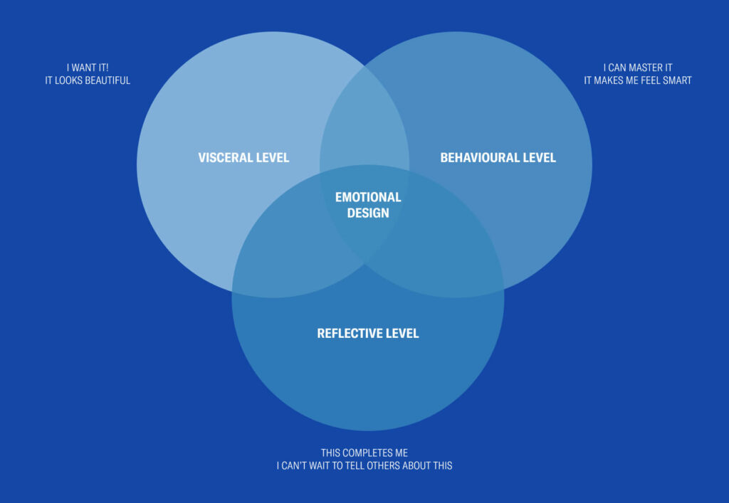
In the words of Don himself,
“Everything has a personality: everything sends an emotional signal. Even where this was not the intention of the designer, the people who view the website infer personalities and experience emotions.”
Don Norman
So, to make sure that your app is one of those daily and uber-important 9, it is imperative to stay valuable and personable, while developing an emotional connection with your users.
🤝 Data x emotional design at Spotify
But how do these companies make things so personalised? How do they know that I might want to cook that recipe? How do they know that I have been craving a trip to Europe? It is all drawn from data.
Customer data has become something of a currency, with many users consenting to this unknowingly or without concern, whilst others are a little more sceptical. But generally, people are much more likely to share their data if there is a clear exchange of some sort of value. For example, Spotify can see what artists and music I listen to and how often I listen to them, and in return, I get some amazing tailored playlists out of it and a very beautifully curated Spotify Wrapped at the end of the year.
In regards to Spotify’s practice of processing raw data Sabrina, one of Spotify’s Product Designers, said the following,
“Spotify operates at a massive scale: We have millions of listeners whose activities generate huge amounts of raw data. Raw data by itself is not that helpful though; we need to be able to process, manage, and distill it into insights that can inform new features or improvements to the experience. And to do that, we need usable, well-designed tools that ensure these insights can be easily understood.”
Sabrina Siu, Product Designer at Spotify
You can read an excellent article about how Spotify designs data science tools here.
Let’s get into those three pillars of emotional design and see how Spotify utilises customer data to create a delightful and tailored experiences for their users.
👀 Visceral Design
Visceral design concerns itself with appearance – it is the user’s initial reaction or first impression to a design. This practise reflects the Aesthetic Usability Effect well, one of the 7 Laws of UX, which states:
“Users often perceive aesthetically pleasing design as design that’s more usable. An aesthetically pleasing design creates a positive response in people’s brains and leads them to believe the design actually works better.”

This design approach stems from iterations of design principles over the years. According to Spotify, the designers found it hard to focus on so many principles, and found that as the product grew, some of the values became less pertinent.
So, they moved from six principles to three core areas of focus:
Relevant – It’s about reflecting you as an individual.
Human – It’s about communication, expression, and human connection.
Unified – It’s about how our brand manifests across our features and apps.

It is so important to get these principles right and continually revise them so that designers feel like they are on the right track and that they are designing the right things for the right people. This will, in turn, create amazing concepts and relevant designs. Iterations come with learnings of course, as you can see with Spotify’s tweaks above. There is always room for improvement, Spotify’s Design team says: “These principles serve as constant reminders to do better.”
These principles are reflected well in spotify’s default dark mode design that is uniquely theirs. The screens play with minimal text and iconography and let the artists, albums and lyrics speak for themselves. They have also made it quite immersive, with video backgrounds and lyrics for certain songs.
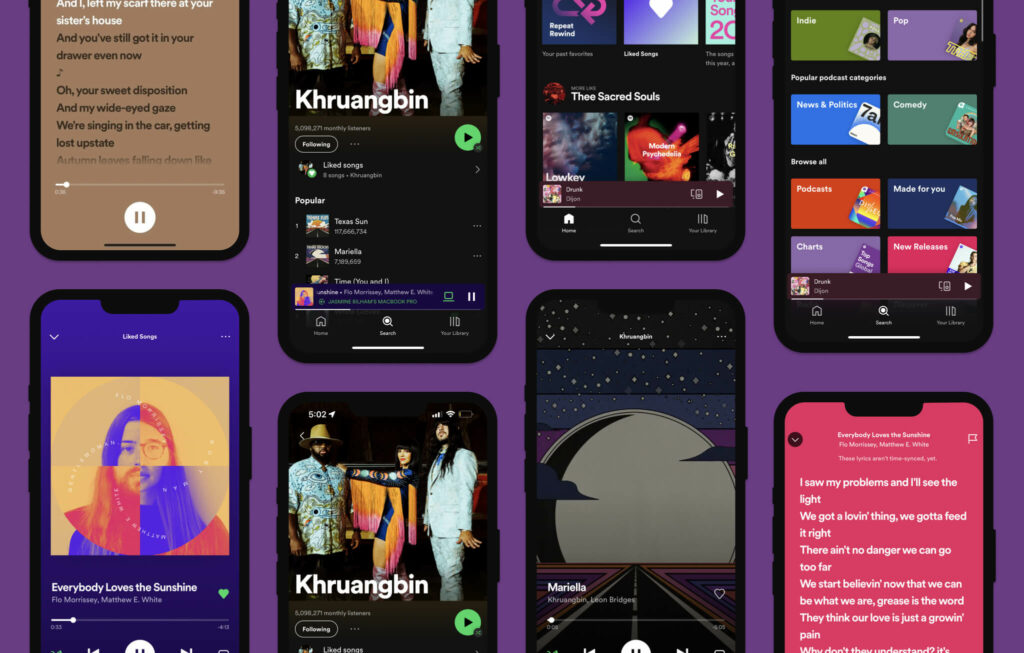
Visual comfort leads to more browsing, so the simplistic and aesthetic nature of their app makes us as users feel more inclined to use it as it doesn’t seem too intimidating. So, I think Spotify can have a big green tick when it comes to visceral design.
🧠 Behavioural Design
Behavioural design has to do with the pleasure and effectiveness of use. According to the Interaction Design Foundation “Users subconsciously evaluate how your design helps them achieve goals, and how easily. They should feel satisfied that they’re in control, with minimum effort required.”
Finding new music can be tricky, and people are unique with their music and podcast tastes. One minute you might want to listen to some 2000s R&B to reminisce, then a murder mystery podcast, and then maybe you’re open to hearing a track you’ve never heard before in order to expand your library. One thing is for sure, it is incredibly satisfying when you find something new that you love.
Ian VanNest, one of Spotify’s Product Designers, mentions how unique each user is:
Almost any time we talk to a user, they end up telling us some variation of, “My taste in music is so weird. I like a little of this, a little of that, and something completely different.” Great personalized playlists reflect every user’s uniquely weird tastes, make them feel like they have a home on Spotify, and hopefully help them broaden their horizons even further.
Ian VanNest, Product Designer at Spotify
So Spotify put that raw data to use and created a ‘Made for You’ section in the app, with curated playlists to get you through your day, regardless of your mood. Just some of the examples are provided in the image below – from reminiscing with Time Capsule, to feeling adventurous with Discover weekly, and Daily Mixes catered to your array of enjoyed genres.
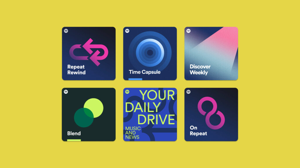
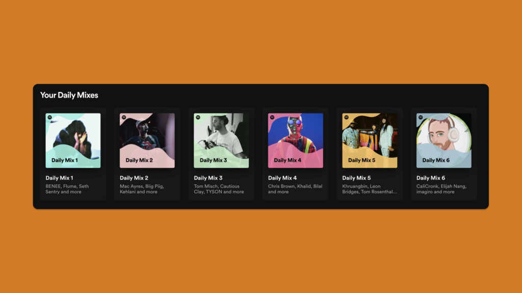
And as to how Daily Mixes are created?
“Daily Mix was designed to provide familiar, comfortable music within each of the user’s top listening modes. It’s designed to be the shortest path to a good musical experience. It reflects how the user actually listens, rather than matching their favorite music against predefined genres. We use clustering technology to identify distinct subgroupings within our users’ listening patterns, and then build recommendations around those, mixing in appropriate new suggestions along with the known favourites.”
Below is an image of three curated playlists that Spotify made for me – all with songs I love and/or new song from artists I already love.
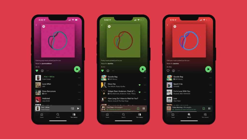
Bringing this back to behavioural design, Spotify takes the lead in generating these personalised playlists for you. Whether the goal that you are trying to achieve is discovering songs, or saving time creating new playlists, these features do have a part to play in those little moments of accomplishment.
❤️ Reflective Design
Reflective design “considers the rationalization and intellectualization of a product. Can I tell a story about it? Does it appeal to my self-image, to my pride?”
It is no secret that humans love to share. We share our travels, our food, our opinions, our highs and our lows – we share practically everything.
One of those things is music, which leads us to the yearly phenomenon that is Spotify Wrapped. In 2016, Spotify introduced Wrapped, a feature that allowed users to take a look back on their last 365 days of music and audio listening. The tool included statistics such as the user’s favourite artists, top played songs, and the number of hours of music they listened to that year.
Our social media feeds are clogged with it toward the end of each year. It is a time to reflect on the year that was, what audio got you through it and to share it with the world.
I quite like this quote from Grace Yang’s article about the cleverness of Wrapped:
It’s a brilliant example of how understanding your users and demographic can help develop interfaces that elevate user experiences. Not only that, but Spotify’s Wrapped helped to solidify a dedicated consumer base — one that would come back to their services each time to view their next year-in-review. For many of us, the yearly roundup has almost turned itself into a game, one where we attempt to “outdo” ourselves year after year in the number of minutes we’ve listened to.
Grace Yang
In 2021’s Wrapped, the colours were bold, bright and unapologetic. There was even a section titled “Your Audio Aura,” a gradient, fluid combination of colours meant to correspond to the melodic vibe of your most-listened-to music – trying to make Spotify’s listeners feel appreciated and understood through their music taste.
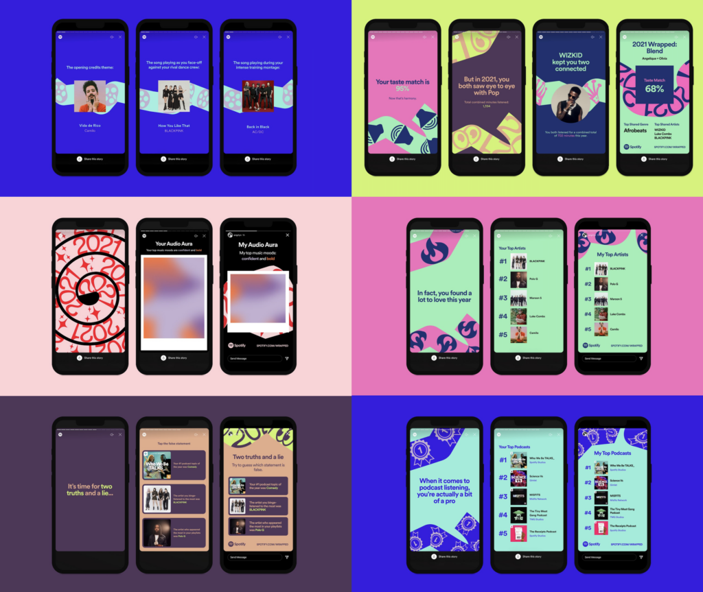
The success of this features lies in the power of sharing and truly connecting with your users. Spotify understood that their user base loves music, they love reflecting on what they listen to and they love to share (or even sometimes boast) their favourite tunes. In turn, Spotify has been able to elevate their product even further by tapping into the tools of sharing and personalisation, providing their users with those sweet, nostalgic moments.
😉 Wrap(ped) up
Gone are the days where seeing your name in an email subject line seemed like ground-breaking personalisation. Today, personalising a user’s experience and making it memorable is expected. Utilising emotional design will make users feel like they are getting something out of investing time and money in a product.
Something that is inherently human is wanting to feel in some way special, valued or listened to. We tend to spend more time and effort with people that we know and love. In the same way, we use apps more frequently when we feel that little more connected, a little more valued and a little more human.
Get a UX & CRO Expert’s Eyes on Your Website. Book a free 30-minute UX Teardown and get actionable insights on what’s costing you conversions — no fluff, just fixes you can implement right away.
Book a Free UX Audit
Related posts
Unravelling the UX/UI Magic of Threads App
In the vast landscape of messaging apps, Threads App has emerged as a standout platform, focusing on streamlining conversations and […]
Designing with Empathy: How Inclusivity Enhances User Experience (4 steps)
What is Inclusivity in Design Inclusive design is the practice of “intentionally including the needs of users who likely experience […]
Error-Free UX: How to Anticipate and Prevent Errors in UX
Errors in UX design can lead to frustration, loss of trust, and even abandonment of a product. A well-designed UX […]
Creative product design that gets results
Take your company to the next level with world class user experience and interface design.
get a free strategy session
