Emojis in Product Design: How They Have Evolved and How to Use Them
A paragraph to a loved one, an Instagram post, a Twitter comment, a marketing email or a work message… these forms of communication nowadays are rarely ever sent without some sort of emoji.
The term emoji sounds like it comes from the word ’emotion,’ but this is pure coincidence. The term comes from the Japanese word for a picture (絵 eh) and the noun 文字 (mōji) which means a letter of the alphabet or character. So it basically translates to ‘pictograph.’
What started as a casual “:)” has become a library of approximately 3,633 emojis at our fingertips, and they are constantly evolving. In this article, we’ll discuss where emojis came from, why they are important, and great practices to keep in mind when using them in product design.
Table of Contents
Where did Emojis originate? 🤔
The origins of the contemporary emoji can be roughly traced back to chat rooms in the 1990s, where simple emojis like 🙂 to indicate a smile or 😉 to emphasise a joke or sarcastic jab were utilised in chats.
Shigetaka Kurita, a designer, is credited with creating the first set of emojis.
According to MoMA’s site,
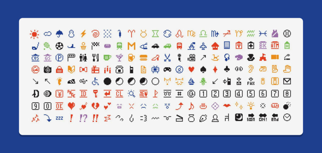
“In 1999 the Japanese telecom NTT DOCOMO released the original 176 emoji (e meaning “picture” and moji “character”) for mobile phones and pagers. Designed on a simple 12 × 12 pixel grid by Shigetaka Kurita, emoji enhanced the visual interface for DOCOMO’s devices and facilitated the rise of the nascent practice of text messaging and mobile email. Drawing on varied sources including manga, Zapf dingbats, and commonly used emoticons (simple faces made out of pre-existing glyphs), Kurita’s set included illustrations of weather phenomena, pictograms, and a range of expressive faces. Simple, elegant, and incisive, Kurita’s emoji planted the seeds for the explosion of a new visual language.”
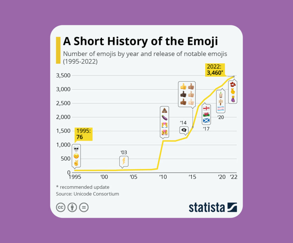
Emojis are more casual than words and add clarity to a phrase that might otherwise possess ambiguous sentiment. Now in 2022, we have approximately 3460 emojis available at our fingertips. Below you can see just how rapid this growth has been, especially since the introduction and rising popularity of smartphones.
Relevancy 👀
Adobe’s recent 2022 U.S. Emoji Trend Report uncovered some insights on just how important and relevant emoji use is in daily personal and work life:
69% of Gen Z and Millennials are more comfortable expressing emotions though emoji than through text-only conversations.
92% of U.S. emoji users agree that emoji can communicate across language barriers.
71% of U.S. emoji users agree that emoji are an important communication tool for creating unity, respect and understanding of one another.
More than half of U.S. emoji users are willing to purchase an item using an emoji (57%) – with Gen Z’ers being the most willing (71%), followed by Millennials (67%).
These little pictographs are ingrained in our daily lives and we are so much more receptive to a statement that expresses more emotion.
Emojis in product design 🎨
In regards to product design, companies are beginning to understand more and more about how emojis can assist in connecting with their audience more and driving conversions. You can incorporate emojis across a wide range of p, including:
1. Home page 🏠 Include a relatable emoji in your tag or headline, or used to emphasise a statement.
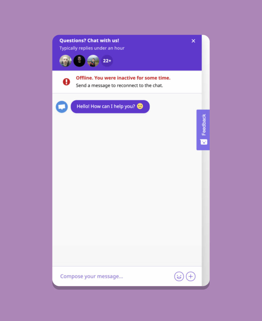
2. Support chats 💬 Emojis in support chats can express a more friendly or welcoming environment for the person at the other end of the chat.
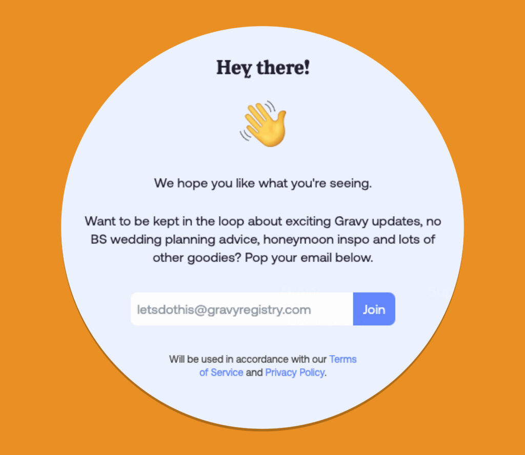
3. Pop-ups 🚨 Pop-ups are usually immediately exited, so you need to capture the user’s attention for a few seconds longer in order for them to stay and read. Including emojis is a way to draw some eyes or create any emotion you wish to convey, whether that be friendliness, excitement, or a sense of urgency.
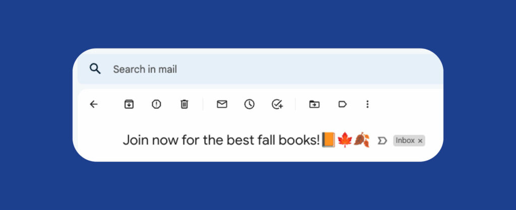
4. Email updates ✉️ Sometimes it can feel like you are drowning in a sea of emails. It can take something like an emoji in the subject to draw your eyes over.
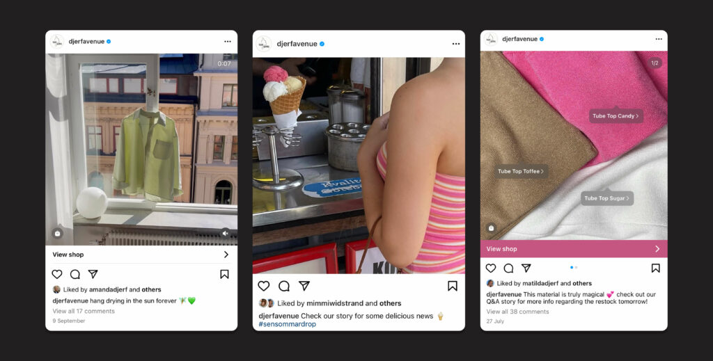
5. Social posts 👋 Emojis can be a great way to express a particular look, feel, or vibe of a brand or company, or even just to inject a little personality into it.
While it might seem simple enough to incorporate one or two (or maybe ten) emojis into your product, there are some best practices to keep in mind so that the content remains relevant, user-friendly and accessible. We’ll jump into these tips below.
Don’t completely replace words 🚫
You cannot always assume that a symbol will be instantly interpreted as the word you were trying to portray. The example below is a very simple one, as most people due to social media understand that a thumbs up often means a ‘like’ reaction. The emoji itself is also quite a simple shape, so it could still be recognisable on a button for instance.

However, if we take a look at something a little more detailed, like the example below, the two different devices are really hard to see and could be hard to recognise for some. It would be much more user-friendly if you simply stated “Go on mobile” and “Stay on desktop”

Replacing words with emojis is also inaccessible. As Content Design London puts it in the following reasons why:
- You cannot be sure people will interpret the emoji as you intended
- Emoji alt-text descriptions used by screen reading and text-to-speech software may not be what you intended the emoji to represent
- It increases the cognitive load for everyone
- Users will not be able to scan-read the content
Emojis are there to enhance an experience or piece of text, not overcrowd or replace it.
Don’t use too many throughout text 😅
One big goal for a product designer is to keep cognitive overload to a minimum for their users. One way to defy this practice is to bombard paragraphs with an assortment of emojis throughout.
While it may look fun, it can be incredibly overwhelming for the user, especially if they aren’t super familiar with a particular emoji. You can see below that the red example feels a lot jankier than the green, as the colourful symbols break up the monotone text and reduces the flow.

It is also important to think about this from the accessibility perspective and imagine how this would sound to someone with a visual impairment. A great example is on this Youtube clip, where the uploader just shows how chaotic it sounds when reading a piece of text with a lot of emojis in it.
Place words before emojis, not after ➡️
It is important to draw the user’s attention first and foremost to the action or text, which can then be accessorised with a suitable choice in emoji. “✨ Get started” isn’t necessarily incorrect, however, your eyes are first drawn to the emoji rather than the text.

Similarly to what we discussed in our “Don’t use too many throughout text” point, the wave emoji in “Welcome to your account 👋 have a little look around” breaks the sentence up and reduces flow.

As a general rule of thumb, aside from more casual situations like texting a friend, if you’re using an emoji to reinforce what is being said, keep it at end of the sentence.
Make sure your emoji translates well across devices 💻
For a little bit of context – Unicode is the standard programming language that allows communication between platforms and is relatively foolproof for text. When it comes to emojis there are licensing issues meaning that different platforms have to develop their own interpretations of an emoji symbol.
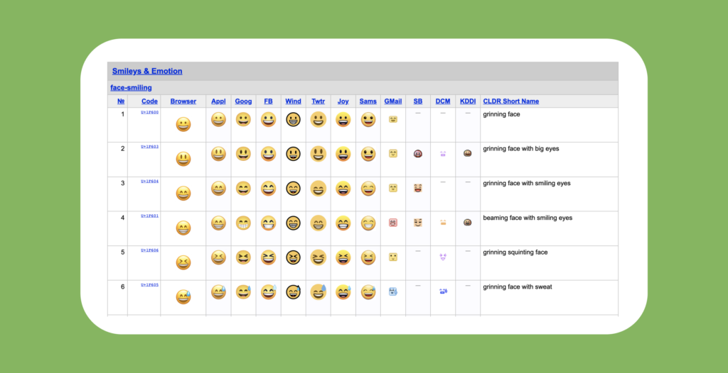
Above is an example of how just six emojis are translated across a variety of platforms. There are definitely visual similarities, however, there are small styling tweaks and variations of colour. This can affect how it looks with the rest of a product’s visuals, or readability if the colour of the emoji blends into the background, which is a nice segue into our final point…
Ensure they work on different backgrounds 🔲
If an emoji is repeated throughout a product and sits on different backgrounds, it needs to keep its visibility. Take the instances below, the dark moon emoji blends into the dark background version, making it quite difficult to recognise.
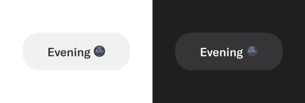
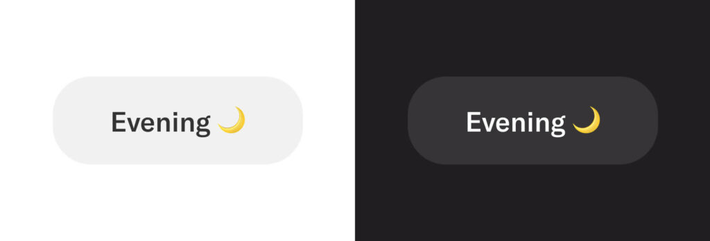
This might mean culling the emoji from the text if it isn’t accessible, or looking for an alternative emoji that is visible amongst a variety of backgrounds and also still makes sense contextually.
Wrap Up 🎁
What makes emojis special is the fact that they have helped millions express themselves better than even the wide array of words in the Oxford Dictionary.
Nancy Gibbs
From the stock-standard smiling face to bowls of spaghetti, shoes, books, arrows, flags, star signs, vehicles, sports, aeroplanes, or the Eiffel tower, emojis are a vehicle for product communication and marketing. Using them correctly and implementing best practices will provide a seamless experience that isn’t overwhelming – but understandable and delightful to the user ✨
Take your company to the next level and get results with our world class user experience, interface design and implementation.
Get a FREE 30 min Strategy Session

Related posts
Unveiling the Magic: A Deep Dive into Snapchat’s UI Design Strategies
Snapchat has taken the world by storm with its unique and innovative user interface (UI) design. But what exactly lies […]
Zero UI: Redefining the Future of Human-Technology Interaction
Zero UI represents a fresh approach to user interface design aimed at reducing reliance on conventional graphical user interfaces (GUIs). […]
7 UX Tips for eCommerce to Increase Conversions
UX has a pivotal role to play in increasing revenue. It is usually an overlooked aspect of the checkout process, […]
Creative product design that gets results
Take your company to the next level with world class user experience and interface design.
get a free strategy session
