Unveiling the Magic: A Deep Dive into Snapchat’s UI Design Strategies
Snapchat has taken the world by storm with its unique and innovative user interface (UI) design. But what exactly lies beneath the surface of Snapchat’s UI? What secrets, techniques, and principles have contributed to its unprecedented success? In this article, we embark on a journey to unravel the mysteries of Snapchat’s UI, exploring the psychology, design philosophy, and technological innovations that have made it a cultural phenomenon.
Join us as we delve into the enigmatic world of Snapchat, peeling back the layers of its UI to uncover the secrets that have captivated an entire generation. From its intuitive navigation to its addictive features, we’ll examine how Snapchat has mastered the art of user experience, setting new standards for interaction design in the digital age.
Table of Contents
The evolution of Snapchat’s UI
From its humble beginnings as a photo-sharing app focused on ephemerality, Snapchat’s UI has undergone a dramatic transformation, mirroring the platform’s own journey and adapting to user needs and market trends. Let’s embark on a visual adventure through the key stages of this evolution:

The OG Snap (2011-2013)
Minimalism reigned supreme. A single swipe right opened the camera, left opened chats, and down brought up stories. Bold yellow accents and a clear focus on capturing and sending snaps defined the early UI.
During this period, Snapchat experienced significant growth in its user base. Most of the users are early adopters, mainly teenagers, attracted by the privacy and spontaneity. User base grew steadily to 10 million by 2013.
Storytelling Takes Center Stage (2013-2015)
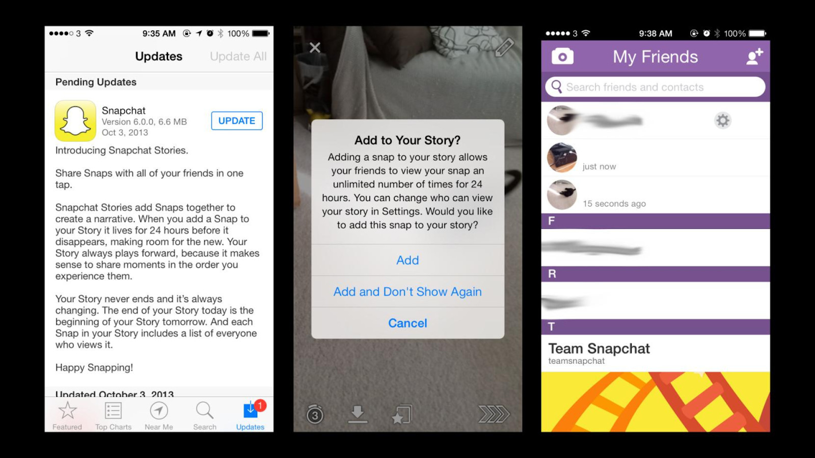
The introduction of Stories in 2013 brought a dramatic shift. The UI evolved to accommodate this new, public form of sharing, placing stories front and center with a dedicated tab and circular profile pictures. Chat conversations received their own dedicated space. Exploded with Stories, Snapchat reached 100 million daily users by 2015. User base diversified beyond the early teen demographic.
Rise of the Discoverables (2015-2018)
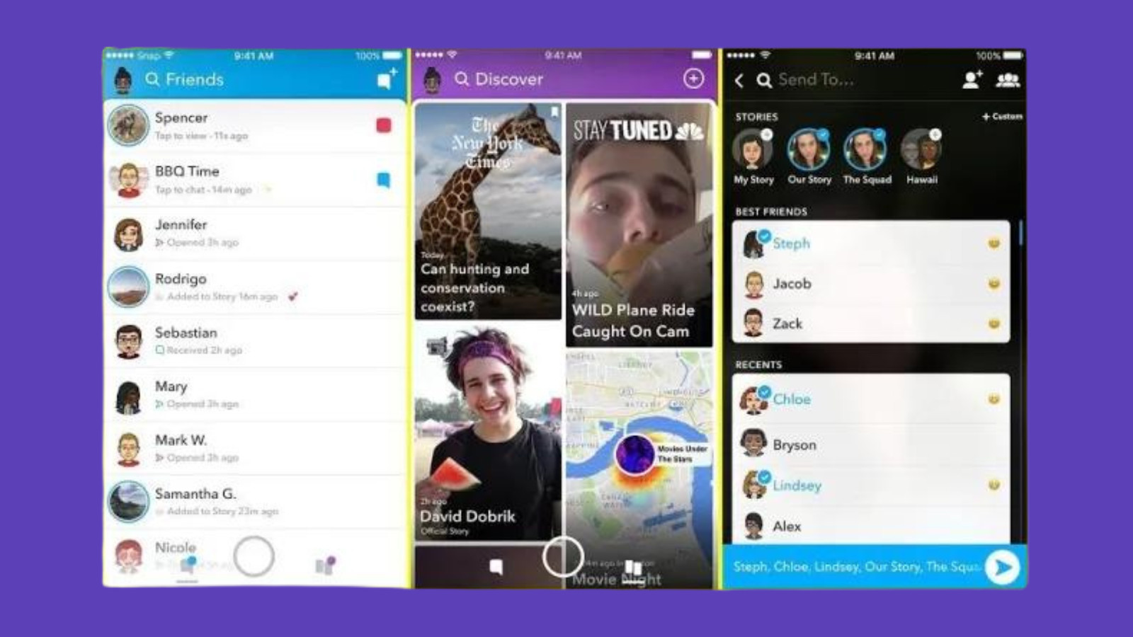
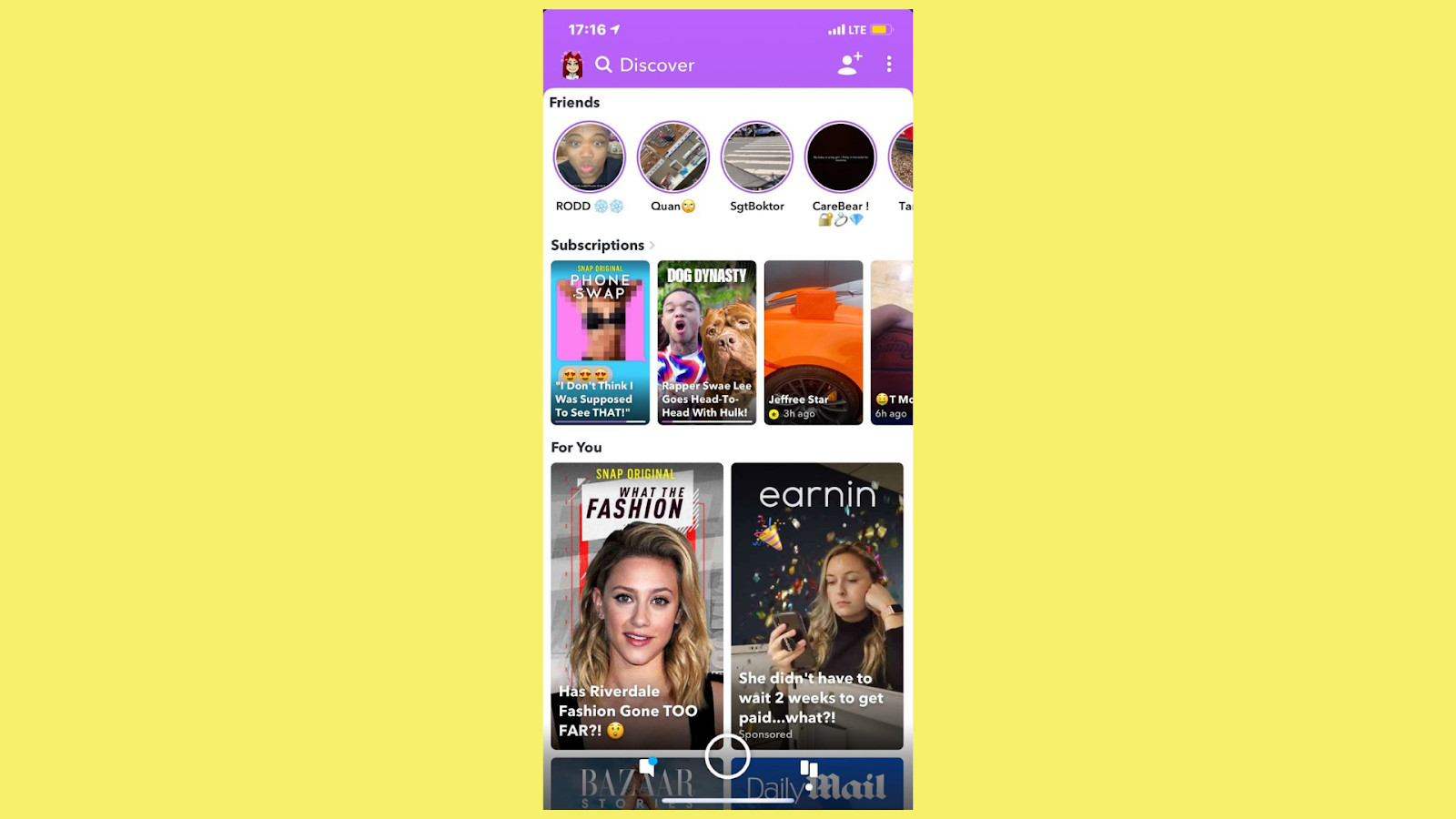
As Snapchat’s popularity soared, the UI branched out. Discover, a curated content portal featuring brands and publishers, joined the fray. Snaps now had to compete for attention with professionally produced content, prompting subtle UI changes to enhance discoverability.
The Great Redesign (2018):
A controversial decision shook things up in 2018. The familiar swipe gestures were replaced with a tab-based navigation, separating friends from Discover, much to the dismay of some users. While intended to improve discoverability, it sparked outcry and forced Snapchat to iterate on the design. As a result, user growth slowed and existing users left.
Refining the Experience (2019-present):
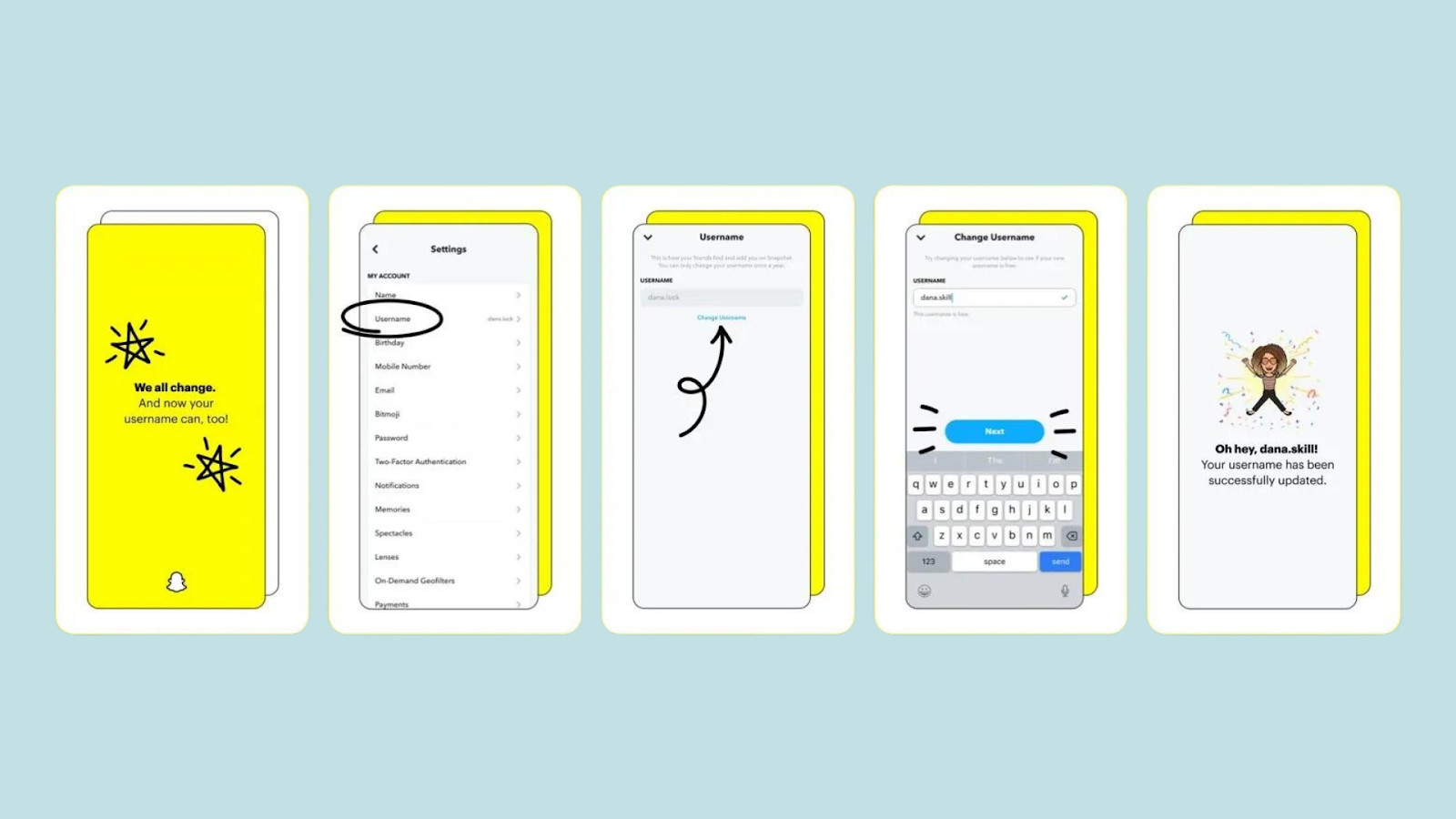
The focus shifted towards refining the experience based on user feedback. The camera screen received an overhaul, incorporating AR Lenses more seamlessly. Navigation became more intuitive, with the return of swipe gestures in some areas. Personalization features like Snap Map gained prominence, reflecting users’ desire for real-time connections.
In this period, Snapchat’s user growth stabilized and began to climb again. As of 2024, Snapchat has over 332 million monthly active users, but faces stiff competition from Instagram and TikTok.
Overview of Snapchat’s UI
A. Home screen
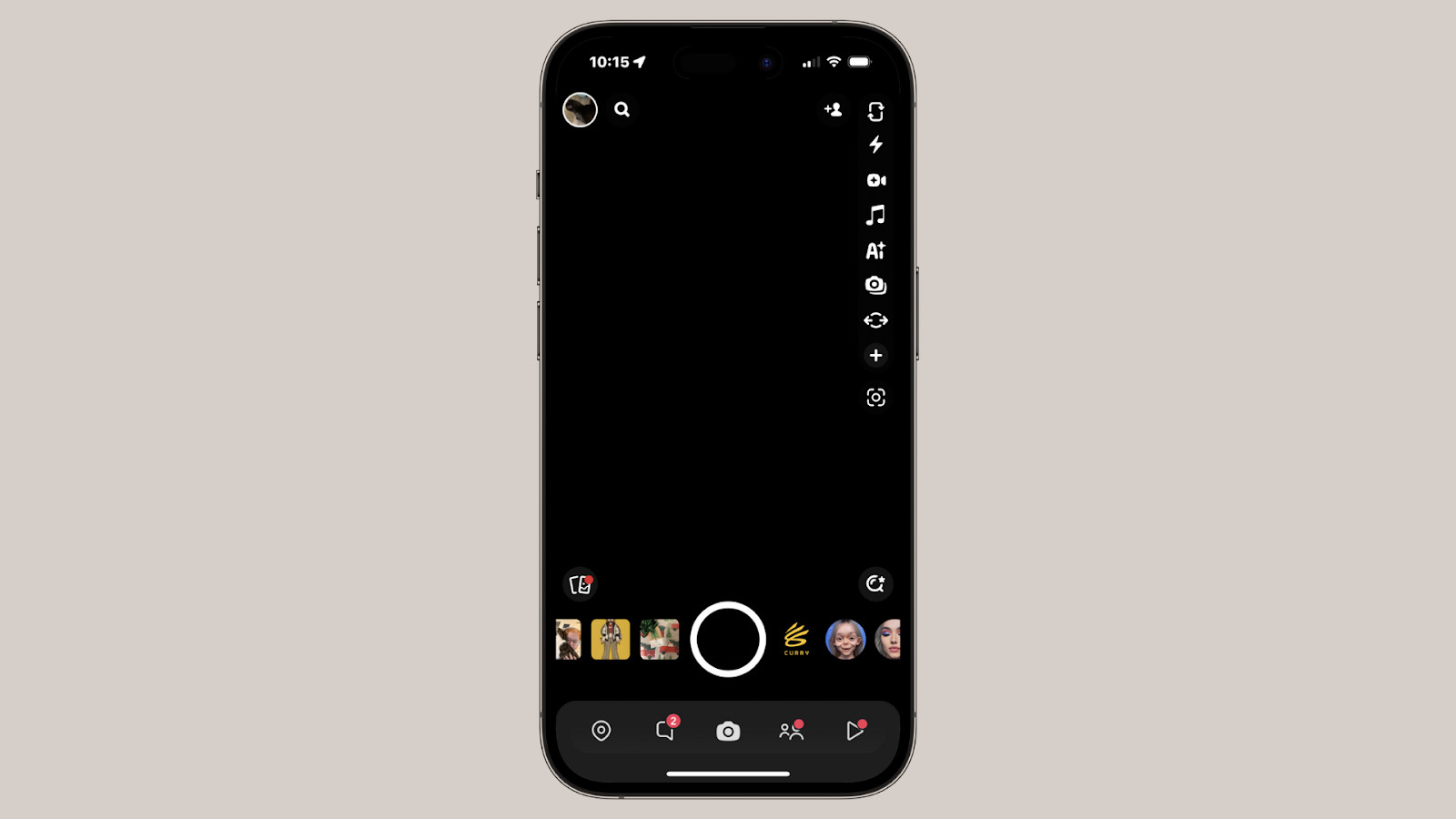
The home screen is the heart of Snapchat’s UI design. It is where users start their Snapchat journey, capturing moments and sharing them with their friends. The camera functionality is at the core of the home screen, allowing users to take photos and record videos with various creative tools and filters. This interactive and intuitive camera experience sets Snapchat apart from other social media platforms.
The navigation buttons on the home screen enable users to access different sections of the app easily. These buttons, strategically placed at the bottom of the screen, provide quick and seamless navigation between the camera, chat, and discover pages. Snapchat’s minimalist approach to UI design ensures that users can effortlessly switch between features without any distractions.
B. Discover page
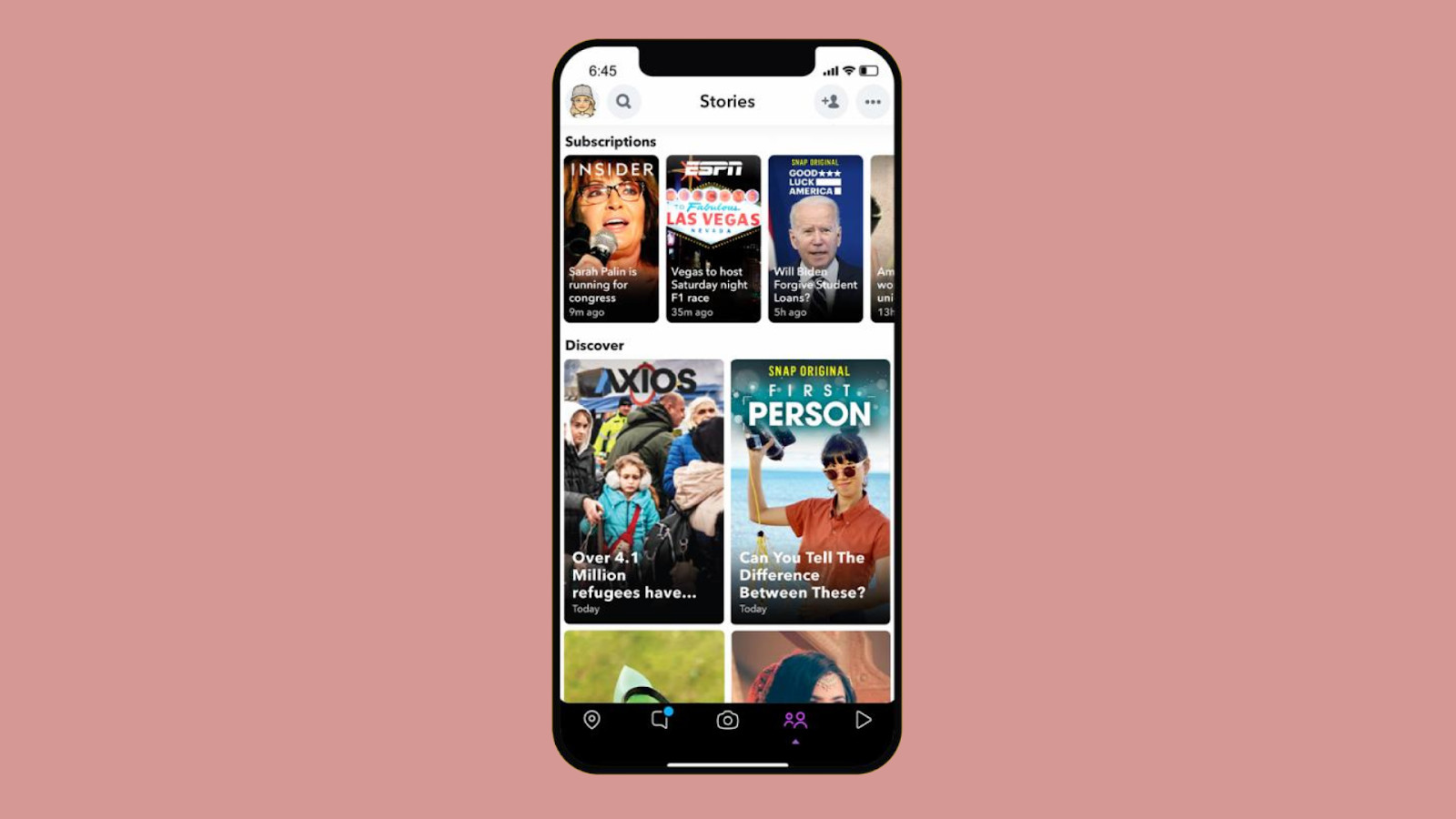
The discover page is where users can explore a wide range of content from various publishers, influencers, and brands. Snapchat’s UI design makes content discovery a delightful experience. The discover page showcases a curated selection of personalized recommendations based on the user’s interests and preferences. This personalized approach to content discovery keeps users engaged and ensures they are always presented with content that resonates with them.
Chat and Stories
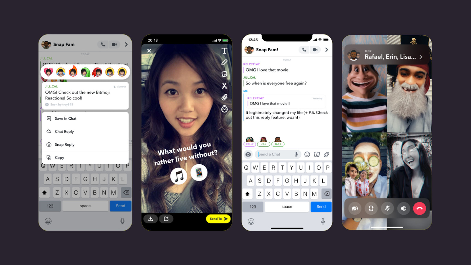
1. Messaging features
Snapchat’s UI design for chat is all about simplicity and efficiency. The messaging features, including text, voice, and video chat, are seamlessly integrated into the app’s UI. Users can easily send messages, photos, and videos to their friends, creating a dynamic and interactive communication experience. Snapchat’s UI design allows for quick and intuitive messaging, making it a preferred choice for many users.
2. Stories format
Snapchat revolutionized the way we share and consume stories with its unique stories format. The UI design for stories enables users to share their moments in a chronological narrative, creating a captivating storytelling experience. The stories format is not only visually appealing but also easy to navigate. Users can swipe through stories effortlessly, immersing themselves in a continuous stream of content from their friends and favorite accounts.
The Secrets Behind Snapchat’s UI Design:
Snapchat, the platform synonymous with disappearing messages and quirky filters, has captivated a generation with its unique UI design. But what lies beneath the playful surface? Let’s delve into the key principles that make Snapchat’s UI tick:
A. Simplicity and Minimalism:
It has a clean and intuitive design. From the moment you open the app, you’re greeted by the camera, inviting immediate engagement. No clutter, no unnecessary elements – just a clean interface that prioritizes ease of use.
It also focuses on core features. Buttons are readily accessible, and core functionalities like capture, effects, and chat are front and center. This laser focus prevents overwhelming users and keeps them immersed in the core experience.
B. Visual Communication:
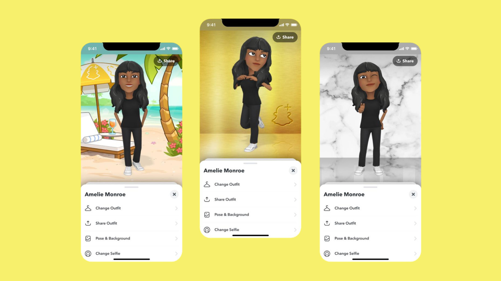
Images and videos reign supreme in Snapchat’s world. The large camera viewfinder and intuitive capture gestures encourage spontaneous visual sharing.
It made use of icons and symbols. Complex features are conveyed through simple, universally understood icons. This reduces the learning curve and makes the app accessible to a wider audience.
C. Ephemeral Nature:
In terms of disappearing messages and stories, the impermanence of content adds a layer of excitement and urgency. It encourages users to be present in the moment and share authentically, knowing their creations won’t linger forever.
It encourages in-the-moment sharing: The limited lifespan of snaps and stories fosters a sense of urgency and exclusivity, prompting users to capture and share experiences as they unfold.
D. User-Centric Design:
Snapchat prioritizes user experience. Snapchat actively gathers user feedback and iterates on its design based on real-world usage. This ensures the UI remains relevant and caters to evolving user needs.
New features and updates are rolled out frequently, keeping the app fresh and engaging. This responsiveness demonstrates Snapchat’s commitment to keeping users at the heart of the design process.
Unique Feature of Snapchat’s UI
While fleeting snaps and engaging stories might be the first things that come to mind when thinking about Snapchat, the app offers much more than just ephemeral content. Delving deeper reveals a treasure trove of features that set it apart from other social media platforms, particularly in the realms of Augmented Reality (AR) and location-based experiences.
Warping Reality with AR Lenses: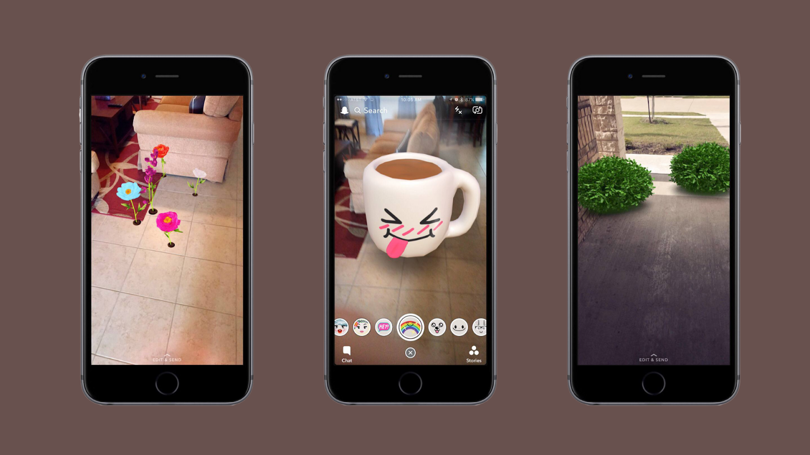
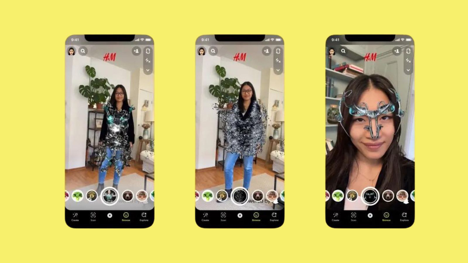
Snapchat’s AR Lenses aren’t just about funny faces and puppy dog filters. These interactive overlays go beyond mere visual amusement, creating unique and engaging experiences. Imagine trying on virtual makeup before buying it, exploring the night sky through your phone, or even bringing dinosaurs to life in your living room. These are just a few examples of how AR Lenses can transform everyday moments into something extraordinary.
And the innovation doesn’t stop there. Snapchat is constantly pushing the boundaries of AR technology, developing new and immersive experiences. From interactive games that respond to your movements to hyper-realistic filters that blur the line between reality and digital worlds, the platform keeps users engaged by offering something fresh and exciting every so often.
Connecting Through Location: The Snap Map Enigma
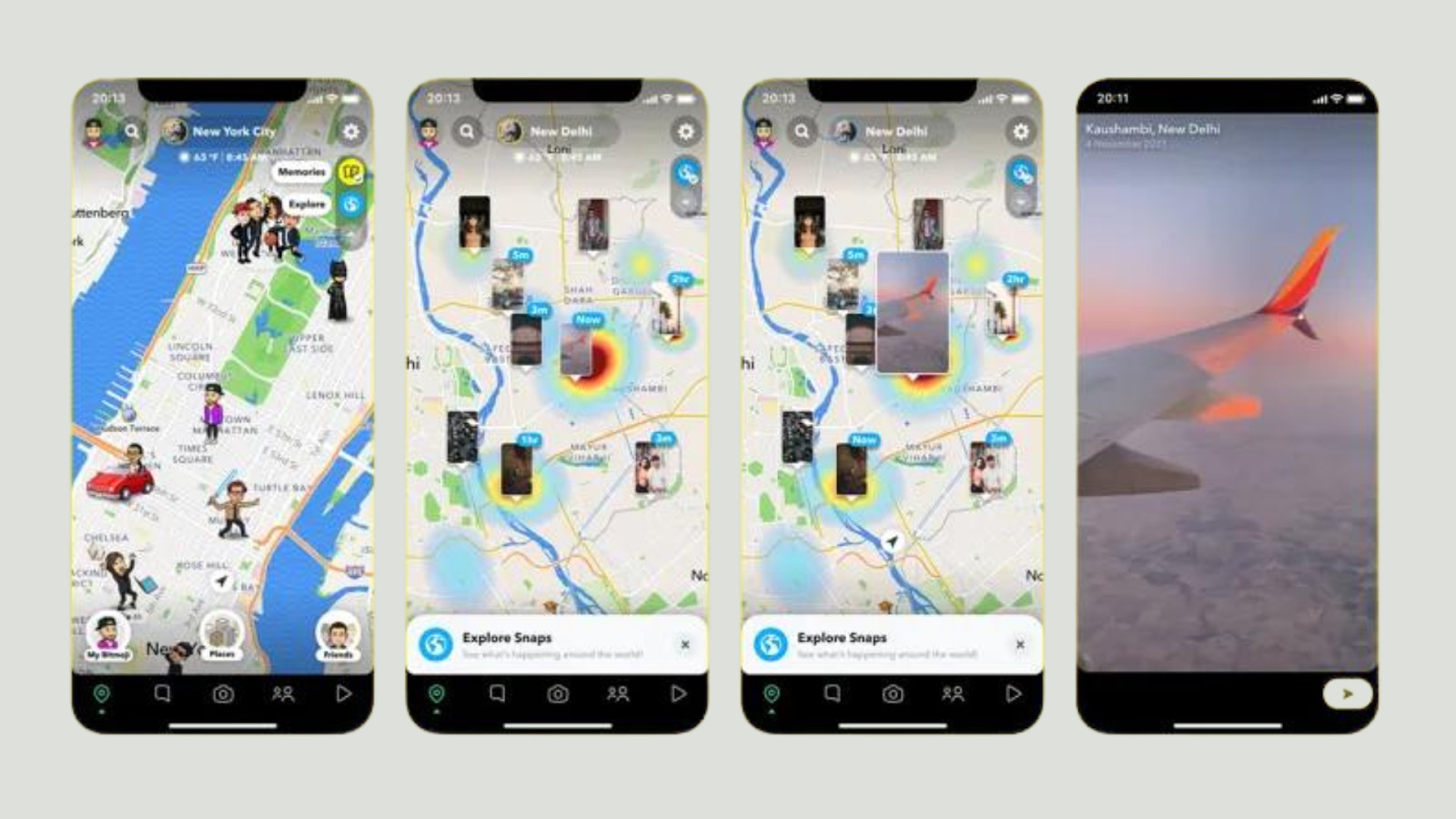
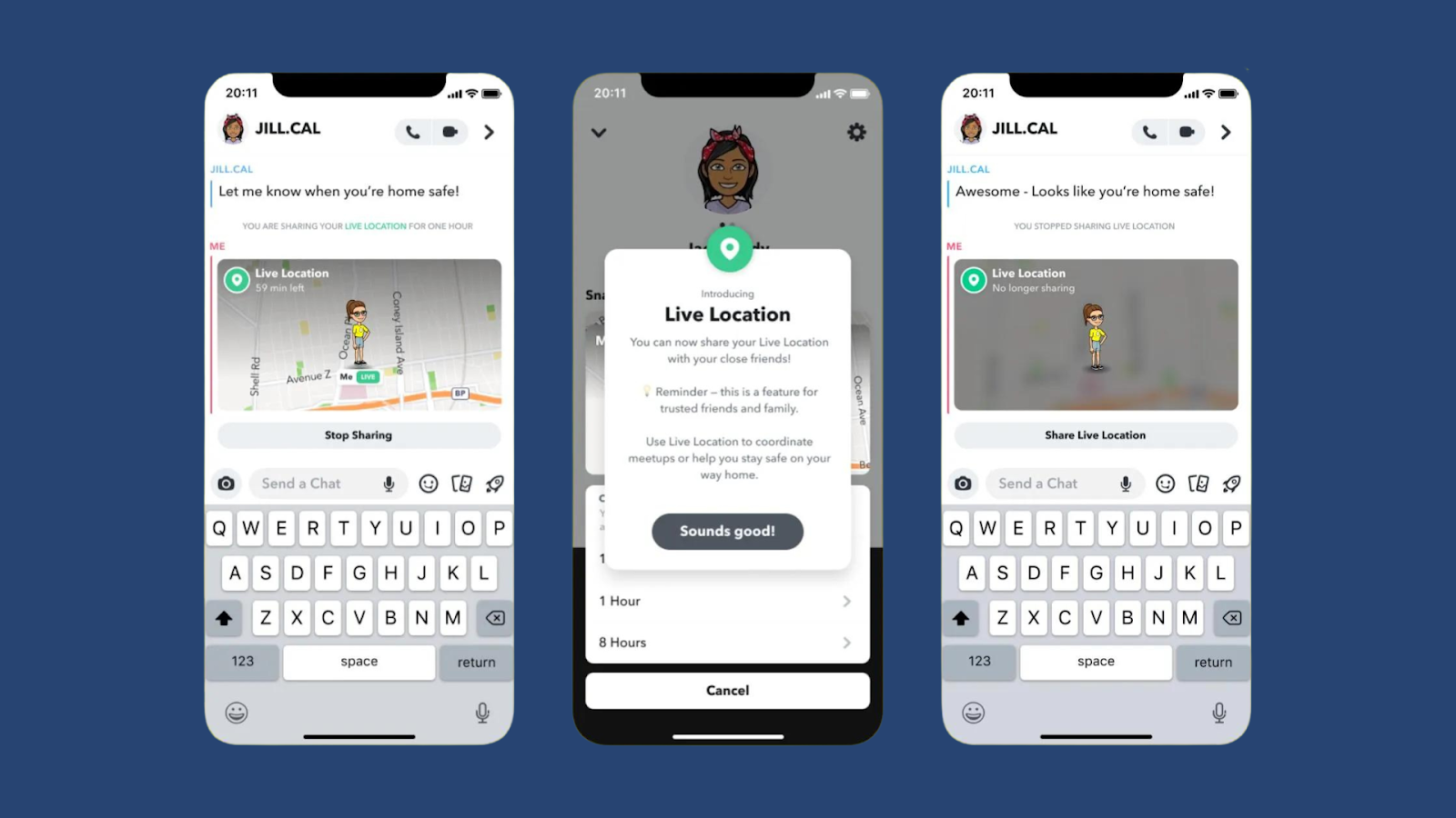
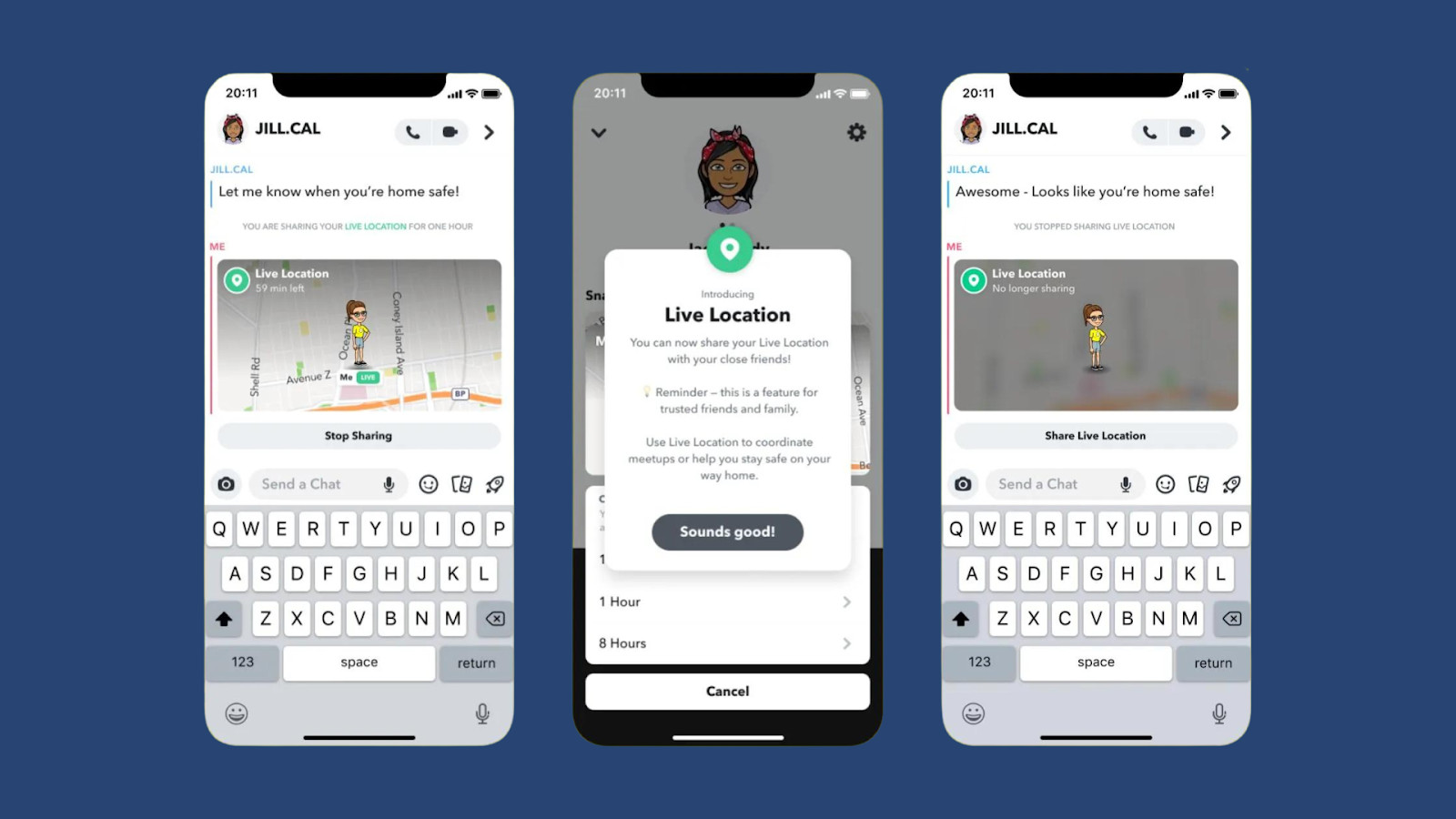
In a world increasingly obsessed with online anonymity, Snapchat’s Snap Map stands out as a unique feature that embraces location sharing. It allows users to see where their friends are (with their permission, of course) on a real-time map, fostering a sense of connection and shared experiences. Planning a spontaneous hangout? Simply check the Snap Map to see if your friends are nearby.
However, Snapchat understands the importance of balancing privacy and social connectivity. Users have granular control over their location visibility, choosing who can see them and even creating “ghost mode” for complete invisibility. This balance makes the Snap Map a valuable tool for connecting with friends without compromising privacy concerns.
Beyond the Hype:
Snapchat’s unique features aren’t just gimmicks; they represent a genuine effort to push the boundaries of social media experiences. AR Lenses offer a glimpse into the future of interactive content, while the Snap Map fosters a sense of connection in a way that other platforms struggle to replicate. So, the next time you open Snapchat, remember that it’s more than just snaps and stories; it’s a portal to a world of creative expression, immersive experiences, and innovative ways to connect with the world around you.
Personalization and Algorithm
Snapchat doesn’t just offer unique ways to capture and share experiences; it also tailors your feed to keep you engaged with content that sparks your interest. This personalization engine, powered by intelligent algorithms, goes beyond the surface, suggesting not just Snaps and Stories, but also friends to connect with and creators to follow.
AI-Driven Content Curation:
Gone are the days of endlessly scrolling through a generic feed. Snapchat’s AI algorithms learn from your behavior, analyzing the Snaps and Stories you watch, engage with, and skip. This data becomes the secret sauce for curating a personalized feed that surfaces content you’ll actually enjoy. No more sifting through irrelevant posts; instead, you’ll discover hidden gems from friends and creators aligned with your interests, be it skateboarding fails, cooking tutorials, or hilarious animal videos.
Beyond Snaps: Friend-Finding Frenzy:
Snapchat understands that connection is key. That’s why its algorithms don’t just suggest content; they actively help you expand your social circle. The “Quick Add” feature analyzes your contact list, mutual friends, and even location data to recommend potential friends you might share interests with. This eliminates the awkwardness of cold introductions, connecting you with people who are likely to become your next Snapchat besties.
Snapchat’s Contribution to Businesses
Snapchat offers several features that can help businesses connect with their audience, build brand awareness, and drive engagement. Here are some key features and examples of how businesses can utilize them:
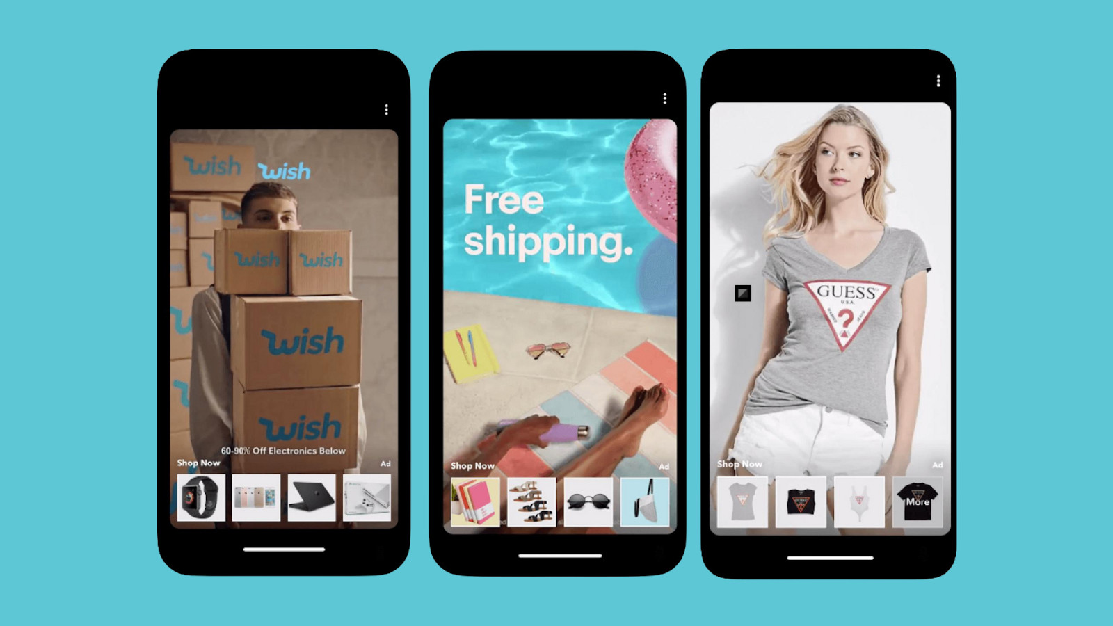
Snapchat Ads
Snapchat provides various advertising options, including Snap Ads, Sponsored Lenses, and Sponsored Geofilters. These ads can help businesses reach their target audience based on demographics, interests, and behavior.
For instance, a restaurant can create a Sponsored Geofilter targeting users who are near their location. When users take a snap in or around the restaurant, they can apply the filter, spreading brand awareness to their followers.
Snapchat Stories
Snapchat Stories allow businesses to create short, engaging content that appears in users’ feeds for 24 hours. This feature is excellent for showcasing behind-the-scenes content, product launches, or special promotions.
For example, a clothing brand can create a series of Snapchat Stories showcasing a fashion show or a sneak peek of upcoming collections, generating excitement among followers and driving them to visit the brand’s website or store.
Snapchat Discover
Discover features content from various publishers, brands, and influencers. Businesses can partner with Snapchat to create engaging content that appears in the Discover section, reaching a broader audience.
To illustrate, a media company can collaborate with Snapchat to create exclusive content related to current events or trending topics. By appearing in the Discover section, the company can increase brand visibility and attract new followers.
Snapchat Influencer Partnerships
Businesses can collaborate with influencers on Snapchat to reach their followers authentically and leverage their influence to promote products or services.
To give an example, A beauty brand can partner with a popular makeup artist on Snapchat to create tutorials or product reviews. The influencer’s authentic endorsement can drive followers to try out the brand’s products.

Snapchat Analytics
Snapchat provides analytics tools for businesses to track the performance of their campaigns, including metrics such as views, engagement, and conversions. This data helps businesses optimize their strategies and achieve better results.
In this case, a retailer can use Snapchat Analytics to measure the effectiveness of their advertising campaigns by tracking metrics such as swipe-up rates and conversion rates. They can then adjust their targeting or messaging to improve performance.
Snapchat’s UI Challenges and Adaptations
Like any social media platform, Snapchat isn’t immune to challenges. It navigates a tricky landscape, balancing user privacy concerns with the need to stay relevant in a fiercely competitive market. But despite the rapids, Snapchat continues to adapt and evolve, demonstrating its resilience and commitment to its unique identity.
Privacy in the Spotlight:
User privacy has always been a hot topic for Snapchat. Controversies related to data breaches and employee access to user information have sparked user concerns and regulatory scrutiny. In response, Snapchat has implemented several measures to regain trust. They’ve enhanced data encryption, strengthened internal controls, and provided users with more granular controls over their privacy settings. Additionally, they’ve actively engaged with privacy advocates and regulators to demonstrate their commitment to responsible data handling.
Beyond Snaps: Embracing Change:
The social media landscape is a dynamic one, and Snapchat has continuously adapted to stay relevant. As competitors introduced similar features like disappearing messages and stories, Snapchat didn’t panic. Instead, it doubled down on its strengths – AR Lenses and location-based experiences. Moreover, it embraced emerging trends like short-form video content with Spotlight and built unique features like Discover, catering to specific interests. This adaptability ensures Snapchat remains a platform not just for fleeting messages, but for diverse and engaging content creation.
Snapchat continues to address these challenges and actively seeks user feedback to improve its UI design.
Conclusion: The future of Snapchat’s UI design
Snapchat’s UI design has evolved significantly since its inception, and it will continue to evolve as technology and user preferences change. The app’s commitment to simplicity, interactivity, and visual communication sets it apart from its competitors and ensures a unique and engaging user experience. As Snapchat continues to innovate and push the boundaries of UI design, we can expect even more exciting and user-centric features in the future.
In conclusion, Snapchat’s UI design is a testament to the power of innovative and user-centered design strategies. The app’s intuitive navigation, visually appealing interface, and emphasis on simplicity and interactivity have made it a favorite among millions of users worldwide. As Snapchat continues to refine and enhance its UI design, we can only imagine what magical experiences lie ahead for its users.
Get a UX & CRO Expert’s Eyes on Your Website. Book a free 30-minute UX Teardown and get actionable insights on what’s costing you conversions — no fluff, just fixes you can implement right away.
Book a Free UX Audit
Related posts
5 tips on Creating an Award-Winning App Onboarding
Intro 👋 97% of companies say that good user onboarding is necessary for a product’s growth. This statistic from UserGuiding truly emphasises the […]
Emojis in Product Design: How They Have Evolved and How to Use Them
A paragraph to a loved one, an Instagram post, a Twitter comment, a marketing email or a work message… these […]
AI Is Flipping UX Upside Down: Navigating the New Era of Design
The world of UX/UI design is experiencing an unprecedented shake-up. Artificial Intelligence (AI) is radically reshaping traditional UX practices, prompting […]
Creative product design that gets results
Take your company to the next level with world class user experience and interface design.
get a free strategy session


