Top 3 UX/UI Design Trends for November 2024
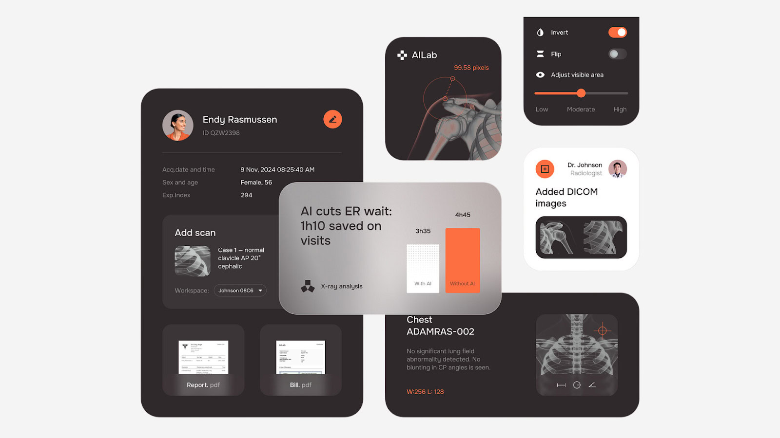
In the constantly changing world of UX/UI design, keeping up with the latest trends isn’t just about making things look nice—it’s about creating digital experiences that feel fresh, easy, and enjoyable for users. Design trends help shape how people see your brand and can make a big difference in how much users like and use your website or app. As we move into November 2024, the focus is on making stronger connections, personalizing user interactions, and creating more dynamic digital experiences.
This article explores three key design trends that are making an impact this month. From the bold yet balanced approach of minimalist maximalism to AI-powered personalization and the rise of immersive 3D elements, these trends are changing how users interact with the digital world. Let’s dive in and see how these UX/UI design trend can enhance your UX/UI and take your brand to the next level.
Table of Contents
UX/UI Design Trend #1: Minimalist Maximalism
Minimalist maximalism—it might sound like a contradiction, but this trend finds the sweet spot between two different design styles. It takes the clean, uncluttered look of minimalism and adds bold, attention-grabbing elements. The goal is to keep things simple while using bright colors, big text, or striking icons to create a focal point that stands out.
Minimalism is all about reducing visual clutter and focusing on what’s essential. Maximalism, on the other hand, embraces boldness, vibrancy, and attention to detail. Minimalist maximalism merges these two ideas by creating a clean, spacious layout and strategically adding bold visual elements to make certain aspects of the design stand out. It gives users a sense of calm and order while keeping them engaged with exciting focal points.
Why It’s Trending
Minimalist maximalism is popular because it gives users a clean, easy-to-navigate interface without being boring. It takes the simplicity of minimalism, which makes designs easy to use, and adds eye-catching elements that make the experience more interesting. This UX/UI Design trend is all about balance—keeping things simple but adding personality where it counts.
In an age where users are bombarded with information, minimalist maximalism provides a refreshing balance. It helps reduce cognitive load, allowing users to easily navigate and digest content, while ensuring that key messages and visuals make a strong impression. The use of bold focal points draws attention to important areas, making the user experience not only functional but also enjoyable and memorable.
How to Implement It
To use minimalist maximalism, focus on adding strong focal points. You could use a large image, a bright splash of color, or oversized text to draw users’ attention. Just make sure these bold elements don’t overwhelm the overall design.
For example, try using contrasting colors that stand out against a neutral background or adding one big, eye-catching design feature like an illustration or icon. The key is to keep the overall layout simple while adding personality in the right places. Here are some specific ways to implement minimalist maximalism:
- Choose a Bold Feature: Select one or two bold features that will draw users’ eyes immediately. This could be an oversized image, a piece of typography that fills the screen, or a vibrant accent color that contrasts against a neutral palette.
- Use Contrast Wisely: Incorporate contrasting colors or textures to create focal points. A pop of bright color against a muted background can instantly add interest without adding clutter.
- Embrace Oversized Typography: Typography can be used as a design element. Oversized headings or text in unexpected places can add a lot of personality while keeping the overall look clean and organized.
- Simplify the Layout: Keep the layout simple and easy to navigate. Make sure that the bold elements you add do not interfere with usability. Negative space is key to making sure the bold elements stand out without overwhelming the user.
Examples in Action
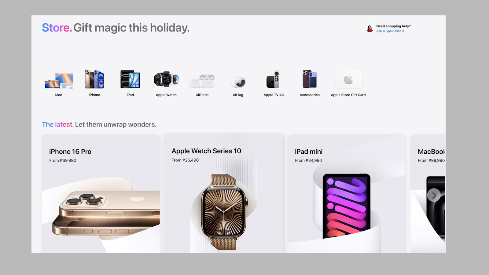
A great example of minimalist maximalism is the Apple website. Apple uses lots of white space and clean lines, but they often include large, bold images of their products that catch your eye. These images are striking and make the product the hero of the page without cluttering the overall design.
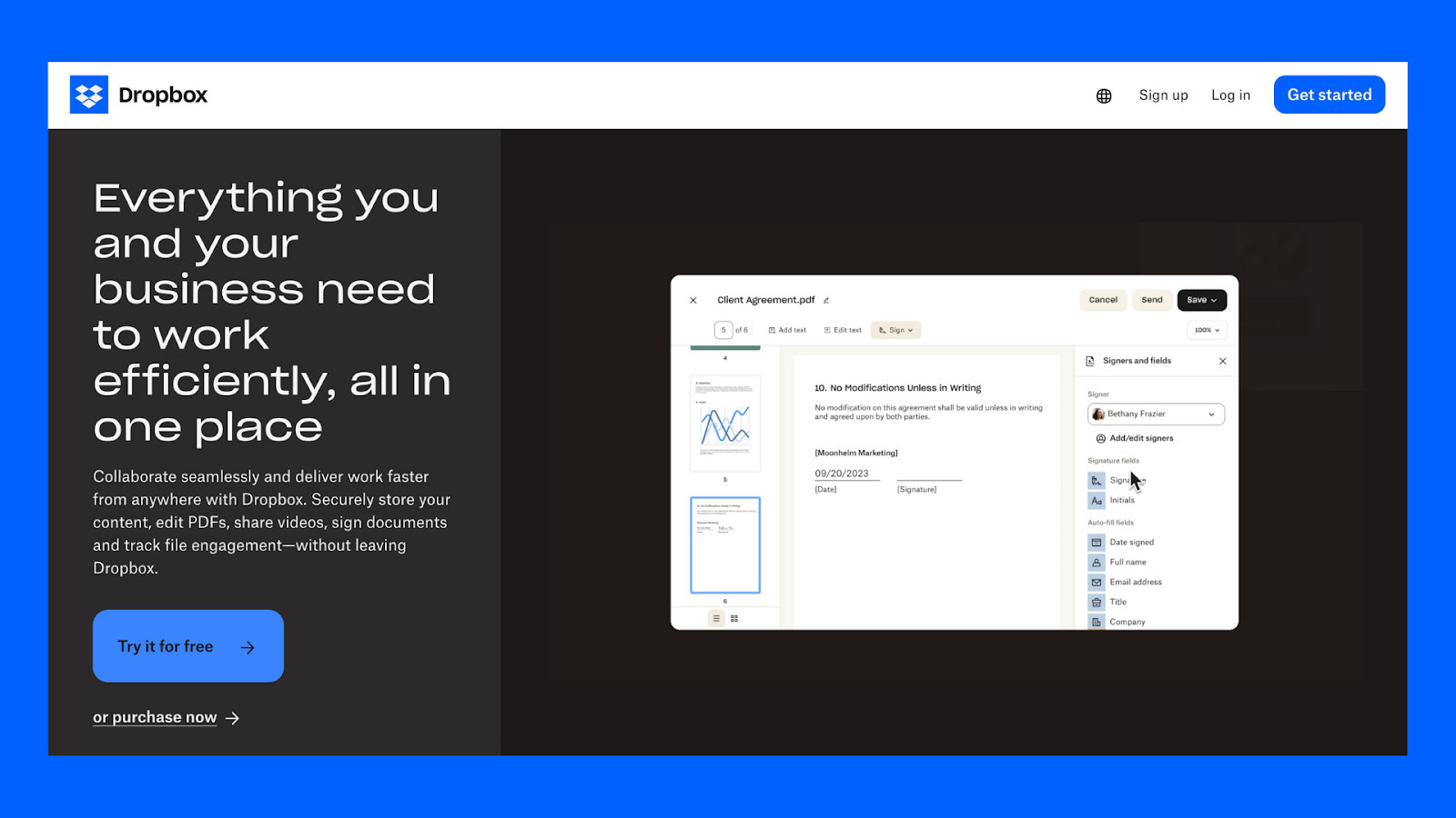
Another example is the Dropbox homepage, which uses a simple layout with colorful illustrations and large text to create a welcoming yet visually striking experience. Dropbox maintains a clean, easy-to-use interface but uses bright, playful visuals to add personality. This makes their homepage approachable and memorable without feeling overwhelming.
UX/UI Design Trend #2: AI-Generated Customization
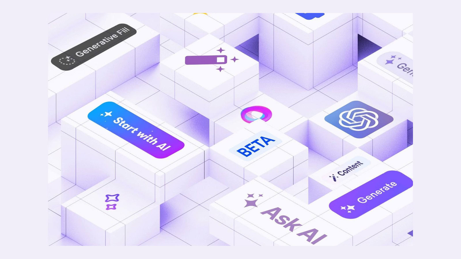
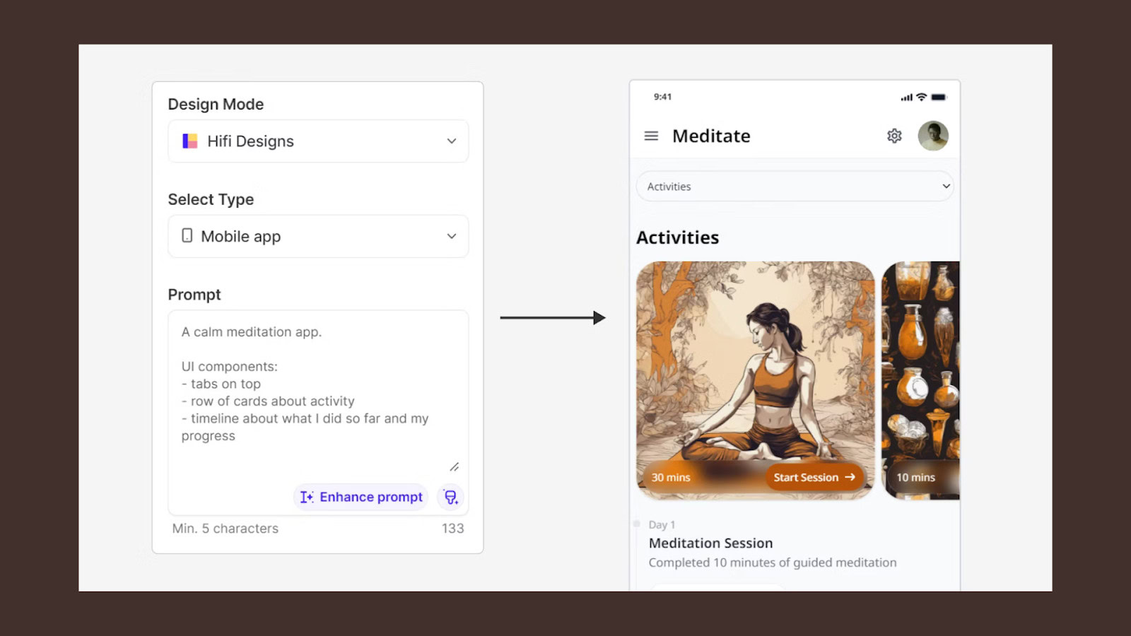
AI-generated customization is becoming a big deal in UX/UI design. Artificial Intelligence is being used more and more to offer personalized experiences that fit each user’s preferences. This UX/UI Design trend uses AI to understand user behavior, gather insights, and adjust content, recommendations, and interfaces in real-time to suit individual needs.
Why It’s Trending
Today’s users expect experiences that feel unique to them. They want things that are relevant, and AI helps make that possible by adjusting interfaces in real-time. AI-generated customization can predict what users want even before they realize it—from personalized product suggestions on a shopping site to curated playlists on a music app. This makes users feel understood and saves them time, which is why this trend is so popular.
AI-generated customization also improves the efficiency of the user journey. By analyzing user data, AI can present the most relevant content or products, reducing the number of steps users need to take to find what they are looking for. This creates a smoother, more intuitive experience that feels tailor-made for each individual.
How to Implement It
You can start incorporating AI into your UX/UI design with small steps, like using machine learning to offer personalized content. For example, you can use AI to recommend products based on what users have looked at before, or create personalized onboarding experiences that adapt to each user.
Another way to use AI is through chatbots that change their tone and style based on how the user interacts with them. By making the experience feel more personal and responsive, you can build a stronger connection with your users. Here are some specific strategies for implementing AI-generated customization:
- Personalized Recommendations: Use AI to analyze user behavior and offer tailored recommendations. E-commerce sites can recommend products based on browsing history, while media platforms can suggest content that aligns with users’ past interactions.
- Dynamic Content: Adjust content in real-time based on user behavior. For example, an online store might change the homepage banners to show products that a returning user is more likely to be interested in.
- Adaptive Interfaces: Create user interfaces that adapt to the preferences and habits of each user. For instance, if a user frequently accesses a specific feature, make it more prominent on their personalized dashboard.
- Conversational AI: Chatbots and virtual assistants can provide a customized experience by learning from user interactions. They can adjust their responses to match the tone and style that the user prefers, making the interaction feel more natural.
Examples in Action
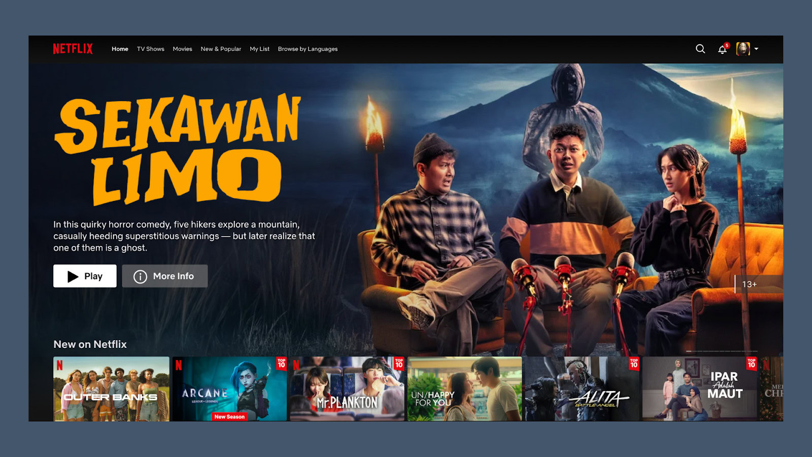
Netflix is a well-known example of AI-generated customization. It uses AI to recommend movies and shows based on what each user has watched before. By learning users’ preferences, Netflix ensures that everyone’s homepage is unique, offering suggestions that are most relevant to them.
Spotify is another great example, creating personalized playlists like “Discover Weekly” that match each user’s music tastes. These playlists are generated using AI that understands what the user likes and introduces them to new music that aligns with their preferences, creating an engaging and personalized experience.
Amazon also uses AI extensively to enhance personalization. When you visit Amazon, the homepage is filled with product suggestions based on what you’ve viewed, searched, or purchased. This level of personalization makes shopping easier and more enjoyable because users can quickly find products that are relevant to them.
UX/UI Design Trend #3: Immersive 3D Elements
Immersive 3D elements are becoming increasingly popular in UX/UI design, with more brands exploring how 3D graphics, animations, and effects can make user experiences more engaging. These elements add depth and realism that flat, 2D designs often lack. From interactive product models to eye-catching animations, 3D is making digital experiences feel more alive and memorable.
Why It’s Trending
Users are looking for more engaging and interactive experiences, and 3D design elements are a great way to provide that. They add a “wow factor” that grabs users’ attention and keeps them interested. With the rise of AR (Augmented Reality) and VR (Virtual Reality), more brands are experimenting with 3D to create new, immersive environments that keep users coming back.
3D elements make the user experience more tangible. Whether it’s rotating a product to see every angle before making a purchase or experiencing a virtual environment, 3D adds a layer of interactivity that makes users feel more connected to the content. This sense of immersion is especially effective in keeping users engaged and encouraging them to explore more.
How to Implement It
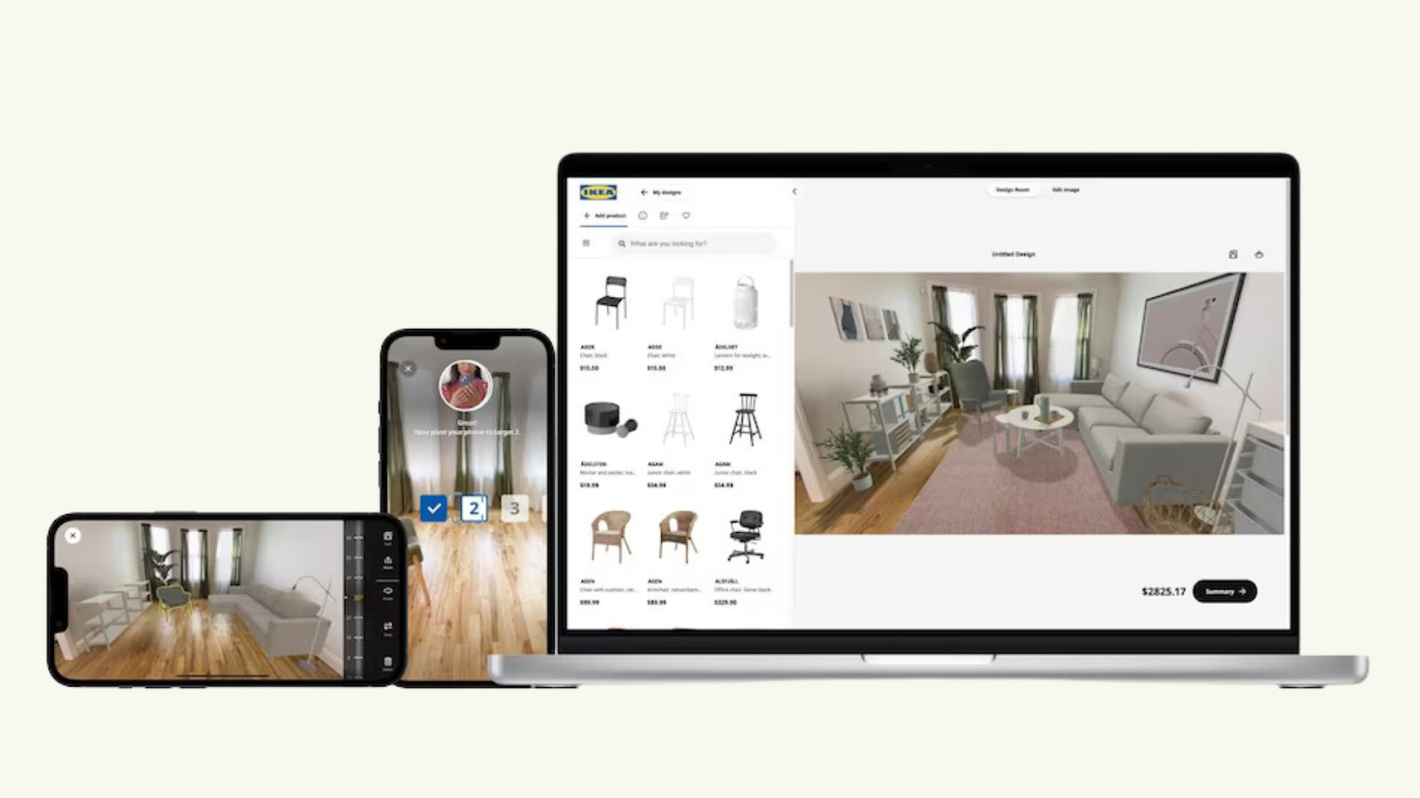
When using 3D elements, it’s important to do so thoughtfully. Start by figuring out where 3D can add value without slowing down your website or overwhelming users. For example, an online store could use 3D product visualizations that let users look at items from every angle, giving them a better understanding of what they’re buying.
You can also use subtle 3D animations to guide users’ attention or highlight important actions. Just be mindful of load times—make sure your 3D elements are optimized so they don’t affect performance. Here are some specific ways to implement immersive 3D elements:
- Product Visualization: If you run an e-commerce site, consider using 3D models for your products. This allows users to see items from different angles, helping them get a better idea of what they are purchasing.
- Interactive Animations: Use 3D animations to highlight specific features or guide users through a process. For example, a car manufacturer might use 3D animations to showcase different features of a vehicle.
- Subtle 3D Effects: Adding small 3D effects, like buttons that appear to lift when hovered over or cards that flip when clicked, can enhance the user experience without overwhelming it.
- Augmented Reality Integration: For brands that want to take things a step further, AR can be used to allow users to see how products look in their real environment. This is especially useful for home décor or fashion brands.
Examples in Action
IKEA’s website and app are great examples of using 3D elements effectively. They have a feature called “IKEA Place” that lets users view furniture in their own space using 3D models. This helps users visualize products in a real setting before making a purchase, making the shopping experience more interactive and confidence-boosting.
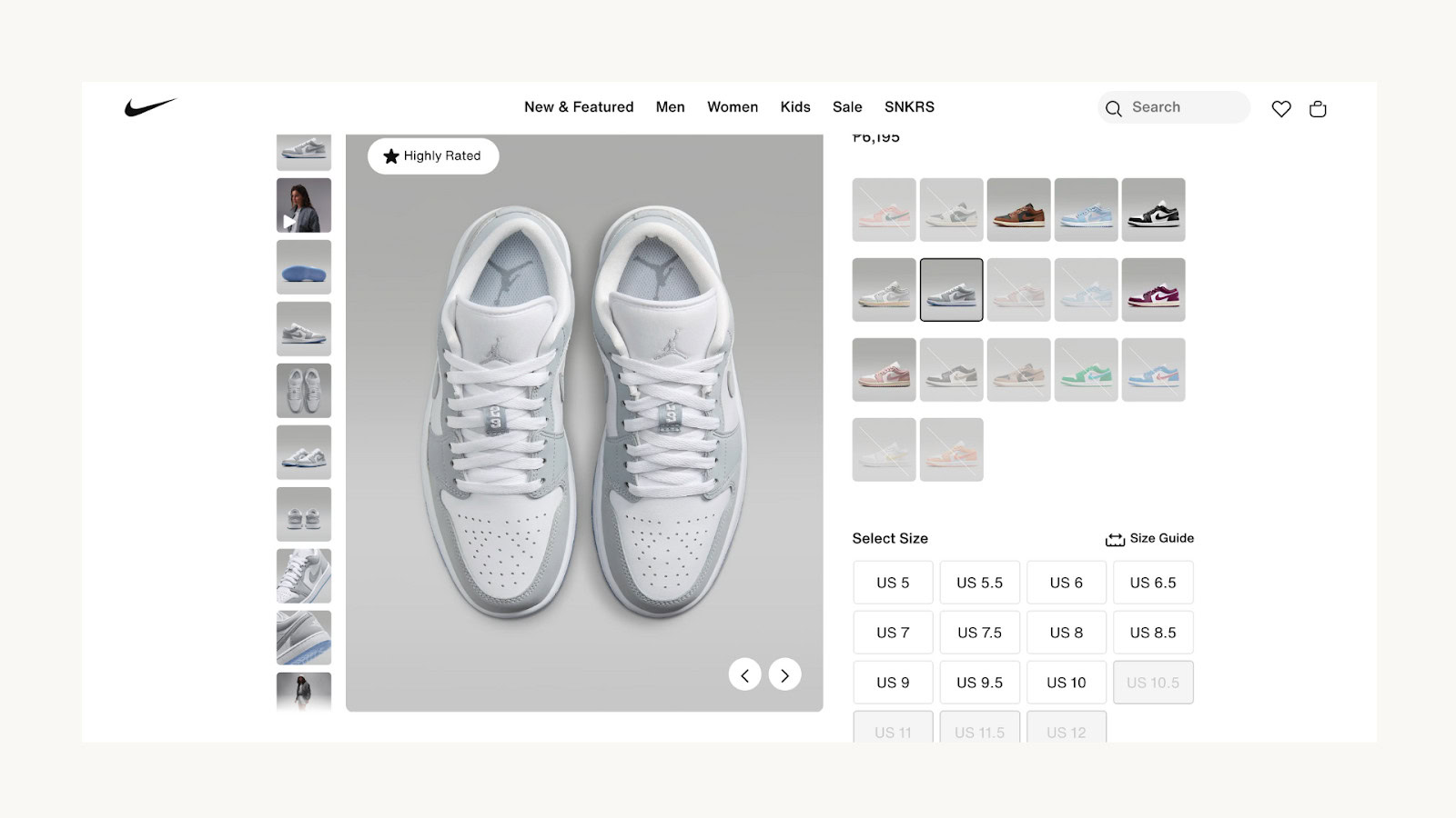
Nike’s website also uses 3D models to showcase their shoes. Users can rotate the shoes, zoom in to see details, and get a much better sense of the product compared to traditional images. This helps customers make more informed purchasing decisions and adds an engaging layer to the shopping experience.
Another example is Shopify’s AR feature, which allows merchants to create 3D models of their products that users can view in their space using augmented reality. This makes the online shopping experience much more engaging and helps bridge the gap between online and in-store shopping.
Conclusion
Design trends are more than just visual styles—they shape how users interact with digital experiences and how they perceive your brand. The top three trends for November 2024—minimalist maximalism, AI-generated customization, and immersive 3D elements—all focus on making user experiences more engaging, personalized, and interactive.
By embracing minimalist maximalism, you can create a design that balances simplicity with boldness, making your brand memorable without overwhelming users. AI-generated customization helps create more personalized experiences, making users feel understood and valued. Meanwhile, immersive 3D elements add depth and interactivity, making your website or app stand out.
To stay ahead in the fast-changing world of UX/UI, consider how these trends can fit your brand and audience. The key is to experiment while always putting the user first. As these trends continue to evolve, they offer exciting opportunities to innovate and create experiences that users will love.
Get a UX & CRO Expert’s Eyes on Your Website. Book a free 30-minute UX Teardown and get actionable insights on what’s costing you conversions — no fluff, just fixes you can implement right away.
Book a Free UX Audit
Related posts
iOS 18 UX Review: An In-Depth Look at Apple’s Latest Update
Apple’s introduction of iOS 18 has created significant excitement, and it’s easy to understand why. The latest version of the […]
Apple’s ‘Exhausted’ Emoji: The Symbol We Didn’t Know We Needed
Have you seen it yet? That yellow face with the heavy under-eye bags that just gets you? Apple recently dropped […]
Top 10 Custom Dashboard Design Tips for 2024
In 2024, data-driven decision-making isn’t just a buzzword—it’s a necessity. As businesses continue to evolve, the ability to make informed […]
Creative product design that gets results
Take your company to the next level with world class user experience and interface design.
get a free strategy session
