
7 Steps for B2B Homepage Design That Humans and AI Can Read

A high-converting B2B homepage tells the right buyer, in one sentence, who you help and the measurable change you deliver, then gives one obvious next step. Every claim on the page, from the hero to the trust close, needs to be readable by a scanning executive and extractable by an AI agent summarizing your site in someone else’s chat window. That means semantic HTML, captioned proof, and zero guessing about what to click next.
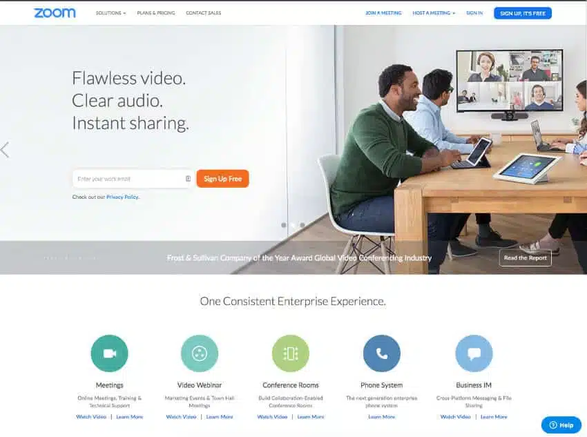
Table of Contents
What Is Good B2B Homepage Design, Really?
Good b2b homepage design isn’t a mood board decision. It’s an information problem you solve in a strict order, because buyers (and increasingly, the AI copilots doing pre-research for them) read pages the same predictable way every time.
The Story-Driven homepage structure that converts best follows a sequence: hero states who changes and how, then problem, then stakes, then proof, then how it works, then who it’s for, then one CTA, then a trust close. Skip a step and the reader has to work to fill the gap themselves. Most won’t bother.
Here’s the anatomy, in the order it should appear on the page:
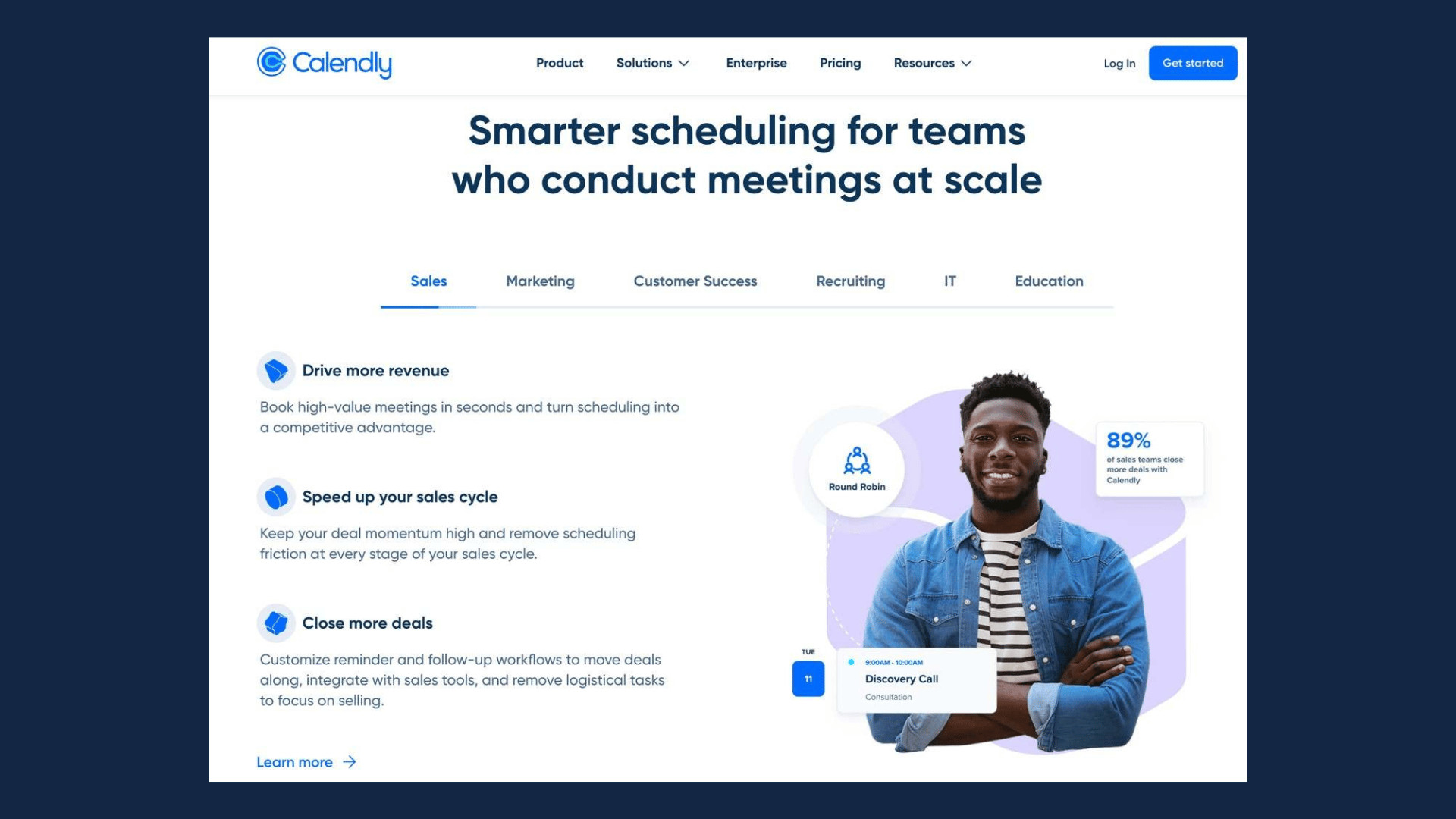
- Hero. One sentence combining category, differentiator, and outcome. Example shape: “We help [category of buyer] achieve [specific measurable outcome] without [the usual cost].” This sits above the fold with a single CTA button, not three competing ones.
- Problem and stakes. Two to three sentences, written in the buyer’s own vocabulary, that name the cost of inaction. This is where B2B copy usually goes generic (“streamline your workflow”) instead of specific (“stop losing 12 hours a week to manual reconciliation”).
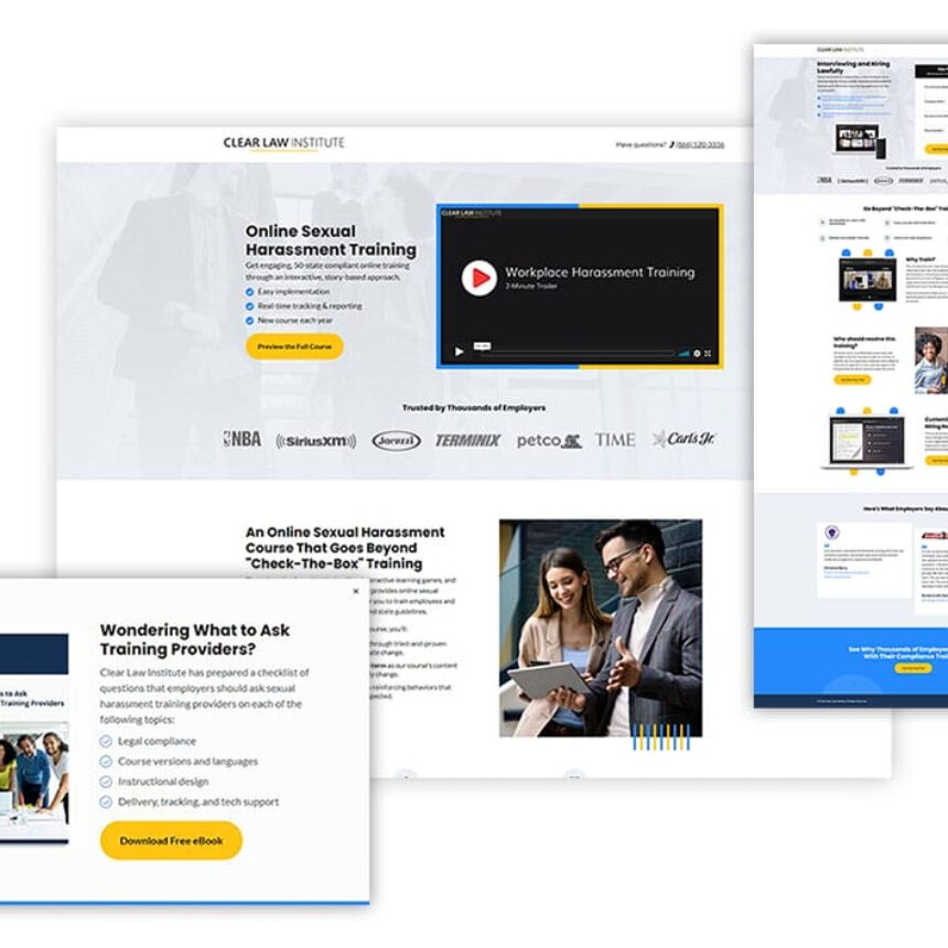
- Proof. A stat, a logo row, or a short outcome-led case study snippet, placed immediately after the problem so skepticism gets answered before it hardens.
- How it works. Three steps, no more. If your process needs a fourth step to explain, that’s a sign the first three aren’t clear yet.
- Who it’s for. A short segment list (by role, industry, or company size) that lets a visitor self-qualify in five seconds.
- CTA. Repeated, but identical in wording and design to the hero CTA. Never introduce a second competing action here.
- Trust close. Security certifications, client logos, or a founder note. This is the last thing a hesitant buyer reads before deciding.
Sequence matters because readers progress in a predictable order: the page should answer the next question before the visitor has to ask it. If your “how it works” section sits below three testimonials, you’ve made the buyer wait for information they needed first. The fix usually isn’t a new design. It’s reordering sections you already have.
One placement rule worth repeating: the CTA above the fold and the CTA at the bottom must be the same action, same words. Two different verbs (“Get a Demo” up top, “Talk to Sales” at the bottom) reads as two different offers, and buyers hesitate when they’re not sure which one is the real ask.
How Do You Design a Homepage That Converts?
Clarity beats cleverness every single time on a B2B homepage. Decision-makers skim in F-patterns and Z-patterns, and they’re often doing it on a laptop between meetings, so your one-sentence value proposition has to survive a five-second read with zero context.
Write the value proposition as: [who you help] + [what changes] + [how fast or how much]. “We help finance teams close month-end 3 days faster” beats “Empowering financial excellence through intelligent automation” on every metric that counts, including how an AI agent would summarize it. Vague abstractions don’t extract cleanly. Specific outcomes do.
CTA microcopy matters more than most design teams admit. “Get Started” is neutral to the point of invisible. “See Pricing,” “Book a 15-Minute Demo,” or “Get Your Free Audit” tell the visitor exactly what happens after the click, which lowers the perceived risk of clicking at all. Strong CTA design also depends on contrast: the button should be the highest-contrast element on the screen, not competing with a hero image or a secondary link in the same visual weight class.
Visual hierarchy is just math dressed up as design. Bigger, higher-contrast, better-spaced elements get read first. If your logo, your headline, and your CTA are all similar in visual weight, the eye doesn’t know where to land, and it usually lands nowhere, which means it leaves.
A few rules worth locking in:
- Keep line length under 75 characters in body copy so paragraphs don’t feel like walls of text.
- Use one accent color for CTAs and nothing else on the page, so the eye learns to associate that color with action.
- Every image or video making a claim (a product screenshot showing “50% faster,” a chart) needs a one-line text caption stating the same claim in words, not just pixels.
- Avoid stacking more than two CTAs of equal visual weight anywhere above the fold.
Captions matter for more than accessibility. Designing for machine readability means pairing visuals with a text equivalent so an AI assistant summarizing your homepage for a buyer doesn’t skip your best proof point because it lived only inside an image file.
Pro Tip: Read your hero sentence out loud to someone outside your industry. If they can’t repeat back what you do and who it’s for, rewrite it before you touch anything else on the page.
What Navigation Structure Helps B2B Buyers Find Information?
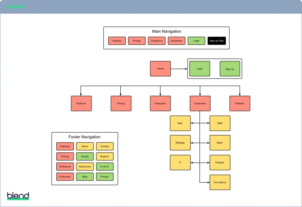
Bad navigation quietly kills more conversions than bad visuals do. A buyer who can’t find pricing, or clicks “Solutions” expecting one thing and gets another, doesn’t complain. They just leave.Information architecture fixes more conversion problems than most visual redesigns, and it comes down to five principles that hold up across almost every B2B site:
- Mutual exclusivity. Each nav item should cover a distinct topic; overlapping categories (“Solutions” and “Products” both describing the same thing) force visitors to guess.
- Scannable labels. Use words buyers actually search for (“Pricing,” “Case Studies”) instead of internal jargon (“Value Framework”).
- Predictable navigation. Keep the nav bar consistent across every page; buyers build a mental map fast, and moving items breaks it.
- No orphan pages. Every page needs a path from the homepage; content buried three clicks deep with no nav link essentially doesn’t exist.
- Shallow depth. Aim for no more than two clicks from the homepage to any conversion-relevant page.
A top-level nav with a moderate number of items, such as Product, Solutions, Pricing, Customers, Resources, and Company, tends to perform best. Excessive navigation items risk overwhelming buyers.
Sticky navigation earns its keep on longer homepages, since it keeps the CTA one scroll away no matter where the reader is. Mega menus make sense only when you genuinely have deep product lines to expose; for most B2B companies, a simple dropdown does the job with less visual noise.
Validate the structure instead of guessing. Tree testing checks whether users can find a specific page using only your nav labels. Card sorting reveals how your own buyers would group your content, which is often different from how your internal team groups it. Click tracking on the live site shows where visitors actually go versus where you assumed they’d go. One team that simplified its navigation this way saw homepage bounce drop 18 percent within 30 days, according to Fernside Studio, without touching a single visual element.
Do Core Web Vitals and Accessibility Affect Conversions?
Yes, directly. A slow or inaccessible homepage loses buyers before your copy or design gets a chance to work at all. Aim for fast page loading and stable visual content so visitors see your value proposition quickly; slow loading and unstable layouts cause visitors to leave early.
Slow loading almost always traces back to a handful of preventable causes: unoptimized hero images, render-blocking JavaScript, and third-party scripts (chat widgets, analytics tags) loading before the content the visitor came for. Compressing images, deferring non-critical scripts, and lazy-loading below-the-fold content are the most common fixes that move LCP scores fast.
Accessibility work overlaps almost entirely with the markup that helps AI agents parse your page correctly. Semantic HTML tags, descriptive alt text on images, captions on video, and full keyboard navigation aren’t separate checklists. Treat them as one job. When a screen reader can navigate your homepage cleanly, a crawler or an AI assistant summarizing your site for a buyer usually can too.
Practical checklist for this pass:
- Use
<h1>through<h3>in true hierarchical order, not just for visual size. - Write alt text that describes the claim, not just the image (“Dashboard showing 40% faster reporting” beats “dashboard screenshot”).
- Caption every video with the spoken claims as on-screen text.
- Test full keyboard navigation through your nav, forms, and CTA buttons.
- Put your core value proposition and proof points in actual text, never only inside a hero video or an infographic.
That last point matters more each year. If your best stat lives inside an uncaptioned image, it’s invisible to both accessibility tools and the AI systems now summarizing homepages for buyers before a human ever loads the page.
What Kind of Proof Actually Converts B2B Buyers?
Vague testimonials (“Great team, highly recommend!”) convince almost nobody. Specific, attributable proof does the heavy lifting on a B2B homepage, and it needs three things: a name, a number, and a source a skeptical buyer could actually go verify.
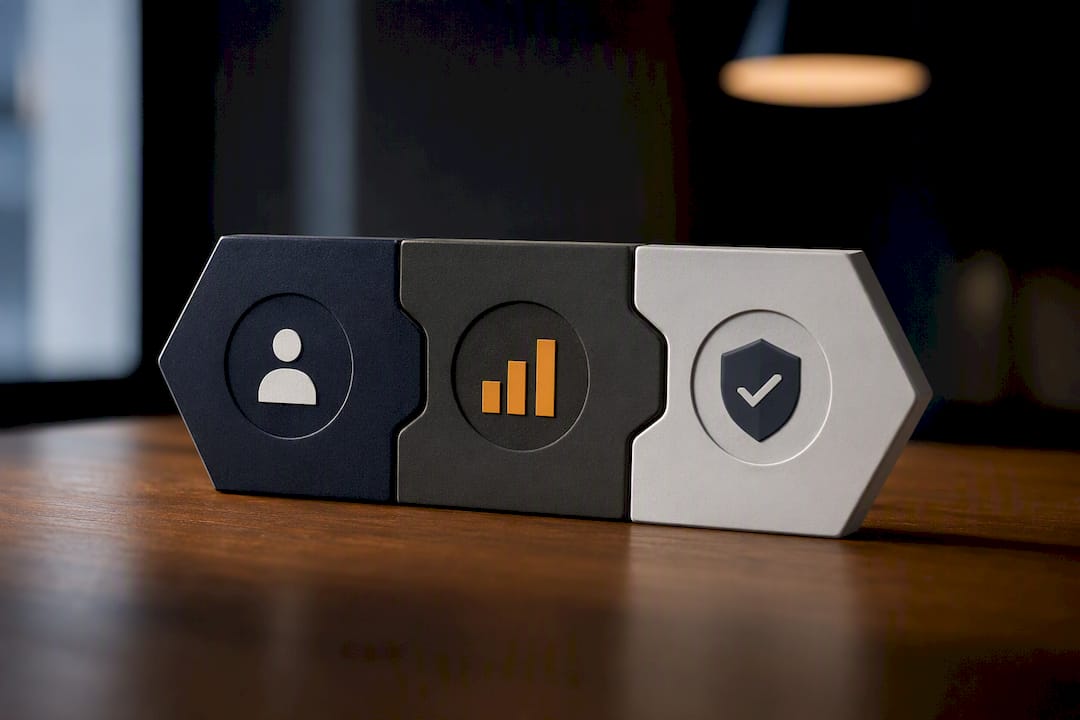
Case study headlines should lead with the outcome, not the process. This titling approach also makes your proof more citable when an AI assistant is summarizing your site for a buyer doing early-stage research, since the outcome is stated plainly instead of buried in a narrative.
A few formatting rules for the homepage specifically, since the full case study should live on its own page:
- Display one hard metric per case study snippet on the homepage; save the full breakdown for the linked page.
- Attribute every testimonial with a full name, job title, and company. Anonymous quotes read as filler, even when the sentiment is genuine.
- Pair client logos with a linked case study and a single line of result text underneath, not just a logo wall with no context.
- Rotate proof points near the top of the page (right after the problem section) with deeper case studies lower down for buyers doing due diligence.
The goal isn’t to cram every win onto the homepage. It’s to put one credible, specific proof point where skepticism naturally peaks, then link out for buyers who want the full story before they book a call.
How Do You Test and Improve Homepage Conversion Rates?
Redesigns are expensive and slow. Testing is cheap and constant, and most homepage conversion gains come from a handful of small, well-targeted fixes rather than a full rebuild.
Run this in the first 30 days on any underperforming homepage:
- Fix or add the single above-the-fold CTA if the page currently has none, or has two competing ones.
- Compress the hero copy down to one sentence naming buyer and outcome; cut anything that doesn’t serve that sentence.
- Run an accessibility and semantic markup pass, since this doubles as your machine-readability fix for AI extraction.
- Check Core Web Vitals scores and fix the worst offender, usually an unoptimized hero image or a blocking script.
- Confirm every proof claim tied to an image also exists as text nearby.
Once those baseline fixes are live, move to structured A/B testing. Prioritize in this order: headline and value proposition first, since it affects every visitor; CTA wording and placement second; hero visual composition third. Testing button color before you’ve nailed the headline is optimizing the wrong variable.
Track conversion rate on the primary CTA as your headline metric, but watch micro-conversions too: scroll depth past the hero, time on page, and clicks into pricing or case study pages. A page that improves scroll depth but not final conversion usually has a mismatch between what the hero promises and what the proof section delivers.
Run each test for at least two full business cycles, not just a week, since B2B buying committees don’t move on consumer timelines. Escalate to a full redesign only when incremental tests plateau, typically after you’ve addressed headline, CTA, and hero composition without meaningful lift.
Pro Tip: Before launching any A/B test, write down the specific hypothesis in one sentence: “Changing X will improve Y because Z.” If you can’t state that sentence, you’re not testing yet, you’re just guessing with extra steps.
What Do Strong B2B Homepages Actually Look Like?
Three homepage patterns show up again and again on the highest-converting B2B sites, and each fits a different stage of company maturity.
- The single-metric hero. One dominant number in the hero (“40% faster close times”) paired with a short qualifying sentence. Works best when you have one flagship outcome that applies broadly across your customer base.
- The persona-split hero. Two or three buttons under the headline letting visitors self-select by role (“I’m in Finance” / “I’m in Ops”), each routing to a tailored section further down the page. Works well when your buyers have genuinely different pain points.
- The proof-first hero. Client logos or a case study snippet placed directly in the hero, ahead of the standard problem section. Works for companies with strong brand recognition among the logos they’d display; less effective for newer companies without recognizable names yet.
Galleries on sites like Dribbble are worth browsing for visual texture, but treat them as mood boards, not conversion proof. A beautiful layout that’s never been tested against real traffic is still a guess.
When briefing a designer or developer, annotate screenshots directly: circle the hero CTA and note the exact wording change you want, mark the proof section with the specific stat to swap in, and flag any image that needs a text caption added. Vague feedback like “make it pop” produces vague revisions.
Raw Studio’s Everdure project is a useful reference for this kind of disciplined rework: a clear structural pass on hierarchy and proof placement rather than a purely cosmetic refresh, matched to what the brand actually needed to communicate.
How Should You Personalize a Homepage for Different Buyer Personas?
A homepage that speaks to everyone equally usually persuades no one specifically. Personalization on a B2B homepage doesn’t require a full dynamic content engine to start paying off.
The lightest version is a persona-split hero: two or three buttons routing visitors by role or industry into tailored sections further down the same page. A visitor who clicks “I’m in IT” should see security and integration language; a visitor who clicks “I’m in Finance” should see ROI and cost-reduction language, even if it’s the same product underneath.
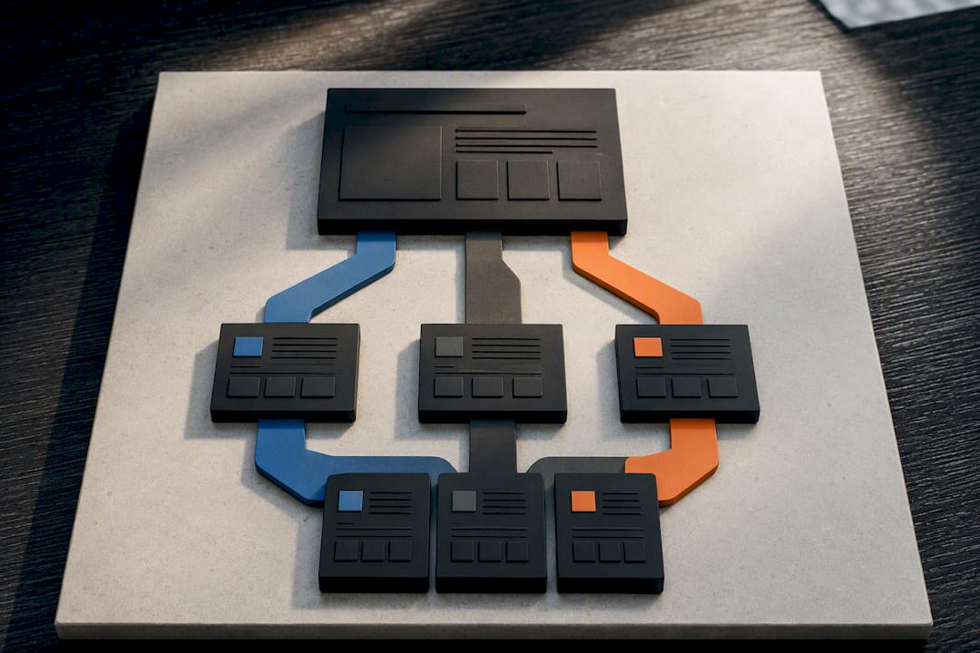
More advanced setups use firmographic or behavioral signals (referral source, company size detected from IP, returning visitor status) to swap hero copy or proof points dynamically. This is worth building once your traffic volume justifies the engineering cost, typically once you’re running consistent paid campaigns into the homepage rather than relying mostly on organic and referral traffic.
The middle ground, and the one most companies should start with: segment your proof section by persona instead of the whole hero. Show a manufacturing case study to visitors arriving from an industrial trade publication, and a SaaS case study to visitors arriving from a tech newsletter. The value proposition stays constant; the evidence adapts.
Whatever level of personalization you choose, keep the core one-sentence value proposition stable across every version. Personas should change which proof and pain points get emphasized, not the fundamental claim about who you help and what changes. A homepage that says something different to every visitor stops being a coherent brand and starts looking like a set of disconnected landing pages wearing the same header.
How Do You Optimize a B2B Homepage for SEO?
SEO on a B2B homepage isn’t about keyword density. It’s about making sure the page answers the exact question a buyer or a search engine expects it to answer, in text that’s structured for extraction.
Start with the title tag and H1: both should reflect what your company does in language a buyer would actually search, not a slogan. “AI-Powered Compliance Automation for Mid-Market Banks” outperforms “Reimagining Compliance” for search intent and for clarity, and it happens to be the same discipline that makes your hero sentence work for human readers.
Structured, hierarchical headings help here too. Search engines and AI assistants both parse H1 through H3 tags to understand page structure, so the same semantic hierarchy you build for accessibility does double duty for SEO. Avoid skipping heading levels purely for visual sizing; it breaks the logical structure crawlers rely on.
Internal linking from the homepage to key service, pricing, and case study pages passes both authority and context. A homepage with no internal links to its deepest, most valuable content is telling search engines that content doesn’t matter much, even when it does.
Page speed doubles as an SEO factor and a conversion factor, since Core Web Vitals scores feed directly into how search engines rank pages. Every fix you make for LCP and CLS in the performance section above is also SEO work.
Finally, make sure your value proposition and proof points exist as crawlable text, not locked inside images or client-side rendered JavaScript that a crawler might not fully execute. The same machine-readability principle that helps AI agents summarize your site correctly is what helps search engines index it correctly too.
How Do You Connect Homepage Forms to Your CRM?
A lead capture form that doesn’t route cleanly into your CRM is worse than no form at all, because it creates a false sense of pipeline while leads quietly go nowhere.
Keep the homepage form itself short. Three to five fields (name, work email, company, and maybe one qualifying question) convert far better than a ten-field form asking for budget and timeline upfront. Save the deeper qualification questions for a follow-up step or a scheduling tool after the initial submission.
Native integrations between your website platform and CRM platforms like HubSpot or Salesforce are worth setting up before launch, not after you’ve already lost a month of leads to a spreadsheet nobody checks. Field mapping matters here: make sure UTM parameters, referral source, and page URL all pass through to the CRM so sales knows exactly which homepage section or campaign generated the lead.
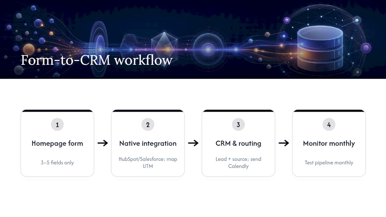
Route form submissions to a scheduling tool (Calendly or similar) directly after submission when the CTA is “Book a Demo,” rather than making the visitor wait for a follow-up email. Every extra step between form submission and a booked call is a chance for the lead to lose momentum and go cold.
Test the entire form-to-CRM pipeline monthly, not just at launch. Integrations break silently when a CRM updates its API or a form field gets renamed, and a broken lead pipe can run for weeks before anyone notices the drop in booked calls. If your CTA promises a demo, the fastest path from click to calendar booking is the one that actually protects your pipeline.
How Do You Write Homepage Copy for B2B Decision-Makers?
B2B decision-makers read homepage copy the way they read a vendor proposal: fast, skeptical, and looking for the catch. Copy that oversells or hides specifics reads as a red flag, not a strength.
Lead with outcomes, not features. “Automated invoice matching” describes what the product does; “close month-end three days faster” describes what the buyer gets. Decision-makers are buying the second thing, and they’ll tolerate reading about the first thing only after you’ve earned their attention with the outcome.
Match tone to the actual stakes of the purchase. A homepage selling project management software to marketing teams can afford a lighter, more conversational voice. A homepage selling compliance infrastructure to banks needs a more measured, precise register, because the buyer is evaluating risk, not just utility. Getting this mismatched, sounding too casual for a high-stakes category or too stiff for a low-stakes one, undermines credibility before the buyer reads a single feature.
Cut adjectives that don’t carry information. “Powerful,” “seamless,” and “innovative” describe nothing a buyer can verify. Replace them with specifics: instead of “powerful analytics,” write “analytics that flag anomalies within 24 hours.” The specific claim is checkable, and checkable claims build more trust than confident-sounding adjectives ever do.
Write for the committee, not just the champion. Most B2B purchases involve multiple stakeholders with different priorities, so your homepage copy should give each of them something to point to: the economic buyer needs the ROI number, the technical evaluator needs the integration detail, the end user needs the day-to-day workflow change. A single well-structured homepage can serve all three without becoming cluttered, as long as each claim sits in the section that persona is most likely to read.
What Common Mistakes Hurt B2B Homepage Conversions?
Most underperforming B2B homepages fail for the same handful of reasons, and almost none of them require a full redesign to fix.
Too many competing CTAs is the most common one. A homepage with “Get a Demo,” “Start Free Trial,” “Contact Sales,” and “Learn More” all fighting for attention gives the visitor permission to choose none of them. Pick one primary action and repeat it consistently.
Vague, feature-first headlines are a close second. “The Platform for Modern Teams” tells a buyer nothing about who it’s for or what changes. If a stranger can’t guess your industry and outcome from the headline alone, it needs a rewrite.
Proof that’s generic or unattributed undercuts trust rather than building it. A testimonial with no name or title reads as filler copy a design team wrote themselves, whether or not that’s true.
Burying the “how it works” section below three rounds of testimonials and a features grid forces buyers to wait for information they needed earlier. Sequence problems like this are often mistaken for design problems, when the real fix is reordering existing sections.
Ignoring mobile and tablet rendering is a persistent blind spot, especially since a meaningful share of B2B research now happens on phones between meetings. A hero that looks sharp on a 27 inch monitor but truncates the value proposition on mobile is losing buyers at the exact moment they’re forming a first impression.
And finally, treating the homepage as a one-time project instead of a living page that gets tested and adjusted quarterly. The homepages that keep converting well are the ones someone keeps paying attention to.
Raw Studio’s Method for B2B Homepage Projects
Raw Studio runs homepage projects through a Design Sprint first: a short, focused process that pressure-tests the hero message, structure, and CTA before a single pixel gets finalized, so the strategy is right before the visual work begins. From there, a Rapid MVP approach gets a working version live fast, so real visitor behavior replaces internal opinion as the deciding factor.
One client engagement produced a 100% increase in conversion rate, documented in the Everdure case study, through exactly this kind of structural and proof-focused rework. A typical initial homepage engagement includes a structure audit, a revised hero and CTA strategy, and a tested prototype, usually within a matter of weeks rather than months.
Get a Free Homepage Audit From Raw Studio
Raw Studio’s free UX audit gives you a structural review of your current homepage against exactly the anatomy covered above: hero clarity, CTA placement, proof strength, and machine-readable markup, without a sales pitch attached to the findings.
If your homepage copy needs work before the layout does, the free branding checklist walks through tightening your value proposition and message hierarchy before you touch a single design file. Both resources exist because most homepage problems are diagnosable before a single wireframe gets drawn, and fixing the diagnosis first saves a full redesign cycle later.
For companies ready to move past a self-audit, Raw Studio’s UX design and conversion rate optimization teams run the Design Sprint and Rapid MVP process described above on live homepage projects. Book a scoping call, request the free audit, or start with the checklist. Whichever entry point fits, the next step is the same: get a clear-eyed read on where your current homepage is losing buyers before you spend a design budget guessing.
Get a UX & CRO Expert’s Eyes on Your Website. Book a free 30-minute UX Teardown and get actionable insights on what’s costing you conversions — no fluff, just fixes you can implement right away.
Book a Free UX Audit
Related posts

Recover Abandoned Carts: 3 Checkout Optimization Fixes for Online Shops
Fix surprise costs, add guest and express checkout, and cut your form down to essentials. Those three changes recover the […]
How to use Data to inform your UX Design in 2023
Data analytics is an essential and powerful tool for UX designers, as it helps them make data-driven decisions about the […]
Why Mobile First Navigation Wins: Smarter Ecommerce Design for Higher Sales
A strong mobile first navigation system is one of the biggest drivers of product discovery in a mobile first ecommerce […]
Creative product design that gets results
Take your company to the next level with world class user experience and interface design.
get a free strategy session
