
Recover Abandoned Carts: 3 Checkout Optimization Fixes for Online Shops

Fix surprise costs, add guest and express checkout, and cut your form down to essentials. Those three changes recover the largest share of abandoned carts, and they’re the cheapest to test. Everything else in checkout optimization, from trust badges to progress bars, matters less than getting these three right first.
Fix surprise costs, add guest and express checkout, and cut your form down to essentials. Those three changes recover the largest share of abandoned carts, and they’re the cheapest to test. Everything else in checkout optimization, from trust badges to progress bars, matters less than getting these three right first.
Table of Contents
What Is Checkout Optimization, and Why Does It Matter?
Checkout optimization is the practice of removing friction, confusion, and surprise from the steps between “add to cart” and “order confirmed.” It sounds simple. It rarely is, because most stores treat checkout as a formality bolted onto the end of the shopping experience rather than the moment that decides whether any of the marketing spend before it actually pays off.
The scale of the problem is bigger than most owners assume. Baymard’s research on checkout UX found that design changes alone can lift conversion by up to 35% for many sites, simply by fixing structural issues rather than rewriting product copy or running more ads. That’s not a rounding error. That’s the difference between a checkout that quietly bleeds revenue and one that closes the sale it already earned.
Quick Stat: Checkout redesign changes, without touching traffic or pricing, can raise conversion by as much as 35% on many ecommerce sites, according to Baymard Institute.
Three metrics tell you whether your checkout is working: cart-to-checkout rate (do people even start?), checkout completion rate (do they finish?), and payment-failure rate (how often does the final step break?). Track those three before you touch anything else.
What Are the Core Principles of Checkout UX Best Practices?
Every tactic in this article traces back to five principles. Memorize these, and you’ll know how to evaluate any new checkout idea that comes your way, whether it’s from a developer, a plugin, or a consultant pitching a redesign.
- Reduce friction. Every field, click, and redirect is a chance for someone to reconsider.
- Be transparent. Hidden costs are the single fastest way to lose a sale you already won.
- Design mobile-first. Most traffic and most abandonment happen on a phone.
- Lead with trust. Payment is the moment people get nervous. Meet that nervousness directly.
- Test incrementally. Full redesigns without testing routinely make conversion worse, not better.
Use impact versus effort to decide where to start. Showing full costs earlier, enabling guest checkout, and trimming form fields all sit in the high-impact, low-effort corner. Rebuilding your entire checkout flow on a new platform sits in the high-impact, high-effort corner, and it should wait until you’ve validated the cheaper fixes first.
Pro Tip: Before changing anything, pull your last 90 days of checkout analytics and find the single step with the highest drop-off. That’s your first test, not whatever felt urgent this morning.
How Do I Simplify My Checkout Flow and Forms?
Form design is where checkout optimization gets its worst reputation, mostly because it’s the easiest thing to overcomplicate. A checkout form is not the place to collect marketing data or verify identity twice. It’s the place to get one transaction finished.
- Make guest checkout the obvious default. Account creation should be an option after purchase, not a gate before it. Baymard’s research on checkout flow consistently ranks a buried or mandatory account requirement among the top causes of abandonment.
- Cut fields down to the essentials. Baymard recommends aiming for roughly 7 to 8 fields maximum, which usually means combining first and last name into one input and dropping anything you don’t strictly need to fulfill the order.
- Turn on autofill and inline validation. Address autocomplete and browser autofill remove typing entirely for repeat information, and inline validation catches a typo in an email field before it becomes a failed order confirmation.
- Preserve entered data after an error. Nothing sends a shopper away faster than watching a form wipe itself clean because one field failed.
Every optional field you mark as optional (in words, not just by omitting an asterisk) removes a small moment of hesitation. Small moments add up across a full checkout.
Pro Tip: Time yourself filling out your own checkout on a phone, thumbs only, no autofill. If it takes more than 90 seconds, your customers feel that friction twice as much as you do.
How Do You Build Trust at the Payment Step?
Payment is the moment doubt creeps in, even for shoppers who were fully convinced two screens ago. Stripe recommends treating checkout as a distraction-free zone, and that principle extends directly to trust signals: they need to appear exactly where doubt appears, not buried in a footer.
- Place security badges and recognizable payment logos near the CTA button, not in a sidebar shoppers have already scrolled past.
- Summarize your return and refund policy in one short line, right there, instead of forcing a click to a separate page.
- Show a visible support option (chat, phone, email) so a hesitant shopper has somewhere to go besides “back.”
- Strip out navigation menus, related-product carousels, and upsell pop-ups during checkout itself.
- Use short, specific microcopy like “Secure checkout, PCI compliant” instead of vague reassurance.
Quick Stat: Baymard’s checkout benchmarks find that many ecommerce checkouts rate as mediocre or worse on usability, with guest checkout visibility and clear error handling among the most common gaps.
Visual polish matters here too. A checkout page with inconsistent fonts, misaligned buttons, or a CTA that looks like every other gray button on the page reads as unfinished, and unfinished reads as untrustworthy.
Which Payment Options Actually Increase Conversion?
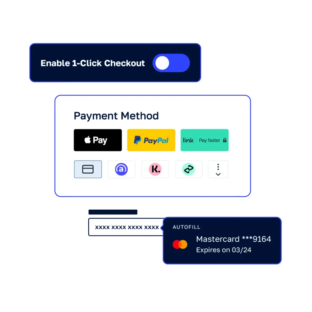
Payment method friction is one of the easiest fixes with one of the fastest payoffs, because it doesn’t require touching your form logic at all. It requires knowing your audience and giving them the button they already expect to see.
- Offer the payment methods your specific audience actually uses, not a generic global list. A B2C fashion store and a B2B software client need different defaults.
- Add at least one buy-now-pay-later option if your average order value supports it. BNPL adoption has become a standard tactical recommendation in checkout optimization guides for exactly this reason.
- Feature express buttons like Apple Pay or Google Pay above the fold, and on the cart page itself, not just at final checkout.
- Consider a hosted checkout or tokenized saved-payment setup if your team doesn’t want to own PCI compliance directly. It’s a lower-risk way to offer one-click repeat purchases.
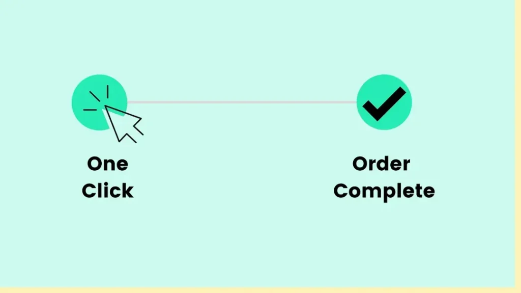
Express checkout buttons do double duty. They cut the entire form-filling process to a single tap for return customers, and they signal legitimacy for first-time buyers who recognize the button before they recognize your brand.
How Should Mobile Checkout Design Differ From Desktop?
Mobile checkout optimization isn’t a smaller version of desktop design. It’s a different problem, because thumbs, screen size, and impatience all behave differently than a mouse and a keyboard.
- Trigger the numeric keyboard automatically for phone numbers, card numbers, and zip codes. Forcing someone to switch keyboards manually is a small but real source of drop-off.
- Use a single “Full name” field on mobile instead of splitting first and last name across two boxes that eat screen space.
- Keep the primary CTA within thumb reach, and make it sticky on longer pages so scrolling never hides the “next” button.
- Test on real phones, not just browser simulators. FullStory’s research on mobile friction found that real-device testing surfaces different issues than desktop-based emulation ever catches.
- Prioritize load speed above almost everything else. A mobile connection that stalls for three seconds during payment does more damage than a missing trust badge.
Mobile-specific adjustments tend to be cheap to build and expensive to skip, which makes this one of the highest-leverage sections in the whole checklist.
How Do I Stop Surprise Costs From Killing the Sale?
Surprise shipping costs are the single most cited reason shoppers abandon a cart, and the fix is almost entirely a matter of sequencing information earlier, not adding new features.
- Show shipping and tax estimates on the product page or in the cart, before checkout even starts, using a shipping calculator if rates vary by location.
- Use a “you’re $12 away from free shipping” progress indicator to nudge order value up while reducing the shock of a shipping line item.
- Display estimated delivery dates wherever your fulfillment data allows it. A concrete date reduces anxiety more than a vague “5 to 7 business days” range.
- Keep the running total visible at every step, and never introduce a new fee once someone reaches the payment screen.
The pattern behind all four of these is the same: cost information should move earlier in the flow, not disappear until the last possible screen. Shoppers don’t mind paying for shipping. They mind finding out about it at the worst possible moment.
How Do Progress Indicators Reduce Checkout Anxiety?
A progress indicator only works if it tells the truth. Baymard’s checkout research is specific on this point: progress indicators need to map one-to-one to the actual number of steps, because a bar that jumps unpredictably creates more anxiety than no bar at all.
- Use descriptive CTA copy like “Continue to payment” instead of a generic “Next,” so shoppers know exactly what’s coming.
- Keep the order summary visible through every step of the flow, not just on the first screen.
- Allow inline editing of quantities or shipping options without clearing the rest of the form.
- Make completed steps clickable, so someone who wants to fix their shipping address doesn’t have to restart the whole process.
A checkout that shows people exactly where they are, and lets them go back without penalty, removes a category of hesitation that no amount of trust badging can fix on its own.
How Should Error Handling and Payment Failures Work?
A declined card is not the end of a sale. It’s a fork in the road, and where it leads depends entirely on what your checkout does in the next three seconds.
- Validate as the shopper types, and when a submission fails, move focus directly to the first error instead of leaving them to hunt for it.
- Persist every field on failure. Stripe’s guidance on cart abandonment is explicit that retaining user input after a failed payment attempt prevents a second, avoidable abandonment on top of the first.
- Offer a clear next step on decline, such as suggesting an alternative payment method rather than a bare “transaction failed” message.
- Hold the cart briefly for time-sensitive issues, and surface a support channel immediately rather than making someone hunt for a contact page mid-payment.
Pro Tip: Write your decline messages like you’re talking to a real person who’s mildly annoyed, not like you’re logging a system error. “Try a different card or contact your bank” beats “Error code 402” every time.
How Do I Recover Abandoned Carts and Measure Results?
Recovery emails work, but only when the sequence and timing are deliberate rather than a single generic blast three days later.
- Build a two to three touch sequence: an early reminder within an hour, a follow-up with urgency or a small incentive around 24 hours, and a final nudge a few days out.
- Track cart abandonment rate, checkout completion rate, and payment-failure rate by cohort, so you know whether a fix worked for mobile users, returning customers, or a specific traffic source.
- Use session replay and funnel analytics before building new tests. FullStory’s approach to reducing cart abandonment centers on watching real sessions to find friction points, rather than guessing at what might be wrong.
Quick Stat: Combining behavioral session data with cohort-level funnel tracking lets you isolate whether a drop-off is a design problem, a payment-method gap, or a mobile-specific bug, rather than treating checkout abandonment as one undifferentiated number.
How Do I Test and Roll Out Checkout Changes Safely?
Full redesigns without testing have a bad track record. Practitioners across the industry warn that a wholesale checkout overhaul, launched all at once, frequently makes conversion worse rather than better, simply because too many variables change at the same time to know what actually helped.
- Start with incremental A/B tests on your top three fixes: cost transparency, guest or express checkout, and form field pruning. These are the highest-impact, lowest-risk changes on the entire list.
- Define a clear success metric and sample size before launch. Checkout completion rate is usually the right primary metric; decide your minimum sample size in advance so you’re not tempted to call a test early.
- Avoid running overlapping experiments on the same page. Two simultaneous tests on the same checkout screen make it impossible to know which change caused which result.
- Keep a running change log of what you tested, when, and what happened, so six months from now you’re not re-testing something you already learned.
Quick wins earn the budget for bigger platform investments later. Skipping straight to a full rebuild skips the evidence that would have told you what to build.
How Has Agency-Driven CRO Improved Real Checkouts?
Checkout fixes are usually straightforward to describe and surprisingly easy to get wrong in execution, which is exactly where structured agency work earns its keep. Raw approaches checkout problems the same way it approaches broader conversion rate optimization engagements: research first, then design, then test, rather than a guess dressed up as a redesign.
- Conversion rate optimization work typically starts with a UX audit that isolates specific friction points rather than proposing a full rebuild on day one.
- UX and UI design services focus on the form, flow, and visual trust cues covered throughout this article, applied to a client’s actual checkout rather than a generic template.
- Web development support turns validated test winners into production code, so a fix that worked in a test doesn’t get lost in a backlog.
The highest-value moment to bring in outside help is usually right after you’ve identified friction through your own analytics but before you’ve committed engineering time to fixing the wrong thing.
What Accessibility Considerations Belong in Checkout Design?
Accessibility in checkout isn’t a separate initiative from conversion. Every barrier that blocks a screen-reader user or someone navigating by keyboard also degrades the experience for shoppers who are simply tired, distracted, or checking out on a cracked phone screen in bad light.
Form labels need to be programmatically associated with their inputs, not just visually adjacent, so screen readers announce “shipping address” instead of silence. Error messages need to be announced when they appear, not just displayed in red text that a sighted user notices and a screen-reader user never hears. Color alone should never carry meaning. A red border on an invalid field needs an accompanying text message, because color-blind shoppers, roughly 1 in 12 men by common estimates, won’t see the red at all.
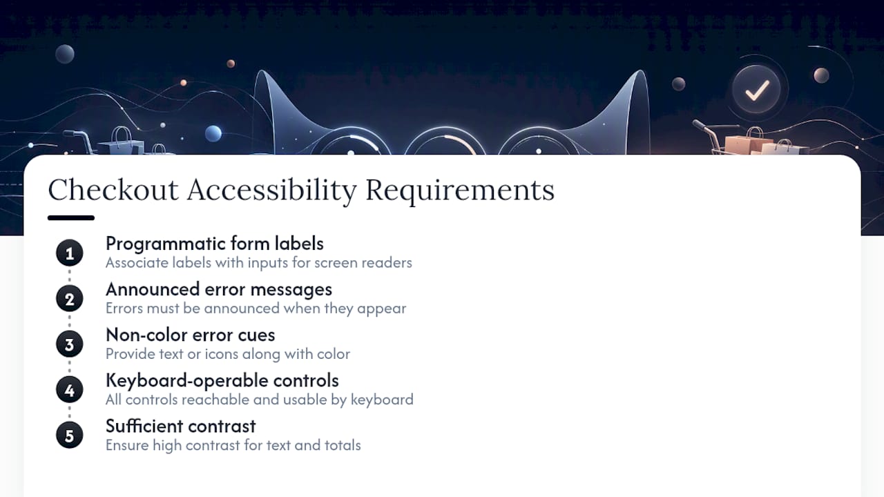
Every interactive element, from the express payment buttons to the “edit” links on your order summary, needs to be reachable and operable by keyboard alone. Tab order should follow the visual flow of the page, not jump around based on how the code happened to get written. Sufficient contrast between text and background matters more in checkout than almost anywhere else on your site, because this is the one page where a misread digit in a total or an address field has real consequences.
None of this requires a separate accessibility redesign. It requires building the same form-pruning, autofill, and inline-validation improvements already covered in this article with keyboard and screen-reader behavior checked at each step, not bolted on afterward.
How Do I Localize Checkout for International Shoppers?
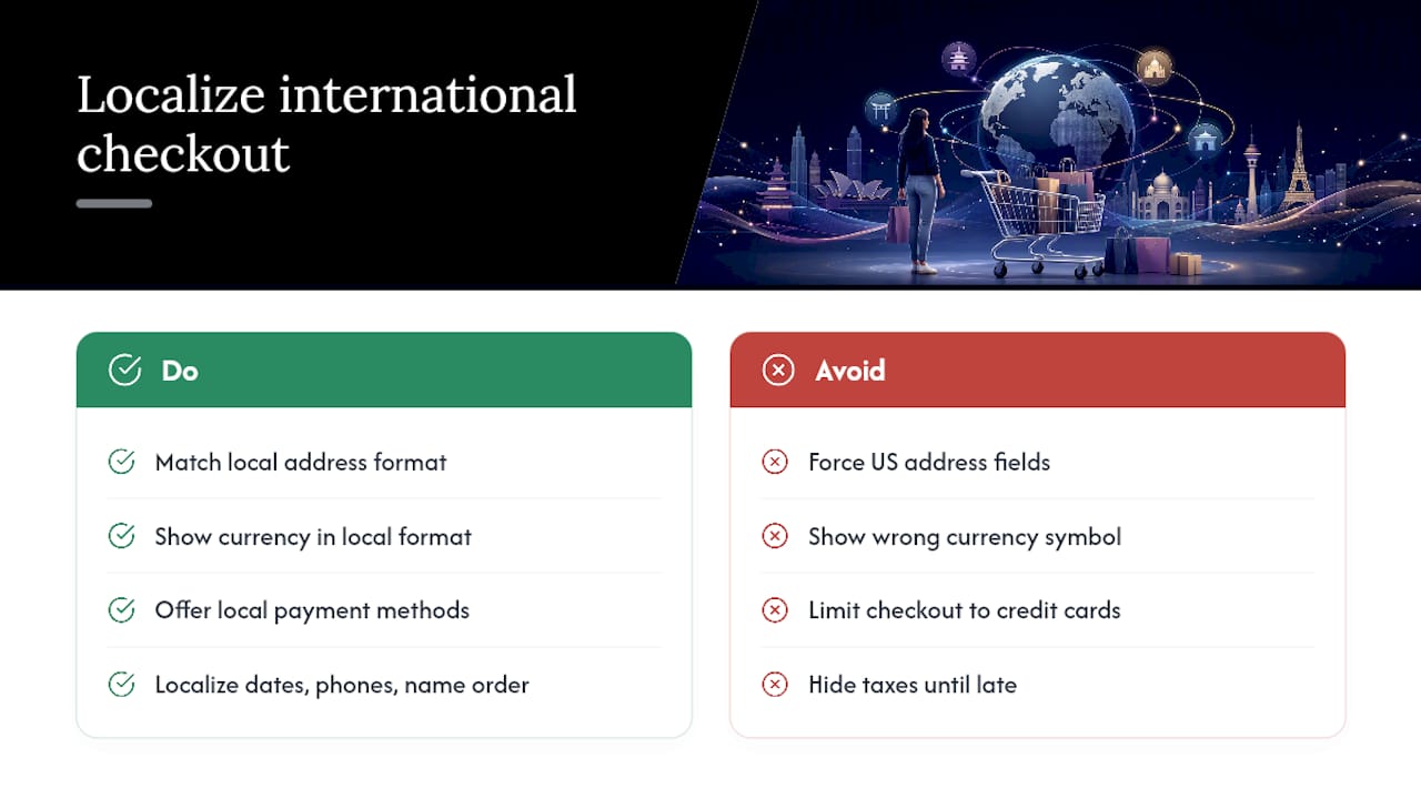
A checkout built for one country rarely works cleanly for another, and the failures are usually invisible to the team that built it. Address formats are the clearest example: a US-style form with separate city, state, and zip fields breaks immediately for countries that don’t use states or that order address components differently.
Currency display needs to match local expectations exactly, not just convert the number. Showing a price in euros with a dollar sign, or displaying $19.99 to a shopper who thinks in comma decimals, creates a moment of confusion at exactly the wrong time. Payment method availability varies sharply by region too. A checkout that only offers credit cards will underperform in markets where digital wallets or local bank transfer methods dominate.
Language localization goes beyond translating labels. Date formats, phone number formats, and even the order of name fields (family name first in several countries) all need to match local convention, not get forced into a US-centric template. Tax display matters as much internationally as it does anywhere else. VAT-inclusive pricing is often a legal expectation in the European Union, not just a nice-to-have, which means the “show costs early” principle from earlier in this article carries different regulatory weight depending on where your shopper is located.
Getting international checkout wrong doesn’t usually show up as a support ticket. It shows up as a quiet cart abandonment from a shopper who never explains why, because there’s no field to explain it in.
Why Does Checkout Page Load Speed Matter So Much?
Speed matters everywhere on a site, but checkout is the one place where a slow load doesn’t just annoy someone. It makes them wonder if the payment actually went through, and that uncertainty is enough to make people abandon rather than risk a duplicate charge.
Every third-party script on a checkout page, from chat widgets to marketing pixels, adds load time at the exact moment speed matters most. Audit what’s actually running on your checkout page and remove anything that isn’t essential to completing the transaction. Image weight matters too, particularly on the order summary where product thumbnails often load at full resolution when a compressed version would look identical to the shopper.
Payment gateway response time is often outside your direct control, but the perceived wait isn’t. A clear loading state, a disabled button with a spinner, and copy like “Processing your payment, don’t refresh” all reduce the anxiety of a few extra seconds even when you can’t eliminate them. Mobile networks make all of this worse. A checkout that loads acceptably on office wifi can crawl on a spotty 4G connection, which is exactly the network condition a lot of mobile shoppers are on.
Test your checkout’s load time specifically, not just your homepage’s. Google’s Core Web Vitals apply to every page on your site, but the business cost of a slow checkout is measured directly in abandoned carts, not just search ranking.
What Legal Compliance Rules Apply to Checkout Pages?
Checkout is where your business handles the most sensitive data on your entire site, and that comes with obligations that aren’t optional extras.
PCI DSS compliance governs how you handle card data, and the safest approach for most smaller merchants is to avoid touching raw card numbers at all by using a hosted checkout or tokenized payment provider. That shifts most of the compliance burden onto the payment processor rather than your own servers. GDPR applies whenever you’re processing personal data from shoppers in the European Union, regardless of where your business is based, and checkout forms need a clear basis for collecting each piece of information you ask for. That’s a second reason to prune form fields down to only what fulfillment actually requires.
Cookie consent and marketing opt-ins need to be genuinely optional, not pre-checked boxes disguised as part of the checkout flow. Regulators in multiple jurisdictions have specifically targeted pre-ticked consent boxes as noncompliant. Refund and return policy disclosure requirements vary by market too. Several jurisdictions require this information to be clearly stated before purchase completes, not buried in a terms-of-service link nobody clicks.
None of this needs to slow checkout down. A well-designed compliance approach, hosted payment fields, clear opt-in language, a one-line policy summary, actually supports the trust-building goals covered earlier in this article rather than working against them.
A 30-Day Plan for Checkout Wins
Week one is an audit, not a redesign. Pull your funnel data, watch a handful of session replays, and find your actual biggest drop-off point rather than assuming you already know it.
Week two is quick fixes: expose shipping costs earlier, confirm guest checkout is genuinely the default path, and cut your form down toward that 7 to 8 field range. Week three is your first A/B test, ideally on whichever of those three changes touches your highest-traffic step. Week four is measurement, not expansion. Resist the urge to launch three more tests before you’ve read the results of the first one.
The mistake I see most often isn’t neglect. It’s overcorrection, jumping straight to a full checkout rebuild because the audit surfaced ten problems at once. Fix the top three, test them, and let the data tell you whether a bigger investment is actually justified.
How Raw Can Help You Fix Checkout Fast
Everything in this article is testable without hiring anyone. But if your audit surfaced more friction points than your team has time to fix, that’s exactly the gap a free UX audit is built to close. Raw’s audit process looks at your actual checkout flow, not a generic template, and flags the highest-impact fixes in the order they’ll move the needle, the same prioritization logic covered throughout this article.
Merchants who move from audit to implementation typically start with the same three fixes outlined in the 30-day plan above: cost transparency, guest and express checkout, and form simplification. From there, conversion rate optimization work turns validated test winners into a checkout that keeps performing as traffic and product mix change. If you’ve already run your own audit and found more problems than time, book a free UX audit and get a second set of eyes on what to fix first.
Get a UX & CRO Expert’s Eyes on Your Website. Book a free 30-minute UX Teardown and get actionable insights on what’s costing you conversions — no fluff, just fixes you can implement right away.
Book a Free UX Audit

Related posts
How Figma Uses 3 Collaboration UX Patterns to Drive Product Adoption
For years, digital design was treated as a largely solo activity. A designer worked in a desktop application, saved a […]
Subscription UX for Ecommerce Brands: Turning Occasional Buyers Into Lifelong Customers
Subscription UX have become a dominant growth strategy in Ecommerce, not because they are trendy, but because they solve real […]

10 Page Monitoring Tools to Use in 2026
A website can look polished, rank well, and still quietly lose revenue because one important page is broken, slow, insecure, […]
Creative product design that gets results
Take your company to the next level with world class user experience and interface design.
get a free strategy session
